Note: All football data in this piece is from Opta and the visualizations were built using that information.
A long, long time ago – November 2014 to be precise – I was lamenting the state of public shot maps. The ones floating around at the time were okay, but they provided neither the clarity I was looking for, nor the scaling I wanted for use looking across periods of more than one game. This isn’t to say the public ones are bad – more that I wanted to see if they could be done better.
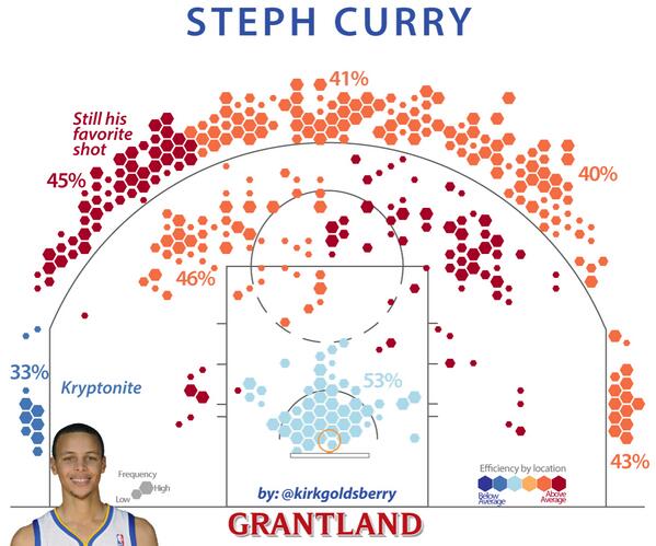
My initial thoughts were that we might be able to do a Goldsberry style approach, adapted for football.
I explained this to my usual partner in crime, DOCTOR Marek Kwiatkowski (as he emphatically reminds me to call him). I have worked closely with Marek for years, and it’s safe to say he’s a bloody genius. The quality of my own work would be nowhere near as good as it is without his feedback. We’re like this…
Anyway, he was intrigued by the idea and started programming. What follows is a design diary for how this idea developed from a frustration to something that was used constantly by the now defunct Football Analytics Team during my days at Smartodds (Brentford and FC Midtjylland).
Nov 10th, 2014
Hi Ted, This is for Arsenal's home performance last season vs Cardiff (two late goals by Bendtner and Walcott). 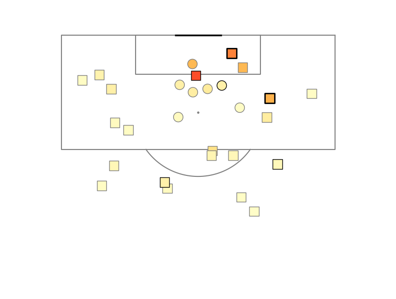 Legend:
circle=header, square=foot/other (triangle for own goals?) Thick black outline=goal, medium black=on target, gray=rest Colour=ExpG (the actual numbers are still wobbly, but it doesn't matter for the concept).
Some ideas:
* player numbers in the marker?
* half-sized marker for blocked shots?
Ted:
Things to consider:
Modified shapes for the following precursor events:
1) Throughball (Arrow?)
2) Successful Dribble (Triangle?)
3) Crosses (Chop 1/3 off whatever shape there is?)
Break colors into buckets for the following probabilities
1-.8: RED
.79-.7 - Red Orange
.69-.6 - Orange
.59-.5 - Orange Yellow
.49-.4 - Yellow
.39-.3 - Yellow Green
.29-.2 - Green
.19-.1 - Sequential Blues (from the PY spectrums you sent)
.09-.0 - Sequential Purples
As you said, there's a lot going on in the lower ranges and it needs more attention. Adding 2 colors of sequential would see to meet that, but open to changes here.
Obviously with this I probably just broke the Green outline concept for goals. Shot on target a thin black outline is good.
I kind of think blocked shots should just show up as grey, as if they have been blotted out of existence because they don't have a real expG value, but not 100%.
Long-term we can make these into an interactive app that has mouseover information for more detail.
Do you think adding player numbers inside the shapes will work or too much noise?
Marek: Hey, A few new versions.
Manual 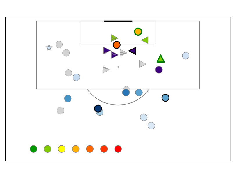
Goldsberry 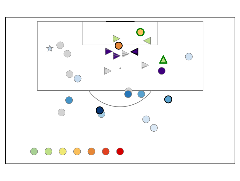 Brewer
 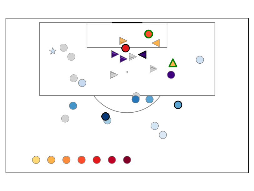 manual=me trying to follow email, goldsberry=colour-picked from him directly, brewer=from colorbrewer2.org.
triangle up=from throughball, left/right=from cross, star=after dribble dotted=header
grayed out=blocked
Outlines still to be worked out, unfortunately with the built-in scatter function I don't have enough control to do the black&white one. I can look into writing a custom scatter later.
In general, I think we are at the limit of the info we want to pack into these charts. I'm already not a fan of the dots/hatching, or even the many marker shapes.
As to the colours, I think you were right to mention the ExpG distribution itself. We should just partition it into ~10 classes of equal size and colour code these with a nice sequential map. It is in essence what Goldsberry is doing, I think. The downside is that the class boundaries will be at awkward ExpG values, but at the end of the day I'm not sure we care about that.
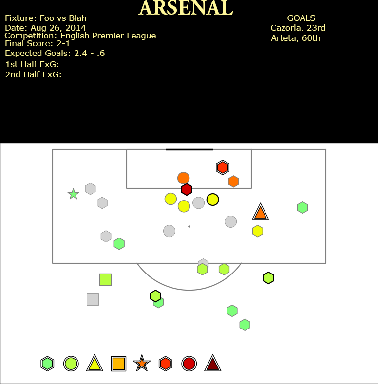
Ted:
Cool! Excellent effort. So much to process here, but that's good.
Now we can filter down what works and what doesn't. Of these I like Gradient + Manual best. Gradient + Brewer probably second, though it's close.
I hate the dots - they just don't work.
Get rid of the directional cross arrows.
It was a really good idea, but too information dense for the first pass.
Make headers circles (intuitive), regular shots hexes (or squares).
Stars and throughball triangles are pretty good, actually.
Black and green outlines aren't that bad. Maybe have no outline at all on normal shots? Obviously the legend will need to be crystal clear on meaning, but I think that will come quickly with usage as well.
Marek: Little bit getting there, perhaps? I quite like this one. 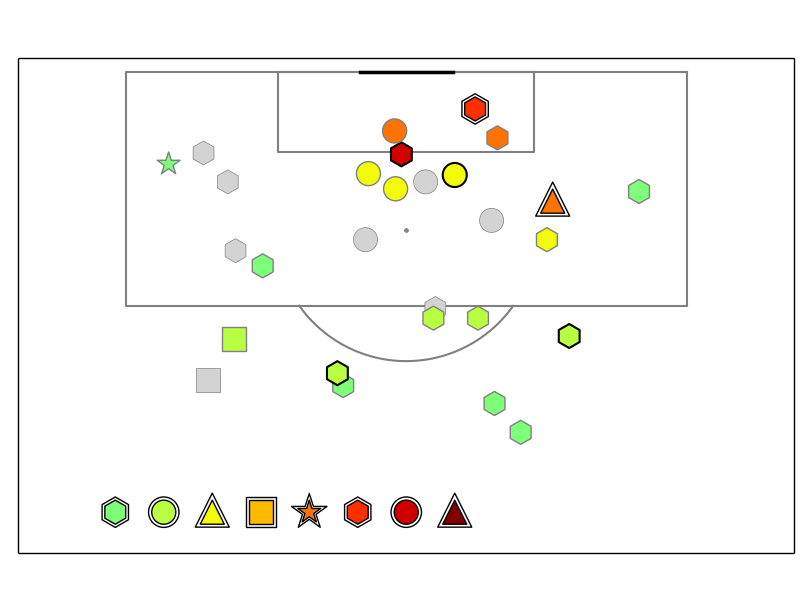
The colormap (I know I'm anal about it) is the right half of 'jet' from this link. I can now easily try any section of any colormap there if you want more samples.
The goal outline works better with regular shapes to my eye (ie triangle and star are a bit iffy), but it's still easily the best I've tried. Hexagon works better as default marker imo: the difference b/w headers and shots doesn't jump at you, but it's clear enough to pick it up immediately when you want to.
Ted:
This works. We'll need to build a spiffy, detailed legend to explain it and then I'll work on the poster display for the top section over the next few days for the info display there.
At this point, Ted realizes he is WAY out of his depth trying to be helpful and this looks terrible. Therefore he asks actual professional designer and all around awesome dude @bootifulgame for feedback.
@bootifulgame sends back this, which makes Ted feel bad about how dumb he is, and about his life, and the fact that he’ll never be able to make truly pretty things.
It just goes to show what you can do with an awesome professional designer involved and not just data dorks trying to solve problems. Alas, the final versions never quite looked as amazing as Ben's.
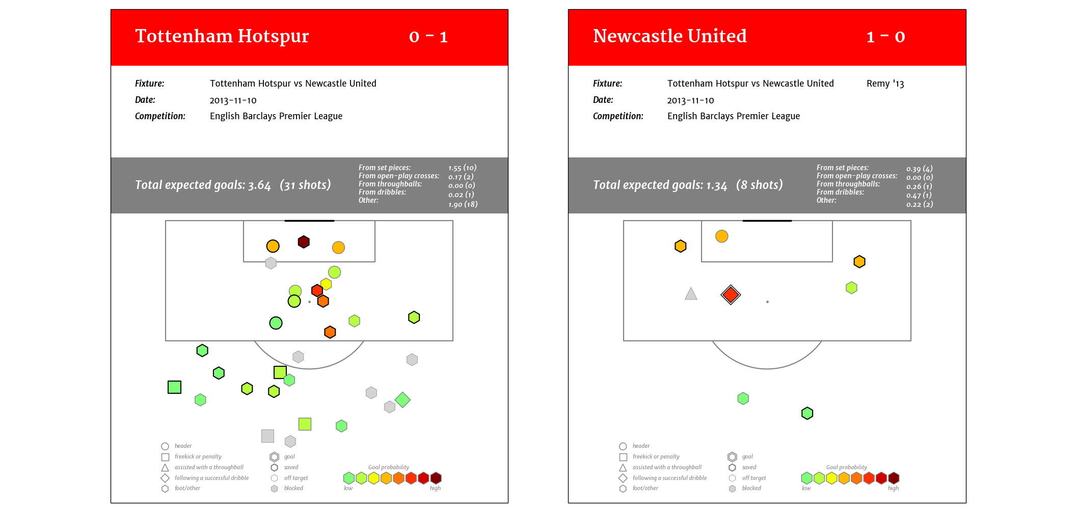
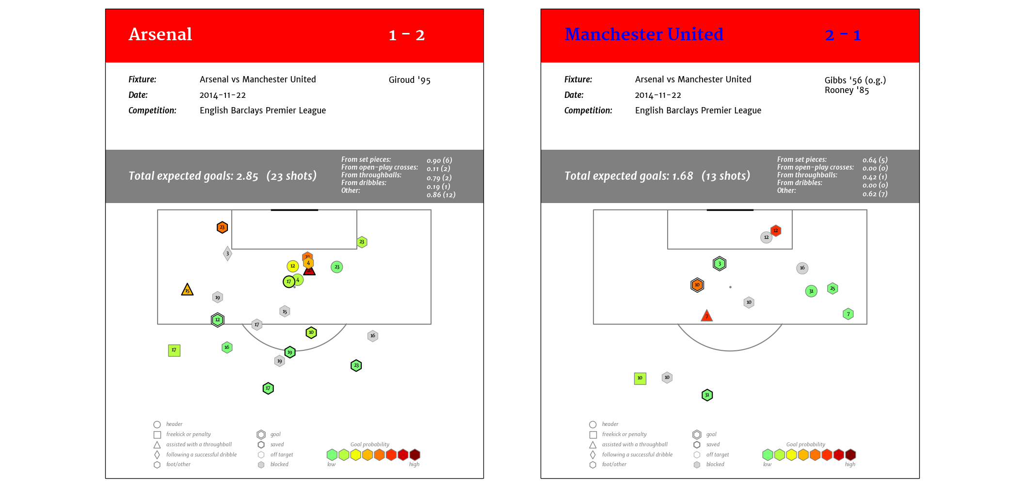
These are some further test versions Marek did for single game plots.
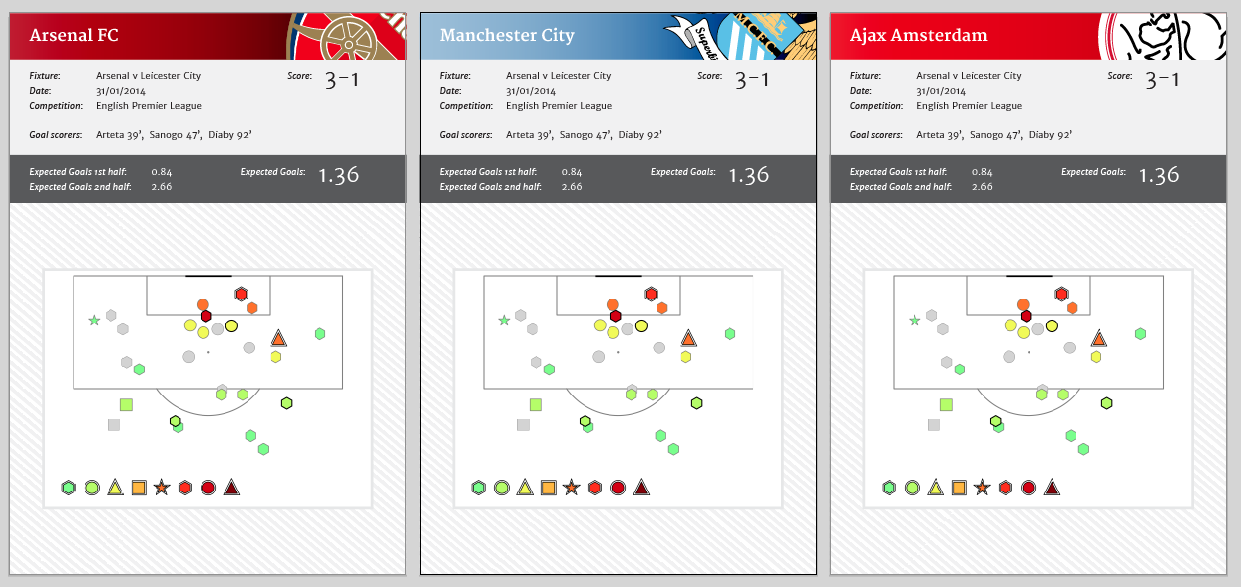
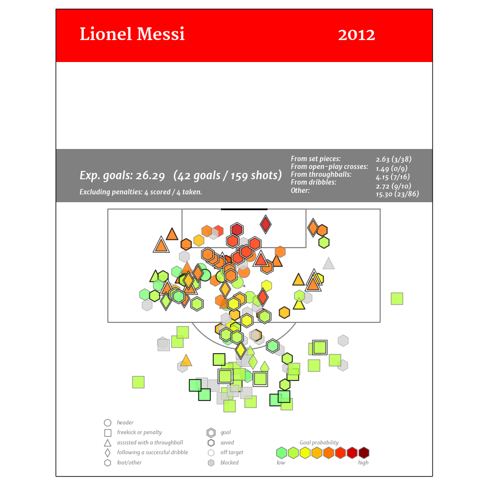
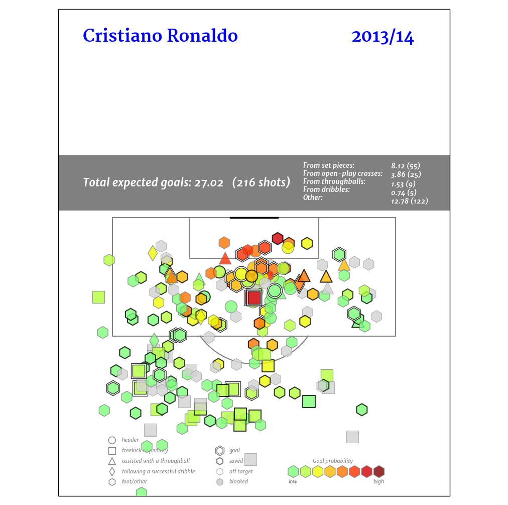
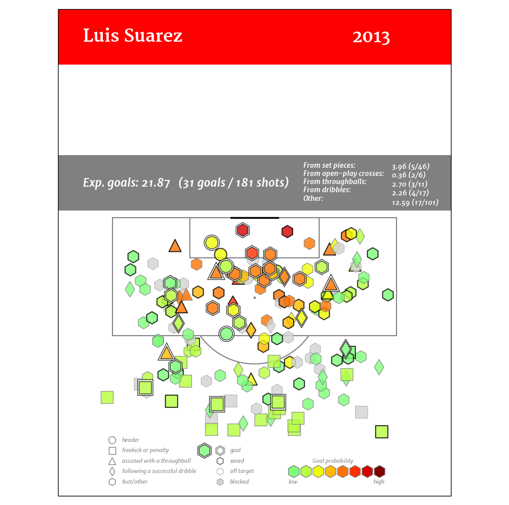
For individual player seasons, they looked like this:
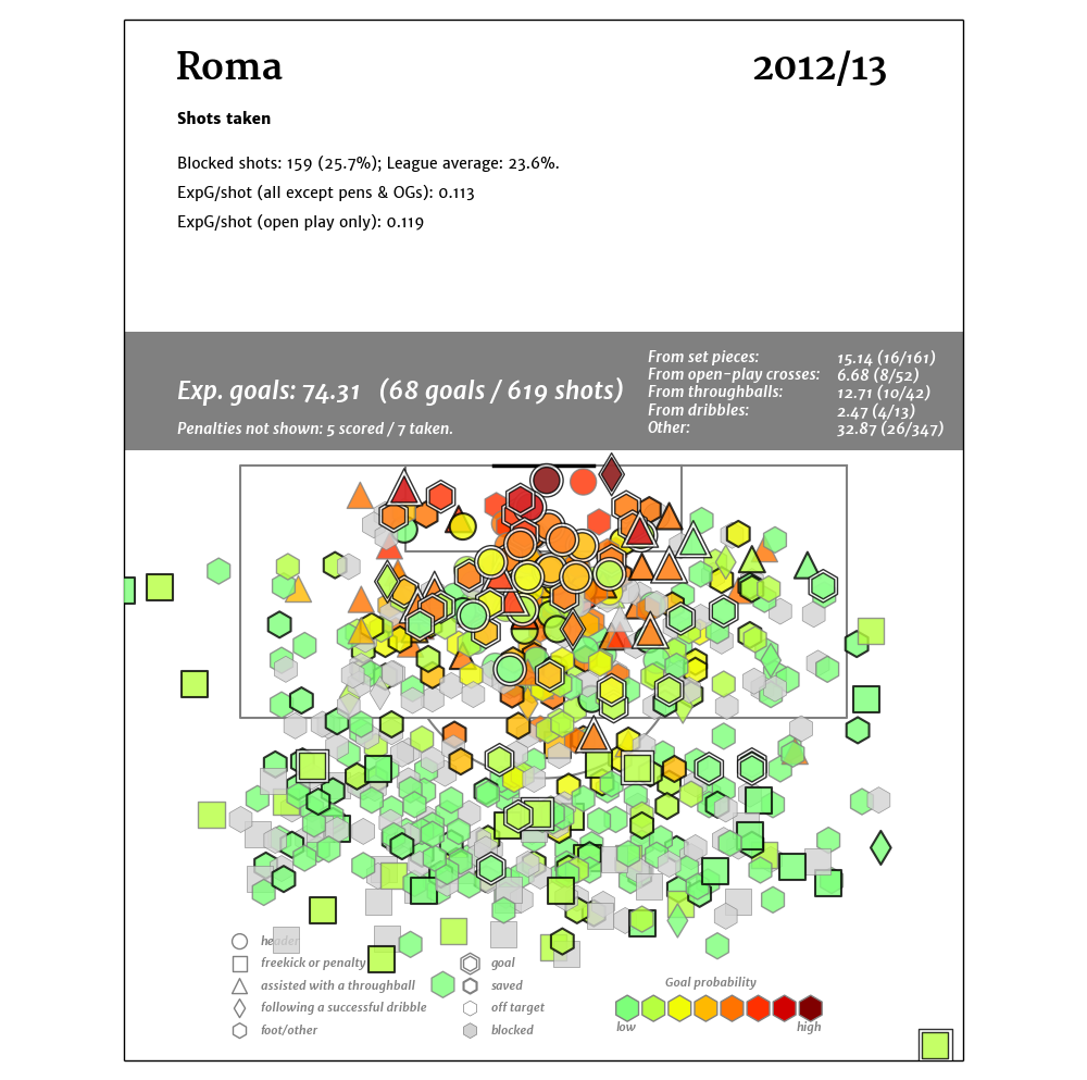
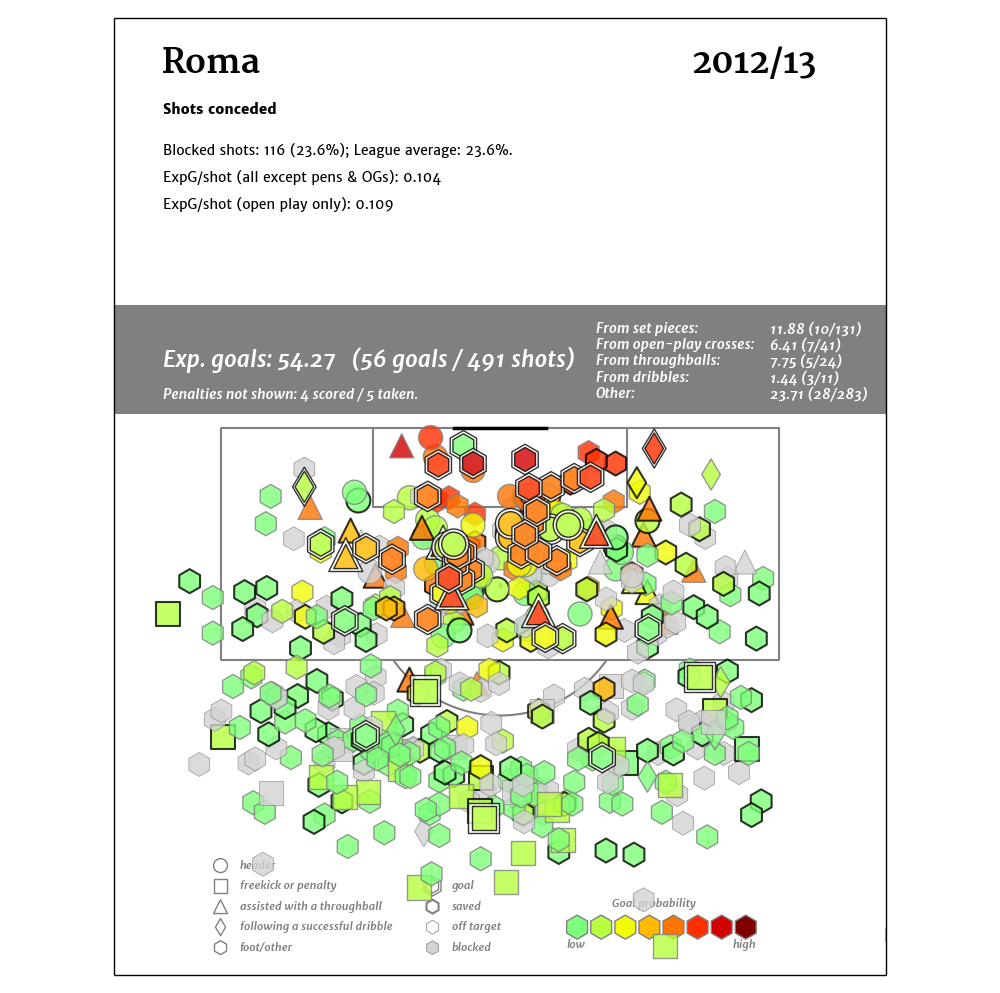
And for team seasons, they look like this:
What Changed?
There was some further tweaking to come.
- Marek got rid of the Super Mario Brothers star for successful dribbles and moved to diamonds. The rest of the markers are fairly intuitive.
- The lowest color on the plot was changed to .05 or lower probability.
- There’s also plenty of other information that can be added in the legend, and you can make a million different data cuts for what you want to see. Open play is an obvious one here, but there are plenty of others.
- They still get really busy for full-season maps for teams. Unfortunately there isn’t much you can do about that. We have a couple of different styles that were built later that try to suss out trends with less noise, but they also have issues.
Conclusion
So there you are, the MK (Marek Kwiatkowski) Shot Map variation and a detailed explanation of how they went from Marek fooling around on a problem to something attractive and useful. Combine them with expected goal race charts (originally seen in hockey, but something 11Tegen11 posts frequently on his Twitter account) and you end up with a fairly complete unit of game analysis, at least when it comes to shots.
Enjoy the Easter holidays,and maybe if I get some time next week, I'll explain a bit more on how to use these charts to analyze team trends.
--TK