
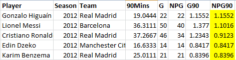
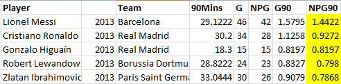
Part 1: Messi did not have the best goalscoring rate in two of the last four seasons. Part 2: Defining elite goalscoring, and the top scorers of 2009-10. Part 3: Bonus Points for wide players and midfielders plus younger players. Top scorers of 2010-11. Greetings. Welcome back to our continuing quest. To seek out… new information regarding the best scorers in Europe. To review… younger players that threw up flags years ago that they were going to be really quite good some day. To boldly go… where few boring statistical analysts have ever gone before… The NPG90 Zone… [Note: if you are hopping on board here, you should probably click on part 2 where I discuss the methodolgy more.] EPL 2011-12 Dzeko was in the Bundesliga top tier in 09-10 and would have been again, if he’d stayed at Wolfsburg. A midseason swap to Manchester City saw his scoring rate drop precipitously, but the next year he actually lead the Premier league in rate, scoring 14 goals from 16.6 90s. Jermain Defoe was second in rate that year off a partial season, and then came Robin van Persie, Papiss Cisse (combined rate between Newcastle and Freiburg), Aguero, Balotelli, and Rooney. Grant Holt appears here, in perhaps his last super useful season, and you also see Yakubu, who was consistently good before moving to China in search of a big money contract. Of the younger players, I was not surprised to see Daniel Sturridge show up, but the appearance of Danny Welbeck at age 21 has certainly made me revaluate an opinion based on last year’s abysmal shooting at United. [table id=57 /] La Liga 2011-12 La Liga’s performers list is again incredibly deep this season, and boasted four of the top 5 rates in Europe, three of which came from Real Madrid. Llorente is here again, and Alexis Sanchez shows a boost after his move to Barcelona from Serie A. Soldado and Negredo are once again hanging around, banging in goals at a very useful, though not quite great rate. Note Falcao’s placement and that of Diego Costa (who at that time was spending a half season on loan at Rayo after recovering from ACL surgery). This is exactly why Atletico knew they could cash in on Falcao and lose precisely nothing (and actually gain a lot) by putting Costa in his place. Also note eventual discount movers Kone and Michu are here, and Sociedad have 22 year old Carlos Vela and 24 year old Agirretxe both on the list. Their improvement plus the addition of Antoine Griezmann would see Sociedad sneak into the 4th Champions League spot a season later. It’s also kind of funny to see Xavi and Cesc both on this list at identical scoring rates. [table id=58 /] Bundesliga 2011-12 Gomez Button? Still here. So are Lewandowski, Reus, Pizarro, and Stefan Kiessling. I had to look up Patrick Helmes on Wikipedia. Looks like he’s a guy with a great career rate, but has blown ACLs a couple of time and bounced around German divisions. Harnik had great rates in 10-11 and 11-12 for Stuttgart but has fallen off a bit since. This is a bit odd, since he’s only 26, but I don’t follow Bundesliga closely enough to know more. Ibisevic has quietly been a very steady performer year in and year out in Germany, plus you have Ribery here (wide forward bonus) and Kagawa appearing again before moving to Manchester United to somehow sit on their bench and make Klopp cry. [table id=59 /] Serie A 2011-12 This year, Italy’s best goalscorer was… Fabrizio Miccoli? Who was 32 at the time? Actually, Miccoli’s production for Palermo in his thirties was astounding. Starting in 09-10, he had a 19G/8A, 9G/2A (only 17 starts), 16/12 (24 starts!), and 8G/8A seasons. Some of those goals are penalty inflated but still… super productivity that late in a career, and being creative as well – that’s almost unheard of. Why did he only seem to turn in those performances that late in his career? Was that the first time he played as a primary striker or something? I am so confused! Pablo Osvaldo shows up again this season, making me wonder even more about why he looks useless in Southampton. As do Fabio Borini (and he’s really young there) and Bojan, making me think they might just need the right situation to regain their potential. And Mattia Destro is only 20 when he is posting those numbers for Sienna, meaning not only does he have one of the best names in football, he also has a goalscoring rate that extrapolates to being a probable world beater when adjusted for age. Interesting stuff. [table id=60 /] French 2011-12 Giroud’s rate this season is quite good, and it’s what caused Wenger to buy him as Arsenal’s forward of the future. The problem is that his conversion rate there is only 13%, which as we have found out in future years, is pretty much his baseline conversion overall. This is unfortunately below the league average in the Premier League, meaning despite having a lot of useful talents, Giroud is frustratingly inefficient in front of goal. This whole series is meant to be a data dump on NPG90, but obviously you never want to evaluate forwards or their production in a total vacuum. What’s curious is that Aubameyang, who appears here for the first time at age 22, had a similar conversion rate to Giroud that year. It got a touch better a year later (13.9%), and is now closer to 21% at Dortmund. There’s a big question of whether or not that is sustainable, but it seems to indicate better surrounding talent = better chance locations = better conversion rate. Maybe. More research is required. [table id=61 /]
Month: January 2014
Everton's Shot Charts and Their Superb Defence
We are half way through the season and it is fair to say that Everton are performing above expectations as they sit in 5th position in the league. Roberto Martinez has brought his brand of attractive football with him from Wigan and, stylistically, they look an altogether different team than the one David Moyes left last spring. But what can their Shot Charts tell us about how they have performed? 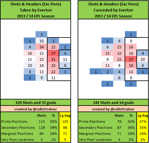 If you require an explanation of the zones used in these images please scroll down to the bottom of this article. Everton Attack Everton have taken the 5th most shots in the league, but their average shot quality is worse than mid-table as they have taken just 35% of their shots from Prime positions, compared to a league average 37%. The Toffees make up for their shortfall in Prime Shots with an above average level of 39% of their shots coming from Secondary spots. All things taken into account, Everton have performed better than expectation as they have scored with 10% of their shots. Just the Top 4 plus Man United have scored with more than 10% of their non- penalty shots, and those five teams all have a considerably higher average shot quality than Everton. If I was forced to estimate the over performance I would suggest that they have scored about 2 goals more than their shots would have deserved. This is obviously not a significant over performance but it is notable that they are on the right side of the curve (from their point of view). Everton Defence A simple look at the league table tells us that Everton have excelled in defence this season. Through the concession of just 19 goals only Arsenal have conceded fewer goals (18) and the North London outfit have played one less game. However, according to my metrics Everton haven’t been as defensively solid as Arsenal and I think they owe a lot to the performance of Tim Howard for their low goals conceded tally. Maybe it's just what I read, but Howard has seemed to have operated under the radar this season. Their total of 241 non-penalty shots represents the 6th lowest number of shots conceded in the Premier League, and the quality of the shots they conceded is certainly lower than the league average with just 33% of their shots against coming from the Prime zone. The combination of these two effects results in the concession of 79 Prime zone shots, meaning that only Arsenal (63) and Man City (72) have allowed fewer shots from the Prime zone than Everton so far this campaign. The above numbers certainly suggest that Everton are defensively well organised, but in my eyes they don’t go quite far enough to explain why Everton’s defence have forced the lowest conversion rate in the league with just 5.8% of the opposition's non-penalty shots being scored. Arsenal are next, with 6.4% of non-penalty shots resulting in a goal, but Arsenal boast the lowest average shot quality allowed in the Premier League, and so all other things remaining equal we would expect Arsenal to have forced the lowest conversion rate. But this hasn't been the case. Tim Howard
 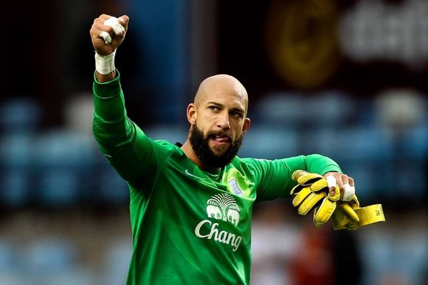 As suggested above, I feel that Tim Howard has been a major reason why Everton have conceded so few goals this term. Regular readers of my articles will know that I use a version of our Expected Goal model (ExpG2) to rate goalkeeper save performances. This model takes into account both the details of the shot as well as looking at the actual shot placement, and on this metric I would content that Howard has probably been amongst the very best shot stopping goalkeepers in the league so far. Our figures would suggest that Howard has allowed 6 goals less than the shots (and placements) he has faced would suggest. One way of viewing Howard’s performance is to compare it with that of Chelsea’s keeper Petr Cech. Cech and Howard have both faced a similar amount of on target shots; the American has faced 69 on target shots and Cech 62. Yet despite facing more shots, Howard has only conceded 15 times to Cech’s 19. I’m not suggesting that Tim Howard is the only reason that Everton are hot on Liverpool’s tail for that all important 4th league position, but the performances of the unsung American are certainly part of the reason for why Martinez’s side are currently punching above their weight. Do I think Howard can continue posting the kind of save figures that he has during the first half of the season? No, I don't. His ExpG2 rating, along with Boruc and Mannone, is just in excess of what any Premier League goalkeeper has achieved over a full season (at least over the last few seasons that I have detailed stats for) and his current rating is substantially higher than he has personally posted over a complete season. In this regard I think Howard acts as a decent proxy for Everton's season. He has undoubtedly put in some really good performances but I don't think the results he has been achieving are sustainable and therefore I would expect a drop off over the second half of the season. Previous Mid Term Shot reports: Arsenal Man City Liverpool Man United Chelsea My Zones A reminder for any new readers of the zones that the summary box below the plots refer to:
 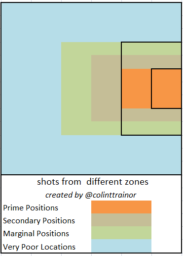 Each team plot has two images. The image on the left reflects the shots (excluding penalties) that the team has taken this season, while the image on the right sets out the shots they have allowed. The table underneath the image summarizes the shots by zone, and in order to aid comparison the numbers highlighted in yellow are the league averages.
Fulham under Meulensteen

This very brief post was prompted by a question from Richard Allen on Twitter.  Martin Jol resided over Fulham until the end of November, and here are the Shot Charts for his Fulham team at the time Jol was sacked. If you require an explanation of the zones used in these images please scroll down to the bottom of this article. Otherwise we'll jump straight into the charts. Jol's Fulham
 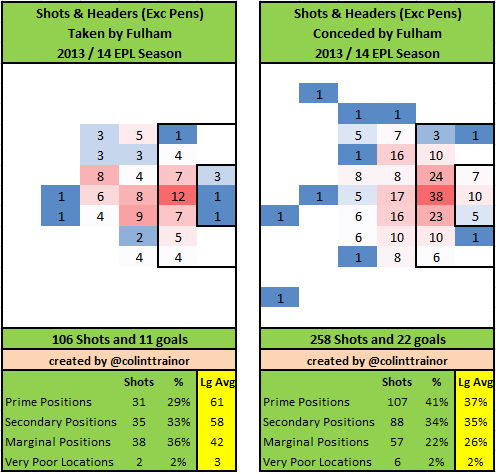 What do we notice? Fulham conceded more than twice as many shots as they gained, and their own poor shot quality combined with the above average quality of shots allowed mean that they conceded more than there times as many Prime location shots as they generated themselves. They also shot far too often from Marginal Positions. All in all, I firmly believe that Jol was lucky that his team only conceded 11 more non-penalty goals than they scored under his reign. He really had Fulham playing abject football. Jol was sacked on 1st December and was replaced by Rene Meulensteen with an almost immediate improvement in results and performances. Although recent results, including a 6-0 tanking by the mighty Hull and a home defeat to Sunderland yesterday suggests that the "Rene impact" has been short lived. What can we learn from the Shot Charts in the games since 1st December? Rene's Fulham Shot Charts
 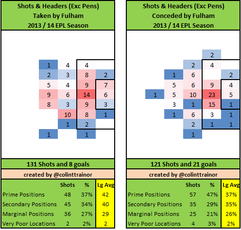 For a start Fulham have had more shots under Meulensteen than they have conceded - so that's a clear improvement. Their split of shots between zones is bang in line with the EPL average (37% from Prime and 34% from Secondary positions). So I can answer Richard Allen's question by saying that Rene has improved the positions where Fulham have been shooting from and it's not a case that the increased shots are just superficially better. From a defensive point of view, Fulham under Meulensteen have a huge problem with where they allow shots to be taken from. Almost half of the shots they allow have come from the Prime Zone - that's a hole that will need to be rectified quickly if Fulham want to escape relegation. However, even including that worrying defensive wrinkle I would suggest that Meulensteen has been most unfortunate to have conceded 21 goals from 121 shots. That is virtually the same amount of goals (22) that Jol's Fulham conceded from a whopping 258 shots. I had been pretty vocal all season that Fulham were atrocious under Jol and that their underlying numbers were much worse than the results they were getting. Whether that was because of good fortune or variance we will never know, but his replacement Meulensteen is in the unfortunate position of being on the receiving end of the variance levelling itself out, ie the results he has been getting are not as good as the underlying stats would suggest. Sometimes, that's just the way the dice rolls. My Zones A reminder for any new readers of the zones that the summary box below the plots refer to: Each team plot has two images. The image on the left reflects the shots (excluding penalties) that the team has taken this season, while the image on the right sets out the shots they have allowed. The table underneath the image summarizes the shots by zone, and in order to aid comparison the numbers highlighted in yellow are the league averages.
Stat Attack - Elite Goalscorers in Europe 2010-11

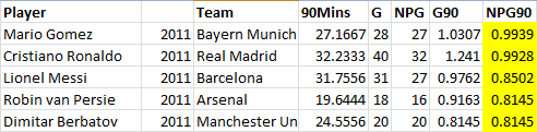
Part 1: Messi did not have the best goalscoring rate in two of the last four seasons. Part 2: Defining elite goalscoring, and the top scorers of 2009-10. This piece assumes you have read at least part 2, since that talks about the various acronyms used in this piece and explains why one would bother to normalize goalscoring data in the first place. Today I will be posting all the top goalscoring stats from 2010-11 and talking a bit about the specific findings from that particular year. They are posted in sortable table format so that they are easy to swipe and re-use for your own research, should you be into that sort of thing. (I won't judge.) Two More Driving Concepts Yesterday I talked about why we strip out penalties and cut the data into 90 minute increments. Today I want to talk about two additional concepts that have an impact on player evaluation when looking at these stats. First of all, when young players appear in these numbers, it's more meaningful than when older players are here. For the purposes of forward play, "young" players equal 23 and Under, while peak is 24-26, and beyond that most players have a post-peak plateau and often a fairly steep decline. There are a lot of reasons for this, but most of it comes down to the age curve. I've written more on this topic here, but the quick and dirty of it is - on average - you can expect younger forwards to continue improving up to age 25-26, at which point their performance tends to peak, and then gradually fall off. Thus, when you see young players deliver stats that are among the best goalscoring rates in Europe, it's exciting, because it means there is a reasonable chance they will get even better. The second concept to keep in mind is a positional one. We expect central forwards to generally exhibit the highest goalscoring rate, and that's generally true across leagues. However, when wide players or attacking midfielders start showing up in this list, it is very interesting. Sometimes this is a systemic effect based on a unique tactical system, but a lot of times it will indicate unusual goalscoring potential from a position that doesn't always deliver those numbers. The modern game practically demands you have wide men who can score goals, so showing up here is a good thing, and doubly so when a player is young. Right, on to the leagues! EPL 2010-11 The Premier League this season had a long list of guys who were good or very good, topped by three players who were among the best in Europe that year in RVP, Berbatov, and 22-year-old Javier Hernandez (who is now 25, and really deserves a full-time starting role somewhere). Note a young Andy Carroll is in this list, as are wide men Florent Malouda, and 21-year-old, always productive but oft-injured Theo Walcott. Jermaine Beckford is also somehow on this list, which is probably the last point he was particularly useful for anyone as a goalscorer. He was already 27 then, which is another reason teams need to pay attention to age when doing transfer business. [table id=52 /] LaLiga 2010-11 Man, La Liga this season was loaded. You have Ronaldo and Messi in the Top 5 in Europe, a ton of middle-tier guys posting outstanding rates, and the kids were ridiculous. Sergio Aguero is here, tearing up the league, Salomon Rondon (21, but moved to Rubin Kazan a year later), Pedro (wide+ young), Giuseppe Rossi (ACLs made of twine but still 23) are too, and ... Diego Costa, mostly in a secondary role. [Insert your own Moneyball diatribe here.] Also here are Benzoil, Gonzo, Soldado, Villa, Negrodo, Llorente, etc - also known as all the guys that either ended up playing at the big 2 in Spain or moving for mucho dinero overseas. Oh, and uh... Pablo Osvaldo. Outside of one volley, he looks utterly useless since he moved to the Premier League. Alas, no model is foolproof. [table id=53 /] Bundesliga 2010-11 Aaaand here I lose my football hipster badge because I have no clue who Novakovic, Allagui, or Lakic are. Sorry. This was the year that the Gomez Button lead Europe in NPG90, and saw Kiessling doing his, "Even Jogi Lowe doesn't know who I am, but I'm always near the top of the league in goals but never get called up to the German National Team" thing. Someone will write a play about this eventually, featuring turtlenecks, Nietzsche, and a lot of drawn out sighs. I figure this is Joey Barton's second career after he hangs up the boots. You also have a bunch of guys in the middle tier that would become very interesting names shortly thereafter. Lewandowski is 22 there. Schurrle is 20-21 and probably played wide a lot, plus you also have young Kagawa (midfielder bonus points), and Mario Mandzukic. On the other hand, you have Papiss Cisse (what a great first six months at Newcastle! *ignores the rest of his Tyneside career*), Lucas Barrios, Mladen Petric (sorry Fulham, he was too old when you got him), and the aforementioned I-have-no-fucking-clue-who-they-are guys. [table id=54 /] SerieA 2010-11 I mentioned on Twitter that there were reasons why Arsenal fans might be interested in the rumored Pato move. As a kid, he was unreal. As an adult, there are questions about his ability to stay healthy and his current motivation. Those scoring numbers though... woof. Also in the mix here are the eternally underrated Di Natale, 23-year-old Edinson Cavani, young Alessio Cerci (currently having a great season for Torino), young Alexis Sanchez (tearing it up for Barcelona), and a bunch of Italian stalwarts that are good but rarely great. [table id=55 /] French 2010-11 Moussa Sow, Lisandro Lopez, and Loic Remy are the pick of the crop from France that season. Sow has maintained the same goalscoring rate since moving to Turkey, Remy has proven himself plenty capable of scoring in the Premier League, and Lopez was at his peak then, had two more good years for Lyon, and now presumably plays on a fat contract in the Middle East. Also of interest here were 23-year-old Gervinho (he really was great at Lille), and 23-year-old Dimitri Payet (midfielder bonus points), who had an amazing year last season and then has underwhelmed a bit this year since a big move to Marseille. [table id=56 /]
Stat Attack – The Top 76 Scorers in Europe 2009-10

I finally finished the data work I wanted to do for transfer shopping pieces, and then I got so excited about the top scorer in Europe 09-13 stuff that I had had to post that first. However, the point of all this was an attempt to build some useful baselines. What type of performance qualifies as elite? Obviously merging words and numbers is tricky, but we’re basically looking at the best of the best in terms of football performance.
The data set I have access to runs from 2009-10 through the current season and covers the big 5 leagues in Europe. For the next few days, I’m mostly going to just post data from the top tiers of performers across Europe in particular seasons so that we have reference points to determine the awesome from the good from the merely average.
Obviously one of the complications you run into is that different leagues have different strengths, and different teams (particularly Real Madrid and Barcelona) have incredible competitive advantages that seem to enhance performance of all their players. The Eredivisie (not in the current data set) has the highest scoring rate in Europe, while Ligue 1 has the lowest. Regardless, we don’t have an objective way of discounting this yet, so I’ll simply break things into league-based data dumps and for now you can make your own determinations.
Goals per 90
I covered this briefly yesterday, but it bears repeating.
Goals are the most basic scoring stat we have. However, just looking at the total goals a player has at the end of the season discounts one particularly important element: playing time. Players that play more should contribute more in rate stats. This is why Benjamin Pugsley and I usually try to normalize rate stats into per 90s. It controls for total playing time (including time missed due to injury or sub appearances), which can be particularly useful when it comes to younger players who may not be full members of the first team yet.
Another element that we want to “fix” here is goal inflation via penalty. Penalty kicks are generally converted at a 76% rate, year after year, and it doesn’t require an expert in goalscoring to do this. (Example: there have been a number of goalkeepers over the years who were designated penalty takers for their teams.) In short, it’s a different skill than normal goal scoring. Thus I’ve done my best to filter this out of the goal scoring information we’re looking at. We care more about guys who are banging them home from everywhere but the penalty spot.
Cutoffs
Going into this, I kind of had the running assumption that .4 goals per90 is the cutoff for being a useful top-level forward that is expected to score goals. Multiply .4 across 38 matches, and you get 15 goals a season – a good, but not great goal tally. (It’s probably great for wide players and midfielders, but that’s another article for another time.) At a later date, I’ll re-slice the data set into standard deviations and the like to get a real cutoff point, but for now let’s stay a bit more casual.
In 2009-10, there were 98 players who scored goals at a rate of .4/90 or better, or just under 20 per league. That seems like a reasonable number. It’s not something everyone can do, but it does indicate a high level of contribution. The tallies for players meeting this threshold across the leagues in each year is
2010: 98
2011: 99
2012: 104
2013: 116
Remove the penalty goals from those numbers, and you end up with
2010: 76
2011: 83
2012: 81
2013: 92
Which strips out about 20-25% of the contenders per year on average.
But what about elite? Where is the elite level of goalscoring?
My first guess was around .6, or 50% more than the “useful” metric. Multiply it out by a full season and it delivers nearly 24 goals from 38 matches. That us a huge number and would put any player with that rate near the top of their league in scoring almost every single year.
Again, a casual look at the numbers seems to bear this out. Number of players for each year meeting this threshold are as follows:
2010: 18
2011: 20
2012: 19
2013: 20
So the surface breakdown of categories goes a bit like this:
.4 to .49 non-penalty goals per 90: Good.
.5 to .59 non-penalty goals per 90: Very good.
.6 to .79 non-penalty goals per 90: Probable Top 20 in Europe
.8 or above non-penalty goals per 90: Probable Top 5 in Europe
[Note: These divisions aren’t perfect, and should definitely be adjusted a bit for younger players, as you expect their performance to increase until they hit their peak. If a younger player (say 22 or under) is putting up numbers in these brackets, they are probably pretty special.
EPL 09-10
|
Player
|
Team
|
90 mins
|
G
|
NPG
|
G90
|
NPG90
|
|---|---|---|---|---|---|---|
| Andrey Arshavin | Arsenal | 25.17 | 10 | 0.3974 | 0.3974 | |
| Aruna Dindane | Portsmouth | 16.22 | 8 | 7 | 0.4932 | 0.4315 |
| Carlos Tévez | Manchester City | 31.87 | 23 | 18 | 0.7218 | 0.5649 |
| Darren Bent | Sunderland | 37.64 | 24 | 19 | 0.6375 | 0.5047 |
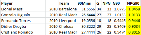
| Didier Drogba | Chelsea | 30.82 | 29 | 28 | 0.9409 | 0.9084 |
| Dimitar Berbatov | Manchester United | 23.29 | 12 | 0.5153 | 0.5153 | |
| Emmanuel Adebayor | Manchester City | 24.58 | 14 | 0.5696 | 0.5696 | |
| Fernando Torres | Liverpool | 19.06 | 18 | 18 | 0.9446 | 0.9446 |
| Florent Malouda | Chelsea | 25.59 | 12 | 0.469 | 0.469 | |
| Francesc Fábregas | Arsenal | 24.37 | 15 | 12 | 0.6156 | 0.4925 |
| Jermain Defoe | Tottenham | 28.52 | 18 | 17 | 0.6311 | 0.596 |
| Louis Saha | Everton | 25.87 | 13 | 11 | 0.5026 | 0.4253 |
| Wayne Rooney | Manchester United | 30.26 | 26 | 22 | 0.8593 | 0.7271 |
LaLiga 09-10
|
Player
|
Team
|
90 Mins
|
G
|
NPG
|
G90
|
NPG90
|
|---|---|---|---|---|---|---|
| Álvaro Negredo | Sevilla | 22.6889 | 11 | 9 | 0.4848 | 0.3967 |
| Zlatan Ibrahimovic | Barcelona | 22.6 | 16 | 14 | 0.708 | 0.6195 |
| Walter Pandiani | Osasuna | 26.8444 | 11 | 0.4098 | 0.4098 | |
| Sergio Agüero | Atletico Madrid | 24.4556 | 12 | 0.4907 | 0.4907 | |
| Roberto Soldado | Getafe | 25.2 | 16 | 13 | 0.6349 | 0.5159 |
| Riki | Deportivo La Coruna | 16.6222 | 8 | 7 | 0.4813 | 0.4211 |
| Pedro | Barcelona | 23.5444 | 12 | 0.5097 | 0.5097 | |
| Pablo Osvaldo | Espanyol | 20.5556 | 10 | 0.4865 | 0.4865 | |
| Nilmar | Villarreal | 27.4778 | 11 | 0.4003 | 0.4003 | |
| Luís Fabiano | Sevilla | 18.2667 | 15 | 14 | 0.8212 | 0.7664 |
| Lionel Messi | Barcelona | 31.5556 | 34 | 33 | 1.0775 | 1.0458 |
| Karim Benzema | Real Madrid | 14.4889 | 8 | 0.5521 | 0.5521 | |
| Joseba Llorente | Villarreal | 19.6778 | 9 | 0.4574 | 0.4574 | |
| Gonzalo Higuaín | Real Madrid | 26.6444 | 27 | 27 | 1.0133 | 1.0133 |
| Frederic Kanouté | Sevilla | 19.8444 | 12 | 10 | 0.6047 | 0.5039 |
| Diego Forlán | Atletico Madrid | 28.6 | 18 | 15 | 0.6294 | 0.5245 |
| David Villa | Valencia | 30.1111 | 21 | 18 | 0.6974 | 0.5978 |
| Cristiano Ronaldo | Real Madrid | 27.4444 | 26 | 22 | 0.9474 | 0.8016 |
Bundesliga 09-10
|
Player
|
Team
|
90 Mins
|
G
|
NPG
|
G90
|
NPG90
|
|---|---|---|---|---|---|---|
| Arjen Robben | Bayern Munich | 19.7556 | 16 | 14 | 0.8099 | 0.7087 |
| Claudio Pizarro | Werder Bremen | 23.6667 | 16 | 0.6761 | 0.6761 | |
| Cacau | VfB Stuttgart | 19.3333 | 13 | 0.6724 | 0.6724 | |
| Lucas Barrios | Borussia Dortmund | 29.1333 | 19 | 0.6522 | 0.6522 | |
| Edin Dzeko | Wolfsburg | 33.3444 | 22 | 20 | 0.6598 | 0.5998 |
| Stefan Kießling | Bayer Leverkusen | 32.4556 | 21 | 19 | 0.647 | 0.5854 |
| Kevin Kuranyi | Schalke 04 | 31.1111 | 18 | 0.5786 | 0.5786 | |
| Ivica Olic | Bayern Munich | 19.9333 | 11 | 0.5518 | 0.5518 | |
| Ciprian Marica | VfB Stuttgart | 16.8778 | 10 | 9 | 0.5925 | 0.5332 |
| Albert Bunjaku | Nurnberg | 24.0667 | 12 | 0.4986 | 0.4986 | |
| Hugo Almeida | Werder Bremen | 14.9111 | 7 | 0.4694 | 0.4694 | |
| Mario Gomez | Bayern Munich | 21.4778 | 10 | 0.4656 | 0.4656 | |
| Thomas Müller | Bayern Munich | 29.3778 | 13 | 0.4425 | 0.4425 | |
| Eren Derdiyok | Bayer Leverkusen | 29.0556 | 12 | 0.413 | 0.413 | |
| Adrián Ramos | Hertha Berlin | 24.7889 | 10 | 0.4034 | 0.4034 | |
| Didier Ya Konan | Hannover 96 | 22.3889 | 9 | 0.402 | 0.402 |
SerieA 09-10
|
Player
|
Team
|
90 Mins
|
G
|
NPG
|
G90
|
NPG90
|
|---|---|---|---|---|---|---|
| Antonio Di Natale | Udinese | 33.4667 | 29 | 23 | 0.8665 | 0.6873 |
| Maxi López | Catania | 15.6556 | 11 | 10 | 0.7026 | 0.6388 |
| Alexandre Pato | AC Milan | 20.0333 | 12 | 0.599 | 0.599 | |
| Mario Balotelli | Inter | 15.4444 | 9 | 0.5827 | 0.5827 | |
| Diego Milito | Inter | 31.9889 | 22 | 18 | 0.6877 | 0.5627 |
| Marco Borriello | AC Milan | 24.5444 | 14 | 13 | 0.5704 | 0.5297 |
| Valeri Bojinov | Parma | 15.6667 | 8 | 0.5106 | 0.5106 | |
| Emanuele Calaiò | Siena | 16.8222 | 8 | 0.4756 | 0.4756 | |
| Davide Lanzafame | Parma | 14.9667 | 7 | 0.4677 | 0.4677 | |
| Sergio Floccari | Genoa | 21.4889 | 12 | 10 | 0.5584 | 0.4654 |
| Fabrizio Miccoli | Palermo | 28.8 | 19 | 13 | 0.6597 | 0.4514 |
| Francesco Totti | Roma | 19.9778 | 14 | 9 | 0.7008 | 0.4505 |
| Giampaolo Pazzini | Sampdoria | 35.9556 | 19 | 16 | 0.5284 | 0.445 |
| Alberto Gilardino | Fiorentina | 32.6778 | 15 | 14 | 0.459 | 0.4284 |
| Mirko Vucinic | Roma | 28.3333 | 14 | 12 | 0.4941 | 0.4235 |
| Adailton | Bologna | 21.7889 | 10 | 9 | 0.4589 | 0.4131 |
| Simone Tiribocchi | Atalanta | 27.5778 | 11 | 0.3989 | 0.3989 | |
| Marco Di Vaio | Bologna | 25.2 | 12 | 10 | 0.4762 | 0.3968 |
French 09-10
|
Player
|
Team
|
90 Mins
|
G
|
NPG
|
G90
|
NPG90
|
|---|---|---|---|---|---|---|
| Mevlut Erding | Paris Saint Germain | 26.9444 | 15 | 0.5567 | 0.5567 | |
| Mamadou Niang | Marseille | 27.6778 | 18 | 15 | 0.6503 | 0.542 |
| Ireneusz Jelen | Auxerre | 26.9444 | 14 | 0.5196 | 0.5196 | |
| Kevin Gameiro | Lorient | 33.2444 | 17 | 0.5114 | 0.5114 | |
| Pierre-Alain Frau | Lille | 23.6 | 13 | 12 | 0.5508 | 0.5085 |
| Gervinho | Lille | 27.4556 | 13 | 0.4735 | 0.4735 | |
| Asamoah Gyan | Rennes | 23.3222 | 13 | 11 | 0.5574 | 0.4717 |
| Michel Bastos | Lyon | 21.8889 | 10 | 0.4569 | 0.4569 | |
| Bafétimbi Gomis | Lyon | 23.0444 | 10 | 0.4339 | 0.4339 | |
| Lisandro López | Lyon | 28.0556 | 15 | 12 | 0.5347 | 0.4277 |
| Emmanuel Rivière | Saint Etienne | 19.2333 | 8 | 0.4159 | 0.4159 |
Check out Emmanuel Riviere sneaking in there at the bottom of the French table. He was 19 at the time - now plays for Monaco. Anyway, I'll keep doing these more complete scoring charts for the next few days so the data is out there, and next week I'll also start providing transfer recommendations for EPL squads.
You Might Think Leo Messi Was the Best Goalscorer in Each of the Past 4 Seasons – You Would Be Wrong

While doing research for elite goalscorer stats over the past few seasons, I finally had a chance to really dig into the numbers and do a full set of conversions to control for penalties and time played.
Why would you want to do this? Two reasons, really…
1) Penalties are converted at a 76% clip on average anyway, and any number of players on a team can do this. Therefore you shouldn’t be rewarding guys for scoring penalty goals – you actually need to subtract those from goalscoring totals. Thus we start with non-penalty goals.
2) Not all players are on the pitch the same amount of time. Some get subbed off regularly, some are only substitutes, some get injured, suspended, etc. By doing some simple calculations, we end up with non-penalty goals per 90 minutes played or NPG/90, which is how all goalscorers should really be evaluated, both in the past and going forward.
Those drawn here by the headline are all thinking, “Shut up, stat man and just get to the point.”
Well, once you do the conversions, you discover that despite the monster goal tallies, Lionel Messi and his superhuman footballing prowess has actually only been the most impressive goalscorer in Europe in two of the last four seasons.
Additionally, you might figure that Cristiano Ronaldo has consistently been the second most impressive goal scorer in each of the last four seasons… Well, that ain’t quite true either.
2009-10
2010-11
2011-12
2012-13
Messi has lead the world in NPG/90 twice in the last four years. He also posted a second and a third, but it wasn’t Ronaldo who clipped him to the top spot in 11-12, it was Gonzalo Higuain. Meanwhile, Ronaldo was actually tied for 1st in 2011 and then second in 2013, but 3rd and 5th the other two seasons in question.
This isn’t to say that both Messi and Ronaldo aren’t amazing – they clearly are (and Messi’s value will become even more apparent when I talk about G+A/90 in the near future). They are also the only two who have been in the Top 5 the last four seasons (Higuain was 12th one of those years). It’s more to highlight the point that there are other players in Europe who have also had amazing goalscoring production when controlled for certain important factors.
Just looking at the headline stats for football can be misleading and costly, both in terms of paying too much for transfers, and when teams undervalue an incredible scorer like Higuain and let him slip away. (Here’s looking at you, Arsenal.)
Anyway, I’ll be going over a much broader list of goalscorers for each of the past four seasons in the next week, as well as highlighting different ways of evaluating scorers, providers, young players, and transfer targets.
If you like this, check back soon – there’s a lot more to come.
--@mixedknuts
Premier League Shots Review: Chelsea

In the 5th in our series of reviews of Premier League team's shooting tendencies we'll move the spotlight onto Chelsea. The Stamford Bridge outfit are very well placed in third position just two points behind Arsenal. Chelsea's Shot Charts If you require an explanation of the zones used in these images please scroll down to the bottom of this article. Otherwise we’ll jump straight into their charts. 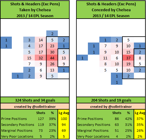 Only Man City, Liverpool and Tottenham have shot more often and the proportion of shots they take from Prime Areas are better than average whilst falling short of the excellent numbers Man City and Arsenal have posted. One interesting attacking wrinkle is that when Chelsea shoot from outside the penalty area the shots are much more likely to come from the left side than the right. Certainly, the difference in shots attempted from the two sides is more pronounced for Chelsea than any of the other leading teams - a quick glance back to the Shot Charts of the other leading teams in this review series (all linked at the bottom of this article for convenience) confirm this fact. Is there any reason for this? As shots from that side of the pitch suit right footed players do Chelsea have a higher proportion of right footed attackers than other teams? Do they build most of their attack down the left side? At this stage of my team mid term reviews I am pretty close to reaching data analysis overload so I haven't investigated either of those synopsis just yet, but it would definitely be interesting to know the reason why Chelsea strongly favour the left side once they are shooting from outside the penalty area. Many of Chelseas's attacking players have chipped in with shots from this left side outside the area with Hazard, Schürrle and Oscar being most prominent - the shots haven't just been concentrated on one player. Defense Defensively, it may be a surprise to see that 42% of the shots Chelsea allow are from Prime positions. Just Tottenham and Fulham have fared worse than Chelsea, both posting figures of 43%. On the plus side however, Chelsea has conceded the fewest shots in the league after the opening 20 games. What is the reason for the concession of such a high proportion of close in chances? I know that in the games against the other leading title contenders Mourinho has tended to send his team out very conservatively and has seemed to settle for a draw. In fact the only two games where Chelsea's ExpG value was less than 1.00 was in the away games at Old Trafford and The Emirates. However, I would suggest than in other games where Chelsea should be too good for the opposition there is a desire to control possession and take the game to the opposition. This could be the reason why so many of the shots they concede are from good spots. Teams that incorporate this style tend to succeed in restricting shots, but when their defences are breached the opposition are be able to work into better positions before taking a shot. The one other factor that will have contributed to such a high proportion of opposition shots coming from the Prime zone is that a large proportion of Chelsea’s shots against are actually headers. The table below sets out the proportion of shots against each team that have come from headers:
 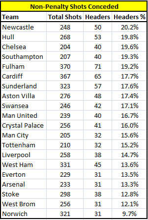 Chelsea sits in 3rd place in this table with almost 20% of their shots against coming from headers. As we know by now headers are scored less often than kicked shots, but will also tend to be taken from the Prime zone - thus "artificially" inflating the numbers in this area. This is probably the reason why although the Blues allow the 3rd highest proportion of shots to come from Prime areas, the quality of their shots conceded is reduced sufficiently that they rank mid table in average shot quality allowed. This serves as a decent reminder when looking at shot locations to ensure you understand the makeup of the shots as headers do not present the same scoring opportunity as kicked attempts at goal do. Previous Mid Term Shot reports: Arsenal Man City Liverpool Man United My Zones A reminder for any new readers of the zones that the summary box below the plots refer to:
  Each team plot has two images. The image on the left reflects the shots (excluding penalties) that the team has taken this season, while the image on the right sets out the shots they have allowed. The table underneath the image summarizes the shots by zone, and in order to aid comparison the numbers highlighted in yellow are the league averages.
Podcast 9 - 3 Things We Learned About The Premier League + Atletico Can Beat Barcelona

A fairly hefty set of topics for our first podcast in 2014. They include: A full preview of Atletico Madrid v. Barcelona this weekend and discussion of why Atletico are actually one of the best teams in Europe. Three things we have each learned so far this Premier League season. Fans and manager expectations are insane! and quick previews of Newcastle v. Manchester City and Aston Villa v. Arsenal. If you like this, RT it on Twitter, plunk it on Facebook, and tell your friends. This is the only content we do on the site strictly because you guys demanded it.
Will Man United really miss out on the Top 4 this season?
In terms of shot volume there are currently four distinct tiers in the 2013/14 version of the Premier League. Tier 1 consists of Man City, Tottenham, Liverpool and Chelsea with all of these teams having between 320 and 350 non-penalty shots in their opening 20 games (16 – 17.5 per game). Tier 2 contains Everton, Arsenal and Newcastle. This group is shooting at the rate of approximately 15 shots per game. Tier 3 contains Southampton, Swansea, West Brom, Aston Villa, Norwich, Sunderland, West Ham and Man United. So far these teams have achieved a shooting rate of 12 – 13 per game. Tier 4 contains the shot shy teams of Hull, Palace, Stoke, Fulham and Cardiff; all of whom shoot 11 – 12.5 times per match. The boundaries between these groups can be clearly seen on the image below. In this chart the vertical axis represents the number of non-penalty shots taken by each team and the horizontal axis shows the number of shots conceded by each Premier League team so far in the 2013/14 season. Total Shots 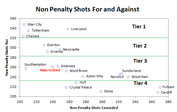 For me, the team that stands out in that chart (apart from the fact that I have highlighted them in red) is Man United. They went into the season as reigning champions and were one of the fancied teams at the start of the season but they currently reside in 7th place in the league. Arguably, wins over the Christmas period against Hull and Norwich masked the fact that they were out shot by what should be inferior teams on both occasions. From my viewpoint, the Old Trafford team are playing like a team that are barely better than mid table. It’s not just that United are struggling in terms of total shots, but they are also struggling to ensure that they shoot often enough from good places. I feel like the world’s greatest proponent of shot locations. It doesn’t matter if a team has had 20 shots in a game, I feel that I need to go to StatsZone or Squawka to see where those shots were actually hit from. If the bulk of them were from outside the penalty area then I mentally discount the volume of shots that the team has taken. A team could get out shot, but so long as their shots were from good places and the opposition’s weren’t then I can accept that. Arsenal this season are almost an example of a team in this category. Prime Zone Shots For any new readers please scroll down to the end of this article where I give an explanation of the zones used in these images. Let’s look at a chart, similar to the one above but one that plots just the shots taken from Prime locations taken and conceded by each team. The obvious advantage of Prime zone shots is that they are scored much more frequently than other shots and so have a higher goal expectation.
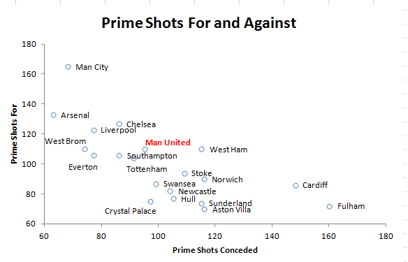
So what do we notice here?
We see how far ahead of the rest of the league Man City are in terms of attacking ability, how far down the vertical axis Spurs have slid compared to the original chart and just how awful Fulham have been this season. From United’s point of view they are higher up the vertical axis than they were in the first plot, but they are still substantially below the four teams at the top. In summary, when looking solely at Prime Shots taken United aren’t as poor as when looking through the lens of all shots, but crucially they aren’t able to point to a large number of Prime zone shots to make up for their lack of overall shots. It’s against this backdrop that we’ll now look at United’s shot charts. Man United's Shot Charts 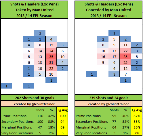 Attack Other than the low number of shots they have attempted nothing much jumps out at us from an attacking point of view. The split in percentages between each zone is broadly in line with what the top teams would hope to achieve, albeit like all the other teams in the league they trail behind Arsenal and Man City in terms of proportion of shots from the Prime zone. Following their defeat of Man United in the FA Cup, Swansea manager Michael Laudrup was quoted as saying:
I don’t think we needed that much luck today, because I don’t think Man United created the chances I expected them to.
I assume that Laudrup was being tactful with that reply as United haven't been creating the chances that most would have expected all season. I'm quite sure that this won't have escaped his notice. Defence The 239 shots conceded is the 7th lowest total in the league, but the location breakdown of the shots allowed should worry David Moyes. The rate of 40% of shots that they allow to come from Prime areas is above the league average and sees them substantially trailing behind the likes of Arsenal (27%) and Liverpool (30%). With United’s attack clearly not firing on all cylinders it is imperative that Moyes can at least rely on defensive solidity. When he joined United all the questions related to whether he would be able to continue with Fergie’s attacking prowess, it was taken for granted that he’s have his team defensively organised. However, Moyes has a considerable amount of work to do at both ends of the pitch if United are to finish in the Top 4 this season. During the summer it would have been unthinkable that United would miss out on qualifying for the Champions League, but I firmly believe that will be United’s fate this season. A lack of any meaningful attacking strategy and a defence with too many holes will see to that in my opinion. It appears however, that not everyone shares the same view as me. On Betfair as of this morning "the market" gives Man United a 35% chance of finishing in the Top 4 (they are quoting decimal odds of 2.82). Those odds look way too short for me and give United far more respect than their play this season has deserved. At the risk of setting myself up for a fall, I can only give United a 6% chance of qualifying for the Champions League this season. Obviously their chances might increase depending on their shopping activities in the January transfer window but my belief is that they are currently just the 6th or 7th best team in the league. Previous Mid Term Shot reports: Arsenal Man City Liverpool My Zones A reminder for any new readers of the zones that the summary box below the plots refer to: Each team plot has two images. The image on the left reflects the shots (excluding penalties) that the team has taken this season, while the image on the right sets out the shots they have allowed. The table underneath the image summarizes the shots by zone, and in order to aid comparison the numbers highlighted in yellow are the league averages.
Why Suárez can't keep up his scoring rate
As per recent years, Liverpool have shot a lot this season. Their 339 non-penalty shots is the second highest total in the league (Man City have just 9 more), but unlike last season they have managed to put more shots on target than any other team. Last season just 29% of Liverpool's shots were on target, this season the accuracy has increased to 37%. Can the shot locations explain the accuracy increase? Are shots being taken from better spots than last season? Or is the increase in accuracy just one of those things that happens from time to time? Liverpool's Shot Charts If you require an explanation of the zones used in these images please scroll down to the bottom of this article. Otherwise we'll jump straight into their charts. This is the Shot Chart for the first 20 games of the 2013/14 season: 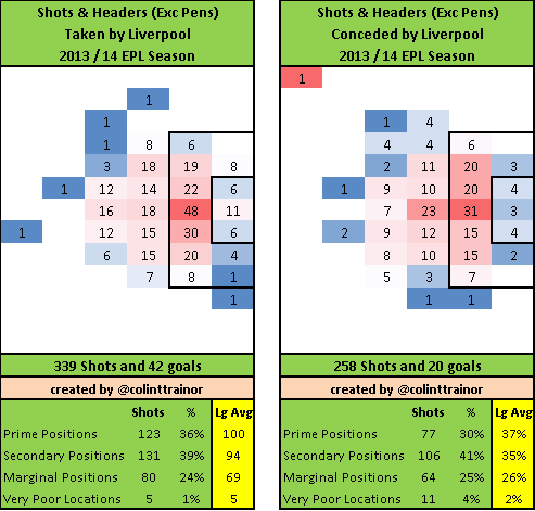 …and for comparison the same image for last season (2012/13)
 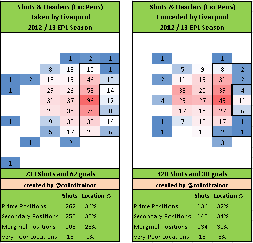 In both seasons 36% of shots taken were from Prime positions, however Liverpool have marginally improved their average shot position this season by increasing their shots from Secondary positions by 4% at the expense of shots from the Marginal Positions zone. Still, any improvement in goal expectation as a result of their shooting locations is pretty minor and is not the reason for the marked improvement in shooting accuracy. Perhaps the players practised their shooting last Summer or more likely they are finally riding the upturn in variance they were due after the last few seasons' poor shooting returns. Looking at the bigger picture, 36% of shots from Prime locations is quite low for a title challenging team. We have already seen that Man City and Arsenal have taken 47% and 45% respectively of their shots from Prime positions. In fact Liverpool are decidedly mid-table in terms of shooting positions as there are only nine teams that have taken a lesser percentage of their shots from Prime spots. So there is still room for improvement. Defense
  Defensively, it’s a tale of two halves – shot volume and shot quality. Defensive Shot Volume Liverpool concede too many shots. Even Crystal Palace and West Brom have conceded fewer non-penalty shots than the Anfield team. In fact, 11 teams in the Premier League have conceded fewer shots than Liverpool, that must to be a worry for Brendan Rodgers. Regardless of the quality of the shots conceded, if they take enough heavy pounding eventually a few more goals will sneak past Mignolet; this is something that Liverpool need to avoid in order to cement their place in the Top 4 at the end of the season. Defensive Shot Quality Liverpool have excelled on the other side of the defensive equation – the quality of shots that they allow the opposition to take. Just 30% of shots they face are struck from Prime locations, only Arsenal (at 27%) can boast a rate that is more impressive than this and the quality of the average shot they face is the second worst in the league. So almost top marks in this regard. Suarez and Coutinho Liverpool currently provides two of the top four Premier league players in terms of shot volume. Luis Suarez has scored with almost 23% of his shots this season whilst Philipe Coutinho has scored with just over 3% of his attempts; chalk and cheese indeed.
  The average goal expectation of Coutinho’s shots is just over 8% per shot, this equates to an expected goal total of almost 5 goals per our model across his 59 shots. It can clearly be seen that his return of 2 goals puts him below expectations in terms of his scoring tally, but with his expected goals total being so low it’s probably not fair to plot a curve for him. Just one or two more goals (if they ever come) would greatly change his place on the shooting curve. However, I can make one solid conclusion; Coutinho is shooting at the 4th fastest rate in the Premier League and he should throttle back how often he pulls the trigger. Shooting an average of more than 4 shots per90 is not smart play when so many of them are from outside the Penalty area. He’s 0 for 36 from outside the area this season; someone please have a word with him. Luis Suárez Now that we have discussed the chalk, let’s move on to the cheese, the Big Cheese – Luis Suárez. What Suárez is doing this season is amazing and 20 goals in just 15 appearances is obviously a terrific achievement in the Premier League. He’s always been a very busy player, so there's no merit in analysing his volume of shots but rather I'll spend my time looking at where those shots are taken from and how he is converting them. First off, let’s establish Suárez’s base stats over the past few seasons. He joined Liverpool in the January transfer window of 2011 but 4 goals in 55 shots during the 2010/11 season doesn’t give us much data to work with so I’ll start the analysis with the 2011/12 season:
 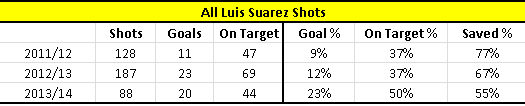 Saved % is the percentage of on target shots that were saved It goes without saying that his 2013/14 conversion rate of 23% wasn’t achieved in previous seasons, but I’m interested in learning more by going beyond the raw goals scored. Looking at his shots on target figures we see that in the two previous seasons his on target numbers were consistent at 37%, but this season he is putting every other shot on target (50%). As well as experiencing an increase in shots on target the real kicker for Suárez this season has been that opposition goalkeepers have saved just 55% of his shots that were on target; the league average in the Premier league is 70% this season, as it was last season also. So Suárez has been way more accurate with his shots this season, and in turn much more of those shots were unable to be stopped by the opposition goalkeepers. Establishing the facts is important, but it’s more important (as well as more fun) to try to understand how these numbers have come about. For example, where is the Uruguayan shooting from this season, and are they from different spots to previous years? Suarez's Shot Charts Here are Suárez’s shooting charts (excluding penalties) for the last three seasons, starting with 2011/12:
 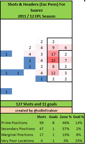 2012/13:
 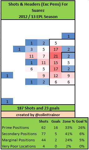 2013/14:
 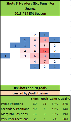 He had some really weird shooting figures in 2011/12. A huge amount of his shots were from Prime positions, yet this was the season that he posted his lowest scoring percentage. As well as being very unlucky in experiencing a 77% save rate in his on target shots, the shot locations would suggest that he was playing a different type of role that season. From 59 Prime zone shots he scored just 8 goals, this season Suárez has scored 11 goals from just half as many shots (30)!! However, what’s most interesting for me from those images is that the places Suárez is taking his shots from this season is not that much different from last year. Like Liverpool, as a whole, the proportion of shots from Prime positions are in line with last year and he has improved his Secondary position numbers, but only by a few percentage points. Expected Goals Using our ExpG values, Constantinos Chappas and I evaluate each shot in terms of how likely a goal is to be scored. It simply provides a quantitative method of comparing shots and so is useful for this task at hand.
 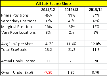 Naturally, the Avg ExpG value for each season rises and falls in line with the zones where the shots were taken from. The small improvement in where Suárez took his shots from this season can be seen as his average ExpG per shot has increased from 11.4% to 12.8%. However, this improvement gets nowhere close to explaining how the striker has scored 20 goals this season. Our model pegs his expected goals tally this season at about 11 goals, hence the stated over performance of approximately 9 goals compared to our numbers. Can it continue? If I were a Liverpool fan the question that I would want answered is whether his terrific scoring rate is based on a shift in fundamentals, and thus is likely to be on-going. I’m afraid the answer to this question is “no”. The types of shots Suárez is taking are not substantially different to last season and in fact they appear not to be as good as the chances he had in 2011/12. The continual improvement in his scoring performances over the past two and a half seasons when compared to our ExpG values does suggest a player that is getting better with each season. However, the magnitude of his over performance this season suggests the scoring run he is on just cannot continue on its current trajectory. That's not to say that he'll go back to similar conversion rates experienced in 2011/12, just that his rate has to dip somewhat. Shot Simulations For all three of the seasons under examination I took each of his shots and simulated them 10,000 times. The following curves are the visual representation of how likely, according to our model, Suárez was to score at least x goals (as labelled on the horizontal axis) based on the shots that he had. The red dot represents the actual number of goals that he scored in each season. Once again, I’ll start with the 2011/12 season:
 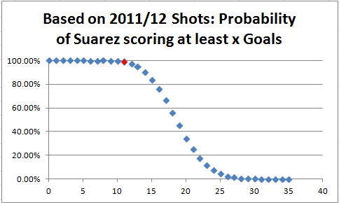 98.6% of the simulations of the shots Suarez had in 2011/12 achieved at least his tally of 11 goals. This number helps to put in context just how unlikely Suárez was to score less than a dozen goals that season. I'm quite sure that the save ratio of 77% during this season will explain some of that under performance.
  In 2012/13, only 37% of the simulations achieved at least his tally of 23 goals. This clearly puts him “ahead of the curve” last season as he has gone beyond the cumulative total of 50% which is where our ExpG value would have pitched him.
 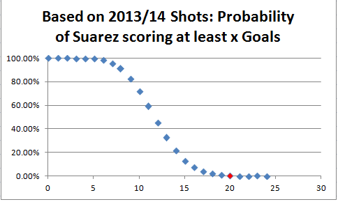 The improvement in finishing has continued, but my word the numbers this season are scarcely believable. In only 0.27% of runs (1 in every 400) did my simulation score the 20 goals that Suarez has managed in real life!! I’m not taking anything away from Suárez here, I’m merely pointing out that given his shots, he is on one of those scoring runs that came up in just 1 in every 400 simulations. Long may he savour it. Aaron Ramsey In early November when Aaron Ramsey was at the peak of his goal scoring exploits (6 goals in his first 23 EPL shots this season) I ran the same simulations in this article. I pointed out that given Ramsey’s shots, in only 0.85% (1 in every 120 simulations) of cases did he score 6 goals. Since that time the Welshman has had 17 further shots and added just 2 more goals to his tally. In that Arsenal article I set out that the shots Ramsey was taking was not consistent with an ability to continue the goal scoring streak that he was on. And so the circumstances are similar here. Will Suárez break 40 league goals? Suárez has scored 20 goals in 15 games. He has 18 games left, and assuming he plays every game and scores at the same rate as the first half of the season he would rack up another 24 goals which would result in him scoring 44 league goals. I don’t think that scoring rate will be achieved. Hell, I don’t think anyone actually believes that. So what do I think is a sustainable goal scoring rate for Suárez from now until the end of the season? Given that he can keep up his very high shot rate, almost 6 per game, I could see Suarez scoring at the rate of 0.75 goals per game. This would see him tag on another 13 goals which would see him finishing the season with 33 goals – still a very fine achievement. Somewhere between the two extremes Suárez’s shooting wasn’t as bad in 2011/12 as the bare stats would suggest and the reverse is also true in the current season where his shooting isn’t as exceptional as his 20 goals would suggest, even taking into account the increase in shots on target. I make these statements with some certainty as the combination of shot locations and actual shot placements this season suggests 15 goals would have been a fair return, this is more than the 11.3 suggested by location but less than the 20 actually scored. Conversely two seasons ago his shot placements suggested 16 goals, less than the 18.2 ExpG but considerably more than the 11 he actually scored. It is difficult to comprehend that the one player could have a truly abysmal finishing performance in 2011/12, but then just 2 years later he's off the chart at the other extreme. Is that due to luck or skill? Without sufficient data to be sure I assume it's a combination of both but it's important to recognise that he was virtually as bad / unlucky (delete as appropriate) two seasons ago as he has been good / lucky in this current season. I have one final image that nicely represents this point, ie the trade off in performance between the two seasons. The following chart plots cumulatively his ExpGoals and Actual goals scored from the beginning of the 2011/12 season until the present time.
 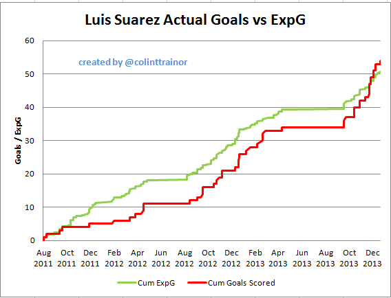 I know that Paul Riley has done something similar with slightly different results, but over the last two and a half seasons we have Suarez less than 4 goals ahead of expectation. Luis Suárez has arrived close to his intended destination it’s just that the journey has been anything but smooth. Previous Mid Term Shot reports: Arsenal Man City My Zones A reminder for any new readers of the zones that the summary box below the plots refer to: Each team plot has two images. The image on the left reflects the shots (excluding penalties) that the team has taken this season, while the image on the right sets out the shots they have allowed. The table underneath the image summarizes the shots by zone, and in order to aid comparison the numbers highlighted in yellow are the league averages.
English Premier League Crystal Ball – More Terrible Statistical Predictions Than You Can Shake a Stick At

Today I am going to talk about what is most likely to happen in the rest of the 2013-14 English Premier League season. These aren’t necessarily things that will happen, but I fully expect the internet to rip me to shreds when the predictions don’t come true. That’s why we make predictions in the first place, right?
EPL advanced stats look surprisingly like they have in years past, but maybe not in the way you might think. In recent seasons, there has often been a cluster of teams at the top of the heap, though this year the cluster might be a touch bigger and has Manchester United situated toward the bottom of that cluster as opposed to nearer the top.
Initially, I thought there was a big difference at the bottom of the league. Relegation battles among a rotating host of teams are a regular thing, and this year is only slightly different. Instead of having a couple of clear cellar dwellers and maybe one or two more teams desperately trying to claw their way out of 18th, this season has six teams fully in the mix. It looked a lot more like normal before December, but suddenly there were just a ton of bad teams all sitting on top of each other, playing awful football.
My model has hated on Cardiff for almost the entire season, and at various points Sunderland, Norwich, and Crystal Palace have joined them as teams most likely to go down.
 Crystal Palace are no longer part of the group that the model thinks will be relegated. Or even compete for relegation, really.
Let that sink in for a moment.
The team currently in 18th place, who currently have the fewest goals in the league, and who at one point I deemed 90% likely to get relegated seem almost metrically certain not to be.
Why?
Well, Tony Pulis has brought defensive solidity to this squad and - this is key – there are a horde of other poorly performing teams this season, some of whom have always been there, and some of whom have suddenly appeared over the Christmas fixture pileup.
The Sixteen Shot Principle
I was sifting through the data for relegated teams recently, and came across a surprisingly consistent finding. An easy baseline indicator of potential relegation candidates is the 16 shot cutoff.
If a team is giving up 16 shots or more defensively per game, they are a relegation candidate.
Last season, teams flagged by this indicator were: Reading, Fulham, Sunderland, Aston Villa, West Ham, and QPR. Reading and QPR were obviously relegated. Sunderland and Villa were candidates for most of the year. West Ham were very Stoke-like in that they gave up a bunch of shots, but most of them didn’t matter, and Fulham were powered by an amazing run early in the season where they looked good, before eventually turned into the team that got Jol fired.
(Note: Wigan were weird in that they only gave up 14.1 shots a match, but were daggered by hideous individual errors at the back and shocking goalkeeping.)
Two years ago, teams tripping this indicator were: Wolves, Bolton, QPR, Blackburn, Sunderland, and Norwich. Three were relegated and QPR finished one point out.
Three years ago, it was Blackpool, West Ham, Birmingham, and Blackburn cracking 16. The first three were relegated.
My current list of teams circling the Premier League toilet bowl is as follows:
Cardiff (on probation for five matches because of a manager change)
Stoke (likely safe)
West Ham
Norwich
Sunderland
Fulham
Five of those teams are serving up the dreaded 16 shots against poo poo platters every week. Stoke is “only” giving up 15.1, but couples that with the second most anemic offensive production in terms of shots. They are prooooobably safe up in 12th, but you may end up seeing a bunch of angry Potters at the end of the season.
The Story of West Ham
As of November 4th, West Ham’s shot dominance – a measure used to evaluate how teams are faring in the battle to take as many shots as possible while giving up few – was 1.02. They were taking 13 shots a game while giving up 12.7. They were poor offensively at getting shots on target, but this type of performance usually yields a mid-table finish.
As of January 2nd, West Ham’s ShDom was .72, and they were giving up 16.8 shots per game. Shot dominance is now 17th in the league, and shots against is 18th. Offensive production is still bad, while defensively they went from slightly above average to OMG relegation. They went from a steady central defender pairing of Tomkins and Reid (who was really good) to one of Alou Diarra and Joey O’Brien, with George McCartney playing left back.
The lesson: Center backs matter a lot, and so do injuries. They tend to be boring transfers, but don’t underestimate their importance. Aston Villa experience similar problems every time Ron Vlaar has an extended stay on the sidelines.
Who is actually getting relegated?
You hear me bang on about this through most of the topics I cover, but managers matter. Their systems play a significant role in determining statistical outputs, which in turn help determine who is most likely to win matches.
Every time a team changes managers, the model goes into a cloud while waiting to evaluate how a team plays under their new manager. The only two model relegation candidates who haven’t changed managers yet are Norwich and West Ham.
West Ham get Winston Reid back soon, which means their defensive performance is likely to change back to what we saw the first ten games. That would save them from relegation.
The model thinks strongly that Tony Pulis will save Crystal Palace.
I am still kind of in shock about this, but that’s the case.
I was wrong, Hatman. You go on wit yo bad self.
Just answer the damned question!!!
Right. Sunderland are still going down, as has been the case since the beginning of the season. Most likely to join them are Cardiff (but this is cloudy because I don’t know how Solkaer will change them), and …
Either Fulham or Norwich.
Fulham have shown flashes of not terribleness since Jol was fired. But they also let Hull post the second most shots on target of any team this season, just last week. HULL! Norwich have talent, but Hughton can’t figure out how to make them perform offensively. Maybe they can be the ones to hire Pepe Mel.
Who Is Winning?
A funny thing happened on the way to the title… For most of the season, Manchester City have been heavy leaders in model coefficients. This is true not only for my model, but for almost everyone else’s models as well. However, Chelsea have been hanging around, grinding out results, and through 20 matches sit third in the table, one point back of City and two points back of league leaders Arsenal.
There is a wafer (pronounced “wah-fur”) thin margin on model coefficients between City and Chelsea. There is another super thin margin between Liverpool, Arsenal, and Everton, though Everton’s will likely drop more due to injuries, etc. City played a ton of the best teams in the league at home during the first half of the season, with Chelsea the only real contender they played away. Obviously that flips now, and City have their toughest challenges on the road this time around. The swings in win probability when playing a team at home versus meeting them away are considerable.
Given the tightness of the race, and the strength of schedule differences going forward, that might actually matter.
Arsenal only have two of the contenders at home during the second half of the season. Liverpool have all of them except Manchester United. So Liverpool have the easiest schedule going forward and they don’t have any European commitments. All of the other contenders have harder schedules and are still in the Champions League… Hrm.
Because of this, and because of the tightness in the current table, I think the league could be won in the transfer window. I know, I know! Usually this football cliché is a chocolate truffle full of bullshit, but this year it might actually matter. If Liverpool fill their midfield holes, or if Chelsea do, they might just have enough in the tank to cross the finish line in first. If Arsenal spunk on a forward with a better than league average conversion rate, they might win it. If none of this happens and City stabilize their defensive performances away from home, then the title should be theirs.
I guess what I am trying to say is that when you account for strength of schedule, I don’t think the title is clearly City’s anymore. In fact, I don’t think it’s clearly anybody’s right now. This was not a conclusion I expected to come to.
Who will actually win?
Ask me again February 1st.
Who is Making Top 4
Arsenal, City, Chelsea, Liverpool. Everton’s squad isn’t quite big enough to overcome injuries and Spurs had little bit inflexible manager niggle to overcome followed by a return to Traditional English Football™.
Waaaait a second…. Where will Manchester United Finish?
6th or 7th seem the most likely. They still aren’t making the Champions League. The more important question will be: Will David Moyes keep his job?
Who will win the golden boot?
Luis Suarez.
Who will break the Premier League record for goals in a season?
Luis Suarez.
Who will score the fewest goals in the second half of the season? Luis Suarez.
Sorry, there seems to be a glitch. I chose Sturridge for the golden boot winner in the preseason based on the fact that Suarez had a lengthy ban to serve. He burned me there, and thus all goalscoring answers from here out, regardless of the actual question are: Luis Suarez.
(Note: He’s scoring goals faster than anyone ever has in the Premier League. Ignore the whole “he only scores in bunches against lower teams” argument, because that is true for all goalscorers. What Suarez is doing right now is unprecedented, and might even be sustainable for the rest of the season.)
Most Overrated Impact Player 
Steven Gerrard. But STATS! 3 goals, 6 assists from midfield in 15 matches. THE CAPTAIN!!1!1!!
Sorry, Liverpool play better overall without him.
Look, Stevie G is still producing well, especially for a 33 year-old. But… Liverpool could get more out of that position. The ball moves better/faster and LFC seem more capable both offensively and defensively without the Gerrard/Lucas axis in place.
Stick Cabaye/Badelj/Gonalons in that Gerrard role and Liverpool are title contenders.
(Yes, I realize that I am arguing against stats argument this time. The analysis in this case is systemic, and more complex than simple player production. However, I will totally understand if you respect me less in the morning.)
Who has been the best manager of the 1st half of the season?
It’s difficult to see past Arsene Wenger right now. Leading the league after 20 matches, with those pieces and injuries, plus getting through the group in the Champions League is a serious accomplishment, even if there was some luck behind it as well.
Honorable Mention: Steve Bruce
File that one under more things I never expected to say. Hull aren’t great, but they aren’t anywhere near relegation right now, either in the table or in the model. According to Ed Thompson, that’s on the back of the second lowest wage spend in the league.
That’s huge.
The Premier League Needs a Winter Break
This argument has nothing to do with the success of the English national team, and everything to do with the product Premier League teams put out on the field. There is one match too many during the Christmas period, and it results in a massive amount of injuries to players. Additionally, teams with smaller squads are the ones who suffer the most from this, as they can’t afford to rotate players like the teams who run 25 deep. Cut the New Year’s Day match and/or move the FA Cup ties to that day so that teams who want to rotate stars for a break can, and then take 10-14 days off or so. That time period is short enough not to screw up too much in the schedule, and it will change the injury pattern we are seeing in the league over recent years.
The data is fairly overwhelming at this point. The only thing preventing it is greed and greed, but by being greedy, teams are actually costing themselves better chances to win games.
(Injury images courtesy of @benjaminpugsley)
Premier League Shooting Report: Man City
Having earlier looked at Arsenal's shot charts, we'll move on to the team that currently sits in second place in the league - Man City. If you require an explanation of the zones used in these images please scroll down to the bottom of this article. Otherwise we'll jump straight into their charts. Man City 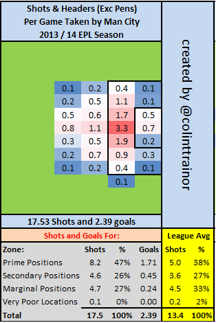 Having scored a whopping 54 goals (49 as shown above, 2 penalties and received the benefit of 3 Own Goals) in their opening 19 games I’ll not win any prizes for originality when I suggest that Man City have been the best attacking team in the league. But I'll suggest that regardless. Their 160 shots from Prime Positions is virtually 2 full shots per game (37 in total) better than Arsenal who chase them in this measure. When a team can combine having the shots with the highest average goal expectation with being the team that shoots most often in the league then they are a serious offensive team – this is exactly the feat achieved by Man City this season. Defensively, City have conceded the fewest shots (190) in the league, but they are nowhere near as tight as Arsenal when it comes to where the shots are allowed to come from. Man City's openness has meant that 35% of the shots they allow are from Prime locations; Arsenal as shown earlier allowed just 27%. However, the 160 Prime shots they have taken means that they join Arsenal as the only two Premier league teams with a ratio of more than 2 for Prime Shots For : Conceded. These are elite numbers as only two other teams have a ratio higher than just 1.50. Player Shooting Performances As much to contrast the under performance of Giroud that I set out in the Arsenal article, here are the shooting curves this season for Man City's two main goal threats - Sergio Agüero and Álvaro Negredo.
 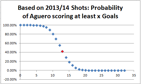 Aguero's goal total of 13 (as denoted by the red dot) intercepts the vertical axis at 41%, and as this is below 50% this demonstrates that the Argentine has converted his chances better than our model expected him to. In just 41% of simulations did he score at least 13 goals given the shots that he attempted. He's not alone though as Negredo has produced a similar shot finishing performance so far this season. The finishing of both strikers firmly put Giroud's lack of scoring prowess into context.
 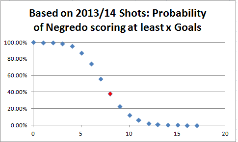 My Zones A reminder for any new readers of the zones that the summary box below the plots refer to: Each team plot has two images. The image on the left reflects the shots (excluding penalties) that the team has taken this season, while the image on the right sets out the shots they have allowed. The table underneath the image summarizes the shots by zone, and in order to aid comparison the numbers highlighted in yellow are the league averages.