
Author's Note: This was written mid-week for The Mirror, but something happened in transit and it didn't get used. Thus I am publishing it here even though the stats for this season are a game out of date. “I rate them as Bale, then Sturridge, then Hazard, but it’s close. They are all outstanding players.” “What is this, a wind up?” “Hey Davey, this guy thinks Sturridge is better than Hazard. I kid you not!” “F***ing stats!” *cracks knuckles* Alright, let’s do this. Some people - like the ones paraphrased above - are wrong about Daniel Sturridge. They see the arrogance, the silly dance, and they write him off as a lot of flash and not much else. They are unbelievably, almost inconceivably, wrong. Despite the fact that Premier League fans have known about him since he was a teenager, Sturridge is still only 24, making him the same age as Gareth Bale and one year older than Hazard. No longer a young player, Sturridge is just entering his prime. The thing is, he didn’t suddenly get good. He’s actually been really good for the better part of four years now, but somehow a lot of fans still haven’t caught on to this fact. Don’t believe me? Let’s look at the production. 2010-11 - Bolton  Owned by Chelsea, but shipped off to Bolton to get actual playing time, Sturridge scored 8 goals in 10.8 90’s, for a spectacular .74 goals per 90. (His rate for the entire season, including sub appearances at Chelsea was .64.) A fairly simple guideline for non-penalty scoring rates as a Forward is as follows: .4 to .49 non-penalty goals per 90: Good. .5 to .59 non-penalty goals per 90: Very good. .6 to .79 non-penalty goals per 90: Probable Top 20 in Europe .8 or above non-penalty goals per 90: Probable Top 5 in Europe Lionel Messi has the best rate on record at 1.44 per 90, set last season. So at age 21, Sturridge posted a rate that would rank him in the top 20 in Europe while on loan at that hotbed of goal production, Bolton. 2011-12 - Chelsea In just over 25 90’s at Chelsea, playing almost exclusively on the right wing (where it is considerably harder to score than being up front), Sturridge slotted home 11 goals for a .44 goal scoring rate. He also had 3 assists that season, solid passing accuracy (81.6%), good key passes, etc. This is an excellent season for a 22-year old, especially when playing out wide. 2012-13 – Mostly Liverpool Between the Olympics and a hamstring injury, the first half of this season was almost a complete washout for Sturridge. Despite the fact that Fernando Torres was no longer El Nino, those at Chelsea decided Sturridge wouldn’t make the final cut of their team, and they sold him to Liverpool with six months left on his contract for a rumoured £12M. His 12-13 season saw this production.
 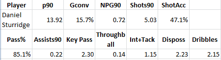 BAM! Right back to what he produced when playing at Bolton, except a touch more efficiently. 2 Dribbles a game is good. 2.3 key passes a game is very good. As mentioned before, .72 non-penalty goals a game will probably make you one of the top 10 goalscorers in Europe in a season. Add a solid assist tally for a forward, and Sturridge’s scoring contribution (goals + assists) was nearly 1 a game. That’s fantastic. Needless to say, Chelsea's other forwards that they chose to keep around have performed nowhere near that well. But yeah, okay, it was only a few months, and anyone can have a hot streak over a few months. Having some doubt is perfectly fine. How did Sturridge fare the next season? 2013-14 – Are You Kidding Me?
 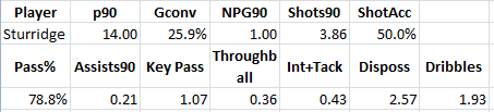 Conversion rate is up, shots per 90 is down. Key passes are down quite a bit, but he’s still churning out an excellent number of assists for a center forward. But that goal rate… WOW. [Note: It's up a notch further, as Sturridge scored Saturday and didn't play the full 90.] Pub quiz! According to data gurus Opta, in the history of the Premier League, how many players averaged one goal or more per 90 when playing at least half a season? … … … The answer: One. Ronaldo in 2007-08. Here’s the thing though… Ronaldo had 31 goals in 30.5 90’s that year, but 4 of those were penalties. His adjusted rate without the penalties is .89. Sturridge’s rate this year is 1. According to Duncan Alexander at Opta, prior to this season, there were three other players who played less than half the minutes in the season who eclipsed this mark: Ole Gunnar Solskaer and Kevin Campbell in 98-99, and Papiss Cisse when he first arrived at Newcastle in 11-12. That’s it. Sturridge only has 14 90’s played so far, and it’s an open question of whether he can keep up this scoring pace, but right now he is scoring goals at a rate that has never been done before in the Premier League. People should be amazed! Instead, they sit back complaining about his dance. [For the record, I love a goal celebration, regardless of how silly, contrived, choreographed or ridiculous.] Add in the assist rate, and Sturridge is accounting for more than 1.2 goals per game in scoring. That’s a crazy number, and it’s better than anything Wayne Rooney or Robin van Persie have ever produced in their illustrious careers. The rate is so good that it approaches Thierry Henry’s incredible 24G/23A season for Arsenal in 2002-03 or Didier Drogba’s 29G/10A season for Chelsea in 2009-10, which might just be the two best scoring seasons in all of Premier League history. Is Sturridge as good as Henry? In a word: no. Henry in his prime was an absolutely unstoppable combination of pace, goal scoring, and brilliant passes to set up his teammates. But at the same age as Sturridge, on what was probably a better team, Henry scored 24G/5A in 33 matches, a rate Sturridge is on pace to match if he can stay healthy the rest of the year. The thing we need to realize is that Sturridge has been good for quite a while, and this season at Liverpool he is actually doing something unprecedented in Premier League history. Daniel Sturridge is now the best English centre forward. With maybe two exceptions (Aguero and Suarez), he is practically the best producing centre forward in England. Maybe, instead of being shocked that someone would think Daniel Sturridge is a match for Eden Hazard, or would dare to mention him in the same breath as Thierry Henry, we can look at his production and think, “Wow, this 24-year old guy who is just now entering the prime of his career, is actually amazing.” Think of it another way. Maybe the answer to “Is Daniel Sturridge as good as Thierry Henry?” isn’t "Of course not!" Maybe, just maybe… It’s “Not yet.” [youtube id="S8M9HhgNL4w" width="633" height="356"]
Month: February 2014
Classifying Central Midfielders
By Marek Kwiatkowski
Go to Squawka or StatsZone and find the passing graphic for Mikel Arteta's last performance. Do the same for Andrea Pirlo. Both are deep-lying playmakers, yet the graphics are different: more long diagonals from Pirlo, more ground covered laterally by Arteta, and there is likely a number of subtler differences, some of which you don't notice right away.
This is hardly news, of course; Arteta and Pirlo are high-profile players and their playing styles are scrutinised by fans and pundits. Everyone knows they're different. But what can you say about, for example, a young Dutch deep-lying playmaker whom you have never seen play? Is he more like Pirlo, or more like Arteta or maybe unlike either? Maybe he's unlike any other player? You find his passing chart, and you can't quite tell.
Annoyingly, the summary statistics don't help either: all three players have completed a stellar number and percentage of passes, forward passes, key passes, final third passes...
My point is that there is a wealth of information in the detailed passing data, especially geometrical information that is currently unused, at least outside of the impenetrable world of clubs' performance analysis departments. Leaving aside pesky factors like technique, positioning of the opponents, the run the target player etc., a pass is pure geometry: the starting point, the angle and the length.
In this article I attempt to use this information to compare passing patterns of Europe's top central midfielders. The data was provided by Opta, and comprises of every pass made in 2012/13 by the 137 central midfielders from the top division in England, Spain, Italy and Germany who played in more than 20 games and completed more than 1000 passes in total.
ON-FIELD POSITION
The first comparison looks simply at where the different players play the passes from. The obvious way to look at it would be to compute the average initial coordinates of a pass, but that's too reductive: it ignores the fact that players may play slightly different tactical roles and occupy different zones of the pitch in different games. So instead I take the average pass position for every game. This results in 20-40 points, depending on how many games the player took part in, and nicely delimits the zone the player typically occupies, especially after outliers are removed.
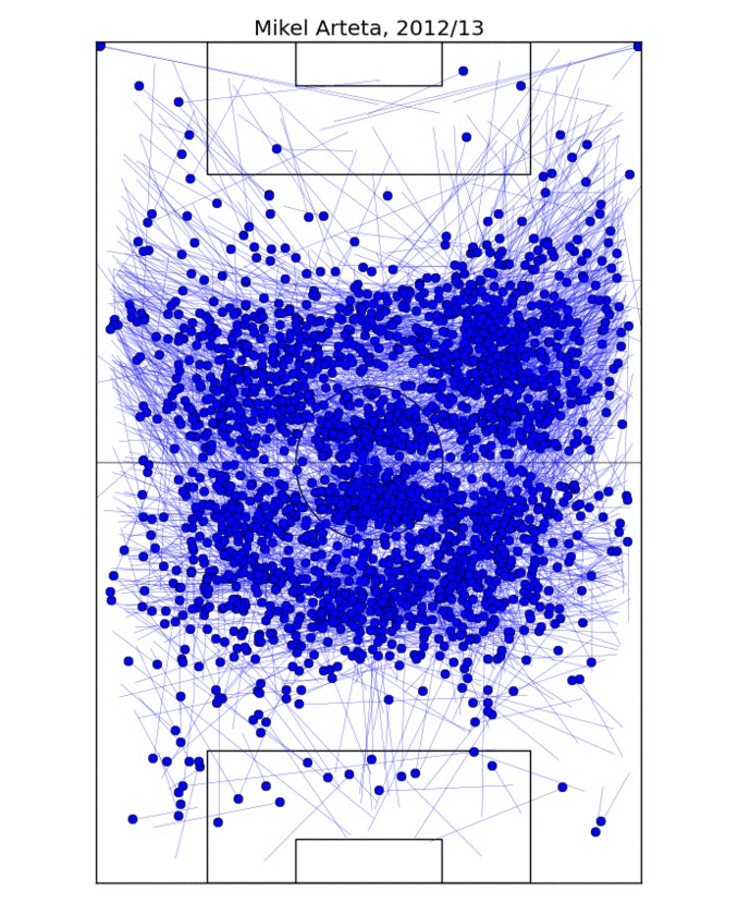
This process is illustrated on Figure 1, where I determine the on-field "zone" of Mikel Arteta. For two different players, I take the ratio of the overlap of their zones to their sum as the measure of similarity. In fact, for technical reasons, measuring *dissimilarity* is better, so I take one minus the ratio above. In this formulation, if two players occupy exactly the same zone, their dissimilarity would be 0; if their zones are disjoint, the dissimilarity is 1.
ANGLE, LENGTH AND VOLUME OF PASSES
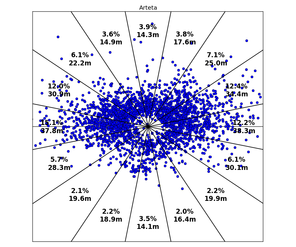
To compare passing lengths and angles we'll do something crazy, and pretend that all passes are played from the kick-off spot. It's a little less crazy than it appears though, because we can now control for the position the passes are played from. So if due to this simplification, the angle/volume model tries to tell us that Cattermole and Silva are similar because they both play a lot of short sideways passes, the position model will warn us this is probably not the case.
Figure 2 shows how we go about quantifying the length and number of passes that a player plays in different directions. The 360 degree circle is split into 16 slices, and we record the percentage of passes in each slice as well as the average length. In this way, the data on length and direction of 1000+ passes is reduced to 16 numbers each, and to compare two players we now only have to compare two pairs of 16-long vectors. This is easily done with standard math, by taking the sum of absolute differences between the 16 matching coordinates.
PUTTING THE TWO TOGETHER
For any two players in the dataset we are now able to quantify their dissimilarity in three respects: the typical position they take up on the field of play, the directions in which they pass the ball, and the average pass length in each direction. In other words, for each pair of players we have three numbers, each number quantifying the dissimilarity in a different aspect of their passing game. Visualising all this information in one go is hopeless, so I will instead focus on individual players.
Each of the following plots compares one chosen player to all the others in the dataset. The volume and length dissimilarities are plotted on the two axes, so the closer the player is to the origin (0,0) point, the more similar to the focus player he is according to the angle & length model. The position dissimilarity is color-coded: the colder the colour, the more similar the player's position to that of the focus one: blue means very similar, brown and red means very dissimilar.
CASE STUDY 1: DAVID SILVA
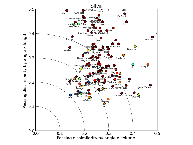
(Click for a larger version)
David Silva's plot suggests the model is sane: it picks Mesut Özil as the most similar player, with a trio of creative midfielders: Nasri, Oscar and Mata not far behind. Steven N'Zonzi appears close to the origin point, but his marker is brown red, which means that he differs from Silva a lot by position. Marouane Fellaini is an interesting outlier, quite similar in all three metrics (the dataset covers 2012/13 when he played in an advanced position for Everton), suggesting that the model would benefit from an extension taking into account pass completion rate, or maybe just the number of passes.
CASE STUDY 2: ANDREA PIRLO
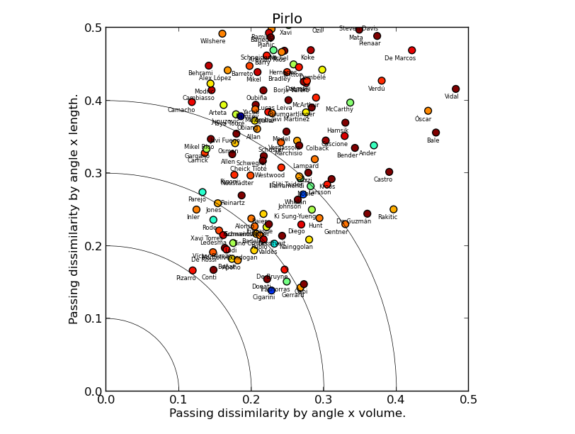
There are a couple of things we can quickly read off Andrea Pirlo's chart. First, despite a fair number of registas in the dataset, all markers are far from the origin point, meaning there are few players similar to him. The dissimilarity by length is higher on average than by volume, reflecting Pirlo's penchant for hitting long balls. Second, Luca Cigarini is clearly the most similar player, with David Pizarro, Steven Gerrard and Roberto Trashorras not far behind (albeit the two show low similarity-by-position to Pirlo), which fits nicely with Ted Knutson's scouting articles here on StatsBomb.
CASE STUDY 3: SERGIO BUSQUETS AND YAYA TOURE
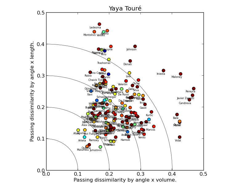
Sergio Busquets and Yaya Touré are rightly seen as unique players. What does our model have to say about that? Let's look at Touré's chart first. In fact, we find a lot of players close to the origin point, and with cold-coloured markers, i.e. similar to Yaya in all respects. This doesn't mean Touré isn't unique, just that what sets him apart from other players is not his passing. The fact that Mikel Arteta is overall the most similar player to Touré according to our model rams the point home.
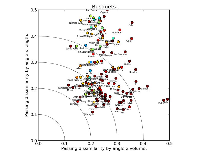
Busquets’ chart tells a different story: the players similar to him in the length & volume model play in different positions, as indicated by the red/brown cloud closest to the origin point. In contrast, the players who occupy similar on-field position to Busquets pass the ball very differently: the blue/green cloud is far from the origin. Sergio Busquets is indeed unique and it is largely his passing that makes him so.
LIMITATIONS AND POSSIBLE IMPROVEMENTS
The passing data is rich, but of course oblivious to many facets of central midfield play, so many that I won't bother enumerating them. So the model I presented here is not a comprehensive player comparison algorithm, and even in its limited domain of application it has a few wrinkles.
The biggest possible improvement, and my next step if there is interest, would be to work with passing data directly in 4 dimensions. Because it takes four coordinates to specify a pass (two for origin point, two for endpoint), passes are inherently 4-dimensional objects. Because 4-dimensional geometry comes with considerable challenges to computation and intuition, I have attempted to reduce it to 2 dimensions here: this is why we looked at the starting point first, and at directions and destination later.
I hope you've enjoyed the read. Comments are welcome here on StatsBomb. If you would like to see the comparison chart for your favourite central midfielder, ask @statlurker on Twitter.
Marek Kwiatkowski (@statlurker) is a scientist living and working in Switzerland.
Data provided by Opta.
![]()
Suarez, Aguero and the importance of significance

First, a disclaimer: the use of the following player examples to demonstrate a bit of statistical theory is by no means a criticism or an opinion on their footballing ability. Oh, and I’m actually a Liverpool supporter so this is definitely NOT a dig at Suarez! Now that the disclaimer is out of the way let’s start: Luis Suarez has so far scored 23 goals in 19 league appearances. Sergio Aguero has scored 15 goals in 15 starting and 2 substitute appearances. Let’s call them a total of 17 appearances for now and we can deal with this later on. Here are these figures in summary: 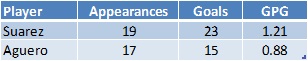 Based on these numbers Suarez is scoring at a much higher rate than Aguero. But could this simply be randomness instead of anything else? It’s time for a bit of statistics. Goals, shots, tackles, interceptions and lots of other match statistics can be thought of as random variables, which follow a probability distribution. So if you were to collect a zillion matches, a p0 percentage of them would have 0 events occurring (e.g. goals) , p1 would have exactly 1 event occurring, p2 would have exactly 2 events and …. Well, you get the drift. These probabilities (p0, p1, p2, …) form the probability distribution. One distribution that is often used when dealing with the occurrence of events is the Poisson distribution. Given a mean, it tells us the probability of an event happening 0, 1, 2, 3, … times within a particular period. So for example, with an average rate of 1.21 goals per match, Suarez has the following goal probability distribution in a match:
 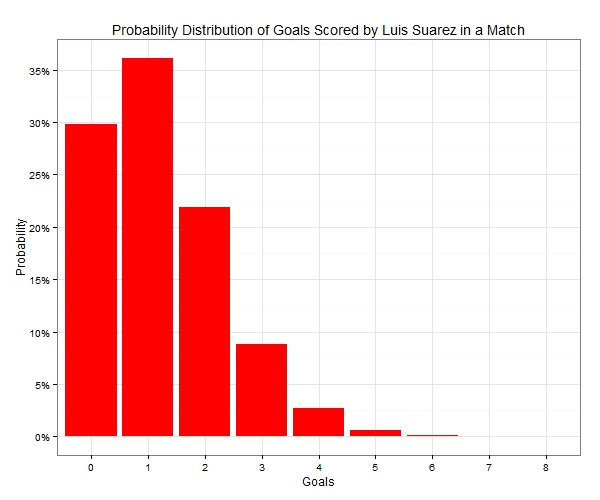 There is about 30% of him not scoring in a randomly selected match, around 36% of scoring exactly once and almost 9% of scoring a hat-trick (actually exactly 3 goals and not more!). Furthermore, if we were to look at the number of goals Suarez was likely to score in 19 matches, again using the average rate of 1.21 goals per match, the probability distribution would now look like the following:
 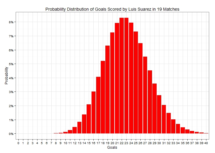 Notice how the probability distribution approaches the bell-shaped Normal distribution as the sample size i.e. the number of matches increases. This is a result of what is known in statistics as the Central Limit Theorem. A very important takeaway from the above graph is that there is a lot of uncertainty in the actual number of goals scored. In fact scoring exactly 23 goals in 19 appearances – as he has done so far in the Premier League – has a probability of just 8.3%. So let’s now turn our attention to Sergio Aguero, too. He scores at an average rate of 0.88 goals per match so if we were to add his goal probability distribution for a single match next to Suarez’s it would look like this:
 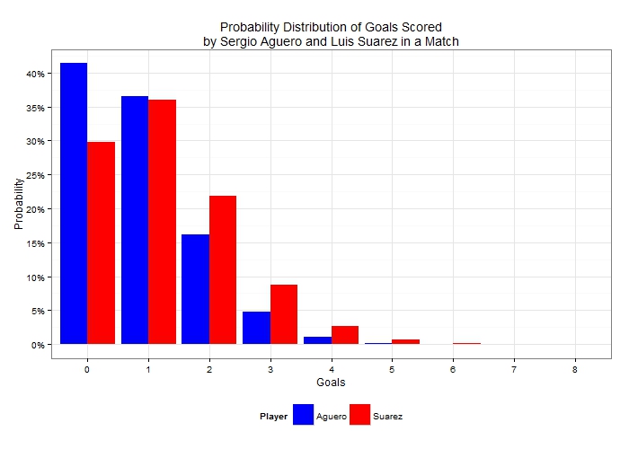 Since Aguero has a lower scoring rate, his probability mass is shifted towards the lower number of goals compared to Suarez’s. He has more than 41% chance of ending the match without a goal and less than 5% chance of getting exactly 3 goals. Looking at these players over a wider sample, it would be unfair to compare the distribution of goals in Aguero’s 17 appearances with Suarez’s 19 appearances so let’s see how those two distributions would look like (given their respective average scoring rates per match) if both had played 19 matches:
 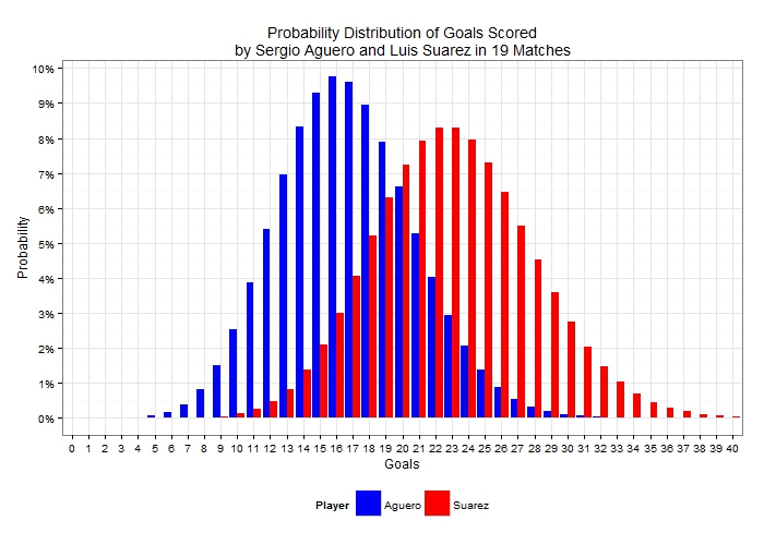 Evidently even though Suarez is generally expected to score a higher number of goals in those 19 matches, it is possible for Aguero to outscore him. It’s therefore important, before jumping into any conclusions about the relative levels of scoring ability between the two players to take into consideration this uncertainty that is demonstrated by the two distributions. To compare these scoring records we can use statistical significance tests which allow us to decide whether there is significant difference between scoring rates or whether any observed differences could simply be attributed to randomness. To carry out a significance test, a null hypothesis is first formulated. In this example, the null hypothesis is that of no difference between the scoring rates of the two players. Then test-statistics are calculated, which in turn result in what is known as a “p-value”. To cut a long story short, and to spare the few readers still following me the statistical theory behind this, we can compare the p-value with small probabilities (usually 5% or 1% which are the chosen significance levels). If the p-value is a very small number – smaller than the significance level – then there is evidence in the data that leads us to reject the null hypothesis. If the p-value is large then the statistical test has failed to reject the null hypothesis, or in this particular case that the two scoring rates could in fact be equal and any observed difference is simply down to randomness. Interestingly enough, comparing Poisson means is not as widespread as means of other distributions but a widely used test is the conditional test developed by Przyborowski and Wilenski (1940). As I don’t want you to be scared away from the maths expression, I’ll jump straight to the p-value result! (But for those of you interested you can scroll at the end for the algebraic expression and then back to continue.) Applying the conditional test to the data at the start of the article (23 goals in 19 matches against 15 goals in 17 matches) results in a p-value of ……. 42.8%! What if we completely ignored Aguero’s 2 substitute appearances and used a scoring rate of 15 goals in 15 appearances? Well, as the sample scoring rate approaches Suarez’s, the p-value in fact increases (p-value = 68.4%). As these p-values are very large and greater than 5% in any case, these results suggest that there is absolutely no evidence in the data that Suarez is scoring at a truly higher rate than Aguero. This may surprise a lot of readers, but it demonstrates the effect that uncertainty can have on estimates, and highlights the degree of care needed to apply when interpreting differences in sample data. We can substitute goals for shots, interceptions, tackles or whatever other metric we decide on; or we can use per90 data rather than unstandardized figures, but the exact same theory applies. Given the recent boom in football analytics, it’s therefore imperative to account for uncertainty when publishing results, otherwise a lot of the findings will not stand (statistical) scrutiny. What’s more is that, by ignoring randomness and sample-size effects, the analytics community may be considered as lacking credibility, something which would not be desirable at all given the constant push for being acknowledged as worthy contributors in the football world. So, without further ado, who is Suarez’s scoring rate (statistically) significantly better than? I’ve compared his rate against all players in the Premier League who have scored at least 7 goals. As I didn’t have their actual minutes played, I’ve used their number of appearances either as a starter or as a substitute. After all, this is not really an analysis piece but rather illustrating a point. The following table shows the p-value of the conditional test of each player’s scoring rate against Suarez’s:
 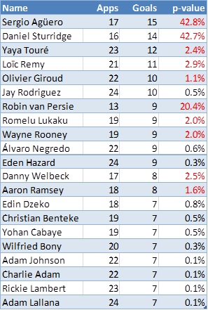 Red highlighted p-values show a total of 10 players whose scoring rate is not significantly different to Suarez at the 1% level of significance. So there you have it, some food for thought: perhaps surprising but Luis Suarez is no better than Sergio Aguero or even Danny Welbeck in terms of scoring rates, from a statistical perspective! [Finally, as promised for any interested parties, the p-value of this test is given by:
 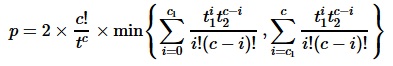 where c1, c2 are the observed events (in the players’ example above, the number of goals) out of t1, t2 time periods (i.e. the number of appearances). c is defined as the sum of c1 and c2 while t is the sum of t1 and t2.] Reference: Przyborowski J., Wilenski H. (1940) Homogeneity of results in testing samples from Poisson series, Biometrika 31, 313-323
StatsBomb Podcast 11 - City vs. Chelsea Preview Plus Reader Requests

Shot Charts: Comparing 5 of the World's Best
In examining football statistics, sometimes there's more information packed into a number than a few digits can convey. For instance, Zlatan Ibrahimovic has taken 77 unblocked shots and scored 16 goals, but these numbers don't contain all the information we would want to know to determine his skill as a scorer or his goal threat when shooting. They don't tell us where the shots come from or how often he converts a particular kind of shot.
This is where a visualization can be extremely useful. Inspired by some of the work that Kirk Goldsberry did for NBA basketball, I collected shot data for 5 top footballers and made shot charts for each one. This post will be something of a test for how compelling the results are.
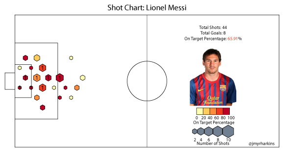
First, a bit of explanation. The size of the hexagons on each chart represent the number of shots taken from within that zone, while the color represents the percentage of those shots which have been on target. The numbers over each hexagon correspond to the number of goals scored from each area.
Zlatan Ibrahimovic 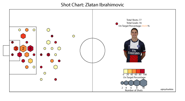
The first thing to point out on Ibra's shot is that he has a shot from well within his own half (on target nonetheless), which seems very much in keeping with the insanity that is Zlatan. Next time I imagine that shot will be finding the back of the net. The chart shows that Ibrahimovic takes quite a few shots, not all of which are from particularly dangerous areas. He does, however, gets his shots on target reasonably well from more dangerous areas. A good comparison for his chart is probably Cristiano Ronaldo, another high volume shooter who isn't afraid to pull the trigger from distance.
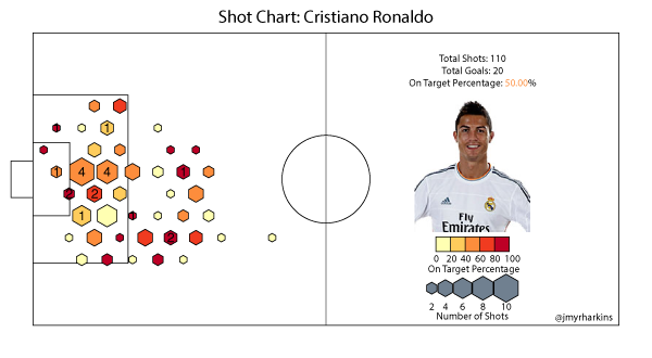
Cristiano Ronaldo, as the chart shows, will shoot from anywhere. Given his swerving shot, he's probably the player you want shooting from range, but his chart shows that his on target rates in many areas suffer from his volume and his overall rate is sunk somewhat by his shot selection. He certainly scores a lot of goals, but this chart makes you wonder if some of it might be a result of sheer numbers in terms of shots taken.
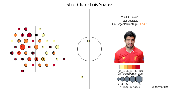
Luis Suarez is another player that fits in as a comparison for these two. Suarez's chart reflects the kind of season he's been having. His total volume is similar to Ibrahimovic, despite missing the first 5 games of the season through suspension. Even with the number of shots he takes, his on target rates from anywhere around the penalty area are consistently high. Suarez shoots from distance, but he really makes his money from 18 yards or closer. For a high-volume shooter, Suarez picks his shots a little more carefully than Zlatan, and certainly more so than Ronaldo, and given his form, it's hard to question the results.
Sergio Aguero
If not for Suarez's insane season, Aguero would probably be considered the in form striker in the Premier League. His chart makes for very different viewing than the previous three.
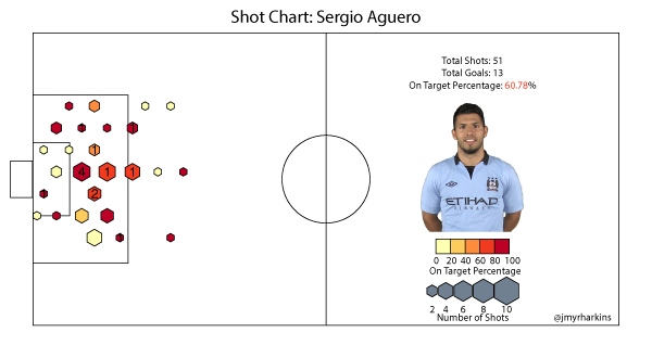
He's missed several games due to injury, which drives his total shot number lower than it might be if he had been fit all season. His chart still illustrates, though, how different his role is from all of the other players charted so far. Aguero relies much more on his finishing ability in the box than creating his own opportunities from distance. The location of his goals reflects this as well. His on target rate is extremely high inside the box. It suffers only when he shoots from acute angles on the left side of the box, where he would be mostly shooting with his non-dominant foot.
Lionel Messi
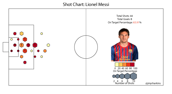
Messi has played fewer league minutes (due to injury) than any of the above players so far this season, so his sample is somewhat limited. He's not a high volume shooter compared to the likes of Ronaldo, but he takes quite a few shots per 90 minutes played. The distribution of these shots, though, looks a bit more like Aguero's than any of the other players. This matches the image of Barcelona's style. Messi often scores his goals by arriving to meet a squared ball at the end of one of Barca's signature passing moves, and most of the time these kinds of opportunities fall right around the penalty spot. If it wasn't already clear, this chart illustrates just how effective he is in this role. With the caveat of the smaller sample size, Messi has the highest on target rate of the group.
There are certainly more things to say about these charts, and more patterns to find, but this is mostly a pilot run for this method of visualization. In the future I'd like to adjust the on target percentage scale to be relative to average rates from different positions, but unfortunately I don't have those data yet. If you'd like to see someone specific charted, or have feedback or ideas for future versions, please let me know on Twitter or by commenting.
Data Notes
The data consist of unblocked shots from domestic league matches up through January 18th. The data gathering was done by hand, match by match, using match reports from Squawka.com, which means it's more likely that I committed an error with a shot or two than if I had access to a database of shot locations.
From the Editor's Desk: A Strange Couple of Weeks
It’s been a strange couple of weeks. Some of my work appeared in The Mirror and the Guardian on the same day, and The Mirror has asked me to continue to write for them, in my own style, about stats and football. The Guardian would like to keep StatsBomb as part of their sports network, but there are issues with republishing the data in our stuff that may or may not get sorted out.
I’m fairly impressed that six months after forming StatsBomb, two different national media sites want to feature our work, which is consistently riddled with stats and analytics.
Around the same time we leapt into national media, I also released the first player radar charts. These have, without a doubt, been some of the most cheered and controversial things I’ve done.
On the one hand, I have data journalists combining with owners of stats sites, and a raft of casual fans lauding them for being interesting and useful visualization of basic football numbers. On the other hand, I have hardcore data visualization and stats people tearing them to bits for reasons various and sundry, many of which I explained in a piece I wrote a week before they started ranting, and most of which assume both my idiocy and their supreme knowledge of the discipline at the same time.
For someone who a) spent months learning about them before publishing and b) is fairly thoughtful about things in general, it’s odd.
I think the radars have a ton of value. The reaction people have to comparing shapes instead of stats is visceral. You can SEE the differences. You can use overlays to compare players. You can shop for similar shapes as replacement players, or even find better ones. You can (probably) use them in various ways to compare team statistical output, including finding strengths and weakness.
Maybe the coolest thing about them is: we don’t know all the uses yet.
The only thing I am certain about is that in many ways, they are useful. Imperfect? Definitely. But useful as well. That’s all I was going for. Actually, I was going for less. I just wanted to create them and see if they had any value at all. Full stop.
Create new thing. Test new thing. Learn more about new thing. Develop new applications, while discarding others. If it’s crap, then discard the whole thing and do something else.
It’s basic (data) science. How that would make people angry, I don’t know, but whatever.
That’s kind of the funny thing about writing about football and stats right now. People are sucked in to the learning experience, while at the same time castigating us for admitting we are still learning. They want to know more while shouting at us, “WHY DON’T YOU KNOW MORE!?!”
It’s odd. It’s even more odd when you think about the fact that basically none of us get paid to do this. We're probably not even that useful in winning your pub quiz round.
I have worked in gambling for nearly a decade. I have an expertise in my subject matter (gambling and practical market economics) matched by maaaaybe a double digit number of people in the world. I still learn new stuff all the time.
Learning is awesome. Not learning would be boring and awful.
Listen… we have an infinite number of things yet to learn about football, stats, and analytics. It doesn’t mean that we (and therefore everyone else listening/reading) don’t know more useful info now than we did last month.
Not just pie in the sky shit like “possession is loosely correlated to more points”, either. I mean practical, help-you-win-more-football-matches type of stuff. Practical, help-you-buy-better-players type of stuff too.
It’s happening now. It will continue to happen into perpetuity. It’s progress.
How Dare You
Then you get pieces like the When Saturday Comes republication in The Guardian today. It’s not worth shredding the piece (although it’s filled with a number of blatantly wrong statements), when the sentiment is what actually matters.
Some people seem to get offended when you apply stats to the beautiful game. I/
get it. That’s fine.
“I just want to watch football and drink a beer.”
“I want to trust what my eyes are telling me about what is actually happening on the pitch.”
“Thinking about numbers and math with regard to football is just wrong.”
“UNCLEAN!!!”
I don’t mind those opinions at all. If you hold them, just tune out. Don’t click the clearly stats-based link. Roll your eyes when someone trumps your football argument in the pub with stats evidence. Please, sweet Christ, do NOT follow me on Twitter. You are welcome to your own opinion – no one is stealing that away from you.
I can tell you from personal experience, even if you do know the stats, you can still get into plenty of arguments with other people who have the exact same knowledge. Not enjoying statistics in football does not invalidate anyone as a fan. Even if we change the name of the game to Heatmap, as Barney Ronay so thoughtfully suggested.
I like stats. And football.
Together.
However, I still reserve my right to enjoy football and things like Santi Cazorla’s sublime first touch, even if I can’t quantify it. (Yet.)
I will say, the one thing that the WSC piece does well is complain about people using stats as a basis for awful opinions. The funny part is, this is no different than normal sports writing, or writing in the media in general.
There are plenty of terrible opinion pieces out there based on what the author saw or experienced. There are also plenty of people who are using stats who have no fucking clue what they are doing.
In short, there’s a lot of bad writing out there, and poorly thought out opinions. Some of it uses stats. Some of it does not.
The stats are not the root of this problem, the opinions are.
Or zonal marking is. One of the two.
Why Bother
I keep getting asked why I don’t argue with public skeptics toward stats and football more (especially on Twitter), and my answer usually takes the form of, “Why would I bother arguing, when I could spend that time working on new stuff instead?”
I’m not sure if I would have had this perspective before I got cancer, but I did and now I do.
I want to learn new things. I want to create new things. I want to teach new things.
And, critically, I want to foster an environment that helps other people do the same.
Negativity is fucking awful for doing all of that.
Skepticism is good. A healthy dose of skepticism is great for learning and getting to the bottom of things. Positive criticism is also useful, both as a tool to learn more, and a tool to improve what you’ve already done.
If you’re interested in this stuff, maybe just take a moment to think about the phrasing of your question before tearing in to someone’s new thing.
“Hey, I like this. Did you think about [foo]? This place has data for that type of thing.”
Is a much different response than
“This is [bad/wrong/ignorant/random]. [Blah] does this much better. I don’t know why you bothered.”
Or don’t consider your phrasing, and be like every other mouth-breather on the internet with a sense of self importance and a half-formed scathing criticism. Just don’t be surprised/shocked/appalled when you find yourself and your opinion lumped together with those other people.
It’s Happening
Look... The Mirror* sought me out to write about football and stats for them. That’s either a sign of the apocalypse, or a fairly clear indication that this shit is actually happening.
It happened in baseball. In hockey. In basketball. It’s happening in the NFL and college football.
It will happen in football/soccer.
Teams that embrace analytics early will outperform those who are slow or stubborn at doing so, from now until the end of time. Even if the sole task is to help those teams to make fewer stupid mistakes, the value is there. (Assuming they are done correctly, which Damien Comolli taught us is not as easy an assumption as you might think. It is probably the most valuable thing Comolli has ever done.)
I choose to be relentlessly positive about the whole thing, because it makes me happier, and it means I can get more work done.
As a casual fan, or a mainstream writer, or a fellow stats geek, how you deal with it is your choice. --Ted Knutson
* For the record, I am happy to write for them. If they think it’s a good fit for what they want to do in the future, I’m cool with it too.