Alongside the release of our Messi dataset we also put a PDF guide to using our data in R. It was intended as a basic introduction to not only our dataset but also the R programming language itself, for those who have yet to use it at any level. Hopefully that gave anyone interested in digging into football data a nice, smooth onboarding to the whole process.
For those who have taken the plunge, this article is going to go through a few more involved things that one could do with the data. This is for those that have already gone through the guide and have been playing about with SBD for a while now. It's important that you have done this first as we will not be walking through absolutely everything and assumes a certain level of familiarity with R. Now that the base terminology of it all has been established it should be easier to explore uncharted territory with a bit less trepidation. So far we have released open data on the women’s and men’s World Cups, the FAWSL, the NWSL, Lionel Messi’s entire La Liga career, the 2003/04 Arsenal Invincibles and 15 years of Champions League finals. You can follow along with this article using any dataset you like but for consistency's sake we will be using the 2019/20 FAWSL season in all examples.
One last disclaimer: this is, of course, all about R. We also have a package for Python that isn’t quite as developed but still handles plenty of the basics for you if that’s your programming language of choice.
A big hurdle to doing anything nuanced with any dataset is one’s underlying understanding of it. There are so many distinct variables and considerations in the SB dataset that even I - having worked with it as my job for two years now - forget about some parts of it every now and then.
To this end it helps to not only have our specs to hand for checking, but also to be aware of the names() and unique() functions. These allow you to get a top-down look at the columns/rows a dataframe contains. So let’s assume you have your data in an R df called ‘events’. We will be using this name for the data in all examples throughout this article. If you were to do names(StatsBombData) that would give you a list of all the columns in your dataset.
Similarly, if you were to do unique(StatsBombData$type.name) you would get a list of every unique row that the ‘type.name’ column contains, i.e all the event types in our data. You can of course do that with any column. It’s good to have these two in your back pocket should you get lost in the forest of data at any point.
xGA, Joining and xG+xGA
xG assisted does not exist in our data initially. However, given that xGA is the xG value of a shot that a key pass/assist created, and that xG values do exist in our data, we can create xGA quite easily via joining. Here’s the code for that, we’ll go through it bit-by-bit afterwards:
library(tidyverse)
library(StatsBombR)
xGA = events %>%
filter(type.name=="Shot") %>% #1
select(shot.key_pass_id, xGA = shot.statsbomb_xg) #2
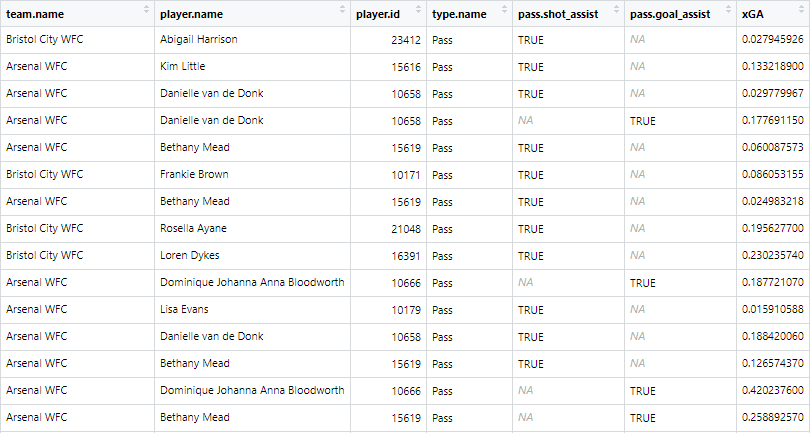
shot_assists = left_join(events, xGA, by = c("id" = "shot.key_pass_id")) %>% #3
select(team.name, player.name, player.id, type.name, pass.shot_assist, pass.goal_assist, xGA ) %>% #4
filter(pass.shot_assist==TRUE | pass.goal_assist==TRUE) #5
- Filtering the data to just shots, as they are the only events with xG values.
- Select() allows you to choose which columns you want to, well, select, from your data, as not all are always necessary - especially with big datasets. First we are selecting the shot.key_pass_id column, which is a variable attached to shots that is just the ID of the pass that created the shot. You can also rename columns within select() which is what we are doing with xGA = shot.statsbomb_xg. This is so that, when we join it with the passes, it already has the correct name.
- left_join() lets you combine the columns from two different DFs by using two columns within either side of the join as reference keys. So in this example we are taking our initial DF (‘events’) and joining it with the one we just made (‘xGA’). The key is the by = c("id" = "shot.key_pass_id") part, this is saying ‘join these two DFs on instances where the id column in events matches the ‘shot.key_pass_id’ column in xGA’. So now the passes have the xG of the shots they created attached to them under the new column ‘xGA’.
- Again selecting just the relevant columns.
- Filtering our data down to just key passes/assists.
The end result should look like this:
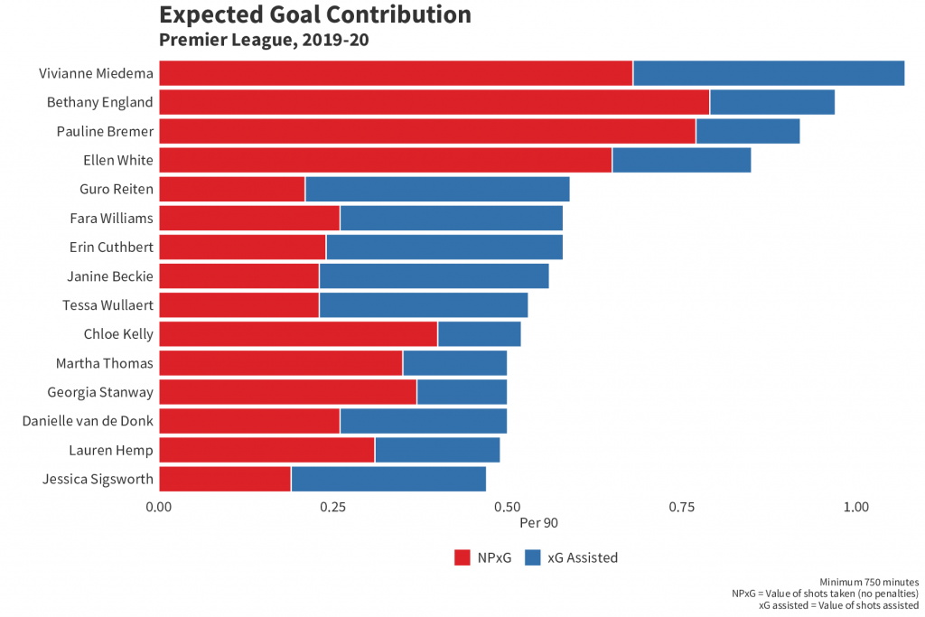
All lovely. But what if you want to make a chart out of it? Say you want to combine it with xG to make a handy xG+xGA per90 chart:
player_xGA = shot_assists %>%
group_by(player.name, player.id, team.name) %>%
summarise(xGA = sum(xGA, na.rm = TRUE)) #1
player_xG = events %>% filter(type.name=="Shot") %>%
filter(shot.type.name!="Penalty" | is.na(shot.type.name)) %>%
group_by(player.name, player.id, team.name) %>%
summarise(xG = sum(shot.statsbomb_xg, na.rm = TRUE)) %>%
left_join(player_xGA) %>% mutate(xG_xGA = sum(xG+xGA, na.rm =TRUE) ) #2
player_minutes = get.minutesplayed(events)
player_minutes = player_minutes %>%
group_by(player.id) %>%
summarise(minutes = sum(MinutesPlayed)) #3
player_xG_xGA = left_join(player_xG, player_minutes) %>%
mutate(nineties = minutes/90, xG_90 = round(xG/nineties, 2),
xGA_90 = round(xGA/nineties,2),
xG_xGA90 = round(xG_xGA/nineties,2) ) #4
chart = player_xG_xGA %>%
ungroup() %>% filter(minutes>=600) %>%
top_n(n = 15, w = xG_xGA90) #5
chart<-chart %>%
select(1, 9:10)%>%
pivot_longer(-player.name, names_to = "variable", values_to = "value") %>%
filter(variable=="xG_90" | variable=="xGA_90") #6
- Grouping by player and summing their total xGA for the season.
- Filtering out penalties and summing each player's xG, then joining with the xGA and adding the two together to get a third combined column.
- Getting minutes played for each player. If you went through the initial R guide you will have done this already.
- Joining the xG/xGA to the minutes, creating the 90s and dividing each stat by the 90s to get xG per 90 etc.
- Here we ungroup as we need the data in ungrouped form for what we're about to do. First we filter to players with a minimum of 600 minutes, just to get rid of notably small samples. Then we use top_n(). This filters your DF to the top *insert number of your choice here* based on a column you specify. So here we're filtering to the top 15 players in terms of xG90+xGA90.
- The pivot_longer() function flattens out the data. It's easier to explain what that means if you see it first:
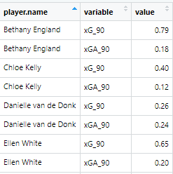
It has used the player.name as a reference point at creates separate rows for every variable that's left over. We then filter down to just the xG90 and xGA90 variables so now each player has a separate variable and value row for those two metrics. Now let's plot it:
ggplot(chart, aes(x =reorder(player.name, value), y = value, fill=fct_rev(variable))) + #1
geom_bar(stat="identity", colour="white")+
labs(title = "Expected Goal Contribution", subtitle = "Premier League, 2019-20",
x="", y="Per 90", caption ="Minimum 750 minutes\nNPxG = Value of shots taken (no penalties)\nxG assisted = Value of shots assisted")+
theme(axis.text.y = element_text(size=14, color="#333333", family="Source Sans Pro"),
axis.title = element_text(size=14, color="#333333", family="Source Sans Pro"),
axis.text.x = element_text(size=14, color="#333333", family="Source Sans Pro"),
axis.ticks = element_blank(),
panel.background = element_rect(fill = "white", colour = "white"),
plot.background = element_rect(fill = "white", colour ="white"),
panel.grid.major = element_blank(),
panel.grid.minor = element_blank(),
plot.title=element_text(size=24, color="#333333", family="Source Sans Pro" , face="bold"),
plot.subtitle=element_text(size=18, color="#333333", family="Source Sans Pro", face="bold"),
plot.caption=element_text(color="#333333", family="Source Sans Pro", size =10), text=element_text(family="Source Sans Pro"),
legend.title=element_blank(),
legend.text = element_text(size=14, color="#333333", family="Source Sans Pro"),
legend.position = "bottom") + #2
scale_fill_manual(values=c("#3371AC", "#DC2228"), labels = c( "xG Assisted","NPxG")) + #3
scale_y_continuous(expand = c(0, 0), limits= c(0,max(chart$value) + 0.3)) + #4
coord_flip()+ #5
guides(fill = guide_legend(reverse = TRUE)) #6
- Two things are going on here that are different from your average bar chart. First is reorder(), which allows you reorder a variable along either axis based on a second variable. In this instance we are putting the player names on the x axis and reordering them by value - i.e the xG and xGA combined - meaning they are now in descending order from most to least combined xG+xGA. Second is that we've put the 'variable' on the bar fill. This allows us to put two separate metrics onto one bar chart and have them stack, as you will see below, by having them be separate fill colours.
- Everything within labs() and theme() is fairly self explanatory and is just what we have used internally. You can get rid of all this if you like and change it to suit your own design tastes.
- Here we are providing specific colour hex codes to the values (so xG = red and xGA = blue) and then labelling them so they are named correctly on the chart's legend.
- Expand() allows you to expand the boundaries of the x or y axis, but if you set the values to (0,0) it also removes all space between the axis and the inner chart itself (if you're having a hard time envisioning that, try removing expand() and see what it looks like). Then we are setting the limits of the y axis so the longest bar on the chart isn't too close to the edge of the chart. 'max(chart$value) + 0.3' is saying 'take the max value and add 0.3 to make that the upper limit of the y axis'.
- Flipping the x axis and y axis so we have a nice horizontal bar chart rather than a vertical one.
- Reversing the legend so that the order of it matches up with the order of xG and xGA on the chart itself.
All in that should look like this:
Heatmaps
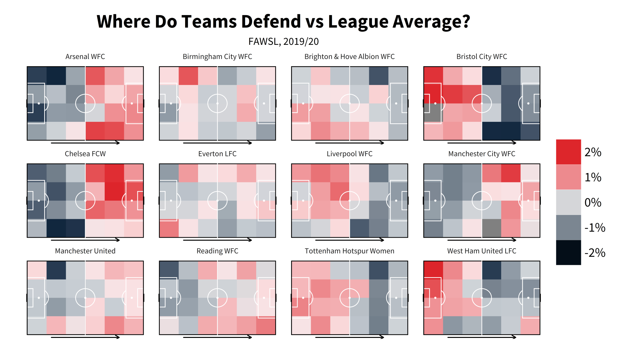
Heatmaps are one of the everpresents in football data. They are fairly easy to make in R once you get your head round how to do so, but can be unintuitive without having it explained to you first. For this example we're going to do a defensive heatmap, looking at how often teams make a % of their overall defensive actions in certain zones, then comparing that % vs league average:
library(tidyverse)
heatmap = events %>%
mutate(location.x = ifelse(location.x>120, 120, location.x),
location.y = ifelse(location.y>80, 80, location.y),
location.x = ifelse(location.x<0, 0, location.x),
location.y = ifelse(location.y<0, 0, location.y)) #1
heatmap$xbin <- cut(heatmap$location.x, breaks = seq(from=0, to=120, by = 20),include.lowest=TRUE )
heatmap$ybin <- cut(heatmap$location.y, breaks = seq(from=0, to=80, by = 20),include.lowest=TRUE) #2
heatmap = heatmap%>%
filter(type.name=="Pressure" | duel.type.name=="Tackle" | type.name=="Foul Committed" | type.name=="Interception" |
type.name=="Block" ) %>%
group_by(team.name) %>%
mutate(total_DA = n()) %>%
group_by(team.name, xbin, ybin) %>%
summarise(total_DA = max(total_DA),
bin_DA = n(),
bin_pct = bin_DA/total_DA,
location.x = median(location.x),
location.y = median(location.y)) %>%
group_by(xbin, ybin) %>%
mutate(league_ave = mean(bin_pct)) %>%
group_by(team.name, xbin, ybin) %>%
mutate(diff_vs_ave = bin_pct - league_ave) #3
- Some of the coordinates in our data sit outside the bounds of the pitch (you can see the layout of our pitch coordinates in our event spec, but it's 0-120 along the x axis and 0-80 along the y axis). This will cause issue with a heatmap and give you dodgy looking zones outside the pitch. So what we're doing here is using ifelse() to say 'if a location.x/y coordinate is outside the bounds that we want, then replace it with one that's within the boundaries. If it is not outside the bounds just leave it as is'.
- cut() literally cuts up the data how you ask it to. Here, we're cutting along the x axis (from 0-120, again the length of our pitch according to our coordinates in the spec) and the y axis (0-80), and we're cutting them 'by' the value we feed it, in this case 20. So we're splitting it up into buckets of 20. This creates 6 buckets/zones along the x axis (120/20 = 6) and 4 along the y axis (80/20 = 4). This creates the buckets we need to plot our zones.
- This is using those buckets to create the zones. Let's break it down bit-by-bit: - Filtering to only defensive events - Grouping by team and getting how many defensive events they made in total ( n() just counts every row that you ask it to, so here we're counting every row for every team - i.e counting every defensive event for each team) - Then we group again by team and the xbin/ybin to count how many defensive events a team has in a given bin/zone - that's what 'bin_DA = n()' is doing. 'total_DA = max(total_DA),' is just grabbing the team totals we made earlier. 'bin_pct = bin_DA/total_DA,' is dividing the two to see what percentage of a team's overall defensive events were made in a given zone. The 'location.x = median(location.x/y)' is doing what it says on the tin and getting the median coordinate for each zone. This is used later in the plotting. - Then we ungroup and mutate to find the league average for each bin, followed by grouping by team/bin again subtracting the league average in each bin from each team's % in those bins to get the difference.
Now onto the plotting. For this please install the package 'grid' if you do not have it, and load it in. You could use a package like 'ggsoccer' or 'SBPitch' for drawing the pitch, but for these purposes it's helpful to try and show you how to create your own pitch, should you want to:
library(grid)
defensiveactivitycolors <- c("#dc2429", "#dc2329", "#df272d", "#df3238", "#e14348", "#e44d51", "#e35256", "#e76266", "#e9777b", "#ec8589", "#ec898d", "#ef9195", "#ef9ea1", "#f0a6a9", "#f2abae", "#f4b9bc", "#f8d1d2", "#f9e0e2", "#f7e1e3", "#f5e2e4", "#d4d5d8", "#d1d3d8", "#cdd2d6", "#c8cdd3", "#c0c7cd", "#b9c0c8", "#b5bcc3", "#909ba5", "#8f9aa5", "#818c98", "#798590", "#697785", "#526173", "#435367", "#3a4b60", "#2e4257", "#1d3048", "#11263e", "#11273e", "#0d233a", "#020c16") #1
ggplot(data= heatmap, aes(x = location.x, y = location.y, fill = diff_vs_ave, group =diff_vs_ave)) +
geom_bin2d(binwidth = c(20, 20), position = "identity", alpha = 0.9) + #2
annotate("rect",xmin = 0, xmax = 120, ymin = 0, ymax = 80, fill = NA, colour = "black", size = 0.6) +
annotate("rect",xmin = 0, xmax = 60, ymin = 0, ymax = 80, fill = NA, colour = "black", size = 0.6) +
annotate("rect",xmin = 18, xmax = 0, ymin = 18, ymax = 62, fill = NA, colour = "white", size = 0.6) +
annotate("rect",xmin = 102, xmax = 120, ymin = 18, ymax = 62, fill = NA, colour = "white", size = 0.6) +
annotate("rect",xmin = 0, xmax = 6, ymin = 30, ymax = 50, fill = NA, colour = "white", size = 0.6) +
annotate("rect",xmin = 120, xmax = 114, ymin = 30, ymax = 50, fill = NA, colour = "white", size = 0.6) +
annotate("rect",xmin = 120, xmax = 120.5, ymin =36, ymax = 44, fill = NA, colour = "black", size = 0.6) +
annotate("rect",xmin = 0, xmax = -0.5, ymin =36, ymax = 44, fill = NA, colour = "black", size = 0.6) +
annotate("segment", x = 60, xend = 60, y = -0.5, yend = 80.5, colour = "white", size = 0.6)+
annotate("segment", x = 0, xend = 0, y = 0, yend = 80, colour = "black", size = 0.6)+
annotate("segment", x = 120, xend = 120, y = 0, yend = 80, colour = "black", size = 0.6)+
theme(rect = element_blank(), line = element_blank()) +
annotate("point", x = 12 , y = 40, colour = "white", size = 1.05) + # add penalty spot right
annotate("point", x = 108 , y = 40, colour = "white", size = 1.05) +
annotate("path", colour = "white", size = 0.6, x=60+10*cos(seq(0,2*pi,length.out=2000)),
y=40+10*sin(seq(0,2*pi,length.out=2000)))+ # add centre spot
annotate("point", x = 60 , y = 40, colour = "white", size = 1.05) +
annotate("path", x=12+10*cos(seq(-0.3*pi,0.3*pi,length.out=30)), size = 0.6,
y=40+10*sin(seq(-0.3*pi,0.3*pi,length.out=30)), col="white") +
annotate("path", x=108-10*cos(seq(-0.3*pi,0.3*pi,length.out=30)), size = 0.6,
y=40-10*sin(seq(-0.3*pi,0.3*pi,length.out=30)), col="white") + #3
theme(axis.text.x=element_blank(),
axis.title.x = element_blank(),
axis.title.y = element_blank(),
plot.caption=element_text(size=13,family="Source Sans Pro", hjust=0.5, vjust=0.5),
plot.subtitle = element_text(size = 18, family="Source Sans Pro", hjust = 0.5),
axis.text.y=element_blank(),
legend.title = element_blank(),
legend.text=element_text(size=22,family="Source Sans Pro"),
legend.key.size = unit(1.5, "cm"),
plot.title = element_text(margin = margin(r = 10, b = 10), face="bold",size = 32.5, family="Source Sans Pro", colour = "black", hjust = 0.5),
legend.direction = "vertical",
axis.ticks=element_blank(),
plot.background = element_rect(fill = "white"),strip.text.x = element_text(size=13,family="Source Sans Pro")) + #4
scale_y_reverse() + #5
scale_fill_gradientn(colours = defensiveactivitycolors, trans = "reverse", labels = scales::percent_format(accuracy = 1), limits = c(0.02, -0.02)) + #6
labs(title = "Where Do Teams Defend vs League Average?", subtitle = "FAWSL, 2019/20") + #7
coord_fixed(ratio = 95/100) + #8
annotation_custom(grob = linesGrob(arrow=arrow(type="open", ends="last", length=unit(2.55,"mm")), gp=gpar(col="black", fill=NA, lwd=2.2)), xmin=25, xmax = 95, ymin = -83, ymax = -83) + #9
facet_wrap(~team.name)+ #10
guides(fill = guide_legend(reverse = TRUE)) #11
- These are the colours we'll be using for our heatmap later on.
- 'geom_bin2d' is what will create the heatmap itself. We've set the binwidths to 20 as that's what we cut the pitch up into earlier along the x and y axis. Feeding 'div_vs_ave' to 'fill' and 'group' in the ggplot() will allow us to colour the heatmaps by that variable.
- Everything up to here is what is drawing the pitch. There's a lot going on here and, rather than have it explained to you, just delete a line from it and see what disappears from the plot. Then you'll see which line is drawing the six-yard-box, which is drawing the goal etc.
- Again more themeing. You can change this to be whatever you like to fit your aesthetic preferences.
- Reversing the y axis so the pitch is the correct way round along that axis (0 is left in SBD coordinates, but starts out as right in ggplot).
- Here we're setting the parameters for the fill colouring of heatmaps. First we're feeding the 'defensiveactivitycolors' we set earlier into the 'colours' parameter, 'trans = "reverse"' is there to reverse the output so red = high. 'labels = scales::percent_format(accuracy = 1)' formats the text on the legend as a percentage rather than a raw number and 'limits = c(0.03, -0.03)' sets the limits of the chart to 3%/-3% (reversed because of the previous trans = reverse).
- Setting the title and subtitle of the chart.
- 'coord_fixed()' allows us to set the aspect ratio of the chart to our liking. Means the chart doesn't come out looking all stretched along one of the axes.
- This is what the grid package is used for. It's drawing the arrow across the pitches to indicate direction of play. There's multiple ways you could accomplish though, up to you how you do it.
- 'facet_wrap()' creates separate 'facets' for your chart according to the variable you give it. Without it, we'd just be plotting every team's numbers all at once on chart. With it, we get every team on their own individual pitch.
- Our previous trans = reverse also reverses the legend, so to get it back with the positive numbers pointing upwards we can re-reverse it.
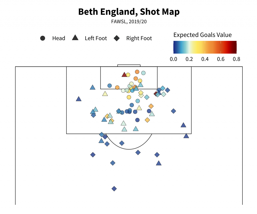
Shot Maps
Another of the quintessential football visualisations, shot maps come in many shapes and sizes with an inconsistent overlap in design language between them. This version will attempt to give you the basics, let you get to grip with how to put one of these together so that if you want to elaborate or make any of your own changes you can explore outwards from it. Be forewarned though - the options for what makes a good, readable shot map are surprisingly small when you get into visualising it!
shots = events %>%
filter(type.name=="Shot" & (shot.type.name!="Penalty" | is.na(shot.type.name)) & player.name=="Bethany England") #1
shotmapxgcolors <- c("#192780", "#2a5d9f", "#40a7d0", "#87cdcf", "#e7f8e6", "#f4ef95", "#FDE960", "#FCDC5F", "#F5B94D", "#F0983E", "#ED8A37", "#E66424", "#D54F1B", "#DC2608", "#BF0000", "#7F0000", "#5F0000") #2
ggplot() +
annotate("rect",xmin = 0, xmax = 120, ymin = 0, ymax = 80, fill = NA, colour = "black", size = 0.6) +
annotate("rect",xmin = 0, xmax = 60, ymin = 0, ymax = 80, fill = NA, colour = "black", size = 0.6) +
annotate("rect",xmin = 18, xmax = 0, ymin = 18, ymax = 62, fill = NA, colour = "black", size = 0.6) +
annotate("rect",xmin = 102, xmax = 120, ymin = 18, ymax = 62, fill = NA, colour = "black", size = 0.6) +
annotate("rect",xmin = 0, xmax = 6, ymin = 30, ymax = 50, fill = NA, colour = "black", size = 0.6) +
annotate("rect",xmin = 120, xmax = 114, ymin = 30, ymax = 50, fill = NA, colour = "black", size = 0.6) +
annotate("rect",xmin = 120, xmax = 120.5, ymin =36, ymax = 44, fill = NA, colour = "black", size = 0.6) +
annotate("rect",xmin = 0, xmax = -0.5, ymin =36, ymax = 44, fill = NA, colour = "black", size = 0.6) +
annotate("segment", x = 60, xend = 60, y = -0.5, yend = 80.5, colour = "black", size = 0.6)+
annotate("segment", x = 0, xend = 0, y = 0, yend = 80, colour = "black", size = 0.6)+
annotate("segment", x = 120, xend = 120, y = 0, yend = 80, colour = "black", size = 0.6)+
theme(rect = element_blank(), line = element_blank()) + # add penalty spot right
annotate("point", x = 108 , y = 40, colour = "black", size = 1.05) +
annotate("path", colour = "black", size = 0.6, x=60+10*cos(seq(0,2*pi,length.out=2000)),
y=40+10*sin(seq(0,2*pi,length.out=2000)))+ # add centre spot
annotate("point", x = 60 , y = 40, colour = "black", size = 1.05) +
annotate("path", x=12+10*cos(seq(-0.3*pi,0.3*pi,length.out=30)), size = 0.6,
y=40+10*sin(seq(-0.3*pi,0.3*pi,length.out=30)), col="black") +
annotate("path", x=107.84-10*cos(seq(-0.3*pi,0.3*pi,length.out=30)), size = 0.6,
y=40-10*sin(seq(-0.3*pi,0.3*pi,length.out=30)), col="black") +
geom_point(data = shots, aes(x = location.x, y = location.y, fill = shot.statsbomb_xg, shape = shot.body_part.name), size = 6, alpha = 0.8) + #3
theme(axis.text.x=element_blank(),
axis.title.x = element_blank(),
axis.title.y = element_blank(),
plot.caption=element_text(size=13,family="Source Sans Pro", hjust=0.5, vjust=0.5),
plot.subtitle = element_text(size = 18, family="Source Sans Pro", hjust = 0.5),
axis.text.y=element_blank(), legend.position = "top",
legend.title=element_text(size=22,family="Source Sans Pro"),
legend.text=element_text(size=20,family="Source Sans Pro"),
legend.margin = margin(c(20, 10, -85, 50)),
legend.key.size = unit(1.5, "cm"),
plot.title = element_text(margin = margin(r = 10, b = 10), face="bold",size = 32.5, family="Source Sans Pro", colour = "black", hjust = 0.5),
legend.direction = "horizontal",
axis.ticks=element_blank(), aspect.ratio = c(65/100),
plot.background = element_rect(fill = "white"), strip.text.x = element_text(size=13,family="Source Sans Pro")) +
labs(title = "Beth England, Shot Map", subtitle = "FAWSL, 2019/20") + #4
scale_fill_gradientn(colours = shotmapxgcolors, limit = c(0,0.8), oob=scales::squish, name = "Expected Goals Value") + #5
scale_shape_manual(values = c("Head" = 21, "Right Foot" = 23, "Left Foot" = 24), name ="") + #6
guides(fill = guide_colourbar(title.position = "top"), shape = guide_legend(override.aes = list(size = 7, fill = "black"))) + #7 coord_flip(xlim = c(85, 125)) #8
- Simple filtering, leaving out penalties. Choose any player you like of course.
- Much like the defensive activity colours earlier, these will set the colours for our xG values.
- Here's where the actual plotting of shots comes in, via geom_point. We're using the the xG values as the fill and the body part for the shape of the points. This could reasonably be anything though. You could even add in colour parameters which would change the colour of the outline of the shape.
- Again titling. This can be done dynamically so that it changes according to the player/season etc but we will leave that for now. Feel free to explore for youself though.
- Same as last time but worth pointing out that 'name' allows you to change the title of a legend from within the gradient setting.
- Setting the shapes for each body part name. The shape numbers correspond to ggplot's pre-set shapes. The shapes numbered 21 and up are the ones which have inner colouring (controlled by fill) and outline colouring (controlled by colour) so that's why those have been chosen here. oob=scales::squish takes any values that are outside the bounds of our limits and squishes them within them.
- guides() allows you to alter the legends for shape, fill and so on. Here we are changing the the title position for the fill so that it is positioned above the legend, as well as changing the size and colour of the shape symbols on that legend.
- coord_flip() does what it says on the tin - switches the x and y axes. xlim allows us to set boundaries for the x axis so that we can show only a certain part of the pitch, giving us:
That's all for now. Hopefully this wasn't all too confusing and you picked up some bits and bobs you can take away to play with yourselves. Don't worry if some of this is overwhelming or you have to do copious amounts of googling to overcome odd specific errors and whatnot. That's just part and parcel with coding (seriously, get used to googling for errors, everyone has to).
Much love. Be well and have great days.