 I was recently invited to send some of my work on passing motifs to be used for a Fink Tank column in The Times, but of course a dendrogram such as the one I linked in my previous entry wouldn’t cut it in printed media. Therefore, I thought the best thing to do was set out to answer some concrete applied questions the methodology might answer, which would be easy to display but interesting nevertheless. The content of this entry was the result: I started by thinking about “distinctive” players; players that couldn’t be replaced easily. Remember that there is solid evidence that the methodology outlined in the previous entry picks up some underlying information on player passing style, and two players are considered similar if their vectors are “close” to each other. With this in mind, I computed the average distance of the 10 closest players for each player. The players for whom this number was highest were considered the most distinctive. The following table shows the top 5 along with their closest neighbours (this whole entry is based on data from the 2015-16 Premier League, without goalkeepers):
  First of all, I strongly think that Ulloa being there is a bit of an oddity: most of his appearances were late substitutions when Leicester were holding onto a 1-0 lead and therefore his stats are representative of this unique predicament. Ozil is the most distinctive player in the league. Looking through his closest players Nacho Monreal and Bacary Sagna can raise a few eyebrows but all in all even they are considerably far away from his style and therefore don’t reveal much about him. It’s a bit like the US mainland and Australia being amongst the closest countries to Hawaii; so treat that with due suspicion. The rest of the players seem to make good footballing sense. I’ll leave it to the readers to read through the results and make their own judgements. Another interesting question which I thought of was this: which players represent the best recruitment opportunities in the sense that they have similar styles to players who play for much better ranked teams. Something like Sunderland players having similar styles to players from Arsenal, Manchester City or Tottenham. There are several ways to answer this question. Let’s start by the simplest: for each player I computed the average final league position of the 10 closest players, and subtracted that number from his own team’s final position. The players for whom this number was highest can be considered to represent the “best” opportunities. The following table shows the top 10:
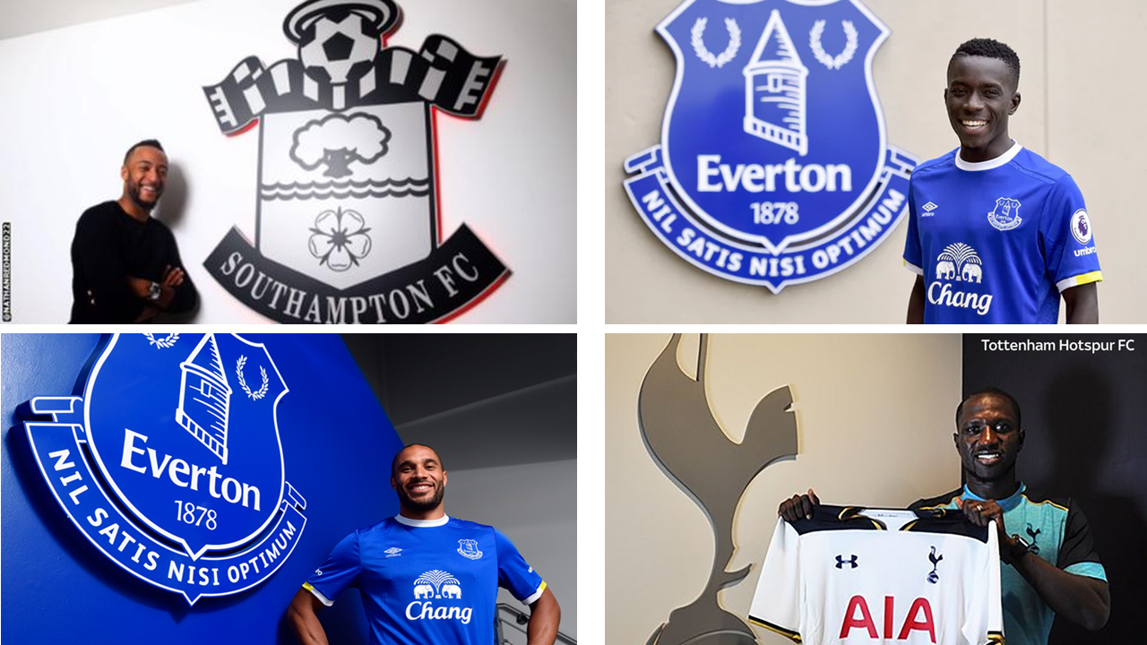
  I didn’t watch Aston Villa much last season and have no opinion on Ashley Westwood to be honest. It’s good to see Nathan Redmond and Idrissa Gueye on there though, considering they have since moved to Everton and Southampton proving they were in fact capable of playing for better teams. The problem with this methodology though is that it assumes that the difference in player’s quality is lineal with league position. That is to say, the difference in quality between a player from the 16th team and one from the 20th team is assumed to be the same as the difference between a player from the champions and a player from the 5th team, when in truth there is no solid basis for this assumption. One way to deal with this is to apply an increasing concave function to league position so that the same differences in position lower down the table are weighted less than for higher placed teams. I tried out a few functions like log, square root, cubic root, etc., and the results vary marginally but the same core of names seems to pop out for most of them. As an example, the table below shows the results for this methodology applying the fourth root to league position:
  Some more satisfying names show up on there now (Ashley Williams who moved to Everton and Jason Puncheon who is pretty good), but it’s still unclear whether this methodology is properly representing the differences in quality required to play for different teams. Perhaps a better way to look at it is by points obtained rather than league position. Is the ratio of points a good representation of the difference in quality? The idea would be something like if a team obtains 90 points then its players must be 3 times as good as those of a team which obtains 30 points. The following table shows the top ten players such that the ratio between their teams’ points and the average points of the teams of their 10 closest players is greatest: NOTE: I had to exclude Aston Villa players here because they obtained such a small amount of points that right away the method assumed it was twice as hard to play for Norwich than for Villa (Aston Villa made 17 points and Norwich 34) and obviously all the Villa players dominated the rankings.
  Nathan Redmond is on the list again which is good to see, as well as Moussa Sissoko who moved to Tottenham this season. M’Vila, Cisse and Watmore are other players on the list which I rate highly, but again, lets allow the reader to make his own judgements. To wrap this theme up, the final way of answering this question I used combines some of the best elements of the previous two ideas: for each player we compute the difference between the average squared points of the 10 closest players and his own team’s final points squared. The square is taken to compensate for the fact that the quality required to go from a 60-points team to an 80-points team is higher than the quality required to go from a 30-points team to a 50-points team. The table below shows the results:
  There are some good names on there. Redmond definitely seems to be a good catch by Southampton. Now, remember that this methodology isn’t meant to be a magic crystal ball. Some people who know I do this type of work constantly ask me: “So, who’s going to win the league? Who’s the next Messi?”. They fail to understand the subtlety of what there is to actually gain from data mining. Ashley Westwood might be great, but then again he might not. Nevertheless, some players which traditional scouting methods seem to like from last season which were recruited by larger teams are also liked by this method. It’s pretty remarkable that this methodology seems to be so rich when it is ignoring a lot of relevant information such as shots, goals, tackles, etc. It only sees what is visible in the passing network, which seems to be enough to make some decisions that very informed professional recruitment makes like picking up Gueye, Redmond, Sissoko, Ashley Williams, etc. That doesn't mean that it has all the answers. For example, it might like a centre back who is good at playing the ball out from the back but it has no way of knowing if he is also defensively sound. If complemented with more sources of information (such as direct traditional scouting), however, this type of work can be very useful for clubs. Finally and on a bit of a sourer note, I thought it might also be interesting to look at some of the “worst” opportunity players; that is to say players who are similar to players from much worse teams than their own. I had to exclude Leicester players because their players completely dominated the top ten in most lists I drew up; even Kante, Mahrez and Vardy. I’m not sure what to make of this, because even though they were the champions, their players aren’t particularly similar to the players from other top teams. Just so it doesn’t seem like I’m slipping something past you, here are the 10 closest players to Kante, Mahrez and Vardy:
  Now, excluding players from Leicester, here are the “worst” opportunities using the “squared points difference” metric outlined above:
  Make of it what you will, but keep in mind that everything has a context and even if I claim this method sees a lot, I also recognise it doesn't know everything. If you see a name in there you don't like, keep calm, take a deep breath, look through the closest players and have a think about what might be going on. _______________ Find me on twitter @dperdomomeza1
2016
Player Passing Motif Style Application: Distinctive Players & Recruitment Opportunities
By admin
|
December 1, 2016