(Editor's Note: This was originally published on the StatsBomb Services blog, but the URL was lost in a server move. We have re-published it here so it can be referenced in future work.)
Some of the work we need to do on the StatsBomb Services side involves teaching people how to use what we create. If it’s not practically applicable and/or can’t be taught, then it’s just a piece of art, not analytics.Today I’m going to discuss passing networks, with a specific emphasis on the xGChain passing networks you’ll find on the StatsBomb IQ platform and also on our Twitter feed.
What is a Passing Network?
It’s the application of network theory and social network analysis to passing data in football. Each player is a node, and the passes between them are connections.
The first time I saw them used in football was either a presentation by Pedro Marques of Man City at the first OptaPro Forum, or Devin Pleuler’s work at Central Winger on the MLS site.
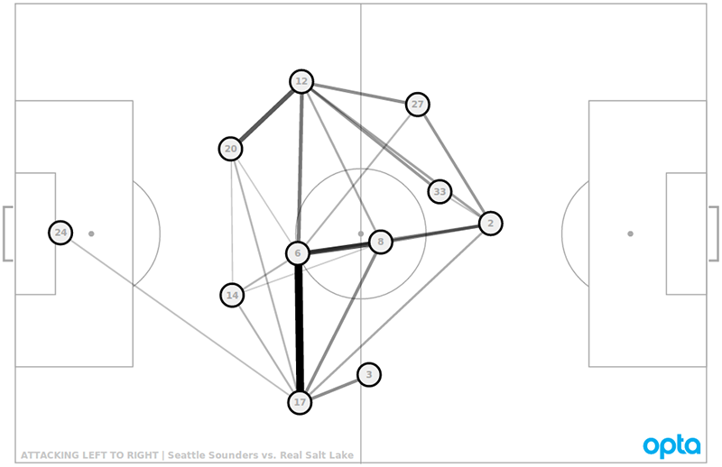
We also used them at Brentford to do opposition analysis, specifically to find which players we might want to aggressively press whenever they get the ball, or looking at valuable connections between players we wanted to break.
The application is simple.
- Look at a bunch of recent matches for a club and you will often start to see patterns of play and interesting details you care about.
- Investigate a little further in the data to find usage information
- Go to the video and see what shakes out.
In many cases, analysts only have time to watch and analyse the last 3 matches of opposition on video. Using the passing networks gives them quick info in an easily digestible format that doesn’t cost them an extra 10-20 hours of video time.
Before we go any further though, I think it’s important to speak about the limitations of passing networks. These are a tool and meant to be part of an analytics suite to help you analyse games, but like any tool, you need to understand their weaknesses.
First, each node consists of the average location of a player’s touches. If they switch sides of the pitch regularly, their average will look central, even if they never touch the ball in that area. This is a limitation of the vis and why we ALWAYS use video to back stuff up.
On the other hand, if you want to stay data-based, you could use things like heat maps, or even dot touch maps for every place a single player touched on the pitch to get more accuracy. This is a bit like using shot maps to supplement aggregate data in player radars to get a clearer picture.
The second limitation is that this info is an extrapolation of what actually happened. Did the fullback pass 15 times to the left wing, exactly along the path in the vis? No, of course not. That information is also easily visualized, but it’s just not contained here.
The third limitation is that these don’t actually explain that much by themselves. They take snapshots of actions through a match and combine them into a bigger picture. It’s like a movie where you only see 20 of 50 scenes without seeing the whole thing. Sometimes, you’ll end up with a clear idea of the plot. Other times, you are going to be really surprised when your friends start talking about the whole Verbal Kint/Kaiser Soze thing. They are still useful, but this is another reason why - in practice - we almost always pair this analysis with video work to complete the picture.
Design Stuff
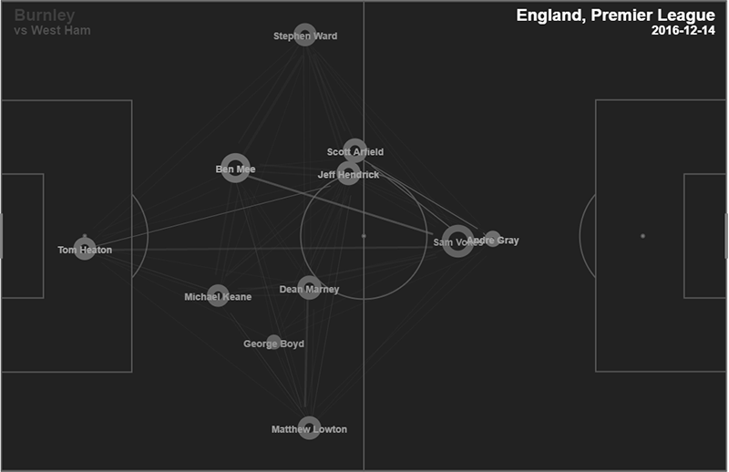
Right, so we have passing networks. Some people do them vertically. We do them horizontally.
Why?
For starters, most humans are accustomed to looking at football matches left to right. High angle tactical cam footage from behind the goal is quite useful if you can get it, but the vast majority of the audience views football in a left to right perspective.
The next thing you notice is that we stack ours on top of each other. This happened as a bit of a happy accident where I noticed a pressing team had a map very high up the pitch. I then put the map from their opponent underneath, and voila! we had a fairly clear view of territoriality in the touch maps.
If you take a step back, it seems fairly obvious, right? There are two teams on the pitch, and each of their actions impacts the other one, so visualize both together. However, actions between two teams aren’t always linked. The shot locations of one team don’t have any impact on the locations of the opponent. Passes do though, so at least in my opinion, pairing them as part of this vis makes sense.
We also have them both going the same direction, which seems to strike some people as odd. All I can tell you is I think the territory element is much clearer if they go in the same direction, but people are welcome to test their own implementations and judge for themselves.
What else do we have… ah yes, the big difference: colour.
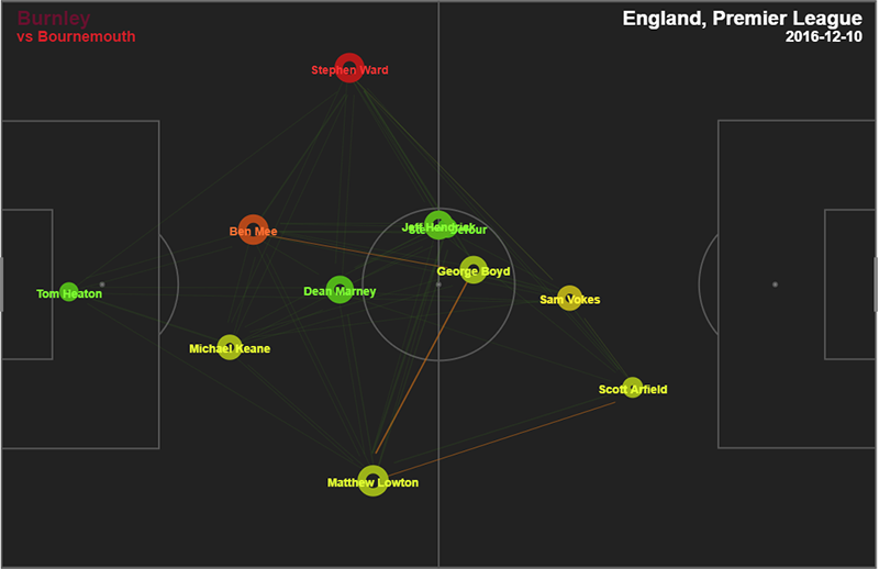
With passing networks, there is a real danger of adding so much information that your vis basically becomes unusable. It’s an incredibly info-dense visualization to begin with, so adding more elements is likely to make understanding what you are trying to display harder instead of easier. I think Thom walked this tightrope perfectly, adding the extra xGChain layer of data while still leaving it interpretable, and to be honest, totally gorgeous.
That said, it may take looking at these a number of times before you become comfortable with what they are trying to display. The same caveat was true of radars and shot maps, and is another reason why analysis blends elements of art with data science.
The xGChain Layer
First you need to understand what the xGChain metric is. So, any time a player is involved in a pass in the possession, they get xGC credit, and then we sum up their involvement over the course of a match and colour their node based on that.
Why?
Because this allows us to take the network vis beyond basic counting stats and starts to examine the value of a player’s contribution to the match. Because the colour scales are tied to the 5%/95% cutoffs I started back with the radars, you also get an easy reference for whether a player’s attacking contribution was pretty great (RED), pretty poor (GREEN), or somewhere in between.
We also start to get a sense of how non-attacking players are contributing to valuable build-up play in a way that just makes sense (at least to me).
Quick Reference
- Size of node = number of touches
- Thickness of line = number of passes between two nodes
- Colour of node = linear scale from green to red (.6-1.4 xGCh based on 5%/95% cutoffs)
- Colour of line = the total xGChain of possessions featuring a pass from A->B (0-.5 values based on 5%/95% cutoffs)
We Still Use Numbers
On Twitter, you will generally see just the visualization. This is mostly due to the limited, bite-size nature of the format. However, on the StatsBomb IQ app, Passing Networks also include all the individual and combination numbers you see below.
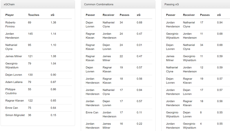
The combination of the vis and the numbers represents the whole of the analysis. The vis gives you basics, the numbers specifics, but both are still constrained by the limitations of this visualization format.
Examples
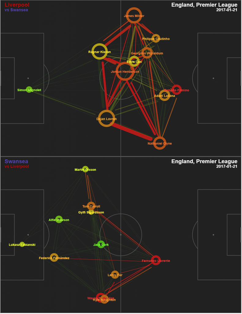
In this one you see Liverpool pushed quite far forward and had massive amounts of possession and created reasonable chances. Pretty much everyone is involved, but Coutinho and Lallana only put up good, not great xGChain numbers for the match. On the Swansea side, Llorente is the only guy up high most of the time, while he and Wayne Routledge both put up big numbers for the game, and Swansea came away with a vital win.
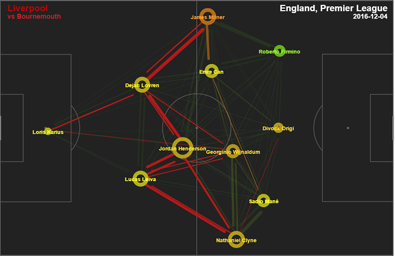
Just a single plot this time from Liverpool’s trip to Bournemouth earlier in the season, mostly to compare same team performance. Here Firmino is posted out wide instead of central, and had comparatively little impact in creating big scoring chances for LFC that match. Normally he’s a fiery red circle, but for this match he’s ineffective green. That’s another cool element these plots allow. Instead of focusing on the full match, you can isolate one player across a number of positions and games and see what it does to their performance.
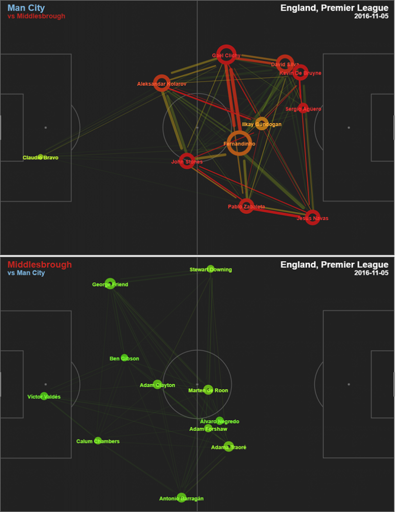
I posted this one because both team’s maps are pretty incredible. City’s front three have average touches nearly on the 18, and nearly everyone except Claudio Bravo is red or orange. Meanwhile Boro had almost none of the ball and created almost nothing as well. The match ended 1-1, with Boro scoring a very late equalizer. 90% of the time our simulations think City win that match.
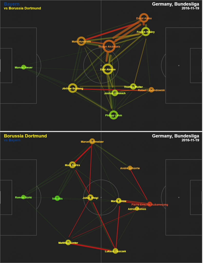
It’s always fascinating to see what happens to these maps when two elite teams square off. This is from the 1-0 Dortmund home win earlier this season. Bayern dominated the touches, but Dortmund just edged then in xG, 1.40 to 1.24. Aubameyang was rampant the entire game, and every time Dortmund touched the ball, they felt dangerous while doing a pretty good job of stymying Bayern’s great attackers.
How Do You Use This Inside a Professional Football Club?
Typically what I would do would be take passing networks for the last 10 matches from the next opposition and divide them into home and away games. Stick the numbers next to each of them for reference, and start to look for patterns.
Which players provide the engine for plan A when this team attacks?
Which players have the most valuable touches?
Does their fullback tend to get really high in possession and can we play behind them?
Which players should we look at for potential pressing triggers?
If we have a choice, which center back would we allow to play the ball forward?
Conclusion
This is already long, so I will wrap it up here. We view passing networks as an integral part of data-based football analysis. Provided you understand their limitations, they can provide a huge productivity boost to opposition and own team analysis. We also think the addition of our xGChain metric adds a layer of value to a visualization that previously only contained counting stats.
If you work in football and want to see what else the StatsBomb IQ platform has to offer, please get in touch.
--Ted Knutson
ted@statsbomb.com
@mixedknuts