Our summer project in StatsBomb IQ has been something I wanted to develop and release for more than 18 months now, but development work on the project was sidetracked by becoming a data company. Unintended consequences and all that jazz. Anyway, it looks like we will release this new section of StatsBomb IQ as a beta release next week and we are calling it IQ Tactics.
I’ll give you all some brief previews of the new module toward the end of this article, but first we’re going to talk about wagon wheels.
No, not THAT wagon wheel… these.
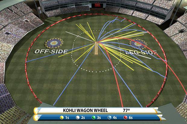
Why are we talking about wagon wheels? A fair question, and one I am glad you asked. The answer is partly because we have incorporated them into IQ Tactics for some good reasons, and partly because I’m a nerd who feels the need to cite and credit past examples and influences when producing new things.
So what is a wagon wheel? It’s a cricket vis that shows where batters have hit the ball around the pitch. You can use them to better place fielders, find batter tendencies, or for various and sundry other reasons specific to the game of cricket. They make a lot of sense for cricket, because unlike nearly every other sport, cricket’s primary battles take place in one central spot of the pitch (okay, technically two) surrounded by a circular surface.
Obviously football is played on a rectangular pitch and has no consistent central points of origin - why are we talking about this type of vis at all?
Well, because passing data is a lot. Like, a lot, a lot. You can’t just map the data and have it make any sense because there is too much of it. This is sort of true for a single game, but especially true when it comes to mapping a high volume passer, or even a low volume team across a stretch of games or an entire season.
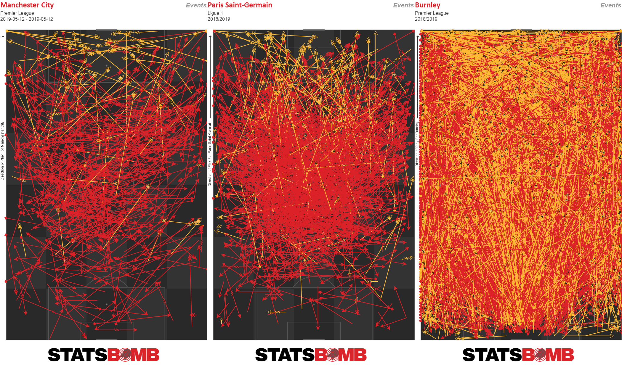
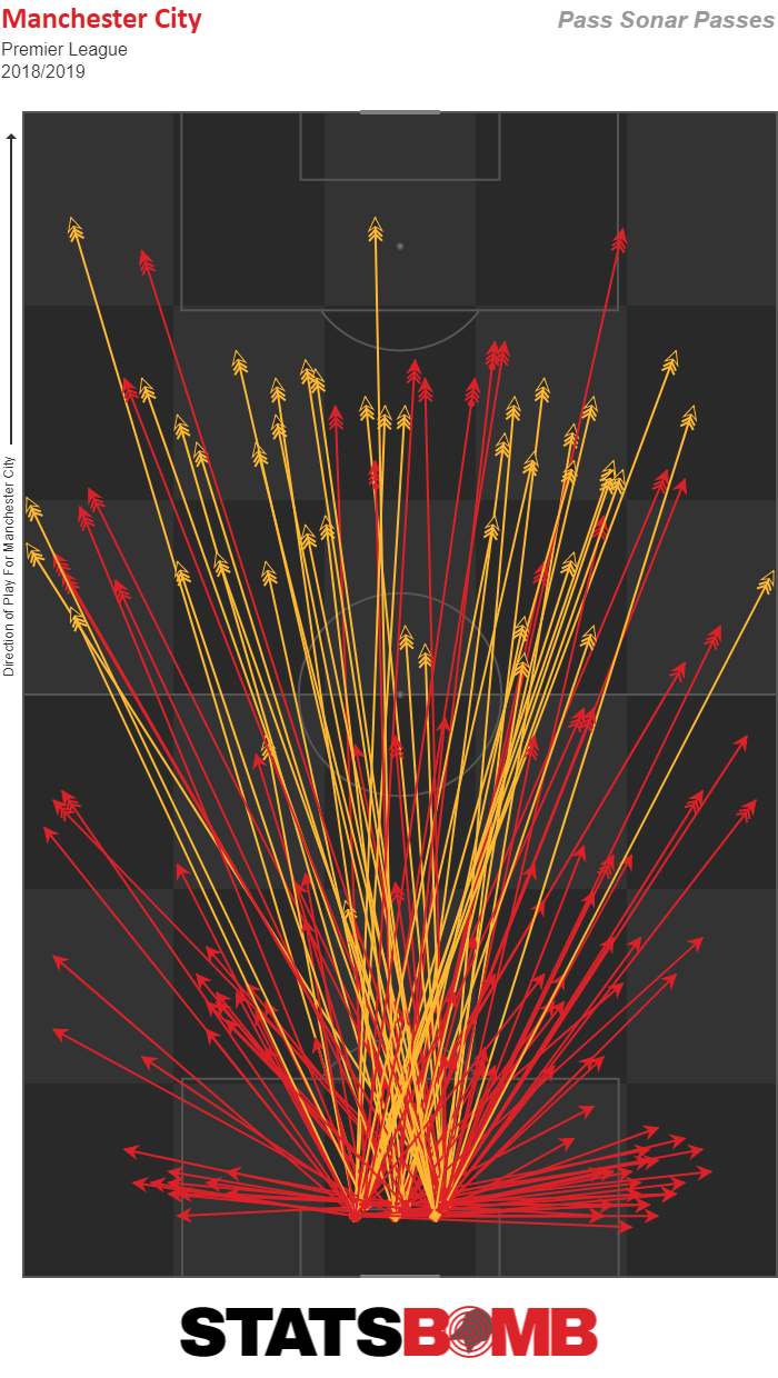
Here are maps of three different aggregations of passing data. Red represents one completed pass, yellow represents an incomplete one. The first map is Manchester City across a single game. The middle is Marco Verratti across the whole of last season. And the last one is Burnley from last year. As you can see, the last two kind of stretch our ability to make any sense of what is happening apart from the colors here suggesting that Marco Verratti is considerably better at completing his passes than… um… Burnley.
So what do you do? Well, lots of things are possible, but from a process perspective, you need to take all of this highly granular data and abstract it in a way that can be interpreted. Traditionally we use heat maps or zone maps to help here, but like all vis, these have their own strengths and weaknesses.
These are zone maps from Engine Room in StatsBomb IQ. They allow us to compare passing tendencies when the ball gets to a particular position in the pitch. In this case, I’m comparing Manchester City and Cardiff City from last year.
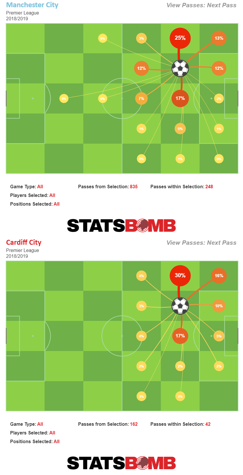
This vis shows where the NEXT pass typically goes for both teams. Notice the difference between how often either team plays the ball wide vs central, or in Man City’s case, directly backward from the zone they are in.
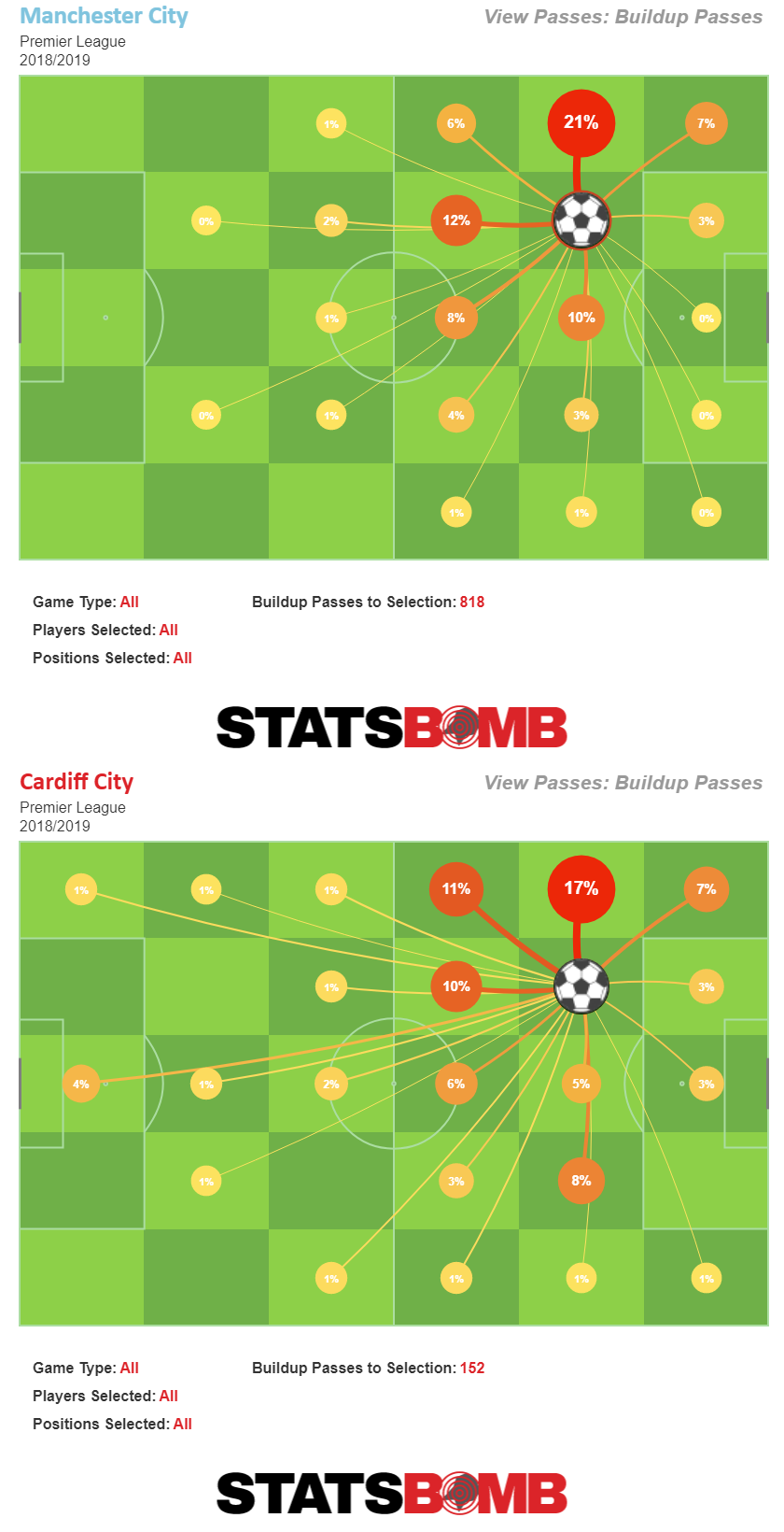
And this vis shows where the buildup pass came from. An entertaining 4% of all passes played into the zone directly outside the 18-yard box for Cardiff City came directly from the GK, while practically none of the passes Man City played into that zone came from their own half. Good ol’ Neil Warnock, out there tacticsing the place up.
Anyway, these are fine and zonal or topographical heat maps are probably better, but for our new module I wanted to explore the radial/wagon wheel/sonar vis style and see what we could do with that.
As noted before, football differs from cricket in that it has no fixed origin point, but what if you made the origin of the pass the central point of the vis, and then looked at all passes from that perspective? These types of plots have been around in football/soccer for quite some time.
The first time I remember seeing them was a link from Howard Hamilton pointing to some random Chelsea blog doing the visualisation work in Tableau. Now this was before I was doing any work in football analytics (I was in gambling back then), so I didn’t pay much attention other than to mentally note, “hey this thing exists,” before totally forgetting about it again.
It turns out that piece was written by current interim editor-in-chief of SB Nation, Graham MacAree. Before he was being full-time obnoxious to Zito Madu (a noble cause, if ever there was one), Graham was creating unique data vis for Chelsea fans on We Ain’t Got No History. Two things continue to impress me about Graham’s foray into radial passing plots.
- He did this in 2011.
- The bloody thing STILL WORKS.
So yeah, Graham is very clever and has been for a very long time, and if you ask him, he will tell you all about it.
The next time I remember seeing these types of vis were in David Sumpter’s FourFourTwo pieces circa 2015.
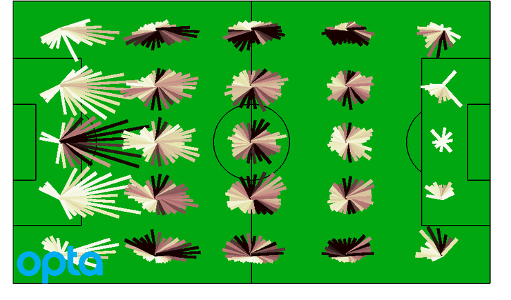
Sumpter took a zonal approach to wagon wheels on the pitch that he called a “distribution map.” Longer lines meant longer passes on average from that zone, and he used a black-to-white colour scheme to indicate how common passes were in each radian, with black meaning very common and white meaning uncommon. With Graham’s design, this colour scheme isn’t necessary, but the single line scheme quickly gets overwhelmed as the season progresses.
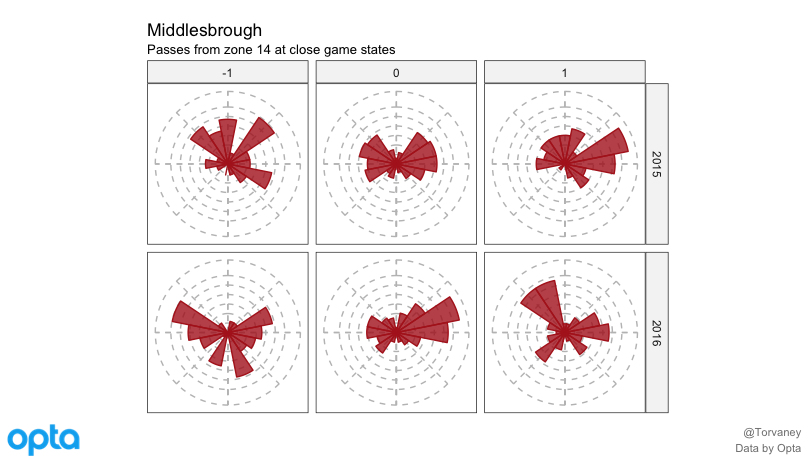
The next iteration of these I saw came from Ben Torvaney in April 2016. He used radial shards from a single zone and analysed Middlesboro’s passing by game state to see how aggressive or conservative they had been. It’s a lovely wrinkle to the analysis and a very readable blog post.
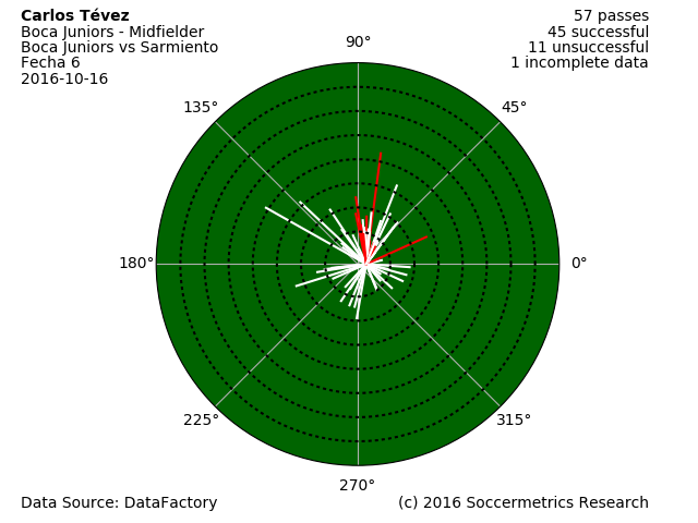
The aforementioned Howard Hamilton circled back on these in late 2016 with a very faithful cricket-style vis.
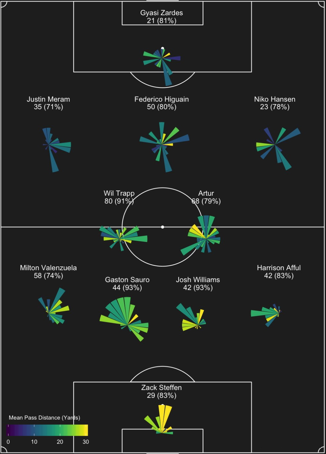
Finally we get to Eliot McKinley’s work on Twitter and the American Soccer Analysis blog. The ASA guys have been quietly innovating different vis approaches for years - partly due to a willingness to just try shit and a lot because they are smart - and Eliot’s passing “sonars” are by far the most attractive version of the radial/wagon wheel vis that I have seen. The initial ones I saw were the positional sonars like the one below…
I looked at this and started thinking about zonal versions like what Sumpter and Torvaney had done to help look at game model information to make things more easily interpretable. Discussion around the concept even ended up in my Barcelona Coaches Summit presentation.
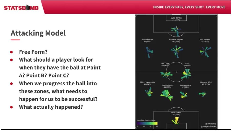
So even though the vis wasn’t there yet, the application was now fairly clear in my mind. The idea stemmed back to some old work Oliver Gage described in writing about his coaches’ game model when he was an analyst at University of Virginia. I’m paraphrasing here, but it was ideas like, “How often did we get the ball into these various zones? What did we do when we got there? We need to pass the ball forward x% of the time when we get into these spaces in order to put pressure on the opponent and have a chance of success.” This felt like one of those situations that these types of plots was made for.
Eliot also started doing zonal plots around the pitch, though he uses different size for his zones than we do at StatsBomb.
For our own versions, we ended up using length of shard compared to league average for the spatial component (shard length) and then the colour component is just raw pass completion percentage as default. However, we’ve added a number of other options that may still see release for IQ users to tweak to their liking.
We’re also keeping the name “sonars” out of respect for Eliot’s gorgeous work. He will tell you himself that he wasn’t the first to try this style of vis on passing data (and MacAree probably wasn’t either, he’s just the first I am aware of), but Eliot’s are certainly the best versions and he deserves the recognition.
Though we may choose to give the throw-in specific “thrownars” a miss...
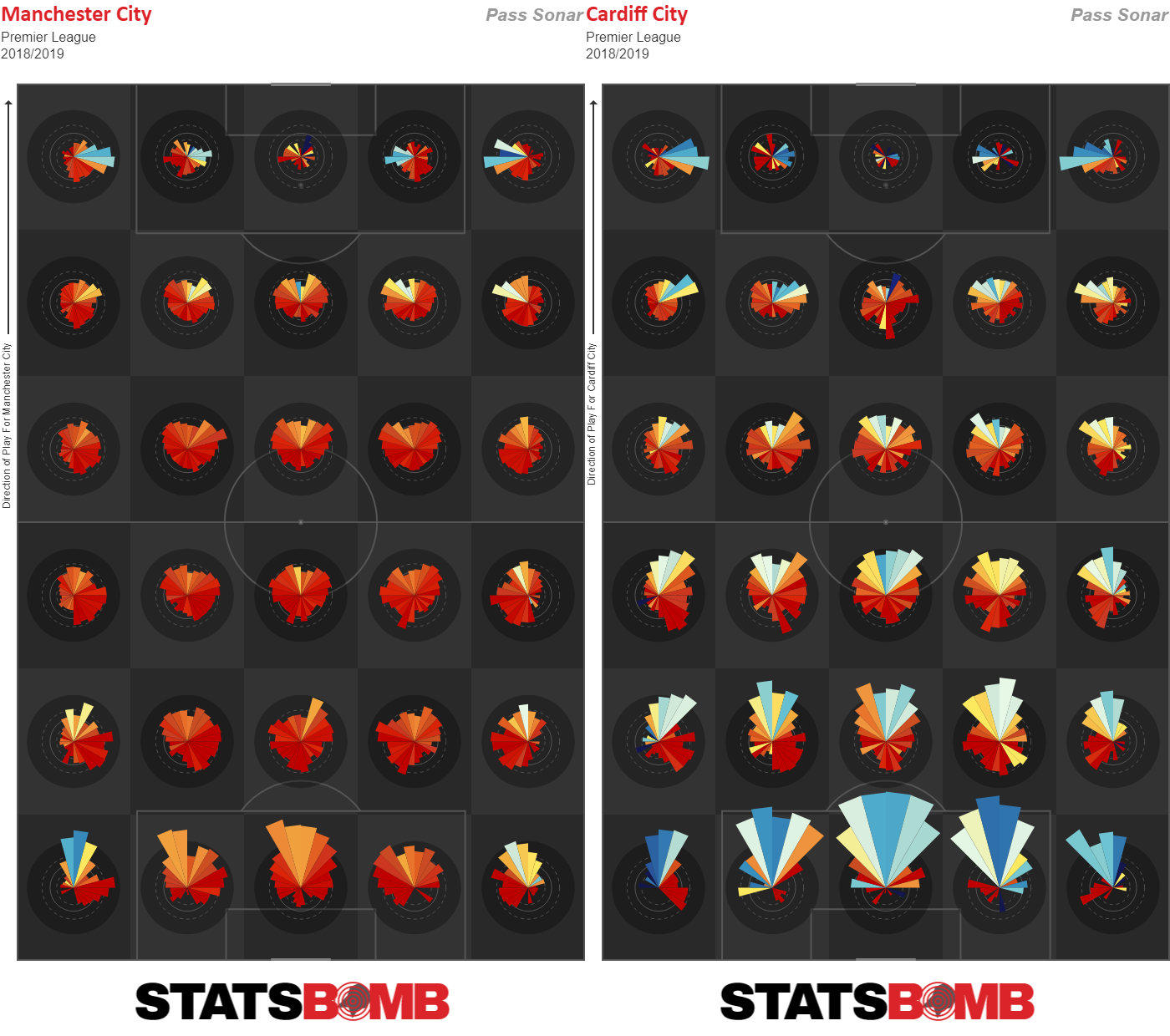
So these are seasonal sonars for passes made by Manchester City and Cardiff City. It's a heatmap scale where deep red is a very high level of completion and blue is a comparatively low completion percentage.
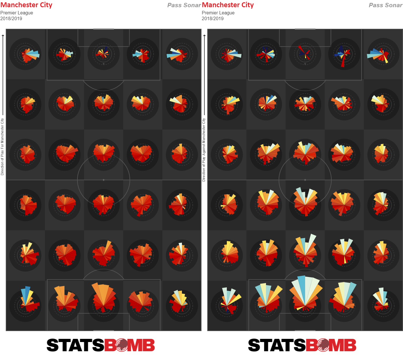
And then these are sonars for Man City’s passes (again) but the second image is passes from Manchester City’s opponents.
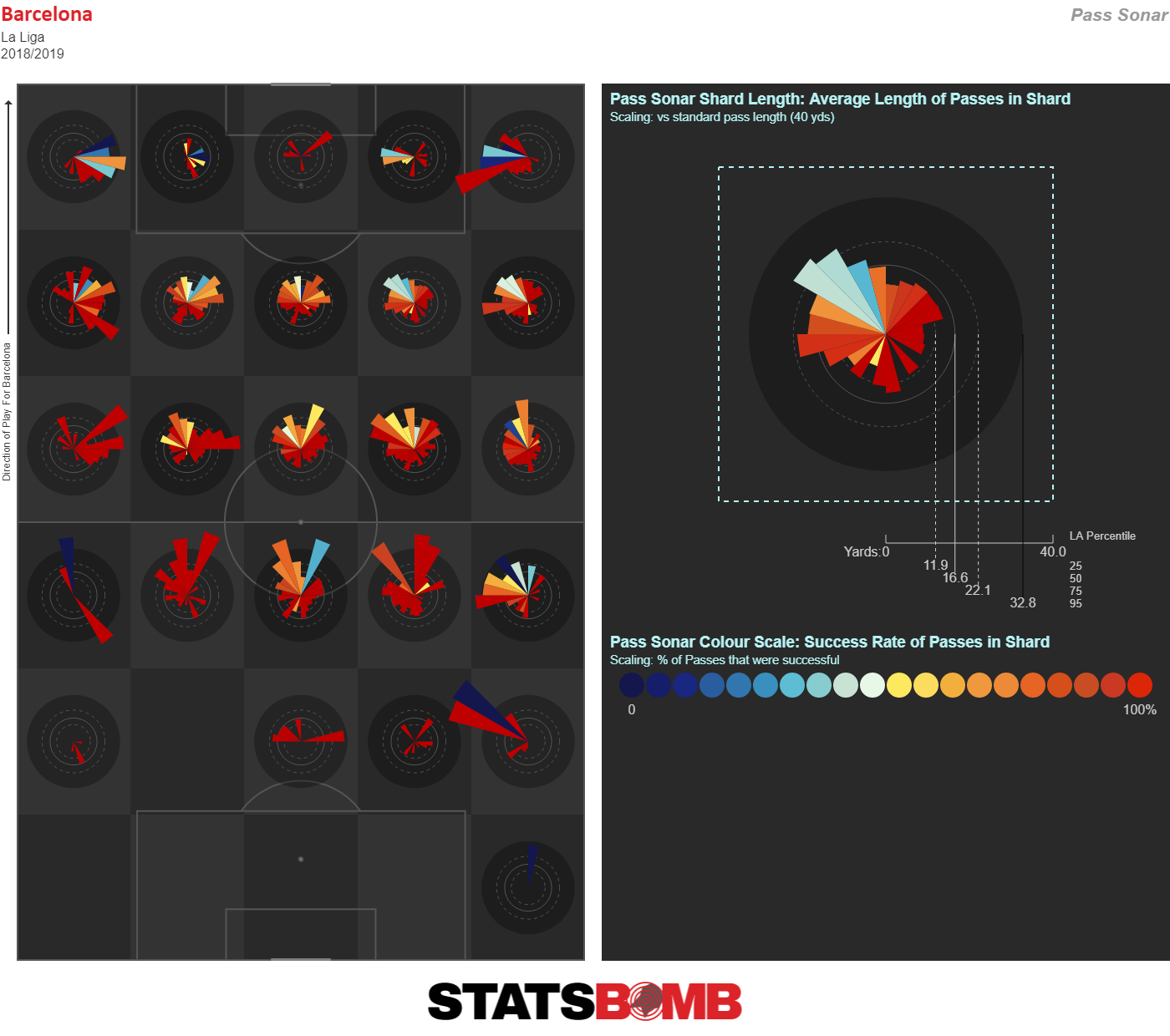
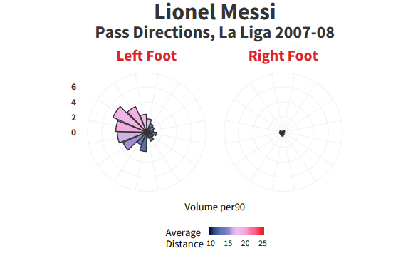
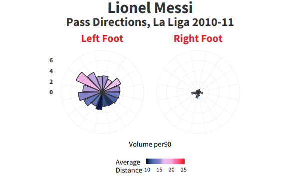
You can also do player seasonal sonars like this one for Lionel Messi, Barcelona 2018-19. We also can go from abstraction (with the sonars) to explicit data with a simple click of the button.
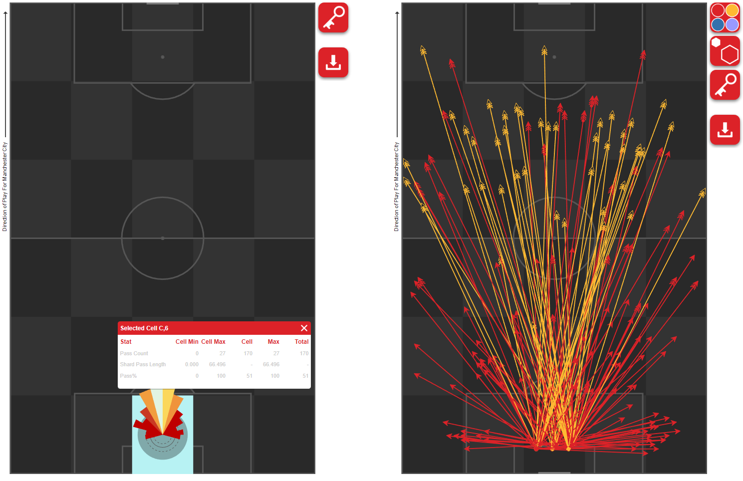
My tweet of Ederson’s goalkicks compared to PSG’s went viral last week while I was playing around with the new tool. Then came a flood of requests for other comparisons. Here are Ederson, Allison, and Manuel Neuer’s goalkick maps from last season.
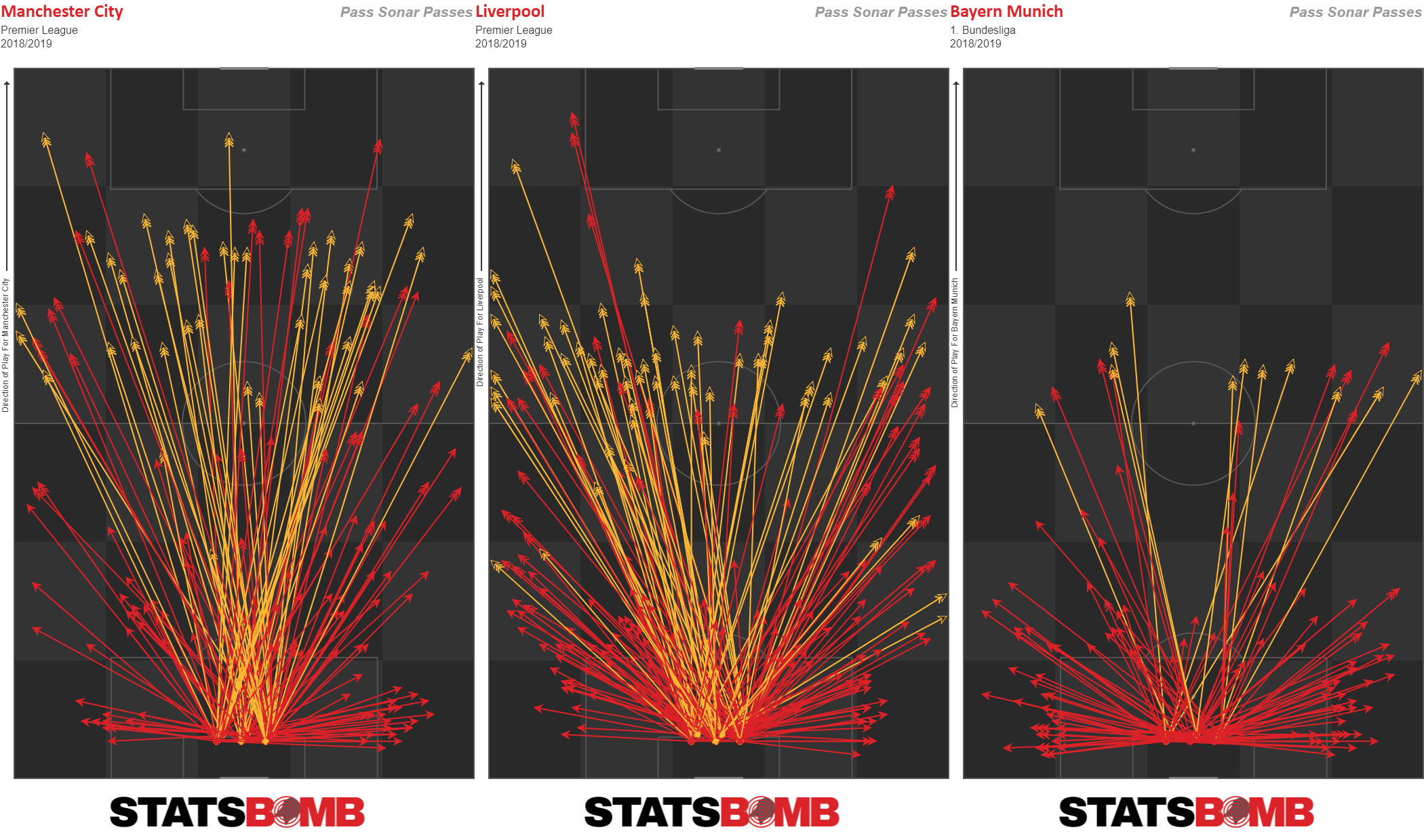
Even when compared to other famous goalkeepers, Ederson - and how Manchester City use him - really is something else.
And the new Tactics tool can do this type of vis for any team or player, with dozens of potential filters added on. And this is just the sonars section, which is probably the smallest and least powerful part of the new release.
*deep breath*
This is already long, but I’ll give you just one more teaser of what's coming next week before I wrap up.
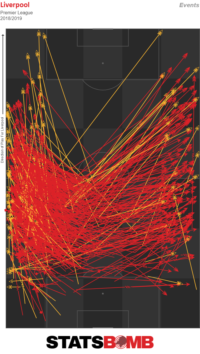
Let’s say you wanted to look at Virgil van Dijk and those raking crossfield balls he plays for Liverpool. First you load up VVD’s profile. Then you click passes, and you select starting origin of his own half and ending origin of the wide zones on the pitch.
Voila!
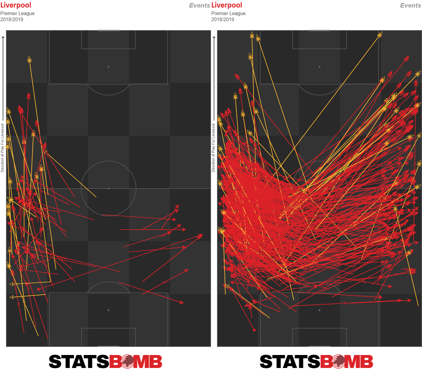
Okay, now just show me the ones to Salah and Mane.
And finally… just show me the passes he made with his left foot compared to those made with VVD's right.
IQ Tactics will change how coaches and analysts work with data from a tactical and opposition scouting perspective. Our goal is to take this information and make it as simple and intuitive as possible to deliver insight that helps our customers win games. I helped design the thing and I still can’t quite wrap my head around all of the cool stuff it can do. It is genuinely that exciting.
Anyway, it goes into Beta release on the StatsBomb IQ platform next week for our customers. If you are interested in having a demo of the new toys AHEM tools, ping sales@statsbomb.com to get started.
--Ted Knutson
CEO, StatsBomb
ted@statsbomb.com
PostScript: If you find yourself wondering what can be done with IQ Tactics and the Messi. Data Biography, you are in good company.
