By Marek Kwiatkowski
Go to Squawka or StatsZone and find the passing graphic for Mikel Arteta's last performance. Do the same for Andrea Pirlo. Both are deep-lying playmakers, yet the graphics are different: more long diagonals from Pirlo, more ground covered laterally by Arteta, and there is likely a number of subtler differences, some of which you don't notice right away.
This is hardly news, of course; Arteta and Pirlo are high-profile players and their playing styles are scrutinised by fans and pundits. Everyone knows they're different. But what can you say about, for example, a young Dutch deep-lying playmaker whom you have never seen play? Is he more like Pirlo, or more like Arteta or maybe unlike either? Maybe he's unlike any other player? You find his passing chart, and you can't quite tell.
Annoyingly, the summary statistics don't help either: all three players have completed a stellar number and percentage of passes, forward passes, key passes, final third passes...
My point is that there is a wealth of information in the detailed passing data, especially geometrical information that is currently unused, at least outside of the impenetrable world of clubs' performance analysis departments. Leaving aside pesky factors like technique, positioning of the opponents, the run the target player etc., a pass is pure geometry: the starting point, the angle and the length.
In this article I attempt to use this information to compare passing patterns of Europe's top central midfielders. The data was provided by Opta, and comprises of every pass made in 2012/13 by the 137 central midfielders from the top division in England, Spain, Italy and Germany who played in more than 20 games and completed more than 1000 passes in total.
ON-FIELD POSITION
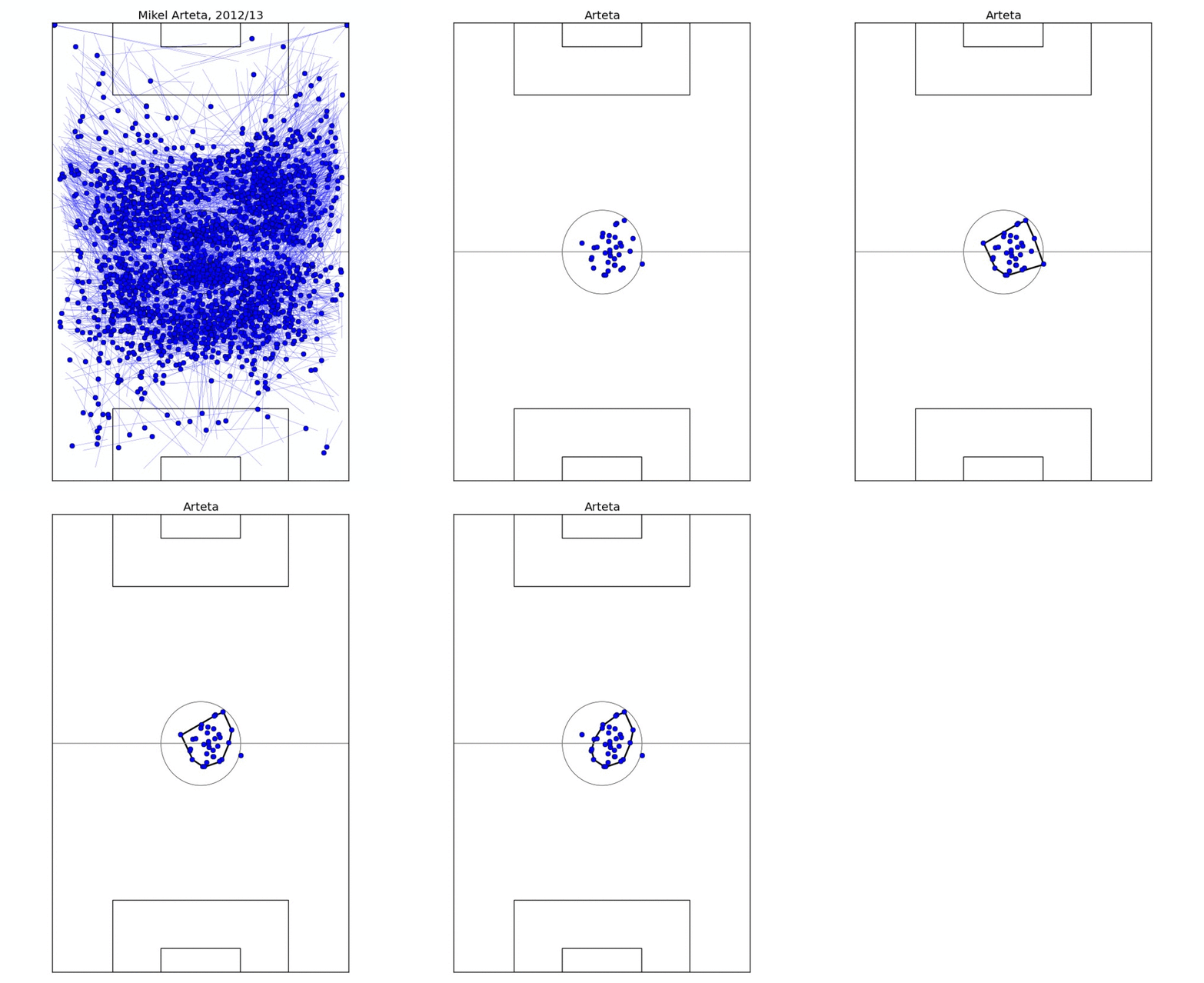
The first comparison looks simply at where the different players play the passes from. The obvious way to look at it would be to compute the average initial coordinates of a pass, but that's too reductive: it ignores the fact that players may play slightly different tactical roles and occupy different zones of the pitch in different games. So instead I take the average pass position for every game. This results in 20-40 points, depending on how many games the player took part in, and nicely delimits the zone the player typically occupies, especially after outliers are removed.
This process is illustrated on Figure 1, where I determine the on-field "zone" of Mikel Arteta. For two different players, I take the ratio of the overlap of their zones to their sum as the measure of similarity. In fact, for technical reasons, measuring *dissimilarity* is better, so I take one minus the ratio above. In this formulation, if two players occupy exactly the same zone, their dissimilarity would be 0; if their zones are disjoint, the dissimilarity is 1.
ANGLE, LENGTH AND VOLUME OF PASSES
To compare passing lengths and angles we'll do something crazy, and pretend that all passes are played from the kick-off spot. It's a little less crazy than it appears though, because we can now control for the position the passes are played from. So if due to this simplification, the angle/volume model tries to tell us that Cattermole and Silva are similar because they both play a lot of short sideways passes, the position model will warn us this is probably not the case.
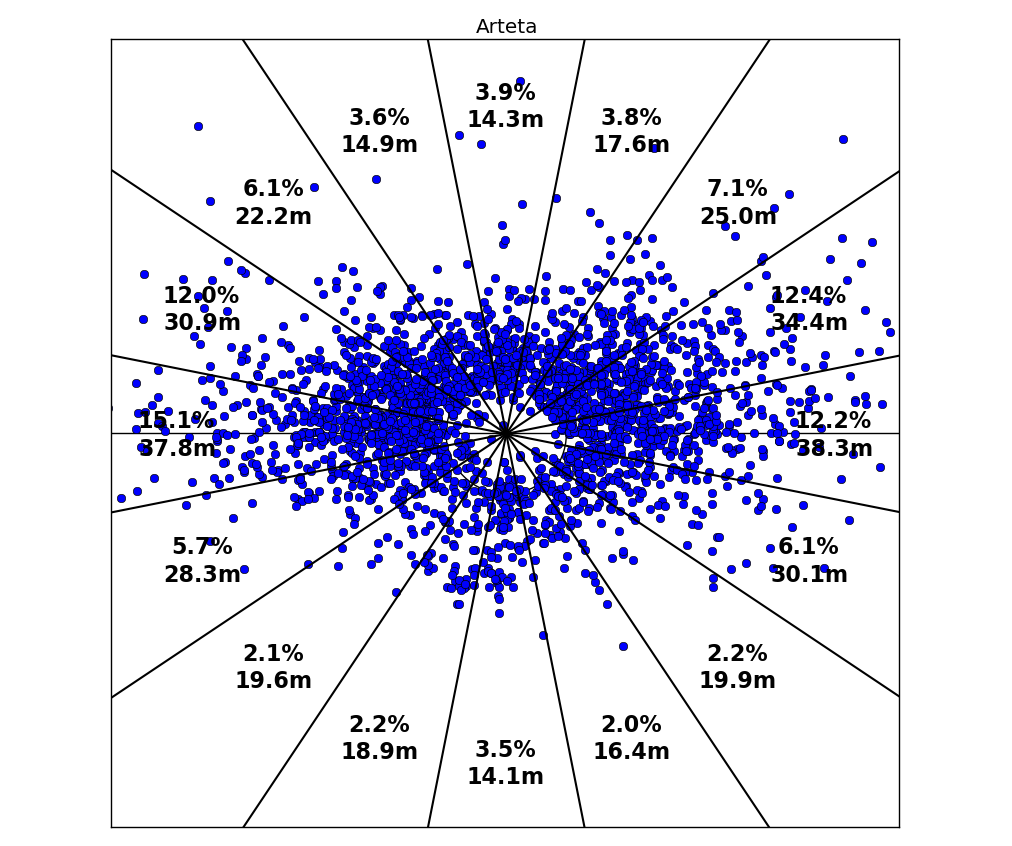
Figure 2 shows how we go about quantifying the length and number of passes that a player plays in different directions. The 360 degree circle is split into 16 slices, and we record the percentage of passes in each slice as well as the average length. In this way, the data on length and direction of 1000+ passes is reduced to 16 numbers each, and to compare two players we now only have to compare two pairs of 16-long vectors. This is easily done with standard math, by taking the sum of absolute differences between the 16 matching coordinates.
PUTTING THE TWO TOGETHER
For any two players in the dataset we are now able to quantify their dissimilarity in three respects: the typical position they take up on the field of play, the directions in which they pass the ball, and the average pass length in each direction. In other words, for each pair of players we have three numbers, each number quantifying the dissimilarity in a different aspect of their passing game. Visualising all this information in one go is hopeless, so I will instead focus on individual players.
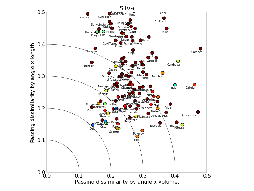
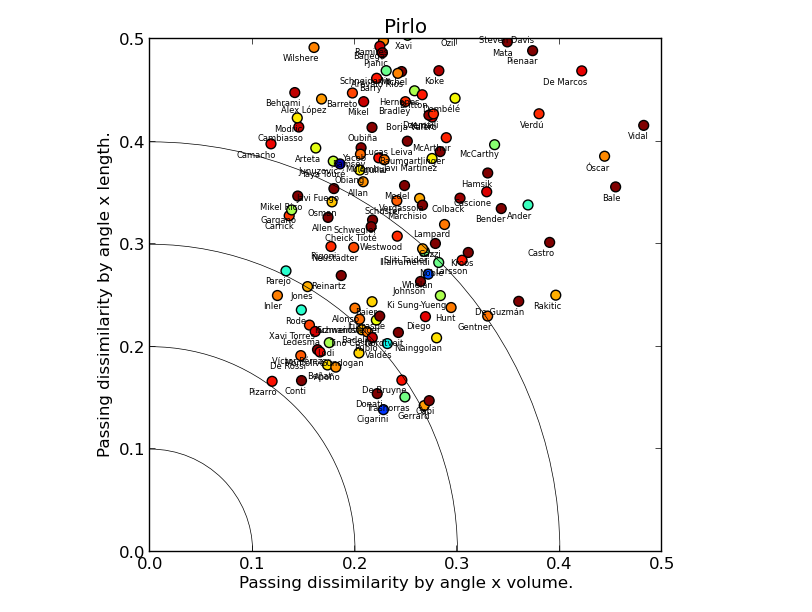
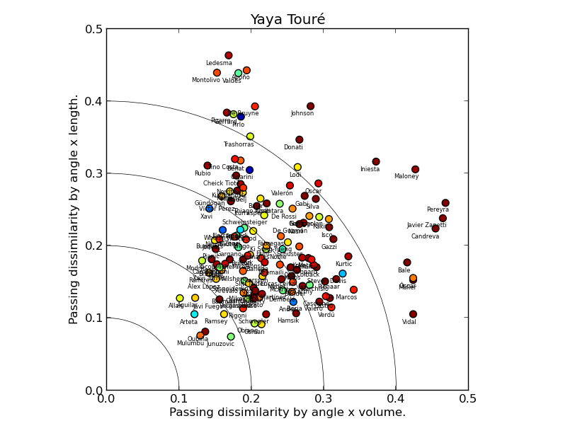
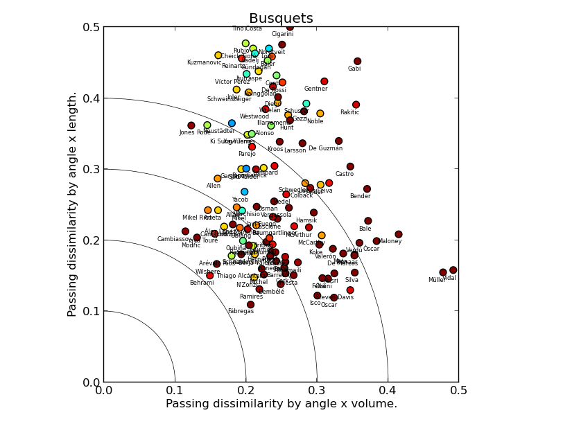
Each of the following plots compares one chosen player to all the others in the dataset. The volume and length dissimilarities are plotted on the two axes, so the closer the player is to the origin (0,0) point, the more similar to the focus player he is according to the angle & length model. The position dissimilarity is color-coded: the colder the colour, the more similar the player's position to that of the focus one: blue means very similar, brown and red means very dissimilar.
CASE STUDY 1: DAVID SILVA
(Click for a larger version)
David Silva's plot suggests the model is sane: it picks Mesut Özil as the most similar player, with a trio of creative midfielders: Nasri, Oscar and Mata not far behind. Steven N'Zonzi appears close to the origin point, but his marker is brown red, which means that he differs from Silva a lot by position. Marouane Fellaini is an interesting outlier, quite similar in all three metrics (the dataset covers 2012/13 when he played in an advanced position for Everton), suggesting that the model would benefit from an extension taking into account pass completion rate, or maybe just the number of passes.
CASE STUDY 2: ANDREA PIRLO
There are a couple of things we can quickly read off Andrea Pirlo's chart. First, despite a fair number of registas in the dataset, all markers are far from the origin point, meaning there are few players similar to him. The dissimilarity by length is higher on average than by volume, reflecting Pirlo's penchant for hitting long balls. Second, Luca Cigarini is clearly the most similar player, with David Pizarro, Steven Gerrard and Roberto Trashorras not far behind (albeit the two show low similarity-by-position to Pirlo), which fits nicely with Ted Knutson's scouting articles here on StatsBomb.
CASE STUDY 3: SERGIO BUSQUETS AND YAYA TOURE
Sergio Busquets and Yaya Touré are rightly seen as unique players. What does our model have to say about that? Let's look at Touré's chart first. In fact, we find a lot of players close to the origin point, and with cold-coloured markers, i.e. similar to Yaya in all respects. This doesn't mean Touré isn't unique, just that what sets him apart from other players is not his passing. The fact that Mikel Arteta is overall the most similar player to Touré according to our model rams the point home.
Busquets’ chart tells a different story: the players similar to him in the length & volume model play in different positions, as indicated by the red/brown cloud closest to the origin point. In contrast, the players who occupy similar on-field position to Busquets pass the ball very differently: the blue/green cloud is far from the origin. Sergio Busquets is indeed unique and it is largely his passing that makes him so.
LIMITATIONS AND POSSIBLE IMPROVEMENTS
The passing data is rich, but of course oblivious to many facets of central midfield play, so many that I won't bother enumerating them. So the model I presented here is not a comprehensive player comparison algorithm, and even in its limited domain of application it has a few wrinkles.
The biggest possible improvement, and my next step if there is interest, would be to work with passing data directly in 4 dimensions. Because it takes four coordinates to specify a pass (two for origin point, two for endpoint), passes are inherently 4-dimensional objects. Because 4-dimensional geometry comes with considerable challenges to computation and intuition, I have attempted to reduce it to 2 dimensions here: this is why we looked at the starting point first, and at directions and destination later.
I hope you've enjoyed the read. Comments are welcome here on StatsBomb. If you would like to see the comparison chart for your favourite central midfielder, ask @statlurker on Twitter.
Marek Kwiatkowski (@statlurker) is a scientist living and working in Switzerland.
Data provided by Opta.
