There's a distinct trade-off between comparable structure and ‘granularity’ or ‘level of detail’ of football data. Imagine this: you have a player who has the ability to pick a certain type of between-lines pass that greatly increases your team’s chance of scoring in that play. With passing data, we could try and identify how this pass is represented in the data and then use the data to identify other players in the world that are also good at making this kind of pass.
To do this, we will need to break the data down in a detailed way, and differentiate this type of pass from other vertical passes that perhaps aren’t as effective. We might want to consider where in the pitch this type of pass comes from or where it finishes, what action it is preceded by, where the defenders are, what happens after the pass is made, etc.; all of this in the hope that we can clearly identify the type of pass we’re looking for and tell it apart from other passes.
However, what happens when we go too far and use too much detail? It is unlikely that each time our player performs this type of pass he does it in exactly the same way, in the same coordinates of the pitch and in the same conditions. If we start using too much detail, we might actually start classifying instances of this type of pass as different when in reality they correspond to the same sought-after ‘type’. Once this happens we are no longer capable of identifying the “type of pass” we were initially looking for, and now have hundreds of different passes that at this level of detail are all different from each other. We can no longer identify players who can play this pass because this “type” was obliterated in the detail.
I actually began thinking about this issue when reading Dustin Ward’s piece on clustering different types of passes. He decides to take 100 clusters or types of passes and see how often each team or player completes each of those types of passes. This is a good example of the trade-off mentioned above. 100 seems like a good number, it certainly reveals more info about a team than if we considered just 1 (which would basically be like looking at overall Pass Success percentages) or 2 types/clusters of passes.
Choosing 100 is also better than choosing 100,000. If we chose 100,000, then each player or team would perform maximum 1 instance in a season of highly detailed, highly differentiated types of passes. We wouldn’t be able to use this information to compare teams or players in any way. But is choosing 100 better than choosing 120? Or than choosing 80? How do we know when this trade-off is striking the right balance?
The key is having something against which to measure ‘balance’, something we want to optimise. In this entry I’ll show you an example of how this something could be ‘repeatability’:
For a while I’ve been wanting to push the Passing Motifs methodology a bit further and include some spatial information about the passes to see what else it can tell us about teams’ passing networks. Below is an example of two very different instances of ABAC.
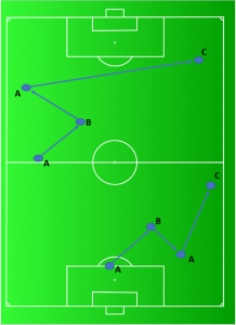
The question I wanted to answer was this: will we gain any additional valuable information about teams by differentiating different ‘types’ of motifs according to their angles, distances and coordinates on the pitch? Crucially, I also wanted to know where the right balance would be when doing this differentiation in light of our structure-detail trade-off. T
here are two ways of looking at spatial variables associated to motifs that I felt could be revealing:
x-y Coordinates of Passes: In Opta’s data files, each pass has a ‘Start x-y’ Coordinate and an ‘End x-y’ Coordinate, meaning each pass has four variables in terms of coordinates. A 3-pass long motif would therefore have a set of 12 variables representing where its passes began and ended.
Angles and Lengths: Another way of looking at it is by the ‘angles’ and ‘lengths’ of passes in a motif. The figure below illustrates how these are found.
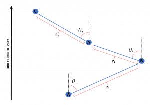
With this idea we would have six variables associated with a motif: the angle of each of the 3 passes of the motif and the length of each of the 3 passes as well.
NOTE: The thing I like about this ‘angles+lengths’ idea is that it doesn’t “care” where in the pitch a motif happened, only its geometric structure. I like this because if it has ‘structure’ or ‘insight’ into teams’ styles it will not be as heavily determined by whether the team dominates the opposition or not: if we only look at pitch coordinates of motifs then top teams like Chelsea or Manchester City will perform all of their motifs high up the pitch. Therefore, the method would be biased towards saying they perform the same ‘types’ of motifs, namely “high up the pitch” motifs. I’m not saying that this isn’t meaningful, but it is information we all know by simply looking at the league table and knowing these teams play deeper into their opposition’s half. However, if we discover structure that is independent of the league table from the geometric shape of motifs, it makes it interesting in the sense that perhaps it wasn’t correlated with "obvious" aspects.
Whichever of the two ideas we go for, there is going to be a set of variables associated to each motif, which we can then use k-means clustering to classify into a certain number of different types of motifs. Our intuition from the trade-off tells us that there is an intermediate number of categories that has the best representation of “style”. The problem is that to use a k-means clustering algorithm, we need to manually tell the algorithm how many different categories we want before knowing this optimum number.
Consider this: for each choice of number of categories, once we have determined the number of categories and classified the different motifs into the category they correspond to, we can use the best practice we know from the original passing motif methodology and look at what percentage of each motif category (in the ABAC-sense) corresponds to which ‘type’ (in a either a x-y coordinate or angles+length sense). So as an example, if we had chosen to have 3 different types of motifs, then for each team we would have this set of numbers: what percentage of the teams ABAB motifs are type 1, what percentage of the ABABs are type 2, what percentage of the ABABs are type 3, what percentage of the teams ABAC motifs are type 1, what percentage of the ABACs are type 2, etc. What we’ll have is a vector representing each team.
Now suppose we randomly divide each team’s motifs into two different sets, so now we have Arsenal’s A motifs and Arsenal’s B motifs as if we were artificially considering each as the motifs of different teams. If choosing this number of categories reveals teams’ structure or style, then the style attributed to Arsenal’s A vector should be very similar to the style attributed to Arsenal’s B vector. The more underlying structure we’re capturing, the more this effect should be obvious. If on the other hand we’ve gone too far and now the extreme detail is overshooting the underlying structure we want to discover, then Arsenal’s A vector will not necessarily be similar to Arsenal’s B vector because the extreme detail is damaging the comparability of styles. This is what I mean by “repeatability”.
The following graph reveals how “repeatable” each choice of number of categories is for both the ‘x-y coordinates’ idea and the ‘angles+lengths’ idea:
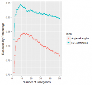
The methodology is as follows: for each number from 2 to 50, we create that number of motif categories using k-means clustering and assign each motif to a category. We then divide randomly each team’s motifs into two different sets to have a vector A and vector B for each team. Then we check how “repeatable” the methodology by checking on average how close teams’ A vector is to their B vector in comparison to the rest of vectors representing other teams; and this process (since it involves both the randomness of a k-means algorithm and the division of a teams motifs into two sets) is repeated a hundred times for each number.
The graph shows as a percentage the average ‘relative closeness’ for each of the hundred trials as follows: I took each teams’ two vectors and determined on a scale of 1 to 39 how close a team’s A vector was to his B vector. Since there are 20 teams and I divided each one into two vectors, there will be a total of 40 vectors representing 'styles'. Considering as a focal point a team’s A vector, its B vector could either be the closest of the other 39 vectors (1), the second closest (2), all the way up to the farthest away (39). I did this for every team and averaged these numbers, to finally compute the percentage that the outcome was of 39 (this was done using passing data for the 2015-16 Premier League season).
Right off the bat we find evidence of the balance we’ve been speaking of. When we start increasing the number of categories we start obtaining more repeatability, meaning we can more closely recognise two vectors as being the A and B vectors of the same team because they are similar (i.e. close) to each other. I like to interpret this as uncovering more underlying information that uniquely identifies a team’s passing network style: no matter how we randomly divide a team’s motifs into two sets, we roughly still know which sets correspond to the same team because we know the “style”.
We then reach an optimum number of categories for which this repeatability is optimised: for the ‘x-y coordinates’ idea it’s at 9 and for the ‘angles+lengths’ idea it’s at 13. After this, the repeatability starts to decrease meaning that a team’s A and B vectors start to not be as similar to each other because they’re made up of highly detailed motifs that are overshooting the underlying “style” of what it actually is that a team inherently does with its passing networks.
We have answered our initial question: The original passing motif methodology (found in this entry) in which we took the 5 different motifs and compared teams according to how much they relatively used each motif had about 83.3% repeatability as per our methodology. By breaking motifs down into an optimum number of categories for the ‘x-y coordinates’ and ‘angles+lengths’ ideas (9 and 13 respectively), we were able to increase our repeatability to 94.3% and 84.4% respectively (evidently the 'x,y Coordinates' has better repeatability than 'Angles+Lengths', but as we said before any structure from a purely geometrical classification is interesting).
Below is a set of boxplots illustrating what the 9 categories represent in terms of the different 'x-y' coordinates:
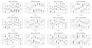
As an illustration, if you look at categories 4 and 8, they both begin a bit past the halfway line really close to the left touchline, but while in Category 4 motifs the three-pass sequence ends a bit further up but still on the left hand touchline, the Category 8 motifs made their way across the pitch to finish closer to the right hand touchline.
The 94.3% repeatability of the 'x-y coordinates 9 category' vectorisation is incredibly high. In fact, if we remove Sunderland and West Bromwich which for some reason only have 80.2% and 83.5% repeatability respectively, the other teams have an average repeatability of 95.7%!
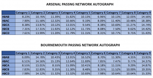
These results mean that we’ve managed to pin down an underlying structure in teams’ passing networks that allow us to identify unique team styles (lets call it "Passing Network Autographs") with a high degree of confidence. We’re at the point where if we’re given a set of motifs we could have a robust educated guess at which team they correspond to and most likely be right (except perhaps if they belong to West Brom or Sunderland for some reason). As an example, below is a comparison of Arsenal's autograph versus Bournemouth's (the team whose 'autograph' most differs from Arsenal's):
Perhaps some readers might be unimpressed with this rather theoretical and un-applied result, but although I admit that in its raw form this seems a bit unmanageable, I would advise them to keep an open mind and think of the potential. For example, having such a reliable ‘passing network autograph’ for teams, we can look through players from outside the Premier League and find those whose current passing network best fits within a team’s autograph.
We could also use our measure of team style to try and predict which styles are more effective against each other, or which defenses are the best at interrupting the attacking flow through a team’s passing network. These possibilities probably sound more appealing to most readers, but in order to do them in a meaningful way they must be underpinned by theoretical confidence that we are indeed identifying team styles. I will try and follow up this theoretical entry with a more applied one exploring some of these possibilities later this month.
I want to finish this entry off by highlighting the important potential of generalisation these ideas have. I feel they’ve helped me establish best practice when it comes to breaking passing motifs into different categories according to their spatial properties (and by best practice I mean knowing how many categories I should break it up into); but the method can also be used to determine best practice in other ideas currently being explored by football analysts.
For example, during my Opta Forum Presentation’s Q&A, Marek Kwiatkowski asked whether the passing motif methodology could be generalised to motifs of more than 3 passes. The answer is that it can, but we run the risk of going too far and start overshooting the structure that the methodology helped us identify as team and player passing style: for 3-pass long motifs we had 5 motif types, while only going up to 5 or 6-pass long motifs we’re already at 52 and 203 types respectively with wacky things like ABCADBA. The ideas presented here can help us answer the question whether it’s worth looking at longer motifs (another entry soon perhaps?).
It can also help Dustin Ward to establish exactly how many types of passes he should consider. In general, it helps us to establish standardised best practice that the whole of football analytics will benefit from and that its currently distinctly lacking.
Echoing Marek’s piece on the state of analytics:
“Established scientific disciplines rely on abstract concepts to organise their discoveries and provide a language in which conjectures can be stated, arguments conducted and findings related to each other. We lack this kind of language for football analytics”.
We need common-ground theory in which our public work can be related and compared, and it’s worth truly understood. The lack of it is holding back all of us who have an active interest in the field really taking off. I hope this approach to improve our understanding of our ideas and take steps towards enhancing them and establishing best practice can inspire other public (and even private) analysts to attempt similar things in their work and establish bridges through which we can compare and complement our work. Valuable applications will inevitably flow from robust, interconnected theory.
MATHEMATICAL FOOT-NOTE:
Comparing the distance between A and B vectors as their position from 1 to 39 on the closest-farthest away scale may seem a bit unorthodox and one might consider simply using the z-score of the distance between teams’ A and B vectors in the context of all the distances between all 40 vectors. However, the reason I don’t do this is that for each different choice of the number of categories, the dimension in which these vectors are is different, and on a personal mathematical note I have deep mistrust in comparing distances between things that are in different dimensions.
P.S.: I want to give a brief mention to Ben Torvaney who gave me a small but meaningful contribution which I feel greatly enhanced the results of this entry.
