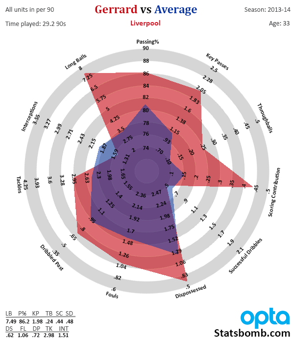
Last week I talked about the revamped radar for attacking midfielders and forwards. Today I’m going to introduce the new central and defensive midfielder template and talk about some things I’ve learned from doing the visualizations. Let’s start with a real-world example of old vs new. This is what Steven Gerrard looked like on the old radar. 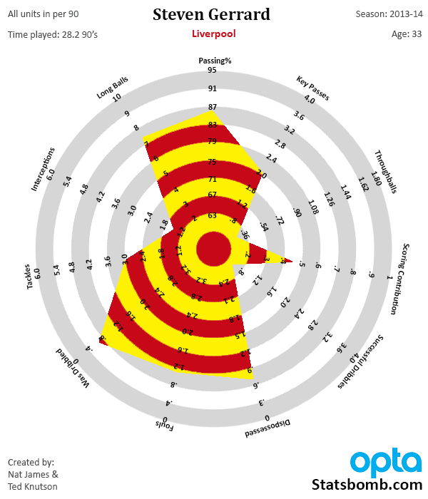 And this is what he looks like on the new version.
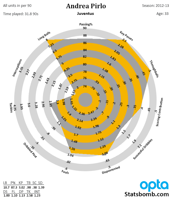
 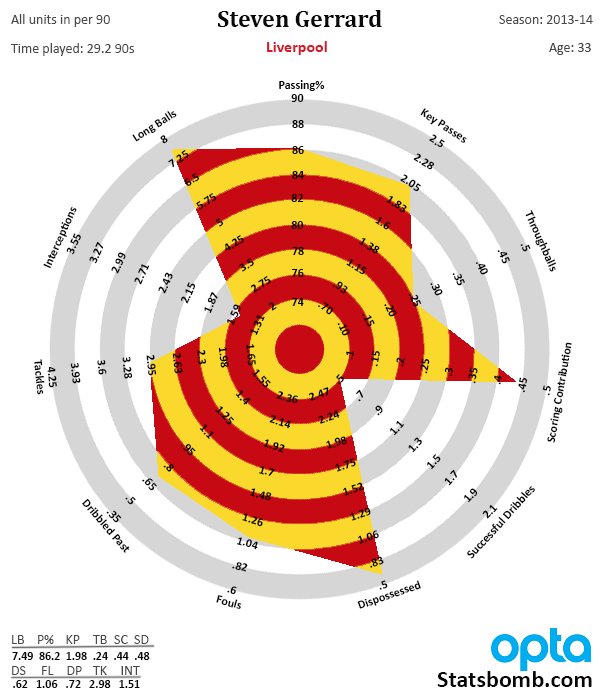 So what changed? First of all, any player hitting a boundary on the outside of the radar has produced a season ranking in the top 5% of all players for that stat at that position, based on production of all players in the big 5 European leagues from 2009-2014 on a per90 basis. This is very, very good. Like, saaaay, Andrea Pirlo.
  From the sublime to the not so good, we have the other side of this change. Any player hitting the dot in the center of the circle produced a season that ranks in the bottom 5% in that category for that season. All of that space in the circle itself is the two standard deviations from the mean. This should make it a bit more statistically rigorous and meaningful, and it also makes average look a lot less awful than it did on the old versions. Speaking of average, this is what statistical production looks like for your average “midfielder”.
 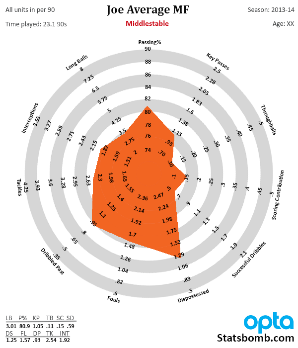 I found this slightly surprising, as your average midfielder looks like a mediocre DM. What that tells us is that most midfielders across the big leagues perform defensive duties and act as recyclers, but don’t have a big impact on the offensive end. That leaves the bulk of the scoring work to be done by forwards and attacking mids. Now this is what a player who scored in the 75th percentile in all stats would look like.
 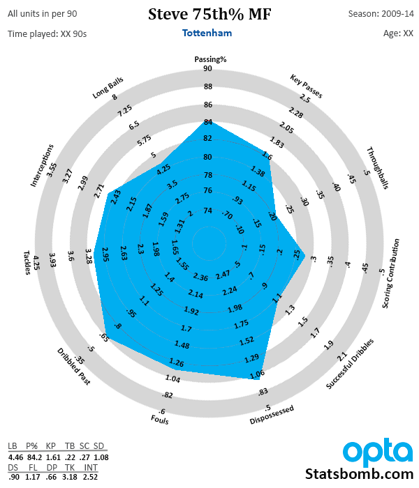 We’re getting quite a bit more offensively here, as key passes are over 1.6 per 90, scoring contribution is over a goal or assist every 4 matches, and you have some dribbling as well. However, it still doesn’t push out to the halfway point in the circles. What this means is that top 25% of all midfielders contribute a ton on offense, and drag the whole population toward the boundary with them. Translation: There aren’t nearly as many midfielders who have high contributions on the offensive end, and thus they are more considerably more valuable than you might expect. A player that has good contributions in both attack and defense and plays midfield? Enormously valuable. Meanwhile, good attacking mids are actually fairly easy to pick out and not that uncommon. (A reason why I thought buying Juan Mata for £37M in January was insane.) Keep this in mind when you see people making midfielder recommendations and attaching prices to them this summer. True midfielders, including deep-lying playmakers, that add to the attack should bring big money on the transfer market. Other things I learned while revamping this include.
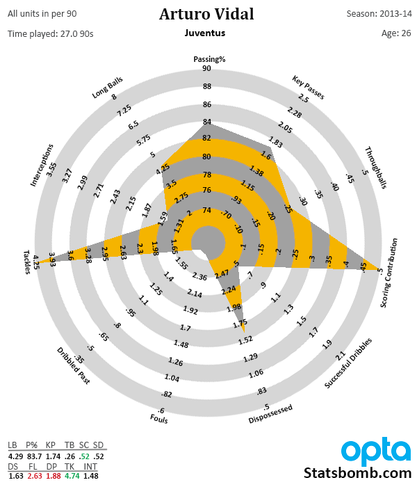
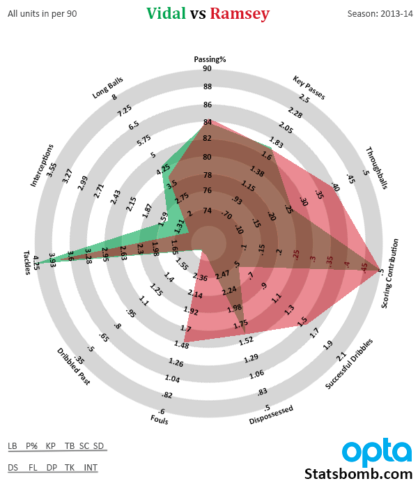
- Tackles and dribbled past are likely inversely correlated. This creates what I call the sting ray effect (you can see it in the Ramsey and Vidal radars below), where by making a lot of tackles, you also put yourself in position where you probably get dribbled past a bunch in the process.Follow-up question because of this: Are high numbers of tackles and fouls also correlated? I don’t know yet. Additional follow-up question: Do extreme performances in tackles make it impossible to have a high number of interceptions as well? Is that true for DMs or only box-to-box players?
- This one goes more with the Forward radar, but dribbles and dispossessions are also probably inversely correlated, especially at the boundaries. The more you dribble, even successfully, the more likely you are to also be dispossessed compared to the general population. There’s a usage rate issue that deserves looking at, but there’s tons more stuff to explore here.
If you want to know more about what other changes I have put in place, scroll to the bottom for a change log. If you want to see a bunch of big-name player radars and comparisons, stay right here. Radar Love 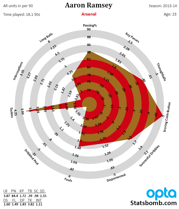
 CM Radar Change Log
- Redid all axes with 5%/95% cutoffs
- Added Age: XX for the season
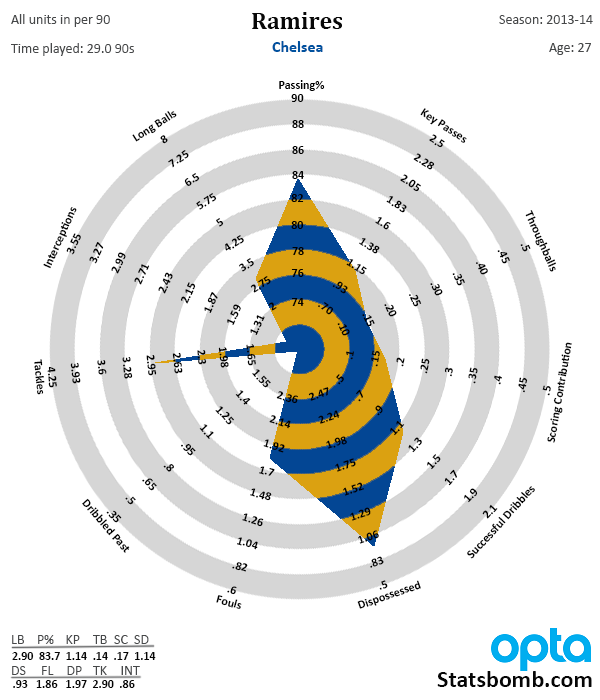
- Added gridlines in the bottom right corner so that you can look up the actual stats produced for that season. I did this because you lose informational acuity for Top 5/Bot5% seasons and I wanted a way to track it. When I have time, I will also highlight top 5 in green and bot 5 in red. If I forget to change the stats in that section, they will probably be Aaron Ramsey’s from 13-14, since he’s the first plot I did on the new template.
- Turned all text on the bottom half of the radar right side up.
Question: Why didn’t you make each ring represent a percentage of the distribution? Essentially, why isn’t the average player a perfect circle at the 50% mark? Answer: Because I felt that doing so would make it less intuitive to read for non-stats people. Additionally, I discovered that by doing so, you lose the distribution point I made above regarding attacking stats and midfielders. To me, Question: How are these created? Answer: I grab the data from a MySQL database that has Opta stats, and then plot the radars and fill in additional information by hand in Photoshop. At some point I would like to get the creation of these automated, but my programming knowledge is not there yet and I really don’t want to decrease the quality of presentation. I’m sure there will be other iterations of these in the future, and I’m currently working on fullback radars as well. As with almost all graphical presentations of data, there are issues with these, but I feel like they are improving as we learn more about the stats and the sport itself. Baby steps.
