Back in January, I introduced player radar charts, which I felt provided an interesting way to view player statistics.
I received a ton of feedback on them, some of which was valid, and some of which just disagreed with design decisions I had made along the way. They were also wildly popular. There's just something about seeing player stats as a shape that makes an impression. This is especially true when comparing two or three players at once, and a number of people inside the football industry also said good things about them.
Those first designs underwent some minor modifications, those most important being that I split them into attacking midfielder/forward charts and then general midfield charts. After I broke them out and modified an axis placement or two, I moved on to other things while popping out a few new radars each week.
However, despite the fact that I stopped working on them, I knew they weren’t perfect (they likely never will be), but also that I would come back to them. One of the big requests I received was to know what the average player looked like. One of the small, but more bothersome design complaints was that I had included all of the potential player performances in the chart, and had not cut it down into percentiles or standard deviations or whatever.
Both of these were related to the same issue, which was that I hadn’t plotted the distributions of all the stats across the player population yet. The reason for this is that I wasn’t particularly happy with my position filter, and also that it would take more time than I had at that point. I wanted to find a way that had a high level of informational fidelity (meaning I didn’t want to produce percentiles), but which also put the radars on better footing with relation to academic rigor.
Cut to today, where I have greater familiarity with the data I’m working with and also a little bit better knowledge of Photoshop to rebuild the templates and you get this.
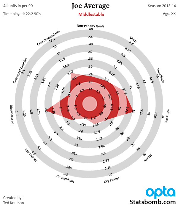
So this is the average attacking midfielder or forward (I’m calling him Joe) on the new template. This template has boundaries that cut off at the 5% and 95% marks of the player population for those positions. So basically the radar chart itself covers stats that are two standard deviations from the mean.
If a player is hitting the boundary on the outside of the chart, they have produced a season in the Top 5% of players for that stat. If a player has a stat hitting the center dot in the chart, they are producing in the bottom 5% of all players in that stat. Simples. (Okay, it is if you understand the princples. Probably.)
As you can see from Mr. Average above, the average player stands out a lot more than he would have in the old chart, and the data points hit around where you would expect them to, even if they aren’t perfectly symmetrical.
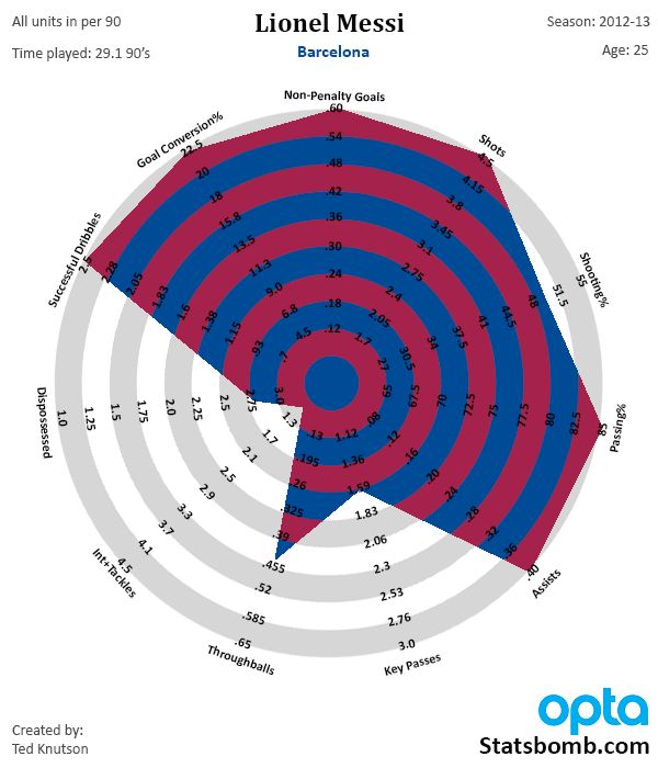
But what happens if we look at a player who is definitely NOT average on the new chart?
Great players now cover even more space than they did before. The tradeoff is that you lose the exact information of the season they produced (which I may start to include at the bottom in small tables at the bottom – I haven’t fully explored that option yet), but comparing players now becomes more sensible and it’s easy to just know that if a player hits a boundary, they are in the Top 5% instead of “this is the greatest single season ever in the database for that stat,” which is what it was before.
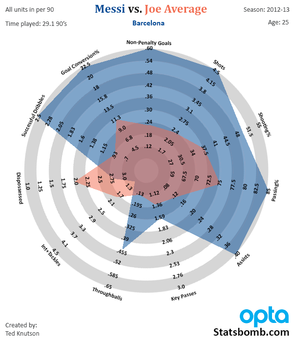
Going forward, I may make the Joe Average shape a very faint transparency layer in all single-player radars for comparison. This one is dialled up a bit, but here’s what Messi looks like when compared to an average forward or AM.
Anyway, the radars now look different and I’m hoping this format will be locked for at least a while going forward. I’ll also produce a new central midfield radar in the next couple of weeks and finish work on the fullback radar, all in the same vein.
If you like them, great. Please tell your friends, etc. If you hated them before because they weren’t properly statty enough, maybe you will like these more. And if you just hate them period, that’s okay too – not everything we do on the site is for you. Hopefully you like other stuff we produce here more.
Cheers, TK
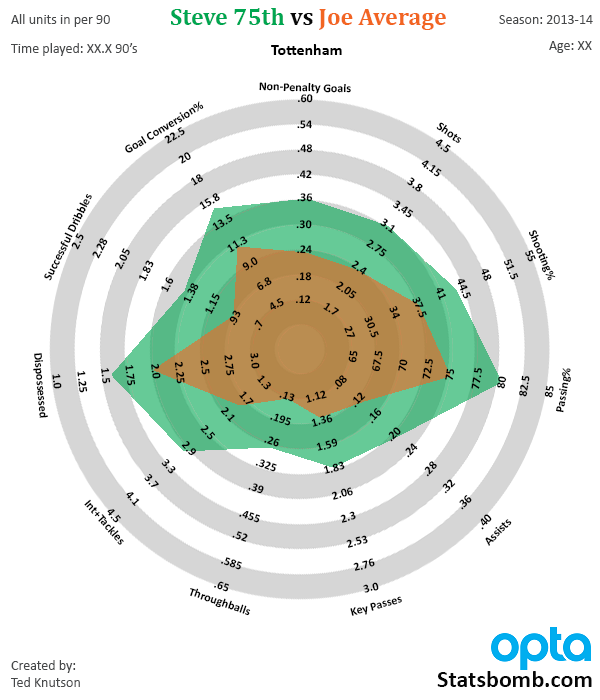
PostScript Devin Pleuler asked me to put together a comparison of Steve 75th Percentile vs Joe Average.


