This article has been co-written by Colin Trainor and Constantinos Chappas
Here at Statsbomb, we like to see how we can use data to assist us in gaining a better understanding of what actually happens on the football pitch. None of us are suggesting that data should replace watching games, but we are adamant that the intelligent use of data complements the watching of games.
It’s pretty nigh impossible for football fans to watch every game, even just in the Premier League. Data helps us get a picture of what happened in the games that we weren’t able to see live or watch a tape of.
Data, when used properly, also provides an objective view of what happened in a game. No longer do we need to rely solely on our recollection to see how a team or player performed throughout a game. Is there a danger that we only remember the good (or bad) things that a player did over the course of a game? If so, data can supplement our natural recall ability.
The Player Positional Tracker
Constantinos Chappas and I have realised that we can use the very detailed Opta event data to visualise the positions that the players took throughout the duration of the game. What follows is our first attempt at this visualisation and I have no doubt that improvements and tweaks will be made in the coming weeks as we begin to receive feedback.
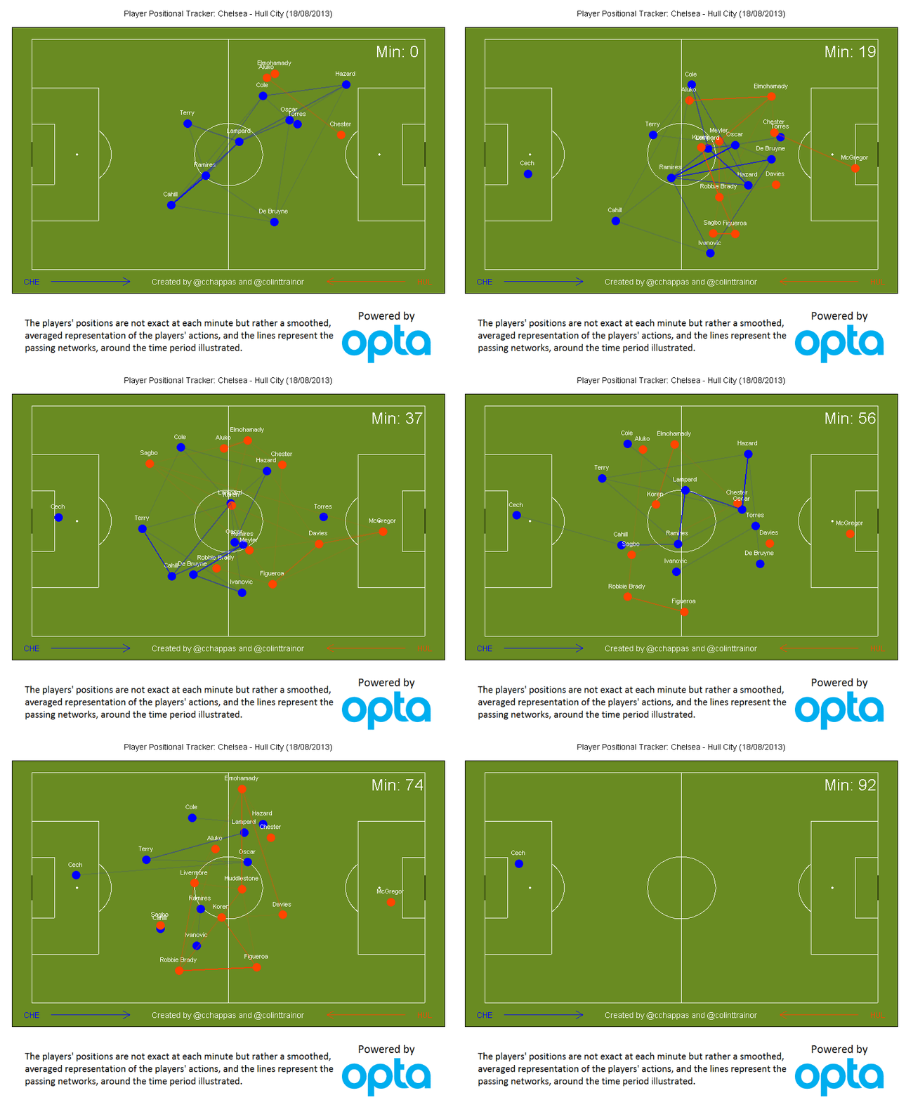
Our aim is to have a selection of these visualisations posted on Statsbomb each weekend. I think that readers will find them of interest and they should help in understanding how players’ roles might have changed during a game. As an introduction the following is the gif for a game from the opening weekend of last season’s Premier League, Chelsea defeated Hull 2-0.
Chelsea 2 v Hull 0 (18th August 2013)
(click on the image to open it in a larger screen)
The reason I chose this game for our introduction is that it captures how the shape of a game changed. Chelsea dominated the first half and raced into a 2-0 lead by half time, during that first half they took 18 shots to Hull’s 2. In the video we can see that Hull’s players were barely able to get out of their own half and all the passes were between Chelsea players.
However, the second half was a different story as it appeared that Mourinho instructed his team to shell. Both teams took just 5 shots in the second half as Chelsea retreated right back and were happy to invite pressure from Hull. As well as operating more defensively, another thing that is noticeable in the second half from the Chelsea defence is how narrow they went in the second half – Cole and Ivanovic both operated narrower in the second half than they did in the first.
Presumably this was a deliberate strategy. The viz also contains passing network for the timescale around the minutes shown on the clock, with thicker lines representing a higher volume of passes.
Technical Appendix
For anyone interested in the technical details of how the data points were created, Constantinos wrote the following brief guide:
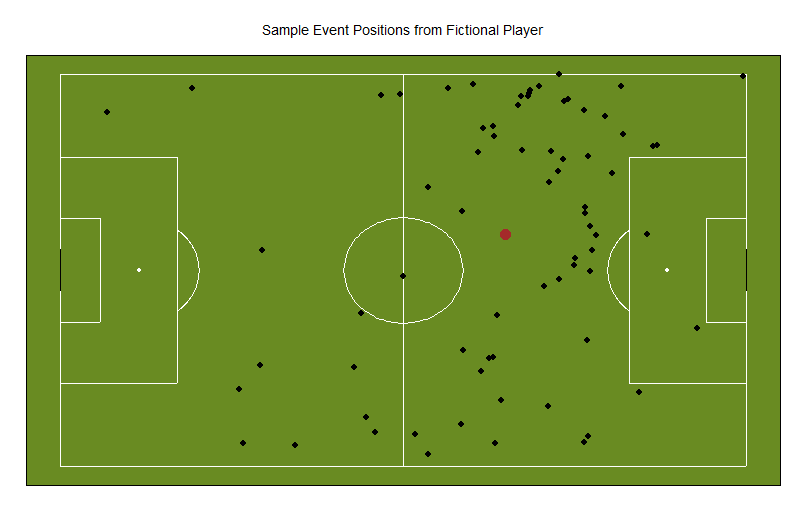
An often presented image is that of the average position of each player during a match. But that alone has its limitations. For example, here is the location of a fictional player’s successful actions during a match along with his average position shown in brown:
What is evidently a wide midfielder / winger operating in either side of the pitch is depicted by his average position as an attacking midfielder, playing down the middle, behind the striker(s). In truth this fictional winger must have switched sides sometime during the match.
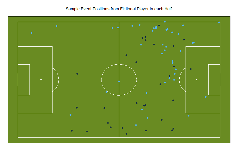
The problem described above can be solved by breaking a match in smaller time intervals and monitoring the average position of players during those time intervals. For example, here are the same player’s actions in either half:
During the first half the player was predominantly on one flank (dark blue) while in the second half, he was mostly operating in the opposite side (light blue). Of course, this can further be broken down in even smaller time intervals. However, one must bear in mind that the smaller the time interval, the fewer data points and therefore the location of the average position of these points may be erratic (i.e. jump around!)
To address this issue, we have taken this a step further. Instead of simply calculating average positions on the pitch, we have modelled these positions against time using what is known as local regression (http://en.wikipedia.org/wiki/Local_regression). This method can provide a smoothed, averaged representation of the position of a player’s actions around any chosen time in a match. Doing this for all players and plotting their position at any given time produces a “movie” which can help when examining team formations during a match. It should be noted that this tool is not designed to provide an actual representation of where each action took place but rather to capture each player’s general area of operation during a match.
In addition to this, we have included passing networks depicting the most popular combinations of players exchanging passes around the chosen time period. Thicker lines indicate a higher frequency of successful passes between those players.


