At the pub after the Opta Forum this year, there was what I can only describe now as “an incident.” I wasn’t aware of it at the time, but it was later related to me as “an analytics rap battle.” This sounds awesome! And obviously totally nerdy. I was absolutely fucking distraught to have missed it. Except… the “battle” occurred between myself and a member of staff at some other club. Wait. What?!? Now I obviously didn’t see it this way. From my perspective, I was having a very enjoyable conversation with someone whose work I really respect, and possibly drinking alcoholic beverages at the same time. However, at one point I kind of looked up and there were probably 10-15 people standing in a circle around us, watching us have said conversation. Internal monologue: “Huh… That’s weird.” *looks around* IM: "Did something happen behind me?" *looks the other way and sees more people staring from the other side* *shrugs* IM: "Fuck it. Now what were we arguing about? Set pieces? Whether Ramsey and Welbeck are terrible finishers?" You have to understand something – stats dorks don’t talk to each other. Like ever. To some extent, we aren’t allowed to do so if we work in a team. Everyone needs to keep whatever competitive edges they have managed to discover secret in order to keep their job. To another extent, even when they do talk, it’s rarely an equal conversation in that somebody almost always knows more than the other people involved, which creates a toxic environment where real conversations can't happen. It kinda sucks, but dream job in football, etc. Thus when I figured out I was going toe to toe with someone who knew at least as much as I do about the topic (applied football stats), it suddenly became rather fun. And apparently was entertaining for everyone else still hanging around as well. Cheers ya'll. Anyway, I relate this story not as an excuse to tell my favorite yo mama jokes, but because one of the many things argued that night is a good example of what you can use the MK Shot Maps to suss out. Example 1: Klopp vs. Tuchel Anyone who has read my work over the years knows I am a big fan of Jurgen Klopp, and his era at Borussia Dortmund is what made me a fan of the club. That said… I think Tuchel is probably better. The reason is that at this point, I am pretty sure that Tuchel can coach an elite attack and an aggressive press, while Klopp’s mastery might simply be the press and a lot of shot volume. Confused? That’s what the visualizations are for. This is Dortmund 14-15 under Klopp for the full season. It’s reasonably indicative of the general pattern under him for the seasons I have data. 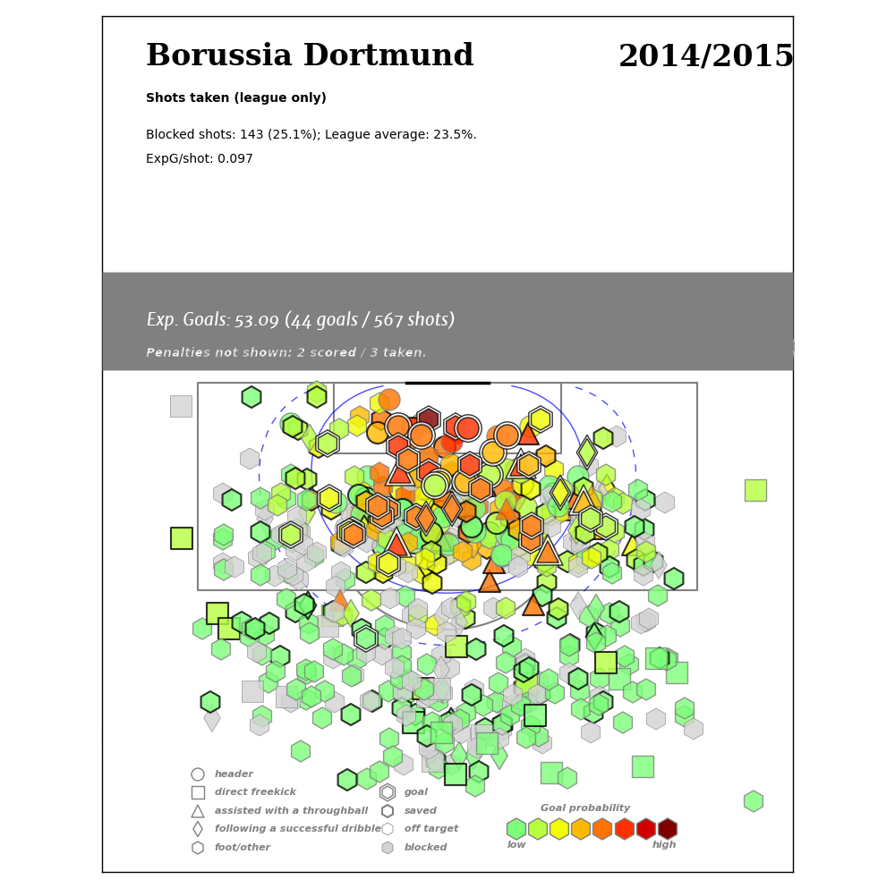 And this is Dortmund 15-16 under Tuchel (as of early February, anyway).
 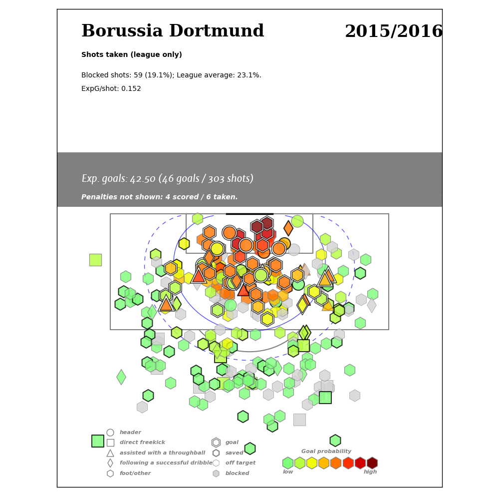 I stripped out some of the extra numbers to reduce the noise a bit. What do you notice? First of all, there are far fewer long range shots under Tuchel. A lot less. Like holy shit, where did all the green and grey shots go? You might ALSO notice that the average quality of Tuchel Dortmund’s chances are MUCH higher as a result. In fact, they are more than fifty percent higher (at least in this public xG model) with similar personnel. That is hard to do. Clever people that you are, you also noticed that despite the fact that the Tuchel map only goes through February, BVB had already scored more goals in 15-16 than they did during the entirety of Klopp’s final season. So yeah, I love me some Klopp, but I think Tight Tommy Tuchel might just be the realest deal around. Example 2: Spurs vs Spurs. "Bah, whatever!" you shout. "Screw German football and their World Cup winning and their awesome fan culture. Give me heart and passion! (Of which, the Germans obviously have none, amirite?)" Fine! No one, but no one, has more passion than Ryan Mason. How’s that for a hot segue? Unfortunately despite said passion, the Spurs midfield featuring notsoyoung master Mason was… um… troubled last season. Some might say porous. Others specifically located in North London have suggested their defense was easier to get great chances on last season than a tortured sexist scoring metaphor. Or maybe… this season’s midfield just has more heart. Or passion. Or confidence? You tell me - I have been away so long, I forgot how to communicate the narrative. ANYWAY, peep this… (click to embiggen)
 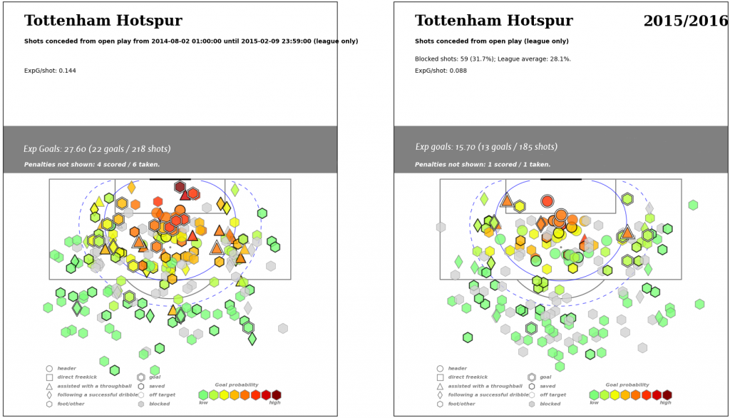 The two periods in question here are the exact same time periods of the season, taken one year apart. The difference in number of shots is noticeable – 218 vs 185. The difference in quality of chances given up is staggering. .144 expected goals per shot in Poch’s first season versus .088 in season two. Pressing systems often take a season to learn, especially for personnel that aren’t used to it. They can also take specific types of players in certain positions to really make them tick. Whatever the case,
  These maps would have fit in really well with the fabulous analysis published on 13Steps yesterday. Yes, yes, I know you might be able to just get this from the simple expected goals per shot metric. Or you might not. Different people learn differently and it actually matters if you provide them multiple ways to do so. Early Feedback So people have seen some charts now. Many say they are too busy. I acknowledge that especially the team ones might be, but the ones I have shared so far are mostly full season charts. Partial seasons tend to be clearer in terms of patterns. Additionally, with the right tools you can break these into rolling 10-game charts, which are probably more useful from a team analysis perspective but rather niche for public consumption. Right now all you are seeing is the image. These are meant to go together with other tools to form a suite of analysis. Additionally, the image itself should be part of an interactive app that has layered information.
- You have the individual shot map containing all the data points.
- When you mouseover any shot, you should get extra information on the shot like who took it, what game, and xG model info.
- When you click through on each shot, it brings up the video clip to watch the shot and how it was created. (This hadn't been programmed yet, but it was part of the design plan.)
So you right back wants to see all the shots created by the left forward this season. Load up the chart on his ipad and *click click click* research done. (He probably also wants to see his dribbles on video too. There's an app for that...) There was one person who asked why can’t they be more like the basketball charts, which are clean and lovely? The answer has to do with volume of data. Football sits at a really awkward place in terms of both player and team shot volume. Unlike hockey and basketball, which have 82 games and huge numbers of shots inside of each game, football has 38 league games and a maximum of 20 shots average for a good team. It also has a much larger playing surface than either of those sports, which means that location bucketing either ends up big and imprecise, or small and worthless. Instead, these maps give granularity to each shot and keep the informational fidelity. As a consequence they can get busy, but I have yet to see anyone solve that issue without significant information problems. Informational fidelity was a key part of the player radar design as well, and keeping it was a big reason I didn't turn everything into percentages as other designers suggested early on in the process. It's hard to argue about percentages of a population that someone else may or may not understand. It's easy to argue about numbers, and here's the key lesson: arguing is really fucking important. I like radars better. That’s nice? They aren’t either/or choices. They are both small parts of a comprehensive toolbox to help evaluate players and do team analysis (both your own and oppositional). And to be totally fair, radars took a lot of shit when I introduced those as well so maybe you’ll come around. Or maybe, if we're all really lucky, someone else will create/publish prettier versions that solve all the problems and we can just use those. Check out my Twitter for lots more current season shot maps (and possibly radars) starting today. --Ted Knutson 
