23 April 2017. El Clásico. Real were one man down and losing against one of the best teams in the world, with less than 15 minutes to go. The match seemed decided. But then, Real equalized.
Looking at the usually tracked events will paint a rather boring picture of the goal: Kroos passes to Marcelo, who crosses to James, who scores. But how did James get in such a great position to shoot from, and who allowed it? We can’t say.
Looking at the video replay will give you much more insight. The main reasons Real got the opportunity to score were:
- Barcelona were quite relaxed defensively, allowing equal number of attackers and defenders
- Ronaldo’s movement opened up space in the near post
- James got rid of the marking with a great run into the near post
- Marcelo crossed perfectly towards James’ run, allowing him to shoot with no opposition
A lot of people bring examples like this one to show why stats alone can’t describe what happens in a football field. Indeed, you can’t objectively measure these 4 elements just by looking at events data.
However, I will argue that you can measure them if you have full positional data (i.e, coordinates for every player on the pitch at every moment of the play), creating relevant stats that measure how space is created, used — and also denied.
Here is a top-down view of the play:
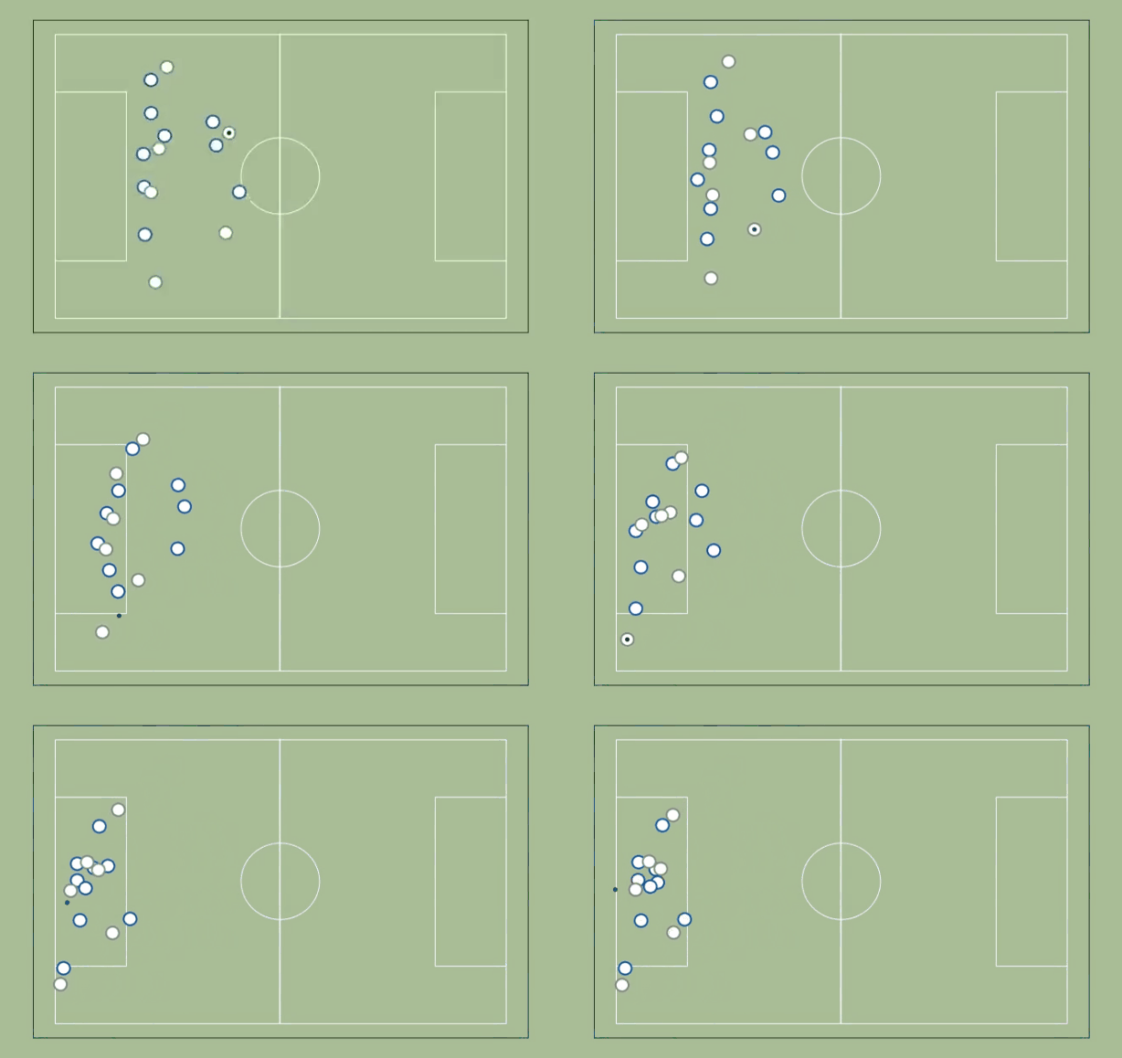
You will probably have to watch it a few times to get some sense of what is going on.
A note about the data
I collected the data myself, with the video as reference (yes, I watched that replay a lot), so don’t assume professional level accuracy. In fact, it may be impossible to collect that data accurately without having access to the stadium itself.
"We collect most of our data ourselves. Data by Opta and others not really useful for our kind of work." —Michael Niemeyer, FC Bayern
1. Numerical Superiority
Barcelona had one more player total, but Real had an equal number where it counted. So, how do we calculate that?
As a first approach, let’s define the active zone as the smallest possible area between the goal line and a parallel line that includes the ball and maximizes the attacking superiority. The superiority metric will be the difference between attackers and defenders in the active zone.
Let’s see how that works in practice:
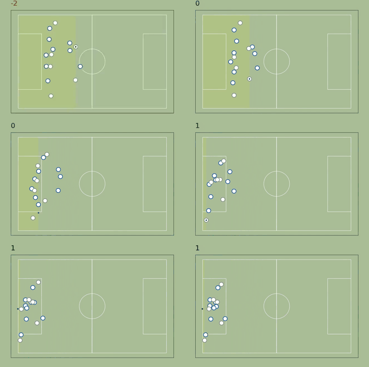
The approach works pretty well in the beginning (it goes from -2 to 0 when none of the midfielders on James follow him after he passes to Kroos) but fails as soon the ball reaches Marcelo: it makes no sense to narrow the area so much, there's no advantage there - the are should include at least the players inside the penalty area.
How can we improve this metric?
- Clearly, what we want isn’t a rectangle; it’s a polygon than that includes the ball, the goal, and any relevant players. But how do we define relevant players?
- We may not want smallest possible area. Increasing the area may allow better passing options — but maximizing the area will simply select the whole field in cases of numerical equilibrium.
- Since multiple criteria need to be considered, how do we weight each one?
Why do we need this metric?
Creating situations of numerical superiority is one of the main advantages of direct or counterattacking styles of play. The ability to create such situations is a very powerful skill that deep midfielders, defenders, and even goalkeepers may have (as Man City fans will undoubtedly witness next season, with the arrival of the wonderful long passer Ederson), roles that have few relevant stats to show off their offensive impact.
On the other hand, the ability to counter such situations is a trait of a well-organized defense — the type of defenses that don’t do lots of tackles but concede very few goals.
2. Marking
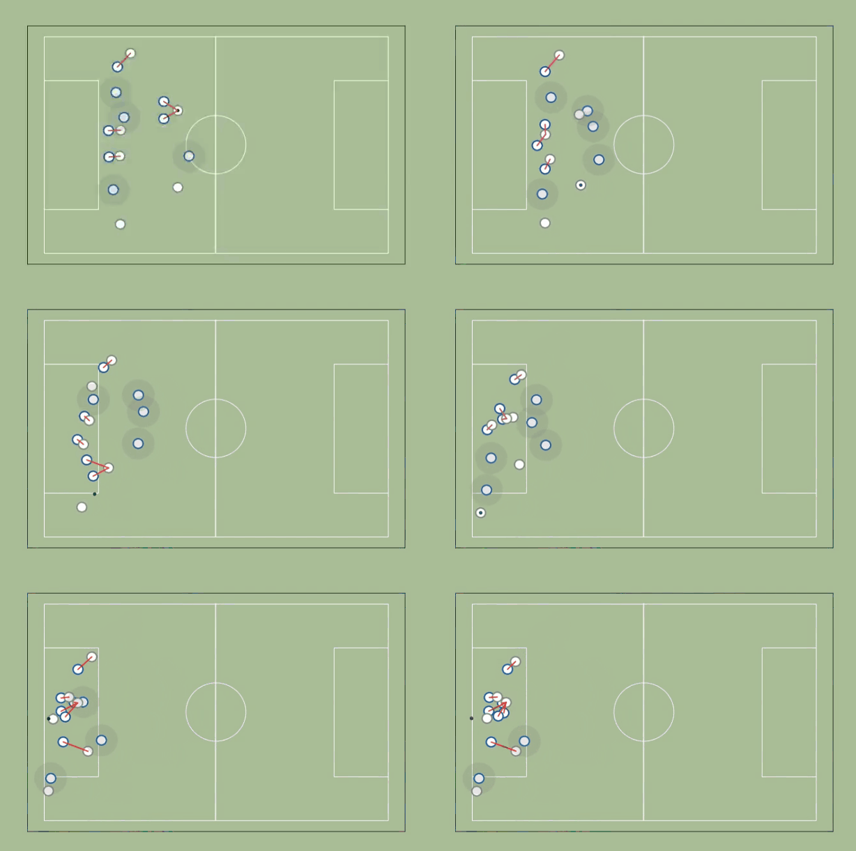
We start by identifying, for each defender, who the closest but farther from the goal attacker is. If the distance to that attacker is less than a certain marking distance (a few meters), we consider that the defender is marking the attacker. If no attacker is closer than that distance, then we assume the defender is marking a zone (a circle with the radius equal to the marking distance).
How do we improve this metric?
- Adjust the marking distance and introduce a marking strength concept
- Consider movement and momentum
- Consider confounding situations (e.g. when 2 defenders are closer to the same attacker, but there’s another attacker nearby, shouldn't we consider both attackers as marked?)
Why do we need this metric?
Tackles and interceptions are the main metrics used to evaluate defenders, but any armchair analyst will tell you that positioning is the name of the game.
‘If I have to make a tackle then I have already made a mistake’ — Paolo Maldini
Most plays don’t involve a numerical advantage situation — and when you have as many defenders as attackers, a marking failure can be the difference between a goal opportunity and an attack going nowhere. Great defenders will make sure the latter happens.
3. Runs & Passing Options
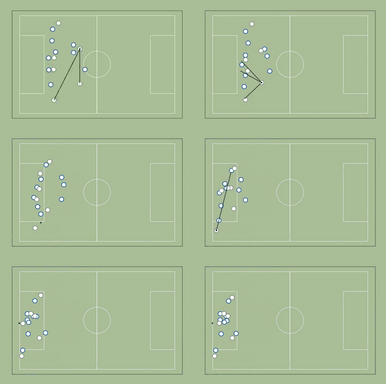
We start by identifying whether each attacker is marked or not. In this case, we are using the expected future attacker position to establish marking — that way, we enable forward runs to open passing options.
We then plot lines between the player who has possession of the ball and all unmarked attackers.
How do we improve this metric?
- Incorporate the improved marking definitions (specifically marking strength)
- Introduce a passing difficulty concept: instead of a binary option (open or close) for passing line, we will have a gradient.
Why do we need this metric?
Off the ball movement is an important skill for an offensive player, and while it usually translates into shots, it is a skill in itself that should also be measured.
‘Cruyff always talked about where people should run, where they should stand, where they should not be moving. It was all about making space and coming into space.’ — Barry Hulshoff, member of 1970s Ajax team
Furthermore, it is a feature of high pressing teams to try to close the opposition passing lines, in hope of an interception or a rushed failed pass — this metric would help us evaluate the effectiveness of such tactics.
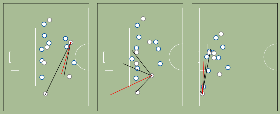
4. Passing Quality
Good passes are made to where the recipient will be, not where they are. For this metric, we show the actual pass over the passing options (reused from the last metric) at the moment the pass was made.
How do we improve this metric?
- Incorporate the improved passing options definitions (specifically passing difficulty)
- Consider potential changes in the recipient movement and available space, converting the destination spots into destination zones
Why do we need this metric?
We have really good information about passes made— origin and destination coordinates, type of pass, success rate, and so on. However, we don’t really measure if that pass was the better option at the moment it was made, and we don’t really measure if the pass was made to the right place at the right speed.
We also don’t know how difficult was that pass: was the receiver completely free? Was there a defender blocking the passing line?
Great passers risk a lot, especially up front, resulting in a lower than normal success rate. Measures to correct this usually involve considering the origin and destination of the pass, but available space should be the most important factor to evaluate passing difficulty.
Conclusion
It is not a coincidence that advanced sports analytics started in Baseball: the sport lends itself to easy record-keeping, with constrained individual duels (the pitcher vs the batter) as the basis for everything that happens.
Football, in contrast, is a hard sport to summarize: it mixes the free-flowing nature of Basketball with the tactical complexity of American Football. Unlike Basketball, possession chains are murky in football (with lots of duels and no clear owner of the ball). Unlike its American cousin, you can’t train a fixed playbook (outside of Set Pieces, football is... well, messy) and there’s no quarterback dictating play.
The goal of this article was to convince you that we need fully positional data to properly measure what happens in the field. Although the top tier professional teams are already doing this type of analysis, we, the fans, don’t have access to it. But we need television broadcasters, sports journalists and tournament organizers to provide such value-added analysis. Hopefully, this post will at least spark interest in it.
Final Note: Data and Code
You can download the the csv file with the data here (x and y coordinates on a scale of 0 to 100). The player data is here (player numbers and names aren't filled yet, but they should be up soon).
If you know Python, you can also view (and download) the Jupyter Notebook that made the animations here (or here, for a more browser friendly version). I'm pretty awful at commenting the code, but feel free to contact me if you have questions.
