
In January, I started with this. Then in April, radars improved to this. Today. I get to introduce fullback radars to the world, as well as explaining some updates to the other templates as well.
What the hell is a radar?
It’s a way of visualizing a large number of stats at one time. In our case, the radars specifically deal with player stats. Some people also call them spider charts or graphs because they can look like they make a spider web.
Why bother creating them? What’s wrong with tables? Or bar charts?
Hrm, let’s deal with the last questions first. There is nothing is wrong with tables of numbers. My brain loves them, and so do many others. Little bit spreadsheet and database fetish? Oh yeah.
However, you have to admit that tables of numbers are a little boring. Bar charts are better, but they kind of fall apart when trying to compare many attributes at the same time. Radars allow exactly that.
Why bother creating them? That one is complicated. Why bother making infographics or doing data visualization at all? The answer is probably at least a book long, but the quick response is because people like to look at stats presented in this way far more than they like to look at a set of numbers. Radars invite you to engage with them. They create shapes that brains want to process. People have real reactions, and once you get used to what they display and how they display it, you can interpret them much faster than if you had to do the exact same analysis with a table of numbers.
Many of the shapes created correspond to “types” of players, at least when it comes to statistical output. Pacey, dribbling winger. Deeplying playmaker. Shot monster center forward. Starfish of futility.
There’s a lot more methodology chat at the bottom of this article, but I need to explain one very quick thing before I move on to the meat of the article.
Radar boundaries represent the top 5% and bottom 5% of all statistical production by players in that position across 5 leagues (EPL, Bundesliga, La Liga, Serie A, and Ligue 1) and 5 seasons of data.
In stat-y terms, the cut-offs are at two standard deviations of statistical production.
In non-stat-y terms, Lionel Messi made EVERYONE look terrible. I know, that doesn’t sound that bad because it’s true, but trust me, the newer way the templates are constructed is better.
So uh... fullbacks?
Indeed. There are different radars for different positions because different stats are important for different spots on the pitch. Tackles and interceptions? Waaay more important for fullbacks and defensive midfielders than for forwards. Shooting stats? Flip it and reverse it. What I’ve done for fullbacks is to try to account for which stats are important in the modern role. This includes crossing, dribbling, and key passes, as many of the best fullbacks are also a crucial part of the attack for top teams.
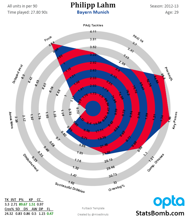
One of two contenders for the title of the best right back of modern times, the German captain has big statistical output. Great passing stats, defensive output, a solid dribbler, and almost never commits a foul. Picked players’ pockets and they never even knew it was gone. The only thing Lahm wasn’t good-to-great at in 2012-13 was winning balls in the air. Which makes a lot of sense, considering his nickname is “The Magic Dwarf.”
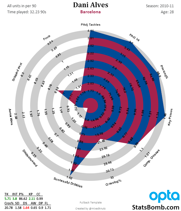
The other contender for the title of best right back in modern times, Dani Alves’ radar is awesome. Top 5% in possession-adjusted tackles and interceptions, while contributing over 2 key passes from fullback per game, and in the 93rd percentile or so on successful dribbles per 90. Alves was bananas on that Barcelona team.
Note that each of these radars have “Padj” before tackles and interceptions. That stands for “possession-adjusted” and to me is the most sensible way to account for stats that typically occur in the defensive end of the pitch. (Aerial Wins can come anywhere and are therefore not adjusted).
The reasons for adjusting defensive rate stats are explained here in quite a bit of detail, but the concept is that you can’t make defensive actions when your team has the ball. Therefore players that play on teams with high possession have far fewer opportunities to make tackles or interceptions than guys who play on low-possession teams. It might be better to think of these adjusted stats as like “tackle points” instead of the pure stat output, but tackle points are much better at measuring things that win you games than the basic tackle and interception rate stats.
Fullbacks are the first radar to have the adjusted stat, but I will likely roll them out to the other two templates in the near future.
For the record, this is what Alves’ output looks like without the adjustment.
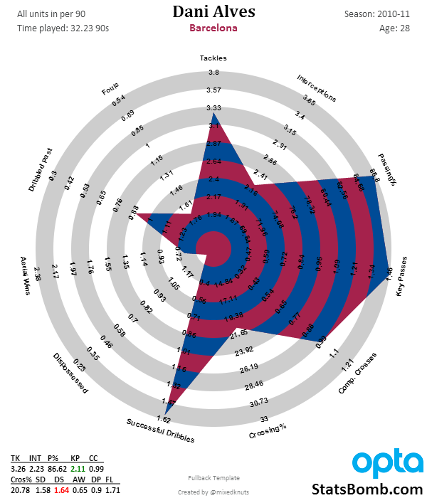
Still very, very good, but Barcelona had 72.6% possession that season. It’s a LOT harder to rack up defensive stats when your team has the ball nearly three quarters of the game.
Right, we’ve briefly looked at two great fullbacks... now what does a bad fullback look like?
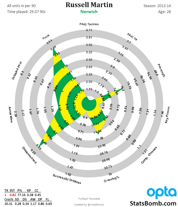
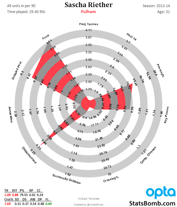
Yikes. No defensive output at all, really. Absolutely dreadful stuff. The only areas they score well are the contextual stats, which to some extent you can achieve by being constantly out of position and incompetent (yes, there are valid criticisms that maybe these shouldn’t be included in the radars because of this, but context is important too!).
Gimme Some More Okay, let’s do that. This one is for Liverpool fans. On the left is Glen Johnson from 2013-14. On the right is Glen Johnson, 2009-10.
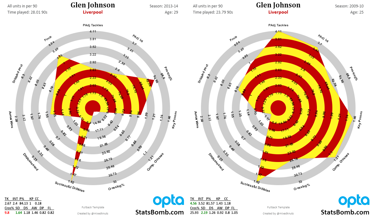
Johnson’s fullback radar from his prime looks like a Lionel Messi radar.
It’s that good.
His current output at age 29 is good, but no longer spectacular. I would look for Liverpool to transition him as soon as they find an acceptable replacement in their price range. I need to do more research, but I’m pretty sure fullback age curves and peaks are closer to forward peaks than they are to central defenders. If true, 30 is getting rather long in the tooth to expect top attacking and defending output from that position.
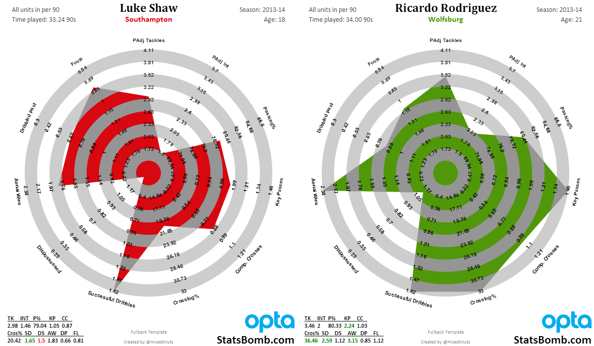
Here’s another one – a battle between two of the best young left backs in the world. On the left is Luke Shaw. On the right is Ricardo Rodriguez. Shaw is English and only 18, while Rodriguez is Swiss and 21. Now Shaw could develop into what Rodriguez already is, but it’s a risk and a mere possibility. Rodriguez is the finished article and his production is ridiculous. Plus, as he’s only 21, it’s possible that Rodriguez will continue developing as well.
I know which one I would rather have.
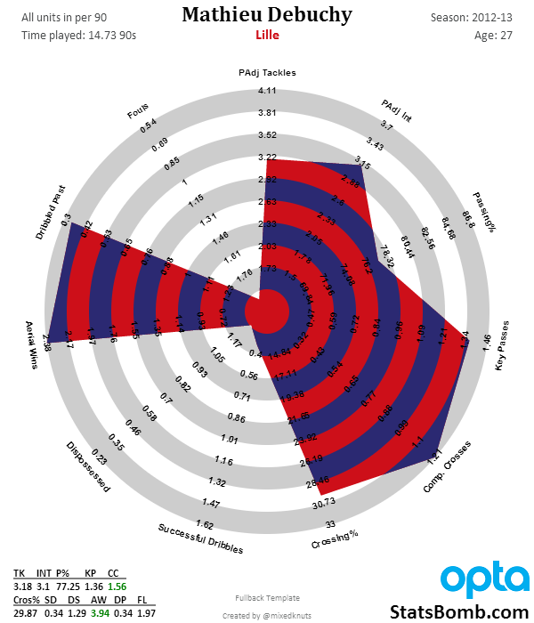
Finally, because Arsenal fans asked, here's Sagna vs Debuchy.
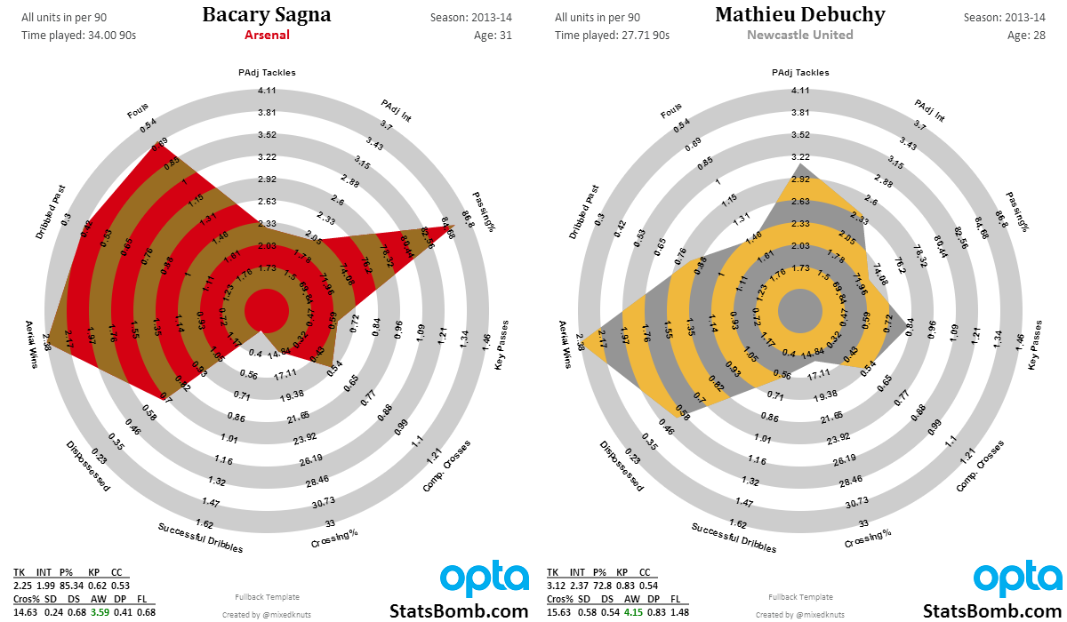
It's hard to see Debuchy as much of an upgrade unless Wenger thinks that his time at Newcastle was mostly a fluke, and that this is the real Debuchy (from Lille in 2012-13).
The Public Radar Tool
If you follow me on Twitter, you know that we’re working toward making the tool that generates the radars for me public. This will allow you guys to do your own research regarding player output and shapes without having to rely on me to produce them when I get time. The man responsible for this is @samihernia, who is just crushing it on a weekly basis.
When the radar tool is finished, it will offer a ton of options that will hopefully include overlays and side-by-sides, plus being able to add Joe Average and Steve 75th transparencies to each of the different templates. At the end of the day, I think the research into this form of visual display for sports stats is really useful, and I’m looking forward to opening up the stuff I get to play around with to all of you, and seeing what you come up with.
ETA for this is: when it’s done.
That’s it for this introductory piece. I hope you like new fullback stuff, and the minor improvements to the old templates as well. As you can see, these vis are being constantly improved, a little bit at a time. If you think they are dumb – no problem. If you like them, as most of you seem to, know that there is more cool stuff coming down the pipeline.
Beyond the radars, we’ll also have a pair of announcements in the next couple of weeks with more exciting news. One involves the site redesign, which is done and being programmed, and the other involves something top secret that I’m not allowed to talk about yet.
Cheers,
--TK
Radar Methodology Appendix and FAQ
Why do some stats cut off at the boundary while they are accurately reflected at the bottom left of the chart?
There are a couple of answers to this. The boundaries themselves represent the top 5% and bottom 5% of statistical production, across five seasons of the big 5 European leagues at that position. Statistically, this represents two standard deviations away from the mean, which is usually a set of outliers we should be very interested in.
My initial radars actually used the individual peak season of output for any player in the same population sample. At first this sounded interesting, but what happened was Lionel Messi made average players look terrible statistically. (You can see it in the link in the link here. Messi, Ronaldo, and Ribery look good, but not awesome, which means normal players look terribad.)
At the end of the day, the current methodology feels much better to me. It orients the charts and your brain to immediately understand whether players are doing really well or really poorly in certain areas. It’s not quite as precise as the pure max output templates, but it is better for the larger population.
Why don’t you use percentiles for outputs on the chart? I’m an American and when I grew up, I collected baseball cards. One of the things I loved as a kid was being able to argue about different players, and knowing their actual statistical output was a big part of this. Even as I grew up, knowing Frank Thomas’s on base and slugging percentages was a thing that stuck with me.
Initially, I didn’t have access to the entire population distribution of stats to be able to create the percentile output anyway, but the more I thought about it, the less I liked changing all of the outputs away from numbers and to population percentiles. It adds a layer of abstraction that I think interferes with potential engagement, which is the opposite of what I am going for.
It might be a useful thing to do if you were scouting players for clubs though.
Radar charts assume that all the stats are equally valuable. This clearly is not the case when it comes to these charts. Absolutely correct, and yet contextual stats tell us a lot about the valuable stats themselves. Assuming they like the radars enough to use them organizationally (and I have been told some teams are considering it), clubs doing scouting could strip out certain stats and add the ones they feel matter the most. I would also expect them to do deeper research regarding exact numeric output from players, and compare the hell out of potential purchases via scouting and video work.
These radars can’t do everything well at once. But they do offer easy, visceral comparisons of statistical output to people who aren’t necessarily that comfortable with numbers. That’s a really valuable thing, both to the public and inside a football club.
Are there any plans for Center Back and Goal Keeper radars? None at this time. Center backs and GK statistical output is intimately tied to tactical choices made by managers. Tactics affect all statistical output on the football pitch, but CB and GK in particular are almost impossible to separate right now, and thus I don’t feel like putting the work into this area is a valuable use of time. It’s something we could revisit eventually.
Some players play many positions? Why don’t you split these out by position? Wouldn’t that more accurately reflect how good they are at playing in certain areas? Absolutely. However, the more data splits you do, the smaller your sample size gets and the harder it becomes to make any conclusions. Additionally... I am just one person. Position splits require quite a bit more work, and even then might be imperfect for a number of reasons.
Why are some stats reversed on the radar? Most have big numbers on the outside, but a few have the small ones. This has to do with how radar charts work. Ideally, you want "better" performers to take up more area in the charts they produce. However, some stats actually track negative actions (like fouls or getting dribbled past), and therefore if you produce higher numbers in those stats, the plot needs to take up less area, not more. Thus I just reversed the axis, and now it makes sense.
Conclusion
Every visualization has design choices, strengths, and limitations. I’ve done my best to make decisions regarding these that make them both approachable, and yet fairly scientific. There are certainly valid criticisms that have been made, but it is a definite balancing act, and overall I have to say I’m really happy with where they are now versus six months ago.
What I can tell you about these six months after I satrted is that they are fairly popular and useful, both in my own research and that of others (I get double digit requests a day and they have been a large driver of increased Twitter followers). They also teach me things I don’t think I knew about players nearly every day I work with them. Shapes now reflect player archetypes to me, and one of the first things I do when hearing about a player I am unfamiliar with is look them up on their radar so that I can immediately understand their general statistical output. That’s pretty damned cool.