Premier League Forwards (2008/13): Goals & SoT Per 90

In one of my first articles on StatsBomb I looked at the top 10 goals per 90 performances by a forward using data from 2008-13. That list featured some surprising results: Berbatov came in at #2, Suarez's 2012/13 season was #5 and Drogba took the #1 spot. I had a very specific set of criteria for players who were eligible for that Top 10 list, the harshest was Time On Pitch% which is the percentage of minutes a player actually played. I set the line at 60%, naturally this meant that quite a few players who posted excellent numbers were ruled ineligible. Let's now roll back from that 10 list and look at all of the Premier League forwards in my data set who scored a goal during the years of 2008-13. The focus here will Shots on Target per 90 and Goals per 90.

SoT Per 90 And Goals Per 90

This is the full list of players, some 360 or so.   Forwards_sot_goals_per_90_medium   
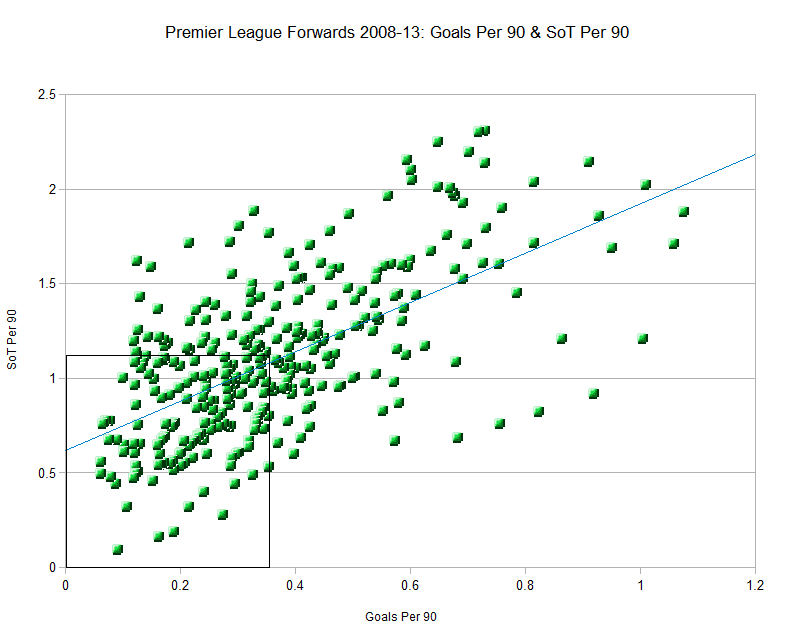
The black box on the bottom left of the graph is the the league average line in Goals per 90 and SoT per 90. Inside the box indicates the player is below league average. There is a pretty large spread here once we first move out of the sub-par performance in the black box.  That large spread becomes a scatter once we move beyond 0.5 goals per 90 and 1.25 SoT per 90. The dots that reside toward the upper right hand side of this chart are the super elite. I want to seperate some of the bigger minutes players from the part time players. To do this I am going to use only players who had an above league average ToP% which is 44.29%.  

Players Above League Average Minutes Played

  Again we use Goals per 90 and SoT per 90.   Elite_sot_goals_per_90_medium *
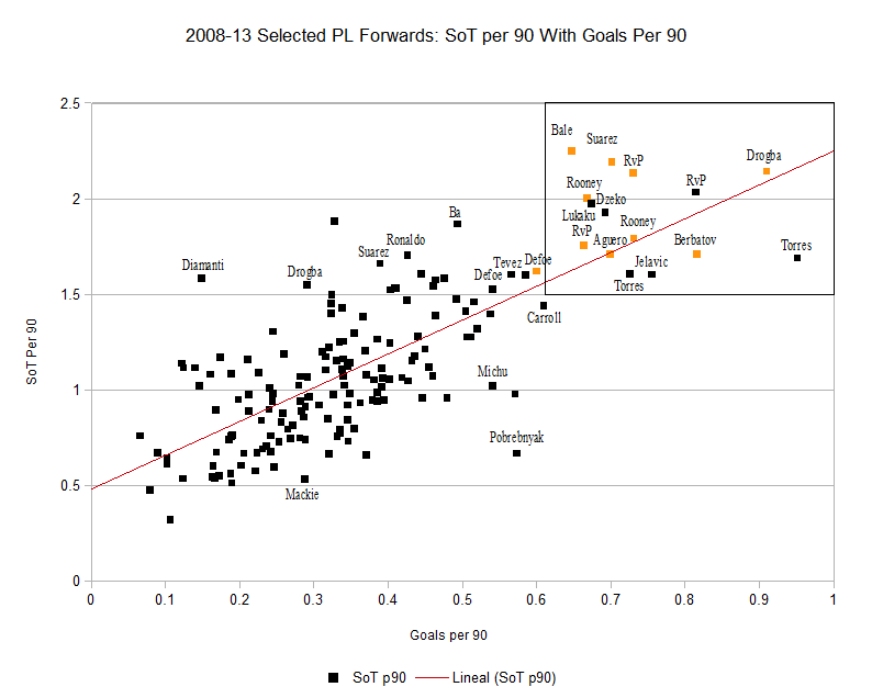
Jelavic only played a half season after his move to Everton. These are the Premier League strikers who played over the average amount of time (44.29%). These are the full time players, there are no small samples here to pollute the results. There are 3 types of players on this list:  

  • A bunching of players who posted middling goals and SoT per 90. This is the main bunch toward the lower left hand side of the chart. Most of the 'full-tme' players fall into this category.
  • A wild, secondary spread of players who posted quite different spreads in Goals and SoT per 90 but didn't belong in categories 1 or 3. This second type of player ranges from high goals/low shots (Pobrebnyak and Michu) to the high volume SoT/middling goals per 90 (Ba, Suarez and Ronaldo).
  • The elite. The amazing seasons that seperate themselves from the rest of the seasons on this chart. There are only 15 players on this elite list of high volume SoT per 90 and Goals per 90 players. Of these 15 seasons 9 of them featured on the Top 10 Forward list. Lukaku, Dzeko, Kelavic and Torres x2 are the players who posted amazing seasons but fell short of the 60% ToP% threshold I put in place.
Looking further at the players who populate that elite top right box we see some players that had more than 1 excellent season: Rooney twice features, Liverpool vintage Torres also features twice. But really that super elite list is owned by Robin van Persie who posted 3 seasons that feature there.
van Persie is a rarity in that he not only posted these 3 amazing seasons, but did so at stages in his career when players are expected to already be in some form of decline.
At the other end of the age scale is Lukaku, who at 19 years old posted one of the top 15 per 90 seasons in the last 5 years. It is going to be fascinating to see the next couple of years of his development.


Ashes First Test: Lack of Partnerships A Concern for 2nd Test

14 runs. In the narrative of a Test match, five days of attrition and back and forth momentum, it is a total low enough to ensure that fans on both sides watched its conclusion with nerves shredded. Whilst not quite matching the parallels of Edgbaston 2005, it was a finish close enough to have left both sides harbouring genuine hopes of victory right until the very last ball was bowled.

Australia will be despondent, having hauled themselves back into a game more than once that looked as though it had slipped their grasp, whilst England will breathe a mighty sigh of relief at having avoided dropping the opening game of the a series that for all intents and purposes should have been theirs around an hour or so into the second day's play. Having now drawn breath and with the dust having settled, we can take a look at a key area of the game – partnerships – to assess where and how that absorbing Test may have been won. Heading into the series, England were very much written up as favourites. A stronger side in all areas was aligned with a more settled preparation as opposed to Australia's rather disjointed lead up, having done away with coach Mickey Arthur just a fortnight or so before the first Test. The Australian hopes were centred primarily around their promising pace attack. With England's occasional habit of collectively batting below par, particularly in the first Test of a series, Australia sensed an opportunity. The difficulty for the visitors is that, in comparison to their bowling, their batting line up does not possess either the depth of quality nor the solidity that England's does. In fact, heading into the Test, their order was still not fully known, perhaps even to themselves. Could their top six really put the runs on the board to make a sustained effort at getting the better of England's attack? Here is the fall of wicket breakdown for both sides over both innings:

Aggregate Runs And Fall Of Wicket Table

  England 1st inns Australia 1st inns England 2nd inns Australia 2nd inns
1st Wicket 27 19 11 84
2nd Wicket 78 19 11 111
3rd Wicket 102 22 121 124
4th Wicket 124 53 131 161
5th Wicket 178 108 174 161
6th Wicket 180 113 218 164
7th Wicket 213 114 356 207
8th Wicket 213 114 371 211
9th Wicket 213 117 375 231
10th Wicket 215 280 375 296

We can see a breakdown of how the runs for each sides two innings were accumulated:

Runs And Fall Of Wicket Graph

Image

It is evident that with the exception of Australia's last wicket partnership in both innings, the lower orders struggled to put together a sustained partnership at any point, with the line of progress almost flat. This will concern England, whose lower order (after Matt Prior) have struggled of late. It shows that although steady progress was made for the early wickets, without the Ian Bell/Stuart Broad partnership on day three and four, England would have been setting Australia a far more reachable total. If Australia had concerns heading into the series regarding their top six, the first Test will have done nothing to allay them. In the game as a whole, only the opening partnership in the second innings between Shane Watson and Chris Rogers was of any note. While England were grateful for Bell and Broad, without the heroics of Ashton Agar along with Philip Hughes, Australian hopes would have been sunk long before Brad Haddin edged to Prior off James Anderson. We can now also see the breakdown of runs per wicket, which further highlight where both teams struggled

Runs Per Wicket Partnership Graph

Image

  Six partnerships in the game exceeded 50; the aforementioned tenth wicket Australian ones, Bell/Broad, Watson/Rogers and the measured third wicket partnership between Alastair Cook and Kevin Pietersen.  In a game that saw the sides separated by just 14 runs, partnerships such as these were key. In the end, despite Agar and Hughes, England's two key wickets proved enough. If we split each innings into two parts - the first six wickets (when the tail end enters) and the final five wickets - we can look at the weighting of runs that the top six wickets contributed:

Percentage Of Runs By Top 6 Wickets Table

England 1st inns Australia 1st inns England 2nd inns Australia 2nd inns
82.79% 38.57% 46.40% 54.39%

Moving forward into the remainder of the series, the two first innings percentage totals will concern both sides. For England, the over reliance on the top six is not sustainable over a series to consistently post match winning totals. For Australia, unless their top six can improve and post totals to compete with England, they will be playing catch up too often to have a realistic chance of recovering the series. It was a Test match that provided wonderful narratives throughout, but in the cold light of day as we head to Lords, batting will remain a major concern for both sides.

Forwards: Age And Decline in Shots Per 90

Earlier in the day Ted Knutson published this (link) on age and value in the transfer market. It's a terrific piece with a focus on Man City's Summer spending and the problems with signing players who, at 28 years old, may have already peaked. Now I know that using words like already 'peaked' when talking about 28 year old athletes may seem like crazy talk but some of the information I collected on this topic shows that the average forward is already starting to decline. To start us off let's look at the age curve. To do this I want to use Time On Pitch % which is the percentage of minutes a player features in divided by the total available minutes (league only).

Age Curve

  Age_new_medium   This chart shows us some cool information although I must repeat the warnings we posted in the previous article that this is only a 5 year sample. More data is desperately required. Here are some quick thoughts from the Age Curve graph:  

  • Young players do not log heavy minutes in the Premier League. An apprenticeship is required, and it is only at the age of 22 that forwards start to play anything approaching regular minutes.
  • The age 29 bucket is strange. It does feature a smaller sample, but it could also be the death rattle of desperate forwards struggling against the dying of the light. Or, maybe it's something to do with power forwards/target men.
  • If we cast aside that 29 year old bucket, which is a smaller sample anyhow, the we see a peak for ToP% between the ages of 24-27 with a slight Autumn peak at age 28. Depending on your outlook peak years in terms of percentage of playing time could be 24-27 or 24-28.
  • If you are a forward aged 30 or over then you can expect the ToP% to fall away quite rapidly. In fact, on average, forwards over this age haven't played this little football since they were 21 or under.

We have the age curve figured out, now I want to show you Shots per 90 and Shots On Target Per 90 performance by age.  

Shots Per 90 And Age

  Age_shots_medium   Yet again we see weird peaks and troughs in the early and late age buckets due to small sample size and talent outliers. The bigger samples are between the ages of 22 and 30.  

  • The ability of forwards to generate shots falls between the ages of 23 and 26.
  • From age 27 shots per 90 is in decline.
  • Arguably shots per 90 is in terminal decline but for the the 32 year old bucket, which has some survivor bias and small sample issues.
  • For reasons unknown, players from the age of 27 onwards just cannot generate shots per 90 at the same rate they once did.


Shots On Target Per 90 And Age

  Sot_decline_medium   This chart looks at Shots on Target per 90 performance of forwards. We see very similar patterns to shots per 90 with volatile spikes for younger players.  

  • Peak years are between 23 and 26 years of age.
  • From 27 years old we see a gentle decline in shots on target per 90 output.  Then we have an out of place spike at age 29 and a huge small sample spike at age 32.


Final Thoughts

Shots per 90 and shots on target per 90 tell virtually the same story: Peak years between 23 and 26 and gradual decline thereafter with a nice renaissance year at 29 when decline has already begun.
This shots numbers when coupled to the time on pitch % age curve show us some pretty important information, even in this smallish sample of half a million minutes of football. I think this information can help us gain further knowledge in the average players expected peak, the age where decline will set in and most importantl,y when to buy and sell forwards.
Rooney, anyone?

2012/13 EPL Table: PDO, ShotDom And SoTDom

Hello. Think of this article and it's center piece - the sortable table - as an introduction to what some of my work at statsbomb.com will look like. Of course there will be lots of words and some nice graphics, but I needed a home from my Bitter and Blue home where I could post tables like the one featured below. Sortable tables. Tables that will feature crazy player numbers, individual team numbers and, of course, league wide numbers. I have a ton of information that I collect on each Premier league season (and probably la Liga from 2013/14) that sits in my database lonely and bored that could otherwise see the light of day. At StatsBomb we have ability to post Tableau and sortable tables , which means we can show lots of weird and wonderful information side by side and allow the reader to sift through the table and sort the teams by the strength, or weakness, in any given statistic. Oh, before I forget. The numbers I will post in some of these tables will not look like your average Premier League table. We will feature new statistics, adjusted numbers, Close Game State and lots of other alternative numbers. Want an example? Here is the 2012/13 Premier league table: Sortable!!!!!! [table id=3 /] As you may have seen, this doesn't look like a normal table. Points  is in a funny place, there is no draws column (width purposes) and then there are four statistics that aren't usually featured on any table. PDO A teams scoring% + Save%. League Average is 100 Shot Dom Shot Dominance, or TK ratio in my db. Shots for/Shots against. Ted's link is here SoT Dom The same thing but just using shots on target instead. For the purposes of this table I included Difference to show which teams had a better SoT Dom than they did Shot Dom. Not many clubs manage the feat of having a better SOT Dom than Shots Dom. Man City and Man United skew the entire league. Everton, Liverpool scrape a positive number, West Brom look decent too. The team with the  biggest negative Difference? Southampton with a -0.23.

Final Word

This table isn't too in-depth or radical, and it's not meant to be. This post is a hello of sorts and an example of what I hope to be running here over the course of next season. Premier League tables with PDO, and shots statistics. Tables with save% and scoring%, Game State info. Player per 90 numbers. A whole lot of numbers, a whole lot of alternative table, all running on a week by week basis.

There'll be lot's of other interesting stuff from me in the next two weeks or so. Think of historic player per 90's, an in-depth look at age and decline by position, plenty of team focus articles. Probably a little (big) article on corners, too.

Hello, welcome and we hope you like the site.