Month: July 2014
Player Heatmaps: Jay Rodriguez 2013/14 EPL Season

Just a really quick post as I wanted to try something different. ... Continue reading "Player Heatmaps: Jay Rodriguez 2013/14 EPL Season"
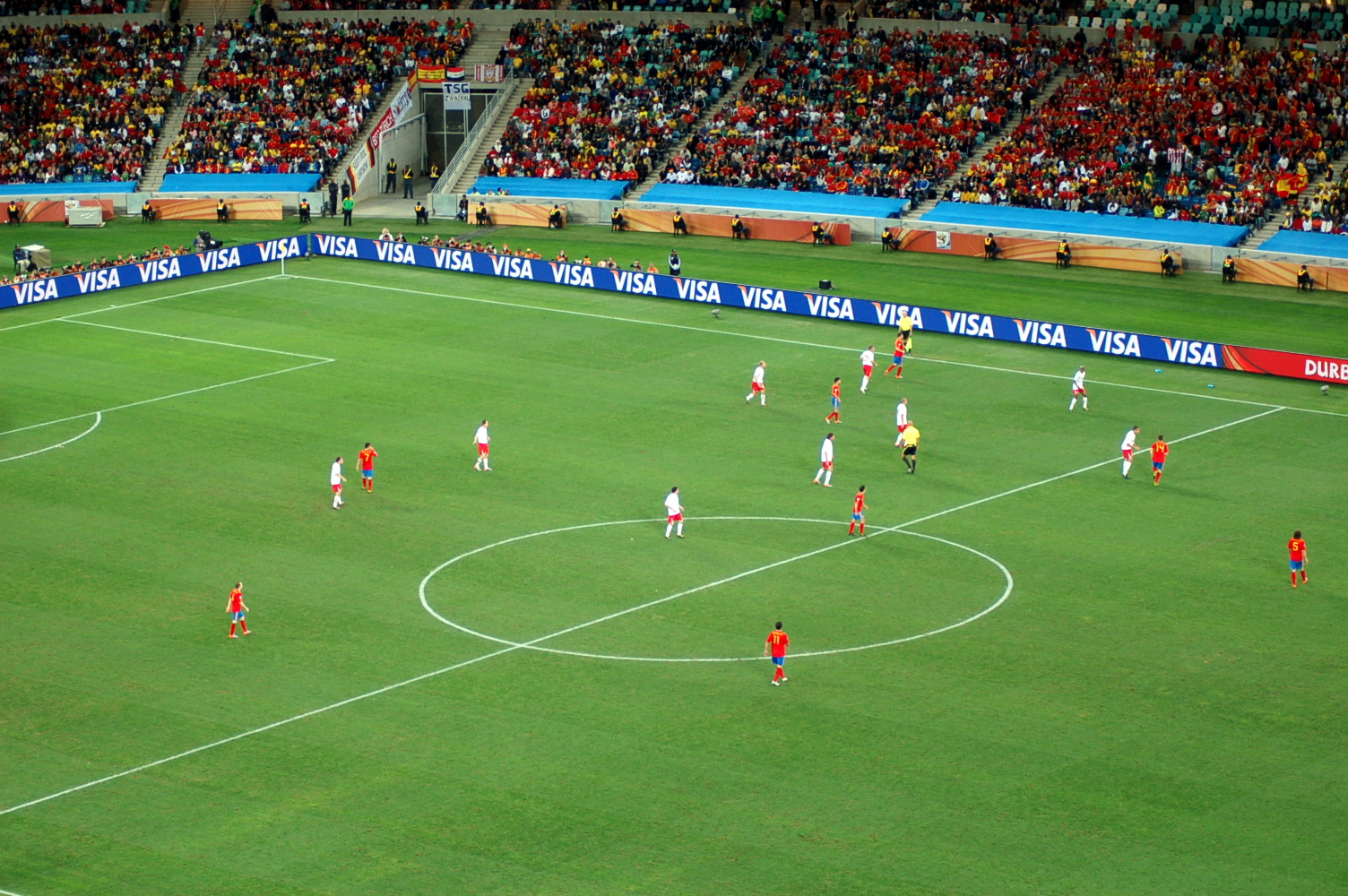
Scout Report: Richairo Živković

Although only 17, Zivkovic is no stranger to the pressure of comparison – the last striker to move from Groningen to Ajax recently joined Barcelona for obscene amounts of money, while Zivkovic’s goal on the opening day of last season usurped none other than Arjen Robben’s record as youngest ever goal scorer for the club. He was reportedly tracked by almost all of Europe’s elite clubs last year but decided to move to Ajax, the club that spawned the likes of Ibrahimovic, Cruyff and Van Basten; which was probably the most logical move given some of the cautionary tales of leaving the Eredivisie too early (I’m looking at you, Castaignos). Groningen only received a small amount of compensation but a sell on clause means that, were Zivkovic to make the big money move that *touch wood* seems inevitable, they would significantly cash in. The son of a Serbian mother and a father from Curacao, he is eligible to play for either Serbia or the Netherlands, but has already featured in youth sides for the latter. There’s a kind of weird lack of Dutch strikers at the moment - after RVP and Huntelaar, their most known, genuine centre forwards are…err…Ricky van Wolfswinkel and Luuk De Jong. Although Depay, Lens and the seemingly immortal Robben can and did play there in Van Gaal’s eternally changing 5-3-2-thing, Zivkovic and PSV’s Jurgen Locadia are currently the only real hopes for an actual number 9 to succeed Robin Van Persie.  Zivkovic is more of a natural striker/poacher than a tricky dribbler, as is shown by only 0.67 successful dribbles per 90, making the comparisons to Robben and Suarez a little redundant when it comes to play style. He was first noticed by Groningen scouts for his pace and agility, two aspects that are still defining features in his predatory game. All 11 of his Eredivisie goals last season came from inside the box, with 2 being headers and the rest coming from his preferred right foot. Managing 0.67 NPG90 and a 19.23% conversion rate is tremendous for someone so young, even if there is some inflation due to regularly being used as a substitute. To put that in context, Locadia and Castaignos scored 0.43 and 0.48 NPG90 respectively, while both being over 3 years older. In fact, Zivkovic’s scoring rate was even slightly higher than Finbogasson’s (the Eredivisie top scorer last season), who churned out 0.62 NPG90. All Zivkovic really lacked in his breakthrough season was creative output, but this could just be a consequence of inexperience. Instinctively, I feel like assist rates would be more dependent on experience than finishing; a goal is always in the same place but your teammates aren’t. Interestingly, Ajax’s academy somewhat specialises in the two areas where he could improve the most – playmaking and using both feet. Zivkovic will also be under the tutelage of one of the best creative forwards of all time in Dennis Bergkamp, so I’d say there’s more than enough reason to think that he may be able to iron out his weaknesses over the coming seasons. Considering he could still be a decade off of his peak, I expect Richairo Zivkovic to achieve big things in the future. [youtube id="Km3wzmCwLfM" width="633" height="356"]
More Discussion about Possession Adjusted Defensive Stats
This weekend, @7AMKickoff published a piece attacking the concept of adjusting defensive stats for possession. The piece was a bit dickish, but there were elements of it that deserve a reply, so I’ll do that today. For reference, here is my original look at possession adjusted defensive stats.
“I’ve done a fair number of regression analyses and I would probably never publish a .40 much less make some of the sweeping statements that Ted makes.”
For starters, I think the piece reads as a fairly cautious look at new research, not something that makes sweeping statements, but I guess mileage may vary. To address the regression bit, obviously I'm fairly well versed in statistics myself, so why would I publish something with just a .4?
There are two primary reasons. The first deals with statistical relevance in complex systems and the second has to do with the relevance of base defensive stats themselves.
Let’s quickly deal with statistical relevance. While it’s generally true that you would prefer to explain everything with just one figure, in most real world examples that’s impossible. After I linked to the 7AM piece this weekend, a number of social scientists spoke up saying they would often be happy to explain .10 to .20 of variation, while .40 is actually fairly useful. There are certain metrics that can have up to .80 r-squared in explaining total goal difference (depending on what adjusted shots model you use), but explaining smaller pieces of the puzzle often gets hard, fast.
Football is an extremely complex game, and defense in particular is very a complex system with multiple potential fail points, covering defenders, presses, low blocks, etc. (Unless of course, your manager is ‘Arry Redknapp, where your players just go fackin’ run about a bit.) When faced with complex systems, especially when just getting started, any additional relevant explanation is useful.
To put it another way, we know shots matter.
How does one prevent shots? That's a surprisingly tricky question to answer. Or at least it has been for me, and I've been frustrated about this for a while. Now for the second point… Did you know that by themselves, defensive stats like tackles and interceptions show zero correlation to anything useful? It's true. They are just numbers on a page. They don't correlate to shots against, goals against, goal difference, points, nada. This is despite them being an intrinsic part of the game, and the method by which most teams get the ball back.
But if you adjust for possession? Now you get the 40% explanation of variation. Going from absolutely no relevance to explaining 40% of important things seemed useful enough to write about. Keeping track of adjustments that have SOME explanatory power while continuing to search for better ones seems worthwhile.
That's the phase that football analytics is in right now. It's annoying to know that a lot of things you write about right now will be obsolete in a week, or a month, or in a year, but that's part of the progression. If I talk about p-adjusted stuff now, maybe someone else will go down that line of research and create adjustments that account for 60 or 80% of the variation in shots conceded.
"Possession is a measure of offensive dominance."
It's really not, and I never suggested it was. For the most part, I ignore possession stats completely, as it seems like a relic of the tiki-taka Barcelona era and little more. It is, however, a useful measure for evaluating who had the ball more and made more passes, which in turn is tied to the opportunity to make defensive actions.
Break it out: The opportunity to make interceptions is tied to your opponent making passes. The opportunity to make tackles is directly tied to your opponent having possession of the ball.
This seems to be what 7AM disagrees with most, but to me it’s fairly clear. Just because every team doesn’t actually try to tackle or intercept the ball in all areas of the pitch doesn’t change the fact that these actions are tied together.
Is possession adjustment imperfect? Absolutely.
I never suggested it to be otherwise. However, it lends statistical meaning to stats where none existed before.
For me, that was enough to force me to change fairly significant amounts of existing code to include them when looking at player stats on the defensive side of the ball. Is possession adjustment wrong (and um wrong)?
That seems like a value judgment, so I guess it’s for you to decide. I can tell you that p-adj stats are already on the fullback radars and will be used the other templates soon, so will be heavily incorporated in my work and the radar player charts I produce. What other people choose to do with them is out of my hands.
At the end of the day, I’m all for other people trying to adjust defensive stats to provide better explanations of metrics we care about. The only issue here is that they a) have to pass the theory barrier, and b) have to add statistical relevance. Do both and surpass what my initial attempt has done, and I’m sure the world will quickly adopt the new approach as more correct. In the meantime, I’ll keep using imperfect stats as opposed to irrelevant ones.
What Matters in Football? A Deeper Look at Chances Created
One of the goals of sport analytics is to convey rich information about a player or team in a single number or statistic. In football one of the main areas of interest is how much a player contributes to scoring goals, something which can be difficult to quantify given the rarity and stochastic nature of goals. I decided to look into developing a single statistic that can be used to compare relative contributions to chance or goal creation. Taking a cue from sabermetrics and baseball analytics, I’ve developed a series of comparative statistics for attacking contributions in soccer called “Chances Created”.
Baseball Model
One of the most influential statistics developed by Bill James, the father of sabermetrics, is called “Runs Created” (RC). RC was a response to baseball’s obsession with the RBI or run-batted-in which is very context and team specific often giving a skewed view of how much a player actually contributes to his team’s offence. RC in its most basic form looks at a players contribution by multiplying the player’s on-base-percentage by their total bases. The simplest test for RC was to see if a team’s RC total roughly added up to their total runs scored and the results were encouraging with a margin of error of approximately 5%.
Since the inception of RC there have been two major advancements. The first which was given the name “Runs Created Plus” (RC+) normalizes the average player’s value to 100, so a RC+ of 115 means that the player contributes 15% more runs than the average player. The second major change was weighting the statistic for several other quantifiable factors, hence “Weighted Runs Created Plus” (wRC+).
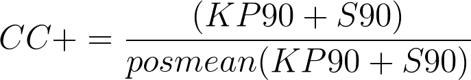
In developing a Chances Created statistic I took this approach so there are three separate statistics: Chances Created (CC), Chances Created Plus (CC+), and Weighted Chances Created Plus (wCC+). The goal of a statistic like this is the same as in baseball, find a metric that gives a better indication of a players contribution to the attack than just goals and assists which are clouded by lots of noise.
Chances Created
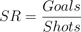
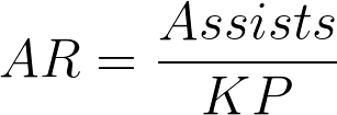
A chance in football corresponds to a shot, whether on target or not. There are two actions which directly create a chance, a shot and a pass that leads directly to a shot (a key pass). So at its core CC is just an accumulation of shots and key passes, but adjusted for playing time to shots and key passes per 90 minutes.
![]()
The next step is to create a statistic that is normalized so that the average is 100. The problem with this is determining what the average player is in terms of chance creation. In baseball, every player has the same opportunity to bat whereas in soccer different players in different positions are expected to contribute different outputs offensively. So instead of normalizing for a non-existent, completely average player I divided players into four positions: goalkeeper, defender, midfielder and forward. Obviously there are a lot of debates about what these positions actually mean and there are players that play in different positions throughout the season. In order to keep as much objectivity as possible I’ve just used the players' positions that they are assigned by the Premier League’s official fantasy league. Not a perfect solution, but as good a benchmark as I could think of.
In creating the average player I also think it is important to only include players who played a significant role in the season, not those who only play bit-part roles. Thus I’ve only included players who have played at least half of their teams games in the season (which in the Premier League is 19).
Finally, I wanted to weight the chances created statistic to account for shot quality. We know that not all shots and not all chances are created equally, so the chances created statistic should also reflect the quality of these chances created. I decide to weight the statistic by assist rate and scoring rate which are essentially the percentage of key passes that lead to goals and the percentage of shots that lead to goals. Since I’m using an entire season’s worth of data the sample size is large enough that these percentages should align relatively closely with the percentages if I had used expected goals, or in other words the sample size should be large enough to drown out any significant noise that exists in the weights. For example if a player takes a lot of shots from poor positions their CC+ will be high, but their scoring rate will be low so their wCC+ will be lower accordingly.

Testing the Statistic
I think there are three key features that a statistic should have in order to be relevant and useful, it should have some explanatory capability, it should be repeatable and it should be simple to understand.
Explanatory: If the teams that have players with the highest CC, CC+ and wCC+ don’t create the highest number of goals then the statistic is useless since it is not connected to anything tangible that teams are trying to accomplish.
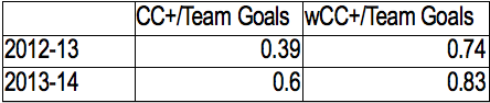
There are high r^2 values between the number of goals a team scores in a year and the average of their players’ CC+ and wCC+. The table below summarizes the r^2 values in the 2012-13 and 2013-14 Premier League seasons between the statistics and team goals scored. As the tables show wCC+ has more explanatory power than CC+ as we would expect.
Interestingly if we look at defenders, midfielders and forwards on each team individually as well as the total average and run a regression on the total number of goals the team scored the individual position specific values are not statistically significant, so everything is captured by the total team average. In simpler terms, if a team’s forwards have a higher wCC+ than their midfielders it doesn’t mean they will score more goals, it is the team average of all positions that matter.
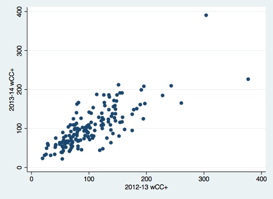
Repeatability: The statistic must have some predictive value. Therefore there must be some trend in the statistic from season to season so that a player’s CC, CC+ or wCC+ has some predictive power for their output in the following season.
Looking at the 2012-13 and 2013-14 Premier League season the r^2 value between wCC+ from one season to the next is 0.78. The scatter plot below shows the tight season to season trend in wCC+.
Simplicity: CC+ and wCC+ are designed to be as simple as possible in compare players. The benchmark of 100 for the average player at each position makes it instantly clear whether a player is above or below average in terms of offensive contribution. This is a statistic that is easy to read and even without the background on the methodology is easy to understand conceptually.
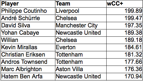
wCC+ Premier League Leaderboards
2012-13 Premier League Defenders
2012-13 Premier League Midfielders
2012-13 Premier League Forwards
2013-14 Premier League Defenders
2013-14 Premier League Midfielders
2013-14 Premier League Forwards
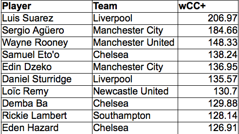
Some of the outliers like Kolarov and Schürrle come down to their classification as a defender and midfielder respectively when in reality they often play in more attacking positions. However, the lists in general seem to provide leaderboards that pass the “eye-test” when it comes to chance creation in the Premier League.
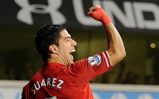
These leaderboards also demonstrate one of the limitations of the statistic. It can only really be used to compare players in the same position. As expected there is a much greater range for defenders than midfielders and forwards, because the denominator becomes steadily higher as we move further up the pitch. This also reflects common sense, there is a bigger range among defenders’ chance creation, who all have different roles in terms of attacking intent, than there is amongst those of forwards whose primary goal is to create chances. For example Kolarov doesn’t create more chances than Suarez despite having a higher wCC+, he just creates more relative to the average defender than Suarez does relative to the average forward.
That being said these leaderboards show how much better Luis Suarez has been than every other forward in the Premier League over the last two years. It is also nice to see this statistic reflect how vital Coutinho was to Liverpool’s 2013-14 season. The other stand out to me was Wayne Rooney’s consistency and impressive numbers over the past two years with wCC+ of 147 and 148. These production numbers fall in line with some of the other work on Statsbomb looking at Wayne Rooney’s career.
Overall I’m pretty pleased with the picture these wCC+ leaderboards give of chance creation over the last two seasons.
Next Steps
I’ve only used the data that I’ve complied to date which is 2012-13 and 2013-14 Premier League data. In order to really understand how widely applicable CC+ and wCC+ is we need to see how it works when applied to other leagues around the world.
The other area where changes could be made is in how the weights are applied. Assist rate and scoring rate are simplistic measures compared to potentially more indicative metrics like expected goals per key pass and expected goals per shot which would require a much richer data set. In the future these weights might give a statistic that better isolates an individual player’s contribution.
This is the first time I’ve ever tried something like this before so I’m open to critiques, suggestions and other tests people think would be applicable to further examine CC+ and wCC+.
What Type of Striker do you want? Pre-Shot Dribble Distance Metric can help

Most everyone reading this will be aware of the Player Radars that Ted has been producing, both here and on his Twitter feed, over the last 6 months. The radars are a great way to get a feel for a player simply by using a dozen high level stats and it also allows you to get a grasp for the likely attributes of a player even if you have never seen them playing before.
How to distinguish different types of strikers?
Data can be, and I’m quite sure is being, used to help filter the number of potential forwards that a club may be interested in. The data that is easiest to gain access to is the widely published totals like number of shots and conversion rates; or other outcome orientated metrics. Of course, I am a big fan of these “counting metrics”, but I believe it is also possible to understand certain stylistic traits of players from the detail event data that Opta collects. As well as helping inform the football fan, this information could also form part of a club’s recruitment and initial selection process, thus narrowing down the potential number of acquisition targets before a scout has even personally laid eyes on the player in question.
What stylistic metrics could we use? 1 - Expected Goal values
Expected Goal values for individual players can certainly be used to tell us what type of shots players tend to take on. However, enough has been written and tweeted recently about this concept for people to have already gained an understanding of this measurement. In fact, only last night, Sander Ijstma published a neat article which showed how individual player ExpG values can be used in assessing shooting styles.
This article is not about Expected Goals, and I merely mention it here to put on record that we can certainly learn about player’s preferences from this measure.
2 - How much do the strikers create themselves?
Some of you will know that I was critical of Tottenham’s purchase of Roberto Soldado, and I said as much in a piece I wrote last August. In summary, it seemed to me that many who claimed that Soldado was worth the price Spurs paid for him was basing this assertion on his super conversion rate at Valencia. In the three seasons from 2010/11 to 12/13 the Spaniard converted at a rate in excess of 20%.
My reluctance to go along with the general consensus was that the quality of Soldado’s chances was simply off the chart - the quality of his average chance in 2012/13 was the second highest of any player in the five main European leagues. To me, this went a very long way to explaining why he was able to boast such a good conversion rate.
The first comment posted by a reader in relation to my article included the observation:
If you fully wanted to investigate the value-for-money on this deal, I think you also need to look at how often does he actually work himself into positions that are good scoring positions
That was a very valid point, and ever since then I have been thinking about how we could capture the work that a striker does himself in fashioning his chances. This concept could lend itself to a number of different types of analyses.
As well as shedding some light on how much of the chances could be attributable to the striker himself, it would also allow us to be able to objectively assign a “style” to forwards. It could even serve as proxy for how mobile and pacy, or alternatively static, a forward is. Regardless of how this information will be digested it became clear to me that this is data we should be analysing, and with the use of Opta’s most detailed event feeds we’re now in a position to look at this.
I’m going to look at this area through the lens of a new metric, Pre-Shot Dribble Distance (PSDD).
Data Rules
I included all kicked shots, but excluded headers as we wouldn’t expect a player to carry the ball prior to them having a headed effort at goal. I only included shots that followed a completed pass. So shots that came directly from turnovers, penalties or direct free kicks were excluded from this analysis. The reason for this is that these types of shots do not have an associated Pre-Shot Dribble Distance attached to them and I am interested in analysing what players do with the ball after they receive it but before they shoot.
Using Opta’s x,y co-ordinates I was able to record the distance, in metres, from where a player picked up the ball to the location where they shot from. I analysed each player for each season we have data for, and I used their median dribble distance prior to each of their shots during any given season. In this case, I felt that using the median distance would be more appropriate than the average as the latter measure could be artificially skewed by the player having one very long run with the ball. By using the median measure one or two “abnormal” values would not change the substance of the underlying Pre-Shot Dribble Distance value for each player, thus we are left we a more representative value for the "typical" Pre-Shot Dribble Distance.
Analysing Attackers
For the purposes of this analysis I am looking only at strikers, or to be more correct, shots that players took while they played as an attacker (as defined by Opta). It is intuitive that, on average, midfielders would carry the ball further than attackers prior to shooting; this will be simply a function of where they play on the pitch and where they tend to collect a pass. In the 2013/14 EPL season, Wayne Rooney had a total of 58 kicked shots at goal that were assisted with a completed pass. Of these 58 shots, he had 37 of them when listed as a midfielder by Opta, with the balance of 21 coming from his role as a striker. In this analysis, I have only used his 21 shots generated from his forward’s role.
The tendencies of players that shoot from midfield can be analysed another day.
Premier League 2013/14
To get a feel for the data let’s have a look at the players in the Premier League that had more than 20 kicked shots (with an assisting pass) as an attacker last season, sorted by median Pre-Shot Dribble Distance:
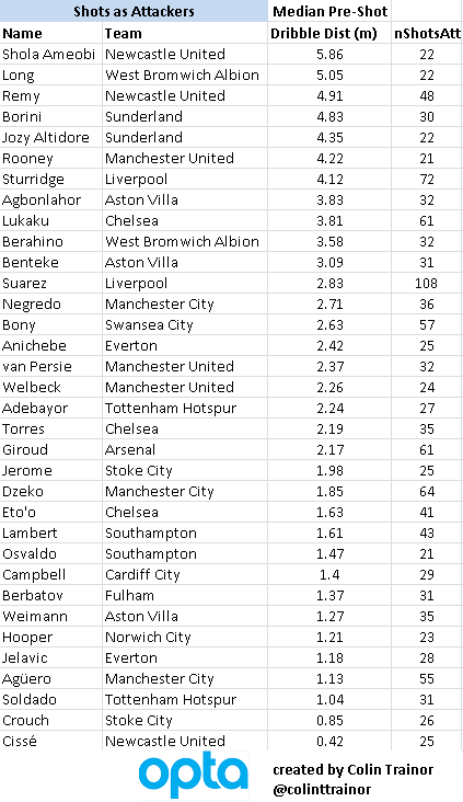
At a first glance, the general shape of the table seems to make a lot of sense to me. At the top of the pile we have the strikers that could be termed as being “mobile” or pacy, ie Shola Ameobi, Remy, Altidore, Rooney and Sturridge and at the bottom we have Crouch, Soldado, Jelavic, Hooper and Aguero. If, like me, you think that Sergio Aguero looks out of place in that very static looking company then please read on as I explain why this might be the case.
I’ve no doubt that team effects come into play here, sides that play a counter attacking style or allow their strikers to be surrounded by plenty of grass will tend to see their strikers post larger median PSDD values.
I’m not necessarily saying that Remy is a better striker than Soldado (hell maybe I am, but that’s not for this article), but these values clearly show how the two players tend to play and the work that they do themselves in fashioning their chances before they finally pull the trigger. In fact, the ability to hit a ball first time is a tremendous skill; and it is for that reason that I want to stress again that the names at the bottom of the list are not bad strikers. They just take a shot much earlier when gaining possession than the players that appear higher up the table.
OK, so anyone that has seen Remy and Soldado play wouldn’t need these PSDD values to know that they aren't a similar type of player. But by measuring the work that they do in creating their shots we have an objective way of measuring this one particular facet of their playing style. The real advantage comes when we are able to analyse players that we are not as familiar with. As well as seeing their outputs via summary stats, we are able to get a feel for tactically how the striker might fit in to a potential new team and / or role.
I think it’s worth repeating that this table, and indeed entire article, is not concerned with how good the striker is at finishing or what his conversion rate was; it’s purely a numerical way of describing how they shoot. We have many other metrics that can help us answer the qualitative output question.
Liverpool
The above table certainly reinforces the image of Liverpool playing, and striving to own, very mobile strikers that don’t need chances served up on silver platters for them to thrive. With Borini (who was on loan at Sunderland last season), Sturridge and Suarez all appearing in the top dozen places it is clear that the Anfield club value pace, power and mobility highly on their list of priorities when looking for attacking talent. It therefore shouldn’t surprise many to see than they are reportedly very close to signing Loic Remy from Newcastle as they look to replace the irreplaceable Luis Suarez. We can see that there is barely another striker in the Premier League that is as mobile or does as much of his own work after receiving the ball as does the Frenchman. It is easy to see how Remy could slot right in at Liverpool.
Sergio Aguero
Of the Premier League strikers from last year, the one that surprised me the most was Man City’s Sergio Aguero . In the table for 2013/14, only 3 strikers recorded a lower median PSDD than the Argentinian’s mark of 1.13metres. When I think of Aguero, I recall his terrific speed, low centre of gravity, his agility and ability to run with the ball. How can we reconcile that with his lowly position in this table?
I am hypothesising here, but I think that even when Aguero played last season he was seriously hampered by injuries. He started just over 50% of all Man City’s league games last season (20 starts), but this data is telling us that even we he did play he was unable to play his natural game. I’m not medically trained and have no access to Man City’s fitness data, so how can I make that assertion?
Very simply, his numbers for 2013 are totally different to any of his other seasons that I have data for (from 2010/11 onwards), as can be clearly seen in this chart below:
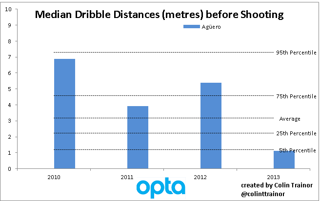
To give get some context around the median Pre-Shot Dribble Distance values for strikers I have plotted lines at various percentiles. These percentiles are based on all of the data in my dataset, ie Big 5 leagues for the last 4 seasons; which is why the percentile values does not tally with the data for just the 2013/14 Premier League table that we had seen earlier in this piece.
In two of the three previous seasons Aguero was well in excess of the 75th percentile, and appeared just below this mark in the other one. However, his median PSDD achieved last season, of just over one 1 metre actually places him in the bottom 5% of all median distances for strikers that had more than 20 shots in a season. We can see that was quite a significant and fundamental change in playing style for him, and one that I am convinced can be put down to the injuries he was carrying; specifically his hamstring injuries that seemed to hamper him for most of last season. Upon receiving the ball, Aguero was much less likely to attempt to advance it prior to shooting than he was in previous seasons and it looks like Aguero was broken in 2013/14.
A Messi Change
Another player that has had a change in playing style highlighted by this metric, albeit much more subtle than Aguero’s, over the last couple of years has been his international colleague - Lionel Messi.
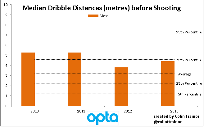
Over the last two seasons Messi is carrying the ball less distance than he did previously before shooting. As stated above, his decrease in PSDD values isn’t as marked as Aguero’s has been, but I can’t help but wonder if the slightly smaller numbers are also to do with the injuries Messi has suffered over the last 24 months. It may also be the case that ever since Pep Guardiola left Barca at the end of the 2011/12 season that Messi’s role in the team has been slightly different to the one he played previously. In either case, we now have a metric that can help us understand / visualise the type of game that a striker tends to play, including the ability to notice when a player varies or departs from a previously favoured style; either due to tactics or because the player in question is not fully fit.
Wrap up
This was only meant to be an introductory post to the concept of Pre-Shot Dribble Distances, and I’m sure I’ll be returning to this topic many times in the future. However, I’ll leave you with one more chart that I think is worth including in this first article on Pre-Shot Dribble Distances.
The highest individual PSDD in any season over the last four Premier League years was posted by Gervinho at Arsenal in 2011/12. However, it becomes apparent that that season was not a one off:
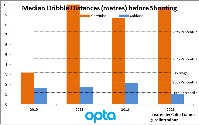
In order to keep the chart a reasonable scale I have capped the median PSDD at 10 metres per shot, but you can see that Gervinho topped that figure in 11/12. In fact, over each of the last three seasons, so covering his spells both at Arsenal and Roma, Gervinho was well above the 95th percentile for this metric. In terms of a player that is powerful and pacy, can carry the ball effectively and make a shot for himself I feel you’d need to travel a long way to find someone better than Gervinho. It seems a shame that Wenger couldn’t find a way to get the most out of the Ivorian as he certainly has a very talented skillset.
And the answer that all Spurs fans have undoubtedly been waiting for is that Soldado was not quite as static or immobile in his time at Valencia as he was last season in North London. Although, as he never made it higher than the 25th percentile in terms of Pre-Shot Dribble Distance in any of his last four seasons, I don’t think I would expect the Spaniard to operate any differently this coming season than he did last year. However, whilst his playing style is very unlikely to change, and good service is essential for him to flourish, he will almost certainly score more goals in the next campaign due to the chances he gets and the areas he operates in.
Introducing and Explaining Fullback Radars. Sagna, Debuchy, Lahm, Alves and More

In January, I started with this. Then in April, radars improved to this. Today. I get to introduce fullback radars to the world, as well as explaining some updates to the other templates as well.
What the hell is a radar?
It’s a way of visualizing a large number of stats at one time. In our case, the radars specifically deal with player stats. Some people also call them spider charts or graphs because they can look like they make a spider web.
Why bother creating them? What’s wrong with tables? Or bar charts?
Hrm, let’s deal with the last questions first. There is nothing is wrong with tables of numbers. My brain loves them, and so do many others. Little bit spreadsheet and database fetish? Oh yeah.
However, you have to admit that tables of numbers are a little boring. Bar charts are better, but they kind of fall apart when trying to compare many attributes at the same time. Radars allow exactly that.
Why bother creating them? That one is complicated. Why bother making infographics or doing data visualization at all? The answer is probably at least a book long, but the quick response is because people like to look at stats presented in this way far more than they like to look at a set of numbers. Radars invite you to engage with them. They create shapes that brains want to process. People have real reactions, and once you get used to what they display and how they display it, you can interpret them much faster than if you had to do the exact same analysis with a table of numbers.
Many of the shapes created correspond to “types” of players, at least when it comes to statistical output. Pacey, dribbling winger. Deeplying playmaker. Shot monster center forward. Starfish of futility.
There’s a lot more methodology chat at the bottom of this article, but I need to explain one very quick thing before I move on to the meat of the article.
Radar boundaries represent the top 5% and bottom 5% of all statistical production by players in that position across 5 leagues (EPL, Bundesliga, La Liga, Serie A, and Ligue 1) and 5 seasons of data.
In stat-y terms, the cut-offs are at two standard deviations of statistical production.
In non-stat-y terms, Lionel Messi made EVERYONE look terrible. I know, that doesn’t sound that bad because it’s true, but trust me, the newer way the templates are constructed is better.
So uh... fullbacks?
Indeed. There are different radars for different positions because different stats are important for different spots on the pitch. Tackles and interceptions? Waaay more important for fullbacks and defensive midfielders than for forwards. Shooting stats? Flip it and reverse it. What I’ve done for fullbacks is to try to account for which stats are important in the modern role. This includes crossing, dribbling, and key passes, as many of the best fullbacks are also a crucial part of the attack for top teams.
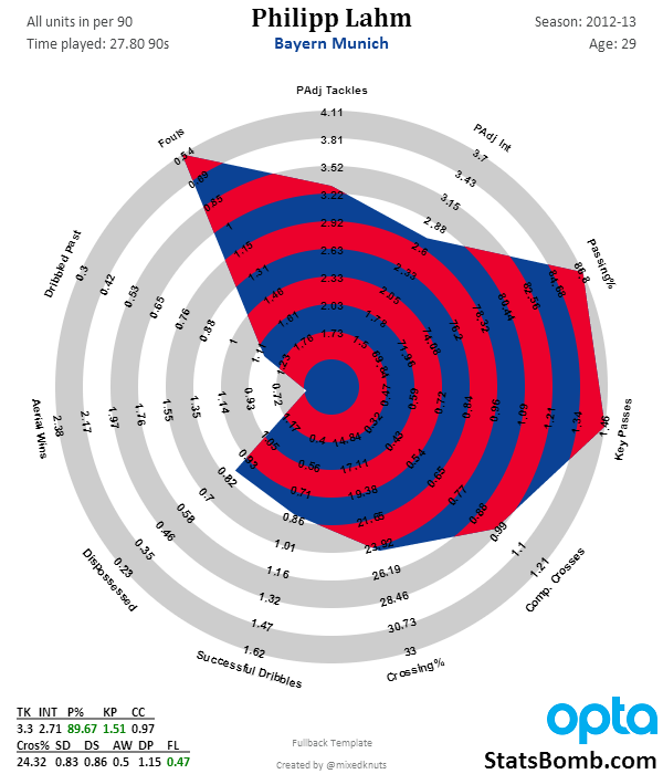
One of two contenders for the title of the best right back of modern times, the German captain has big statistical output. Great passing stats, defensive output, a solid dribbler, and almost never commits a foul. Picked players’ pockets and they never even knew it was gone. The only thing Lahm wasn’t good-to-great at in 2012-13 was winning balls in the air. Which makes a lot of sense, considering his nickname is “The Magic Dwarf.”
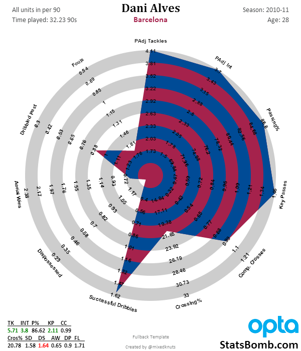
The other contender for the title of best right back in modern times, Dani Alves’ radar is awesome. Top 5% in possession-adjusted tackles and interceptions, while contributing over 2 key passes from fullback per game, and in the 93rd percentile or so on successful dribbles per 90. Alves was bananas on that Barcelona team.
Note that each of these radars have “Padj” before tackles and interceptions. That stands for “possession-adjusted” and to me is the most sensible way to account for stats that typically occur in the defensive end of the pitch. (Aerial Wins can come anywhere and are therefore not adjusted).
The reasons for adjusting defensive rate stats are explained here in quite a bit of detail, but the concept is that you can’t make defensive actions when your team has the ball. Therefore players that play on teams with high possession have far fewer opportunities to make tackles or interceptions than guys who play on low-possession teams. It might be better to think of these adjusted stats as like “tackle points” instead of the pure stat output, but tackle points are much better at measuring things that win you games than the basic tackle and interception rate stats.
Fullbacks are the first radar to have the adjusted stat, but I will likely roll them out to the other two templates in the near future.
For the record, this is what Alves’ output looks like without the adjustment.
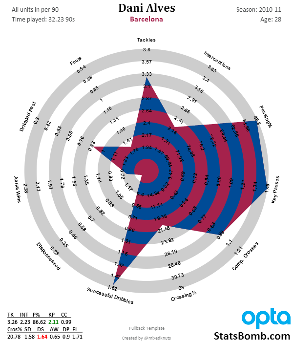
Still very, very good, but Barcelona had 72.6% possession that season. It’s a LOT harder to rack up defensive stats when your team has the ball nearly three quarters of the game.
Right, we’ve briefly looked at two great fullbacks... now what does a bad fullback look like?
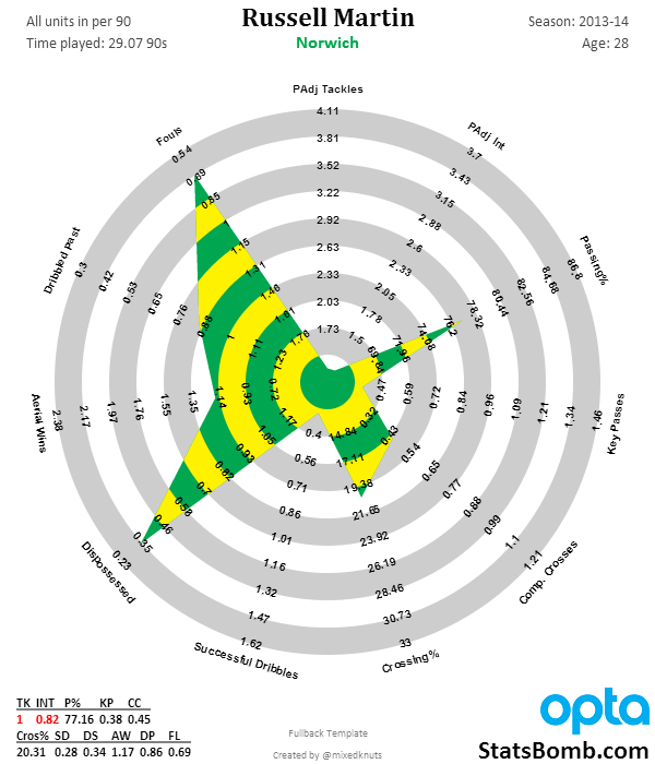
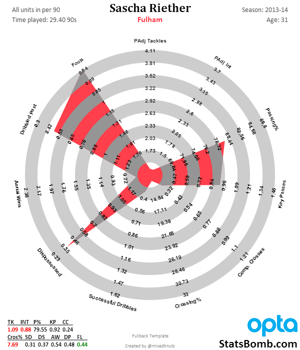
Yikes. No defensive output at all, really. Absolutely dreadful stuff. The only areas they score well are the contextual stats, which to some extent you can achieve by being constantly out of position and incompetent (yes, there are valid criticisms that maybe these shouldn’t be included in the radars because of this, but context is important too!).
Gimme Some More Okay, let’s do that. This one is for Liverpool fans. On the left is Glen Johnson from 2013-14. On the right is Glen Johnson, 2009-10.
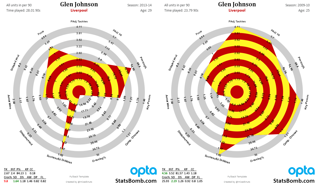
Johnson’s fullback radar from his prime looks like a Lionel Messi radar.
It’s that good.
His current output at age 29 is good, but no longer spectacular. I would look for Liverpool to transition him as soon as they find an acceptable replacement in their price range. I need to do more research, but I’m pretty sure fullback age curves and peaks are closer to forward peaks than they are to central defenders. If true, 30 is getting rather long in the tooth to expect top attacking and defending output from that position.
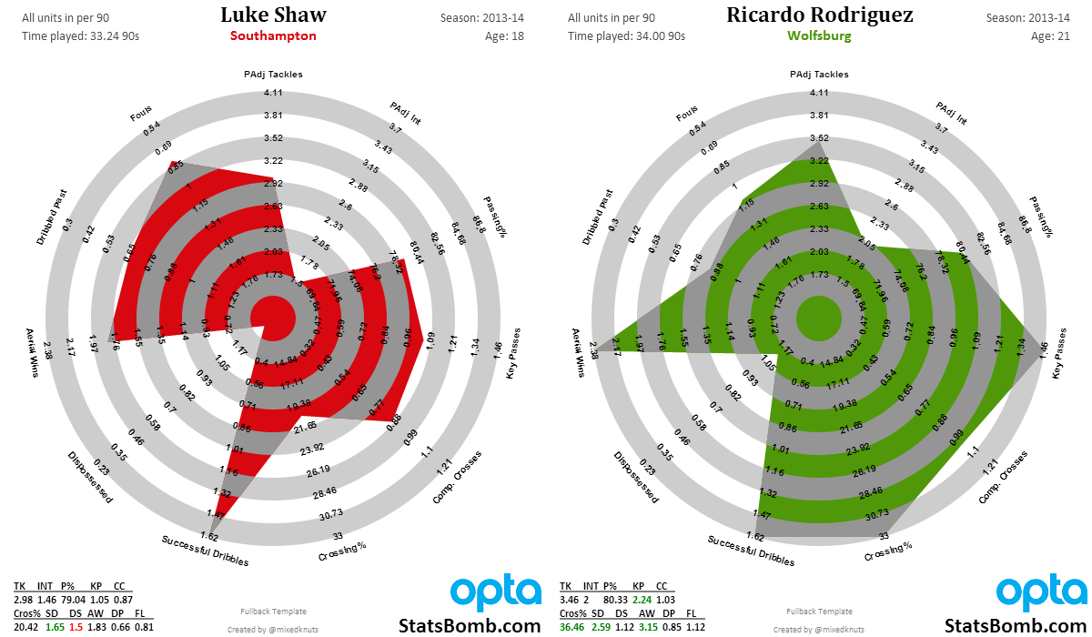
Here’s another one – a battle between two of the best young left backs in the world. On the left is Luke Shaw. On the right is Ricardo Rodriguez. Shaw is English and only 18, while Rodriguez is Swiss and 21. Now Shaw could develop into what Rodriguez already is, but it’s a risk and a mere possibility. Rodriguez is the finished article and his production is ridiculous. Plus, as he’s only 21, it’s possible that Rodriguez will continue developing as well.
I know which one I would rather have.
Finally, because Arsenal fans asked, here's Sagna vs Debuchy.
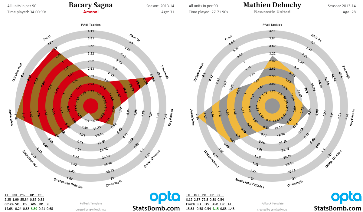
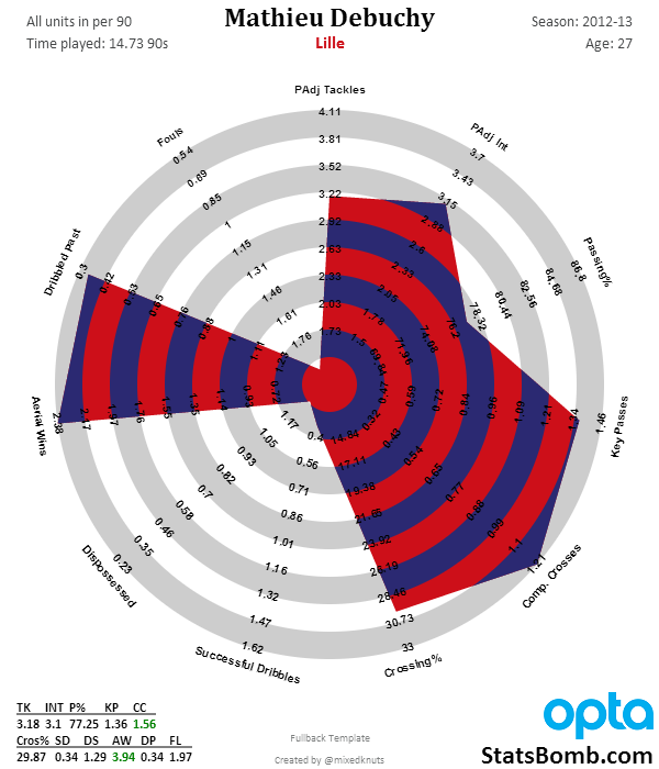
It's hard to see Debuchy as much of an upgrade unless Wenger thinks that his time at Newcastle was mostly a fluke, and that this is the real Debuchy (from Lille in 2012-13).
The Public Radar Tool
If you follow me on Twitter, you know that we’re working toward making the tool that generates the radars for me public. This will allow you guys to do your own research regarding player output and shapes without having to rely on me to produce them when I get time. The man responsible for this is @samihernia, who is just crushing it on a weekly basis.
When the radar tool is finished, it will offer a ton of options that will hopefully include overlays and side-by-sides, plus being able to add Joe Average and Steve 75th transparencies to each of the different templates. At the end of the day, I think the research into this form of visual display for sports stats is really useful, and I’m looking forward to opening up the stuff I get to play around with to all of you, and seeing what you come up with.
ETA for this is: when it’s done.
That’s it for this introductory piece. I hope you like new fullback stuff, and the minor improvements to the old templates as well. As you can see, these vis are being constantly improved, a little bit at a time. If you think they are dumb – no problem. If you like them, as most of you seem to, know that there is more cool stuff coming down the pipeline.
Beyond the radars, we’ll also have a pair of announcements in the next couple of weeks with more exciting news. One involves the site redesign, which is done and being programmed, and the other involves something top secret that I’m not allowed to talk about yet.
Cheers,
--TK
Radar Methodology Appendix and FAQ
Why do some stats cut off at the boundary while they are accurately reflected at the bottom left of the chart?
There are a couple of answers to this. The boundaries themselves represent the top 5% and bottom 5% of statistical production, across five seasons of the big 5 European leagues at that position. Statistically, this represents two standard deviations away from the mean, which is usually a set of outliers we should be very interested in.
My initial radars actually used the individual peak season of output for any player in the same population sample. At first this sounded interesting, but what happened was Lionel Messi made average players look terrible statistically. (You can see it in the link in the link here. Messi, Ronaldo, and Ribery look good, but not awesome, which means normal players look terribad.)
At the end of the day, the current methodology feels much better to me. It orients the charts and your brain to immediately understand whether players are doing really well or really poorly in certain areas. It’s not quite as precise as the pure max output templates, but it is better for the larger population.
Why don’t you use percentiles for outputs on the chart? I’m an American and when I grew up, I collected baseball cards. One of the things I loved as a kid was being able to argue about different players, and knowing their actual statistical output was a big part of this. Even as I grew up, knowing Frank Thomas’s on base and slugging percentages was a thing that stuck with me.
Initially, I didn’t have access to the entire population distribution of stats to be able to create the percentile output anyway, but the more I thought about it, the less I liked changing all of the outputs away from numbers and to population percentiles. It adds a layer of abstraction that I think interferes with potential engagement, which is the opposite of what I am going for.
It might be a useful thing to do if you were scouting players for clubs though.
Radar charts assume that all the stats are equally valuable. This clearly is not the case when it comes to these charts. Absolutely correct, and yet contextual stats tell us a lot about the valuable stats themselves. Assuming they like the radars enough to use them organizationally (and I have been told some teams are considering it), clubs doing scouting could strip out certain stats and add the ones they feel matter the most. I would also expect them to do deeper research regarding exact numeric output from players, and compare the hell out of potential purchases via scouting and video work.
These radars can’t do everything well at once. But they do offer easy, visceral comparisons of statistical output to people who aren’t necessarily that comfortable with numbers. That’s a really valuable thing, both to the public and inside a football club.
Are there any plans for Center Back and Goal Keeper radars? None at this time. Center backs and GK statistical output is intimately tied to tactical choices made by managers. Tactics affect all statistical output on the football pitch, but CB and GK in particular are almost impossible to separate right now, and thus I don’t feel like putting the work into this area is a valuable use of time. It’s something we could revisit eventually.
Some players play many positions? Why don’t you split these out by position? Wouldn’t that more accurately reflect how good they are at playing in certain areas? Absolutely. However, the more data splits you do, the smaller your sample size gets and the harder it becomes to make any conclusions. Additionally... I am just one person. Position splits require quite a bit more work, and even then might be imperfect for a number of reasons.
Why are some stats reversed on the radar? Most have big numbers on the outside, but a few have the small ones. This has to do with how radar charts work. Ideally, you want "better" performers to take up more area in the charts they produce. However, some stats actually track negative actions (like fouls or getting dribbled past), and therefore if you produce higher numbers in those stats, the plot needs to take up less area, not more. Thus I just reversed the axis, and now it makes sense.
Conclusion
Every visualization has design choices, strengths, and limitations. I’ve done my best to make decisions regarding these that make them both approachable, and yet fairly scientific. There are certainly valid criticisms that have been made, but it is a definite balancing act, and overall I have to say I’m really happy with where they are now versus six months ago.
What I can tell you about these six months after I satrted is that they are fairly popular and useful, both in my own research and that of others (I get double digit requests a day and they have been a large driver of increased Twitter followers). They also teach me things I don’t think I knew about players nearly every day I work with them. Shapes now reflect player archetypes to me, and one of the first things I do when hearing about a player I am unfamiliar with is look them up on their radar so that I can immediately understand their general statistical output. That’s pretty damned cool.
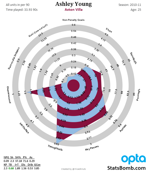
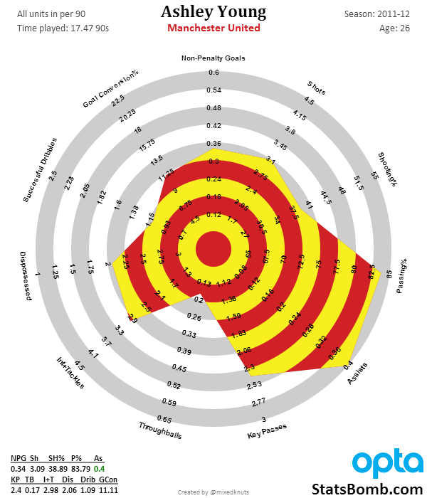
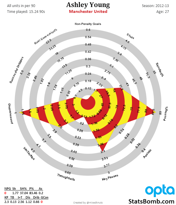
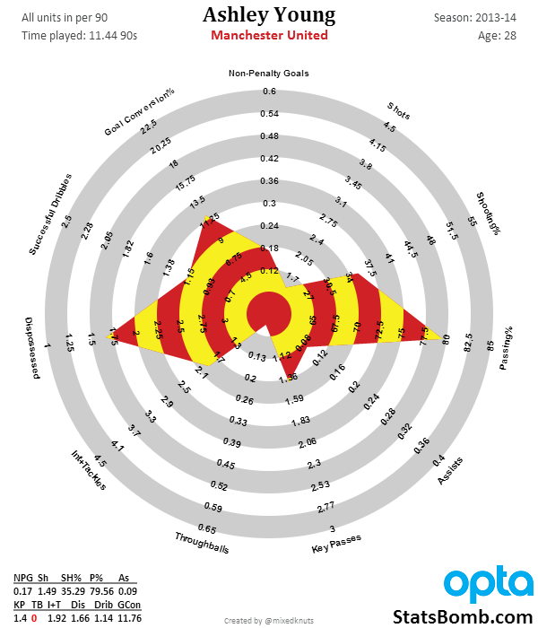
The Peak and Decline of Ashley Young
Summertime is project time. It's also holiday time, and the combination means it's hard to get fresh content on the site at the rate that I would like. Hopefully all of the effort now will pay off down the road. But in an effort to produce new content, I've been adding more (quick) visualizations and less writing. These have generally come in the form of Gifolutions during the World Cup, or quick takes on a topic like Is Khedira a Defensive Midfielder. Today is another one looking at Ashley Young's last five seasons. Sadly, none of these radars include drawing penalties just yet (I will eventually add those into expected assists when we make the transition there), but Young is one of the few attacking players in the database right now to transition from young player, to peak, and into plateau/decline in age. Check it out. 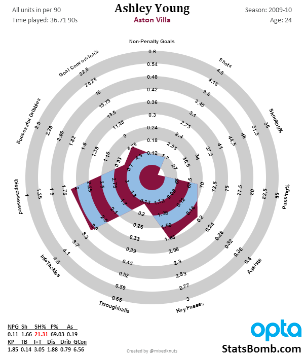
Germany must make a tough decision. (Nate Silver, Day 24)

First, I want to clear up a slight bug in the spreadsheet. In game 25 France played Switzerland. Nate backed Switzerland. After Costa Rica defeated Italy in game 24 Nate's stake on Switzerland would have gone up, but the line had moved and with the new line he kept his original stake. That led to a roughly 7k difference on the spreadsheet as I forgot to correct for the bet size not increasing. With the correction, after 62 games Nate stands at $535,399. Now, let's talk about the 62nd game, Argentina vs. Netherlands. Netherlands had to make the same choice Germany has to make: to attack and leave fewer defenders to protect against a counterattack from Messi, or leave an extra man back and play a defensive game. Netherlands chose to play defense and that led to this: 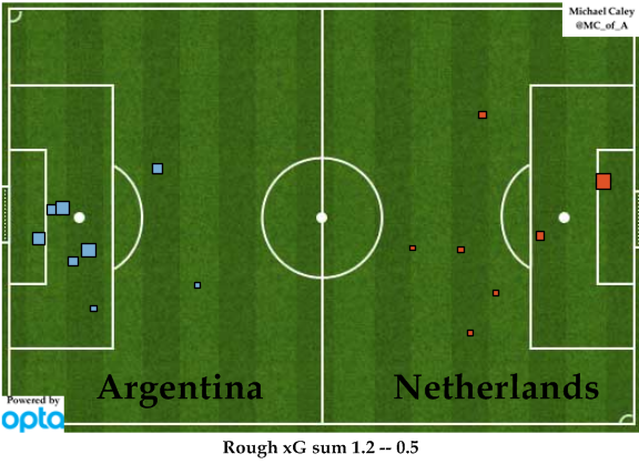 It ended up being tied nil-nil after 120 minutes (which was the second straight nil-nil penalty shoot-out for Netherlands). Unfortunately, their luck vs. Costa Rica didn't repeat, partly due to their inability to sub Tim Krul in for penalty kicks. The fact is, Argentina were the better team and deserved to advance to face Germany. Argentina have only scored two goals in the knockout round, but they've allowed none. They're comfortable playing in a defensive struggle. Is Germany? My guess is they'd prefer to play in a more open game and will risk giving Argentina a few good scoring chances in return for the advantage of playing with an additional attacker. Their offense is partially based on"threat density" and having multiple options for receiving a pass in the attacking zone. That they were able to dominate offensively while only allowing two goals (and none in before already taking control of the game) of the knockout round is impressive. Germany is the best team in the world. Argentina has the best player in the world and have home continent advantage. Nate Silver has made his choice: Game 64: Germany to win the World Cup, 9.72%: Risking $52,041 to win $36,139 You may have noticed that game 63 is missing. The 3/4 game is an abomination and is somehow less meaningful than the play-in games that have somehow become the "first round" of the NCAA Tournament. Some interesting notes about Nate's wild ride sailing full-Kelly through the World Cup: Nate peaked at $940,835 after Costa Rica advanced vs. Greece. While he's currently up $435,399, he's down $405,436 over the past 10 games. If Argentina wins, Nate will finish with $483,358. If Germany wins? $571,538. Seems like destiny to me. 🙂 Seth Burn @sethburn on Twitter P.S. Some of you may remember my first post at Statsbomb: http://statsbomb.com/2014/06/goldman-sachs-and-the-world-cup/ Goldman Sachs is currently down $3,077,100. They currently have a bet against Argentina for $470,000 to win $100,000. However, as they have $6,452,900 left in their World Cup trading account, they could still put themselves in line for a 14% return if they were to invest all of that account on Germany. A bold gamble to be sure, and somewhat cynical. However, if you were a rogue trader who wanted to hide his losses? Win or get bailed out. That doesn't sound like Goldman Sachs, does it? 😉
Gifolution: Alexis Sanchez. From Udinese to Barcelona to Arsenal
Arsenal got their man. Alexis Sanchez, perhaps the best forward "available" on the market, is now an Arsenal man. Below shows how Sanchez's output has developed over the years. When he started at Udinese, he was clearly in a more creative role. However, as the years went on, his goal scoring touch developed and by the end of last season, he had one of the highest goalscoring rates in La Liga without losing any of his passing creativity. There are huge questions as to whether he is big enough to play center forward at Arsenal (he's only 1.70m tall), but he is a powerful runner and has the skill set to play any of the forward positions. Regardless of where he plays, Sanchez is a huge upgrade in attack for the Gunners. 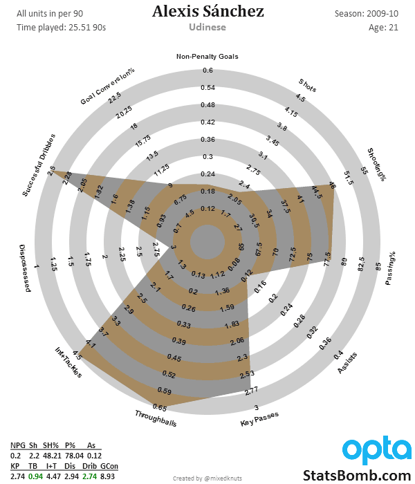
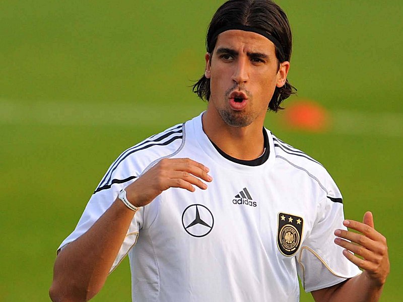
Is Sami Khedira Arsenal's Answer at Defensive Mid?
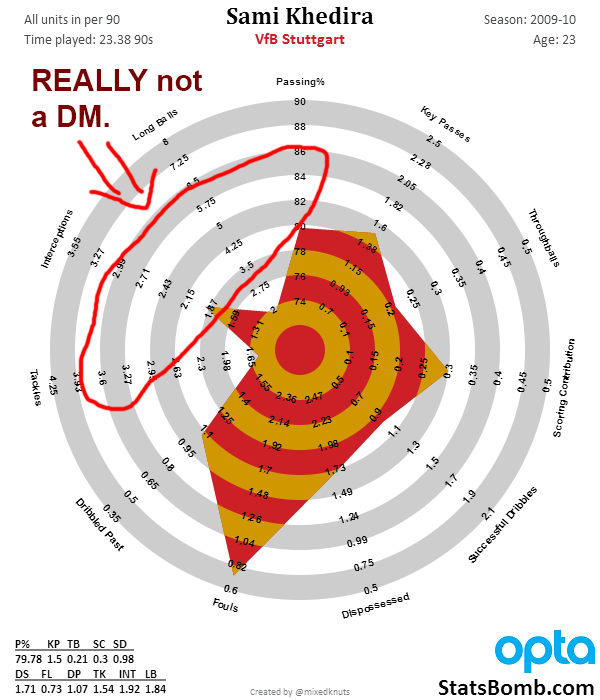
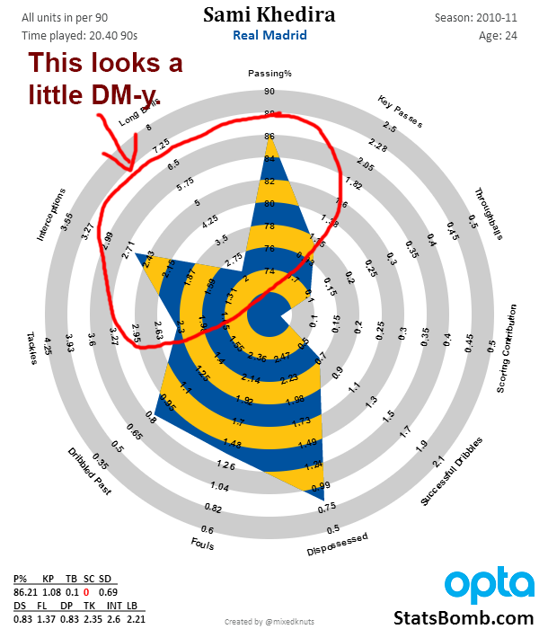
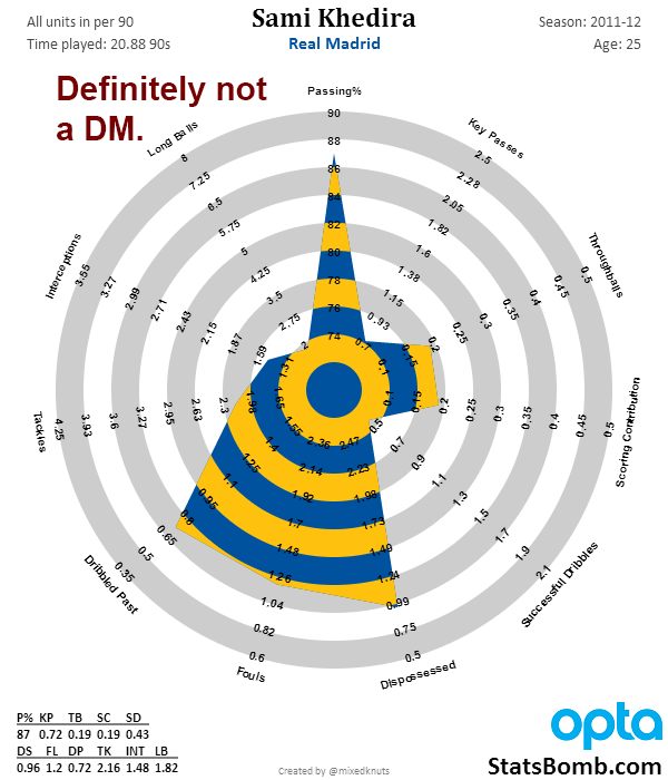
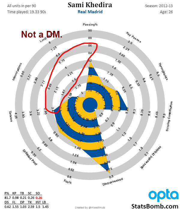
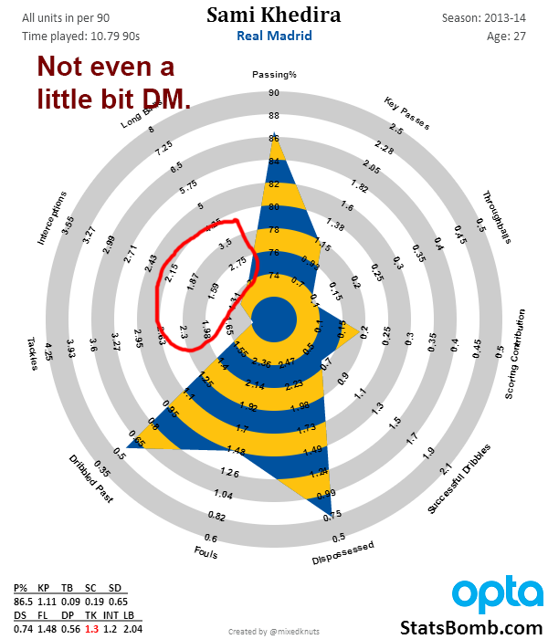 Hrm... Okay, so what DOES a defensive midfielder look like? Here's one.
 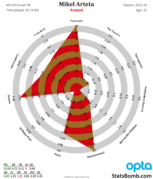 Here is another. This one is French and just entering his prime.
 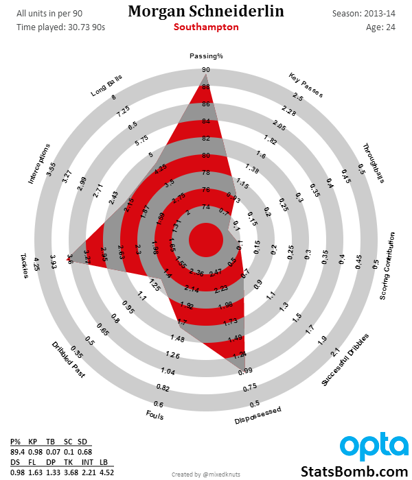 Finally another. This one is even on the German National Team, and he's young too.
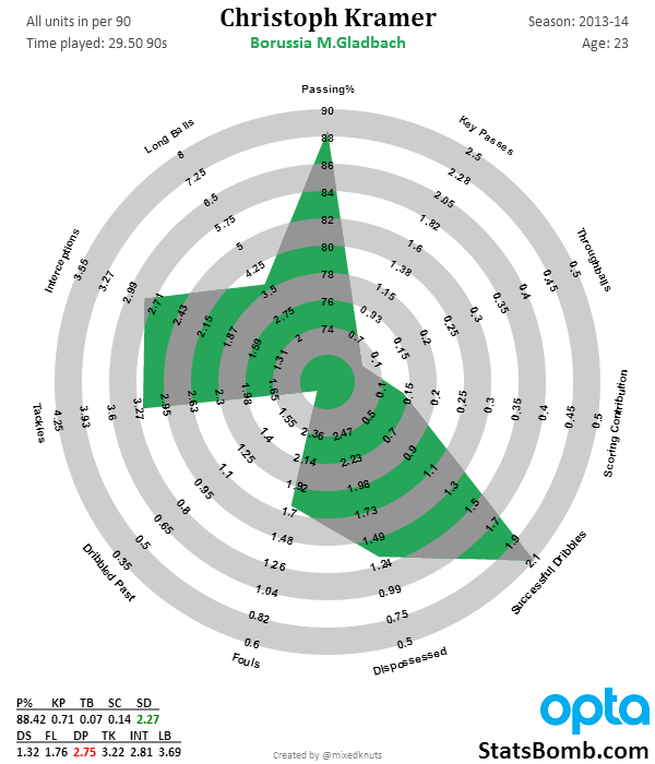
Developing the Young Player Scouting System – Midfielders

(All data for the models is powered by Opta.)
As many of you know, I’ve been working on a statistical scouting model. The theory behind is this that by using a mixture of key performance indicators, you can unearth players that teams should be interested in watching and potentially signing, while making scouting more efficient, saving time and money in the process.
The background information for the attacking player system can be found here, and a data dump of the 2014 output can be found here.
Now I think the attacking player scout is really quite good. Backtested over four seasons, it seems to turn out near superstar players about 70% of the time, and unfortunate duds at a 15%. This falls in line with the fact that we understand attacking output fairly well, so it’s easy to pick them up with stats.
But what about midfielders?
I can tell you for a fact, scouting midfielders via stats is much harder. Thus far it’s been hard enough that some of my more skeptical friends don’t think this type of scouting is possible. However, this is the type of feedback that I tend to use as encouragement to persevere, so that’s what I did. This model is only a prototype right now, but early results are fairly promising.
Here is the list of players the model flagged after the 2010 season. The midfield scout is set to pick up players up to a year older than the attacking scout, mostly because midfielders have a longer age curve than attackers.
On first glance this looks like a mixed bag, but I think the output is really promising. Regardless of what you think of Alex Song now, Alex Song in 2010 was one of the most promising young mids on the planet, and eventually moved to Barcelona. Also present are Ramsey, Lucas, Mikel, Mark Noble (underrated), and uh... Denilson (can’t win ‘em all). Three Leverkusen guys show up from Germany, one of whom is now considered one of the best all-around midfielders in the world, and the other who is merely one of the best in Germany (Gonzalo Castro). Banega and Busquets are the two that show up from Spain, while you get Matuidi, Cigarini, and Marchisio out of France and Italy.
It’s an imperfect list, but it’s also a good start.
The other backtested years actually seem to improve on the overall results. In the big 5 leagues, a little over 50% of the names this model picks up become stars. About 65% are at least good or very good, while the outright failure rate is around 15%. Again, this is taking output of younger players and saying “we think these guys either already are or will become very good.” The failure rate on transfers as a whole is 55-60%, so a prototype that picks out stars near that rate, with a failure rate of 15% is very strong.
Much like with the attacking player model, with the midfielders I am going to be open with the players the model picked up for the 2013-14 season. I definitely won’t have time to write about them, but if you are interested and want to do so, feel free. Making these public also provides a testable record to look back on over the next few seasons to see who developed into good players and who didn’t make it. I’m also including Eredivisie picks here with one caveat. I only have one season of data for the Eredivisie, so this isn’t backtested at all. My hope is that it still works with some minor tweaks, but without data to go by, it is only a hope and not something backed up by data analysis (right now).
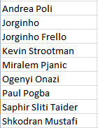
EPL
Bundesliga
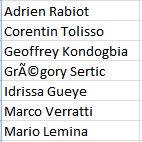
La Liga
![]()
Serie A
Ligue 1
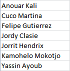
Eredivisie
Anyway, I hope you guys are enjoying this series. You’ll see radars of these players gradually appear on my Twitter timeline over the coming weeks. I have to admit, despite watching a ton of football, I know nothing about the vast majority of them. If you have thoughts or comments, feel free to leave them here, or hit me up on Twitter.
If you work for a club and are interested in discussing the statistical scouting models I have been developing, feel free to send me an email at mixedknuts at gmail.
Cheers, --TK