Man United v Chelsea Player Positional Tracker

Man United 1 vs 1 Chelsea

United grabbed a very late equalizer as Mourinho's Chelsea just faced to hold on to their second half lead.

Here is our visualisation that shows the smoothed positions of players around the time as indicated. The locations are identified with reference to actions as identified by Opta.

Comments from Sam Gregory appear below the PPT.  Click on the gif to open in a larger window:


MUFCvCHE

1st Half 
  • United lined up with Van Persie in the middle flanked by Januzaj and Di Maria on the wings. It was a fairly straight forward 4-3-3 with Mata floating between the two lines as the link between midfield and forwards. This marked yet another change in formation for Van Gaal who had used a 4-1-4-1 against West Brom.
  • Blind was quite effective in the first half following Fabregas throughout and keeping him off the ball in the middle. Fabregas was forced to drop into positions closer to the Chelsea back four as the half went on.
2nd Half
  • To start the second half Di Maria and Januzaj switched wings and Di Maria was very involved for the first fifteen or twenty minutes testing Ivanovic on the left side.
  • Once Chelsea scored through Drogba they reverted to their typical shut-down football. Cahill and Terry dropped much deeper while Ivanovic and Felipe Luis made fewer attacking runs. Mikel came off the bench to fulfil his usual role of guarding the back four, giving Matic and Fabregas more freedom to disrupt United's passing game further up the pitch.
  • United's attacking game completely fell off after the Chelsea goal and it wasn't until the final five or so minutes when they started to make a few chances.
Conclusion
  • Fabregas probably had his least effective game since coming to Chelsea and a lot of the credit goes to Blind and Fellaini who kept him fairly quiet.
  • A draw was probably a fair result, but Chelsea usually hold onto these results when they are able to slow down and kill off the game so United can take solace in the fact they were able to pull off the draw.

Tottenham v Newcastle Player Positional Tracker

Tottenham 1 vs 2 Newcastle Newcastle upset the odds with a come from behind win at White Hart Lane on Sunday afternoon. Here is our visualisation that shows the smoothed positions of players around the time as indicated. The locations are identified with reference to actions as identified by Opta. Comments from Zubair Arshad appear below the PPT: TOTvNUFC  

  • This was a real "game of two halves".
  • Main comment for Spurs was their narrowness of Chadli/Lamela occupying the same space as Eriksen, therefore making it a bit easier for Newcastle to defend. This can be seen in the PPT. Lennon was introduced in the 75th minute to address this but Pardew reacted by bringing on Haidara to play in front of Dummett on the left.
  • Newcastle struggle to establish any dominance in the game (especially in first half) without Tiote. Anita is the furthest possible replacement for Tiote that we have. He received 4 passes and made 4 passes in the first half therefore no surprise to see his "dot" very erratic and small. It was difficult to pinpoint NUFC's structure (mainly because they barely had one), with Sissoko and Colback high up the pitch to try and support Perez but NUFC overall had very little possession in the first half. (21%).
  • The second half was a different story. Clearly the Ameobi goal changed the game, but there was a lot more structure to Newcastle's midfield. Cabella, Ameobi and Gouffran interchanged between the lines and flanks, with Sissoko and Colback sitting a little deeper frustrating Tottenham in the middle of the pitch.

Where has Liverpool's Press gone to?

Liverpool's defensive problems this season have been well documented.  This very brief post isn't going to address Liverpool's defensive issues, but will concentrate on one very specific team issue; their lack of a high press this season. Last Season's Press These are the PPDA values for each team last season in the EPL (the lower the PPDA value the more aggressive the press employed by the team). For anyone unfamiliar with the PPDA metric an introduction can be found in this article. 1314EPL Apart from the fact that Liverpool were ranked in 3rd place on my Pressing metric last season, what is probably more stark is the fact that Liverpool pressed as aggressively when they were leading games as when they were behind or drawing.  Naturally, we would expect a team that is leading to sit back a little and to reduce the intensity of their press.  But Liverpool didn't do this. All the other top teams exhibited the expected pattern of posting lower PPDA numbers, and thus a more aggressive press, during losing Game States.  Liverpool were the sole exception to this (of the top teams). As to the reason for this we'd only be speculating, but there are a couple of ideas that spring to mind. The first is that Rodgers didn't trust his team to defend a lead by sitting back.  Perhaps he knew that they were suspect defensively, and to keep them continually on the attacking front foot really was The Reds' best form of defense. Alternatively, these pressing numbers encapsulate the Spirit of Luis Suarez.  We can all envisage Suarez running around the attacking half of the pitch like one of those Ever Ready Bunnies from the old television adverts.  His work rate was phenomenal and perhaps this PPDA metric quantifies that.   8 Games into the 2014/15 EPL Season 1415EPL Liverpool's press, their desire to win the ball back in attacking positions, has markedly decreased this season.  They fall from last season's 3rd position to a mid table ranking.  But what is also really noticeable is that their PPDA values when split across Game States are now beginning to follow the familiar pattern that all the other teams exhibited; they press less when they are in winning positions in games. Has the work ethic in the attacking half dropped off a little?  Is this a planned decision or has it just "happened"? We can obviously only offer guesses and conjecture at this stage, but has the team been forced to drop a little deeper to provide some defensive cover for Gerrard this term?  Never mind the goals that are missing due to the absences of Suarez and Sturridge, but are we also seeing the impact of these absences on the way Liverpool defends when not in possession of the ball. It will be interesting to see what changes Rodgers makes to try to get his team press a little more throughout the remainder of the season.  For I'm sure he will be disappointed in their relative lack of pressing through 8 league games so far this campaign.

Goalkeepers: How repeatable are shot saving performances?

Assessing the skills of goalkeepers is exceptionally difficult, and it’s why I have never attempted to do it. As well as the basic and fundamental skill of shot stopping, the best goalkeepers will be able to effectively assess situations and decide whether to advance or stay on their line. How they deal with a high ball is also important, as is their distribution and their communication and organisational skills. Combine those altogether and you have a range of skills that would be very difficult to measure using conventional statistics.

Although I don’t think we are in the position of being able to rate goalkeepers in terms of their entire skillset we are in the position of being able to assess their shot stopping attributes. I’ve been told that the best way to eat an elephant is “one bit at a time”, and so we’ll take the same approach to rating goalkeepers. Let’s start the process by having a look at goalkeepers’ shot stopping numbers. The dataset that I’ll use for this analysis is Opta data for the four complete seasons from 2010/11 to 2013/14 covering the Big 5 leagues (EPL, La Liga, Serie A, Bundesliga and Ligue 1). This gives me a dataset of more than 64,000 on Target shots which were faced by 393 goalkeepers.

Goalkeepers with Best Save Percentage

To get our bearings we’ll take an initial glance at the Top 12 goalkeepers from the last four seasons as ranked by Save Percentage (Saved Shots / Total OnTarget shots faced) and I’ve applied a cut-off of a minimum of 300 shots.

SavePerc

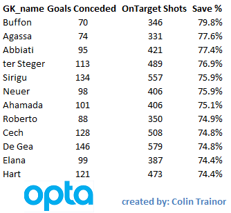
This list seems to make some sense; we have Buffon topping it and it includes other accomplished net minders such as Abbiati, Sirigu, Neuer, Cech, De Gea and Hart. With the possible exception of Victor Valdes, it’s fair to say that this list of Top 12 Shot stoppers (ranked by Save %) includes most of the names that would quickly spring to mind. The football world will be glad to hear that, even when looking solely at numbers, some goalkeepers appear to be better than others. OK, so that isn’t exactly ground breaking; but it’s a starting point. At this point it’s also worth considering whether, just because the best shot stoppers have the highest save percentage, it means that the keepers with the highest save percentage are necessarily the best shot stoppers.

Repeatability

In terms of assessing the shot stopping skills of goalkeepers, the question about whether we can tell the great stoppers apart from the average ones is not the most important question for me. What is important is the timescale, or quantity of On Target shots, that we need to observe before we are in a position to be able to soundly judge shot stopping skills.

Why is this important?

If it takes a very long period of time before we can be confident that a goalkeeper’s save numbers are repeatable then that has to have implications for football teams. How do teams scout for a goalkeeper?

How can they possibly tell whether the saves a potential new signing made in the handful of games he was watched is likely to be repeatable going forward?

How do they know when to drop a goalkeeper due to a few bad performances?

For me, it’s apparent that we need to be able to assess how repeatable shot stopping performances are for a goalkeeper from one period of time to another. To do otherwise means that any decisions or judgements that are based on the outcomes achieved during the first period of time may be built on shaky foundations. This viewpoint seems to be shared by Billy Beane, as in an interview last week with Sean Ingle he was quoted as saying:

“You don’t have a lot of time to be right in football. So ultimately, before you mark on anything quantitative, you have to make sure you have scrutinised the data and have certainty with what you are doing, because the risk is very high.”


How to Measure Shot Stopping ability

For this analysis I am going to use two forms of measurement for assessing the quality of shot stopping performances. The first measure is the simple Save %, and this was the metric that the first table in this article was ranked by.

The second measure is based on our (created with Constantinos Chappas) Expected Goals model, or specifically our ExpG2 component of the model. This ExpG2 value is the expected value of the shot AFTER it has been struck. This means it takes into account all of the factors that existed at the point the shot was struck (ie location, shot and movement type etc) but it also includes the shot placement, but doesn't include the location of the GK at the time of the shot.

As expected, the shot placement is a huge driver of the ExpG2 value. A shot arrowed for the top corner will have a much higher ExpG2 value than a shot which was taken from the same location, but which was placed centrally in the goal. ExpG2 can be used to measure the placement skill of the shooter, but it also has great use in measuring the shot stopping performance of goalkeepers.

It is only right that a ball that hits the net in the very top corner reflects less badly on the keeper than one which squirms through his body in the middle of the goal; the ExpG2 metric achieves this. This analysis will use ExpG2 Ratio, which is calculated as: ExpG2 / Actual Goals Conceded An example: 12.34 ExpG2, but the GK conceded 14 goals. The ExpG2 ratio in this case is 0.88. A value of 1.00 means that saves have been in line with expectation, a value greater than 1 suggests the keeper has performed better than the average keeper would have done for the shots he faced, and a value of less than 1 means he allowed more goals than the average keeper would have done.

Repeatability (yes, that word again)

The key point in this analysis is not to measure the shot stopping performance of any goalkeeper, but to instead look at how repeatable the shot stopping performances are from one period to another. After all if they aren’t repeatable, be that due to variance, luck or something else we aren’t currently measuring, decisions and actions taken by teams shouldn’t be the same as those that they would take if they were known to be repeatable.

Isn’t that right football industry?

In March this year, Sander Ijtsma published a piece where he suggested that you could practically ignore save percentages.  I wanted to expand on that concept a little.

Method of Analysis

I sorted all the On Target shots by date and sequentially numbered each shot faced by each goalkeeper. I created a variable, n. This allowed me to divide the shots faced by each keeper into sets of n size. I then calculated a single correlation value for each level of n by plotting all the individual save performances achieved in Set 1 (which will be of size n) on the x asis against the individual save performances achieved in Set 2 (which will be of size n) on the y axis.

It would probably help to use an example; let’s say n = 50. For each GK I measured the save performance for their shots numbered 1 – 50, 51 – 100, 101 – 150, 151 – 200 etc. I then plotted the relationshion between shots 1 – 50 and 51 - 100. I did this as I wanted to see how repeatable the save performances were for goalkeepers from one set to the next. I also plotted the relationships between shots 51 – 100 and 101 – 150, as well as between 101 – 150 and 151 – 200 etc. I continued on using this logic to plot the relationship values for each consecutive set for each goalkeeper until I couldn’t compare any more sets of n on target shots for them.

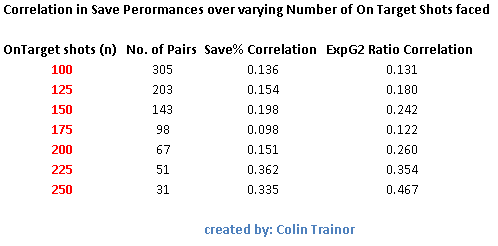
A single correlation value was then calculated for each level of n. I made n a variable so it could be changed to assess the level of correlation (repeatability) between consecutive sets of On Target shots faced by goalkeepers based on the number of shots in each sample. The table below sets out the extent of the correlations for varying sizes of n.

Correlation

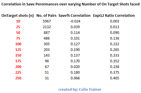
The values in the two columns on the right of the table show the correlation for the save performance of a goalkeeper over two consecutive sets of facing n On Target shots. The third column shows the correlation for the simple Save % metric, while the final column shows the correlation for the ExpG2 Ratio measurement.

A brief reminder that a value of 1 means the save performance of the two consecutive sets are perfectly positively correlated, while a value of 0 indicates that no correlation exists whatsoever. I don’t want to make this piece any more technical than it already is but I’ll simply state that the correlation coefficients themselves have confidence intervals around them, these are primarily driven by the number of pairs for each level of n.

Let’s walk through one of the lines in the above table, we’ll use n = 100. There were 305 instances (pairs) in my data set where goalkeepers faced 100 on target shots followed by another 100 on target shots. The correlation in their save performance when measured by the simple save ratio between the first and second sets of 100 shots was just 0.127. When we instead measure the keepers’ save performances by the ExpG2 metric the correlation increases to 0.232. A correlation of 0.232 is a weak correlation as it means that just 5% (0.232^2) of the variability in the second set of 100 on target shots is explained by the first set of 100 on target shots. That is startling.

Even when we use the advanced ExpG2 metric to assess how well a goalkeeper performed over a series of 100 on target shots we can still only expect it to explain just 5% of their performance over the next 100 on target shots he faces.

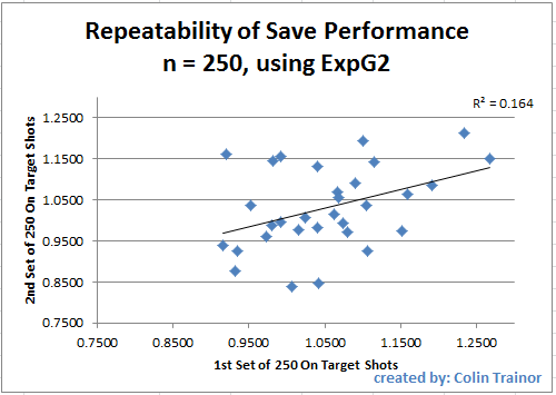
As an average goalkeeper faces approximately 4 on target shots per game this means we need to assess a keeper over about 25 games to only get a 5% steer towards how he will perform over the next 25 games. Pause and think of the implications of that. Even a sample size of 250 shots (n = 250) has a correlation, using the more detailed ExpG2 metric, of just 0.405, this level of correlation is generally described as a moderate correlation as it gives an r2 (variance) value of just 0.16.

At this point I cannot calculate correlations for n greater than 250 as I do not have enough data in my dataset. To give you an idea of the amount of dispersion of save numbers from one set to the next I have produced below the plot for the 31 consecutive sets of 250 shots (which means the goalkeeper has had to face at least 500 on target shots):

n250

Does the shot order matter?

Daniel Altman read a draft of this piece and he suggested I should look at whether I am introducing some bias into the correlations due to the way that I populate the two groups of n shots. You will recall that I carried out the above analysis by splitting the shots into groups based on the sequential order the keeper faced those shots, and doing this inevitably builds a time and age factor into the makeup of the groups.

This is fine as I initially only wanted to measure sequential relibality (as this is what happens in the real world when it comes to assessing a goalkeeper's performances at a certain point in time), but this may cause difficulties if we attempt to measure innate talent. To address Altman's prescient point I randomised the order of the shots and conducted the same analysis as before.  The correlation values between consecutive sets of n shots (with the shot groupings decided on a random basis) are as follows:

Correlation when randomised

As expected, because we chose a different basis on which to create our sets of n, there are some differences between the correlation values in this table and the one that appeared earlier in this article.  However, at n = 250 the correlation value of 0.467 still means that we would only expect 22% of variability in the second set of 250 on target shots to be explained by the first set of 250.  This is still quite a low value and suggests that even when we strip away any impact of age / time bias there doesn't seem to be a great level of repeatability in terms of goalkeeper save performances.

Conclusion

Of course there are goalkeepers that save shots better than others. But for every goalkeeper such as David de Gea that have consistently over performed (1.23 and 1.21 is the ExpG2 Ratio for his two sets of 250 shots) we have a Stephane Ruffier who notched up ExpG2 ratios of 1.15 and 0.98 in his two sets of 250 shots.

If those two players had been assessed after their first batch of 250 on target shots (which would have taken almost two full seasons to amass) they would both have been assumed to be well above average shot stoppers. However, only one of them went on to repeat it again after they faced another batch of 250 on target shots. Imagine the analyst that recommended signing Ruffier on the strength of his save performances using an advanced metric over a “large” dataset of 250 shots or 60 games. This is a good time to recall Billy Beane's assertion that we need to make very sure that we know what we are doing with our data as the stakes will be high for any club that truly embraces the use of data in their decision making process.

When this level of variance exists after 250 shots, it is easy to see how Simon Mignolet went from being one of the best shot stoppers in the EPL in the 2012/13 season (ExpG2 ratio of 1.25) to being one of the worst in 2013/14 (ExpG2 ratio of 0.88). Very simply, trying to judge how good a goalkeeper is at saving shots based on one season’s worth of data is little more than a craps shoot such is the divergence on performance over 150 shots. Just 11% of his performance next season can be explained by his performance in the season just passed.

It looks to me that the very fact a player is good enough to be a goalkeeper for a top tier club means that he has achieved a level of performance that is difficult for even advanced numbers to distinguish, at least not until he has faced a very large number of shots. I’m just not sure yet how large that number needs to be. Remind me never to advise a club when they are looking at buying a goalkeeper as the shot stopping facet of the goalkeeper’s skillset was supposed to be one of the easier ones to measure and interpret.

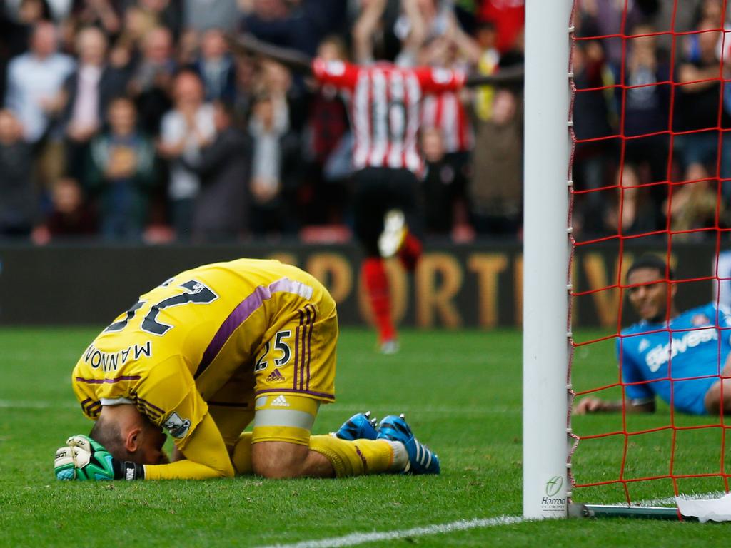
Thanks to Constantinos Chappas and Daniel Altman for allowing me to bounce off them some of the more stat heavy angles of this piece. Cover picture by Steve Bardens.

Arsenal v Hull Player Positional Tracker

In a game that Arsenal dominated, they had to settle with a point thanks to their late equalizer from Danny Welbeck.  Arsenal's territorial and possession dominance can be clearly seen on the Player Positional Tracker. ThatsWengerBall gave me his thoughts on the game via the lens of the PPT, and his comments appear below the gif. (Click on the image to open in a larger window) ARSvHUL That'sWengerBall's comments:

  • Arsenal started the match in a 4-3-3 formation however spent much of the game in a 3-4-3 shape, with Flamini dropping between the centre backs whilst Gibbs and Bellerin pushed up the pitch.


  • Hull City, meanwhile, chose defensive solidarity by starting in a 3-5-1-1 formation and packing the central areas. Both Hernandez and Ben Arfa were continually dropping deep, helping to squeeze out any space.


  • There was very little play in Arsenal's half of the pitch as the Gunners proved adept at keeping the ball in the final third. However the centre of the pitch became over-congested from around the 25th minute onwards when Arsenal's wingers, Chamberlain and Alexis, both started to play very narrow.


  • Arsene Wenger made some changes after the 60th minute. Ramsey and a few minutes later, Campbell came on as Arsenal pushed even higher up the pitch searching for an equaliser. Hull stayed very deep with Ben Arfa effectively acting as a left back for much of the game.


  • This game was a classic example of one side playing a low block against another team that dominates possession. When looking at this PPT and the stats after the match many Arsenal fans will be scratching their head as to how they didn't get the three points. Hull were a little lucky but their defensive resolve matched with their efficiency up front meant they earned a valuable point.

Does van Persie still merit a starting place for MUFC?

  A chart created by Christoffer Johansen made its way into my Twitter timeline last week. This chart was fairly stark in that showed a steady and perceptible decline in the output of Man United’s Robin van Persie over the last 4 or 5 seasons. Christoffer’s chart was as follows: BojoShots That chart doesn’t need much commentary, so I’ll give it none. Johansen then went on to show that van Persie’s decline extended to more than just the rate that he shot over the last five seasons. He showed that the year on year provision of assists is another category that has seen a decline from the Dutch captain: BojoAssists   Wider Attacking Contribution On a team with as much attacking talent as this current Man United side possess, it is obvious that both the shots and the headlines will be shared around. Not everyone can take the final shot, or even play the assist for the shot; this is especially true when the attacking talent includes all of Falcao, Rooney, Di Maria, Mata and van Persie. This desire to award attacking players the recognition that their involvement deserves is what motivated me to create the Attacking Contribution metric . Previously, unless they played the final pass or had the shot, their part in attacking moves would have gone unnoticed by the statistics that are currently reported on. An introduction to this metric can be found in an article published last week on Statsbomb.  In summary, it records the number of times that a player was involved in the final four events of an attacking move that culminated in a shot. Due to the various ways that forwards play it can be difficult to compare their outputs. Some forwards excel in holding up play and linking with others, while some are simply there to score the goals. I decided to include the final four events in the calculation of the Attacking Contribution metric as this will, generally, capture all the players that were integral to the attacking move. If attacking players are regularly failing to be involved in the final four events of their teams’ attacking moves I think that questions should be asked of them. What exactly is their role in the team? What does the coaching staff want them to achieve? And, most importantly, are they taking the position of a player that has more to give to the team than they themselves are?   Robin van Persie’s Attacking Contribution From Johansson’s charts we can see that RVP’s shot numbers have declined and that he’s also providing a minimal level of assists. This in itself might not be a problem.  With all the attacking talent at Louis van Gaal’s disposal it is possible that van Persie is being involved earlier in the moves. Such an earlier involvement would not see him gaining recognition under the two categories of stats that Christoffer Johansen covered in his charts. If he was central to United’s attacking moves, moves which were being finished by the likes of Di Maria, Rooney or Falcao then supporters of RVP could rightly say that the 2014 version of the Dutch forward is about more than just scoring goals. But is this actually the case? The Attacking Contribution Metric can help us answer this question: RVP I only have data for games played from the start of the 2010/11 season. Robin van Persie was remarkably consistent during the spell from 2010/11 to 2012/13, during these three seasons he was involved in almost 50% of the shots his teams took while he was on the pitch. RVP’s productivity numbers noticeably tail off last season (2013/14) as he is involved in only 39% of United’s shots. Although the table above doesn’t include his playing minutes, I can tell you that he played less than 1700 minutes last season compared to the 3500 and 3350 minutes that he clocked up respectively in each of the two preceding seasons. The Dutchman obviously struggled with his fitness last season; he missed plenty of game time, and when he did play he wasn’t as productive as in previous terms. If last season was disappointing for van Persie, then this current one has started off very badly. His involvement in just 28% of United’s shots is an extremely poor individual return for a front line attacker and represents a serious decline from the exceptionally high numbers we have grown used to seeing van Persie deliver, first at Arsenal and then in Ferguson’s final season at Old Trafford.   Man United’s Individual Attacking Contributors The table below shows the attacking involvement of United’s attacking players this season: MUFCReliance I know that the season is young, but we can see that six other United players have had a greater attacking input that van Persie has so far. How can Anders Herrera have had a greater influence (in terms of the percentage of attacking moves he has been involved in) than RVP has had? United’s attacks are passing van Persie by, this is a trend that I picked up few times this season in the commentaries that I made on some of Man United’s Player Positional Trackers, an example of which is United’s defeat against Leicester. Given the attacking firepower that currently resides inside Old Trafford I don’t think, in his current form, that van Persie is deserving of a start in United’s line up. With Mata, Falcao, Rooney, Di Maria, and Herrera real possibilities for the five available attacking spots (and that’s even before we consider Januzaj or Valencia), Robin van Persie should no longer expect to be one of first names on the Man United team sheet. Maybe the injuries have finally taken their toll. The fact that he has recently turned 31 will not help him either, but there is no doubt that his ability to influence games is clearly waning, and United will need more from all of their attacking players if they are to successfully secure a Top 4 league position this season.   Tale of Two Dutch Strikers 404630_gallery In a brief Twitter conversation with Simon Gleave on Saturday, Simon mentioned that there was quite a bit of chatter in the Dutch media around van Persie and Huntelaar. Comparisons were being made between the two, presumably around which of the players should receive the nod to start up front as the Oranje played Kazakhstan on Friday night. Van Persie led the line whilst the Schalke striker had to be content with a place on the bench, although Huntelaar did come on in the 56th minute and he grabbed the Dutch equalising goal just six minutes later. This article is mainly concerned with van Persie, but given the circumstances I decided to widen it out to briefly include some of Klaas-Jan Huntelaar’s numbers.   Van Persie or Huntelaar When van Persie was in his prime there was no contest around which of the two were the more productive player. However, is this still the case now in late 2014? It’s impossible to answer this question with the use of just one metric but let’s take a look at Huntelaar’s Attacking Contribution metric over the last four and a bit seasons: Huntelaar A few seasons back (2010 – 2012) we can see that at with an attacking involvement of approximately 35% in Schalke’s shots he was considerably less involved than van Persie was at Arsenal and Man United. However, as Father Time has quickly caught up with RVP it looks as though Huntelaar’s attacking performances haven’t yet taken the very noticeable decline that van Persie’s has; this despite the fact that just six days separated their birth. I’d expect the 42% contribution rate that Huntelaar has posted so far this season to reduce a little, but at this stage he still looks to be a player that will contribute to about one third of Schalke’s attacks. I’m conscious that this Attacking Contribution metric isn’t all encompassing. It doesn’t assess the quality of chances, nor the rate at which they convert their chances and we also need to be aware that we are looking at players that play in two different leagues. But, even being mindful of all of those caveats, it could be argued that van Persie has regressed to the point that he and Huntelaar could be expected to have a similar attacking contribution for the Netherlands.

3'781 ways to score a goal

Is every goal unique? The instinct says yes, but one needs only to remember Steven Gerrard to realise that it is possible to make a fine career out of scoring the same three goals over and over. The truth sits somewhere in the boring middle, but it's undeniable that many goals share similarities, including how they are created. It is this similarity that I set out to explore here.

My analysis rest on the notion of possession chains. For every on-the-ball event -- such as a goal -- it is possible to find the unbroken, ordered sequence of previous events leading to it. This is the idea on which Colin Trainor based his recent article about players' attacking contributions. My definition of a chain is likely different from his, and too technical to give it in full here, but the broad outline is as follows:

  • I only look at chains terminating in a goal,
  • The events in the chain are strictly consecutive (ie. no intermediate events are excluded),
  • Only actions by the scoring team belong in a chain,
  • A set piece can only be the first event in the chain (ie. we never look past a set piece),
  • Ditto possession regain events (tackle, interception, recovery).

The numerous minor choices I had to make on top of these may mean that the overall definition is so arbitrary that I am unsure how much of what follows is insightful (never mind useful), and how much is just having unwholesome fun with the data. Caveat emptor.

The data I looked at was kindly provided by Opta and comprises all games from 2010/11 to 2013/14 in the top divisions of England, Spain, Italy, France and Germany. For every goal I derived the possession chain and grouped identical chains. It turns out that the 50 most common goals look like this:

50ways

[Yep, that's a screenshot.]

As you can see, by far the most common goal is scored with the team's first touch in the chain. I think this is partly a testament to the randomness of the game itself, but also to the strictness of the definition of the chain: if a defender manages to get a touch just before an intricate move is about to be crowned with a goal, none of the move will count in the chain. A penalty and a header from a corner complete the top 3.

Another summary of the results is provided in the figure below. Apologies for the terse, but hopefully still unambiguous codes for individual events. Note that listed event can occur anywhere in the chain for the goal to be counted, so for example the "head" bar comprises not only the headed goals, but also any goals where there was a headed pass in the move.

bars

It turns out that only 64.5% of goals have a completed pass in the buildup (again, under my restrictive definition of buildup). I was delighted to discover that this agrees nicely with the classic analysis of Reep and Benjamin ("Skill and Chance in Association Football" J. R. Stat. Soc. 134(4):623-9, 1968, cited here after The Numbers Game), whose number is 60.6%. A quarter of goals involve a cross (but not necessarily as an assist), and about 1 in 19 see a shot saved before the ball goes into the net. Own goals are 3% of the total.

Finally, for the theory minded, here is the distribution of frequencies of individual chains on a log-log scale. It's tempting to drop some names here (cough Zipf cough), but in truth so many things look linear-ish on a log-log plot that it's best not to. Perhaps if and when the definition of the chain is made more robust, the distribution plot will be more interesting.distro

Premier League after 7 games. How have teams pressed?

  Only seven games have been played so far in the 2014/15 Premier League season, but I thought I would take the opportunity that the current International break provides me to publish my pressing figures for the league. Those readers familiar with my work will know that I use the PPDA metric to evaluate the aggression that teams have shown in attempting to win the ball back in a certain attacking area of the pitch. In summary, I take the number of passes that a team allows and divide that by the defensive actions that they carry out in this attacking area; thus we arrive at the Passes per Defensive Action (PPDA) metric. If anyone wants to find out a little more of the background of this metric or the details of the attacking zone that the calculations are based on please read my introductory post into the PPDA concept.   Game State There is no doubt that the type of game a team plays is influenced (to some degree) by the scoreboard. If a team is chasing the game then we would expect to see them record a lower PPDA value (a lower value shows that a lot of pressure was exerted by the team when they weren’t in possession), whereas a team that is in the lead may be content with retreating into a solid defensive shape. If they do shell and retreat then their PPDA value will be high as they will allow the opposition almost unchallenged possession in areas far away from their goal; areas they are confident they can’t be hurt from. To take account of this, the table below also includes the percentage of minutes that each team has spent in winning positions so far this season. The PPDA values haven’t been adjusted for Game State, but we can visually see the impact that Game State might have had on the PPDA values that have been posted.   Current Season PPDA Values after 7 Games GW7_2014   Arsenal We can see that Arsenal currently lead the Premier League in terms of the aggression that they use to win the ball back in their attacking areas. They permit less than 9 passes before they register a defensive action of their own, and this value places them just ahead of Man City. However, if we then look at the time spent winning we can see that Arsenal has spent just 11% of the time winning compared to 31% by Man City. So what does that mean? Although the raw numbers tell us that Arsenal are pressing more than any other team, I would suggest that they are achieving this figure because they have spent a huge amount of time chasing games. A team of Arsenal’s quality wouldn’t expect to be leading just 11% of the time and I would expect to see Arsenal’s PPDA value increase as they take greater control of games. On the other hand, due to the amount of time that Man City have spent in winning positions this season, their PPDA value looks sustainable –winning the ball back high up the pitch is simply part of their tactics.   Stoke – where did they come from? The appearance of Stoke in 3rd place in this table is a little surprising; especially when we consider that they haven’t been chasing games to any great extent. All the other teams in the top half of this Pressing Table would either be considered strong teams or else they have been leading games for less than 20% of the time. Yet, rather curiously Stoke don’t fall into either of those categories. The numbers tell us that Mark Hughes has turned Stoke into a pressing team. The Pochettino effect can be seen as Southampton fall from previously topping this league last season to now only appearing in 6th position this season, while Spurs are going the other way with a very small decrease from their value achieved last season. I haven’t seen that many Tottenham games, but that ties in with what a lot of Spurs fans are saying; Pochettino hasn’t quite got the team playing as he would like. It’ll be interesting to see if, with more time with his players, he is able to reduce their PPDA from its current value of 10.21. My guess is that he will be able to succeed with this and Tottenham fans should see a more aggressive level of pressing than they have witnessed so far this term.   Liverpool; Life without Suarez Liverpool fans will not need to read this article to know that their team aren’t quite firing on all cylinders so far this season. But this article highlights another area of the game where they just aren’t quite the same team as last season. At the bottom of this piece I produce the PPDA table for last season, a table in which Liverpool finished third with a PPDA of 10.79. With a leading time of 30% the Reds haven’t been winning for an enormous amount of minutes this season yet they appear in only 13th position. It’s hard not to think about the Luis Suarez shaped hole in the Liverpool PPDA number this season, and although I do not assign PPDA to individual players it’s clear that he was a huge part of Liverpool’s urgency last season. He is a unique talent and it’s unreasonable to think that Liverpool could have replaced him with a player of the same quality but it looks like the club still have quite a way to go to replace the lost work rate of the Uruguayan, never mind his skill and talent.   Chelsea Speaking of “enormous amounts of winning minutes”, we come to Chelsea. What happens when a team leads for 60% of all the minutes they have played, especially if they are coached by Mourinho? They sit back, soak up pressure and invite the trailing team to break them down. Inevitably they score a goal on the break and post a high PPDA value, but hey, that doesn’t really matter. There’s no doubt that as Chelsea’s schedule toughens up and they aren’t posting as many winning minutes that we’ll see their PPDA value sharpen. If you look at the table at the bottom of this piece you will see that this is the team that was only behind Southampton last season in terms of their aggression in winning the ball back. Like their near neighbours across Stanley Park, Everton will probably be disappointed with their lowly position. Generally, the stronger teams appear towards the top of these tables. They haven’t been posting Chelsea style leading minutes yet they seem to have been happy to concede possession in high areas, a tactic normally employed by the minnows of the league.  Everton employed a fairly aggressive level of pressing last season, but that same level of intensity hasn't been displayed so far this term.   Aston Villa West Ham’s position in the PPDA table can be excused by their large amount of leading minutes, and Aston Villa would probably attempt to make the same excuse. However, their PPDA over 7 games is unbelievably high at more than 31; their PPDA is much higher than the 19th placed team. In six of Villa’s seven games they posted a PPDA of greater than 20; to give an idea of scale 19.96 is the 10th percentile PPDA value in the Premier League over the previous four seasons. It’s almost as if Villa’s whole game plan is based around sitting extremely deep and then hitting teams on the counter attack with some pacey forwards running into acres of space………….   QPR Holding penultimate place in this measure of aggressive pressing is QPR. Considering they have led for just 7% of their game minutes their PPDA of just over 18 is blurgh. Even when they aren’t leading games (which is the vast majority of the time) they seem to be concerned with keeping the score down. They’ll surely have to show more ambition than this if they are to have any chance of avoiding relegation from the Premier League by the time May 2015 comes round.   Last Season: 2013/14 PPDA Table 2013PPDA Feature Photo taken by Ian Walton

How low can you go: Assorted thoughts about crosses

There is a pass that David Silva and Mesut Ozil, Premier League's outstanding playmakers, are very fond of. Standing just inside the opposition penalty area close to a corner, with options inside and outside the box, they slip the ball instead to the overlapping fullback who crosses it in. Why do they do this if, as the common wisdom has it, crossing is low percentage play?

The obvious answer is that not all crosses are equal, and with good setup play a cross is a dangerous weapon. I think it is particularly true of short, low crosses, precisely the kind Ozil and Silva encourage. I set out to investigate this hypothesis, only to realise that I don't have a clean way of separating low and high crosses in my database. What follows are two simple analyses trying to work around this problem.

Completion and conversion

Two definitions: I consider a cross completed if the next on-the-ball action is performed by the player from the crossing team. A cross is converted if the crossing team scores within 5 seconds of the cross. This is an arbitrary window, but it should catch all the goals (including own goals) which are "due" to the cross in significant degree. This will include own goals, rebounds and goals from brief goal-line scrambles. Note that conversion and completion are independent in this formulation: a completed cross may be converted or not, and a converted cross needn't have been completed. I looked at the last four full seasons of the five big European leagues and only considered locations where I have more than 1000 attempted crosses. Unless indicated otherwise, only open-play crosses were considered.

conversion completion

As expected, the premium crossing area is on the edge of the penalty and inside it (shall we call it the Zabaleta Zone?), where around 5% of crosses are converted. If this sounds low, then consider that the average cross conversion rate is just 1.76%. What was a bit of surprise to me is that it seems to be easier to complete a cross from the wide areas, farther away from the box. I suspect this is due to the fact that with a short cross the area is on average more crowded and who takes the next touch becomes more random. Average completion across all areas is 23.58%.

Crossing and success

There is a weak positive relationship between success (measured in points per game) and the proportion of cross-assisted shots that aren't headers. (Here assist is taken in the strict sense and not in the sense of conversion defined above.) The correlation coefficient for the attached graphic is 0.43, which drops to 0.32 when Manchester City, the ultimate low-crossing team, are removed. Interestingly, this relationship doesn't exist in the Bundesliga and Ligue 1.

epl_crosses epl_low

I don't want to speculate on the nature of this relationship beyond what Devin Pleuler said on Twitter on Monday:

https://twitter.com/devinpleuler/status/519196963129294850 https://twitter.com/devinpleuler/status/519197095887380481

That is, a preference for low crossing will come naturally to better teams. Success and reliance on crosses are inversely related: the higher proportion of a team's shots come from crosses, the lower points-per-game. The strength of this relationship is similar to the previous, and, once again the effect is not found in Germany or France.

Conclusions

There can be no firm conclusions until I find a way of separating low crosses from the rest. However, it does appear that not all crosses are equal, and that a team that relies heavily on crosses for chance creation should make sure they know what they're doing.   Data provided by Opta.


Attacking Contribution Metric and Man United’s reliance on Di María

Short version: Angel Di María is the player that his club have relied upon most for his attacking contribution so far in this Premier League season.

Long version: Please read on

Many years ago the only individual player performance stats that we had access to were goal scoring records. Then someone decided it would be a neat idea to give credit to other attacking players and we began to also record the assists, ie the player that set up the goal. These stats are great, but as only approximately one in every ten shots is scored we inevitably lost a lot of detail as these performance counting stats only included the sample of shots that were scored. Why should the final shot from the striker influence whether or not the creative midfielder was awarded the assist or not for his through ball? To a large degree, the actual finish was outside of his control after all.

In relatively recent times things have improved for those that like to count things. Thanks to Opta (other brands may also be available) we now have a proliferation of sites that list the total number of shots and key passes that players make during each individual game and also cumulatively across a season. By stepping back one level from the old goal and assists metrics we can now credit players for their attacking output, regardless of the outcome of the final shot.

We know that not all shots are created equally, but given that there is a certain level of randomness in whether or not any individual shot actually results in a goal this increased level of transparency of individual attacking contribution can only be a good thing.

However, if we wish to accurately measure Attacking Contribution why stop at just the shot and the key pass? Doing so means that the player that played the penultimate pass gets no recognition at all, at least as far as the stats are concerned, and what about the player that made the pass preceding that?

Attacking Movements

Using detailed Opta event data I can join together the sequence of events for each shot that was taken and I can map out the complete attacking movement. These moves range in length from zero passes before the shot to the 51 event attacking move that Tottenham achieved against QPR earlier this season; a move that ended in a Nacer Chadli goal.

Using the information derived from these moves I want to have a go at creating a more comprehensive Attacking Contribution metric. This metric will go farther than counting just shots and key passes and can help us objectively measure the attacking importance of any individual player to their team. We have no need to just award “attacking points” to the shooter and the maker of the final pass. As with most of these metrics we’ll start with undertaking attacking analysis, as inevitably trying to analyse defensive contribution will be a much more difficult piece of work.

Data Rules

I needed to decide on a cut-off point in determining which actions to count in my Attacking Contribution metric. Although I want to go farther back in the chain than the guy who made the final pass, it is a tough sell to suggest that the player who made the 10th last pass in the move should receive credit for his part in the move. It’s an arbitrary cut-off but I decided to permit the final four attacking events in a move to contribute towards Attacking Contribution; this allows for the shot plus the previous three attacking events (pass, take-on or ball recovery).

For this measure I didn’t want to place different weightings on the extent of the involvement in any given attacking move. Very simply, if a player was involved in the final four attacking events in a move that led to a shot then they were awarded an Attacking Contribution. It is obviously possible for a player to be involved more than once in a move, ie they play a one two before taking the shot, but each player was only awarded one Attacking Contribution per move. After all, I simply want to measure how many moves each player could be said to have been involved in.

I am conscious that this analysis can only use the data that I have access to. Although the Opta event data is very detailed it only covers “on the ball” actions, which will be fine for 95% of this analysis. However, it will be unaware of the player that made the step over that sent the defender the wrong way or the supporting forward who made the unselfish run to pull the defenders out of their shape. I don’t imagine that these “oversights” will significantly impact on the findings in this analysis but I wanted to address that point now.

The premise of this metric is that it shouldn't just be the shooter and the player that makes the final pass that receives Attacking Contribution credit, as is currently the case.

This post will serve as an introduction to my Attacking Contribution method; I have a few ideas related to this metric that I would like to tease out and analyse in the near future but I’ve got to start somewhere and I’ll keep the numbers in this piece fairly simple.

2014 Premier League Attacking Contribution

As a means of illustrating and working through this metric let’s look at the first seven games of the 2014/15 Barclays Premier League.

Here are the 15 players that have had the greatest Attacking Contribution in absolute terms:

ACLeaders

With 22 key passes and 7 assists it’ll not surprise anyone to see that Cesc Fabregas has been the player that has had the highest Attacking Contribution during the opening seven game weeks of this new season.  By looking at the total number of minutes that each player has played we can convert these values to Attacking Contributions per90, this method of normalisation means we can easily compare players regardless of time spent on the pitch.  However, I'm not going to dwell on this aspect right now.

What I do want to spend some time on is describing how I see this metric being most useful: Which player contributes most to their teams’ shots?

Attacking Reliance

To assess the attacking impact that a player has I looked at their individual Attacking Contribution numbers as a proportion of the total shots that their team had while they were on the pitch. By doing this I’m not actually trying to measure the effect that a player has on their team’s attacking output, ie if the player was missing I’m not suggesting that his team would see their shots total drop by x shots. Instead, I am quantifying the proportion of shots a team takes that goes through the player, in other words it looks at to what extent a team relies on a player. How much of a team’s attacking game revolves around player X or player Y?

In this analysis I used a cut-off of 50% of minutes - a player has needed to be on the pitch for at least 315 minutes so far this season.

By dividing a player’s Attacking Contribution by the number of shots his team took whilst he was on the pitch I then arrive at an Attacking Reliance %. This Attacking Reliance percentage informs us of the proportion of attacks that the player is involved in (as defined by the final four attacking events of the move) or how much their team has relied on them in an attacking sense. The table in descending order of Attacking Reliance% currently appears as:

Reliance

Now we get a different looking table, and one that seems to make sense. Fabregas has the highest absolute Attacking Contribution value, but despite his sublime performances Chelsea have had a sufficient volume of shots for them not to be overly reliant on the Spaniard.

High Reliance Players

We can see that even though he has only been with Man United for a very short period of time Angel Di Maria is having a hugely important contribution to their attacking output with an Attacking Reliance figure of 56%. Compare that with United’s other big name signing / loanee Falcao; even if I set aside the 50% minutes rule in this data set he still wouldn’t appear in this list. The Colombian striker has been involved in just 40% of United’s attacking moves. Given his price tag he’ll want to be quickly increasing that value.

The reliance that United has had on Di Maria is the highest in the league, just pipping Christian Eriksen who himself posts a rounded Attacking Reliance value of 56%. Despite struggling and appearing to be out of favour for large parts of his first year as a Tottenham player, the Danish attacking midfielder is now showing everyone his true worth. In fairness, it’s worth pointing out that some analysts were ahead of the curve on his ability.

Ted concluded that piece with “This might be controversial, but based on the rarity of that type of performance and how he’s performed over his career, Christian Eriksen is quite possibly one of the best attacking passers in the Premier League already”. 

Although Graziano Pelle has received the majority of the plaudits down on the South coast it is interesting to see that Dusan Tadic actually has had a greater involvement in Southampton’s attacking moves than the Italian striker. In fact, even James Ward-Prowse has a higher Attacking Reliance value than Pelle, who for the record has posted a value of 42%.

Swansea’s twin attacking threat of Gylfi Sigurdsson and Bony complete the list of players that posted an Attacking Reliance value of greater than 50%. So all a team has to do to stop Swansea is to stop Gyfli and Bony. Why did no one say that before? (insert sarcastic emoticon)

It is unusual for a team to have two players with such high Reliance values, but obviously these things happen so early in the season with a team that has had the second lowest number of shots in the league. In North London, Danny Welbeck will be pleased with his start to life as an Arsenal player with his involvement in 48% of Arsenal’s shots that have occurred while he has been on the pitch.

One other player that is worth mentioning is Riyad Mahrez of Leicester.  He has played just shy of 400 minutes this season, but more shots have gone through him while he has been on the pitch than any of the other Leicester players, including better known players such as Jamie Vardy and Leonardo Ulloa.

Wrap-up

An Attacking Reliance figure for any individual player of 50% is massive, at least in Premier League terms. Over the last four full seasons only eight players achieved a value of this scale over the full 38 game season (and no, I’m not going to name them today, remember I said this was just an introductory article to the concept).

I’ve said it many times before, but one of the aims of my analytical work is to be able to objectively measure what our eyes see. In this regard, analytics won’t always provide ground breaking findings but it will allow us to quantifiably assess certain impacts, which may in turn, be used as inputs in subsequent applied research. This introductory analysis falls into this category.

In future articles I intend to undertake further analysis so we can see if we can learn anything more from Attacking Reliance figures.
Does a high reliance on individual players effect how successful a team is?
Does it matter if players with a high Attacking Reliance value leave the club?
Do we even have enough examples to be able to test this?

At this stage I don't have the answers to the above questions, but I hope that’ll change in the near future.

Man United vs Everton Player Positional Tracker

Man United 2 vs 1 Everton Some brief comments and analysis from Sam Gregory appear below the PPT (click on the image to open in a larger window). MUFCvEVE

First Half

  • The Rafael-Baines battle down the wing was an interesting one, with both fullbacks essentially playing as wingers or at the very least attacking wingbacks.

  • Di Maria was taking up some very advanced positions in the first half, being the furthest United player forward on several occasions. Especially during the ten minute period starting in the 25th minute, which included Di Maria’s goal.

  • Besic, Naismith and Barry were fairly ineffective as a midfield trio during the first half seeing very little of the ball and playing with a lot of distance between them.

Second Half

  • Oviedo’s introduction on the left hand side for Everton helped to pin Rafael back in his own half while allowing Baines more space to make forward runs.

  • Leon Osman had quite a big attacking presence for Everton in his short time on the pitch. He picked up quite a few attacking positions and his influence was noticeably quite large for his entire time on the pitch.

  • The front three for United of Mata, Van Persie, Falcao and later Wilson were quite innocuous in the second half. Dropping deeper and deeper to try and get involved without really seeing a lot of the ball.

Conclusions

  • Everton were much better in the second half after Oviedo and Osman came on in the second half. Until that point they had been unable to really create a lot against United, but after the substitutions were unlucky not to get a point from the game.

  • United clearly missed Herrera in midfield as they weren’t able to create as many attacks from midfield as they have in previous weeks. That being said Di Maria stepped up and created just enough to get United over the line with the three points.