Feb 2014 Mailbag: Who Broke My Damned Kagawa?!?

feb_mailbag_kagawa


I get a lot of requests for radars of specific players and or years. Apparently the radars are popular, which is great, but I don’t actually have enough time to keep up. This one, however, I have wanted to do for a long time, so here we go.


Kagawa_Gif_OMGMOYES


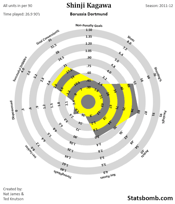
If this were an art installation, it would be a painful, heart-wrenching piece called “What Have You Done To My Kagawa?!?

If it were a parody twitter account, it would be vaguely funny, but as racist a portrayal of Asian stereotypes as Mickey Rooney in Breakfast at Tiffany’s. (Seriously, don’t follow EvilKagawa.)

My short answer on why Kagawa looks so much worse than he did at Dortmund is: User Error.

Moyes doesn’t know how to deploy him to get the best out of him, and make no mistake, Kagawa’s best is very very good. He’s one of the best pressing attackers you will find, and he’s one of those guys that creates with his dribbling, passing, and goals. Those things are incredibly valuable, and Moyes has no idea what to do with Japan's best player .

This is one area where I end up having a ton of sympathy for football players. First, you move to a huge club with a genius manager, in the most popular football league in the world. Exciting, right?

That genius manager uses you a bit differently than you are used to, but your stats still look okay. Then said manager retires and the new guy, who clearly is not as good as the old guy, thinks you’re basically useless. This is despite the fact that your two most recent bosses - who were unequivocally brilliant - found your work tremendously valuable.

If this was a normal job, you just leave. Since it’s football and you have a contract, you’re stuck until your agent can negotiate an escape, but in the meantime this new donkey is fucking up the program. He’s screwing up your career path, your chance to make the World Cup team, and generally making your life miserable. Sure, you’re still getting paid well, but there is an awful lot more to life and happiness than getting paid.

I hope he moves this summer. Kagawa is an outstanding player. He deserves a manager who understands his game well enough to let the rest of the world see that’s true.

1. I'm not really sure whether it is suitable for this mailbag column, but I was wondering what you think of the Europa League in general, because I never ever hear you about it.

2. What should Chelsea do with Thibaut Courtois? He probably is one of the best goalkeepers in the world at the moment, but if you take him back at Chelsea you have to ditch Cech or will he be loaned to Atletico for another season?

--Simon

To answer your first question, I’m off on Thursdays, and use that day to take a break from football and pretend I have some sort of social life. Even if Arsenal were playing in the EL, I would not end up watching it, so that’s why I also never talk about it.

The question about Courtois is interesting, especially since I get the feeling he’s ready to jump ship if that situation doesn’t get resolved soon. For those who don’t follow much football outside of England, Courtois is definitely one of the top 5 goalkeepers in Europe right now, despite only being 21. Chelsea own him, but he’s been on loan at Atletico Madrid the last two seasons, and has been a crucial part of their resurgence under Simeone.

On the other side of this issue is Petr Cech, Chelsea’s stalwart goalie who himself is only 31 (middle aged for a GK), and who hasn’t exactly been a slouch. He’s probably capable of another five seasons of top play.

Objectively, it’s a great problem for a team to have, but neither guy is willing to play second fiddle. The question then becomes fairly simple. Which guy is the best player? I personally would go with Courtois. He’s young, but has proven himself at the Champions League level, and is likely to be around for a very long time. That said, Mourinho is often loyal to his best players, and he and Cech have a long history of good results together.

If I were trying to make this decision, I’d have a public skills contest broadcast on Sky like every night for a week. You’d record the footage of the battle/practice matches, and then you’d also have some goalkeeping greats commenting over the top of the footage and grading what they see and explaining why it’s important.

Screw Being Liverpool - tell me you wouldn’t watch this!

The only issue for Chelsea is that if they do choose to bring Courtois home, they will have to find a buyer for Cech if he doesn’t want to play backup. Again, a good problem to have, but not one without potential pitfalls.

Is there a good way to statistically measure the effect of being in a good/bad team on a player's performance?  For example, Bale's numbers at RM this season are outstanding, how much of this improvement is due to him getting better vs being surrounded by better players?  I get the impression that it's generally accepted that say, 10g/10a at a team that gets relegated is a lot more impressive than at a team that wins the title, but has anyone attempted to quantify HOW much more impressive it is?

- Martin (@Mush_27)

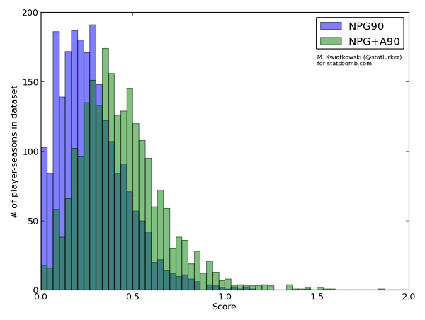
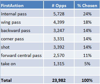
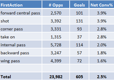
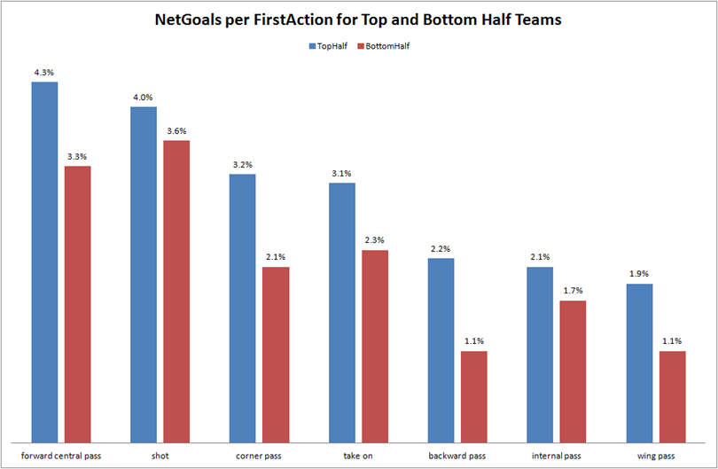
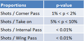
Excellent question, and the answer is that work here is ongoing. The top performers every season in the NPG90 metric also tend to come from the very top teams in Europe, of which there actually are not that many. There’s a hefty selection bias involved (the best players tend to move to the teams with the most money), but enough footballers in Europe that you would expect at least some unusual names to crop up each year.

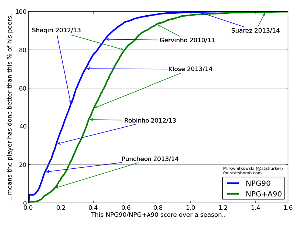
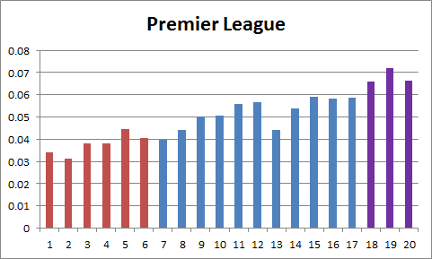
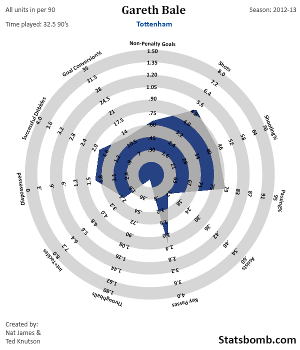
Gareth Bale is an excellent test case, because instead of being surrounded by a bunch of slightly above average players like he was at Spurs, he’s now surrounded by the world’s best and the shooting rates for his teams are very similar. It’s hard to design a better real world experiment than this.

Here is Bale’s radar last season at Spurs.


Bale_2013


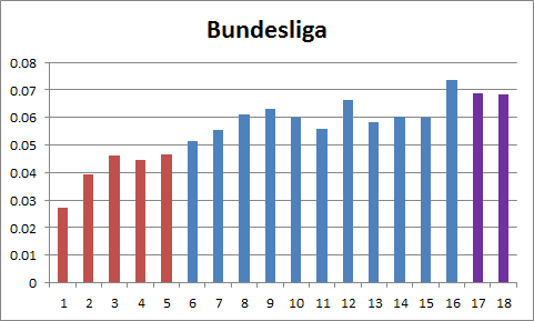
And here is this year’s Madrid radar.


Bale_2014_partial


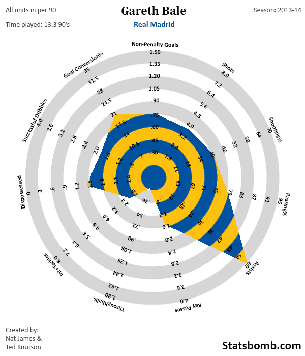
Now obviously, the analysis isn’t that straightforward. For one, Bale has only played as a forward for the last three seasons of his career – he was originally a left back (and a very good one). Also, Bale is now 24, which means he’s just entering his prime as an attacker – we’d expect him to improve this year and maybe next as well.

That said, this is one helluva leap in production, fuelled largely by the boost in conversion rates for himself and his teammates, which is likely the result of playing on a better team. His key passes per game actually went down, but he's currently breaking the boundary in assists per90 at .68. Helloooooo differences in defensive pressure.

Your question about good performers on smaller teams is tougher to answer. Sometimes you see standout performers on those teams because of talent, and other times you get it because they seem to monopolize the ball (see also: Diamanti). This is one reason why it would be beneficial for us to develop some sort of usage rate in football, and use it to normalize offensive output for comparison.

I also think people like Daniel Altman are looking at the performance value versus overall team quality question from a number of different angles, and will likely publish more on it in the near future. Baby steps.

Some questions about de Eredivisie; what does the model thins about Ajax now. still doesn't like em? They have been not good after the winter break imo, but they did take most of the points.

And what about the relegation race, so many teams still not safe. I know your model really hated RKC all season, but they keep picking up points here and there.. Any thoughts now?

Cheers,

John van Herk

(Note: This question was asked a couple of weeks ago)

Ajax are pretty interesting because much like Liverpool in the Premier League, they have progressed well all season. The model currently has them as the second best team in the Eredivisie behind Twente, but because Twente keep dropping points, Ajax are now the most likely to win the league (by a small margin, anyway). This is the first season I’ve had access to Eredivisie data, so I’m still learning a lot about how the league operates. More info leads to tweaking leads to better predictions down the road.

Regarding relegation, the model still hates Waalwik and still thinks they are the worst team in the league, though they are not as bad as they were in the first half of the season. (To be fair, it would be difficult for them to stay that bad for a full year.) Roda are also most likely to remain in the bottom three, and my model really dislikes Utrecht, though that seems to be in dispute with opinions from other modelers and Eredivisie fans alike. [I have two beer bets made much earlier in the season that they will finish lower than 12th.]

I think Nijmegen could still climb to safety, but it kind of depends on them playing defense from time to time, which is practically a unicorn for the bottom half of the Dutch league. 38% shots on target average across the league. What the actual fuck?

My question deals with Arteta.  You mentioned a few weeks ago how he comes up in looking at deep lying playmakers and defensive midfielders.  I'd like you to expound upon that, specifically how he rates defensively.  He seems to get a lot of criticism for that (unfairly in my opinion).

Thanks and keep up the good work, Tripp

Looking at the stats (which probably don’t tell you the whole story, but certainly convey a lot of it), Arteta is excellent defensively. He’s also an excellent passer, both when he was an attacking midfielder earlier in his career, and now when he acts as a destroyer and ball recycler for Arsenal. For the past three seasons, Arteta has probably been the best combination of passer and defensive midfielder in the league. Yes, better than Carrick, and just about every other PL DM I can think of.

He was so good in 2011-12 that when he was injured, Arsenal absolutely could not function without him. Some of that dependence has waned, but he’s still probably their number one option at that position in midfield. The worry I have is that he turns 32 next month, and plays a physical position that often gets injured. Arsenal need to make sure they have reliable cover going forward and an eventual succession plan in the next year or two.

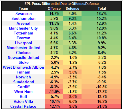
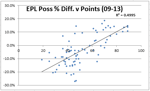
Since 2005, Jose Mourinho coached teams have been making a mockery of football’s current possession based stats – namely, time in possession.

Even the “And Back to the Studio” crowd has sobered up from their collective Barcelona Bender and started to realize that time in possession is a stylistic choice, not necessarily a route to winning games. Unfortunately, this has led to a new, insipid trope of citing possession stats just because they’re there.

The number of possessions stat in basketball has formed the basis for the genuinely useful offensive and defensive efficiency ratings and even the incoming ‘databall’ revolution. Do you think it’s possible to develop a similar stat for football, and if so, how would you go about doing it?

MO, Los Angeles

In addition to the “Mou skew” you currently have Simeone’s Atletico team, and earlier versions of Borussia Dortmund where Klopp’s teams rarely dominated possession, they simply dominated the scoreboard.

Alex Olshansky has probably done the most work on different ways of looking at possession so far, including from this article earlier in the week. Mike Goodman’s work on MiPMoP is also an interesting take on possession value and how teams use it.

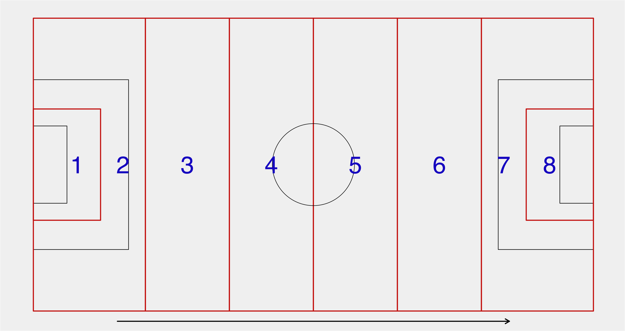
In a similar vein, I’ve worked on shot pace a couple of times, helping to quantify how quickly teams move the ball up and down the pitch during their matches. It would likely be preferable to look at final third entries for and against instead of shots, but sadly that data isn’t publicly available at the moment.

So to answer your question, there are a number of people casually working on this, and normalizing possession and attacking rates is fairly important, but there are other issues that are probably more interesting and more valuable at this time. We’ll get there.

And that, my friends, is all I have time for. We now have enough followers that I can gather new questions at least once every month, so I’ll start shooting a mailbag at least that often from here out. If you have questions before I ask, it’s best to just shoot me an email at my twitter account name, Gmail, and I’ll file them away for later use. Twitter seems to be losing hashtags, which means I lose everything that comes at me there immediately.

Cheers,

--TK

From Awesome to Average to Awful: Goalscoring Stat Distributions

Thanks to Ted Knutson's work, we know the players with the best attacking output between 2008/09 and 2012/13. (For all the usual reasons I hesitate to say the "best attacking players".) But his litany of superstars (a few surprise names notwithstanding) says nothing about how we should evaluate the performance of more ordinary players. We know Olivier Giroud isn't as good as Messi, but can we quantify that gap? And how does he compare to the rest of the field? In short, we need to see how the basic performance metrics are distributed across all players in the game. This is what I'm setting out to do, in what will hopefully be a series of articles. Today, I focus on attacking production, ie. goals and assists.

I use two simple metrics that you probably have seen before: non-penalty goals scored per 90 minutes spent on the pitch (NPG90), and non-penalty goals plus assists per 90 minutes (NPG+A90). Ted has already written about the need of discounting penalty goals from analyses and the importance of normalisation by time in the article linked above, so I don't have to. Naturally, normalisation for other factors, most notably team and opponent strength, would be nice, but I don't do it since there is no canonical method of doing so. Caveat emptor.

The dataset I used consists of players from the five big European leagues, and spans almost five full seasons (full 2008/09 to 2012/13 and 2013/14 until last weekend). For this article I restricted it to the players who can reasonably be termed "attackers", because I didn't want the low attacking output of defenders and deeper midfielders to overwhelm the distributions. The actual algorithm used to determine whether a player should be counted is rather complex, and I will not describe it here, except to say that it did not rely on the goal and assist numbers and so didn't introduce bias. I wouldn't expect it to be 100% accurate, but the collection of players considered here should contain most forwards, wingers and purely attacking midfielders from my dataset. Playing 900 minutes or more over the course of a season was also required for inclusion in this study.

The histograms of NPG90 and NPG+A90 are shown below:

hist

(NPG90 mean: 0.28, std dev: 0.18; NPG+A90 mean: 0.44, std dev: 0.23)

Now, I am not a statistician, but to my eye both distributions resemble the normal distribution, but with the left side thinned out and the left tail chopped off by the boundary. This makes sense intuitively: with the multitude of factors contributing to player's performance we'd expect it to be normally distributed; and the missing players in the left half are simply those who are not good enough for a team in Europe's big 5 leagues, and ply their trade elsewhere.

Another, and perhaps better way of visualising this data is the cumulative distribution plot: cdf

Here we can see for example that to be in the top 20% of attackers in Europe, a player should score at least at the rate of 0.42 goals per 90 minutes, and have a "goal involvement rate" of 0.59 per90 (NB. For a top-class #9, these numbers are not enough -- they are biased downwards by all the midfielders in the dataset). We can also see why Arsenal believed in Gervinho, and that Miroslav Klose is not doing badly for a 35 year old.

With thanks to Ted Knutson for discussions on this subject. Data collected by Opta-Logo-Final-Cyan.

Tottenham's Performance 2011-2014: Good managers, crap managers, or something in between?

I was kind of curious as to how Tottenham's share of the shots (TSR & SoTR) and share of the goals (Goal%) looked during the 2013/14 season pre and post AVB. Having completed that task and seen the results (which I will get to), I thought I'd go back and look at Tottenham's previous 2 seasons for which I have data. Just to make certain that everyone understands the stats that I will be talking about, here is a quick reminder: TSR - share of the shots taken. SoTR - share of the shots on target taken. Goal% - share of the goals scored. PDO - scoring% (goals f/shots on target for) + save% (100-goals a/shots on target a). Good. I'll start with Tottenham's 2011/12 Premier League season to warm things up for the main event. 2011/12 - Harry Redknapp Image So Tottenham, under Redknapp's management, had plenty talent - Modric & Bale - and posted a 61% share of the shots (TSR) and a 59% share of the shots on target (SoTR). Fine numbers. Tottenham's share of the goals finished at 63% which is more or less in line with season-end TSR. But as you can see from the graph above Tottenham's share of the goals (goal%) was a lot higher than TSR for the first 27 or 28 games of the season. The reason for this? PDO. Tottenham's PDO was ~1100 for the first 28 or games or so and this enabled Tottenham to post a higher share of the goals than their TSR would've suggested. Still following? I hope so. In short: if a team posts a goal% way higher than their shots or shots on target share then it may well be safe to conclude that a big part of that overperformance is due to high shooting percentage and/or a high save%. Conversely, a goal% that is lower than a teams share of the shots or shots on target may well have been suffering from a low scoring% and/or a low save%. Just theories for now, but we understand that scoring and save percentages, given time, regress back toward the mean somewhat. Redknapp's final season saw early overperformance driven by a high PDO, which then regressed. Tottenham, more or less, were a pretty good team who finished with a goal% in line with their TSR%.  2012/13 - AVB Now to AVB Image AVB improved upon Redknapp's strong shots numbers and finished the season as a 65% TSR and Shots on Target Ratio team. Both of those shots ratio numbers are superb. The problem? scoring% and save% (PDO) were subpar (below 1000) for all but three games of the entire season. This caused Tottenham's goal% to fall to 58%. Villa-Boas was able to coach this Tottenham to outshoot the opposition and dominate the play but what he couldn't coach may have been something out of his control and that was the rate that Tottenham converted their chances (scoring%) and prevented the opposition from converting their chances (save). Now, Tottenham's low PDO - and thus goal% - may have been influenced by poor shots locations, or personnel issues, or tactical issues or whatever. The problems with PDO will likely also have been caused by what is loosely termed as 'bad luck'. It is almost impossible to tease out the exact cause of Tottenham's woes - there's likely some systems issues and there's likely some 'bad luck'. Shit happens, but that shit really handicapped a Tottenham team who had shown excellent ability to control games and outshoot the opposition. ***** Now to the good stuff. 2013/14 - AVB (16 Games) Image These are Villas-Boas's final games as Tottenham manager and final games before he officially became damaged goods, and even "a manager with a defective tactical system". Tottenham's TSR was ~62% at the time of his sacking and the SoTR was ~58%. Both of those numbers, while good, are still down on the previous season (Bale's exit?). Still, those numbers should be good for a top 4 battle, the problems for Villa-Boas, once again, were caused by Tottenham's inability to convert chances (scoring%) and preventing the opposition from converting their chances (save%).  A series of hammerings wrecked Tottenham's PDO and thus impacted their Goal%. This time it wasn't so easy to use 'bad luck' as the cause for the low PDO and goal%.  Villas-Boas' systems (high line and inability to penetrate in attack) were spotted early by football media and used as a facile excuse for Tottenham's failings. The reality was less clear. Yes, Tottenham played a high line which was, on occasion, completely wrecked, but it also worked in many games that Villa-Boas deployed it. As for the lack of penetration in attack, meh. Soldado wasn't helping, neither was Townsend or many of the other baffling personnel decisions, nor was a league high number of minutes spent in a tied position. Villa-Boas' tenure saw Tottenham control games and post excellent shots numbers but either 'bad luck' or 'bad systems' or a combination of those and many other factors saw Tottenham's Goal% significantly lower than their TSR and SoTR numbers would've suggested. People call PDO a coach killer, and for good reason. 2013/14 - Sherwood Image Of all the candidates dotted throughout europe, Tim Sherwood was deemed to be best qualified, either through talent or familiarity, to coach Tottenham Hotspur. And who am I to question Sherwood's appointment, after all 23 points in 11 games is mighty good form! Sherwood restored Adebayor to the lineup and was rewarded with timely goals. The systems were tweaked slightly and Tottenham piled up the points. All is good, huh? Well, not really. Sherwood has Tottenham posting the lowest TSR (~51%) and SoTR (~48%) numbers of any Tottenham manager in the last three years - significantly lower than Redknapp and lower still than AVB's teams. Score effects may play a part in the decline of those shots numbers, but it does not by any stretch of the imagination explain all of the decline. Nor has Sherwood faced particlarly tough competition which could explain the decline. Sherwood has simply taken AVB's team, tweaked personnel and tactics and turned it from a 62% TSR/58% SoTR shots team into 51%/48% team. A shots drop that dramatic is rare indeed and it'd be mighty interesting to watch Tottenham's zone entries to see just why they are no longer generating the same number of shots. (*Villa-Boas team were taking 17.3 shots per game and conceding 10.8 per game. Sherwood's team are taking 12.5 shots per game and conceding 12 shots per game.) Still, what does the average fan care for drops in shots rate, or drops in TSR or SoTR? Tottenham are winning, Adebayor is scoring at a fast and easy rate, the players are "confident and happy" again, the points are piling up. The problem is, all the points and and goals are built not upon an ability to out-chance the opposition and dominate the shots count but upon an outrageous PDO of 122.75.

To my knowledge I have never seen a PDO that high over an 11 game span and that PDO is causing Tottenham's Goal% to sit way above (64%) the normal levels that Tottenham's shots share (TSR & SoTR) suggest it should be. Tottenham's form under Sherwood is being powered by a statistic which is commonly referred to as 'luck' and that statistic tends to regress pretty heavily back toward the mean of 100.00.

I am aware there may be Tottenham fans who will argue  that this PDO (scoring% + save%) is powered not by 'luck' or unexplained variables but by systems and personnel and skill and the speed of attacks (which can be a part of PDO.) Maybe Tottenham fans are right to suggest skill and sytems are powering this hot streak of form, but to suggest this they would be indicating that Sherwood is a tactical genius, or a master psychologist, or that Adebayor has morphed into a world class striker, or that Tottenham's attacking speed has dramatically improved, or that the defensive and attacking systems are the leagues best and that is why that PDO stat-thingy is the best in the the league over the last 11 games. And maybe if all those things are real and those things and are really driving that PDO number, then maybe they are sustainable and Tottenham can continue to take a 64% share of the goals while only taking a 51% share of the shots, and maybe's and if's into infinity! If you are a Tottenham fan who believes that this form, with those average shots numbers, is sustainable then you are suggesting that maybe Sherwood is a tactical genius, maybe he does make the players happier, maybe Adebayor is now a world class striker. Thing is, if you do believe Tottenham's form is sustainable without dramatic improvement in an ability to outshoot the opposition then you are betting on an awful lot of maybe's continuing from now until the rest of the season and beyond. Sherwood may be a genius, Adebayor may now be a world class striker, I don't know. But the way PDO regresses and a little history close to home (graph 1 - Redknapp) tells us that PDO's that high and goal%'s that far seperated from TSR%'s don't tend to continue forever. To me good coaches produce teams that outshoot the opposition in terms of shots and shots on target in most game situations while creating the very best quality chances they can and preventing the opposition from creating good chances. Andre Villas-Boas had the shot dominance part down, but was handicapped by the scoring% and save% elements of performance. Sherwood is producing teams that are completely average by the shots dominance count but have bananas high - like Barcelona high - scoring percentages and strong save percentages. Long term, which manager type is the better option?

*****
Bonus

20011-2014 - TSR, SOTR & Goal% Image Rolling Sherwood's full 11-game reign is the very last data point (far right). Worst SoTR, 2nd worst TSR, Highest PDO, abnormally high Goal%. Image

Splitting Possession into Offense/Defense

Does Possession % Matter?

Any analytically inclined soccer fan (a.k.a. you) is probably well-aware of the limits of possession % as a meaningful metric.  In fact, its faults are so numerous and well documented that the ubiquitous  ironic mentions of "but what about possession?" every time Barcelona loses have (mostly) stopped.  I understand the collective derision, but if we look at the metric in a deeper way can we glean some interesting information?  I think so.

One thing that I think does need to be stated is that there is a relationship between possession % and points (at least in the EPL – see graph below).

epl poss v points

The causes of this relationship are complex and difficult to disentangle, but probably the best way to think of possession % is as a symptom of playing winning football as opposed to the cause, though of course sometimes it is the cause! Confusing! A must read on this subject is  Devin Pleuler's  interesting take on possession as a defensive weapon.

How is Possession % Calculated?

Based on some good work a couple years back by Graham Macaree, we know that the possession % that the majority of media outlets use is really just a pass ratio.  The pass ratio approach is pretty simple: team possession % = team’s total passes / both teams’ total passes. This methodology was confirmed to me by an Opta employee.  We can debate the merits of this approach until we are blue in the face, but for many sensible reasons I think it is probably the best proxy.

Splitting Possession % into Offense/Defense

Not all pass ratios/possession % are created equal.  For example, let us assume that an average EPL match sees 900 passes on average between the two teams (450 for each team).  On this particular match day Arsenal outpasses Swansea 600-400 (60%/40%).  Across town, West Ham outpasses Crystal Palace 300-200 (60%-40%).  Both Arsenal and West Ham have the same possession % (60%), but they have achieved them in vastly different ways.  By comparing their passing #’s to the league average, we can essentially allocate Arsenal and West Ham’s 20% possession advantage (60%-40%) to an offensive and defensive component, as demonstrated below.  You start by comparing how many passes each team attempted and allowed and compare them to the league average.  Arsenal, in this example, were 150 passes above an average offense (600-450).  West Ham, by contrast, were 150 passes below an average offense (300-450).  But, West Ham makes up this difference by allowing 250 less passes than an average defense (450-200).

possession differential example

That was a hypothetical, but what does this approach look like for this year’s EPL? (stats are two weeks old)

epl pos diff

Talk about a tale of possession haves/have nots.   The difference between the #1 possession team (Swansea) and the #10 team (Chelsea) is closer than the difference between Chelsea and the #11 team (Newcastle)!  Another thing that jumps out is the comparison between Southampton and Arsenal; both have similar possession #’s, but achieve it in a very different fashion: Arsenal with offense and Southampton with defense.

You also might notice the larger variance in the offensive component compared to the defensive component.  This makes sense, as a team might face a variety of passing styles over the course of the year, but their offensive style is more persistent.  Running some regressions (based on past five years of EPL data – 100 teams) backs this up, as the offensive component has a much stronger correlation with total possession differential than the defensive correlation.  Interestingly, while you would expect a strong relationship (R2  > 0.7) between offensive and defensive components, the R2 was only 0.49, which I think demonstrates that this exercise of decoupling possession into offense/defense has some merit.

offense defense rsquared   offense v defense

Two Useful Metrics I Wish We Had

I have been thinking a lot recently about additional information I’d like to have beyond what’s available at WhoScored and Squawka to help with player scouting. What’s there is good, but there are always additional wrinkles you can add, or directions you can take analysis that could prove fruitful, especially if you have access to the base data. Here are two stats that I wish we had access to, because I feel like they would open up new levels of player understanding. 1)      Throughball Runs. It takes two to tango. It’s true for dancing, and it’s also true for completing the game’s most valuable pass. (Check Michael Caley’s work here for more detailed info on this.) It’s not enough to have a midfielder who can pick out the pass and weight it perfectly, you also need a forward who sees and makes the run for the sequence to work. The way I view this is a bit like how the NFL uses target stats for receivers. It’s great that you had 5 catches, but if the ball was thrown in your direction 20 times in a game, something strange is going on. This particular stat opens up the concept that some players will be better at making runs that aid throughball completion than others. And if guys never make the runs, that tells you a lot as well. It also allows us to follow the possession chain from there. Was the ball completed? Did it result in a shot? Was that shot on target? Converted? Maybe we’ll find nothing, but given the value of this interaction in terms of creating goals (most of which comes from the fact that it beats defensive positioning – another lack of data we currently deal with when analysing the game), I really wish we had the ability to look at the other half of the stat. Obviously, throughballs themselves are highly influenced by tactics, but honestly, everything on the football pitch is. 2)      Second Assists While we’re on the topic of possession chains, this one really frustrates me. Many, many goals are actually created not by the last pass before the shot, but by the pass before that. Check this out. iniesta_rayo_2nd_assist That ridiculous pass from Iniesta and run from Fabregas is what I would term the “unlock,” which is what actually gets Barcelona in behind the defense. From that point, the actually probability of scoring a goal becomes somewhere between 30-40%. However, the actual assist comes from Fabregas squaring the ball for the finish. This type of thing happens pretty regularly. That Iniesta pass is clearly enormously valuable, but it won’t appear in any of the basic stats we have access to. There’s also a theory that Iniesta has been doing this his entire career, and if you incorporated this extra stat into the larger picture, you’d have a better estimate of his value to the team (which you can see with your eyes, and vaguely extrapolate with stats, but not at a level anyone is happy with). Obviously ice hockey already does this and has done it for ages. I don’t know exactly how difficult it would be to pull this out of the database, but it’s something I think would add better context and value to current player analysis, especially when it comes to wide players and midfielders. So yeah, Opta people, or other data companies who want to move out into the light, can we have new, useful toys to play with? Please?

Mythbusting: Is Long Range Shooting a Bad Option?

What follows is a synopsis of my presentation at the OptaPro Forum which was held in London on Thursday 6th February.  This article was first published on the OptaPro blog.

This analysis was only possible due to the data provided to me by Opta.

Opta-Logo-Final-Cyan

Expected Goals

The use of Expected Goals (ExpG or xG) as a metric in football is becoming more widespread.  Even though all current versions if this metric are proprietary and use varying calculation methods, the aim of any Expected Goal measure is simply to assign numerical values to the chances of any given shot being scored.

The ExpG model that I and Constantinos Chappas developed produces a goal probability of approximately 3% for any shot that is struck from a central position outside the penalty area.  Over the past year there has been recognition that shooting from long range is sub-optimal and by doing so a team is merely giving up other, more lucrative attacking options – think Tottenham Hotspur and Andros Townsend.

However, although I will admit that I had jumped to this conclusion in my own mind I was conscious that the alternative options open to the player in possession had never been evaluated before (at least not publically).  This desire to establish baseline conversion rates for the different attacking options available to a player who was 25 – 35 yards from goal formed the basis for my Abstract submission.

Opta very kindly granted me access to the detailed match events for the English Premier League 2011/12 and 2012/13 seasons so that I could undertake this study and present my findings.

Those who are interested in the methodology I used can scroll to the bottom of this article, but for the sanity of any casual readers I will go straight to the findings of this study.

How many times was each option chosen?

Totals

Figure 1: Number of Opportunities for each FirstAction

Take ons were attempted much fewer than any of the other possible attacking options.  With the exception of internal passes, all the other FirstActions were attempted between 11% - 18% of the time.  At least part of the reason why there were so many internal passes is that some of the passes that were destined for forward central, wings or the corners would have been intercepted within the rectangle.  As I’m using the end co-ordinates of the pass, and intentions can’t be measured, these passes fall into the internal pass category.  

But how often was a goal scored from each option?

As each possible attacking option has not only a chance of the team in possession scoring, but also the move breaking down and the opposition quickly countering I wanted to look at the net goals scored.  It seemed reasonable to assume that the choice of attacking option would have a bearing on how likely the opposition were to score.

To calculate the net goals scored figure for each option I deducted the number of goals scored by the opposition from the number of goals scored by the original attacking team (both within 30 seconds from FirstAction taking place).

Conv

Figure 2: Net Conversion Rates for each FirstAction

Shooting is good?

Much to my amazement, the choice of shooting was actually the joint most efficient attacking option for the player in possession to take.

I had certainly expected that a forward central pass would be one of the more efficient attacking options, but due to the lowly 3% success rate of shooting from this area I had expect shots to appear much further down the table.

Eagle eyed readers will have noticed that the net conversion rate for shots of 3.9% is much higher than the 3% I quoted at the start of my piece.  Was I wrong in my initial understanding?

In my dataset a goal was scored directly from the initial shot in 2.9% of cases, however this was further supplemented by goals being scored from another 1.2% of initial shots due to secondary situations, ie rebounds or players following up.  From this figure of 4.1%, a value of 0.2% was deducted to reflect the amount of times that the opposition scored within 30 seconds of the initial shot.  And so we arrive at a net conversion rate of 3.9%.

Another surprising aspect is that, on average, a team only scored 1 in every 40 times that they had possession of the ball in the area under analysis.  Without having any real knowledge, I had expected the number to be higher, but I guess it shows that our perception and memories can be misleading – hence why we should use data to aid us in our decision making processes.

What is the significance of these findings?

If these results can be taken at face value then no longer can we criticise a player for “having a go” from outside the area.  He’s actually attempting one of the most efficient methods to score from his current location.

The findings are even more important to weaker teams.  It appears that the option where the stronger teams have less of an advantage over the weaker teams is actually the option with the highest expected value (along with the forward central pass).  I say that shooting is the option that should favour weaker teams because those teams are less likely to possess a number of players that can thread a well weighted through ball or play an intricate pass.  They are also likely to struggle to attack in sufficient numbers to create an overlap down one of the wings or to have as many players in support of the ball carrier as the stronger teams will have.

As well as it being logical that weaker teams could benefit more from this knowledge than stronger teams, I was able to demonstrate this by ranking the teams based on average league points per game and splitting the sample into two halves – Top Half and Bottom Half teams.

Bars2

Figure 3: Net Conversion Rates for Top and Bottom Half Teams

As expected, Top Half teams had a higher conversion rate than their Bottom Half equivalents across all FirstActions.  However, we can see that the drop off between the Top and Bottom Half teams is at its lowest for the Shot option and also that a Shot was actually the most efficient option for Bottom Half teams; whereas Forward Central Passes were the most efficient options for the Top Half teams.

Statistical Rigour

I wanted to satisfy myself that the differences in the conversion rates for shots over the other options (excluding forward central passes) were statistically significant.  I also excluded backward passes from these tests as I don’t think players choose a backwards pass with the expectation that their team will score a goal from it.

The Null Hypothesis used was that there were no differences in net conversion rates between the proportions.

pvalues

Figure 4: p-values for significance in Net Conversion Rates

It can be seen that the Net Conversion Rates for shots are significantly different than corner passes, internal passes and wing passes.  The only option that didn’t reach the statistically significant threshold was shots compared to take ons, and it is my opinion that with a larger data sample these proportions would also emerge as significantly different.

At this stage we have demonstrated that shots from outside the penalty area are just as efficient as forward central passes, and more efficient than the other possible options.  However, I need to address the fact that there could be bias within the net conversion rates of shots.

Possible Sources of Bias

I am aware of four possible sources of bias that could be at play here which could artificially inflate the conversion rates of shots over other options.

  1. Team Quality
  2. Score Effects / Game State
  3. Lack of Defensive Data
  4. Natural Selection

I will briefly discuss each of these in turn and address them where possible.

1 - Team Quality Bias

We have already seen that Bottom Half teams convert shots at a higher rate than other options and that Top Half teams also convert shots at a relatively high rate.  There are statistically no significant differences in how Top and Bottom Half Teams convert shots.

2 - Score Effect Bias

It is accepted that the styles and tactics teams use vary depending on the scoreboard.  A team that is trailing are more likely to attack in numbers and a team that is leading may remain more compact.  It could be possible that shots are being attempted, or converted, at different rates depending on the current score line.

To investigate if this was the case I temporarily removed the Opportunities that occurred when there were two goals or more between the teams.  I then analysed the remaining Opportunities by looking separately at Opportunities which arose when the game was tied and when the game was close (ie tied or just one goal between the two teams):

GS

Figure 5: Net Conversion Rate at Close and Tied Game States

Shots in the entire sample were converted at 3.9%, this is the same conversion rate for Opportunities arising when the game is tied and almost the same for Opportunities occurring when a team is leading by just a single goal.

It appears that shots are converted at broadly similar rates regardless of the current match score, and so there is no bias attributable this source.

3 - Lack of Defensive Data

The Opta dataset is very comprehensive in relation to on the ball events, but unfortunately I was not given any data that could help me ascertain the amount of defensive pressure on each Opportunity.

It could be possible that players shoot from Opportunities which have the greatest chance of their team scoring a goal and they only take other options such as passes to the wings or the corners when a shot is not possible.  Conversely, there will also be occasions when a player could take a shot but opts instead to play a ball for an overlapping runner or attempts to thread a through ball inside the penalty area.

I do not have the data to be able to form an opinion on this either way, but am making the reader aware that this could be a potential source of bias.

4 - Natural Selection

In analysing this dataset I do not have knowledge of the tactics that each team attempted to use on match day or the instructions that were handed down by coaches and managers to the players.  The final potential source of bias identified is the possibility that the only players that attempted to shoot from as a FirstAction were elite shooters (think Gareth Bale last season).

A player that is poor at long range shooting could be instructed not to shoot from an Opportunity or to always seek out the elite shooter.  If this was the case, then the 3.9% Net Conversion Rate for shots that was observed in my dataset wouldn’t be representative of the entire sample of Premier League players.

I would counter that by saying that we know that it’s not just elite players that shoot.  There will have been long range shots taken during the last two Premier League seasons by players who are not skilled in shooting.  So this figure of 3.9% will already be diluted (to some unknown extent) by the conversion rate of non-elite long range shooters.

Even if non-elite shooters are expected to have a conversion rate below the average of 3.9%, the magnitude of the buffer in conversion rates enjoyed by shots over the alternative plays of wing, corner and internal passes and take ons are sufficiently large to suggest that taking a shot may even be the optimum FirstAction for non-elite shooters.

Conclusion

The purpose of this study was to establish benchmark conversion rates for each possible attacking Opportunity given a defined area of the pitch.   I knew that I couldn’t capture all the information that was existent for each individual Opportunity but given the extent of the dataset used in this analysis I assume that I have obtained a representative sample on a macro level.

Given the visibly low conversion rates from long range shots I was surprised at just how efficient (relatively speaking) this option was.  This reinforces the fact that it is not enough to simply know the success rate for any option; we must also be able to reference that against the opportunity cost or success rates of the other possible options.

I am not suggesting that players should shoot on every attack; however I have demonstrated that we should be wary of criticising players for attempting to shoot, especially those in less technically gifted teams.  This study has shown that where players have opted to shoot it was, generally, the most efficient option open to them.

Armed with the information in this study it is no surprise that Tottenham had the highest conversion rate of their Opportunities over the last two seasons.  Gareth Bale would certainly have contributed to the success rate last season, but the North London side converted their Opportunities in both seasons at 3.8% and Bale did not have an exceptional shooting performance during the 2011/12 season.

The logic and methodology used in this study could be carried out on other areas of the pitch and thus benchmark conversion rates could be established as required.

Methodology

I followed the flow of individual match events and created possession chains.  For this analysis I was only interested in possession chains which had an attacking event (ie pass, shot or take on) take place within the boundaries of the red rectangle as displayed in Figure 6.  Where an attacking event did take place within the rectangle I labelled this an “Opportunity” and it forms part of this analysis.

The boundaries of the rectangle in Figure 6 can be described (in Opta parlance) as:

80 ≥ x ≥ 67

65 ≥ y ≥ 35

In plain English, I was concentrating on Opportunities which occurred 23 – 37 yards from goal and in the central third of the pitch.

Over the two Premier League seasons there were almost 24,000 such Opportunities to analyse.

redzone

Figure 6: Rectangle showing boundaries for Opportunities

For my analysis I decided to have seven categories of attacking options based on the FirstAction carried out by the player within the rectangle.  These were:

  • Internal Pass  (red)
  • Corners Pass (yellow)
  • Wing Pass (black)
  • Forward Central Pass (blue)
  • Backwards Pass (orange)
  • Shot
  • Take on

To aid identification the colours noted above relate to the colours of the zone boundaries shown in Figure 7.

colourzones

Figure 7: Boundaries of Five Passing Zones

To determine whether a goal was scored from each Opportunity I took the time of the FirstAction and allowed a period of 30 seconds to elapse to see if the attacking team scored a goal.  I decided to use 30 seconds in an attempt to allow fluid passing movements to have a reasonable chance of concluding whilst trying not to contaminate the analysis with events from subsequent movements.

The reason that I chose a time based cut off instead of following the move until the team lost possession is that a clearing header by a defender does not necessarily mean the end of an attacking movement as the ball could drop at the feet of the original attacking team.  Creating logic to determine when possession was really lost is challenging and objective, and so I avoided this method.

Free kicks were excluded from this analysis.

Comparing actual and expected goals

Based on this year’s figures, Luis Suarez is an exceptional goal scorer. Daniel Sturridge less so…!

[Dramatic pause for effect.]

Now that the bomb is away, let’s focus on the stats.

This article is written to explain how one could compare what was expected to happen (based on some statistical model) and what actually happened, and how to quantify how likely that result was, in the end. It may appear to somewhat overlap with my previous article on the statistical significance of comparing metrics, but it should be stressed that both pieces have been written to illustrate methods, using data for demonstration rather than to focus on the particular data analysed.

Goal expectation (ExpG) models have been growing like mushrooms in the football analytics community. Some analysts have published the details of their models; others have kept the calculations to themselves. In general, these models take into account a number of factors affecting the probability of a shot being scored and assign a numerical “goal expectation” value to each shot. This way, one can assess the performances of players in terms of scoring by comparing the actual number of goals scored compared to what would be expected given the nature of the chances they took.

This article is partly motivated by this post by Mark Taylor in which he indirectly highlight the fact that knowing the total ExpG figure of each player/team is not sufficient, but one needs to know how that ExpG breaks down i.e. the ExpG value of each shot. The reason behind this is that the distribution of the ExpG figures will affect the probability of scoring 0, 1, 2, … goals etc.

Armed with this, I’ve set about to check how the number of goals actually scored by a player compares to what was expected from him, given the chances he took. I’ve used the goal expectation model that was developed by Colin Trainor and myself, introduced in this piece and whose results have been used on this site.

Let’s start with the Premier League top scorer. The following chart depicts a histogram of the ExpG of his shots:

SuarezExpG

More than 50% of his shots have an ExpG figure between 0.02 and 0.08. A few of his shots arise from even more difficult chances but there are some shots from relatively good positions including a couple which he was odds-on to score (and he did). I should note here that other analysts may have different numbers depending on how their models calculate ExpG, but that is not that important right now as the same theory applies but the results may differ slightly (I presume).

Based on our results, the total ExpG figure for Suarez’s 116 shots was 13.8 goals. Instead, he found the net a total of 23 times. If we assume that the ExpG figure assigned for each shot closely resembles the goal expectation of that particular shot from an average player, we can calculate the probability of a player actually scoring 0 goals out of 116 similar shots to the ones taken so far by Suarez. That would be given by:

Prob( 0 goals ) = ( 1 - ExpG_1 ) * ( 1 - ExpG_2 ) * …. * ( 1 - ExpG_116 ) = 0.0000000653 = 0.00000653%

where ExpG_i is the goal expectation of the ith shot. Similarly, we could calculate the probability of our average player scoring 116 goals which would be:

Prob (116 goals) = ExpG_1 * ExpG_2 * … * ExpG_116 = 0.000 … (total of 124 zeros!) … 000217

Obviously, both probabilities are very small. We could sit down and write down algebraic expressions for the probability of the average player scoring 1, 2, 3, …, 114, 115 goals too. [For the statistically-oriented readers, that is the probability distribution of the sum of 116 Bernoulli variables which don’t necessarily have the same success probabilities (given by ExpG_i in each case here)]. Instead of doing that, we can simulate these shots/goals and look at the resulting distribution.  Out of the 116 shots Luis Suarez took, the average player would score goals with the following distribution:

SuarezDistribution

As designed, the average would be 13.8 goals, but inspecting the whole distribution is much more revealing. The probability of an average player scoring 23 goals or more (i.e. equaling or surpassing Suarez performance) is just 0.6% and is highlighted in blue in the chart above. This indicates how exceptional Suarez’s goal scoring performance has been this season.

If we repeat this process for Daniel Sturridge and his 63 shots the goal distribution is as follows:

SturridgeDistribution

The probability of an average player equaling or surpassing Sturridge’s tally of 16 goals given the chances Daniel took is 6.1%. It’s still low, but not as impressive as Suarez’s.

I’ve carried out the same analysis for all players who scored an arbitrarily chosen number of 9 or more goals in the Premier League so far this season and calculated the probability that an average player would equal or exceed the observed performance (i.e. the number of goals scored) of each player. Note that the penalty goals (or misses) need not be removed from the simulation, as they have been assigned a higher ExpG value which reflects the goal expectation of those shots. The resulting probabilities are shown in increasing order in the following chart:

TopStrikersProb

If we were to use the 5% significance level, only 3 players (Suarez, Hazard and Yaya Toure) have demonstrated statistically significant, above-average, goal scoring performances once the nature of their chances has been taken into consideration. They are followed by Sturridge who narrowly misses the cut. However, the remaining leading goalscorers have not demonstrated any exceptional ability in converting their chances and in fact, players like Giroud and Negredo have been vastly underperforming in terms of the number of goals they actually scored compared to the number they were expected to contribute given the chances they took. Especially, in Giroud’s case, the 10 goals scored compared to the 13.6 he was expected to score given his chances, constitutes serious underperformance which suggests that perhaps Arsenal should be looking for reinforcements in that area in the summer.

As a concluding remark, I’d reiterate that this is a method to compare actual versus expected goals scored which does not make any unnecessary distributional assumptions on ExpG. It can therefore accommodate comparisons either in terms of specific players who could have a non-homogeneous shot profile (e.g. including shots from favourable positions, penalty shots or long range attempts) or even be used to evaluate a team’s scoring performance. Finally, it can be applied from a defensive standpoint to evaluate how teams or goalkeepers have prevented shots from being scored.

Tottenham, Lucky Tim Sherwood and why Results can be misleading

On 16th December 2013, the day after Tottenham’s humiliating home defeat by Liverpool, Andre Villas-Boas was relieved of his managerial duties at White Hart Line.  A poor return of just 27 league points in 16 games combined with a lack of goals was enough for Daniel Levy to issue AVB with his P45. On the day AVB was sent packing Tim Sherwood assumed first team coaching duties, and it was with some surprise that one week later he was handed an 18 month contract as the permanent Spurs Head Coach. Ten league games later, Sherwood’s Spurs have racked up 23 league points. His average of 2.3 points per game comfortably betters AVB’s return of 1.7 points per game and so this means that Levy made the correct choice in disposing of AVB’s services.  Right? ............Well not necessarily. The performances of Spurs under AVB and Sherwood show how management in the modern game is so difficult.  The desire to obtain results in the short term means that some very knee jerk decisions can, and are, being made.  Sherwood has certainly put league points on the board for Tottenham, but based on their underlying numbers their performances under him don’t look any better than the previous performances under AVB. Lefty Gomez, a pitcher in Major League Baseball in the 1930s and 1940s, often remarked "I'd rather be lucky than good”, and at this stage it looks like Time Sherwood would share that sentiment. Tottenham under Andre Villas-Boas TotAVB The Shot Chart excludes penalties and shows average shots per game.  Shots taken by Tottenham under AVB’s reign are shown on the left side, with their shots conceded appearing on the right side of the image.  All teams attack the goal on the right in my Shot Charts. The table below each chart shows the average number of shots per game across four different zones, where the chances of a shot being scored reduces as we move through the zones.  The proportion of shots in each zone are shown, followed by the average number of goals per game in total and separately for each zone. Anyone who wants to see the boundaries of the four zones that I refer to can scroll down to the bottom of this post where I have included a layout template.   We can see that AVB’s Tottenham averaged more than 17 shots per game, but scored less than 0.7 goals per game (penalties and own goals are excluded here).  On the other side of the ball, his team gave up almost 11 shots but managed to concede 1.2 goals per game. The yellow panel in the middle of the graphic shows the number of shots taken in each zone by the average Premier League team during AVB’s managerial spell.  Although Tottenham had almost 4 more shots per game (17.2 versus 13.3) than the average team, we can see that the bulk of their additional shots came from zones other than Prime zone, with the result that these additional shots would have had a reduced probability of being scored. This fact that Spurs had more shots is no real surprise as I think most watchers of the game will have been aware that Tottenham shot a lot, but that a fair number of these were from low goal expectation locations.  However, I don’t want to compare Tottenham’s attacking performance under Villas-Boas against the average Premier League team.  Instead I want to compare their attacking performance against their defending one. Despite having slightly more Prime zone shots than they conceded, the North London side managed to concede almost 1 goal per game from this zone yet managed to score less than 0.4 goals per game themselves.  Tottenham converted just 7% of their Prime zone shots during their first 16 games but somehow conceded a goal in 1 out of every 5 shots that the opposition took from this same zone. AVB’s critics would say that his principled tactic of using a very high defensive line resulted in Spurs not conceding many chances but those they did would come with a high goal expectation.  We can see that the above image shows this is true, as 42% of shots Tottenham conceded during this time were from the Prime zone, compared to 30% of their own shots. However, even allowing for the fact that the average shot Tottenham conceded was more dangerous than other teams we can see from the above graphic that AVB was most unfortunate to somehow end up with an average goal difference (excluding penalties and own goals) of -0.50 per game.   Levy changed things up on the 16th December with the installation of Tim Sherwood, but how have Tottenham performed (from a shooting perspective) since then? Tottenham under Tim Sherwood TotTim The initial reaction is that those shot numbers don’t look like they should have returned 23 points from 10 games, but that’s what has happened. On the defensive side, Spurs have conceded 1 more shot per game than they were before Christmas – and worryingly for them that additional shot is coming from the Prime zone.  In fact, since Sherwood took over, half of all shots they have allowed have been struck from the Prime zone.  Despite the notion that the AVB set up allowed good quality shots against them, it appears that the Sherwood version is even more susceptible to permitting very dangerous opposition shots. It’s worth specifically noting the concession of an average of 1.3 shots per game from within the 6 yard box is a particularly bad stat.  Over the 10 games, this equates to 13 shots conceded from inside the 6 yard box and only Fulham and Cardiff have conceded more shots from this very important area in the period since Sherwood took over.  By way of comparison, Everton have conceded 3, Liverpool 6 and Man City 4 over the same period, so the amount of such chances conceded by Tottenham are not consistent with a team chasing that important 4th league position. Yet, despite all of that, the concession of an average of just 1 goal per game (excluding penalties and own goals) is less than allowed by AVB managed Tottenham teams in the first half of this season. Going Forward under Sherwood Although Sherwood’s Spurs’ have taken 4 shots per game less than AVB’s, the reduction in shots have mostly come from the low expectation zones – so there can be no great criticism of the quality and number of shots that Tottenham are now attempting. However, even with that allowance, Tottenham’s underlying offensive performance under Sherwood is similar to the defensive one described above.  By this, I mean that the numbers don’t indicate that they should be any more potent than they were under Villas-Boas; but they have been. What has been different to the AVB reign is that over the last 10 games Tottenham have been able to put the ball into the net much more regularly than before.  They have scored an average of 1.8 goals per game, which is more than a full goal higher than the AVB version of Tottenham managed to score.  The difference in pre and post Christmas is encapsulated by the fact that under AVB, Tottenham scored just 7% of their Prime zone shots, this compares with a huge 28% conversion rate experience by Sherwood. Goal Difference Over the 10 games that Sherwood has been in charge, Spurs have an average goal difference (excluding penalties and own goals) of +0.8 per game compared to AVB’s -0.5.  Yes, it is true that AVB’s goal difference took a hammering due to a couple of very heavy defeats but these can’t be ignored for two reasons. The first reason is that Sherwood has recently been handed his own Man City shaped spanking and secondly, those heavy defeats appear to have played a large part in the reason AVB was sacked.  For example, had Liverpool beaten Tottenham by just a single goal in December would there have been the same clamour for his removal? Little thing called luck We have seen that the swing in average goal difference of 1.3 goals per game hasn’t come about from an underlying difference in the number or quality of shots that their teams were taking and allowing.  Instead, it looks like lady luck has played a huge factor in the goals tallies for both managers with Sherwood seemingly taking advantage of the “Luck Pendulum” as it came back Tottenham’s way just as he took over, with the North London outfit seemingly bereft of luck in the early part of the season. “You make your own luck” is a common cry, and whilst there is no doubt that Sherwood has been brave with his choice of tactics and personnel, the evidence of the shots that have occurred in Tottenham’s games would suggest that he has been fortunate in picking up as many points as he has. PDO There is one metric that has perfectly captures the ebbs and flows mentioned above in relation to Tottenham’s season; PDO. PDO doesn’t actually stand for anything, but has been described as follows by James Grayson (the guy who first applied it to football): “PDO is the sum of a team’s shooting percentage (goals/shots on target) and it’s save percentage (saves/shots on target against). It treats each shot as having an equal chance of being scored – regardless of location, the shooter, or the identity or position of the ‘keeper and any defenders. Despite this obvious shortcoming it regresses heavily towards the mean – meaning that it has a large luck component. In fact, over the course of a Premiership season, the distance a team’s PDO is from 1000 is ~60% luck.” As stated in James’ own definition, the weakness of PDO is that it treats all shots as equal.  Fortunately in this instance, the profile of the shots taken and allowed is roughly similar in the two managerial spells so PDO will give us a good representation of what has been happening. On Friday, Grayson tweeted the following information: TotPDO The important figures are contained in the last column.  Under AVB, Tottenham had a PDO of just 860, yet under Sherwood they have recorded an extremely large PDO of 1256. The league average team will record a PDO of 1000 and teams will tend to regress back towards that value.  The AVB number of 860 in comparison to Sherwood’s 1256 neatly illustrates the difference in luck experienced by the two managers.  We can see that the component that has seen the biggest shift in outcomes has been Tottenham’s Shooting percentage, ie Goals / Shots on Target. Under AVB, Tottenham scored from less than 17% of their shots on target, however since Lucky Tim has been at the helm they have managed to convert more than 51% of their on target shots!!!  It may be the case that Sherwood has tremendous coaching capabilities but I’d certainly be betting that his Tottenham team won’t finish the season with more than half of their on target shots being scored.  In fact, I’d wager that the Regression Monster is due to pay another visit to White Hart Lane. I have included both my Shot Charts and James’ PDO calculation in this analysis as they complement each other.  The Shot Charts may help someone appreciate how such vastly different PDO scores can arise, and the one line PDO number neatly summarises the vast amount of information contained within the detailed Shot Charts. Sound basis for analysis This piece hasn’t been written in an attempt to defend AVB or to suggest that Levy made the wrong move in sacking the Portuguese manager.  Rather, the aim of this is to show just how fine the line is in such a results orientated business. The results achieved by Sherwood in the Premier League have been more impressive than those achieved by Villas-Boas, yet when we look beyond the bare league points won by each custodian there is nothing in the underlying numbers to suggest that Sherwood deserved to gain more league points than AVB.  Sometimes football really is a funny old game. I can only hope that football club owners and chairmen have their own objective way to measure performances and that they don’t hire and fire solely with reference to league points won.  For any that do use the latter criteria aren’t running their clubs in a way that will maximise the chances of their club being successful, however success is defined. Opta-Logo-Final-Cyan Zone Boundaries Template Zones

Radar Love: Box-to-Box Midfielders

For some unknown reason – perhaps because I saw he was still under contract at Arsenal – I found myself looking at Abou Diaby stats earlier this week. Arsenal fans look upon his last contract with a great deal of regret, but I discovered that the data I had access to contained his last good season before the perma-crock hit, and it’s really quite impressive. Abou_Diaby_2010 There are three peaks here that in combination are extremely unusual, and they are the Int, Tackles, and Dribbling totals. It’s a weird mix, because defensive mids generally don’t dribble the ball out that often, and certainly not at a per 90 rate that would imply the guy is a forward or a winger. Diaby’s rate of dispossession presumably frustrated Wenger to no end, but if he were to cut back on that just a touch, Diaby would have been  a worldie. Unfortunately, two particularly brutal injuries in his career broke his body, and at this point, who knows if he’ll ever play professionally again. Now I mentioned above that the high defensive actions plus high dribbles is unusual. You might expect it a bit more in fullbacks who are obviously going to be involved with the defense, but also push into an attacking role on transition. Not so fast, my friend! In fact, out of aaaaall the thousands of player seasons we have access to over the last 4.5 years, the two other guys to post numbers like this were both CMs. Gundogan_2012 This guy was possibly Dortmund’s most important player last season. It’s hard to measure the contributions of Gotze, Lewandowski, Reus, etc, but I watched a number of BVB games last year, and they just didn’t function as well without Gundo in the team. This chart is masterful. A high usage rate plus frequent dribbles are always going to create issues with being dispossessed, but Gundo was more careful with the ball than Diaby was, and he did everything else well too. I hope he can get healthy and stay healthy, because he’s incredible. Badelj_2013 This is another tremendous season of production, and a big reason why I was recommending Badelj as a quality purchase for a number of upper-tier Premier League teams last summer. His defensive work is treeeemendous (more than 8 actions per game), but again you see the huge transitional impact here, whether it’s from spraying accurate long balls to flank attackers, or from dribbling through the midfield to help get the ball forward. His numbers haven’t been as good this season, but I’m inclined to write that off on the fact that Hamburg are a white hot mess more than anything else. This type of production is extremely rare and valuable and I still think Badelj would make a good buy for a Premier League team this summer. Anyway, short and sweet today. I just wanted a place to host these radars, and also to point out a fairly unusual midfielder profile that I stumbled across while wondering what could have been. Addendum This was supposed to be a quick piece, which is why I didn't spend a ton of extra time posting different data, formatting, etc. However, because someone requested it in the comments, here is the quick and dirty stats set I was looking at to build these (unformatted and ugly). Box-to-Box_Mids Opta-Logo-Final-Cyan

M******** (a.k.a “The Scottish Play”)

M******** (a.k.a “The Scottish Play”)

“Sometimes what doesn’t happen can be just as important as what does”

(Chris Anderson, Footballers Football Show, 2013)

moneyball

Last week I had the good fortune of being invited to present at the inaugural OptaPro Analytics Forum. This forum featured many interesting guests from a wide variety of backgrounds, including representatives from professional clubs, getting together to talk about how numbers can be used to enhance our understanding of “the beautiful game”.

When contemplating the event later that evening it dawned on me that there had actually been a rather large elephant in the room . Just like superstitious Shakespearian actors,  even though many interesting topics were covered, not a single speaker or audience member mentioned “the M-word”.

baker


Statistics in sport hit the mainstream in 2011 when Brad Pitt starred as former Oakland Athletics’ general manager Billy Beane in “That Movie”. The film tells the story of how a down-on-its-luck, low budget baseball club achieved unprecedented success through the innovative use of statistics. The club’s success is primarily due to Beane (Pitt) and, in the Hollywood version, his hiring of a young stats whiz kid (Jonah Hill).

Around the same time “M********” was premiering, John W Henry was settling in to his new role as owner of Liverpool Football Club. Henry is also owner of the Boston Red Sox baseball team, had worked with Beane previously, and made no secret of his intention to try to implement a similar approach to building and running a “soccer” club.

One of Henry’s first moves was to appoint Frenchman Damian Comolli as “Director of Football Strategy”. Comolli had spoken before of his admiration for the work of people such as Beane, and was immediately given the remit of managing Liverpool’s recruitment strategy.

In the summer of 2011, Comolli oversaw an unprecedented signing spree:


carroll

Liverpool’s signings that season included Andy Carroll (£35m), Charlie Adam (£9m), Stewart Downing (£20m) and Jordan Henderson (£16m).


The 2011/12 season was a disaster. Despite winning the League Cup next to none of the signings paid off. Liverpool finished 8th in the Premier League and both Comolli and manager, Kenny Dalglish, were sacked soon after. It was not difficult to sense a feeling of satisfaction in many quarters that such a numbers driven “experiment” had failed.

What struck me from several discussions at the OptaPro Forum, was that many people who work in this fledgling analytics community now see it as part of their job to defend statistics in sport and rebuild the appetites of club owners and fans for such work.

Although there have been several positive developments recently – notably Chris Anderson and David Sally publishing The Numbers Game and Sky Sports devoting a whole episode of The Footballer’s Football Show to statistics (3rd December 2013) – there has been an undeniable sense of a stalling, despondency and collective banging of heads against brick walls.

Chris Anderson is a well-respected and thoughtful academic but it was perhaps unfortunate that his co-panellists on The Footballer’s Football Show were Sam Allardyce and our friend Mr Comolli.  Allardyce speaks often of his admiration for statistics and video analysis, but the consistent lack of aesthetic appeal with which his teams often play is surely part of the reason that the phrase “playing the percentages” comes with such negative connotations.

recent article for When Saturday Comes in the Guardian caused a stir with a scathing attack on the field, including such lines as “these people don’t deserve football” . Only last night journalist and radio DJ Danny Baker tweeted to his 300,000 followers "Surely now we can finally see 'stats' are train spotting bullshit".


allardyce comolli

Are Allardyce and Comolli really the best advert for football analytics?

 "M********" is an adaptation of a 2003 book by Michael Lewis which, for me, is far more interesting than the movie. This book was a catalyst for an explosion of similar work in the US, whose major sports all seem more prepared to embrace  such work than soccer. Indeed Henry himself is a confirmed speaker at the forthcoming MIT Sloan Sports Analytics Conference alongside  such high profile figures as current Indianapolis Colts quarterback Andrew Luck .

However, in this country it is the juxtaposition of the sugar-coated Hollywood story and the failings of  Comolli-era Liverpool with which most conversations about statistics in football both begin and end.


adam

It seems the shadow of Charlie Adam looms large in more ways than one.

 One analogy that sprung to my mind was the 2011 UK referendum on a proportional representation voting system (bear with me!). I, and many people I know, were advocates of such a system but I remember being not entirely satisfied with the actual proposal put forward by the Yes campaign. As such, I am sure many either abstained or actually voted to keep the current system. I personally voted Yes, not particularly because I liked the system for which I was voting – I just recognised that if the campaign was defeated this time the issue would likely not make its way back onto the political agenda in my lifetime.

Just because Liverpool was the first club to experiment with analytics and it failed, do we now write off the entire field of work for a generation?

It was therefore with some trepidation that I made my way to Birkbeck University this week – how would the forum play out? What would be the response from the army of mysterious and secretive “performance analysts” that the clubs had (almost) all sent? I personally envisaged one of two responses – either “Stats in football? Nonsense. What can you do for me? Tell me to sign Andy Carroll?” or maybe the polar opposite “Stats, brilliant, yes we have been doing that for years but we can’t possibly tell anyone, our managers would shoot us”.

Fortunately what actually transpired was a series of varied and interesting presentations across a wide variety of topics, with equally stimulating debate both during and after. My personal background is in the betting industry, but there were presentations from people in fields as varied as telecommunications, accountancy and theoretical biology. It was hugely rewarding for “outsiders” such as myself to have the opportunity to share our work.

In addition, much of the work was of a level that it was easy to envisage immediate and tangible benefits for clubs resulting from it.

Of particular interest were two presentations of work that is actually currently ongoing at two of the top clubs in the whole of Europe. Pedro Marques (1st team analyst at Manchester City) presented some of his and his colleagues work on visualising the nature and frequency of passing networks by forthcoming City opponents. This included not just detail on how they collect and look for patterns in the data, but also actual training ground footage of the coaching staff implementing their findings.

Also, representatives from Spanish telecommunications giant Telefonica presented some of the work they have done for none other than FC Barcelona on “Players’ pre- and post-pass movements” – that is, not only measuring what happens when players have the ball, but actually measuring players’ movements when they do not have the ball.

After the event, it was enlightening to talk with representatives sent from Liverpool FC (who were not, incidentally, part of the Comolli regime) about the challenges they faced in trying to rebuild the reputation of analytics at the club in the wake of its previous experience. I think this remains a challenge for the whole industry. A club requires the full and unstinting support of all stakeholders to have any kind of success with data analysis but the vision really has to come right from the top. They spoke positively of the support they continue to receive from John W Henry and, judging by recent performances at least, it seems that finally Henry’s faith could be on its way to being rewarded.

To see clubs of the stature of Liverpool FC, Manchester City and FC Barcelona put their weight behind data analytics should be a huge incentive for other clubs to make similar investments – and not just financial investments.

Personally, I found the forum immensely energising and I hope to be able to continue to do work in this field in the future.

Just don’t mention the M-word.

The Only Scores Against Bad Teams Myth, Part 1

There is this “thing” that’s been bugging me recently regarding, “Player X only scores against bad teams.” As a stats guy, I have a hard time believing in the concept of big game players, or clutch, or whatever. Therefore, later this week, I plan to dig into these concepts in a bit more detail across a reasonably large player population, but my hunch is that basic math means people are spitting confirmation bias all over this bad boy, hitting all the targets indiscriminately. However, before we get there, we need to have some sort of baseline to look at regarding goal expectation. For purposes of this study, I’m going to chop the teams into European vs. Not European as the team quality cut. I’m doing this because we know competing in the Champions or Europa Leagues will add money (and presumably quality) to a team’s roster, and also because I wanted to raise the N of this study by looking across a number of leagues and scorers for the past few years. The Premier League EPL_0913_GA To the left is the ratio of goals against, given up by average finishers at that league position from 2009-2013. Multiply by 100 to get the percentage. The top 6 teams in a 20 team league make up 30% of the league. However, in the Premier League, they only give up 22.7% of the goals. Bundesliga Bundesliga_0913_GA Germany is an 18-team league, so the cut here will be 5 teams vs. the remaining 13. In Germany, the Top 5 teams only give up 20.4% of the goals, while comprising 27.8% of the population. (It’s about the same as the Premier League.) La Liga  Spain_0913_GAplot And with Spain you see a similar trending, though here it’s 23.9% of goals against vs. 30% of the population. So as you probably figured, it’s actually harder to score against rather good teams than it is against considerably worse teams, and not just because there are fewer good clubs around.  This makes intuitive sense, but it rarely gets brought up. Or maybe everyone just expects good scorers to be able to overcome good defences (which is weird, because there are almost always more players committed to defending). Anyway, one of the issues you run across with this type of analysis is a painfully small N. Six good teams a year means twelve league matches vs. 38 in the league as a whole. Therefore what I’m going to do to try and increase the N is look at a larger number of top scorers in each league and group them together to increase the basic N, and also where possible, look at the same scorer across multiple seasons to see if it’s random noise. Now that the baselines are built, we can start to dig in to player performances. Er… just as soon as I get the data sliced. Which may be a while.