Month: July 2020

StatsBomb Podcast: PL Wrap Up July 30th 2020
Liga MX Statistical Standouts: The Teams, Players and Trends to Watch

Four months after a ball was last kicked, Liga MX returns on Thursday for the first half of the 2020-21 season, which will carry the name of the Torneo Guard1anes in honour of the effort and sacrifice of healthcare workers during the COVID-19 pandemic in Mexico. Here are some teams, players and trends that stand out in the data as ones to keep an eye on. This article is also available in Spanish. Over and Under-Performing Teams 2019-20 Apertura champions Monterrey performed terribly in the Clausura prior to its premature end in March. They had lost five and drawn five and were yet to record a victory. But the underlying numbers suggest there was little to be unduly concerned about. Antonio Mohamed’s team found themselves in the rather unique situation of combining the league’s best non-penalty expected goal (xG) difference with its worst non-penalty goal difference. 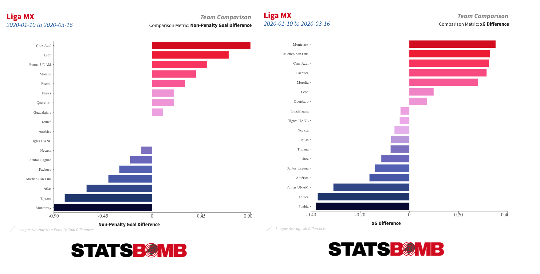 Over time, those kinds of things tend to even themselves out, and that is just as true the other way around. Over the full course of the 2019-20 season, no team outperformed their xG difference to the extent that Necaxa did, but even they started to drift back towards their underlying numbers during the Clausura.
 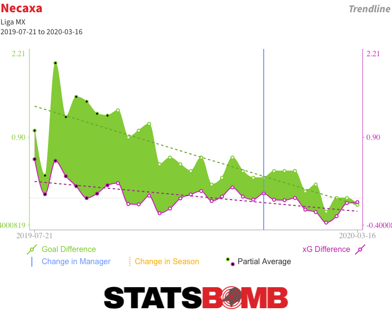 That should be of concern to teams like Puebla and Pumas. Both were in the playoff hunt during the aborted Clausura but had some of the league’s worst underlying numbers. León: The Throughball Masters On an outright basis, León had the best attack in Liga MX last season, and their expected goals tally was also up there with the league’s best. Yet their attack functioned very differently to those of the other high-scoring teams. They took a below league-average number of shots, but their average chance quality was far and away the best in the division.
 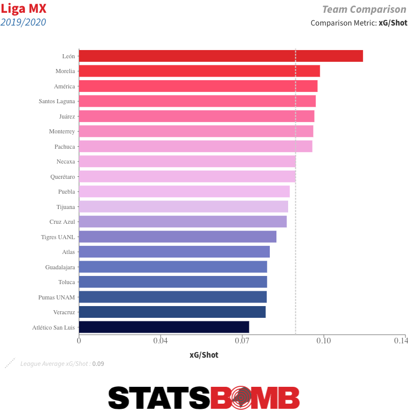 A look at their shot map provides us with a good idea as to why. See all those triangles? Those are shots from throughballs.
  Let’s separate them out.
  That is a lot of throughball shots -- 11 more than any other side, and almost twice as many on a proportional basis. Over 20% of León’s xG and goals came from them. Throughballs produce some of the highest quality chances in the game, and León create a ton of them. On an individual basis, the league’s top two throughball providers and four of the top five play for Léon: Luis Montes, Joel Campbell, Fernando Navarro and Pedro Aquino. You’ll also find Ángel Mena and Leonardo Ramos inside the top 15. So if you like yourself a good throughball, León are clearly the team to watch. On the opposite end of the scale, Chivas were the only team not to score a single goal from a throughball last season. Lopsided Attacks Last week, we had a look at the most lopsided attacks across the major European leagues, and the same general trends we saw there hold in Liga MX. Teams take a marginally higher percentage of their shots, generate a marginally higher percentage of their xG and score a marginally higher percentage of their goals from the left than the right. As in the major European leagues, shots from the centre account for around 75% of the goals. In the 2019-20 season, Puebla were the team with the biggest swing to one side in terms of the proportion of shots from the left and right that were taken from each side. They took 59.42% of those shots from the left:
 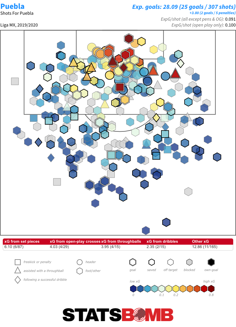 In terms of goals, no team were as lopsided as Necaxa, who scored nearly a quarter of their goals from the right, but only 5.66% from the left. Defensive Styles This graphic shows how each team’s proportion of defensive actions, including StatsBomb’s exclusive pressure data, to opposition passes compares with the league average in each of six vertical zones. The red tones indicate that the team completed an above-average proportion of defensive actions in that zone.
 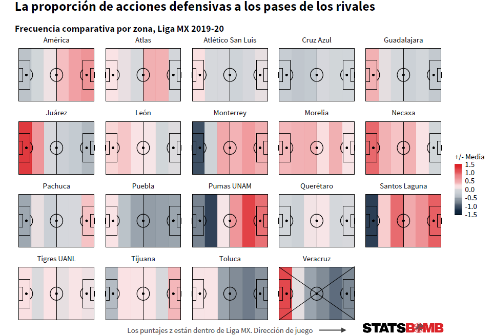 Through this, we can identify groupings of teams with similar defensive styles. If you like proactive teams that defend high up the pitch then Monterrey, Pumas or Santos Laguna might be to your liking. If teams who primarily defend in their own defensive third are your thing then Chivas, Juárez or Toluca might be the ticket. If you’re looking for ones who are pretty much averagely proactive all across the pitch there is always León or Tigres. There is a style for every taste. Talented Young Forwards There were five young forwards, aged 21 or under, who saw at least 900 minutes of action over the course of the truncated 2019-20 season. In order of their combined expected goals and expected goals assisted contribution per 90 minutes, lowest to highest: Diego Abella (Puebla), Germán Berterame (San Luis), José Macías (León/Chivas), Adrián Lozano (Santos Laguna) and Federico Viñas (América). The top two, Lozano and Viñas, have quite different profiles. Lozano is a creator who also posts up solid shot volume; Viñas is an out and out, penalty box centre-forward.
 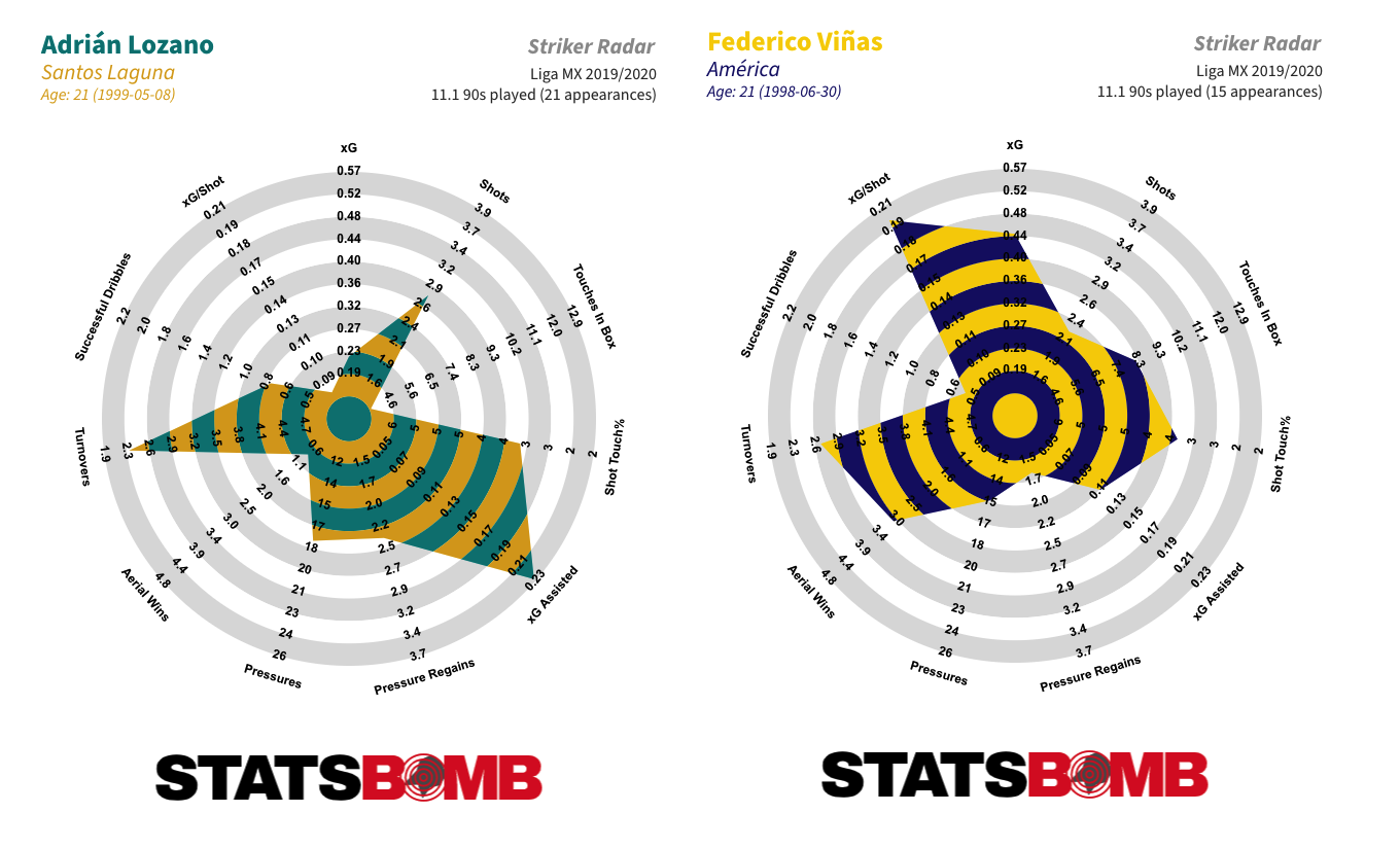 Viñas over-performed his xG tally through the 2019-20 season, converting him into the highest scorer, on a per 90 basis, in the league amongst all players who played at least 900 minutes. But even his xG figure was the second best in the league on that basis.
  Macías is an interesting case. He put up solid numbers at León in the first half of the season (his goal tally was significantly inflated by the five penalties he converted) but then really kicked things up a notch upon returning to his parent club Chivas in January. The question now is if he can maintain that output over a larger sample size.
  One and Two-Footed Players One of the unique features of the StatsBomb data set is that we record the foot with which each pass is played. Over a period of time that allows us to look at which players are the most and least two-footed. During the 2019-20 season, the Pachuca central defender Óscar Murillo was the the most two-footed player in Liga MX. He attempted 49% of his passes with his left foot and 51% with his right.
 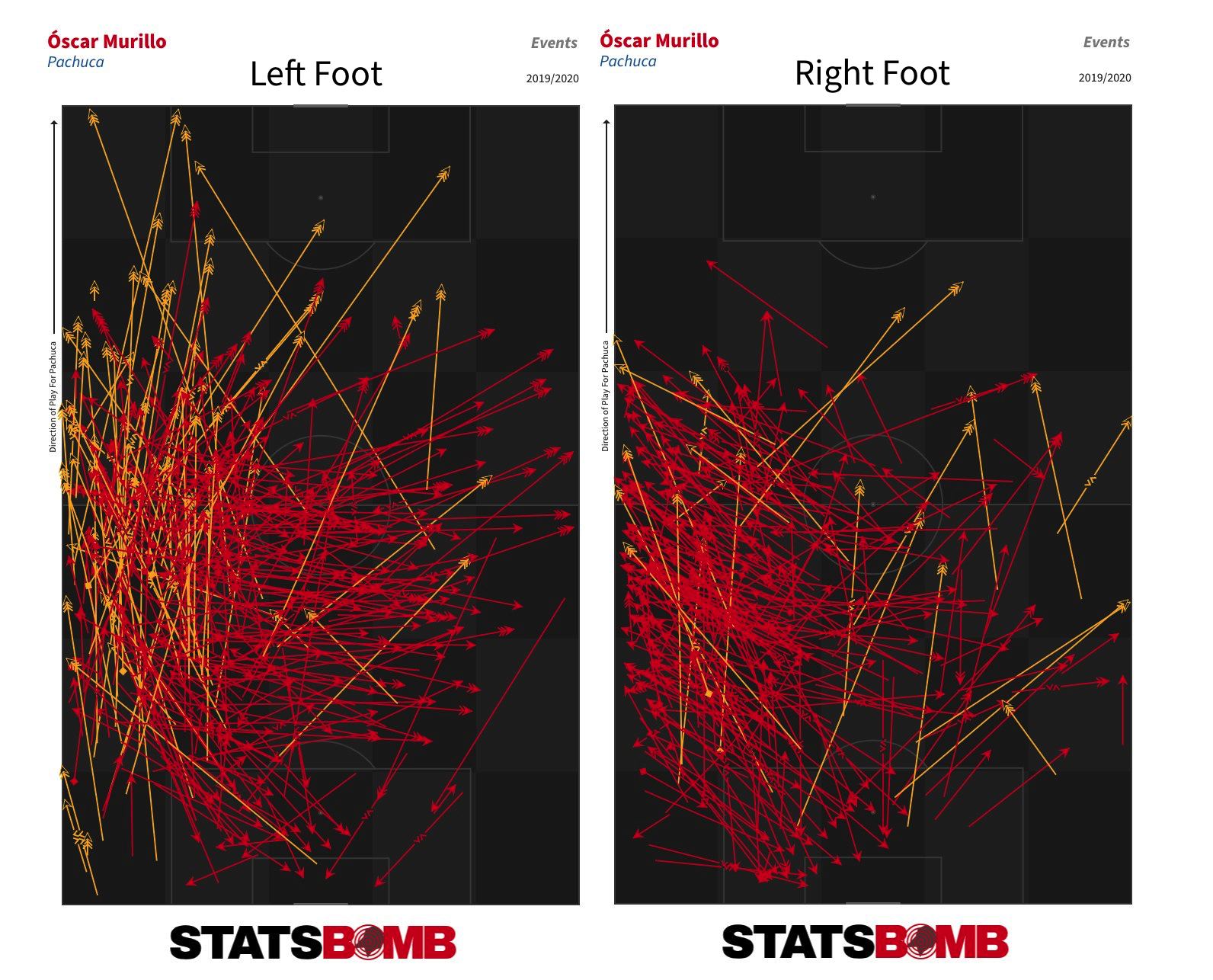 Leonardo Ramos of León and Puebla’s Abella were next up. But who was the least ambidextrous player? Jaime Gómez of Querétaro, who attempted 97% of his passes with his right foot. His teammate Ayron del Valle and León’s Miguel Herrera (now of Pachuca) showed similar skews to their favoured feet. More Stats of Interest If dribblers are your thing, Querétaro were the team to watch last season. Jeison Lucumí and Fabián Castillo were the top two in Liga MX in terms of both attempted and completed dribbles.
 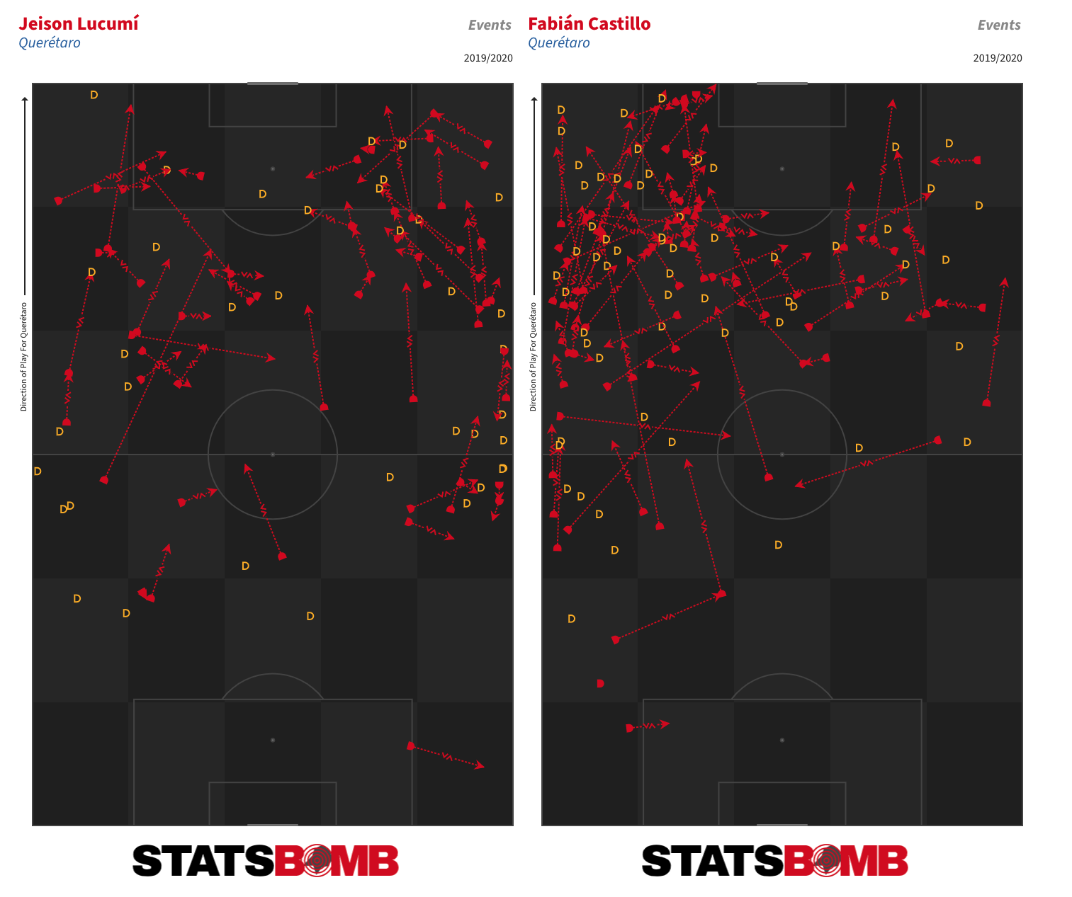 Fernando Gorriarán had the dubious honour of taking the highest number of shots without scoring (46) in Liga MX last season, but the Santos Laguna midfielder was also one of the most defensively active players in the league. Only Luis Quiñones of Tigres and León’s Aquino got through more combined interceptions, pressures and tackles than the Uruguayan on a possession-adjusted basis.
  Rodrigo Noya didn’t react well to being pressed last season. The pass completion rate of the Nexaca central defender dropped from 81% in all situations to 57% when he was put under pressure -- a drop of 26 percentage points than was the highest in the league amongst all outfield players who attempted at least 20 passes per 90.
 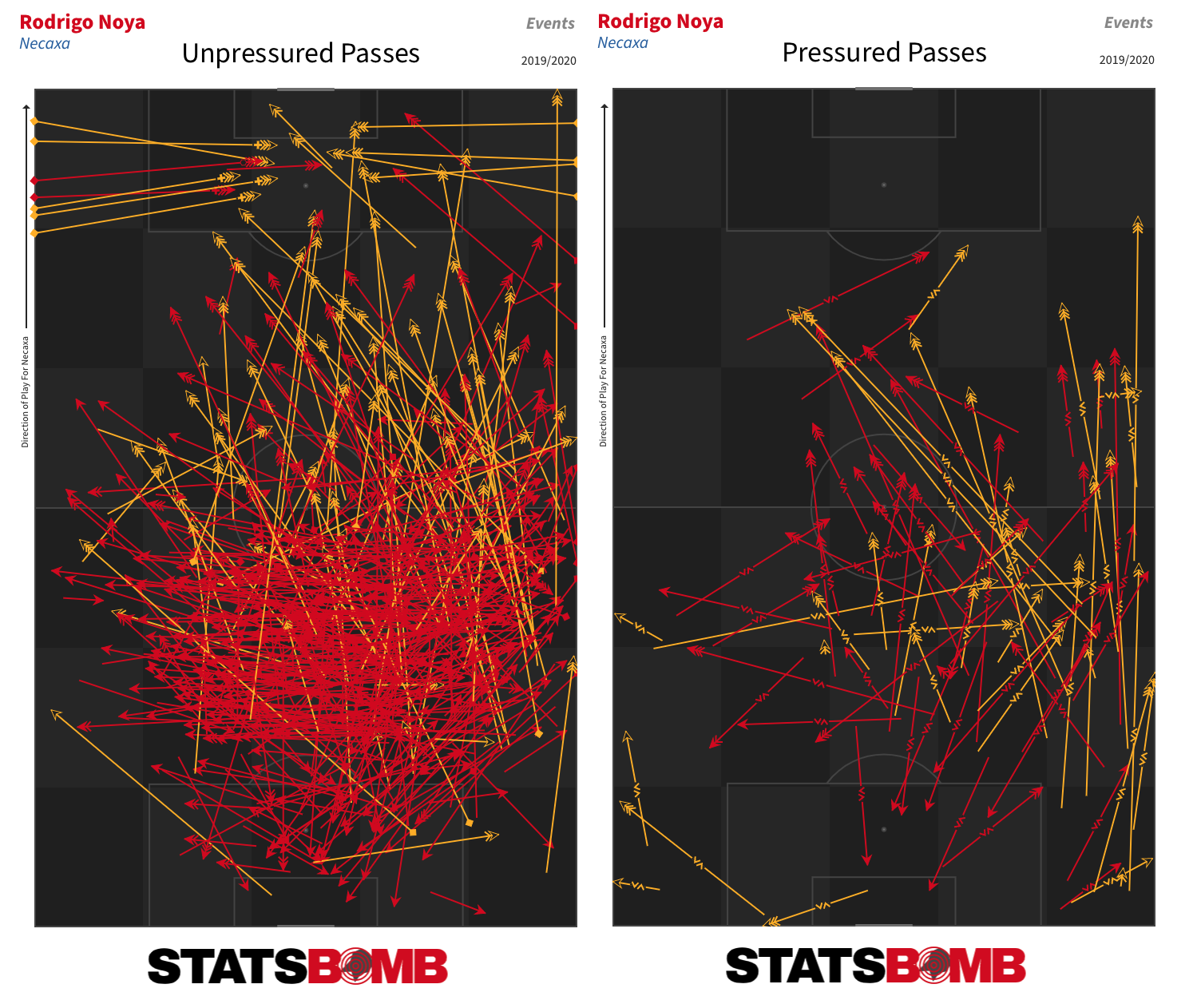 Finally, it was quite clear which teams did the best job of generating chances and goals from set pieces in the 2019-20 season. Cruz Azul, Monterrey, Pumas and Santos Laguna filled the top four places in terms of both set piece xG and set piece goals.
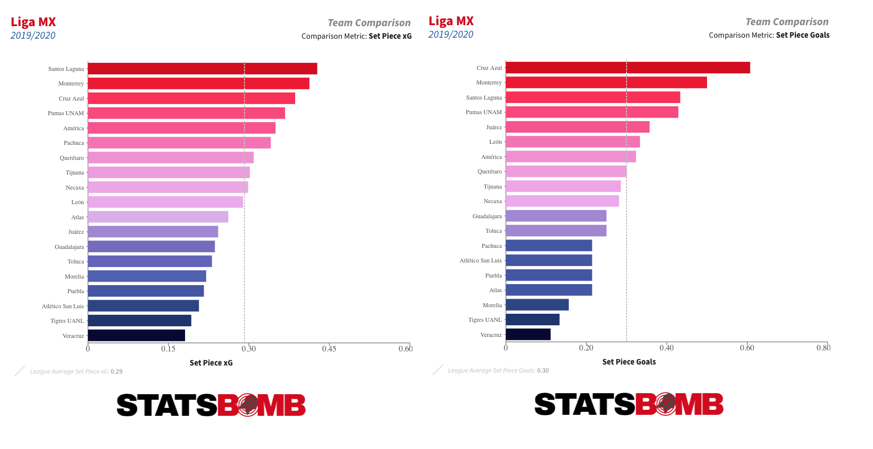
Doing More With StatsBomb Data in R
Alongside the release of our Messi dataset we also put a PDF guide to using our data in R. It was intended as a basic introduction to not only our dataset but also the R programming language itself, for those who have yet to use it at any level. Hopefully that gave anyone interested in digging into football data a nice, smooth onboarding to the whole process.
For those who have taken the plunge, this article is going to go through a few more involved things that one could do with the data. This is for those that have already gone through the guide and have been playing about with SBD for a while now. It's important that you have done this first as we will not be walking through absolutely everything and assumes a certain level of familiarity with R. Now that the base terminology of it all has been established it should be easier to explore uncharted territory with a bit less trepidation. So far we have released open data on the women’s and men’s World Cups, the FAWSL, the NWSL, Lionel Messi’s entire La Liga career, the 2003/04 Arsenal Invincibles and 15 years of Champions League finals. You can follow along with this article using any dataset you like but for consistency's sake we will be using the 2019/20 FAWSL season in all examples.
One last disclaimer: this is, of course, all about R. We also have a package for Python that isn’t quite as developed but still handles plenty of the basics for you if that’s your programming language of choice.
A big hurdle to doing anything nuanced with any dataset is one’s underlying understanding of it. There are so many distinct variables and considerations in the SB dataset that even I - having worked with it as my job for two years now - forget about some parts of it every now and then.
To this end it helps to not only have our specs to hand for checking, but also to be aware of the names() and unique() functions. These allow you to get a top-down look at the columns/rows a dataframe contains. So let’s assume you have your data in an R df called ‘events’. We will be using this name for the data in all examples throughout this article. If you were to do names(StatsBombData) that would give you a list of all the columns in your dataset.
Similarly, if you were to do unique(StatsBombData$type.name) you would get a list of every unique row that the ‘type.name’ column contains, i.e all the event types in our data. You can of course do that with any column. It’s good to have these two in your back pocket should you get lost in the forest of data at any point.
xGA, Joining and xG+xGA
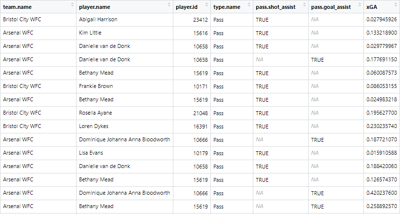
xG assisted does not exist in our data initially. However, given that xGA is the xG value of a shot that a key pass/assist created, and that xG values do exist in our data, we can create xGA quite easily via joining. Here’s the code for that, we’ll go through it bit-by-bit afterwards:
library(tidyverse)
library(StatsBombR)
xGA = events %>%
filter(type.name=="Shot") %>% #1
select(shot.key_pass_id, xGA = shot.statsbomb_xg) #2
shot_assists = left_join(events, xGA, by = c("id" = "shot.key_pass_id")) %>% #3
select(team.name, player.name, player.id, type.name, pass.shot_assist, pass.goal_assist, xGA ) %>% #4
filter(pass.shot_assist==TRUE | pass.goal_assist==TRUE) #5
- Filtering the data to just shots, as they are the only events with xG values.
- Select() allows you to choose which columns you want to, well, select, from your data, as not all are always necessary - especially with big datasets. First we are selecting the shot.key_pass_id column, which is a variable attached to shots that is just the ID of the pass that created the shot. You can also rename columns within select() which is what we are doing with xGA = shot.statsbomb_xg. This is so that, when we join it with the passes, it already has the correct name.
- left_join() lets you combine the columns from two different DFs by using two columns within either side of the join as reference keys. So in this example we are taking our initial DF (‘events’) and joining it with the one we just made (‘xGA’). The key is the by = c("id" = "shot.key_pass_id") part, this is saying ‘join these two DFs on instances where the id column in events matches the ‘shot.key_pass_id’ column in xGA’. So now the passes have the xG of the shots they created attached to them under the new column ‘xGA’.
- Again selecting just the relevant columns.
- Filtering our data down to just key passes/assists.
The end result should look like this:
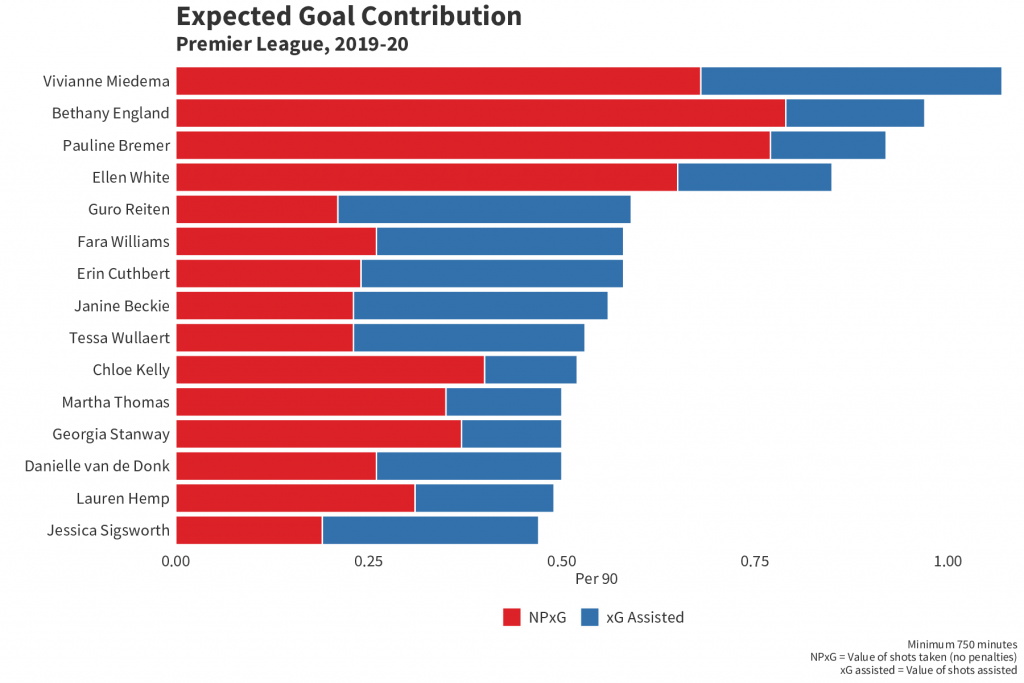
All lovely. But what if you want to make a chart out of it? Say you want to combine it with xG to make a handy xG+xGA per90 chart:
player_xGA = shot_assists %>%
group_by(player.name, player.id, team.name) %>%
summarise(xGA = sum(xGA, na.rm = TRUE)) #1
player_xG = events %>% filter(type.name=="Shot") %>%
filter(shot.type.name!="Penalty" | is.na(shot.type.name)) %>%
group_by(player.name, player.id, team.name) %>%
summarise(xG = sum(shot.statsbomb_xg, na.rm = TRUE)) %>%
left_join(player_xGA) %>% mutate(xG_xGA = sum(xG+xGA, na.rm =TRUE) ) #2
player_minutes = get.minutesplayed(events)
player_minutes = player_minutes %>%
group_by(player.id) %>%
summarise(minutes = sum(MinutesPlayed)) #3
player_xG_xGA = left_join(player_xG, player_minutes) %>%
mutate(nineties = minutes/90, xG_90 = round(xG/nineties, 2),
xGA_90 = round(xGA/nineties,2),
xG_xGA90 = round(xG_xGA/nineties,2) ) #4
chart = player_xG_xGA %>%
ungroup() %>% filter(minutes>=600) %>%
top_n(n = 15, w = xG_xGA90) #5
chart<-chart %>%
select(1, 9:10)%>%
pivot_longer(-player.name, names_to = "variable", values_to = "value") %>%
filter(variable=="xG_90" | variable=="xGA_90") #6
- Grouping by player and summing their total xGA for the season.
- Filtering out penalties and summing each player's xG, then joining with the xGA and adding the two together to get a third combined column.
- Getting minutes played for each player. If you went through the initial R guide you will have done this already.
- Joining the xG/xGA to the minutes, creating the 90s and dividing each stat by the 90s to get xG per 90 etc.
- Here we ungroup as we need the data in ungrouped form for what we're about to do. First we filter to players with a minimum of 600 minutes, just to get rid of notably small samples. Then we use top_n(). This filters your DF to the top *insert number of your choice here* based on a column you specify. So here we're filtering to the top 15 players in terms of xG90+xGA90.
- The pivot_longer() function flattens out the data. It's easier to explain what that means if you see it first:
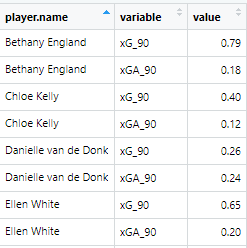
It has used the player.name as a reference point at creates separate rows for every variable that's left over. We then filter down to just the xG90 and xGA90 variables so now each player has a separate variable and value row for those two metrics. Now let's plot it:
ggplot(chart, aes(x =reorder(player.name, value), y = value, fill=fct_rev(variable))) + #1
geom_bar(stat="identity", colour="white")+
labs(title = "Expected Goal Contribution", subtitle = "Premier League, 2019-20",
x="", y="Per 90", caption ="Minimum 750 minutes\nNPxG = Value of shots taken (no penalties)\nxG assisted = Value of shots assisted")+
theme(axis.text.y = element_text(size=14, color="#333333", family="Source Sans Pro"),
axis.title = element_text(size=14, color="#333333", family="Source Sans Pro"),
axis.text.x = element_text(size=14, color="#333333", family="Source Sans Pro"),
axis.ticks = element_blank(),
panel.background = element_rect(fill = "white", colour = "white"),
plot.background = element_rect(fill = "white", colour ="white"),
panel.grid.major = element_blank(),
panel.grid.minor = element_blank(),
plot.title=element_text(size=24, color="#333333", family="Source Sans Pro" , face="bold"),
plot.subtitle=element_text(size=18, color="#333333", family="Source Sans Pro", face="bold"),
plot.caption=element_text(color="#333333", family="Source Sans Pro", size =10), text=element_text(family="Source Sans Pro"),
legend.title=element_blank(),
legend.text = element_text(size=14, color="#333333", family="Source Sans Pro"),
legend.position = "bottom") + #2
scale_fill_manual(values=c("#3371AC", "#DC2228"), labels = c( "xG Assisted","NPxG")) + #3
scale_y_continuous(expand = c(0, 0), limits= c(0,max(chart$value) + 0.3)) + #4
coord_flip()+ #5
guides(fill = guide_legend(reverse = TRUE)) #6
- Two things are going on here that are different from your average bar chart. First is reorder(), which allows you reorder a variable along either axis based on a second variable. In this instance we are putting the player names on the x axis and reordering them by value - i.e the xG and xGA combined - meaning they are now in descending order from most to least combined xG+xGA. Second is that we've put the 'variable' on the bar fill. This allows us to put two separate metrics onto one bar chart and have them stack, as you will see below, by having them be separate fill colours.
- Everything within labs() and theme() is fairly self explanatory and is just what we have used internally. You can get rid of all this if you like and change it to suit your own design tastes.
- Here we are providing specific colour hex codes to the values (so xG = red and xGA = blue) and then labelling them so they are named correctly on the chart's legend.
- Expand() allows you to expand the boundaries of the x or y axis, but if you set the values to (0,0) it also removes all space between the axis and the inner chart itself (if you're having a hard time envisioning that, try removing expand() and see what it looks like). Then we are setting the limits of the y axis so the longest bar on the chart isn't too close to the edge of the chart. 'max(chart$value) + 0.3' is saying 'take the max value and add 0.3 to make that the upper limit of the y axis'.
- Flipping the x axis and y axis so we have a nice horizontal bar chart rather than a vertical one.
- Reversing the legend so that the order of it matches up with the order of xG and xGA on the chart itself.
All in that should look like this:
Heatmaps
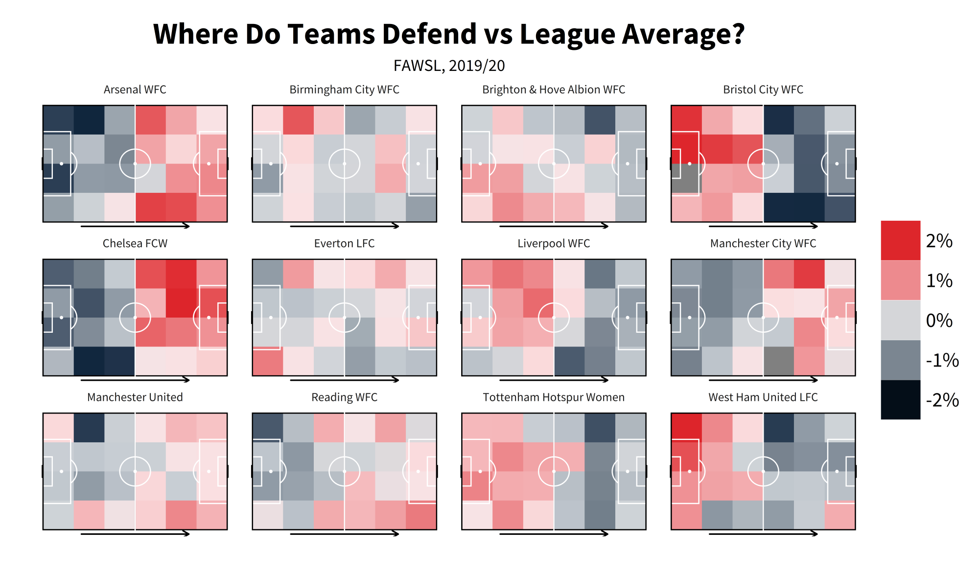
Heatmaps are one of the everpresents in football data. They are fairly easy to make in R once you get your head round how to do so, but can be unintuitive without having it explained to you first. For this example we're going to do a defensive heatmap, looking at how often teams make a % of their overall defensive actions in certain zones, then comparing that % vs league average:
library(tidyverse)
heatmap = events %>%
mutate(location.x = ifelse(location.x>120, 120, location.x),
location.y = ifelse(location.y>80, 80, location.y),
location.x = ifelse(location.x<0, 0, location.x),
location.y = ifelse(location.y<0, 0, location.y)) #1
heatmap$xbin <- cut(heatmap$location.x, breaks = seq(from=0, to=120, by = 20),include.lowest=TRUE )
heatmap$ybin <- cut(heatmap$location.y, breaks = seq(from=0, to=80, by = 20),include.lowest=TRUE) #2
heatmap = heatmap%>%
filter(type.name=="Pressure" | duel.type.name=="Tackle" | type.name=="Foul Committed" | type.name=="Interception" |
type.name=="Block" ) %>%
group_by(team.name) %>%
mutate(total_DA = n()) %>%
group_by(team.name, xbin, ybin) %>%
summarise(total_DA = max(total_DA),
bin_DA = n(),
bin_pct = bin_DA/total_DA,
location.x = median(location.x),
location.y = median(location.y)) %>%
group_by(xbin, ybin) %>%
mutate(league_ave = mean(bin_pct)) %>%
group_by(team.name, xbin, ybin) %>%
mutate(diff_vs_ave = bin_pct - league_ave) #3
- Some of the coordinates in our data sit outside the bounds of the pitch (you can see the layout of our pitch coordinates in our event spec, but it's 0-120 along the x axis and 0-80 along the y axis). This will cause issue with a heatmap and give you dodgy looking zones outside the pitch. So what we're doing here is using ifelse() to say 'if a location.x/y coordinate is outside the bounds that we want, then replace it with one that's within the boundaries. If it is not outside the bounds just leave it as is'.
- cut() literally cuts up the data how you ask it to. Here, we're cutting along the x axis (from 0-120, again the length of our pitch according to our coordinates in the spec) and the y axis (0-80), and we're cutting them 'by' the value we feed it, in this case 20. So we're splitting it up into buckets of 20. This creates 6 buckets/zones along the x axis (120/20 = 6) and 4 along the y axis (80/20 = 4). This creates the buckets we need to plot our zones.
- This is using those buckets to create the zones. Let's break it down bit-by-bit: - Filtering to only defensive events - Grouping by team and getting how many defensive events they made in total ( n() just counts every row that you ask it to, so here we're counting every row for every team - i.e counting every defensive event for each team) - Then we group again by team and the xbin/ybin to count how many defensive events a team has in a given bin/zone - that's what 'bin_DA = n()' is doing. 'total_DA = max(total_DA),' is just grabbing the team totals we made earlier. 'bin_pct = bin_DA/total_DA,' is dividing the two to see what percentage of a team's overall defensive events were made in a given zone. The 'location.x = median(location.x/y)' is doing what it says on the tin and getting the median coordinate for each zone. This is used later in the plotting. - Then we ungroup and mutate to find the league average for each bin, followed by grouping by team/bin again subtracting the league average in each bin from each team's % in those bins to get the difference.
Now onto the plotting. For this please install the package 'grid' if you do not have it, and load it in. You could use a package like 'ggsoccer' or 'SBPitch' for drawing the pitch, but for these purposes it's helpful to try and show you how to create your own pitch, should you want to:
library(grid)
defensiveactivitycolors <- c("#dc2429", "#dc2329", "#df272d", "#df3238", "#e14348", "#e44d51", "#e35256", "#e76266", "#e9777b", "#ec8589", "#ec898d", "#ef9195", "#ef9ea1", "#f0a6a9", "#f2abae", "#f4b9bc", "#f8d1d2", "#f9e0e2", "#f7e1e3", "#f5e2e4", "#d4d5d8", "#d1d3d8", "#cdd2d6", "#c8cdd3", "#c0c7cd", "#b9c0c8", "#b5bcc3", "#909ba5", "#8f9aa5", "#818c98", "#798590", "#697785", "#526173", "#435367", "#3a4b60", "#2e4257", "#1d3048", "#11263e", "#11273e", "#0d233a", "#020c16") #1
ggplot(data= heatmap, aes(x = location.x, y = location.y, fill = diff_vs_ave, group =diff_vs_ave)) +
geom_bin2d(binwidth = c(20, 20), position = "identity", alpha = 0.9) + #2
annotate("rect",xmin = 0, xmax = 120, ymin = 0, ymax = 80, fill = NA, colour = "black", size = 0.6) +
annotate("rect",xmin = 0, xmax = 60, ymin = 0, ymax = 80, fill = NA, colour = "black", size = 0.6) +
annotate("rect",xmin = 18, xmax = 0, ymin = 18, ymax = 62, fill = NA, colour = "white", size = 0.6) +
annotate("rect",xmin = 102, xmax = 120, ymin = 18, ymax = 62, fill = NA, colour = "white", size = 0.6) +
annotate("rect",xmin = 0, xmax = 6, ymin = 30, ymax = 50, fill = NA, colour = "white", size = 0.6) +
annotate("rect",xmin = 120, xmax = 114, ymin = 30, ymax = 50, fill = NA, colour = "white", size = 0.6) +
annotate("rect",xmin = 120, xmax = 120.5, ymin =36, ymax = 44, fill = NA, colour = "black", size = 0.6) +
annotate("rect",xmin = 0, xmax = -0.5, ymin =36, ymax = 44, fill = NA, colour = "black", size = 0.6) +
annotate("segment", x = 60, xend = 60, y = -0.5, yend = 80.5, colour = "white", size = 0.6)+
annotate("segment", x = 0, xend = 0, y = 0, yend = 80, colour = "black", size = 0.6)+
annotate("segment", x = 120, xend = 120, y = 0, yend = 80, colour = "black", size = 0.6)+
theme(rect = element_blank(), line = element_blank()) +
annotate("point", x = 12 , y = 40, colour = "white", size = 1.05) + # add penalty spot right
annotate("point", x = 108 , y = 40, colour = "white", size = 1.05) +
annotate("path", colour = "white", size = 0.6, x=60+10*cos(seq(0,2*pi,length.out=2000)),
y=40+10*sin(seq(0,2*pi,length.out=2000)))+ # add centre spot
annotate("point", x = 60 , y = 40, colour = "white", size = 1.05) +
annotate("path", x=12+10*cos(seq(-0.3*pi,0.3*pi,length.out=30)), size = 0.6,
y=40+10*sin(seq(-0.3*pi,0.3*pi,length.out=30)), col="white") +
annotate("path", x=108-10*cos(seq(-0.3*pi,0.3*pi,length.out=30)), size = 0.6,
y=40-10*sin(seq(-0.3*pi,0.3*pi,length.out=30)), col="white") + #3
theme(axis.text.x=element_blank(),
axis.title.x = element_blank(),
axis.title.y = element_blank(),
plot.caption=element_text(size=13,family="Source Sans Pro", hjust=0.5, vjust=0.5),
plot.subtitle = element_text(size = 18, family="Source Sans Pro", hjust = 0.5),
axis.text.y=element_blank(),
legend.title = element_blank(),
legend.text=element_text(size=22,family="Source Sans Pro"),
legend.key.size = unit(1.5, "cm"),
plot.title = element_text(margin = margin(r = 10, b = 10), face="bold",size = 32.5, family="Source Sans Pro", colour = "black", hjust = 0.5),
legend.direction = "vertical",
axis.ticks=element_blank(),
plot.background = element_rect(fill = "white"),strip.text.x = element_text(size=13,family="Source Sans Pro")) + #4
scale_y_reverse() + #5
scale_fill_gradientn(colours = defensiveactivitycolors, trans = "reverse", labels = scales::percent_format(accuracy = 1), limits = c(0.02, -0.02)) + #6
labs(title = "Where Do Teams Defend vs League Average?", subtitle = "FAWSL, 2019/20") + #7
coord_fixed(ratio = 95/100) + #8
annotation_custom(grob = linesGrob(arrow=arrow(type="open", ends="last", length=unit(2.55,"mm")), gp=gpar(col="black", fill=NA, lwd=2.2)), xmin=25, xmax = 95, ymin = -83, ymax = -83) + #9
facet_wrap(~team.name)+ #10
guides(fill = guide_legend(reverse = TRUE)) #11
- These are the colours we'll be using for our heatmap later on.
- 'geom_bin2d' is what will create the heatmap itself. We've set the binwidths to 20 as that's what we cut the pitch up into earlier along the x and y axis. Feeding 'div_vs_ave' to 'fill' and 'group' in the ggplot() will allow us to colour the heatmaps by that variable.
- Everything up to here is what is drawing the pitch. There's a lot going on here and, rather than have it explained to you, just delete a line from it and see what disappears from the plot. Then you'll see which line is drawing the six-yard-box, which is drawing the goal etc.
- Again more themeing. You can change this to be whatever you like to fit your aesthetic preferences.
- Reversing the y axis so the pitch is the correct way round along that axis (0 is left in SBD coordinates, but starts out as right in ggplot).
- Here we're setting the parameters for the fill colouring of heatmaps. First we're feeding the 'defensiveactivitycolors' we set earlier into the 'colours' parameter, 'trans = "reverse"' is there to reverse the output so red = high. 'labels = scales::percent_format(accuracy = 1)' formats the text on the legend as a percentage rather than a raw number and 'limits = c(0.03, -0.03)' sets the limits of the chart to 3%/-3% (reversed because of the previous trans = reverse).
- Setting the title and subtitle of the chart.
- 'coord_fixed()' allows us to set the aspect ratio of the chart to our liking. Means the chart doesn't come out looking all stretched along one of the axes.
- This is what the grid package is used for. It's drawing the arrow across the pitches to indicate direction of play. There's multiple ways you could accomplish though, up to you how you do it.
- 'facet_wrap()' creates separate 'facets' for your chart according to the variable you give it. Without it, we'd just be plotting every team's numbers all at once on chart. With it, we get every team on their own individual pitch.
- Our previous trans = reverse also reverses the legend, so to get it back with the positive numbers pointing upwards we can re-reverse it.
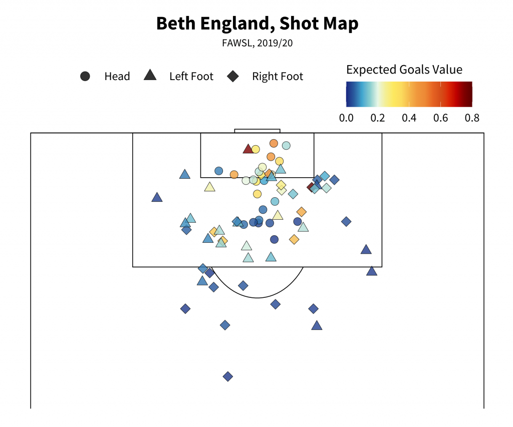
Shot Maps
Another of the quintessential football visualisations, shot maps come in many shapes and sizes with an inconsistent overlap in design language between them. This version will attempt to give you the basics, let you get to grip with how to put one of these together so that if you want to elaborate or make any of your own changes you can explore outwards from it. Be forewarned though - the options for what makes a good, readable shot map are surprisingly small when you get into visualising it!
shots = events %>%
filter(type.name=="Shot" & (shot.type.name!="Penalty" | is.na(shot.type.name)) & player.name=="Bethany England") #1
shotmapxgcolors <- c("#192780", "#2a5d9f", "#40a7d0", "#87cdcf", "#e7f8e6", "#f4ef95", "#FDE960", "#FCDC5F", "#F5B94D", "#F0983E", "#ED8A37", "#E66424", "#D54F1B", "#DC2608", "#BF0000", "#7F0000", "#5F0000") #2
ggplot() +
annotate("rect",xmin = 0, xmax = 120, ymin = 0, ymax = 80, fill = NA, colour = "black", size = 0.6) +
annotate("rect",xmin = 0, xmax = 60, ymin = 0, ymax = 80, fill = NA, colour = "black", size = 0.6) +
annotate("rect",xmin = 18, xmax = 0, ymin = 18, ymax = 62, fill = NA, colour = "black", size = 0.6) +
annotate("rect",xmin = 102, xmax = 120, ymin = 18, ymax = 62, fill = NA, colour = "black", size = 0.6) +
annotate("rect",xmin = 0, xmax = 6, ymin = 30, ymax = 50, fill = NA, colour = "black", size = 0.6) +
annotate("rect",xmin = 120, xmax = 114, ymin = 30, ymax = 50, fill = NA, colour = "black", size = 0.6) +
annotate("rect",xmin = 120, xmax = 120.5, ymin =36, ymax = 44, fill = NA, colour = "black", size = 0.6) +
annotate("rect",xmin = 0, xmax = -0.5, ymin =36, ymax = 44, fill = NA, colour = "black", size = 0.6) +
annotate("segment", x = 60, xend = 60, y = -0.5, yend = 80.5, colour = "black", size = 0.6)+
annotate("segment", x = 0, xend = 0, y = 0, yend = 80, colour = "black", size = 0.6)+
annotate("segment", x = 120, xend = 120, y = 0, yend = 80, colour = "black", size = 0.6)+
theme(rect = element_blank(), line = element_blank()) + # add penalty spot right
annotate("point", x = 108 , y = 40, colour = "black", size = 1.05) +
annotate("path", colour = "black", size = 0.6, x=60+10*cos(seq(0,2*pi,length.out=2000)),
y=40+10*sin(seq(0,2*pi,length.out=2000)))+ # add centre spot
annotate("point", x = 60 , y = 40, colour = "black", size = 1.05) +
annotate("path", x=12+10*cos(seq(-0.3*pi,0.3*pi,length.out=30)), size = 0.6,
y=40+10*sin(seq(-0.3*pi,0.3*pi,length.out=30)), col="black") +
annotate("path", x=107.84-10*cos(seq(-0.3*pi,0.3*pi,length.out=30)), size = 0.6,
y=40-10*sin(seq(-0.3*pi,0.3*pi,length.out=30)), col="black") +
geom_point(data = shots, aes(x = location.x, y = location.y, fill = shot.statsbomb_xg, shape = shot.body_part.name), size = 6, alpha = 0.8) + #3
theme(axis.text.x=element_blank(),
axis.title.x = element_blank(),
axis.title.y = element_blank(),
plot.caption=element_text(size=13,family="Source Sans Pro", hjust=0.5, vjust=0.5),
plot.subtitle = element_text(size = 18, family="Source Sans Pro", hjust = 0.5),
axis.text.y=element_blank(), legend.position = "top",
legend.title=element_text(size=22,family="Source Sans Pro"),
legend.text=element_text(size=20,family="Source Sans Pro"),
legend.margin = margin(c(20, 10, -85, 50)),
legend.key.size = unit(1.5, "cm"),
plot.title = element_text(margin = margin(r = 10, b = 10), face="bold",size = 32.5, family="Source Sans Pro", colour = "black", hjust = 0.5),
legend.direction = "horizontal",
axis.ticks=element_blank(), aspect.ratio = c(65/100),
plot.background = element_rect(fill = "white"), strip.text.x = element_text(size=13,family="Source Sans Pro")) +
labs(title = "Beth England, Shot Map", subtitle = "FAWSL, 2019/20") + #4
scale_fill_gradientn(colours = shotmapxgcolors, limit = c(0,0.8), oob=scales::squish, name = "Expected Goals Value") + #5
scale_shape_manual(values = c("Head" = 21, "Right Foot" = 23, "Left Foot" = 24), name ="") + #6
guides(fill = guide_colourbar(title.position = "top"), shape = guide_legend(override.aes = list(size = 7, fill = "black"))) + #7 coord_flip(xlim = c(85, 125)) #8
- Simple filtering, leaving out penalties. Choose any player you like of course.
- Much like the defensive activity colours earlier, these will set the colours for our xG values.
- Here's where the actual plotting of shots comes in, via geom_point. We're using the the xG values as the fill and the body part for the shape of the points. This could reasonably be anything though. You could even add in colour parameters which would change the colour of the outline of the shape.
- Again titling. This can be done dynamically so that it changes according to the player/season etc but we will leave that for now. Feel free to explore for youself though.
- Same as last time but worth pointing out that 'name' allows you to change the title of a legend from within the gradient setting.
- Setting the shapes for each body part name. The shape numbers correspond to ggplot's pre-set shapes. The shapes numbered 21 and up are the ones which have inner colouring (controlled by fill) and outline colouring (controlled by colour) so that's why those have been chosen here. oob=scales::squish takes any values that are outside the bounds of our limits and squishes them within them.
- guides() allows you to alter the legends for shape, fill and so on. Here we are changing the the title position for the fill so that it is positioned above the legend, as well as changing the size and colour of the shape symbols on that legend.
- coord_flip() does what it says on the tin - switches the x and y axes. xlim allows us to set boundaries for the x axis so that we can show only a certain part of the pitch, giving us:
That's all for now. Hopefully this wasn't all too confusing and you picked up some bits and bobs you can take away to play with yourselves. Don't worry if some of this is overwhelming or you have to do copious amounts of googling to overcome odd specific errors and whatnot. That's just part and parcel with coding (seriously, get used to googling for errors, everyone has to).
Much love. Be well and have great days.
How Lopsided is Manchester United’s Attack?

On a recent edition of the StatsBomb podcast, Ted made note of the lopsidedness of Manchester United’s shot map. There is a pronounced tilt toward the left, from where their two -- pre-Bruno Fernandes -- highest-volume shooters Anthony Martial and Marcus Rashford get off the majority of their efforts.
The data suggests a slight shift to the left is normal. For the purposes of this article, we have split the width of the pitch into five equal sections and then discarded the widest zone on each side. That leaves us with three zones that roughly span the width of the penalty area. From left to right we will name them, well... left, centre and right.
Across the last couple of seasons in the big-five European leagues, shots, expected goals (xG) and goals have been distributed like this:
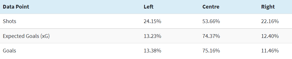
In that time, 52.10% of all shots taken from the two wider zones, left and right, have been taken from the left. This season, 62 of the 98 teams in the big five leagues have taken a higher proportion of those shots from that side. This makes some degree of intuitive sense. The left forward or winger in most teams is a right-footed player tasked with moving inside to get off shots from their favoured foot. Left-footed, right-sided forwards, or at least good ones, are a rarer commodity.
Even within that context, United’s left-sided inclination stands out.
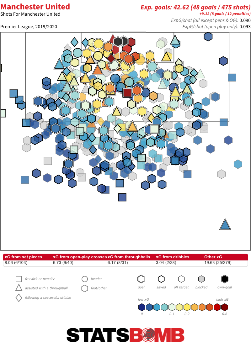
Across the three zones, only six teams take a higher percentage of shots from the left than United’s 30.35%. If we limit ourselves to just the two wider zones, only five take a greater proportion of those shots from the left than United’s 62.39%. It’s also notable that 24.07% of United’s goals have come from that left-sided zone: more than double the average.
The only teams who take a higher proportion of their wider zone shots from the left than United are Nantes, Watford, Real Valladolid, Crystal Palace and Real Madrid:
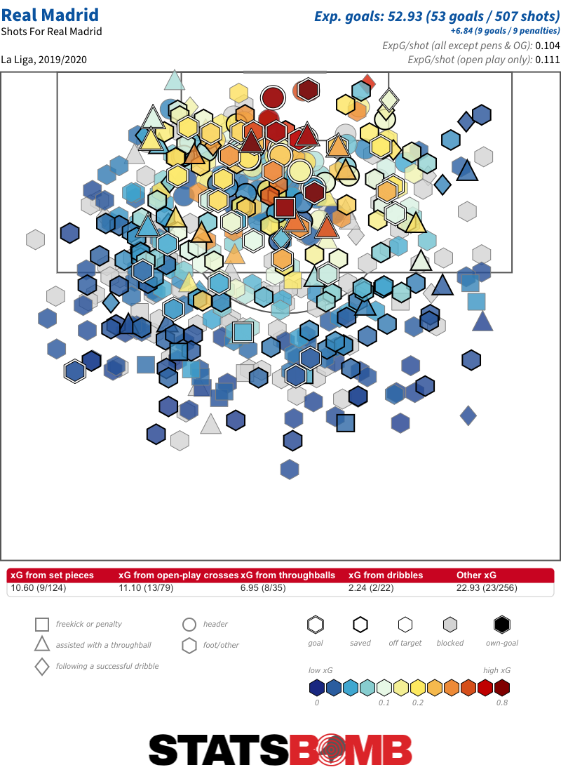
Karim Benzema aside, only Gareth Bale has taken more than 10 shots from the right for Madrid. Benzema, Toni Kroos, Vinícius Junior, Marcelo and even Casemiro have all hit double figures from the left. Between Bale’s relatively infrequent appearances and Marco Asensio’s absence through injury for the large majority of the campaign, there just hasn’t been any natural shot output from the right. Last season, thet took 57.30% of their wider zone shots from the left; this season, that has increased to 67.95%.
What about the right? There are far less standouts there. Only 36 teams have taken a greater proportion of their shots from the two wider zones from the right hand side. Within that, the highest proportion is Liverpool’s 57.47%. For reference, there are 16 teams with a larger proportional swing to the left.
Partly because they’ve also attempted a higher proportion of central shots than United, it isn't something that clearly shows up on their shot map.
What is perhaps of greater interest is that this tilt to the right, relatively subtle though it is, was also there last season, when 56.75% of their shots from the two wider zones were taken from that side.
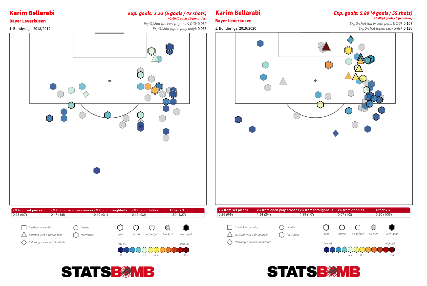
The four teams that follow Liverpool in this season’s top five are Bayer Leverkusen, Brescia, Arsenal and Everton. Leverkusen were also up there last season. We can probably name that the Bellarabi effect.
If we broaden our analysis to the proportion of right-sided shots amongst those attempted from all three zones, we encounter a few teams who struggle to create central shots and so attempt a relatively high proportion of efforts from both of the wider zones.
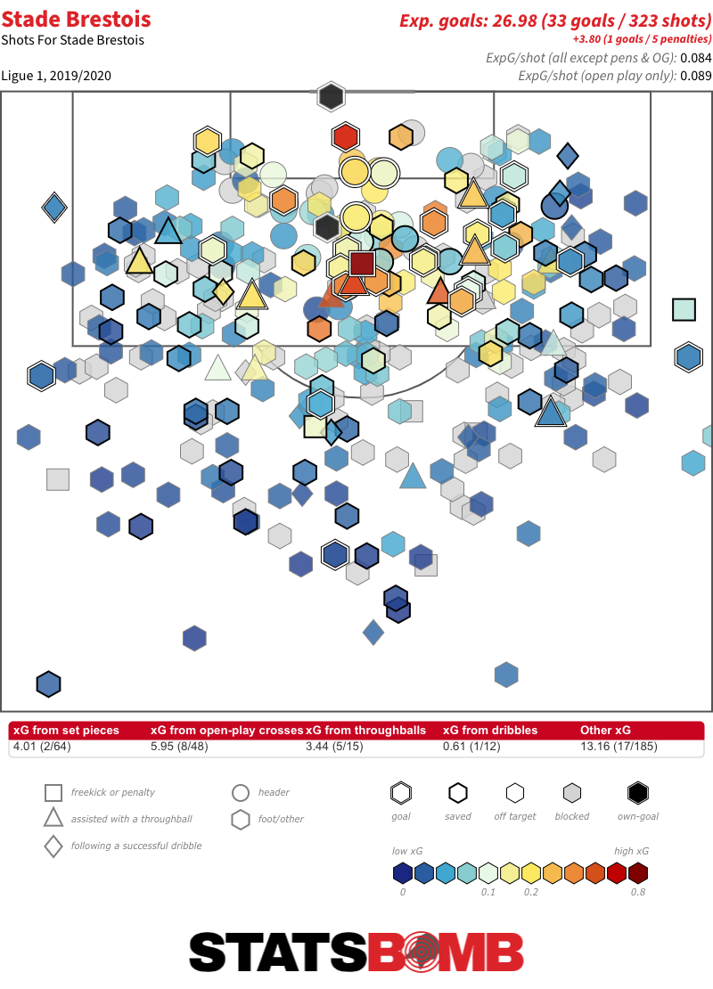
Stade Brestois are the prime example. No team have taken a larger proportion of their shots, generated a larger proportion of their xG or scored a larger proportion of their goals from the right this season. But only 51.08% of their shots from the two wider zones have been from that side. On a proportional basis, no team have taken less shots or scored less goals from the centre.
There are two teams with an almost perfect equilibrium between left and right-sided shots: Bayern Munich and Saint-Étienne. They have that in common, but the eventual outputs of their respective attacks almost couldn’t be more different:
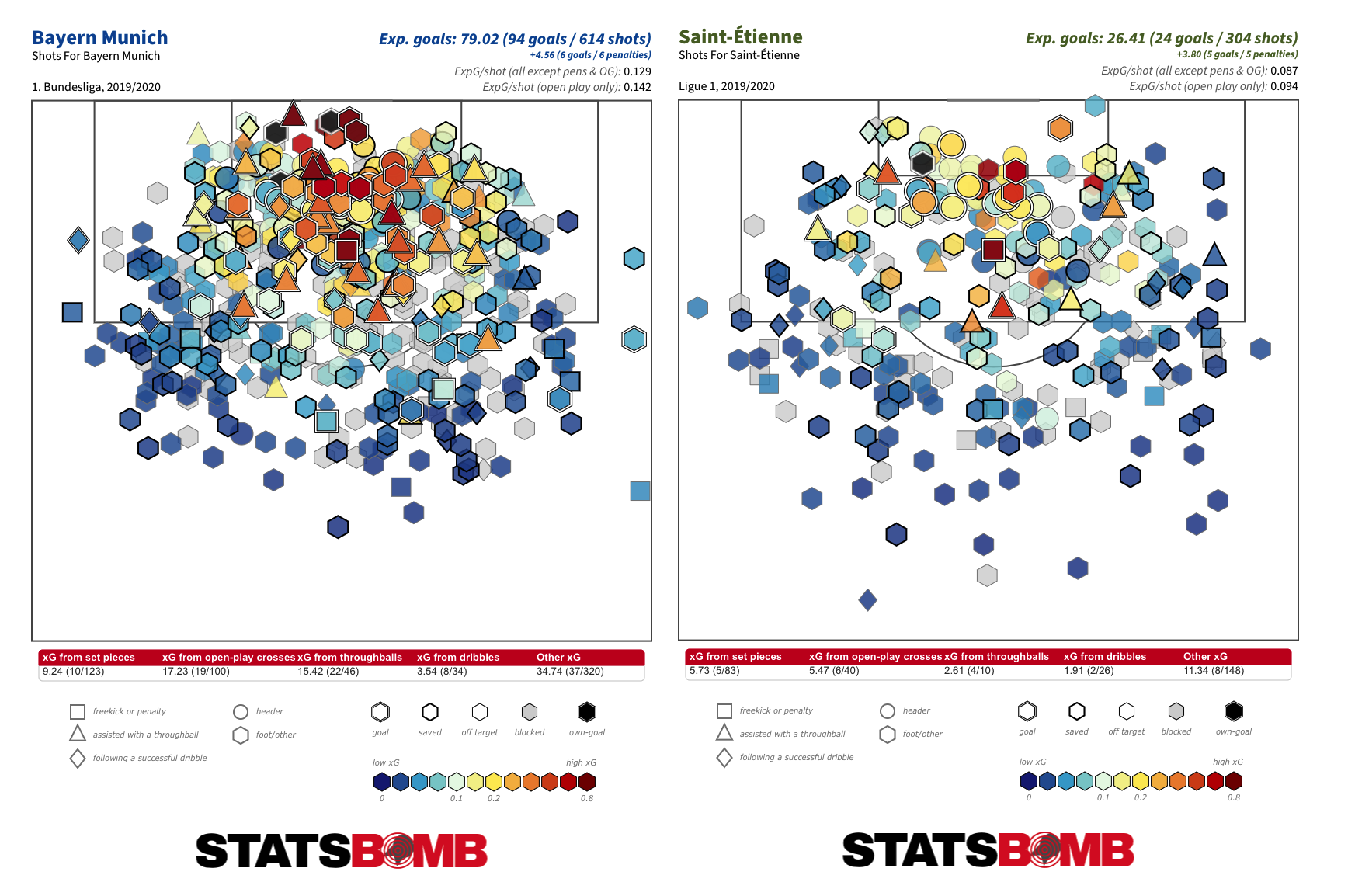
In fact, there is little evidence that the balance between left and right-sided shots has any marked effect on a team’s ability to create chances and goals. The top-10 highest scoring teams in the major European leagues this season display a variety of proportional breakdowns. It appears to be a stylistic indicator inevitably linked to the characteristics of the players out on the pitch rather than something that correlates with top-line outputs.
To finish up, a few tidbits:
- both Bournemouth and Torino have failed to score a single goal from a right-sided shot this season. Torino from 81 shots and 4.82 xG; Bournemouth from 48 shots and 3.16 xG.
- Espanyol are the only side not to have scored a single goal from a left-sided shot. That from 69 attempts and 2.94 xG.
- highest average quality shot from the left: Paris Saint-Germain (0.11 xG/Shot), Barcelona (0.10), Liverpool (0.09), Dijon (0.08), Borussia Dortmund (0.08).
- lowest average quality shot from the left: Mallorca (0.04 xG/Shot), SPAL (0.04), Espanyol (0.04), Genoa (0.04), Granada (0.04).
- highest average quality shot from the right: Borussia Monchengladbach (0.10 xG/Shot), Paris Saint-Germain (0.10), Hertha Berlin (0.09), Borussia Dortmund (0.09), RB Leipzig (0.09).
- lowest average shot quality from the right: Granada (0.04 xG/Shot), Espanyol (0.04), Mallorca (0.04), Genoa (0.04), Leganés (0.05).
StatsBomb announce partnership with Belgian FA

StatsBomb are proud to announce that we will be working with the number one ranked team in men's international football--Belgium. With access to StatsBomb Data across 70 leagues, Belgium will benefit from the detail and breadth of our unrivaled dataspec (over 3400 events per game) ahead of an important year for their team that will culminate in the rescheduled UEFA Euro 2020 tournament. By combining insight from data and the StatsBomb IQ analysis platform, no stone will be left unturned in evaluating and reviewing performances from their player group while an extra layer is added for opposition analysis. En route to UEFA Euro 2020, Belgium were dominant in qualifying Group I winning all ten games. They scored 40 goals while conceding just three and with stars such as Kevin De Bruyne, Eden Hazard and Romelu Lukaku in their ranks, will be well placed for a deep run in the final tournament. Yannick Euvrard, Senior Performance and Data Analyst, RBFA “We are happy to be working with Statsbomb. It provides us access to specific event data that creates new insights for our national team in preparation for the UEFA Nations League, the World Cup qualifying campaign and the European Championship next summer.” Ted Knutson, CEO, StatsBomb "StatsBomb are delighted to partner with the number one men's team in the world in supplying them with cutting edge data and analysis tools. We look forward to seeing them return to the pitch and wish them the best of luck for Euro 2020."
StatsBomb provides data and services to a huge number of organisations across multiple world markets and industries.
We offer:
- Products designed for clubs, federations, media and gambling
- An industry leading data specification
- A commitment to innovation and continued development
- First class customer retention and service levels
- Reliable product delivery
Contact sales@statsbomb.com today for more details.
StatsBomb Transfers Podcast: July 7th, #1

Headers Across Leagues
It's reasonable to think that headers have been somewhat overlooked by the analytics community as attention progressed from shooting towards passing, pressing and dribbling. Despite this, they remain an important component of the game with strong variations between competitions across the world. In this article we're looking at a variety of recent league seasons, covering the wide range of competitions that StatsBomb collects.
Analysis
Presented below is the average number of headers per game for each competition split by season. I grouped the competitions to aid comparison and kept the scale constant for each visualisation. Competitions are ordered by their average across the seasons shown.
England & Scotland
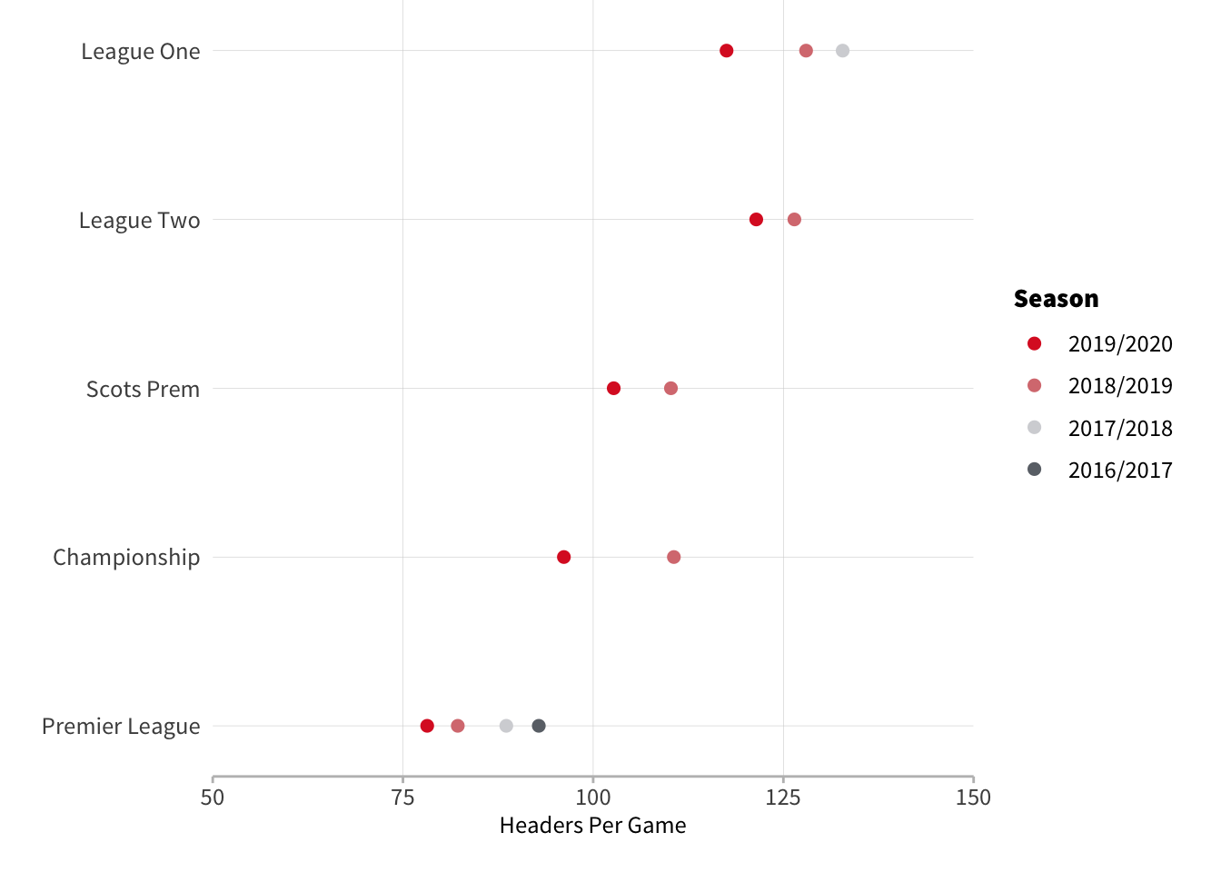
No surprises with the British competitions and we can see a consistent increase in the number of headers per game as we go down the tiers.
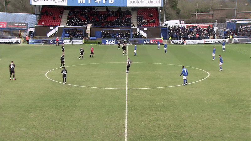
There’s actually not much difference once you get down to League 1 and League 2, and in 2018/19 both leagues saw roughly 40 extra headers each game than the Premier League. Indeed, League 2 is responsible for the highest number of headers recorded in a match per our dataset - Macclesfield v Northampton this season had 235 headers equating to roughly one every 23 seconds. If you’re struggling to believe that a professional football match had this many headers then watching the first 30 seconds of the match should clear up any doubts:
The lowest number of headers is the 10 from PSG v Nice last season. Typically the variation between games isn’t as extreme as those edge cases. The standard deviation on a game by game basis ranges from 15 in Colombia’s first tier to 30 in the Scottish Premiership.
The Big 5
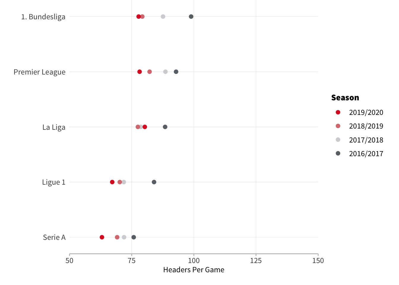
Across the Big 5 we can see the Premier League, Bundesliga and La Liga showing very similar heading tendencies whilst Ligue 1 and Serie A appear to occupy their own group with slightly less heading than the other three.
The Rest of Europe

Most European leagues are hovering around 75 headers per game which aligns more with the Big 5 than what we see in the UK’s lower tiers but there are pockets of stylistic difference, namely in the Austrian Bundesliga and Czech Liga.
Second Tiers
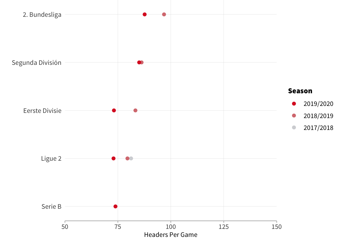
Looking at second tiers we see both Germany and Spain average more headers in their second tier than their top league which mirrors what we see in England. Elsewhere, France, Italy and the Netherlands however have similar averages in their second tier as they do in their top league implying style of play is more consistent across levels in those countries.
Americas and Australia
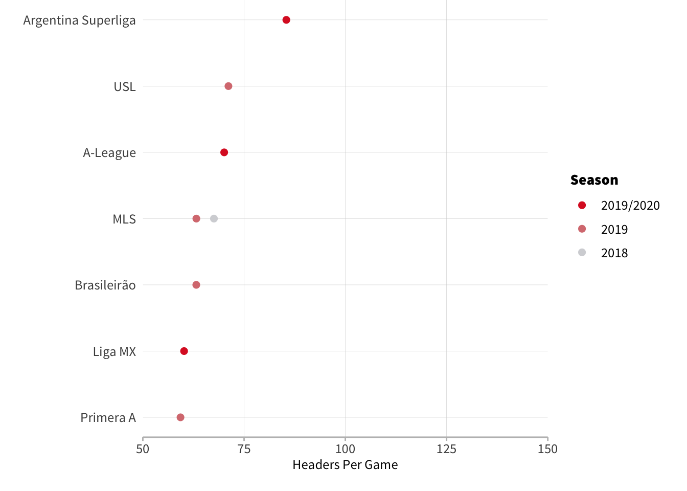
These leagues represent the least aerially active competitions in the men's game - Colombia and Mexico in particular see very few headers. Interestingly, Argentina sets itself part from the other two South American countries with roughly 20 more headers per game.
Women’s Football
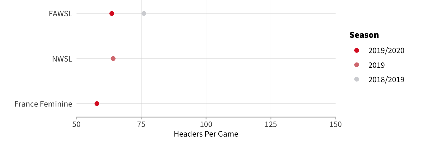
All three competitions have low header numbers, similar to what we saw in the Americas. France actually has the lowest number headers per game in the dataset ahead of the mens' leagues in Colombia and Mexico.
Spatial Trends
Let's see if there are any locational differences between the leagues covered here:
Men’s Competitions
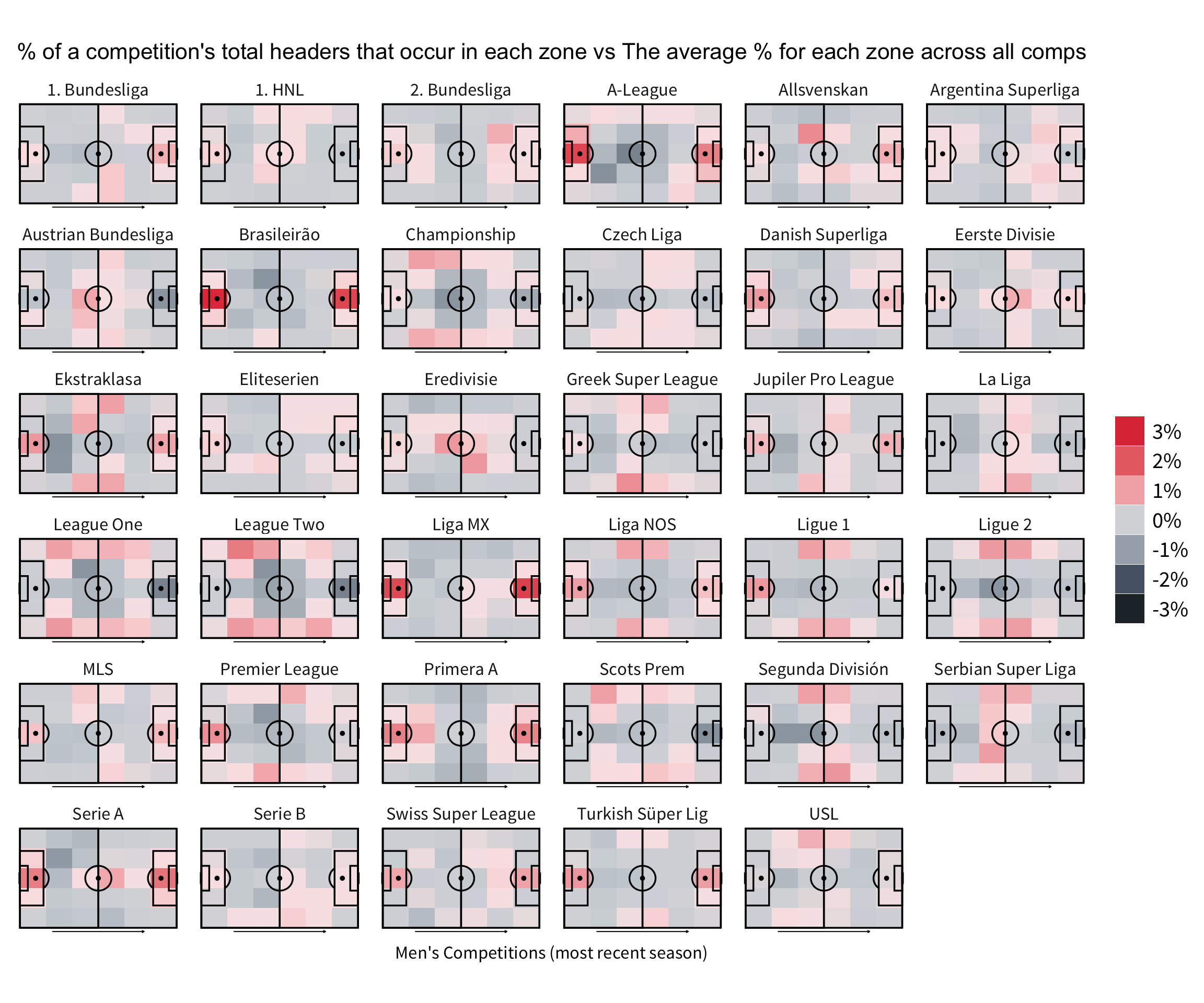
First thing to note is that there’s really not much difference between leagues in terms where their headers take place. At most you’re looking at a three percentage point difference for a zone. That being said, there are a few noticeable clusters.
Firstly, you’ve got the leagues that have a higher proportion of headers inside the box such as Brazil and Mexico. Both these leagues had very low overall header numbers and it seems that heading in those leagues mostly comes from crosses into the box. The UK leagues all show similar patterns with more headers coming in the channels where you would expect the fullbacks to be. If you watch UK lower league football you’ll notice that there’s a lot more long balls into the channel and this seems to support that pattern.
The final cluster has more headers around the half-way line than normal - France, Netherlands, Austria. I’m not totally sure why this might occur, maybe those leagues are willing to clear the ball back the half way line more or aim long goal kicks there more frequently.
By Region
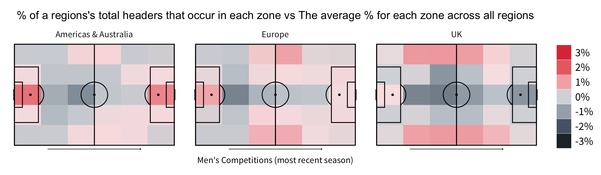
Grouping the competitions by region further highlights these differences - there really are no leagues quite like the UK!
Women’s Competitions
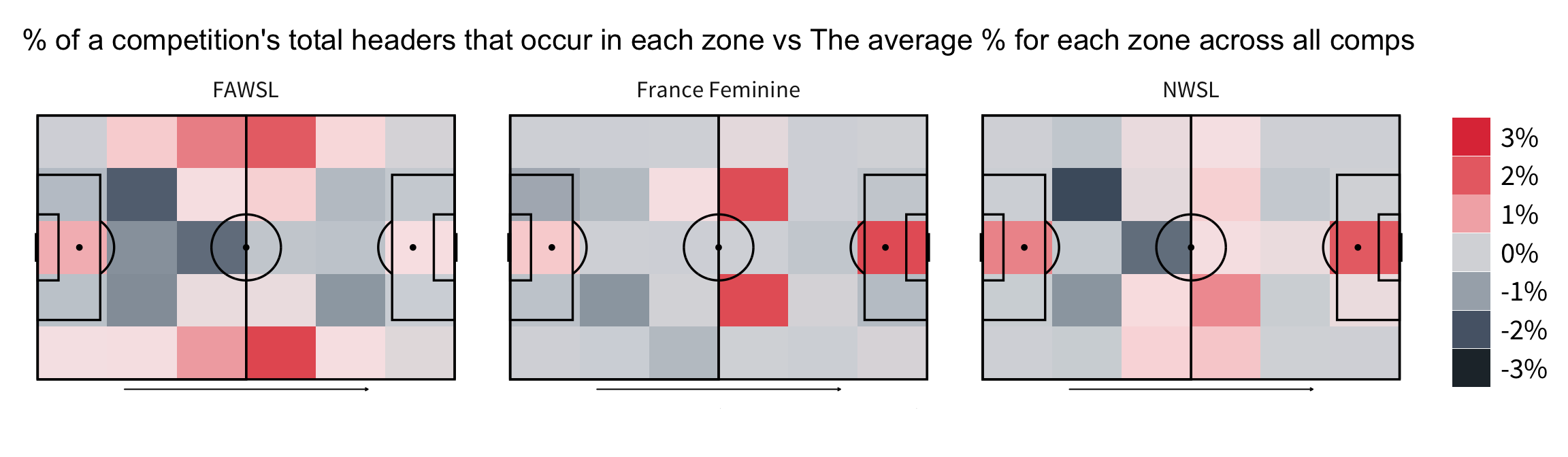 Looking at the women’s leagues reveals three different patterns. It appears heading is slightly different across each of these leagues.
The FAWSL seems to be similar to what we see in the UK’s male leagues with more headers in the channels but they are concentrated around the half way line here. France has a pattern that we haven’t seen before with hot zones in the opposition half. It is possible that the team in possession winning more attacking headers in this league.
The locations of these zones suggest they win these attacking headers from goal kicks and crosses more than usual. In America, we can see a similar pattern to Brazil and Mexico with more headers in each box.
Wider Trends
Finally, you may have noticed in the first section that for leagues in which we have more than one season, headers per game seems to be going down and this is correct. Within the leagues and seasons covered here are 30 instances of a league having less headers per game the following season and only 3 instances of a league having more headers.
Only Belgium, Austria and Spanish La Liga saw an increase in the number of headers this season compared to last. This is an overwhelming trend that can surely only be explained as an evolution of tactical preference and would bear further analysis. This could be through less crossing or in build up play - we already know crossing can be an inefficient form of attack if overprioritised so perhaps teams are catching on to this. It will be interesting to monitor this trend over the next few years.
La Liga Roundup: Arthur Departs and Results Catch Up With Celades

In this week’s La Liga roundup we look at Valencia’s dismissal of Albert Celades and Arthur’s departure from Barcelona. Results Finally Catch Up With Celades Here’s an idea for wannabe football club owners: don’t impose unworkable conditions on a coach who leads your team to consecutive top-four finishes and its first silverware in over a decade. If you really must persist, definitely don’t replace them with a coach of questionable merit and experience. If you do, this might happen: 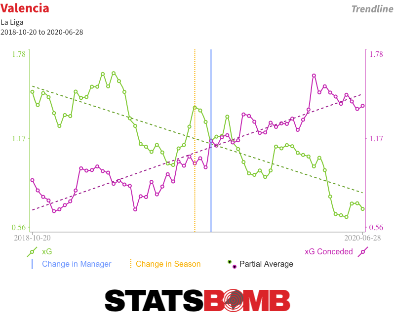 Until recently, Valencia’s results since Albert Celades replaced Marcelino back in mid-September were pretty good. When the league was paused in March, they were seventh in the table, just four points shy of the top four. But the underlying numbers always told a different story, one that results since the restart more accurately reflect. Three defeats in four left Valencia eight points off the top four and Celades without a job. We don’t even really need to dig as deep as expected goals to understand how bad Valencia were under Celades. They took just 8.28 shots per match, the second-lowest tally in the league, and matched that to a league-worst 15.52 conceded. It doesn’t take a genius to work out that giving up seven more shots than you take each week isn’t exactly a formula for sustained success. Back in the days when Total Shots Ratio ruled the analytics roost, we’d probably have considered any team with a shot share of 40% or less to be pretty bad; Valencia under Celades had just a 35% share. If we bring xG into the equation, their average shot quality was better than the quality of those they conceded, but the difference was nowhere near big enough to balance such a large disparity in shot volume. They combined the fourth-lowest xG per match (0.89) with the second-highest xG conceded (1.35) for the third-worst xG difference (-0.46) in the division. Those are the numbers of relegation candidates rather than European aspirants. Results hid those issues. Valencia consistently over-performed their underlying numbers. Even with their slowdown post-restart, they were still running almost nine goals ahead of expectation when Celades was relieved of his duties.
  As is almost always the case, there have been attempts to create a narrative arc, to say that things were okay until injuries took hold or to identify a tipping point when control of the dressing room was lost. But the truth is that Valencia were never very good under Celades. It just took a little while for results to reflect that reality. Arthur Leaves, Barcelona Get Older Still Consecutive draws against Celta Vigo and Atlético Madrid have probably ended Barcelona’s challenge for La Liga. Even if they win all five of their remaining matches, Real Madrid can afford to drop four points in their remaining six and still claim the title thanks to their superior head-to-head record. Off the pitch, Barcelona have this week confirmed what essentially amounts to a swap deal with Juventus that will see the Italian club pay an initial €72 million for Arthur at the same time as Barcelona put down €60 million for Miralem Pjanic. It is not a move that makes much sporting sense. The two players have performed different roles this season, which complicates a direct comparison. But even if we accept that stylistic differences aside they are probably about par in terms of present ability, it remains difficult to form a cogent argument for swapping a soon-to-be 24-year-old for a 30-year-old. Particularly when Barcelona already have a large contingent of post-peak players gobbling up minutes.
  The truth is that this deal isn’t about what happens on the pitch; it’s about moving around figures on a spreadsheet to balance budgets. Both teams had deficits to make up and constructed a mutual means of doing so. Alternative scenarios that revolve around Barcelona selling Arthur but reinvesting the money in a young midfielder or banking it and promoting from within simply aren’t realistic; Juventus would never have paid that much for him if they didn’t have €60 million coming right back the other way. Performance may not have been the primary driver behind Arthur’s departure, but it is also fair to say that he hasn’t quite taken the step forward some at the club had hoped for. Prior to the season start, then-coach Ernesto Valverde set him the target of increasing his attacking output, and he did seem to deliver in the early part of the campaign. The problem is that not much of that held over a larger sample size. Arthur’s shot and expected goal (xG) numbers remain up, but that is balanced by lower key pass and xG assisted figures, resulting in an insignificant change in his combined shot and assist output season on season. His number of throughballs has likewise levelled out to last season’s figure. What he clearly is is a very able dribbler and ball-carrier. He has unsurprisingly been unable to maintain his early-season pace of three successful dribbles per 90, but a smidgin over two per 90 still makes him the third most regular dribbler among the central midfielders of La Liga. His success rate of 88% is higher than that of anyone with an average of at least one completed dribble per 90, and a solid number of his dribbles have been genuinely progressive.
 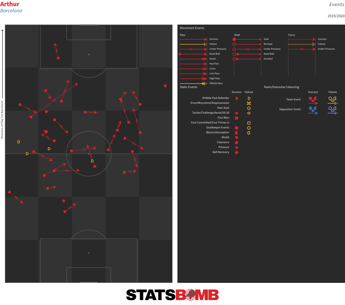 He’s also carried the ball further per 90 than any of the league’s other central midfielders.
 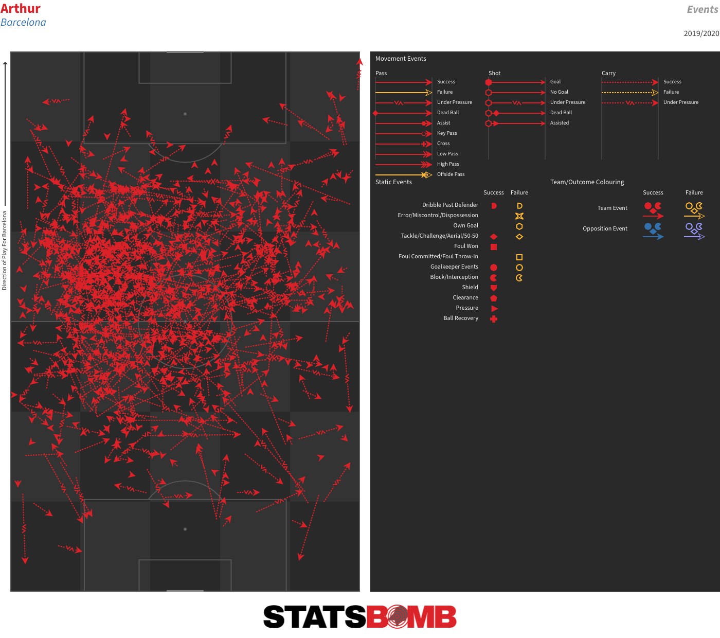 Add that to a very solid overall passing game and you have a player who probably deserved the benefit of at least another season to try and up his final-third output and offer a bit more defensively. Particularly so given how difficult it is to untangle some of his stagnant final-third output from the general attacking (and overall) decline at Barcelona. As it was, he represented the most sellable asset of a club who needed to balance their books. The fitness problems that have seen him miss a number of matches with knocks and niggling injuries arguably created enough doubts around him to justify Barcelona cashing in on him in a favourable deal. It’s just very hard to say that this was it.