Shot Influence In 2012/13: Messi, Suarez & Bale

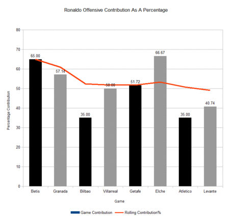
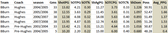
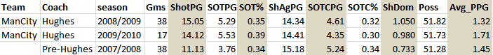
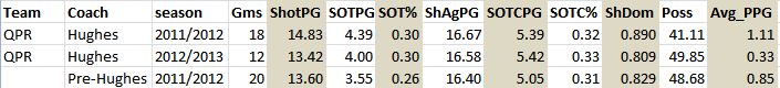
Let me start with a brief introduction on the topic of Shot Influence, or Attacking Influence, or whatever it may end up being named. What is Shots Influence? An attempt at quantifying the importance of a single player to his teams attacking output. How is it calculated? We combine player X's shots + shot assists and divide that number against the teams shots output when the player was on the field of play. EG: Player X had 4 shots and 1 shot assist. His team recorded 10 shots in that game. Player X was responsible, in some way, for 50% of his teams attacking output. Origins of Shots Influence Well, two people were sat watching Man City v Bayern Munich and became fascinated with which Bayern players were creating the most shots for their team and how that influence may look as a percentage. The genesis for that Man City v Bayern conversation was, for me, sparked by Benjamin Wendorf's work on 1980's hockey players and their shots contributions. Why is Shots Influence of interest to me? It may not be! But, I am going to try and make it interesting. Shots Influence,I believe, can tell us some pretty cool things about how important a player was to his teams attacking output. If a player has a high shots influencepercentage then we may conclude that he is very important to his team when on the field of play and something I called a 'hub player' - a player that is always involved in the attacking scheme in terms of taking shots or creating shots. Benchmarks It's way too early to be drawing any conclusions as to what numbers may separate an average player from a good player, and a very good player from a Messi. If pushed I would say that if a player is responsible for ~40% of his teams attacking output in terms of shots, then it's likely that he is a mighty good player. Previous Shots Influence work Seven weeks of Man City data <LINK> Ronaldo <LINK> Messi <LINK>   Right, that's the boring stuff out of the way! I want to use three examples of players performance from the 2012/13 season to highlight how influential certain players are and how that influence can change over the course of the season. Suarez, Bale and Messi are the three examples I want to use. All three players were excellent in 2012/13, all posted really high shots influence numbers. Let's begin.

All Graphs Are Interactive
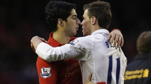
Suarez

Luiz Suarez had a monster season in 2012/13, which I had ranked as the 5th best season by a forward in the last 5 PL seasons. Still, during the summer, many Liverpool fans wanted to sell, to a certain extent, understandably, to a club that was willing to buy the player. 'Over-rated', 'inefficient', 'not worth the trouble' and 'Liverpool perform better without him' are just a small selection of words which used to criticize Suarez, and i don't entirely disagree with a lot of those words. That said, I was, and still remain, a big fan of Suarez the player. He's a 'hub player', constantly involved, almost always important to his teams attacking play when on the field. Hell, I even tried to convince @mixedknuts that he would be a good signing for Arsenal! Just how good is Suarez? Well, we need to see him to repeat last seasons level of performance before we anoint him as a genuinely consistent player who has world class ability. But my, was Suarez important to Liverpool's attack when he was on the field of play.

The chart above lists Suarez's game-by-game percentage contribution (red) and his rolling contribution. Suarez tailed off a little as the season wore on (Coutinho influence?) but Suarez's rolling attacking contribution as a percentage of Liverpool's attacking output is crazy good. When Suarez was on the field of play, 43.47% of Liverpool attacking output in terms of shots was created by Suarez. Suarez was the hub for Liverpool last year, he was vitally important when he did feature for Liverpool. Now, some of Suarez's high percentage contribution is due to his shot-happy nature and his willingness to shoot from anywhere. Suarez took 187 of Liverpool's 641 shots (29.17%) when on the field of play, but he also was a pretty good creator of shot opportunities for his team-mates: of non-Suarez shots the player was responsible for creating 90 shots assists of 551 shots (16.3%). Suarez was pretty important for Liverpool last season when he actually played. A 43.4% attacking contribution number is testament to that.

Bale

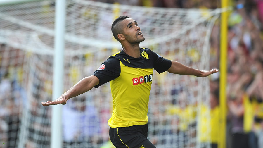
Injured, Welsh Ronaldo, shot monster. Those are the first three words that spring to mind when I think of the most expensive player in history. Bale is a fine, fine player who is an attacking monster with a skill set for the ages. Real Madrid overpaid, we all know that, but they still purchased a mighty good player. Bale's 2012/13 season seemingly convinced Madrid to pursue Bale, and what a season 2012/13 was.

Bale's rolling contribution improved as the season went on, and that may be testament to playing in the more influential central position that Bale occupied. Improvement in Bale's game was also a thing. Gareth Bale's final attacking contribution number stands at 43.23%, just a shade behind Suarez's. Only God knows what Bale's contribution number would have looked like if he had played centrally all season and not played injured in the last 5 or so games. Bale's shots only as a contribution percentage: 165 shots for 29.7%. Bale's shot assists for non-Bale shots: 75 shots assists for 19.2%. Yup, that 19% number doesn't really point to a player who couldn't create for his team-mates.

Messi

Initially, I wasn't going to include Messi's numbers in this feature, but I changed my mind. I think it's important to include the data from the footballjesus as a sort of impossible benchmark.

We know Messi is brilliant, we know he receives deferential passes from team-mates who are also excellent at creating space for him. But we didn't previously know that Messi was responsible for >50% of Barcelona's shots output when he was on the field of play.

FIFTY ONE PERCENT! We know Messi is a super freak, but I didn't expect Messi to post a contribution number that was so high, simply because the quality of his team-mates is of such a level that the shots output would be distributed a little more evenly.

Messi posted a 2012/13 number that is pretty hard to believe. Even with all the world class talent at Barcelona, He still stands out as a God amongst men.

Messi's shots only as a contribution percentage: 163 shots for 40.1%.

Messi's shot assists for non-Bale shots: 45 shots assists for 18.5%. With Messi on the field of play 40% of Barcelona's shots are taken by one player.

The Future

For the 2013/14 season I am tracking the shots influence numbers for 5 or 6 players from each PL team. Over the course of the season this should give us some nice information on who has been the most creatively important players for their respective teams. Suarez should be an interesting case in 2013/13. Which player stands out for Tottenham in Bale's absence will also be of interest.

10 Points: Ronaldo, Liverpool, D-Fence, Drunks & Close Goal Difference

By Ben Pugsley

1) Palace Defender Is Drunk!

Go to 1:39 of this video and watch #27 of Crystal Palace stumble around, fight with his balance and get nowhere near the twisting Daniel Sturridge. Now, you may miss it the important section of this video the first time around, but keep watching and be amazed at a pro athlete seemingly devoid of balance and agility.

2) The Progression Of Man City

Saturday's game against Everton was a small 90 minute snapshot of where Man City are at right now: unsure of mind, panicked in defense, caught out too easily by direct attacks; but as time wore on, dominant, increasingly confident and too much talent for their opponents.

City's defensive scheme is troubling many a fan right now: the inability to effectively defend counter attacks and passes over the top or into the channels is something that needs to be fixed, and fixed quickly. But this will take time, just like it took time to fix during the Everton game. Man City's vulnerability to Everton's attacks faded as the game wore on, maybe a deeper defensive line was employed, maybe Pellegrini figured out Everton's attacking scheme and made some tweaks?

Here's the crux: Pellegrini, brilliant reputation and all, is going to need games to figure out the PL and it's varied teams. Each team poses different questions for Pellegrini, but just as he learned on the spot during the Everton game, he will surely learn during the course of a 38 game season. The defensive scheme will be fixed given time and a greater tactical flexibility (two up front/3 in midfield) may become evident as the season rolls on. City's attacking setup looks strong, midfield balance can be worked on and once the defensive system is fully understood by the players, or, fixed by the manager, Man City should be in great shape.

Time and all.

3) Poyet and The (almost) Impossible job

On the Statsbomb podcast we talked briefly about Sunderland and the tall task they already face in securing PL survival. Now, I know it seems ridiculous to talk about a team being doomed after just 7 games but with just a solitary point to Sunderland's name it is already a big ask for the new manager to keep this team in the division.

If 38 points is the relegation line in the sand then Sunderland need to get 37 from their remaining 31 games. Without any maths Poyet's job is simple: Turn this Sunderland side, without a midfield and all, into a mid-table team. Only mid-table form (1.2 ppg) will likely be good enough to ensure Sunderland's survival.

Di canio was a mistake, Poyet is likely an improvement. But I am not convinced Poyet has enough ability to dig Sunderland out of the hole that Di Canio put this team into. The silver lining: an early lopsided schedule may mean Sunderland enjoy a run of easy games at some point in the season. then again, Sunderland are getting so many things wrong that they cannot currently be trusted to beat even the softer opponents in their fixture list.

4) Close Goal Difference

What is close goal difference? The goal difference at Minus 1, Tied & Plus 1 Game States. I use close GD as it's a pretty intuitive improvement on regular GD: remove the (relatively) meaningless blowouts and hammerings teams enjoy/suffer and we get a better picture about a teams ability.

Close_gd_corr_wk_7_medium

There doesn't look to be too much difference between normal GD and close GD (bad scaling) when looking at the charts, but the r2's at the bottom of the chart give us a better indication of which metric is better. The correlation between close GD and points will tighten by the seasons end to ~98/99. Standard GD to ~90/91 (I think).

One we remove the blowout results and settle on Close GD we can put a graph together.


Close_gd_wk_7_table_medium

Obviously these numbers can, and will, change over the course of the season but I wanted to post this info up for the simple reason that it highlights just how bad Sunderland (and Palace) have been.

When the game really matters (close Game State) Sunderland are being hammered. It doesn't matter if the game is tied, or Sunderland are leading or losing by a goal, they are being outscored heavily. Sunderland's league worst PDO doesn't help, but it's the underlying shots profile that is causing this -11 close GS number.

Once we know that Close GD is a better 'fit' with points won, we can roll back and look at close TSR which would be an improvement on standard TSR.

5) West Ham

He may as well be a West ham fan

Dfence_medium

If I had have looked into some of West Ham's defensive numbers prior to the Tottenham game I would have noticed that they were pretty darn good, and that maybe those numbers could have caused Tottenham some problems.

But then again, I would have probably just ignored them if I had have seen them; after all Tottenham, away from home, seemed like a tall task for a poor West Ham away team. West Ham weren't poor away from home vs Tottenham, they were excellent and they restricted Tottenham to great effect.

Wh_sot_rating_medium


League average SOT For% (shots on target/total shots) is ~32.5

League average SoT Prevention% (100-shots on target against/total shots against) is ~67.5

Whilst West Ham are pretty poor on the attacking side of the ball their SoT Prevention % is amazingly good at Tied and Plus 1 GS. West Ham can really restrict an opponents offensive efficiency but in restricting their opponents West Ham are struggling with efficiency when they themselves attack.

I guess there's only so much tactical currency to go around and a good balance between offensive and defensive efficiency is a pretty hard thing to achieve. West Ham restricting a tired Tottenham side may not be that surprising, but West Ham's attacking efficiency, obvious to all by their 3 goal tally, is positively shocking.

6)Goal of the Week

Come on down, Ravel!

Apologies for the video quality, blame the idiots at the PL.

7) Liverpool's Shots Numbers

Here at 10 Points we have previously discussed the Liverpool's tactics when leading in a game; Liverpool tend to shell (sit back, tighten their shape) and protect the lead that they have rather than continue the excellent work that put them into the lead in the first place.

Now, Suarez's return to the team may change Liverpool's tactical setup just a wee bit (LINK Do read this over at Grantland) and we may begin to see Liverpool out-shooting the opposition, at any game state, once again. But, for now, the jury is out:


Liv_shots_wk7_medium 
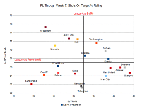
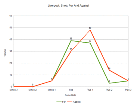
Liverpool are slightly out-shooting the opposition at Tied GS, but once in the lead (Plus 1, 2) Liverpool's shots numbers drop off and the oppositions pick up. Liverpool's +1 GS shots number is the 3rd worst in the league behind Sunderland and Hull, not exactly the type of company one wants to keep.

Nearly all teams in the PL sit back slightly when leading by a solitary goal, but Liverpool are an extreme example of this this effect I call 'shelling'. Maybe, just maybe,  Rodgers felt that Liverpool, sans Suarez, just didn't have the horses to play a controlled attacking game when the opposition would be desperately trying to find a way back into the game.

Worrying if true.

8) Shots Efficiency

Whilst we are on a roll with the graphs ( I don't much feel like opinion points or tactics this week)......

The chart below features each PL teams efficiency in terms of shots on target for % and sot prevention%. The information is pretty easy to understand:

  • If your team is in the top right quadrant they are above league average in terms of offensive and defensive efficiency.
  • If your team is in the lower left quadrant then they are pretty bad on both sides of the ball.
  • Then there's Sunderland.
Note that some of the big hitters congregated at the bottom right of the chart - super efficient in terms of offense, but lacking a little in terms of defensive efficiency.

Shots_on_target_rating__medium


9) Newcastle: For Real?

Newcastle may just be the league's most intriguing team through the first 7 games. Why? It doesn't immediately seem apparent why: 10 points from 7 games and -1 close GD are not numbers to be particularly interested in. But these numbers are:

TSR 57.9 (4th) Great.

SoTR 54.4 (9th) Good (ish)

Unblocked Shots Ratio 57.5 (4th) Great

Final Third Pass Ratio 50.5 (10th) OK

PDO 850 (18th) Terrible

SoT Rating (sot for% + sot prevention%) 93.4 (16th) Mightily Innefficient

There are some things to really like about Newcastle's 7 games so far: Total Shots Ratio, powered by a terrific Tied GS number, is mighty impressive. Shots on target ratio is good, USR is really strong. SO, by the shots info Newcastle are a strong team and may be expected to pick up quite a few points this season if these numbers hold.

But, and there's always a but, Newcastle and their excellent shot ratio numbers are being poisoned by some of the terrible stuff that is going on, namely the PDO and SOT rating.

Newcastle's PDO number will act as an anchor for even the best of shots teams. Whilst Newcastle's SoT Rating - a measure of a teams ability to get their shots on target and prevent the opposition from doing likewise - looks non too clever at the moment.

The verdict: Newcastle are doing some things really well, but unless they fix their ability to get shots on target, and stop the opposition from doing the same, then the excellent shots numbers may only allow Newcastle to climb so far up the table.

10) Cristiano Ronaldo's Shots Influence

Shots influence is a brand new little stat that the good folks at BitterandBlue created (LINK). In short this stat looks at a players contribution, in percentage form, to his teams performance in a given game or over the course of a season.

So far, I have only looked at a few players but Ozil and Giroud show well, as does David Silva. There's showing well (around 40% contribution) and then there is Cristiano Ronaldo: Black=home , Grey=away.

Ronaldo_week_8_medium

No surprises that Ronaldo's lowest contributions as a percentage were against, arguably, the two hardest opponents in Bilbao and Atletico. That previous sentence is the only remotely negative thing I can say about Ronaldo's attacking contribution; everything else is gold.

Just think about it: A team, and a bloody good one at that, has a player who is so good, and so influential, that he is responsible for just short of 50% of that clubs attacking output. FIFTY PERCENT. Ronaldo ladies and gentlemen.


Defensive Metrics - An Introduction

Defensive measures are a peculiar thing.

Unlike attacking measures, where it is accepted that more is better (think of shots or possession), the same logic just doesn’t hold true for defensive metrics.  In this piece I’m going to concentrate on interceptions and tackles as the main defensive measures.

In essence a tackle is pressing the man in possession of the ball whereas an interception is caused by a player anticipating where the ball will be played and moving into its line.

In other words:

Tackle = Pressure on Man

Interception = Pressure on Ball

Current Metrics

If you lead the league in numbers of tackles or interceptions does that mean that you are very good at tackling or making interceptions?

It may do, but it may also mean that your team is so bad at holding onto possession that you get substantially more opportunities to attack both the ball and the man than better teams do.

Here, courtesy of whoscored, is the current EPL table for tackles, and it has been ranked in descending order.

Tackles

Is Crystal Palace really the best team at tackling in the Premier League?

No, I don’t believe they are, and this is the point.  There has been a lot of work in the last year or so on the attacking metrics in football (examples include Expected Goal values, per90 figures and shots from Prime locations) but so far the defensive side of the game has been largely ignored.  There are many reasons for this, including defending being more about a team unit than individual actions and positioning data arguably being more important in trying to understand defence than attack. But in my opinion there is another more basic problem with trying to ensure that people begin to look at the defensive side of the game from an analytical point of view. According to wikipedia, a league table is defined as:

"A league table is a chart or list which compares sports teams ….. by ranking them in order of ability or achievement.”

Due to the metric that is currently common place, the use of absolute values, the league tables that rank defensive measures don’t achieve their basic intention, ie ranking the teams in order of ability.  This is a fundamental flaw and one that needs to be eradicated.

In order to achieve the aim of ranking teams on ability, a different system of measuring the defensive actions needs to be introduced.  We need to normalise the defensive actions carried out by each team.

Normalising Defensive Actions

I propose normalising the defensive actions by reference to the number of passes that each team concede.  A tackle or interception can only be attempted when the opposition is in possession of the ball. So by looking at defensive or pressing actions compared to the number of passes that each team conceded we will have a fair basis on which we can rate each team’s ability to tackle or win the ball via an interception.

The table below shows the total number of Interceptions, Tackles, Combined Pressing Actions (sum of Tackles & Interceptions) as well the number of passes conceded by each team during the first 7 games of the 2013/14 EPL season.

The stats for the above table have come from StatsZone and Whoscored, both of which are powered by Opta

PAPI – Passes allowed per Interception

PAPT – Passes allowed per Tackle

PAPPA– Passes allowed per Pressing Action

The final 3 columns in the table show the number of passes that each team has conceded on average for every interception, tackle and combined pressing action (either an interception or a tackle) they have made.

NOTE – In the final 3 columns in the above table the lower the number the better, ie teams allow fewer passes before they perform the Pressing Action.

Take Arsenal as an example. On average they have made an interception every 33 passes they have allowed, a tackle every 24 passes and either a tackle or an interception every 14 passes.

Feel free to play around with the table by sorting the various columns.

Tackles

Revisiting the Tackles table as presented by whoscored we remember that Crystal palace topped the table.  Using the PAPT (Passes allowed per Tackle) measure I would suggest that 6th place would actually be a fairer reflection of their tackling prowess.  The team that allows the fewest number of passes (less than 18) before they are able to get at tackle in is Southampton.  This fact instinctively seems correct as the Southampton manager, Maurico Pochettino, insists on a high press in an attempt to ensure that the Saints win the ball back quickly.

Other teams to note are Man City, Liverpool and Everton who just trail behind Southampton in their efforts to put the opposition under pressure by way of tackling.

At the wrong end of the scale is Fulham who need to see 33 passes being made against them before they are able to apply pressure to the man in possession (tackle).  Perhaps this can help us to understand just why Fulham have been so poor this season.

It is understandable that teams with lower budgets struggle from an attacking point of view, but it is much more difficult to understand why teams such as Fulham and West Brom are so far behind on their tackling rates.  The type of player that can make an impact on how often a team can tackle can be obtained for fractions of the cost of top attacking talent.

Interceptions

Man United top the Interceptions table by snaffling the ball once every 23 passes.  Interestingly, there have been approximately 50% more tackles than interceptions in the EPL so far this season, yet the top two teams on the PAPI (Passes allowed per Interception) metric, Man United and Swansea, actually managed to achieve more interceptions than tackles. This fact is quite significant and it perhaps suggests that these two teams play on the counter attack by being more interested in breaking up the opposition’s attack by way of an interception which should then lead to a more effective counter of their own.

Seeing Chelsea right at the bottom of the PAPI table seems like a surprise.  It’s not normal to see one of the stronger teams at the bottom of any league table.  Unfortunately for Sunderland, the same can’t be said of them and they hold the same place in the PAPI table as they do in the real league table.

The teams’ style of defence can be quickly seen and compared in this Scatter Plot:

PAPT Scatter Plot

(The chart can be clicked and opened in a separate window for clearer viewing)

Visually a few things jump out at us from that image.

  • Chelsea and Sunderland defend using the same styles?
  • As a Mourinho team (counter attacking) I wouldn’t have expected to see Chelsea’s with virtually the most infrequent rate of interceptions – they are at the opposite end of the scale to Man United.
  • Fulham and West Brom defend in the same way. By this I mean they neither pressurise the ball nor the man.
  • Swansea and Southampton are often grouped together as being pressing exponents, but it is clear that, at least over the opening 7 games, Swansea put much less pressure on the man in possession than they do the ball.

Combined Measure

The PAPPA (Passes allowed per Pressing Action) is an aggregated measure that tells us how aggressive a team is in defence on the basis of both tackling and forcing interceptions.

As with the PAPT table, Southampton takes pride of place at the top of the heap and they are being chased up by AVB’s Tottenham with Man United close behind in 3rd place.

Foundation

The figures presented in this piece are the foundation that I believe will lead to further analysis, quantification and understanding of defensive styles and strategies.  The hope is that metrics that actually mean something are brought into use on the defensive side of the game.  Undoubtedly this will then encourage a deeper understanding of how teams defend and the merits of each type of defensive system.

For example, Liverpool and Man City seem to have plenty of aggression which allows them to execute tackles at a high rate (pressure on the man), but they don’t feature as prominently in the PAPI (pressure on the ball) rankings. Man United are the opposite and then there are teams like Southampton, Tottenham and Everton who are fairly aggressive in both defensive facets.

Are there defined strategies at work here, or with just 7 games played is there still an element of variance in the numbers in these tables?  Time will tell.

Conclusion

I’m conscious that there are many ways to defend, and teams that employ an aggressive high press will tend to appear at the top of these metrics.  That’s not to say that this is the correct way to defend.

The aim of this piece was to begin to quantify and attempt to develop the use of meaningful defensive metrics. As a result we at least can understand show many more passes a team will be allowed to take if they play against a deep lying passive defence (Sunderland) compared to a high energy tacking defence (Southampton) and we can think about making informed decisions about which defensive style is appropriate.

StatsBomb Predictive Models – English Championship After 10.5 Games

I’m slightly short on time for the rest of this week because I’m off to Dublin for the weekend, but enough of you asked for the updated English Championship rankings from the predictive model, that I was moved to post them. If you have never read one of our predictive model pieces, check back here for a fairly thorough intro. One thing to keep in mind is that the model neither knows nor cares how many points each team has in the league table (though we attach them once points start to matter in who might actually finish where at around the halfway mark in the season), so some things might look very strange right now. That is to be expected. It also doesn’t know how much teams spent on players and payroll, so if a team is punching above or below their weight here, it’s on statistical merit alone. engch_week11rank League Winner: Watford, Burnley Promotion Playoffs: Ipswich, QPR, Middlesboro, Forest, Leicester, Wigan, Derby… sort of Relegation Candidates: Yeovil. Barnsley, Doncaster, Millwall, Bolton At the top, the picture is pretty clear. Watford are the best team in the model , followed by Burnley. Burnley’s striker pairing of Ings and Vokes – who work as a comedy duo during the offseason – are notching damned impressive numbers. Check them out if you see a Burnley game on TV, they are worth a watch. If I’m honest, it feels like QPR are sandbagging. Only 2 goals conceded in 10 matches is ridiculous, but that team should be scoring a lot more than they are. It feels like Harry has told them they absolutely must be solid defensively, and that’s costing them at the offensive end. This is weird, because in the past Redknapp has been a fairly indifferent defensive manager (as indicated by his yet-unpublished manager fingerprint), while pretty much letting his talent figure it out on the offensive end.  Given the money disparity, QPR should be walking away with this league. Statistically they are fine, but Watford and Burnley are definitely better. A quick note on Derby: their coefficient is in flux since they fired Nigel Clough. Under Clough they were doing pretty much everything right statistically except winning the games. Under McClaren - well, we’ll see. It takes 5-6 matches before teams stabilize enough to have any clue as to how they will look. At the bottom end of the table, it looks like Yeovil are probably doomed. Their situation isn’t completely hopeless, but uh… At least they have Barnsley to keep them company? Bolton’s surface shot dominance looks okay, but they have real issues when you dig deeper, especially on the offensive end. Jermain Beckford (29!) is never the answer to fixing a team’s offensive woes. Neither is David Ngog. Bolton have both and could desperately use a loan or two up front from the Premier League. Movers and Shakers As you can see in the chart above, I’ve noted how much teams have moved up or down in the rankings. In the coming weeks, I’ll likely add this to Tableau for a prettier graphical representation, but for now you get the lazy version. As mentioned before, there is fairly reasonable volatility in the early weeks, but from here on out things will settle down quite a bit. Due to clustered coefficients, it’s not that hard for teams to wiggle around in the center of the rankings, but it gets tough to break into either the very top or bottom of the table without exceptional performances. Birmingham, Charlton, Forest and Boro were the big positive movers this time, with both Birmingham and Charlton leaping out of relegation range, and Boro and Forest showing themselves as playoff candidates. On a marked downward trend are Brighton, Huddersfield, Yeovil, and Blackburn. Yeovil were already worryingly bad before, but have plunged all the way to the bottom. The silver lining is that they can’t drop any further (though their coefficient can)!  Brighton went from playoff candidates to middle-of-the-pack stragglers, and Blackburn once again look like a team where Jordan Rhodes (9 goals already) will keep them afloat, even if the rest of the team is pretty meh. Huddersfield looked very much like the little team that could initially, but they have come back to the pack and are dead average overall (but very good defensively).  

StatsBomb Podcast #4 - Sunderland, Top 7 Transfers and more

Today we talk about whether Gus Poyet can save Sunderland, review the new boys for the Top 7 teams (Liverpool, Arsenal, Chelsea, Spurs, Everton and both Manchester clubs), delve into some Bayern Munich and Borussia Dortmund stats, and the usual tangential blather. Oh, and we announce the winner of the free kit giveaway! Check it out.

Manager Statistical Fingerprints – Andre Villas-Boas

If you read my Introduction to Manager Fingerprints, you know I’m pretty excited about this line of research. Statistical output for football teams is a function of both talent and tactical systems, but it appears that at least some managers (like Mark Hughes) end up with similar statistical production almost in spite of differing talent levels. This area of research is incredibly deep, because you can apply it to every single manager across every single league you have statistics for, both currently and historically.

It’s also tremendously interesting because it creates an actual consulting product that teams who are searching for new managers can and should use. You want to know the managers out there across leagues whose teams have the best (and worst) statistical output. In fact, I would immediately argue that teams trying to hire a new manager need to know these things just to prevent themselves from making big mistakes.

I’ve got a few more ideas I pitched to the guys at Opta that I want to write about, but here on StatsBomb I wanted to talk about one of the most exciting young managers in Europe – Andre Villas-Boas.


AVB_RDM


AVB

From Porto to Chelsea to Spurs - and nearly to PSG this summer - Andre Villas-Boas is a manager in demand. A fresh-faced 35 years old, when hired AVB comes complete with ginger beard, gravelly voice, and an alleged general disdain for stats. Yet he also employs a tactical system that produces statistical output that is an analyst’s wet dream, and it is wickedly consistent.

According to Wikipedia, for his first managing gig he took over Academica Coimbra when there were bottom of the league without any wins, in October 2009. By the end of the season, they were 11th in the league, 10 points clear of relegation. Unfortunately I don’t have any stats from that season, but we do have the stats from his next stop.

Check this out.


AVB_Porto


This is AVB at Porto. Granted, those numbers are fuelled by the best talent in the Portuguese league, but they are tremendous. Shot Dominance of 1.92 (meaning they shoot they ball almost twice as often as an average opponent) is outstanding, as are the shots on target percentages, especially on the defensive side of the ball. 27% of opponent shots on target would almost always be one of the leaders in Europe for that metric. In his one season at Porto, AVB went undefeated in the league, won the Portuguese Cup, and the Europa League, not unlike his mentor Jose Mourinho.

In fact, I ran the rest of Porto’s stats from that year through the predictive model, and while the level of league competition is different, Porto graded out like Bayern Munich from last season. Cruising to the Europa League was no problem.

For reference, Porto had finished third the season before, 8 points behind Benfica. In AVB’s one season they won the league by 21 points. 2.82 points per game in a league season!

That summer, Roman Abramovich hired him away from Porto (paying 15M euros for the privilege) and made him the new Chelsea manager.


AVB_Chelsea


His time at Chelsea was (allegedly) fraught with personnel clashes. AVB’s system requires his team to employ a high line to allow selective defensive pressing within a confined space. This is especially true when employing two midfield destroyers, who hunt the ball and immediately recycle it to attacking players. He was also hired to help transition Chelsea away from their aging, Mourinho-built core into a newer, younger team. Unfortunately, John Terry and company were not very interested (or capable) of playing AVB’s preferred style, which resulted in all sorts of political stuff leaked from the dressing room and into the press.  It also resulted in way too many great chances for opposing attackers – note the shots on target conceded percentage - and AVB was eventually fired in March.

Chelsea would go on to win the Champions’ League title that season under assistant manager Roberto DiMatteo.

Things might not have worked out quite how he hoped, but you can see the outline of what AVB was working toward. Play the high line, employ faster center backs in defense, tighten up a bit, then drop the shots on target while pushing the shooting pace. Another year of personnel changes and he might have gotten there.

Note the incredibly large dive in Shot Dominance and overall effectiveness once DiMatteo took over the same personnel. They may have managed to grind out a Champions’ League title, but a team with those stats would never win the league.

Never one to overlook a quality bargain, Daniel Levy hired AVB as Harry Redknapp’s replacement that next summer, and this is what AVB’s teams have produced at Spurs.


AVB_Spurs


Look familiar? This season should look even better, as Spurs parlayed Gareth Bale’s skills into talent upgrades all over the park.

Three different teams, three different groups of talent, two different countries, and yet the system is producing nearly the exact same thing year in and year out. Everything we had been told previously suggests that’s not supposed to happen. This type of statistical output is very often the product of teams that win the league. Granted, Villas-Boas has gone to teams with pretty good talent levels each time, but look at the difference between the stats Chelsea produced under him versus what they did immediately after under Di Matteo. That’s massive.

Look at what he did at Spurs with the same group of guys versus Redknapp, and you see nearly identical offensive shot stats, but the defense got much tighter. As a result, Shot Dominance ramped up. This year, you’ll probably see that improve slightly again.The key to winning the league, however, will be improving the shots on target numbers to closer what they were at Porto (Premier League average is about 32.5%). It could still happen, since Spurs have better personnel in nearly every spot except whatever role Gareth Bale was actually playing.

That said, they are still integrating the new players into the offense, and they still have some fairly serious issues defending set plays, which thus far in the season is hurting the shots on target numbers at both ends.

I would be shocked if Spurs don’t make the Champions’ League this year. Despite massive spending disadvantages compared to the rest of the top teams, they might even be a reasonable dark horse contenders to the league title.

This would not have happened under Harry Redknapp.

All data used in this piece is from Opta.

Abbreviation Guide

Shot PG – Shots For, per game

SOTPG – Shots on Target For, per game

SOT% - Shots on Target percent

ShAgPG – Shots Against, per game

SOTCPG – Shots on Target Conceded, per game (sometimes written as SOTCON)

SOTC% - Shots on Target Conceded percent

ShDom – Shot Dominance. This is a metric that looks at how many shots a team takes versus concedes against average competition. Greater than 1 means a team takes more shots than average opponents, less than 1 means they take fewer than the opponent. This is a different way of working with TSR (Total Shots Ratio)

Poss – Possession Avg_PPG – Average points per game in the league table for that season.

Introducing Manager Fingerprints

This article was originally published on the OptaPro Blog. Managers get a bum rap. For guys allegedly only responsible for 15-20% of a team’s performance (Soccernomics), they tend to catch a ton of flack when things go wrong, while the players catch most of the praise when things go right. Most managers are compensated fairly handsomely for their burden, but for a job that some view as simple as choosing which players to play each day, it seems pretty harsh. Personally, I’m unconvinced managers have so little influence. Players matter a lot, but so do tactical systems. Give Sam Allardyce an identical set of players as Pep Guardiola, and you will get substantially different statistical output. You might even get different game outcomes (win/lose/draw). In fact, that’s one of the things that bothers me about football - there is only one way of evaluating managers. Results. Did you win enough, Y/N? Obviously you can contextualize that a bit and investigate whether a manager won enough versus expectation, or versus monetary expenditure or whatever, but at the end of the day results are the only widely used method to determine whether a manager is doing a good job. This is a problem. Think of it another way… You are the owner of an English Premier League football team. Your manager has taken a new job and now you need to search for a new manager. How do you evaluate candidates for the position? Points per game at past jobs? That’s it? Considering that the person you hire has an enormous influence on a company/investment that is likely worth hundreds of millions of pounds, that’s a little terrifying.  What if they were lucky before? What if they inherited a ton of talent (and money) compared to other teams in the league and rode that to positive results? Additionally, how can an owner – someone who is probably not completely immersed in football – know about what style of play a particular manager uses? Or 20 managerial candidates? Remember when Owen Coyle was branded as playing expansive passing football at Bolton, and then Zonal Marking did a tactical review and discovered that Bolton were among the league leaders in long balls? That type of thing happens all the time. Figuring out signal from noise in that environment is nearly impossible. A Statistical Framework This is where stats come in to play. Whenever I want to evaluate something intelligently, I always come back to the data. Managers influence the way their teams play via tactics. Some teams sit deep and rely on set piece expertise to grind out wins (Stoke under Tony Pulis). Some teams pass their opponents into oblivion (Barcelona under Pep and Villanova). Other opponents play fairly normal, positive football until they score, at which point they shell and unleash lightning counter-attacks. All of these different tactical variations affect the stats teams produce. By focusing on statistics that actually matter (ones that have a positive correlation to points produced), we can create a “managerial fingerprint” that tells you how future teams a particular person manages are likely to perform. What Matters? For now I want to focus on five simple stats, four of which involve shooting and one that provides context and hits heavily on passing. The shooting stats are Shots For per game, Shots Against per game, and then the percentage of Shots on Target, for and against.  These stats take a step back from goal differential, but still provide a fairly accurate picture of what is happening in the areas of the pitch that matter. The contextual stat is possession. Some systems need heavy possession to create chances, while other ones prefer to set up a bunker defense and then attack quickly out of it. Possession tells you a lot about how a manager wants their team to play (and at least a little about what type of football you’ll be giving to fans). All of these stats correlate with winning, but there’s one other thing you need even out, and that’s the league dynamic. Teams in the Bundesliga and Spain average a much higher percentage of shots on target than those in England. Therefore a manager whose team is allowing 33% Shots on Target against in Bundesliga, is actually 2-3% better than league average. The same number in England would be a half percent worse than the league average, so league context remains important. An Example I’m going to delve into additional specific managers here on OptaPro in the future, but today I wanted to look at the fingerprint for one of the most well-travelled managers in recent Premier League history: Mark Hughes optapro_hughes_1 This is Mark Hughes at Blackburn. At the bottom there you can see the 38 games prior to when Hughes came in, including a disastrous 5 game stretch under Souness before he upped sticks and moved to Newcastle. The Shot Dominance (ShDom) numbers under Hughes are solid, and they would generally produce a happy midtable side for just about any team. They were mostly indifferent toward possession, basically floating around 51% the entire time. [Note: There’s a legend that explains all the abbreviations at the bottom of this article.] However, EPL Shot on Target percentage is usually around 32.5%, and the Shots on Target Conceded percentage (SOTC%) in the second two years of Hughes’s reign would be worryingly high and possibly indicate a need to invest in better personnel there. In fact, the year after Hughes left, Rovers finished 15th, while conceding the third most goals in the league. Hughes was hired during the summer of 2008-09 to help take Manchester City on to bigger and better things. The personnel he had at City was considered much better than what he had at Blackburn, and obviously given the Abu Dhabi takeover, they spent much more money as well. His first season included players like Robinho, Joe Hart, Micah Richards, Vincent Kompany, Pablo Zabaleta, and Craig Bellamy. By the start of Hughes’ second season in charge, he had also had Gareth Barry, Carlos Tevez, Adebayor, Kolo Toure, and Joleon Lescott on the playing staff. optapro_hughes_2 That’s just weird. Despite talent that was massively better than what Hughes had at Blackburn, City’s statistical profile looks almost identical to the last place Hughes managed with one major difference – the shots on target percentages on both sides of the ball were much better. That’s it though. The tempo they played was a little faster (a touch more shots for and against), but given the different talent, I would expect the ShDom and possession numbers to differ much more than they do. The ShDom numbers in particular though, are quite a bit different than the football City produced under Sven Goran Eriksson. The next stop on the Mark Hughes Managerial Tour was London, where Hughes took over Fulham after Roy Hodgson bounced off to West Brom (via Liverpool *ducks*). optapro_hughes_3 From Blackburn to the nouveau riche of Manchester City and back to Fulham, and the underlying numbers remain the same. The Shots on Target for the offense is lower (in my opinion, this is again probably a result of talent disparity), but that is it. Finally, we have QPR. Hughes replaced Neil Warnock midseason and was there for 30 matches before being replaced himself by Harry Redknapp. optapro_hughes_4 Neil Warnock didn’t look like he could save this club. Mark Hughes never really improved them during his 30 games in charge bar the possession numbers. Nor did Harry Redknapp, whose shot dominance and shots on target numbers were basically the same as Hughes.  I can’t really explain this one except to say that QPR just couldn’t do anything well enough on either side of the ball to survive, and none of these managers was clever enough to figure out how to fix them/keep them in the Premier League. Mark Hughes’ Statistical Fingerprint Looking at all of this – a little over eight full seasons of data – I would conclude that Hughes is an average manager. He’s able to consistently produce a style of football that is likely to finish in the middle of the table. When presented with a hugely talented team at Manchester City, he was unable to find a way to further maximize their skills. The average shot dominance number for his career is bang on 1, and both shots on target for and against are around the league average as well. Statistically, Mark Hughes is almost the epitome of the average Premier League manager. Some people would probably roll their eyes at this. “Oh boy, you found someone average!” In reality, this is kind of a big deal. If you hire Mark Hughes, at least you know you aren’t making a mistake. Teams in the top half of the table that want to improve probably don’t want him, but if you are a bottom half team attempting to simply secure regular survival, Hughes seems fine. Sometimes fine is good enough. Managerial Fingerprint Conclusions The point of all this is that teams need additional methods to evaluate managers beyond “did they win enough?” That sliver of information is too thin to make judgments where tens or hundreds of millions of pounds can ride on the outcome (especially given the cost of firing managers and coaching staffs these days). Going beyond the points per game approach and looking at the underlying statistics that matter is the first step in building a new framework that will help football organizations evaluate current personnel as well as future managerial hires. It can also help currently employed managers know the areas they need to improve better. This information may seem fairly basic right now (and obviously plenty of additional statistics can be layered on top of it), but despite the simplicity, it captures stats that have a significant relationship to winning. There are plenty of additional questions that this framework can help us answer. Here are just a few:

  • Do elite managers tend to dramatically change the statistical output of teams when they take over?
  • When teams hire new managers, does statistical performance improve in the second season? (Given the average manager only last something like 1.5 seasons these days, this is kind of a big deal.)
  • Can new managers elevate or decrease the performance of identical talent?
  • Review past managerial hirings and firings to determine whether they made solid statistical sense, or whether they were destined to fail from the start.

Using the managerial fingerprint framework, I will start to delve into some of these topics on future posts here and on StatsBomb.com. It’s far from finished, but it certainly provides additional data for making better managerial decisions. --TK Shot PG – Shots For, per game SOTPG – Shots on Target For, per game SOT% - Shots on Target percent ShAgPG – Shots Against, per game SOTCPG – Shots on Target Conceded, per game (sometimes written as SOTCON) SOTC% - Shots on Target Conceded percent ShDom – Shot Dominance. This is a metric that looks at how many shots a team takes versus concedes against average competition. Greater than 1 means a team takes more shots than average opponents, less than 1 means they take fewer than the opponent. This is a different way of working with TSR (Total Shots Ratio) Poss – Possession Avg_PPG – Average points per game in the league table for that season.

Premier League Shot Benchmarks

By Dan Kennett Following the recent podcast [LINK] and extensive discussion about the merits of Andros Townsend’s long-range shooting, I thought it would be timely to update the Shot Benchmarks that I’ve previously shared on twitter in 2012 to include the 2012/13 season.  This post can serve as a useful reference for the analytics community.

Over 5 complete seasons of the Premier League there are nearly 55,000 shots in total.

Of those 55,000, nearly 500 are penalties that continue to be scored at a rate of 3 in 4 (75.6% to be precise).

There are also 2,300 Direct Free Kicks (DFK) converted at an average of 1 in 15 (6.6%).

Conversion rate varies from a high of 8.5% in 2009/10 to a low of 5.2% in 2011/12 From now on, all totals EXCLUDE penalties and DFK’s

The total shots inside the box has remained almost constant over 5 seasons with an average conversion of 13.1%.  Season conversion rates vary from a low of 12.4% (1 in 8) to a high of 13.5% (1 in 7.4)

Where it gets interesting is shots OUTSIDE the box.  The total shots taken outside has declined year on year for 5 seasons.  The total has fallen by 12% from 4600 in 2008/09 to 4050 in 2012/13

The conversion of shots outside the box has also improved over time (even if 2012/13 slightly less than 2011/12).  In 2008/09 the figure was 1 in 50 open play shots outside the box scored a goal!  Over the last 2 seasons this has improved to 1 in 30.  Over 5 seasons the average is 1 in 37, a huge difference to the 1 in 15 scored from direct free kicks.

The chart below illustrates the 2 points above:

dan_kennett_shots

As a consequence of the decline in total shots outside the box, the proportion of shots INSIDE the box increased year on year from 55.6% to 59.1%.

Trying to sum it all up with a nice soundbite, the last time I looked at this analysis at the start of 2011/12, the mantra was that 45% of all shots are from outside the box for just 15% of the goals.

If we exclude DFK’s and penalties and look over 5 years, this changes to a less snappy 42% of shots are outside the box for 14% of the goals.  But it still begs the question, if the chances of scoring from outside the box are so low why do teams even try to do it?  Wouldn’t it simply be better to keep passing and probing until a chance inside the box could be created or a set piece opportunity won?

As for Andros Townsend, well if he keeps on shooting at the current rate then he’ll probably score from a long shot the match after next…

Premier League - Prime Zone Shots After Week 6

There is a growing recognition that although shooting often is certainly preferred to infrequent shooting, it’s probably more important to ensure that teams are shooting from the best shooting locations. This point has been touched upon in recent days by both Zach Slaton (LINK) and Richard Whittall (LINK).  Indeed, if you had to assign a single reason why Man United won the Premier League last season then I would suggest you could possibly find the answer in the fact that they were able to fire off so many of their shots from these Prime locations. Shots from far out have a lousy goal expectation; sometimes not even as much as 1%.  Teams want to be shooting from close central positions and preferably preventing the opposition from doing the same. I record the shots that Premier League teams gain and concede and one of the methods I use to represent this data is to analyse the shots into four zones.  To save me typing a lot of surplus words the image below gives a pretty clear representation of the four zones as well as the boundaries for the zones. Shooting Zones At various times during the season I will do a piece on a particular team’s shooting locations but in this one I thought it would be good to get a summary snapshot of the shots in Prime locations, both for and conceded by each of the Premier League teams. The importance of Prime location shooting can’t be overstated.  Very simply if you don’t shoot enough of your shots from this zone you’re going to struggle as the Goal expectation for shots from this area is much higher than any other shot. Prime Shots through 6 EPL Games 2013/14 Season (exc Pens) The  horizontal axis represents the amount of shots that teams have gained in the Prime zone, and the vertical axis the number that they have conceded. Prime Shooting  

Fulham It is clear to see that two teams are visually being left behind after only 6 games – Fulham and Crystal Palace.  Pretty much everyone expected Palace to struggle, but for most it’s a surprise to see just how rubbish Fulham have been so far this season. During the International break, after 3 league games were played, I took a look at the stats at that stage and I flagged up the fact that Fulham appeared to be heading for trouble.  That article can be found here (LINK) and nothing has happened that would make me change my mind in this regard. They have conceded almost 50 Prime shots, and only racked up 13 of their own.  I would suggest that the 18th position they occupy in the league is actually flattering them.  They have been truly rancid at both ends of the pitch and have allowed 10 more shots from Prime locations than any other team in the league. (I refer to Fulham again in the Tottenham paragraph below as it becomes clear just how porous they have been in defence.) In terms of a graphical illustration, here are all the shots conceded by Fulham this season: Fulham Defend 122 shots is a huge amount to concede in just 6 games, and it is made worse by the fact that 40% of them were in the Prime zone. As a comparison, here is Fulham's attacking output for the opening 6 games: Fulham Attack No comment required. Crystal Palace Crystal Palace’s woes are attacking related.  On the defensive side they could lie amongst a host of other teams, but their creation of just 9 shots in Prime locations is the reason for their position alone on the left side of the chart. Aston Villa The general consenus is that Aston Villa have played above expectation in picking up 9 points from a tough set of opening fixtures as they nestle in the middle of the league table.  I am less satisfied with their performance.  They have led a charmed life to have only conceded 8 goals (with one of them being an OG) based on the chances they have given up. Their numbers suggests that they have been very fortunate to pick up as many points as they have done.  Indeed their victory against Man City was achieved by scoring 3 goals despite a very insipid attacking performance – unless they improve I would expect the see the Midlanders fall down the league table over the coming weeks. Hull OK, so it helps when one third of your league goals have come from penalties,  as has been the case with Hull.  Those penalties have been more than welcome on Humberside as it appears that they don’t deserve, at least on this metric, to be occupying a top half league position. Man United United’s league position of 12th is a pretty true reflection of their standard this season; there can certainly not be any complaints that they have been unlucky with the results they have achieved.  Who would have thought that they appear as if they are a mid table team, surrounded by the likes of Norwich, Swansea, Stoke and West Ham? Liverpool Liverpool’s defensive style employed during their opening few games certainly doesn't help their ranking position in this measure.  This is clearly seen by the fact that even though they are second in the actual league table they are outside the best performing top half dozen teams according to this metric. It appears that Mignolet has been a very important acquisition for the Anfield club as Liverpool have conceded just 4 goals so far.  The amount of shots conceded in the Prime zone would lead to an expectation that the Belgian would have been beaten more often than has actually been the case. Upon taking the lead in their opening 3 games they created nothing of note.  Perhaps the introduction of Suarez may kick them on and they will create more clear cut opportunities, permitting them to join the top 6 teams.  These leading teams that have developed a little gap from the rest and can all be found towards the bottom right corner of the chart. Tottenham Spurs have continued where they left off with last year.  Their defence and their ability to prevent shots from the best locations has been immense – in 6 games they have allowed just 14 shots to be struck from the Prime zone. Let’s jump back to Fulham for a moment.  Defensively they have been so bad that they have actually conceded more shots from Prime locations than Tottenham have total shots; it’s hard to believe that they are playing in the same division. At the other end of the pitch it’s also like the 2012/13 season never ended.  Although they comfortably lead the league in the number of shots taken, at 115 excluding penalties, they have only mustered a miserly 28 of them from Prime locations. 9 teams have had more shots in Prime Locations than Tottenham despite have much less shots.  Incredibly, despite have 50 shots less that Spurs, Stoke actually managed to have two more of their shots from within the Prime zone compared to the North London Shot Monsters. Southampton No doubt that the Saints are the surprise name appearing amongst the leading six.  They want to play football the right way, and they are getting the results that their performances have deserved.  Their lofty league position of sixth is a fair reflection of their quality thus far. At the Top So over the space of 5 league games Arsenal have gone from being in the middle of an emergency to emerging as genuine title contenders.  It’s amazing the impact that one German can have in England. The introduction and integration of Mesut Özil, as well as the form of Giroud and Ramsey has (almost) deservedly sent Arsenal to the top of the league table. By this measure, Man City are the best team in the league and some very poor fortune / defending (delete as appropriate) means that they currently sit 7th in the league table.  Offensively, with 48 shots from Prime Locations they are almost 1 Prime shot per game ahead of Arsenal in second and 1.5 Prime Shots ahead of Chelsea in third. On the basis of these numbers it’ll not be very long until City begin the climb to a more deserved league placing.  Their lowly placing is due in part to the fact that they have performed badly in keeping out the relatively few very good shots they have conceded.  I would expect this situation to reverse, unless Joe Hart is a major part of that reason. 2013-09-28T154143Z_1205361430_LR1E99S17L81R_RTRMADP_3_SOCCER-BRITAIN I’m a charitable sort, so for the time being I’ll peg it down as being due to variance until  a bigger sample of games have been played this season. Rankings We all love league tables an so in tabular format, on the basis of Shots taken and allowed from within the Prime Zone I’d rank the teams in the following order after the first 6 games:

1

Man City

2

Arsenal

3

Chelsea

4

Tottenham

5

Everton

6

Southampton

7

Liverpool

8

West Ham

9

Man United

10

West Brom

11

Norwich

12

Stoke

13

Newcastle

14

Swansea

15

Cardiff

16

Sunderland

17

Hull

18

Aston Villa

19

Crystal Palace

20

Fulham

Stoke City's New Look - the Long and Short of it

Stoke assistant manager Mark Bowen was doing the rounds last week telling BBC Sport: "We've done passing drills on the training ground and small games to encourage the players to stay on the ball that little bit longer." Even before the season began Bowen was keen to make it known Stoke were going for a style change telling Sky Sports News: "We want the players to know they can play the ball, that mistakes will be made, but that we won't come down on them like a ton of bricks every time." The usual statistics certainly support the fact that Stoke have indeed changed their approach. Whoscored tells us Stoke's possession is up over 6% so that they're now basically sharing the ball 50-50 with opponents. Pass accuracy is up nearly 10%, they've played an average of 100 MORE short passes per game than last year and 9 long balls less. And all this having played Liverpool, Man City and Arsenal already. I though there was a pretty good chance that a lot of this passing might be guff. Lots of sideways passing between centre halves, lot's of middle third possession not actually hurting the opposition. I'll be honest, I haven't seen more than a minute of Stoke's games this season. I'm not sure if I've even seen all their goals yet. What i'm trying to say here is that I simply don't know. What I wanted to do, and what I have done then, is to take a look at the types of chances Stoke created last season and compare them to the types of chances they've created this. On a spreadsheet. Still here? Good. For your viewing pleasure I have translated it all into some easily understood (hopefully) graphics.

Stoke1

Stoke2

For future reference, the 'wheat' zone is the central area inside the box where the vast majority of goals are scored from. See here for further reading. Going on these images it seems the types/number of chance Stoke have created in the wheat zone this season are almost identical to last season's. They've just increased the number of shots they've taken from the 'chaff' areas outside the box. However, when we take into account the opposition played so far, Stoke's passing where it matters HAS improved. My chance creation model enables an expected goals figure to be calculated based on type and number of chances made. In the exact same fixtures last season (substitute Reading for Palace in the newly promoted bottom of the table team stakes) Stoke could have expected to score 3.6 goals in the 6 games. This season they could have expected to score just over 7 goals. For now it doesn't matter that Stoke have only actually converted 4 of these chances. If they carry on creating these chances, they could well see a steady improvement on last year. Follow me on Twitter here.

StatsBomb Predictive Models – Serie A Through 6 Matches

By Ted Knutson Greetings, and welcome to another edition of our Predictive Models, this time featuring Italy’s top league. If you aren’t familiar with what these are or why you might care, feel free to click here [LINK] for a more complete explanation. For the rest of you, let’s dive right in.

R Team

1

Roma

2

Juventus

3

AC Milan

4

Inter

5

Lazio

6

Napoli

7

Fiorentina

8

Livorno

9

Udinese

10

Genoa

11

Cagliari

12

Torino

13

Parma

14

Atalanta

15

Sassuolo

16

Chievo

17

Bologna

18

Verona

19

Sampdoria

20

Catania

League Winner: Juventus, Roma Champions League Spots: AC Milan, Inter, Lazio, Napoli Relegation Battle: Uh, it's complicated. This is not what I expected at all. Roma are at the top of the rankings (they were likely projected around 6th preseason), and Fiorentina are struggling down in 7th (having lost Super Mario Gomez very early on). Both Milan teams are playing better than I figured (Inter in both coefficient and results, Milan in co-efficient only) and… Lazio? Lazio are rated above Napoli? LAZIO?!? The same Lazio who have already played at Juventus and at Roma? This is deeply unexpected. (For me, anyway. You guys probably already knew all this.) This is the same team that I said just yesterday, “don’t count as having played anybody.” I need to apologize to Lazio and their fans. I was wrong. I'm sorry. You guys are totally anybodies. While talking about strength of schedule, I can say that Roma have had it fairly easy thus far, while Inter have played both Juve and Fiorentina and done quite well. I didn’t think Mazarri would be able to whip them into shape this quickly, especially with all the defensive issues they suffered last year, but that’s exactly what has happened. The short of it is: there are six strong teams at the top of Serie A right now, with Roma and Juve currently a class above the rest. In fact, their coefficients through the first six matches are in the same range as Dortmund and Bayern Munich, meaning they have been hugely dominant. Fiorentina could potentially join the teams at the top, but they need more defensive solidity and better health. At the bottom end of the model expectation, strength of schedule is wreaking havoc. Verona and Bologna (very hard opening schedule) are the “worst of the lot”, with Catania (very hard opening schedule), Chievo (very hard opening schedule), Sassuolo (yep, Inter, Napoli, Lazio), and Atalanta at the edge of the danger zone. (All of these teams have production that is quite a bit worse than the rest of the league). Sampdoria are probably only hanging out down there because they too have faced Juventus, Roma, and Milan in the first six matches – I think they are a lot better than this. Yes, I know Verona have 10 points, despite giving up 20.5 shots and 8 shots on target per game. No, I can’t quite explain how that has happened except to note they also had a miserable opening schedule (Juve, Roma, Milan). Variance is a bitch. Sassuolo, despite some abusive beatings, have fundamentals that suggest they should get a bit better as they go along as well. So regarding the bottom of the table, take all of this with a grain of salt. Usually there's more balance to the schedule overall and we can draw at least some vague conclusions at this point. Not this year. Basically every single team down there has faced two or three of the six best teams in the league in their first six matches and been roughed up. The next five matches will be a much better indicator of where these guys will end up at the end of the year.