Player Aging: Attacking Players

End of my Hiatus

First things first.  Although I never publicly announced it at the time, I’ve spent the last 12 months consulting for a Premier League football team.  My engagement ended at the end of the 2015/16 season and so now I’m able to pick up my virtual pen and begin writing again.  It’s been about 18 months since I’ve done this so please be gentle...

Player Aging

Player aging is a thing.  We know that people get physically stronger as they mature from a teenager into an adult and then some time later they begin to lose some of their physical edge.  That much is a fact, but what is open to some debate is when exactly those transitions happen, what is the extent of the improvement and subsequent decline and also whether players’ increasing tactical knowledge and “game sense” as they gain experience can help offset some of their loss in physical edge.

There have been other pieces written on player aging.  Michael Caley has written about this, as he has done with just about everything else to do with football analytics, but while most of the current writings tend to focus on the share of player minutes at each age I wanted to have a more detailed look at how some individual components of players’ performances are impacted as they age.

Data Rules and Explanations

As always, Opta is the source of the data that I’m using in this study and I’m looking at the Big 5 Leagues for the 6 seasons from 2010/11 to 2015/16.  I wanted to take a look at each position separately as the skills required for each position may be different.

I used the Opta starting formational information and included players who started the games, dividing them into the following positions:

  • Full Backs
  • Centre Backs
  • Midfielders (Central: defensive or attacking)
  • Wingers
  • Forwards

I undertook the analysis at a game by game level, so in the games where, for example, Christian Eriksen started centrally his numbers went into the Midfielder grouping, whereas when he played on the left side of midfield his numbers went into the Wingers grouping.  There may be an amount of arbitrary decision making around the position assigned to the players by Opta, but I think my method should ensure that players are broadly assigned to the correct positional grouping.

I then excluded any players that didn’t play at least 540 minutes in a given position and analysed the remaining players through the use of a few summary season metrics.  The hope is that we get an idea of how the individual components of a player’s game are impacted by their aging.

I grouped all players together who were younger than 20 (identified in the “Teen” group in the charts below) and at the other end of the scale I grouped all players that were older than 32 in the “Old” group.  At my stage in life, 32 actually seems quite young, but that’s probably a discussion for another day!

The player’s age for each season is taken as his age as at the 31st December in the season, and the individual metric value generated for each age group is the median value of its population. As there will likely be some variation across leagues I initially analysed each of the five leagues separately, but there was quite a bit of noise as some of the bins were too small so I decided to combine all the leagues to maximise my data size as I want to be able to identify the general trends.

In this first part of my look at Player Aging I will concentrate on the attacking positions, Wingers and Forwards.  Other positions should / may follow this article.

OK, so now on to the good stuff………

Wingers – Key Metrics

Let’s go straight in and look at the key attacking output of wingers; namely Open Play Shots, Open Play Key Passes (regardless of whether those KPs were converted or not) and Scoring Contribution.  Scoring Contribution is defined as Non-Penalty Goals and Assists, and as you are reading this on StatsBomb all three metrics are shown on a Per90 basis.

WingerOutput

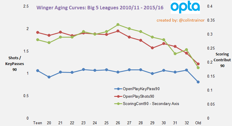
The secondary axis (the one on the right side of the chart) is the axis for Scoring Contribution, whilst the main axis displays the Shot and Key Pass numbers.

Open Play Shots

The red line represents Open Play Shots per 90 minutes and there is a very tiny increase in this level until players reach the age of 26 (1.95 at 26yo vs 1.85 at 22yo).  After the age of 26 there is a very clear drop off in shot volume for wingers and by the time they reach 29 years old their shot volume has dropped to about 1.6.  There is then a small uptick at 30, but the pattern is clear; Shot volume for wingers reduces after they reach 26 years old.

Open Play Key Passes

Immediately we can see that for the blue line (Open Play Key Passes) the change in output for wingers as they age is not as severe as that observed in their change in shooting volumes.  There is a slight increase from teenage years until players reach the age of 23, and then it flattens until 28 when it begins it’s very slow decline.

One hypothesis for this almost (but not quite) horizontal line is that there are many different ways to play a Key Pass, for example, they can be created through a burst of speed or through the playing of a well-timed, accurate pass.  The former of these methods is more likely to happen with younger players, whereas the latter may be suited to a more experienced player and so we don’t really see age having much of an impact on how creative wingers are.

Scoring Contribution

The green line, which represents Scoring Contribution, is the absolute key one in terms of final output for attacking players as it represents how many Non-Penalty goals they either score or directly assist.  The pattern here for wingers is very clear as it steadily increases from their teenage years until they reach 26, at which point it begins its steady decline.

In absolute terms, the median Scoring Contribution value for 21 year old wingers is 0.29 Per90, and this increases to 0.34 by the time they reach 26 years old, and then decreases to 0.28 by the time they reach 30.  Those differences may sound small, but over a 38 game season the difference in the output between one 26 year old and one 30 year old winger comes to almost 2.30 goals.

Forwards – Key Metrics

We’ll now run the same analysis for Forwards as we did for Wingers.

ForwardsOutput

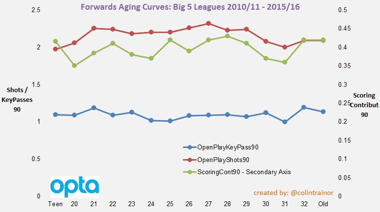
It’s probably no great surprise to see that the lines on the Forwards key output charts following similar patterns as those seen in the Wingers’ chart.  Shot volume increases until it peaks at 27 while Key Pass volume broadly remains fairly flat throughout the career of a forward.

In terms of the composite metric, the green Scoring Contribution one, there is an anomaly with 32 years and older forwards performing very well (notably in Italy). I assume there will be a large element of survivor bias in this number as any 32 year old (or older) that is playing is more likely be doing so because they are performing whereas the same probably can’t be said for the average 30 year old forward.  However, leaving this wrinkle aside we can see a general increase in Scoring Contribution for forwards until they reach 28 years of age, at which point their numbers can expect to decline.

The extent of the decrease in Scoring Contribution between a 28 year old forward and a 24 or a 30 year old forward is similar to what we seen when looking at wingers.  The median 28 year old clocks up 0.43 Scoring Contribution Per90, compared to 0.37 for both a 24 year old and a 30 year old.  This lack of a peak age forward leading the line for a team again equates to an expected shortfall of 2.30 goals over a full season.

Wingers - Other Metrics

Apart from the key output metrics I wanted to look at how a few other metrics reacted, across the population as a whole, depending on the age of the winger.
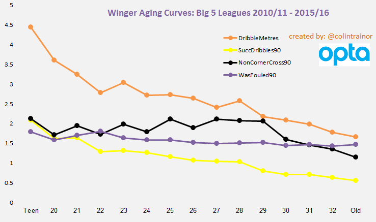
WingerOthers

Dribbling

Two of the metrics on the above chart relate to dribbling.  The yellow line is the traditional Successful Dribbles stat as provided by Opta while the orange line is one of my processed metrics.  The orange line represents the number of metres that the player dribbles the ball closer to the goal than from where they picked it up; so this shows how much progress towards the goal the player makes when carrying the ball.

These two dribble metrics follow a very clear and similar pattern, albeit a somewhat surprising one.  On the whole, wingers will dribble the ball less with each passing year.  Unlike the shooting and Key Pass metrics that we read about earlier in this piece, players do not carry the ball further or more often in their mid to late twenties than they do in their younger years.

To me, this is really interesting.  We have seen that wingers’ attacking output (as defined by shots and assists) increase from their early twenties until they reach 26 years old yet we see that they are carrying the ball less often and over shorter distances.  The median winger will have 1.1 successful dribbles when they are 26 years old compared to 1.6 when they are 20 or 21 but their decreased ball carrying does not seem to have an adverse impact on ultimately how creative they are.

One hypothesis for this is that they simply become smarter footballers as they mature.  They make better choices as perhaps they no longer feel that they have to prove themselves by beating their man like they did when they first broke into the team.  Perhaps they learn to lift their head and look for better options instead of simply carrying the ball for its own sake.

The takeaway from this discovery: So while we look at (for example) a 19 year old Raheem Sterling and marvel at his numbers we should bear in mind that, whilst his end product should increase until he reaches his mid-twenties, we should expect his ball carrying numbers to reduce.

Fouls Won

The purple line displays the number of fouls won or drawn by the median winger at each age of his professional life.  Although the line looks fairly flat on this chart there is a slight consistent reduction in fouls won from 22 years old (from 1.8 to 1.45 by the time the winger reaches 30).  Despite the existence of this slight decrease in fouls won as the winger ages it’s clear that the pace of decline is nowhere near as sharp as that shown in the main dribble metrics.

Once again, that’s an interesting result.

Does this suggest that it demonstrates players becoming cuter or more “game smart” as they develop in years because they can draw a foul comparatively easier (when controlling for how much they carry the ball) than when they were younger?  Or does it mean that fast players can’t or don’t win free kicks as often as we think they should?

Non-Corner Crosses

The last remaining line on the chart, the black one, shows us how many non-corner crosses the median winger plays.  There is a blip at 25 that otherwise distorts a fairly clear increase in the number of crosses wingers play until they reach 27 to 29 years old, after which point the output sharply decreases.  As the value of a cross is pretty marginal I’ll not spend any more time on this one but just wanted to mention it as I pulled the data to get to this point.

Forwards – Other Metrics

ForwardsOthers

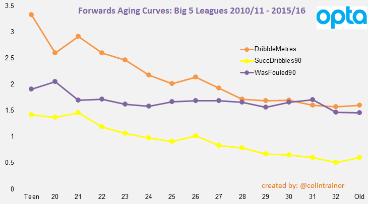
No comment required here as the lines for the dribbling metrics and fouls won for forwards are almost a carbon copy of the wingers’ numbers produced earlier.  This in itself is encouraging as the emergence of similar patterns across two totally distinct data sets gives us confidence that there is signal in what we are looking at.

Conclusion

For most readers, this won’t be the first time they have read about Player Aging in football, and as a concept it is quite straightforward.  However, the reason that I undertook this research was that I was unable to quantify the impact that playing a 24 year old or a 30 year old player instead of a player at peak age (assuming both have achieved similar percentile achievements in their age bracket) for its position would have on a team’s expected output.

Balancing a squad from an age perspective is difficult; buying to improve your chances of immediate success will have a negative impact on your future chances and buying young talent to maximise resale value means that the team won’t be at their absolute peak for the forthcoming challenges.  It’s undoubtedly a tough line to walk successfully but now when teams make decisions around the age structure of their squad (here’s looking at you, Man City) we can be a little more knowledgeable around quantifying the potential impact of the decisions that are made.

Although the charts contained in this piece relate to the median number posted by each each group for each metric I also looked at the 80th percentile and, while the curves were obviously higher than the median ones, the drop off from the peak was roughly a similar amount to those displayed here.

Based on the data that I have analysed it looks like the peak age for a winger is 26, whereas a forward peaks a year or two later when they reach 27 or 28 and the expected impact of playing the 24 or 30 year old instead of your peak age player on an ongoing basis will shave approximately 2.30 goals from your attacking output over the course of a season.

Bayern Munich vs FC Koln Player Positional Tracker

Bayern Munich had a fairly comfortable 4-1 win at home to FC Koln this evening.

As picked up by Rene Maric in his as usual, excellent, tactical analysis of the game Bayern Munich decided to totally overload the left side of the pitch.  Rene's analysis can be found here.

I produced a Player Positional Tracker (PPT) for this game and I think it neatly shows how Bayern approached this game, and it compliments Rene's article.

For anyone that isn't aware, our PPT is produced using Opta "on the ball" events.


FCBvFCK

(click on the image to open the PPT in a larger window)

We immediately see how Bayern tilted their offensive moves towards the left side of the pitch and how narrow they were on the right side.

Koln's right side of the defense were faced with Ribery, Gotze and Alaba all attacking them.

For the first 30 minutes, Bayern's right sided attacking players, Robben and Muller's dots on the PPT were very small; this indicates a lack of passes or shots (i.e. attacking involvement).

Newcastle v Chelsea - Player Positional Tracker

Newcastle 2 vs 1 Chelsea

Here is our visualisation that shows the smoothed positions of players around the time as indicated.

As we don't have access to detailed tracking data we have tried to be as smart as we can with the "on-the-ball" data collected by Opta; we think we've made a decent attempt at trying to understand the flow of the game and the general positional trends of the players within the game. We know it's not perfect, but we'd need full tracking data to ensure that we have the exact positions of every player correct at all times.  In the absence of full tracking data, hopefully people will find these visualisations helpful.

I don't have much time this morning (which has been the case for the last month or so) so I am only pointing out a couple of very noticeable features from my watching of the PPT below.

  • In the early stages, Newcastle were quite agressive with Ameobi and Dummet playing high up the left wing.  Was this deliberate to keep Ivanovic in check?
  • Newcastle had a decent spell of possession half way through the first half, with Sissoko especially involved during this time
  • I was surprised at the absolute lack of width displayed by Chelsea; it was virtually non-existent in the opening hour.  At times Chelsea had 5 players in the central attacking part of the pitch; Willian, Hazard, Oscar, Diego Costa and Fabregas

Anyway, let me in the comments know what else you see, and you can click the image below to open in a larger window.


NEWvCHE

Man City v Man United Player Positional Tracker

Man City 1 vs 0 Man United Here is our visualisation that shows the smoothed positions of players around the time as indicated. The locations are identified with reference to actions. Comments from Sam Gregory appear below the PPT.  Click on the gif to open in a larger window:

MCFCvMUFC

First Half

  • Rooney’s return to the United starting XI saw him take up an influencial central midfield role playing alongside Fellaini and Blind in the middle of a 5 man midfield.
  • Both teams started playing with one man up top but Aguero was much more effective than Van Persie. Van Persie was marked out of the match by Kompany and received very little service. Aguero on the other hand found plenty of space between Rojo and Smalling and was very mobile moving from side to side. His involvement is noticeably much larger than Van Persie.
  • After Smalling’s sending off Jovetic moved up the pitch and effectively joined Aguero as a second forward.

Second Half

  • For the first twenty-five minutes of the second half City absolutely dominated the ball. The ten United players left on the pitch had some of the smallest influence dots during this period that I’ve ever seen on a PPT. It wasn’t until the goal that United was able to put anything together in the second half. Yaya Toure and Fernando were particularly dominant to start the second half
  • During the last twenty minutes Di Maria, Rooney and Fellaini played much further up the pitch, with Di Maria playing in a more central position. This gave United something going forward and gave City a bit of a scare during the closing moments.
  • Added by Colin: Kompany and Demichelis swapped sides in Man City's defence for the final 20 minutes of the game.  Presumably this was an attempt by Pellegrini to contain Di Maria as much as possible. EDIT - @evolutionHPcal has suggested it may also have been to help Clichy with Fellaini's aerial threat.

Conclusion

  • City were dominant and fully deserved the three points in a game they should have scored more than one goal. Chris Smalling’s sending off was clearly the turning point, but City deserve credit for capitalizing on the advantage.

Man United v Chelsea Player Positional Tracker

Man United 1 vs 1 Chelsea

United grabbed a very late equalizer as Mourinho's Chelsea just faced to hold on to their second half lead.

Here is our visualisation that shows the smoothed positions of players around the time as indicated. The locations are identified with reference to actions as identified by Opta.

Comments from Sam Gregory appear below the PPT.  Click on the gif to open in a larger window:


MUFCvCHE

1st Half 
  • United lined up with Van Persie in the middle flanked by Januzaj and Di Maria on the wings. It was a fairly straight forward 4-3-3 with Mata floating between the two lines as the link between midfield and forwards. This marked yet another change in formation for Van Gaal who had used a 4-1-4-1 against West Brom.
  • Blind was quite effective in the first half following Fabregas throughout and keeping him off the ball in the middle. Fabregas was forced to drop into positions closer to the Chelsea back four as the half went on.
2nd Half
  • To start the second half Di Maria and Januzaj switched wings and Di Maria was very involved for the first fifteen or twenty minutes testing Ivanovic on the left side.
  • Once Chelsea scored through Drogba they reverted to their typical shut-down football. Cahill and Terry dropped much deeper while Ivanovic and Felipe Luis made fewer attacking runs. Mikel came off the bench to fulfil his usual role of guarding the back four, giving Matic and Fabregas more freedom to disrupt United's passing game further up the pitch.
  • United's attacking game completely fell off after the Chelsea goal and it wasn't until the final five or so minutes when they started to make a few chances.
Conclusion
  • Fabregas probably had his least effective game since coming to Chelsea and a lot of the credit goes to Blind and Fellaini who kept him fairly quiet.
  • A draw was probably a fair result, but Chelsea usually hold onto these results when they are able to slow down and kill off the game so United can take solace in the fact they were able to pull off the draw.

Goalkeepers: How repeatable are shot saving performances?

Assessing the skills of goalkeepers is exceptionally difficult, and it’s why I have never attempted to do it. As well as the basic and fundamental skill of shot stopping, the best goalkeepers will be able to effectively assess situations and decide whether to advance or stay on their line. How they deal with a high ball is also important, as is their distribution and their communication and organisational skills. Combine those altogether and you have a range of skills that would be very difficult to measure using conventional statistics.

Although I don’t think we are in the position of being able to rate goalkeepers in terms of their entire skillset we are in the position of being able to assess their shot stopping attributes. I’ve been told that the best way to eat an elephant is “one bit at a time”, and so we’ll take the same approach to rating goalkeepers. Let’s start the process by having a look at goalkeepers’ shot stopping numbers. The dataset that I’ll use for this analysis is Opta data for the four complete seasons from 2010/11 to 2013/14 covering the Big 5 leagues (EPL, La Liga, Serie A, Bundesliga and Ligue 1). This gives me a dataset of more than 64,000 on Target shots which were faced by 393 goalkeepers.

Goalkeepers with Best Save Percentage

To get our bearings we’ll take an initial glance at the Top 12 goalkeepers from the last four seasons as ranked by Save Percentage (Saved Shots / Total OnTarget shots faced) and I’ve applied a cut-off of a minimum of 300 shots.

SavePerc

This list seems to make some sense; we have Buffon topping it and it includes other accomplished net minders such as Abbiati, Sirigu, Neuer, Cech, De Gea and Hart. With the possible exception of Victor Valdes, it’s fair to say that this list of Top 12 Shot stoppers (ranked by Save %) includes most of the names that would quickly spring to mind. The football world will be glad to hear that, even when looking solely at numbers, some goalkeepers appear to be better than others. OK, so that isn’t exactly ground breaking; but it’s a starting point. At this point it’s also worth considering whether, just because the best shot stoppers have the highest save percentage, it means that the keepers with the highest save percentage are necessarily the best shot stoppers.

Repeatability

In terms of assessing the shot stopping skills of goalkeepers, the question about whether we can tell the great stoppers apart from the average ones is not the most important question for me. What is important is the timescale, or quantity of On Target shots, that we need to observe before we are in a position to be able to soundly judge shot stopping skills.

Why is this important?

If it takes a very long period of time before we can be confident that a goalkeeper’s save numbers are repeatable then that has to have implications for football teams. How do teams scout for a goalkeeper?

How can they possibly tell whether the saves a potential new signing made in the handful of games he was watched is likely to be repeatable going forward?

How do they know when to drop a goalkeeper due to a few bad performances?

For me, it’s apparent that we need to be able to assess how repeatable shot stopping performances are for a goalkeeper from one period of time to another. To do otherwise means that any decisions or judgements that are based on the outcomes achieved during the first period of time may be built on shaky foundations. This viewpoint seems to be shared by Billy Beane, as in an interview last week with Sean Ingle he was quoted as saying:

“You don’t have a lot of time to be right in football. So ultimately, before you mark on anything quantitative, you have to make sure you have scrutinised the data and have certainty with what you are doing, because the risk is very high.”


How to Measure Shot Stopping ability

For this analysis I am going to use two forms of measurement for assessing the quality of shot stopping performances. The first measure is the simple Save %, and this was the metric that the first table in this article was ranked by.

The second measure is based on our (created with Constantinos Chappas) Expected Goals model, or specifically our ExpG2 component of the model. This ExpG2 value is the expected value of the shot AFTER it has been struck. This means it takes into account all of the factors that existed at the point the shot was struck (ie location, shot and movement type etc) but it also includes the shot placement, but doesn't include the location of the GK at the time of the shot.

As expected, the shot placement is a huge driver of the ExpG2 value. A shot arrowed for the top corner will have a much higher ExpG2 value than a shot which was taken from the same location, but which was placed centrally in the goal. ExpG2 can be used to measure the placement skill of the shooter, but it also has great use in measuring the shot stopping performance of goalkeepers.

It is only right that a ball that hits the net in the very top corner reflects less badly on the keeper than one which squirms through his body in the middle of the goal; the ExpG2 metric achieves this. This analysis will use ExpG2 Ratio, which is calculated as: ExpG2 / Actual Goals Conceded An example: 12.34 ExpG2, but the GK conceded 14 goals. The ExpG2 ratio in this case is 0.88. A value of 1.00 means that saves have been in line with expectation, a value greater than 1 suggests the keeper has performed better than the average keeper would have done for the shots he faced, and a value of less than 1 means he allowed more goals than the average keeper would have done.

Repeatability (yes, that word again)

The key point in this analysis is not to measure the shot stopping performance of any goalkeeper, but to instead look at how repeatable the shot stopping performances are from one period to another. After all if they aren’t repeatable, be that due to variance, luck or something else we aren’t currently measuring, decisions and actions taken by teams shouldn’t be the same as those that they would take if they were known to be repeatable.

Isn’t that right football industry?

In March this year, Sander Ijtsma published a piece where he suggested that you could practically ignore save percentages.  I wanted to expand on that concept a little.

Method of Analysis

I sorted all the On Target shots by date and sequentially numbered each shot faced by each goalkeeper. I created a variable, n. This allowed me to divide the shots faced by each keeper into sets of n size. I then calculated a single correlation value for each level of n by plotting all the individual save performances achieved in Set 1 (which will be of size n) on the x asis against the individual save performances achieved in Set 2 (which will be of size n) on the y axis.

It would probably help to use an example; let’s say n = 50. For each GK I measured the save performance for their shots numbered 1 – 50, 51 – 100, 101 – 150, 151 – 200 etc. I then plotted the relationshion between shots 1 – 50 and 51 - 100. I did this as I wanted to see how repeatable the save performances were for goalkeepers from one set to the next. I also plotted the relationships between shots 51 – 100 and 101 – 150, as well as between 101 – 150 and 151 – 200 etc. I continued on using this logic to plot the relationship values for each consecutive set for each goalkeeper until I couldn’t compare any more sets of n on target shots for them.

A single correlation value was then calculated for each level of n. I made n a variable so it could be changed to assess the level of correlation (repeatability) between consecutive sets of On Target shots faced by goalkeepers based on the number of shots in each sample. The table below sets out the extent of the correlations for varying sizes of n.

Correlation

The values in the two columns on the right of the table show the correlation for the save performance of a goalkeeper over two consecutive sets of facing n On Target shots. The third column shows the correlation for the simple Save % metric, while the final column shows the correlation for the ExpG2 Ratio measurement.

A brief reminder that a value of 1 means the save performance of the two consecutive sets are perfectly positively correlated, while a value of 0 indicates that no correlation exists whatsoever. I don’t want to make this piece any more technical than it already is but I’ll simply state that the correlation coefficients themselves have confidence intervals around them, these are primarily driven by the number of pairs for each level of n.

Let’s walk through one of the lines in the above table, we’ll use n = 100. There were 305 instances (pairs) in my data set where goalkeepers faced 100 on target shots followed by another 100 on target shots. The correlation in their save performance when measured by the simple save ratio between the first and second sets of 100 shots was just 0.127. When we instead measure the keepers’ save performances by the ExpG2 metric the correlation increases to 0.232. A correlation of 0.232 is a weak correlation as it means that just 5% (0.232^2) of the variability in the second set of 100 on target shots is explained by the first set of 100 on target shots. That is startling.

Even when we use the advanced ExpG2 metric to assess how well a goalkeeper performed over a series of 100 on target shots we can still only expect it to explain just 5% of their performance over the next 100 on target shots he faces.

As an average goalkeeper faces approximately 4 on target shots per game this means we need to assess a keeper over about 25 games to only get a 5% steer towards how he will perform over the next 25 games. Pause and think of the implications of that. Even a sample size of 250 shots (n = 250) has a correlation, using the more detailed ExpG2 metric, of just 0.405, this level of correlation is generally described as a moderate correlation as it gives an r2 (variance) value of just 0.16.

At this point I cannot calculate correlations for n greater than 250 as I do not have enough data in my dataset. To give you an idea of the amount of dispersion of save numbers from one set to the next I have produced below the plot for the 31 consecutive sets of 250 shots (which means the goalkeeper has had to face at least 500 on target shots):

n250

Does the shot order matter?

Daniel Altman read a draft of this piece and he suggested I should look at whether I am introducing some bias into the correlations due to the way that I populate the two groups of n shots. You will recall that I carried out the above analysis by splitting the shots into groups based on the sequential order the keeper faced those shots, and doing this inevitably builds a time and age factor into the makeup of the groups.

This is fine as I initially only wanted to measure sequential relibality (as this is what happens in the real world when it comes to assessing a goalkeeper's performances at a certain point in time), but this may cause difficulties if we attempt to measure innate talent. To address Altman's prescient point I randomised the order of the shots and conducted the same analysis as before.  The correlation values between consecutive sets of n shots (with the shot groupings decided on a random basis) are as follows:

Correlation when randomised

As expected, because we chose a different basis on which to create our sets of n, there are some differences between the correlation values in this table and the one that appeared earlier in this article.  However, at n = 250 the correlation value of 0.467 still means that we would only expect 22% of variability in the second set of 250 on target shots to be explained by the first set of 250.  This is still quite a low value and suggests that even when we strip away any impact of age / time bias there doesn't seem to be a great level of repeatability in terms of goalkeeper save performances.

Conclusion

Of course there are goalkeepers that save shots better than others. But for every goalkeeper such as David de Gea that have consistently over performed (1.23 and 1.21 is the ExpG2 Ratio for his two sets of 250 shots) we have a Stephane Ruffier who notched up ExpG2 ratios of 1.15 and 0.98 in his two sets of 250 shots.

If those two players had been assessed after their first batch of 250 on target shots (which would have taken almost two full seasons to amass) they would both have been assumed to be well above average shot stoppers. However, only one of them went on to repeat it again after they faced another batch of 250 on target shots. Imagine the analyst that recommended signing Ruffier on the strength of his save performances using an advanced metric over a “large” dataset of 250 shots or 60 games. This is a good time to recall Billy Beane's assertion that we need to make very sure that we know what we are doing with our data as the stakes will be high for any club that truly embraces the use of data in their decision making process.

When this level of variance exists after 250 shots, it is easy to see how Simon Mignolet went from being one of the best shot stoppers in the EPL in the 2012/13 season (ExpG2 ratio of 1.25) to being one of the worst in 2013/14 (ExpG2 ratio of 0.88). Very simply, trying to judge how good a goalkeeper is at saving shots based on one season’s worth of data is little more than a craps shoot such is the divergence on performance over 150 shots. Just 11% of his performance next season can be explained by his performance in the season just passed.

It looks to me that the very fact a player is good enough to be a goalkeeper for a top tier club means that he has achieved a level of performance that is difficult for even advanced numbers to distinguish, at least not until he has faced a very large number of shots. I’m just not sure yet how large that number needs to be. Remind me never to advise a club when they are looking at buying a goalkeeper as the shot stopping facet of the goalkeeper’s skillset was supposed to be one of the easier ones to measure and interpret.

Thanks to Constantinos Chappas and Daniel Altman for allowing me to bounce off them some of the more stat heavy angles of this piece. Cover picture by Steve Bardens.

Attacking Contribution Metric and Man United’s reliance on Di María

Short version: Angel Di María is the player that his club have relied upon most for his attacking contribution so far in this Premier League season.

Long version: Please read on

Many years ago the only individual player performance stats that we had access to were goal scoring records. Then someone decided it would be a neat idea to give credit to other attacking players and we began to also record the assists, ie the player that set up the goal. These stats are great, but as only approximately one in every ten shots is scored we inevitably lost a lot of detail as these performance counting stats only included the sample of shots that were scored. Why should the final shot from the striker influence whether or not the creative midfielder was awarded the assist or not for his through ball? To a large degree, the actual finish was outside of his control after all.

In relatively recent times things have improved for those that like to count things. Thanks to Opta (other brands may also be available) we now have a proliferation of sites that list the total number of shots and key passes that players make during each individual game and also cumulatively across a season. By stepping back one level from the old goal and assists metrics we can now credit players for their attacking output, regardless of the outcome of the final shot.

We know that not all shots are created equally, but given that there is a certain level of randomness in whether or not any individual shot actually results in a goal this increased level of transparency of individual attacking contribution can only be a good thing.

However, if we wish to accurately measure Attacking Contribution why stop at just the shot and the key pass? Doing so means that the player that played the penultimate pass gets no recognition at all, at least as far as the stats are concerned, and what about the player that made the pass preceding that?

Attacking Movements

Using detailed Opta event data I can join together the sequence of events for each shot that was taken and I can map out the complete attacking movement. These moves range in length from zero passes before the shot to the 51 event attacking move that Tottenham achieved against QPR earlier this season; a move that ended in a Nacer Chadli goal.

Using the information derived from these moves I want to have a go at creating a more comprehensive Attacking Contribution metric. This metric will go farther than counting just shots and key passes and can help us objectively measure the attacking importance of any individual player to their team. We have no need to just award “attacking points” to the shooter and the maker of the final pass. As with most of these metrics we’ll start with undertaking attacking analysis, as inevitably trying to analyse defensive contribution will be a much more difficult piece of work.

Data Rules

I needed to decide on a cut-off point in determining which actions to count in my Attacking Contribution metric. Although I want to go farther back in the chain than the guy who made the final pass, it is a tough sell to suggest that the player who made the 10th last pass in the move should receive credit for his part in the move. It’s an arbitrary cut-off but I decided to permit the final four attacking events in a move to contribute towards Attacking Contribution; this allows for the shot plus the previous three attacking events (pass, take-on or ball recovery).

For this measure I didn’t want to place different weightings on the extent of the involvement in any given attacking move. Very simply, if a player was involved in the final four attacking events in a move that led to a shot then they were awarded an Attacking Contribution. It is obviously possible for a player to be involved more than once in a move, ie they play a one two before taking the shot, but each player was only awarded one Attacking Contribution per move. After all, I simply want to measure how many moves each player could be said to have been involved in.

I am conscious that this analysis can only use the data that I have access to. Although the Opta event data is very detailed it only covers “on the ball” actions, which will be fine for 95% of this analysis. However, it will be unaware of the player that made the step over that sent the defender the wrong way or the supporting forward who made the unselfish run to pull the defenders out of their shape. I don’t imagine that these “oversights” will significantly impact on the findings in this analysis but I wanted to address that point now.

The premise of this metric is that it shouldn't just be the shooter and the player that makes the final pass that receives Attacking Contribution credit, as is currently the case.

This post will serve as an introduction to my Attacking Contribution method; I have a few ideas related to this metric that I would like to tease out and analyse in the near future but I’ve got to start somewhere and I’ll keep the numbers in this piece fairly simple.

2014 Premier League Attacking Contribution

As a means of illustrating and working through this metric let’s look at the first seven games of the 2014/15 Barclays Premier League.

Here are the 15 players that have had the greatest Attacking Contribution in absolute terms:

ACLeaders

With 22 key passes and 7 assists it’ll not surprise anyone to see that Cesc Fabregas has been the player that has had the highest Attacking Contribution during the opening seven game weeks of this new season.  By looking at the total number of minutes that each player has played we can convert these values to Attacking Contributions per90, this method of normalisation means we can easily compare players regardless of time spent on the pitch.  However, I'm not going to dwell on this aspect right now.

What I do want to spend some time on is describing how I see this metric being most useful: Which player contributes most to their teams’ shots?

Attacking Reliance

To assess the attacking impact that a player has I looked at their individual Attacking Contribution numbers as a proportion of the total shots that their team had while they were on the pitch. By doing this I’m not actually trying to measure the effect that a player has on their team’s attacking output, ie if the player was missing I’m not suggesting that his team would see their shots total drop by x shots. Instead, I am quantifying the proportion of shots a team takes that goes through the player, in other words it looks at to what extent a team relies on a player. How much of a team’s attacking game revolves around player X or player Y?

In this analysis I used a cut-off of 50% of minutes - a player has needed to be on the pitch for at least 315 minutes so far this season.

By dividing a player’s Attacking Contribution by the number of shots his team took whilst he was on the pitch I then arrive at an Attacking Reliance %. This Attacking Reliance percentage informs us of the proportion of attacks that the player is involved in (as defined by the final four attacking events of the move) or how much their team has relied on them in an attacking sense. The table in descending order of Attacking Reliance% currently appears as:

Reliance

Now we get a different looking table, and one that seems to make sense. Fabregas has the highest absolute Attacking Contribution value, but despite his sublime performances Chelsea have had a sufficient volume of shots for them not to be overly reliant on the Spaniard.

High Reliance Players

We can see that even though he has only been with Man United for a very short period of time Angel Di Maria is having a hugely important contribution to their attacking output with an Attacking Reliance figure of 56%. Compare that with United’s other big name signing / loanee Falcao; even if I set aside the 50% minutes rule in this data set he still wouldn’t appear in this list. The Colombian striker has been involved in just 40% of United’s attacking moves. Given his price tag he’ll want to be quickly increasing that value.

The reliance that United has had on Di Maria is the highest in the league, just pipping Christian Eriksen who himself posts a rounded Attacking Reliance value of 56%. Despite struggling and appearing to be out of favour for large parts of his first year as a Tottenham player, the Danish attacking midfielder is now showing everyone his true worth. In fairness, it’s worth pointing out that some analysts were ahead of the curve on his ability.

Ted concluded that piece with “This might be controversial, but based on the rarity of that type of performance and how he’s performed over his career, Christian Eriksen is quite possibly one of the best attacking passers in the Premier League already”. 

Although Graziano Pelle has received the majority of the plaudits down on the South coast it is interesting to see that Dusan Tadic actually has had a greater involvement in Southampton’s attacking moves than the Italian striker. In fact, even James Ward-Prowse has a higher Attacking Reliance value than Pelle, who for the record has posted a value of 42%.

Swansea’s twin attacking threat of Gylfi Sigurdsson and Bony complete the list of players that posted an Attacking Reliance value of greater than 50%. So all a team has to do to stop Swansea is to stop Gyfli and Bony. Why did no one say that before? (insert sarcastic emoticon)

It is unusual for a team to have two players with such high Reliance values, but obviously these things happen so early in the season with a team that has had the second lowest number of shots in the league. In North London, Danny Welbeck will be pleased with his start to life as an Arsenal player with his involvement in 48% of Arsenal’s shots that have occurred while he has been on the pitch.

One other player that is worth mentioning is Riyad Mahrez of Leicester.  He has played just shy of 400 minutes this season, but more shots have gone through him while he has been on the pitch than any of the other Leicester players, including better known players such as Jamie Vardy and Leonardo Ulloa.

Wrap-up

An Attacking Reliance figure for any individual player of 50% is massive, at least in Premier League terms. Over the last four full seasons only eight players achieved a value of this scale over the full 38 game season (and no, I’m not going to name them today, remember I said this was just an introductory article to the concept).

I’ve said it many times before, but one of the aims of my analytical work is to be able to objectively measure what our eyes see. In this regard, analytics won’t always provide ground breaking findings but it will allow us to quantifiably assess certain impacts, which may in turn, be used as inputs in subsequent applied research. This introductory analysis falls into this category.

In future articles I intend to undertake further analysis so we can see if we can learn anything more from Attacking Reliance figures.
Does a high reliance on individual players effect how successful a team is?
Does it matter if players with a high Attacking Reliance value leave the club?
Do we even have enough examples to be able to test this?

At this stage I don't have the answers to the above questions, but I hope that’ll change in the near future.

Chelsea v Arsenal PPT. Where was Arsenal's right side attack?

Chelsea 2 vs 0 Arsenal

Chelsea continued their great start to the season with a commanding victory at home to Arsenal.  They managed to take the lead through a Hazard penalty and they did what Mourinho teams do so well; totally stifled the opposition whilst carrying a terrific attacking threat due to the pace (of thought as well of feet) in their side.

I asked ThatsWengerBall to give me his thoughts on the game via the lens of the PPT, and his comments appear below the gif.

However, I wanted to mention the one facet of the game that was really noticeable with this PPT; Arsenal's total abandonment of the right side as an attacking option.  Up until the point Oxlade-Chamberlain came on and provided width on that side, Arsenal didn't have anyone in that area of the pitch during the match.  Watch the entire gif to see what I mean.

Ozil was the most right sided player, but he Cazorla, Welbeck and Wilshere were all primarily in the centre of the pitch.  The lack of Arsenal players in that right side was so noticeable as to make me presume it was a pre-defined strategy for Wenger.  If so, it changed immediately when Ox was brought on.

Definitely a strange one to play so many attacking players in the centre, especially against a Chelsea team that is so solid up the middle.

(Click on the image to open in a larger window)

CHEvARS

That'sWengerBall's comments:

  • The central/left area of the pitch was very congested with Arsenal’s offensive players throughout the match. Wilshere, Cazorla, Alexis, Özil and Welbeck all occupied positions very close together which had both positive and negative effects on their game.
  • Arsenal played to their strengths, almost turning their offensive game into a five-a-side style match. With little room in the centre of the park, the five aforementioned players exchanged tight angled passes and attempted a very high number of take-ons (40 between them).
  • Whilst this successfully negated Chelsea’s physical advantage (the average height of their starting XI was around 4cm taller than Arsenal’s) and proved effective at moving possession into the final third, they struggled to provide the killer ball as there was so little space that every pass had to be inch perfect.
  • Chelsea’s offensive play was a little more balanced, with Hazard targeting the inexperienced Chambers on the left and Schürrle or Costa acting as an outlet on the right. Whilst this proved effective at stretching Arsenal’s defence, Chelsea’s midfield 3 were unable to provide much support due to the pressure provided by Arsenal’s midfield overload. Oscar, Fabregas and Matic could rarely be found on the ball in the final third of the pitch and Chelsea only managed to complete 85 passes in that area compared to Arsenal’s 143.
  • The shape of the game changed a little from the 70th minute. Wenger brought on Chamberlain who instantly provided width with his shuttling runs down the right hand side; however Mourinho knew he had the upper hand with the goal advantage and brought on Mikel to shore up the defence.
  •  ­Neither side massively impressed going forward, but in the end two moments of individual quality – Hazard’s dribble and Fabregas’ pass – gave Chelsea the three points.


Gif Heatmaps: Messi and his increasing Key Pass numbers

Only 6 games have been played in the current La Liga season, but Lionel Messi is forging ahead at the top of the creativity charts.  With 4 Key passes per90, he's clocking up a full 1.5 Key Passes more than anyone else in Spain's top division.

His "Ted Radar" for the current season looks like this:


Lionel_Messi_2014-15


Other than his lack of tackles and interceptions (of which he hasn't made any) he's pretty much exhibiting the Full Umbrella radar this season.

His Key Pass value of 4 is a large increase on the 2.4 he chalked up last season but it appears that this increase in creativity is neither fluke nor coincidence.   At a press conference this morning Lionel Messi was quoted as saying the following:


barcastuff


Locations of Passes that Messi received

Not that I doubted for one second what Messi was saying, but I wanted to see what the Opta data has to say about Messi's positions over the last few seasons.  I created a gif of the heatmaps based on the locations where Messi has received passes since 2012/13.

MessiPassesRecvd

Although Messi is still occupying a little of the central spaces it can be clearly seen that during the first 6 games of this season he is operating in positions that are more right of centre.  These locations are visibly different to the more central locations he picked the ball up in during the preceding two seasons.

As Messi said this morning, the other Barcelona forwards are playing in more central positions this season.  Based on this, I guess we can expect to see Messi clocking up some seriously high Key Pass values as the season progresses.  It'll be interesting to see if this change in positioining has any impact on his shots volume; so far this hasn't been the case.

Olympique Marseille; their tactics and a Player Positional Tracker

Marseille 3 vs 0 Rennes (20th September 2014)

This format of this Player Positional Tracker post is a little different to the way we usually publish them.  I thought it would be good to hear the thoughts on the game from someone that is much more familiar with the teams involved than I am.

This game was played last Saturday, but instead of publishing it straight after the final whistle I wanted to get the thoughts of the excellent Sébastien Chapuis; Sébastien is my go-to guy for French football. 

Sébastien's thoughts, both on this game, and in respect of how Marseille set themselves up under Bielsa in a wider context appear underneath the PPT for this game.


OMvREN

Game and positional observations

  • Marseille was set up with a back four considering that Rennes only played with a lone striker (Toivonen). Contest looked one-sided in the first half, Rennes was well organised with 2x4 in his defensive half, preventing Marseille to play.

  • Thus, Payet and Ayew had to roam to try to overload Rennes in central areas.

  • Bielsa likes to have attackers on different lines, attacking shape looks lopsided.

  • Thauvin was wide high willing to take on defenders, while the aforementioned Ayew acted more as a midfielder tucking inside on the other side

  • Rennes caused a threat on the counter attack but failed to convert good goalscoring chances.

  • Toivonen acted as a focal point, receiving support from box-to-box Abououalaye Doucouré while Paul-Georges Ntep ran in behind.

  • Gignac's well taken brace ended the contest in the second half of the game before Alessandrini's first goal in OM colors, bending a free kick into the top corner against his former team (for the narrative)

Bielsa's system relies on a high pressing game to recover the ball high up the field.

Bielsa applies the spare man rule at the back and adapts during games. Back 4 if opponent fields one lone striker, back three if opponents has two out and out strikers.

Bielsa does not want his team to prepare attacks for too long, he encourages vertical attacking football;

Hence the feeling that the team is sometimes cut in two parts:

  • a base of 3 players at the back (Morel, Nkoulou and Romao),
  • 4 attackers roaming, running and looking for space (Payet, Thauvin, Gignac and Ayew),
  • two wing backs providing width and linking up with wide players (Dja Djedje and Mendy)
  • the lone Imbula creating the link in between the two blocks (dribbling his way out from defensive third)


General observations on the set-up of Bielsa's OM:

  • Marseille is exposed when opposing teams play direct football above the first pressing wave (such at what Bastia did on opening day) or manage to play their way through (such at what Rennes did on occasions).
  • Space behind the full backs is an area targeted by opposing teams looking to hit quickly in transition considering the fact that many OM players will be subsequently caught out of position
  • Right and left CB are expected to cover in behind wing-backs when ball is played there, when OM features a back 3.
  • When OM features a back 4, the process to defend such situations relying on a communication process isn't fully functional right now. As CB is dragged wide, DM fills his position in central defence but fails to receive support from either Imbula or Payet to keep the area ahead of the penalty box in control.
  • More generally, OM's expansive gameplan means that it commits bodies forward to attack as well as to counter-press, this puts even more emphasis on the outcome of 1 vs 1 at the back.
  • If a player is 1. on the wrong side of a defensive 1 vs 1 or/and 2. fails to receive support from a team mate on the second ball of a clearance and possession is turned over, Marseille is under threat in his defensive third
  • Bielsa is said to be unhappy with the club's activity on the transfer market, especially in defensive positions. Has tried several options at the back: Romao, Nkoulou and the much maligned and formerly side defender (not fullback) Jeremy Morel converted into a CB. Even inexperienced youngster (yet aerially dominant) Stephane Sparagna got a chance on opening day at Bastia. It is to be seen whether new signing Doria can grow into a key player for OM at the back
  • Ultimately, Marseille haven't faced any of Ligue 1's heavyweights yet. Results have been good, long spans during games have been pretty entertaining (players say they're working hard during the week to enjoy the weekend game)
  • Marseille has had the ability to convert momentum into goals, especially through opening the scoring. OM is on a 5 game (winning) streak in which they scored first, Gignac scoring 4 of those (out of his 8 league goals).

Marseille: The Bielsa Press quantified

Previously I have written about the metric which can help us quantify and assess the strength that a team used to press the opposition; Passes per Defensive Action or PPDA.

An introduction to this metric, including its definition and what the numbers represent can be found in this article written in July

In a follow up article which looked at manager tendencies in relation to this PPDA metric  it was no surprise to find that Marcelo Bielsa ranked very highly amongst managers that incorporated a pressing game.  In fact, over the last four seasons across the Big 5 leagues only six managers used a more agressive level of pressing that Bielsa did.

Bielsa at Marseille

Bielsa took over the reins at Marseille at the start of this new season and he and his team have made a great start to the season. With five wins and a draw from their opening seven Ligue 1 games Marseille currently lead the league. It’s also fair to say that the gusto that his team presses with has gained some media attention.  An example of which found its way into my Twitter timeline last night.


TwitterPress


It’s very early in the season but I wanted to see how Bielsa’s Marseille have performed on my PPDA metric; ie just how strong has their press actually been.

We are all aware that different leagues have differing preferred playing styles, and this is especially true in respect of pressing. In previous articles I showed that the level of pressing is lower in France and England than it is in the other 3 of the “Big 5 leagues”.

French Ligue 1 Pressing Values

To ensure we are comparing like with like, I looked at PPDA values for all individual games played over the previous four seasons within each of the Big 5 leagues. Below are the PPDA values at various percentiles for French Ligue 1.


F1Percentiles


As an example, in Ligue 1 a team that recorded a PPDA value of 6.85 in a game would mean that their “pressing performance” was in the top 10% of aggressive presses in the context of that league.  But remember, this table is based on single, individual games and not on a cumulative number of games.

Marseille’s PPDA values in 2014/15

So what do Marseille's PPDA values look like on a game by game basis this season?


marseille


We can see that the data, unsurprisingly, backs up and confirms what our eyes have been telling us; Marseille have been operating a very agressive press. Indeed their cumulative PPDA over the course of the opening seven games of 8.66 is the lowest in Ligue 1, in other words Marseille are pressing more aggressively than any other team in the league.

If anyone is interested this is the “Pressing Table” for all teams so far in Ligue 1 this season.  I'm sure that someone much more familar with French football than I am can tell me if these rankings are in line with the public perception of how individual teams set themselves up.


Ligue1Table


Some interesting patterns emerge when we look at Marseille’s pressing on a game by game basis.

The first two games they played seen them record their most aggressive press, and the intensity of the press has tapered off since then. Is this a case of Bielsa toning down his press because it didn’t suit his players?

I don’t think so. Marseille didn’t win either of their first two league games this season, and we would expect teams that are chasing the game to use the press more as they attempt to regain possession and thus record higher PPDA values. Despite what the twitter screenshot (that I posted above) shows, there is no doubt that teams will not press quite so aggressively when they are leading. Why would they risk getting played through?

The apparent decrease in Marseille’s pressing aggression as the season has progressed can be explained, however it is worth pointing that none of the games have seen OM record a PPDA value ranked in the 90th percentile or higher (with reference to individual game Ligue 1 PPDA values). Then again, when teams are winning it would probably be unwise for them to press so aggressively that they notch up a pressing score in an individual game that places them in the top 10% of all values recorded in France.

During Bielsa’s time in control of Bilbao his PPDA value was 8.39. From a pressing point of view it is arguable that Marseille’s PPDA of 8.66 in the context of Ligue 1 is even more impressive than the value he recorded in Spain.

There is no doubt, Marseille are playing football according to the Gospel of Marcelo Bielsa.  It will be super interesting to see if this brand of football will be good enough to win the title and see off the might of PSG.


PoweredbyOpta