Introducing Goalkeeper Radars

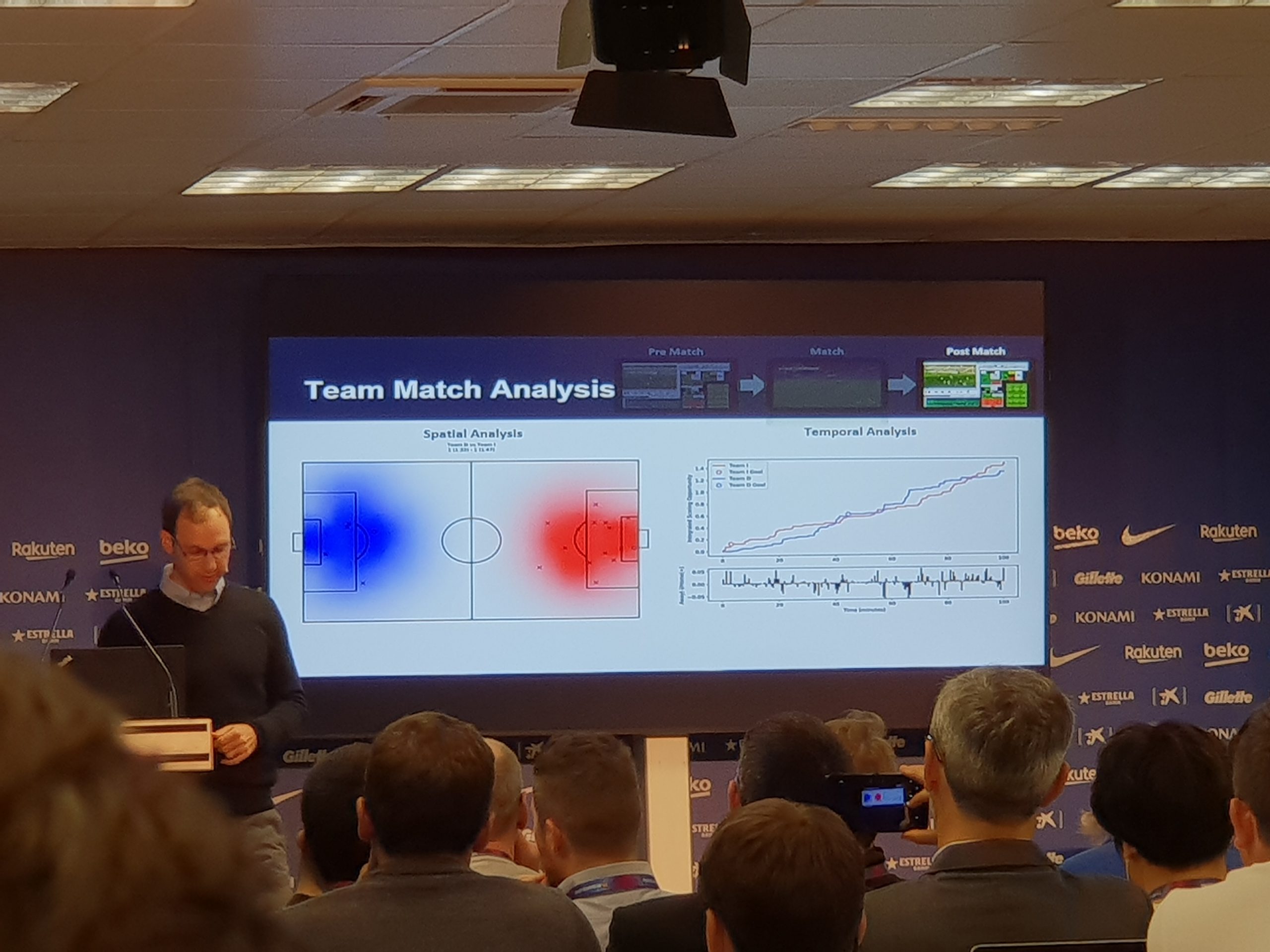
If you pay attention to our social media, you know that we recently released the new goalkeeper(GK) module on our analytics platform StatsBomb IQ. This past weekend, phase 2 of the module went live, and included in that release were an awful lot of things, not least of which were the long-awaited GK radars.

Today I'm going to discuss what we've done with the GK metrics, why they differ from what you might see elsewhere, and why this is something people in football really need to care about. (Note: For those of you who want to know more about the framework we have chosen to analyse GKs, please check out my intro piece here.)

StatsBomb Data is Different

I have been working with player data in football since 2013, but I never bothered to do much work with GK data. It's not that I didn't think GKs were important - obviously they are. The problem was that I felt the data we had access to didn't add much insight into the job GKs actually do. Primary jobs for GKs consist of:

  1. Stopping shots
  2. Claiming crosses and high balls
  3. Distribution

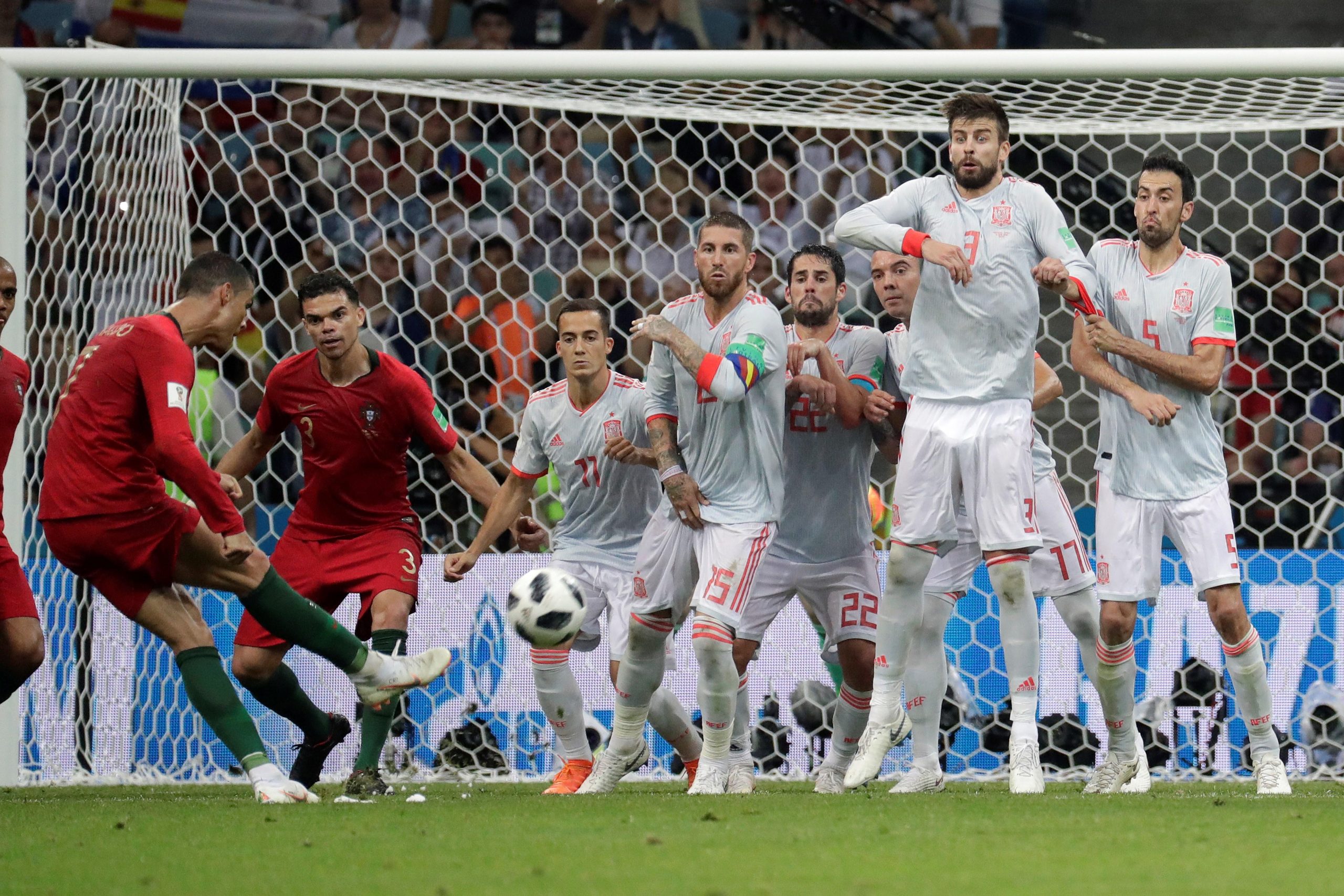
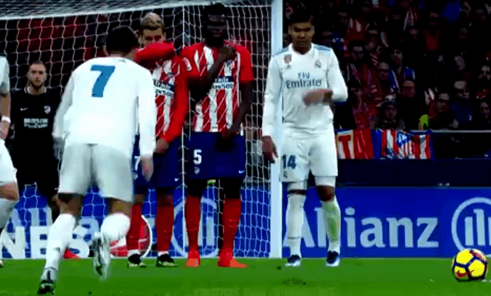
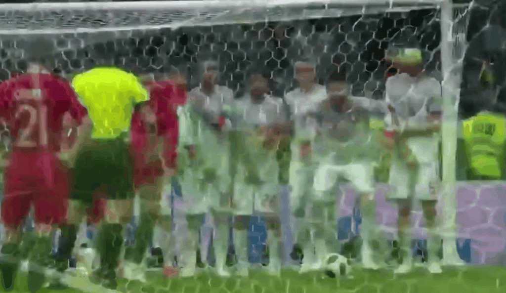
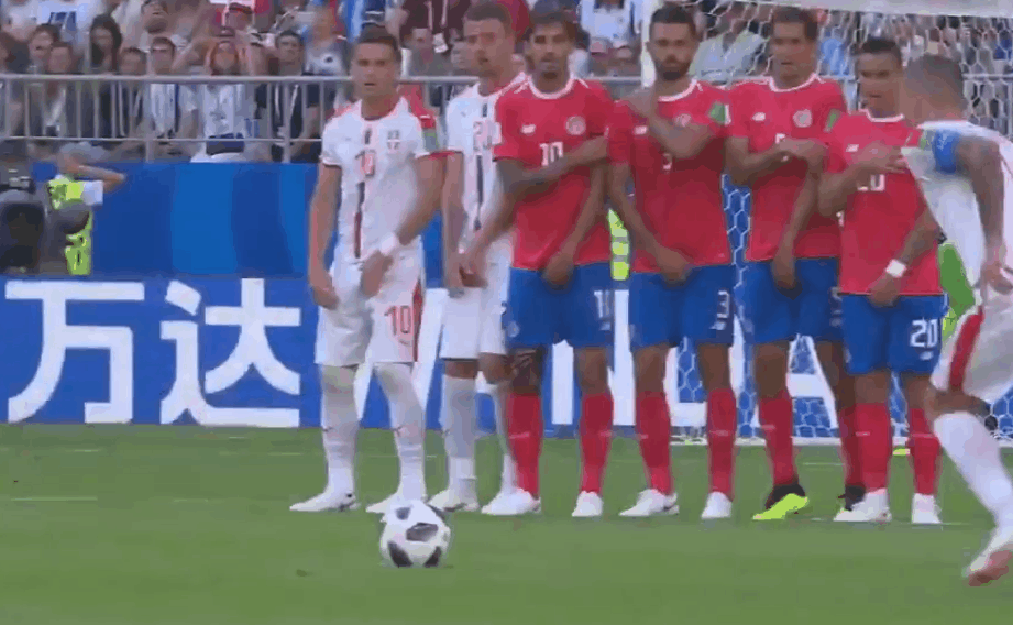
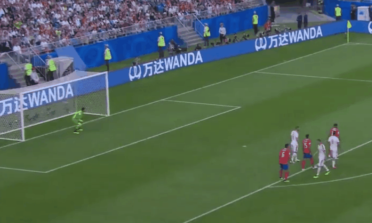
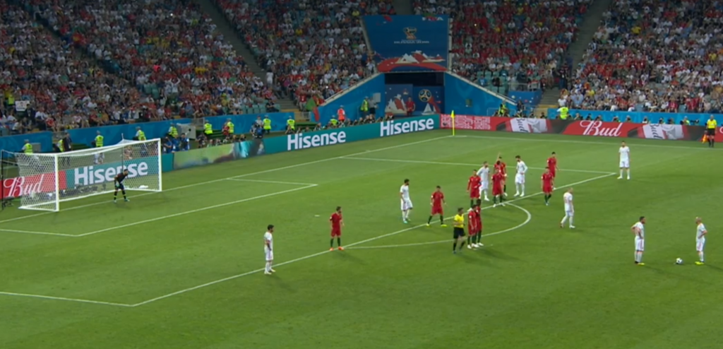
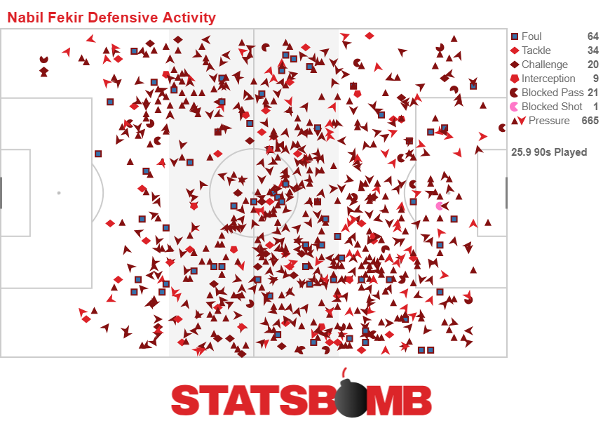
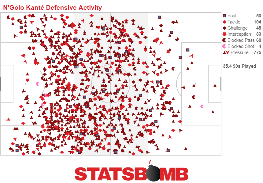
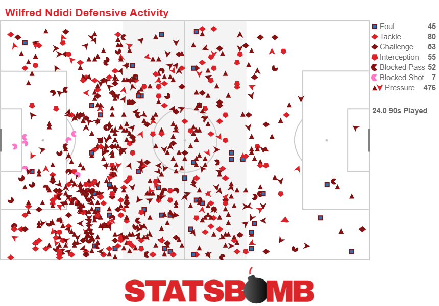
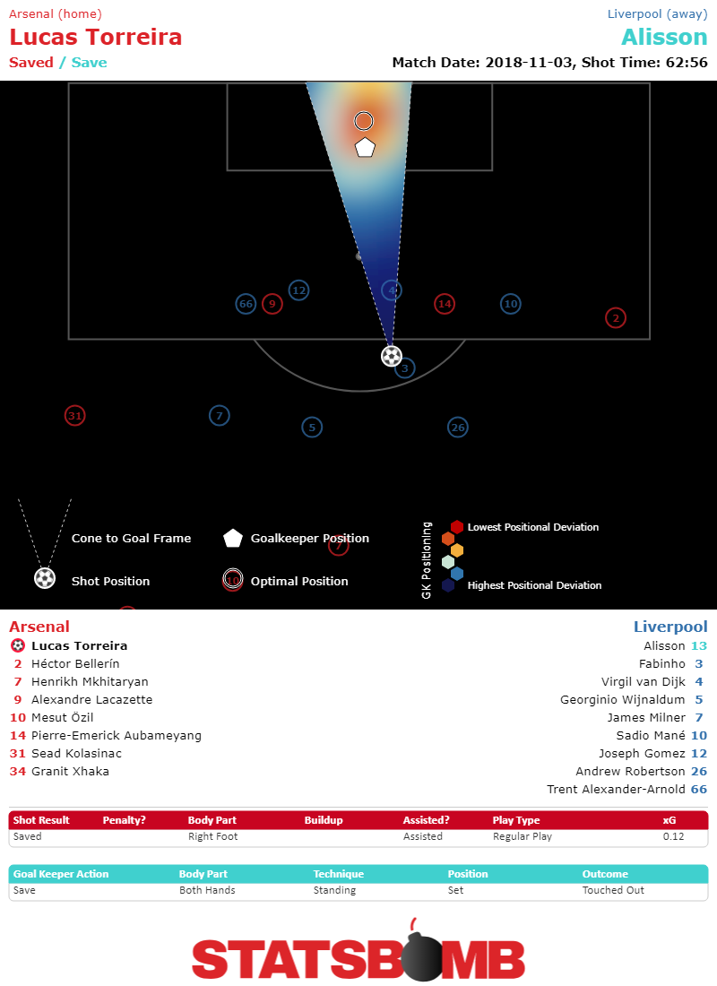
When I was designing the data spec for our new data, I went around to most of the smart people I know in football and asked them how we could improve football data without widespread tracking data. We ended up with a long list of upgrades to what our competitors offer, but probably the most important element across everyone's list was the position of the GK on every shot. And the reason for this was that a big part of the GK's job is simply being in the right place to have the best chance of saving any particular shot.

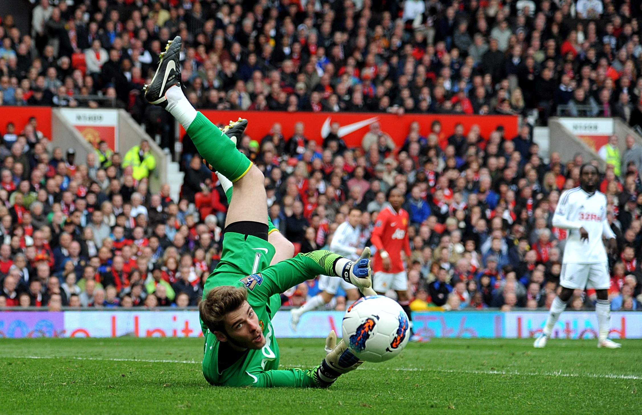
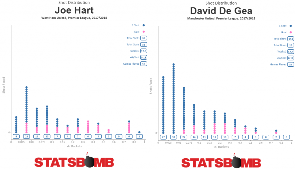
Think of what you often hear in commentary when David de Gea is playing.

"It's not really a save, the ball just hit him and bounced off."

"Another shot right at him."

"Great reflex save from de Gea, but again the ball was right at him."

Being in the right position to make saves for a keeper is a huge skill, but you can't measure that if you don't have the data.

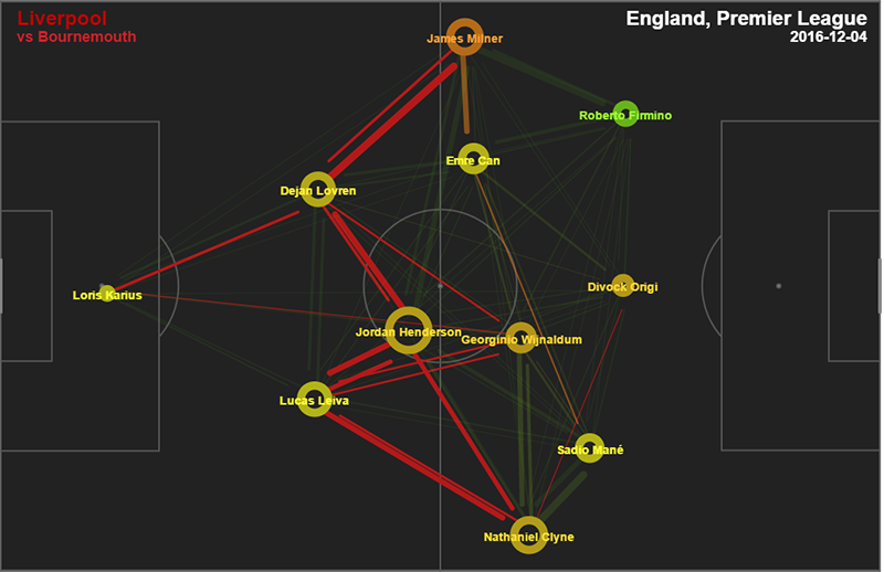
So we collected it, along with the position of all the defenders in the frame when a shot is taken, and we call them Freeze Frames.

(Credit for all the data science heavy lifting in the GK Module goes to Derrick Yam, who did great work on this on.)

Once we had enough shots, we were then able to investigate where GKs generally should be positioned on shots from any particular location in order to make a save and put that information into a model. We then use that model to evaluate each GK on each shot and produce two shot stopping metrics.

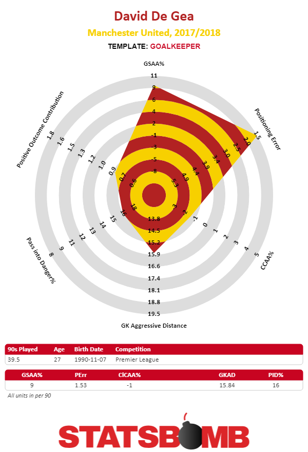
GSAA% - Goals Saved Above Average Percentage: How the Goalkeeper performed versus expectation. Calculated as: (PSxG - Goals)/Shots Faced

Positioning Error - How far from the optimal position for facing a shot the Goalkeeper is (on average).

The next two metrics we produced focus on GK activity around the box.

CCAA% tries to answer how active are GKs at gathering claimables - high balls and crosses into the box that could be claimed.

The claimables model first defines the likelihood of a pass from and to a particular location being claimed and then evaluates GKs based on their activity. (This is made easier because StatsBomb Data also includes pass height as you wouldn't generally expect GKs to claim ground passes.) Busy GKs that come off their line to claim lower xCL balls are graded higher than those who are consistently rooted to the goal line. The reason is because claims have some level of value in cutting out opposition chances, and GKs can be rewarded and penalised based on this activity.

(Note: There are a lot of additional technical details behind the scenes here that are only available to StatsBomb IQ customers right now.)

For GK Aggressive Distance we wanted to look at how active are GKs generally at moving off of their goal line to do football things? We investigate the distribution of the distance from goal for goalkeeper actions that are not passes, saves or claims. This includes clearances, interceptions, tackles and ball recoveries. This shows the presence a goalkeeper has further up the pitch and measures their defensive contribution in a manner more common to field players.

Finally, you get to the distribution metrics. Admittedly, these are as more stylistic profiles as opposed to telling you whether a player is strictly good or bad at a skill set, but we chose these because we liked the insight they deliver in this area. In real world analysis, we produce something like twenty different distribution metrics in this area to dig deeper.

Pass into Danger% - Percentage of Passes made where the recipient was under pressure or otherwise in Danger.

Positive Outcome Contribution - How frequently is the player involved in sequences that soon resolve with a Postiive Outcome.

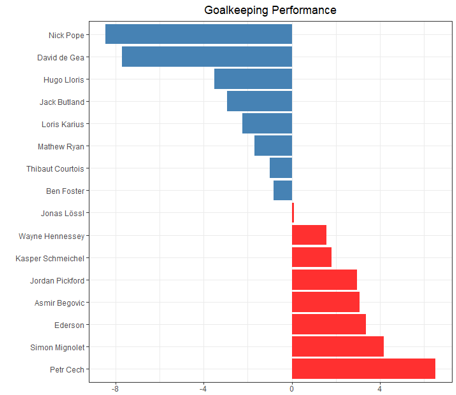
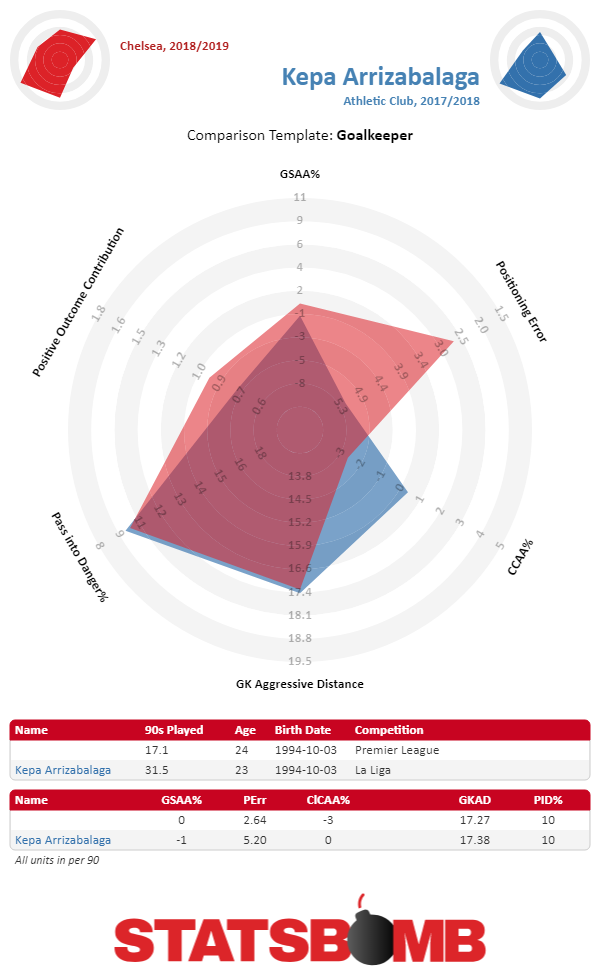
Combine all of those into a visual plot with the outside ring as a top 5% cutoff and the inside ring as a bottom 5% cutoff and you get this:

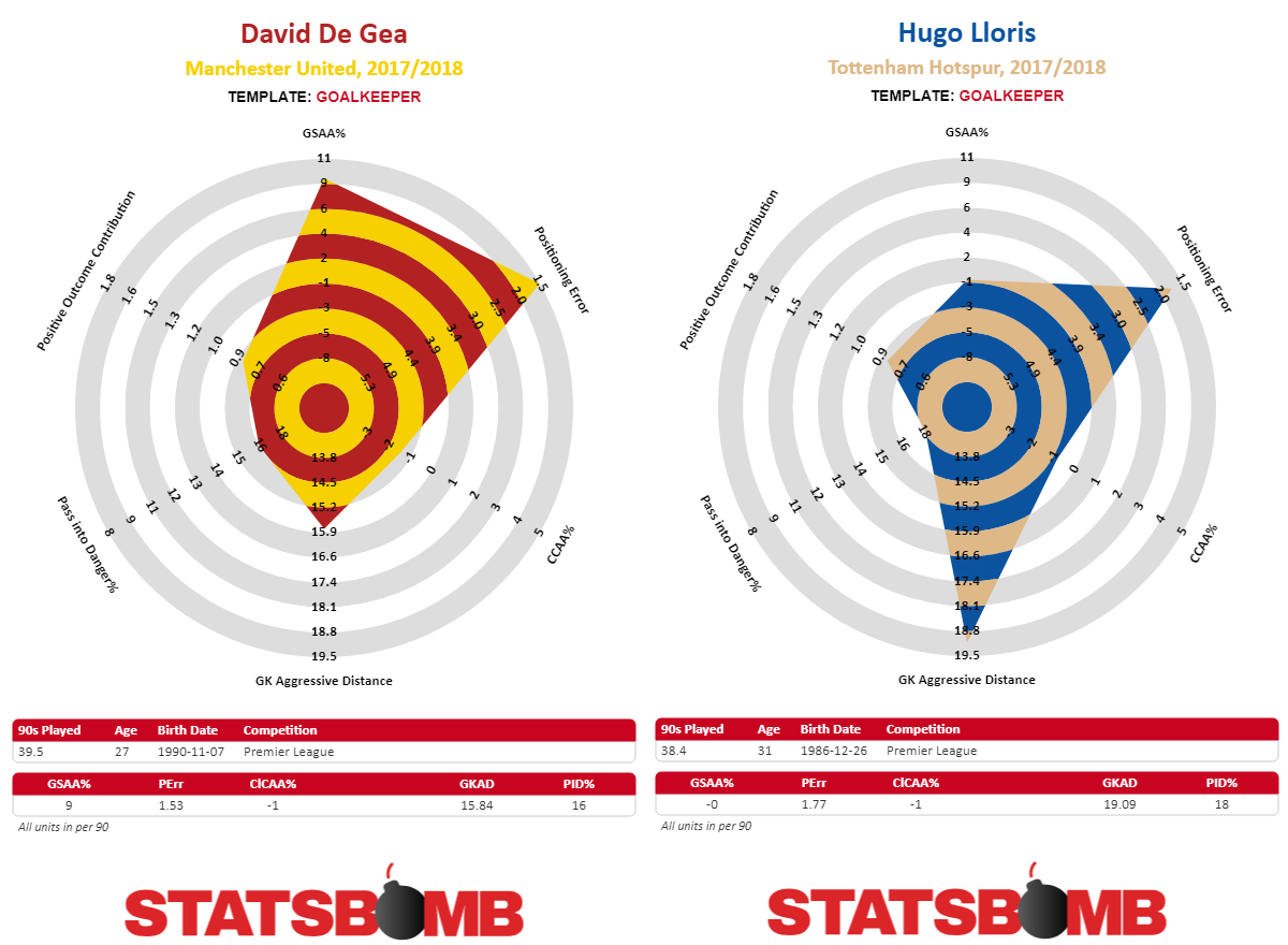
If you have watched these GKs quite a bit over the years, these really do feel "right" in terms of profiling their skill sets. De Gea is great at stopping shots, but doesn't do that much with regard to coming off his line. Lloris is a solid shot stopper who remains very busy around his own penalty area.

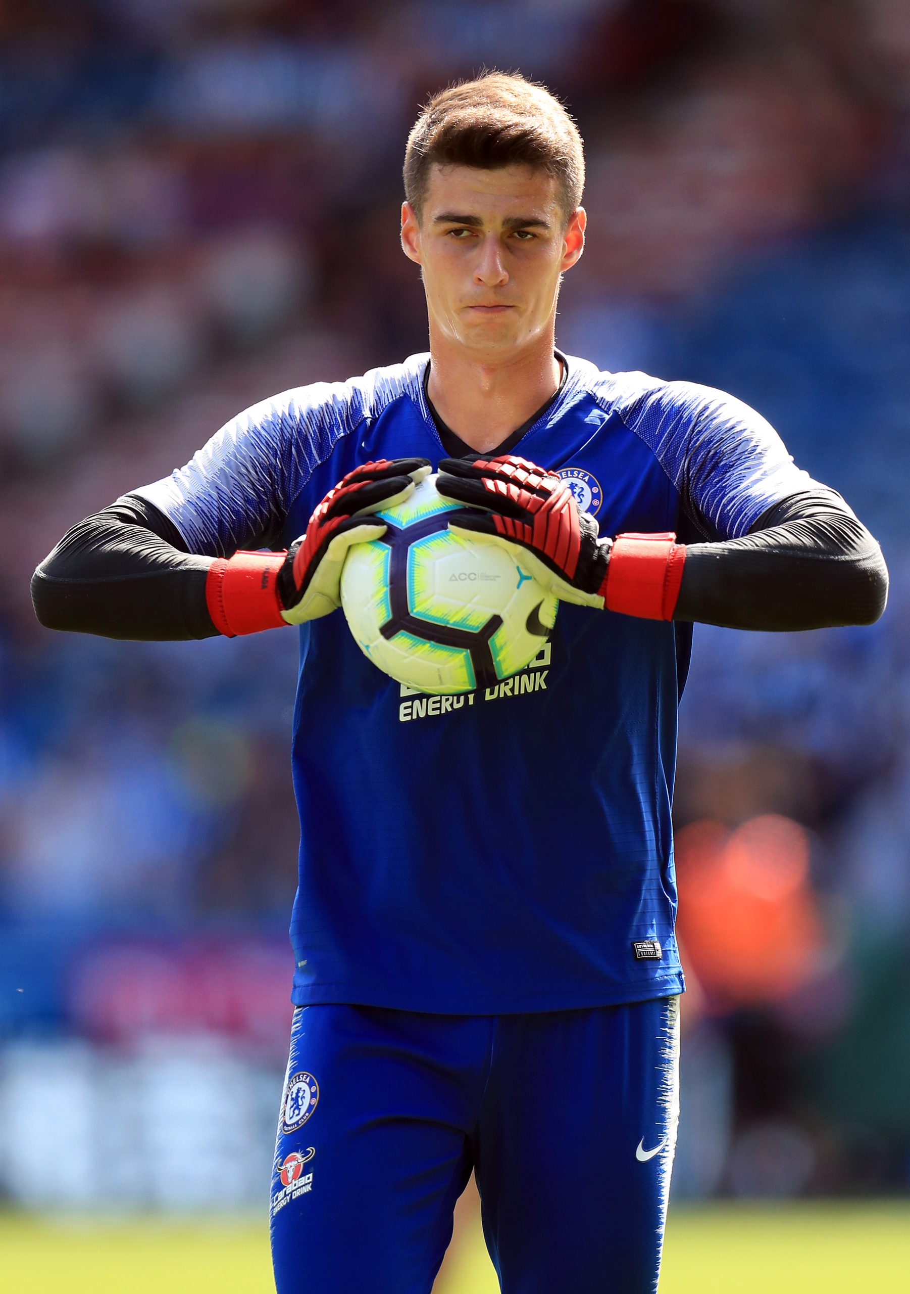
What about Chelsea's Kepa, who Derrick analysed early in the season as being largely average in most of our metrics?

And with our data, we now have detailed GK metrics for every league we collect, from the Premier League right down to League Two. Or MLS. Or Poland. Or your academy...

Goalkeeping is Unsolved

I hinted at this a little in my Barcelona presentation, but from talking to teams around the world, I get the impression very few understand goalkeeping from an analytic and training standpoint, and almost no one is closing the loop with regard to data driven coaching. I've been working with football data for nearly six years now, and it took us until now one to build a framework we liked to evaluate GKs analytically. Because of this, there are just so many things we don't know.

  • How do GKs age? What does the age curve look like?
  • Does shot stopping ability - which appears largely stable - increase, plateau, and decrease at certain times?
  • Are shot stopping and positional error negatively correlated to claim activity and defensive aggression?
  • How do GK skills transfer from lower quality leagues to higher ones?
  • How do they transfer across top leagues?
  • Our model thinks David de Gea saved Manchester United thirteen goals more than an average GK would have last season. Is that type of elite performance sustainable?

And that barely scratches the surface. Not knowing things in sport is dangerous. It throws a random factor into every decision you make that could be tremendously costly down the line. But ignorance becomes way more dangerous when it shifts from "no one really knows these things" to "we're the only ones who don't know these things." If your opponents have better info, and you are the only sucker left on the block...

We designed StatsBomb Data to allow coaches and analysts to ask questions they never could before. And with StatsBomb IQ, we deliver powerful, easily understandable insights to answer those questions.

We're not just here to stop teams from making mistakes, though data is super useful for that. We are here to deliver info that makes teams better in every area of the game. Recruitment, self-analysis, opposition scouting...

And now goalkeeping.

--Ted Knutson

ted@statsbomb.com

@mixedknuts

PostScript

For good or for ill, next month is the five-year anniversary of the first player radars I ever created. For those who want a design history and defense of the visualisation format, relevant links are below.

The first terrible introduction article.

Understanding Radars for Mugs and Muggles

Defending Radars CASSIS Presentation - RADAR WARS. (Also an excuse to poke fun at Luke Bornn and Daryl Morey)

New Radars on StatsBomb Data

Barcelona Football Coach Analytics Summit - Trip Report

Last week I spoke at the FC Barcelona Football Coach Analytics Summit, held at Cuitat Esportiva Joan Gamper, or what is effectively modern La Masia. It’s the complex that houses the training areas for Barcelona’s football teams plus basketball and handball. This is a bit of a report on what I did and learned on my trip.

On a personal level, it’s difficult to convey how special this felt. For a journey that started from absolutely nothing in 2013 to be invited to speak at this kind of event in Barcelona in 2018 is kind of staggering.

StatsBomb. Barcelona.

As if being invited to speak wasn’t enough, the people I spoke alongside are among the best of the best in their fields.

  • Sarah Rudd of Arsenal, one of the pioneers in the field of football analytics.
  • Dean Oliver, one of the fathers of NBA Analytics.
  • Will Spearman, actual fucking particle physicist at CERN, who now solves tracking data problems for Liverpool.
  • Ravi Ramineni, also an early pioneer in football analytics who works for Seattle and gets to tell stories about actually having an impact on the pitch.
  • Javi Fernandes, who merely taught the world that Messi does amazing things just while standing still.
  • And Evil Luke Bornn, whose resume of notable works in the field is taller than the NBA players he teaches now. The less said about this man, the better.

If you could quietly shadow any of these people in their jobs for a day, you’d learn a massive amount technically, statistically, and about the game itself.

Anyway, it was amazing just to be there amongst very humbling company. Below are my notes for the weekend.

For starters, it’s fairly clear at this point that the data revolution in football is ongoing. It’s not just rich teams like Barcelona, Liverpool, and Arsenal that are investing here. And it’s not even all the rich teams, to be honest - there are plenty of teams with money that haven't touched serious data analytics. It’s the SMART teams that are now involved. Early mover advantage is serious. What I know now after working in this field dwarfs what I knew at the start, and even though our early work was pretty good, we're far more capable of contributing useful insight across most of a football club than we were in 2013-14.

What the smart teams know now - with better data access and a lot of money to invest - may even dwarf what we know outside, or at least it probably will soon, largely because they get to incorporate our research alongside their own.

Luke’s Talk - Communicating Ideas Visually

Those of you who saw Luke speak at the OptaPro Forum in February saw a similar talk, which was really good. There were minor adjustments this time around, including a lovely Jose Mourinho quote about people who use stats in football.

The basics are that, despite doing a lot of modelling with a lot of math, Luke’s group at the Sacramento Kings constantly try to find ways to summarise their info visually. This includes plenty of TVs around the practice facility that subtly convey info that helps teach the players about their own games and that of the opponents.

Every shot at the training facility is tracked in their data, and they end up with something like 2.5 million shots a year plonked into their data set. What’s interesting though is that unopposed, the best shooters in their team can make around 90-95% of their shots from three-point range, while it’s closer to 40-45% in games, so basic practice data is not the same as game samples.

Ted(’s) Talk - Game Models and the Full Data Stack

The beauty of not working in a football club is that you have way more freedom in what you get to talk about and how you get to do it. The downside is you don’t get to show cool stuff that has practical, on-field impacts with stories to tell behind it. And you don’t really get to work with tracking data (yet). And you don’t get to have words like “Liverpool” or “Manchester United” next to your name. For like 99% of the audience, Liverpool is just going to be cooler than StatsBomb, and nothing I can do will change that.

One of the requests for my talk from Javi was to discuss how data can help coaches make in-game adjustments. This is complicated, because I don’t work for a club currently and we don’t collect our data live just yet, but as you can see from my talk, I made do.

Sarah Rudd

Sarah found the sweet spot for giving insight about work she does inside of Arsenal while also not giving away super sekrit info.

As teams do more with tracking data, the level of technical knowledge you need to be able to work on those parts of the team increases dramatically. StatDNA in particular has gone from being able to work in CSV files to needing an entire real-time SPARK infrastructure that scales as necessary.

We’ve seen recent discussions about teams being able to use data to communicate with the bench, but I’m not sure the meaningful tech problems, like parsing and digesting the vast amount of info in tracking data in real-time, have actually been solved.

As I noted on Twitter, I really loved Sarah’s slide on “surfaces”, or different analysis frameworks that get repackaged over the top of their tracking info. One of these is spatial control, but the other one is for mapping pressure. We obviously use some form of these ideas at StatsBomb, but I didn't know what to call them. Surfaces feels right.

I missed Dean’s talk because of a meeting, and only caught half of Ravi’s due to room change confusion.

Javi’s talk was a small spin on his Sloan work linked here, plus updated practical stuff for how they are starting to approach the use of complex tracking work at FCB. He also discussed the translation of some pretty massive model and data work regarding a question from Valverde on whether the team was transitioning too quickly and needing to pause to let the opposition retreat and create space.

All of this model work was distilled across multiple visualisations and was eventually communicated by back to the team by the coach, on a tactics board, with two horizontal lines.

Months worth of work, and the coach just drew two lines…

On the other hand, it’s a hell of a lesson in information compression and delivery.

The Spearman

Will’s stuff has really progressed since he was wowing people at Forums with his early work on vectorization of passing models and space control. This talk provided insight as to how he thinks data helps them right now (to remove bias, to act as a force multiplier), plus some cool, relatively basic application info.

His background probably makes him the nerdiest of the professional football analytics practitioners, but Will's so smart and good at communicating that he's able to compress these incredibly complex ideas into understandable bites.

OBSO does an awful lot to help smooth the progression of scoring expectation in a football match to something closer to what we generally see on the pitch. After the event finished, we were taken on the team bus to Camp Nou, where the gala to kick off the Sports Tech Symposium was held and I got this photo.

And the next day there was a morning discussion panel on Analytics for the more general Sports Tech audience. Panels with people who actually work for teams are often boring because they have to be guarded about their insights, but I thought Luke did a great job moderating this panel, and extracting interesting perspectives from the panelists. I recorded some of the highlights in a tweet thread.

The afternoon of this event coincided with a monstrous thunderstorm that went on for hours. I think I’ve been in Barcelona about 20 days in my life and this was the first one I can remember rain. Obviously I failed to bring a coat and ended up drenched while waiting for my cab back to the hotel.

Dinner that night was a jaunt to Enoteca Paco Perez, which was good but not amazing and certainly not value for money. This is basically the opposite of how I feel about the rest of the cuisine in the city, and pretty much Spain in general. I don't know if it's my favourite country in Europe, but it's way way up there.

One thing that was amazing were the brew pubs in central Barcelona. Friends thought I was in Copenhagen when I posted this photo, but no, there is a fantastic Mikkeller pub smack in the middle of Barcelona. Mmm, beer.

And Garage Beer Co was pretty great as well.

After dinner on Thursday, I ended up at the hotel bar with people from Liverpool, Ajax, Huddersfield, and MIT and drank waaaaaaaaay too many old fashioneds, and forgot to set an alarm before passing out into bed. Luckily my internal body clock woke me just in time to catch a cab to the airport for my flight home. Sometimes you run hot, though the hangover from Thursday took forever to shake off, so maybe the karmic scale zeroed out on that one.

Anyway, StatsBomb. Barcelona.

Really smart people giving lots of football insight. Very lucky.

Maybe we can do it again next year? Peace.

--Ted ted@statsbomb.com

@mixedknuts

5 Easy Ways Data Can Give Football Clubs an Edge

In something a little different today, I'm going to discuss five simple ways data can help football teams gain an advantage. There's this idea among football's old guard that data is complicated and difficult, but the reality is, we try and provide useful insight that is easy to understand and interpret.

1) Corner Touch Maps

This is what we call a corner touch map. Marek and I designed it back in 2014 to help out with the set piece program, and it's probably the dumbest, simplest vis we'll ever build.


What it shows is the first touch by either team after a corner is taken.

Why?

Because I can show you a shot map of where teams have had shots off corners, but that only tells you about when they have been successful. These maps more clearly show their plan and - generally - their intended delivery zones.

Check out the map from right-sided corners from Manchester City last season.


This immediately tells you two things. First, they take a lot of short corners, and you need to be ready for those. Second...


City apparently only took outswingers from that side last season, and as a result, neither team had a touch in the box on the left HALF of the six yard box.

And honestly, if I am an opposing coach facing City, my life is nearly impossible as it is, so I am thanking little baby jesus for making my life much easier by allowing me to generally ignore marking that zone (unless there are runners) and overload the zones along the curve. This is just a tiny glimpse of how we use data to help execute set pieces at both ends of the pitch.

2) Arsenal's Left Lane


This is what we call a Defensive Activity Map. Teams are attacking from left to right. The vis attempts to profile where teams are making defensive actions (including pressures), and then compares their defensive activity in each area to the rest of the teams in the league. Zones where they make more actions than average are hotter, and zones where they have fewer actions are greyer or blue.

Arsenal this season are slanted right, possibly because of personnel issues (left back injuries), but maybe as part of a plan? This type of vis doesn't deliver a magical recipe for how to solve/attack tactical issues, but it does help coaches and analysts ask interesting questions. As a coach, I go to the video and try to figure out what is weird. If I am an analyst, maybe I compare the success of attacks down Arsenal's left compared to the right/center and see if there is a vulnerability that way.

3) Similarity Scores

We use these a lot in recruitment, largely because it's easy to talk to coaches about who their ideal player for a position is as opposed to all of the precise things they need that player to do on the pitch.

Once you know which players fill their ideal archetypes, you can then dig into the data for what those players do on metrics you care about, and then plonk down a list of players to scout in the leagues you can afford.

Coach, who is your ideal wide forward?

"I want Lionel Messi."

(Seriously - this always happens. Every coach says this exact same joke.)

And because we are indulgent number wonks who have this already set up in StatsBomb IQ, we can answer the question honestly.

The most similar players to Messi 17-18 in our current data set are:

Neymar Messi (18-19 edition)

Eden Hazard

Raheem Sterling

and Nicolas Pepe, who has been on fire so far this year.

But the fun part of this is that you can actually narrow down the data to the leagues you can afford to buy players in and still have the exact same conversation.

Who is the Lionel Messi of League One? 2017-18 Bradley Dack, maybe? Or Conor Chaplin?

How about in Austria Bundesliga? Uh... Andrei Ivan?

Look, I'm not saying the data is always right in these situations, but shopping for the poor man's Messi apparently comes with serious limitations.

4) Evaluating Goalkeepers

On Monday, we released phase 1 of the Goalkeeper Module into StatsBomb IQ. It allows teams to profile goalkeepers statistically across a broad range of metrics that haven't really been available before because in other data sets, we never knew where the keeper was when a shot took place.

We were messing around with some of the visualisations in testing and came across this fun one for last year. David De Gea and Joe Hart faced almost exactly the same amount of xG in shots on target last season, but how that xG came about and what happened after that was dramatically different.


The vis above is broken into xG buckets, and you'll notice that the shots Hart had to content with were generally much higher quality than those De Gea dealt with. Sadly, nearly every high xG shot Hart faced also made it into the back of the goal.

When it comes to analysing and evaluating GKs with stats, we're just getting started. Expect to see a lot more from us on this topic in the coming weeks.

5) Passing Tendencies at the Team and Player Level


TL;DR

Stats don't have to be complicated to deliver powerful, useful insight. And often the simple stuff is the most effective IF you know where to find it.

Ted Knutson ted@statsbomb.com @mixedknuts

Radar Wars

In August 2018, I was invited to be a keynote speaker at the CASSIS sports analytics conference in Vancouver. These are my slides from the keynote and I did a voiceover that is as close to what I said at the time as I can remember.

The first time I did a version of this talk was at Verily/Google around Sloan time in Boston. I didn't expect Evil Luke Bornn to be in the room, while I knew Seth Partnow would be there ahead of time.

This time, I knew Luke would be at CASSIS, but so was Sam Ventura, and there was a rumour that Daryl Morey was in Vancouver at the time (later confirmed), and could randomly show up as well. That created an odd, but amusing vibe. All of these people make appearances in this talk.

--Ted Knutson @mixedknuts ted@statsbomb.com

Explaining xGChain Passing Networks

(Editor's Note: This was originally published on the StatsBomb Services blog, but the URL was lost in a server move. We have re-published it here so it can be referenced in future work.)

Some of the work we need to do on the StatsBomb Services side involves teaching people how to use what we create. If it’s not practically applicable and/or can’t be taught, then it’s just a piece of art, not analytics.Today I’m going to discuss passing networks, with a specific emphasis on the xGChain passing networks you’ll find on the StatsBomb IQ platform and also on our Twitter feed.

What is a Passing Network?

It’s the application of network theory and social network analysis to passing data in football. Each player is a node, and the passes between them are connections.

The first time I saw them used in football was either a presentation by Pedro Marques of Man City at the first OptaPro Forum, or Devin Pleuler’s work at Central Winger on the MLS site.

We also used them at Brentford to do opposition analysis, specifically to find which players we might want to aggressively press whenever they get the ball, or looking at valuable connections between players we wanted to break.

The application is simple.

  1. Look at a bunch of recent matches for a club and you will often start to see patterns of play and interesting details you care about.
  2. Investigate a little further in the data to find usage information
  3. Go to the video and see what shakes out.

In many cases, analysts only have time to watch and analyse the last 3 matches of opposition on video. Using the passing networks gives them quick info in an easily digestible format that doesn’t cost them an extra 10-20 hours of video time.

Before we go any further though, I think it’s important to speak about the limitations of passing networks. These are a tool and meant to be part of an analytics suite to help you analyse games, but like any tool, you need to understand their weaknesses.

First, each node consists of the average location of a player’s touches. If they switch sides of the pitch regularly, their average will look central, even if they never touch the ball in that area. This is a limitation of the vis and why we ALWAYS use video to back stuff up.

On the other hand, if you want to stay data-based, you could use things like heat maps, or even dot touch maps for every place a single player touched on the pitch to get more accuracy. This is a bit like using shot maps to supplement aggregate data in player radars to get a clearer picture.

The second limitation is that this info is an extrapolation of what actually happened. Did the fullback pass 15 times to the left wing, exactly along the path in the vis? No, of course not. That information is also easily visualized, but it’s just not contained here.

The third limitation is that these don’t actually explain that much by themselves. They take snapshots of actions through a match and combine them into a bigger picture. It’s like a movie where you only see 20 of 50 scenes without seeing the whole thing. Sometimes, you’ll end up with a clear idea of the plot. Other times, you are going to be really surprised when your friends start talking about the whole Verbal Kint/Kaiser Soze thing. They are still useful, but this is another reason why - in practice - we almost always pair this analysis with video work to complete the picture.

Design Stuff

Right, so we have passing networks. Some people do them vertically. We do them horizontally.

Why?

For starters, most humans are accustomed to looking at football matches left to right. High angle tactical cam footage from behind the goal is quite useful if you can get it, but the vast majority of the audience views football in a left to right perspective.

The next thing you notice is that we stack ours on top of each other. This happened as a bit of a happy accident where I noticed a pressing team had a map very high up the pitch. I then put the map from their opponent underneath, and voila! we had a fairly clear view of territoriality in the touch maps.

If you take a step back, it seems fairly obvious, right? There are two teams on the pitch, and each of their actions impacts the other one, so visualize both together. However, actions between two teams aren’t always linked. The shot locations of one team don’t have any impact on the locations of the opponent. Passes do though, so at least in my opinion, pairing them as part of this vis makes sense.

We also have them both going the same direction, which seems to strike some people as odd. All I can tell you is I think the territory element is much clearer if they go in the same direction, but people are welcome to test their own implementations and judge for themselves.

What else do we have… ah yes, the big difference: colour.

With passing networks, there is a real danger of adding so much information that your vis basically becomes unusable. It’s an incredibly info-dense visualization to begin with, so adding more elements is likely to make understanding what you are trying to display harder instead of easier. I think Thom walked this tightrope perfectly, adding the extra xGChain layer of data while still leaving it interpretable, and to be honest, totally gorgeous.

That said, it may take looking at these a number of times before you become comfortable with what they are trying to display. The same caveat was true of radars and shot maps, and is another reason why analysis blends elements of art with data science.

The xGChain Layer

First you need to understand what the xGChain metric is. So, any time a player is involved in a pass in the possession, they get xGC credit, and then we sum up their involvement over the course of a match and colour their node based on that.

Why?

Because this allows us to take the network vis beyond basic counting stats and starts to examine the value of a player’s contribution to the match. Because the colour scales are tied to the 5%/95% cutoffs I started back with the radars, you also get an easy reference for whether a player’s attacking contribution was pretty great (RED), pretty poor (GREEN), or somewhere in between.

We also start to get a sense of how non-attacking players are contributing to valuable build-up play in a way that just makes sense (at least to me).

Quick Reference

  • Size of node = number of touches
  • Thickness of line = number of passes between two nodes
  • Colour of node = linear scale from green to red (.6-1.4 xGCh based on 5%/95% cutoffs)
  • Colour of line = the total xGChain of possessions featuring a pass from A->B (0-.5 values based on 5%/95% cutoffs)

We Still Use Numbers

On Twitter, you will generally see just the visualization. This is mostly due to the limited, bite-size nature of the format. However, on the StatsBomb IQ app, Passing Networks also include all the individual and combination numbers you see below.

The combination of the vis and the numbers represents the whole of the analysis. The vis gives you basics, the numbers specifics, but both are still constrained by the limitations of this visualization format.

Examples

In this one you see Liverpool pushed quite far forward and had massive amounts of possession and created reasonable chances. Pretty much everyone is involved, but Coutinho and Lallana only put up good, not great xGChain numbers for the match. On the Swansea side, Llorente is the only guy up high most of the time, while he and Wayne Routledge both put up big numbers for the game, and Swansea came away with a vital win.

Just a single plot this time from Liverpool’s trip to Bournemouth earlier in the season, mostly to compare same team performance. Here Firmino is posted out wide instead of central, and had comparatively little impact in creating big scoring chances for LFC that match. Normally he’s a fiery red circle, but for this match he’s ineffective green. That’s another cool element these plots allow. Instead of focusing on the full match, you can isolate one player across a number of positions and games and see what it does to their performance.

I posted this one because both team’s maps are pretty incredible. City’s front three have average touches nearly on the 18, and nearly everyone except Claudio Bravo is red or orange. Meanwhile Boro had almost none of the ball and created almost nothing as well. The match ended 1-1, with Boro scoring a very late equalizer. 90% of the time our simulations think City win that match.

It’s always fascinating to see what happens to these maps when two elite teams square off. This is from the 1-0 Dortmund home win earlier this season. Bayern dominated the touches, but Dortmund just edged then in xG, 1.40 to 1.24. Aubameyang was rampant the entire game, and every time Dortmund touched the ball, they felt dangerous while doing a pretty good job of stymying Bayern’s great attackers.

How Do You Use This Inside a Professional Football Club?

Typically what I would do would be take passing networks for the last 10 matches from the next opposition and divide them into home and away games. Stick the numbers next to each of them for reference, and start to look for patterns.

Which players provide the engine for plan A when this team attacks?

Which players have the most valuable touches?

Does their fullback tend to get really high in possession and can we play behind them?

Which players should we look at for potential pressing triggers?

If we have a choice, which center back would we allow to play the ball forward?

Conclusion

This is already long, so I will wrap it up here. We view passing networks as an integral part of data-based football analysis. Provided you understand their limitations, they can provide a huge productivity boost to opposition and own team analysis. We also think the addition of our xGChain metric adds a layer of value to a visualization that previously only contained counting stats.

If you work in football and want to see what else the StatsBomb IQ platform has to offer, please get in touch.

--Ted Knutson

ted@statsbomb.com

@mixedknuts

I Think We Broke Denmark

I was mucking around with an analysis for a customer this week when I ran across something I hadn't looked at in a really long time - the set piece table for Danish Superliga 14-15. That was the season FC Midtjylland (FCM) won their first ever Danish title, largely on the back of scoring tons of set piece goals. Brian Priske was the set piece and defensive coach that season and he and the players probably deserve 99% of the credit for those goals, but a tiny portion of what's left should probably be apportioned to Matthew Benham for the idea that this phase of the game was exploitable, and to my own work in designing the set piece program.

Anyway, the reason why I mention it is not to break my arm patting myself on the back, but because after this nostalgic instance of stumbling across the 14-15 stats, I wondered what the 17-18 set piece table looked like.

That's when things got weird...

Background

When FCM first started having success on set pieces, we discussed how to talk about this in a few internal meetings, especially with regard to questions from the press. I distinctly remember the message we landed on being one of happily crediting player skill and a bit of luck, but under no circumstances should anyone say that we worked on these more than normal.

Set piece goals to outsiders would hopefully be written off as things that magically happened, which was just fine by me.

(This splash image is from Daniel Taylor's scathing piece on Championship owners.)

That's why I thought it was weird when pieces like Sean Ingle's one from February 2015 started appearing in the press. Why was this thing that we knew was hugely important to us and driving a lot of our success, suddenly public knowledge? I still don't actually know, to be honest. My guess was that it provided a counterpoint of positivity to the ongoing Warburton mess at Brentford, but even acknowledging the edge existed - and one that would likely be sustainable long term - seemed incredibly dumb.

One of the big rules of conducting sports analytics inside a team is that when you find an edge, you exploit the hell out of it.

And you never talk about it in public.

Why not? Because professional sport is competitive and you don't want to make your competition any smarter. Plenty of them will ignore the information or not be able figure out how to successfully exploit your edge directly, but even one team copying an edge for free is too many.

In many cases, the edge only exists because people don't know it's there to begin with. That's why many coaches and general managers/directors of football will outright lie when reporters start asking questions in these areas.

The Fallout

In a way, the public discussion created a fascinating economics question. How do actors in competitive economies adapt behaviour to new information over time? Or to put this in more obvious sports terms, what happens when a comparative league minnow wins a title on the back of scoring a lot of set piece goals, and then tells the entire world what they did?

Welcome to Denmark!

That is a lot of set piece goals. Like... a LOT. And from a whole bunch of non-Midtjylland teams. Brian Priske would later spend some time helping giants FC Kopenhagn crush the league (partly also via dominating from set pieces), and his expertise may have dispersed into greater Denmark a bit, but this whole "we too can score lots of set piece goals" idea has clearly caught on up North.

In 14-15, FCM were the only team in the league to crush this particular phase of the game, scoring 25 goals, while three other teams barely cracked 10. Three years later, eleven of fourteen teams were in double digits.

I Now Have SO MANY QUESTIONS

One of the things I used to argue about with my long-time collaborator Marek Kwiatkowski was whether working on set pieces more in training forces trade-offs in other areas. I was firmly in the "you can score more goals, period" camp (Marek is a natural uber-skeptic), but it was mostly just theory. However, now we get a chance to look at exactly that.

Are the total goal outputs largely fixed and you just shuffle between open play and set pieces, or can you just plain score more goals by adding set piece expertise? To put it another way, can you create a bigger pie or are you just carving out different sized pieces?

Set piece goals per game, 14-15: .55
Set piece goals per game, 17-18: .75
Total goals per game, 14-15: 2.41
Total goals per game, 17-18: 2.91

Set piece goals per game have gone up by .20, while overall scoring is up half a goal a game. This lends weight to the bigger pie hypothesis, and not merely different sized pieces.

Note: The Danish league changed structure between 14-15 and 17-18 by adding additional teams and the world's most complicated playoff structure, so it's not as clean as an analysis as it might otherwise be. Professional sports...

But wait, you say... some of that increase can be explained by competitive reasons, right? By increasing the league size, they probably brought in some weaker teams that were more likely to get blown out.

A fair point. Going to the first year of the 14-team league, we see... .63 goals from set pieces and 2.65 goals a game. Again, more set piece goals and more goals overall.

Shouldn't there be an equilibrium, though? Teams are scoring more set pieces, and they presumably know how to defend better against them as well, right? So why are we seeing so many more goals?

This is where we get to a bit of theory. Back when I was at FCM, someone asked our striker Duncan about defending set pieces, and his reply was that if the timing and delivery were right, the goals were basically unstoppable.

Now part of this comes back to creating complexity in your delivery and route patterns, and who you are targeting on all your different set pieces. You can't just do what England did in the World Cup and run the same play over and over again and succeed. You might be able to get away with that for a few games, but you'll struggle mightily through a league season. Defenses will adjust to that type of basic plan. However, if you are smart about your planning... well, maybe the goals actually are unstoppable.

Given the fact that the fewest set pieces goals conceded in the entire league was nine (and three seasons earlier, it was just four), either everyone in Denmark suddenly became really bad at defending set pieces or everyone became much better at executing them in ways that were difficult to stop.

I lean toward the latter.

The analysis above isn't scientific or conclusive. There are confounding factors, and football is an inherently complex game that often defies simple explanations anyway. However, I find the dramatic increase in set piece goals across the entire league here fascinating, and if we were building a case that you can increase set piece goal production at the cost of basically nothing else, we now have some evidence that perspective may be correct.

My Own Work

One of the things I am happiest about regarding set pieces is that what we built at Midtjylland was sustainable, despite the fact the coach initially responsible for the success was poached by a bigger club. Well done to Mads Buttgeireit for continuing to innovate in this area, and well done to FCM for listening when I said, "You HAVE to get Priske a fucking set piece assistant or you'll lose tens of millions of euros in value if he ever leaves."

Listening is underrated.

We also know for a fact that data analysis has dramatically changed the way that both baseball and basketball are played now. It's not just about finding better players, it's often about finding fundamentally superior styles of play before your competition and then beating them with it over and over again until they adopt your style.

In light of the above, I still find it amusing that this summer, no one on the club side came and talked to us about set pieces. The World Cup of Set Pieces was great. I broke down a lot of things, both on the site and on Twitter. Still, zero interaction.

¯\_(ツ)_/¯

In a way, this was really good, because I honestly did not have the bandwidth to spare while also launching StatsBomb Data. (I probably still don't, but football is a siren's call.) In another way, it's just continuing evidence that football is glacial when it comes to adopting new ideas from outsiders. Lest you think things are progressing behind the scenes in England, the Premier League scored 214 set piece goals in 2017-18... and 216 in 14-15. Fair dos to Bournemouth and Eddie Howe/Tom Webber for leading the league in this area last year though.

Our price for consulting on this is not cheap. We don't need to be. We still get you goals at a huge discount vs what you pay at the player or manager level without cannibalising anything else. And we teach your club personnel how to sustain this edge. The value you get at the club level is stupidly large.

And like I said above, it's not like teams were put off by the price... no one even had the conversation. *

One thing I do want to note is that if you are a national team and want help with set pieces for the Women's World Cup, definitely get in touch because like with our data, we will offer a deep discount to support the women's side of the game.

Conclusion

I will always be a nerd at heart, so finding data on how the Danish Superliga ecosystem changed after we shocked it in 2014-15 was super exciting to me and I had to write about it. While it doesn't offer conclusive proof of anything, it certainly allows you to ask interesting questions about what would happen if the rest of the football world starts to adopt advice on better ways to play the game that were reached largely via data and analytics.

Thank you for listening!

Ted Knutson
CEO, Founder StatsBomb
ted@statsbomb.com
@mixedknuts

*And I also know that plenty of you are in clubs already and listening, and you'll take what you learn from us and do it on your own and probably succeed at least somewhat, because you are smart and it's not that hard to do better than what you have now. It's probably pretty hard to score 25 every season like FCM though.

Other Writing

Changing How the World Thinks About Set Pieces Set Pieces and Market Inefficiency.

Historic data used in this piece was licensed from Opta

The World Cup of Set Pieces

The World Cup is upon us. FIFA's glorious international smorgasbord, where every day throughout the group stage, fans are treated to an incredible array of matches. Some, like Spain vs Portugal, are incredible. Others, like Croatia vs. Nigeria are mostly inedible, but you don't know that until you have already eaten it, so it is part of the fun. Plus, there's always more to gorge on tomorrow!

Long-time StatsBomb fans know that we are advocates of set pieces.

I have written two major pieces on this, the first discussing why it seems to be a big hole in the game, and the second with more a focus on market dynamics, and how much cheaper it would be to generate additional goals via improved set piece coaching than trying to buy the same improvement in a forward. We also developed and maintain an ongoing Set Piece Program as part of our consultancy work for teams at the club level and for international federations.

Usually, set pieces account for 25-33% of all goals scored in a league. They almost never account for that amount of training time or resources. That percentage seems to jump a bit in international tournaments because teams are more risk averse, leading to fewer open play goals, but similar numbers of set pieces. Thus far in the 2018 World Cup, set pieces account for right around half of the goals. Presumably this will slow down a bit, but I thought it would be fun to break down certain elements that stood out for me thus far.

Ronaldo's Changing Technique

Ronaldo's generally used a knuckleball technique on free kicks for years now, to very mixed success.

This technique is useful for flighting the ball from range with very little spin. It makes it easier to hit it hard, but depending on the characteristics of the ball and the wind, not always that easy to hit the target because the ball can move in unexpected ways. However, when it comes down, it can descend hard and fast. And "unexpected" isn't always bad, because it causes problems for GKs as well. Prior to his goal against Spain that made it 3-3, he'd apparently had zero success in his last 45 attempts from direct free kicks.

As Ronaldo was lining up the kick, Danny Murphy said on English commentary that he didn't think he could get the ball over the wall and back down again. That seemed a bit silly, because good takers can easily get the ball back down from 22-23 yards, but maybe less so with the knuckler? Let's face it, Ronaldo just hasn't been great at free kicks for a while.

Hence I was surprised to see this.

Side foot, gorgeous top and side spin, perfect placement. BOOM! 3-3. Portugal didn't even set up a screen to help block the goalkeeper's sightlines - Ronaldo's free kick was just that good. However, the difference in technique is notable. Professional golfers constantly work on their swing to keep adjusting to the changing reality of their body, and also to work through current problems.

In this case, it's like Ronaldo put away his driver for once and picked out the 8-iron instead. There is no reason this can't and shouldn't happen in football, and it was really cool to see Ronaldo change up technique based on circumstances. Speaking of free kicks...

GK Screens

I don't know how Kolarov hits that so hard and with so much spin in what looks like an easy motion, but that's his gift. Unlike on Ronaldo's kick, Serbia do send two players out to the wall to help mess with the keeper's vision, and it looks like it may have had a small effect. Check out the double hop from the GK as he sets his feet to save (admittedly easier to see in the video highlights).

Now the extra screen may or may not have had an impact on when the GK saw the ball, but there's a good chance the keeper was unsighted until the very moment that ball came over the wall, which is a big edge. This is what you'd expect to see and why you do it. GK reaction time = space to hit the target where he can't make the save. He has to reset his feet a second time before he picks up the flight of the ball and make a leap. Maybe it was unsaveable, but good process is good process and deserves noting. (Note: I discussed GK screens a lot more here.)

Read Plays

Diego Costa's second for Spain was very interesting. First of all, this is normally (and correctly) a direct shot on goal.

Usually you line a bunch of guys up with the wall, someone whacks the bejesus out of it, and a small percent of the time, it's a goal, and once in a very rare while you get a lucky rebound. Spain didn't do any of that.

Look at the formation of the Spanish players above.

They have split two players very wide here on a free kick from dead central. Why? David Silva does what American sports generally call a "read", analysing who is matched up against each of the wide players, looking for a potential mismatch. In this case, he sees Busquets at 1.89m matches against Guedes at 1.78.

(Watch the video just before he takes the kick and you can see him glance again to look toward Busi.)

This triggers the floated wide ball, where Busquets is more likely to beat his man and win a header back down into the center of the box, which can then be cleaned up by whichever runners manage to get clear of their man (in this case it was Diego Costa and Gerard Pique). If neither wide player is mis-marked, Spain can either take the DFK, or restart the possession normally.

All of this is based on the kick taker's analysis of the situation. It's a clever way of testing the opposition understanding of the strengths and weaknesses of your team, and building variation into identical formation setups. All it takes is one screw up to yield a goal, and the vast majority of football matches are decided by one goal alone. Thus far in this World Cup, a remarkable amount of those goals have come from set piece situations.

Now if you'll excuse me, I have so many more games to watch.

Ted Knutson @mixedknuts ted@statsbomb.com (Header image courtesy of the Press Association)

Let's Talk About Press, Baybee

I have two major things on my agenda for today’s piece:

  1. Get a positively ancient Salt n’ Pepa song stuck in the heads of most of our readers simply by reading the title.
  2. To deliver a foundational piece discussing why we here at StatsBomb seem to care a great deal about pressing, both at the team and the player level.

However, in order to examine the press, we first have to discuss an often-overlooked topic in online football discourse: defending.

Defensive Choices and Principles

All tactical choices in football start with defending. Choices for how to defend strongly impact what types of players are needed across all the positions in the squad. The defensive structure of the team determines what is possible and necessary in the transition to attack. Regardless of what style of defending you choose, every system has inherent trade offs. High pressing leaves you vulnerable to high quality shots when opponents break the press. Deep blocks rarely restrict volume of opposition chances, but instead try to restrict the quality of those chances. Middle blocks try to strike a balance between restricting quantity and quality, but take high levels of organization and can concede too much space to dangerous players out wide. It’s worth noting that even inside these categories there remains a huge amount of variation.

Deep Block – Traditional English

This is the style usually employed by teams managed by Tony Pulis, Sam Allardyce, and weirdly enough, Arsenal. (Arsenal’s defense has been coached by Steve Bould, though Arsenal tend to include some mild gegenpressing.) It continues to see moderate success in the English lower leagues. Deep Block teams sacrifice control of the defensive half of the pitch in order to better control the area in and around the box. Defense of this style is typically happy to concede higher volumes of shots from distance on the assumption that few of these will be scored.

Middle Block (Portuguese and Italian Variations)

This style of defending is focused on jamming the middle of the pitch 20-40m away from goal with bodies, thus forcing opponents wide if they want to progress the ball. Progression through the middle is heavily contested, and progression wide often gets trapped, or results in easily cleaned up crosses. They will allow the opponent a ton of possession in “safe” areas, far from goal, but get aggressive as the ball approaches danger areas. Strengths of this style are that it blends some of the benefits of low block and high press together. Good middle blocks are excellent at constraining shot volume, while also leaving opponents with poor quality shots when they do get them. Antonio Conte’s teams are a good example of elite middle block teams, but it’s fairly common among well-trained Italian and Portuguese head coaches.

High Press – Many Variations

Pressing styles have gained popularity in the last decade, largely because of how successful they have been. Guardiola’s style is an elite positional press that almost no one in football really replicates. Thomas Tuchel’s press from his Dortmund days is probably the closest anyone has come, but still differs in execution. Jurgen Klopp’s press is also different from Guardiola’s, but has also been very successful over the years. It comes out of the Ralf Rangnick/Hoffenheim school of zonal pressure, but has morphed enough over the years from its roots that it’s probably unique. Then you get to the Salzburg/Roger Schmidt press, which shares common roots in the Hoffenheim school, but is now probably the most aggressive of the lot.

Those teams typically run a 4-2-2-2 formation, and are defined by a narrow, extremely intense pressing style that focuses keeping the ball high up the pitch in wide areas, and winning the ball back early to then immediately transition against the goal. Adi Hutter has also successfully used this style to dominate the Swiss Super League this past season, despite a fairly massive budget disparity when compared with Basel. The benefits of high pressing come from severe shot constraints to the opposition.

Elite high pressure teams can give up as few as 6.5 shots per match across a season, which is an absurd number. The flip side of this is giving up very good chances when opponents do break the press, which happens more against teams with talent or when your pressing side lacks pace. Additionally, this type of defending takes very high physical output, which can wear a squad down over a season, especially across multiple competitions. Finally, it requires serious athletes, with pace in nearly every position and some amount of tactical smarts, because the tactical concept of “covering shadows” is damned important. Note: Man-marking presses like the Dutch style are probably outmoded and tend to constrain the attack too much to function well in the modern day, especially in better leagues.

Traditional Defensive Stats

Historically, the defensive stats we had access to were tackles, interceptions, fouls, clearances, blocks, aerial wins, and fouls, plus a few minor additions. They are useful, but inherently limited in helping you evaluate team tactics and player output via data (and believe me, I have tried). Pressures as a type of event don’t exist in other event data sets, but they do in StatsBomb Data, and we think this is a Big Deal(™). Let me walk through some examples to better illustrate why. Take two teams from the English Premier League 17-18. These are their traditional defensive stats per game:

On the surface, there is very little separating these teams, and that includes when you look at their defensive activity maps. These visualisations plot where defensive actions occur on the pitch in each zone, and then colour them hot or cold compared to league averages.

So it looks like Team A is a little more active defensively each match based on the stats, and they defend in very similar areas. But what happens when you add pressure data into the mix?

Team A looks basically the same compared to league average, while Team B looks complete and utterly different with the incorporation of pressure data. Now, instead of a traditional deep block, Team B looks absolutely miserable to play against. You simply do not get time on the ball against Team B almost anywhere on the pitch. Team A = West Brom Team B = Burnley These are two teams you could easily describe as Deep Block in style, but boy do they vary in execution when you play against them, and from a data perspective, you only see that when you layer in pressing information.

Pressure Players

Let’s drill down a little further into analysing individual players. Like many sports, football is an invasion sport. As in basketball and hockey, each team attempts to defend a goal, and possession is traded back and forth regularly between both sides. The two obvious questions about gaining an edge in this system then become:

  1. Can we get an advantage over our opponent in scoring chances or difference per possession, or trip up and down the pitch?
  2. Can we create more possessions?

Traditional defensive stats usually reflect a possession change. Defenders can tackle or intercept the ball, they can get a ball recovery off a mistake, they can win headers, they can block/clear the ball, the ball can be claimed/saved by a Goalkeeper, and that’s about it. But there’s also one other thing they do more than anything else, that hasn’t really been recorded before: they can force mistakes. And that is where pressure comes into play. Take Roberto Firmino from this season.


77 total tackles and interceptions... 723 pressures. The broad definition of a pressure is to close down an opponent in a way that forces them to make a decision. And sometimes - actually, LOTS of times - those decisions* fail and result in a change of possession. *Decisions, or actions under pressure, or inevitably, because Twitter shortens everything, AUPs Here’s Firmino’s map again, but this time with a focus on just those actions that resulted in an obvious change of possession (tackle, interception), or when his pressure caused the opponent’s action to fail (usually a failed pass).

76 tackles and interceptions… 100 forced failures of actions under pressure. Nabil Fekir is an excellent player, and I’ve been high on his potential for years, but in addition to his attacking skills, he had a monster season pressing the opponent at Lyon. This extra layer of information reinforces why Liverpool should be interested in Fekir on any number of levels.

And it’s not just the hard-working, sometimes underappreciated forwards that benefit from this info, it’s also hard-working, often underappreciated defensive midfielders as well.


Kante is everywhere, but so is Ndidi, at least when it comes to defensive output. Kante's numbers are probably more exciting here because Chelsea tended to dominate possession more than Leicester this season, but both of these gentlemen Do Work.

Further Research

  • The visualisations above only show failures caused immediately after/by the pressure, but sometimes a press is a destabilising factor for future actions in a possession. We can continue the filtering process to find possessions that broke down 1, 2, X actions after the pressure from a player to better attribute credit.
  • For any particular match, we can look at who is being pressed, and specifically which actions are being put under pressure, and where. This can help in building game plans, but also in better evaluating where your own attacks are breaking down.
  • How does pressing change over game time? With fatigue? After subs? Based on game state?

Thank you for listening to me ramble on about why we think pressure events are such a big deal when it comes to analysing football. We're admittedly just scratching the surface on the information from the new data set, but the new avenues for research opened by StatsBomb Data are incredibly exciting.

Ted Knutson

ted@statsbomb.com

@mixedknuts

Photo courtesy of the Press Association

The Dual Life of Expected Goals (Part 1)

“Let me explain... No, there is too much. Let me sum up”  --Inigo Montoya

The great thing about running a football stats website is that you get to do things like devote thousands of words entirely to a single statistic, and there’s nobody to tell you not to. So, let’s get into expected goals, what it is, where it came from, and most importantly where it’s going from here. Lots of football fans have only experienced the good ol’ xG as a single game number, either included on the bottom of a TV scroll, next to shots, fouls and assorted other stats, or on twitter as a pretty little shot map. That wasn’t what it was designed for though. Single game xG is a useful tool (and one we here at International StatsBomb Headquarters are committed to making more useful) but it was originally developed for something entirely different.

Goals: The Only Stat that Matters

In the beginning there were goals. Just goals. That was the only thing that was counted. Whoever had the most goals won the most games. You play to win the games. Therefore, the only thing that mattered was counting goals. There were some exceptions of course. Charles Reep notably counted passes by hand well before the rest of the world decided to do the same. But, for the most part, people watched football and counted goals, and the years went by. Eventually, somebody decided to count the passes leading to goals as well. And voila, there were assists.

At that moment, at the dawn of statistical time, a schism was born. On a team level, the statistic of goals gives you more information, than if you didn’t have it. Not only is it the way in which we keep score, but also the knowledge of a team’s goal difference helps observers determine how good they are with more accuracy than if they knew whether they had won or lost. On the other hand, knowing about a team’s assists doesn’t give an outside any more information about how good the team is. There’s a reason that goal differential is a thing and assist differential isn’t.

Statistics, at their heart, serve two purposes. The first is predictive. What do knowing these numbers tell us about the future? Knowing how many goals a team scored and conceded makes people better able to predict how likely a team is to win future games. The second is descriptive. What do these numbers tell observers about how things happened? Assists are a descriptive statistics, and a useful one, but they aren't especially predictive. If assists were zapped out of existence overnight there'd be very little impact on the world's ability to predict the outcome of football matches.

That’s a tension that has always existed, and it’s one that remains at the heart of how the football world is increasingly using xG.

Shoot Your Shots

Before getting to modern statistical times, there’s one more stop to make. One of the first things that statisticians began regularly counting was the number of shots teams were taking. It’s an obvious statistic to look at, and it turns out that it’s pretty important. You cannot score (for the most part) if you do not shoot. This is not rocket science. It’s not even bottle rocket science.

As Ted and James talked about on the last StatsBomb podcast the groundwork for looking at shots in football was laid in hockey. In hockey shots served both a clear descriptive purpose and provided predictive utility. Shots in hockey are a pretty good way of describing who has possession. Descriptively, by saying teams have a lot of shots, you can also say that teams have a lot of the puck. Predictively they also have a lot of value. In hockey the best teams reliably take a lot more shots than their opponents, but it’s very hard to control how often the shots a team takes are scored. By measuring how many more shots a hockey team takes than their opponents, it gets easier to predict which hockey teams will do well in the future.

Those findings were applicable to football, but only in a limited way. The first major problem is that descriptively comparing shots is not a particularly good way to measure possession. The relationship between possession and shooting is a lot looser in football than hockey (this will surprise nobody who has watched either sport for more than ten minutes. It’s mostly down to one sport being played with feet on grass and the other one being played with sticks on ice. Small things like that.). Using shots as a proxy for possession doesn’t really work. Broadly speaking football uses passes played to measure possession, which is better, but not perfect.

Despite that, measuring shots is still pretty good as a predictive tool. Knowing how many shots a team has taken and conceded makes you even more able to predict how they’ll do in the future than if you only knew about their goals scored and conceded. That’s great. It’s also frustrating. The gap between shots’ predictive power and descriptive power makes it impossible to turn the information we get from shot differentials into anything resembling insight.

The information those stats contains does a pretty good job of explaining what will probably happen next, and a terrible job of explaining why. If a team is scoring a particularly high percentage of their shots, or on a particularly cold run, looking at shot numbers doesn’t offer any answers as to why it’s happening. All that they have to offer is an assurance that it probably won’t continue.

One thing that’s important to note here is that just because these stats can’t provide a reason for the divergence between shooting and scoring doesn’t mean there isn’t one (or many), it just means that those reasons are incidental to predicting what comes next. That’s an answer that’s useful to only a very small group of people (mostly the ones looking to put a bet down). It doesn’t help people interested in understanding what’s going on, people like, say, coaches who have to make the hundreds of daily decisions which go into running a team.

And now, finally, we get to the good stuff.

What to Expect When You’re Expecting Goals

Using past shots to predict how will teams will do in the future is good. Further modifying that to factor in what type of shots teams are taking is even better. That’s, in effect, what xG does. Notably what xG was not developed to do is accurately describe a single shot or a single game. Rather, it was designed to take lots of information, thousands and thousands of shots, synthesize it, and use that information to represent how many goals a team might reasonably be expected to score or concede given the types of shots they’ve taken and given up.

This is good and useful information. There are ample studies showing how this process is better at predicting how a team will do in the future than pretty much anything else out there. It takes the old information, based purely on the volume of shots and improves it. It turns out that sometimes when a team is shooting better or worse than average it’s because on average they’re taking better or worse shots.

There are two problems with xG as currently constituted. The first is that just like with a basic shot based metric teams frequently spend stretches of time doing better or worse than where the metric thinks they’ll end up. And, just like with shots, xG doesn’t offer many answers other than the (quite good) prediction that eventually that will stop. It explains part of what shots miss, but there’s still plenty of room left blank.

The problem of what xG might be missing in the short term is encapsulated by how it’s used for single games. It’s important to start off by saying, that xG maps contain more information than pretty much any other form of quick glance game recap. But it’s not what it was designed for. The total goals a team score will often differ wildly from what xG predicts. Frequently this is by design. If a player misses a sitter, xG and actual goals should differ. That’s the point. The model is crediting the team for creating the chance, understanding that in the future creating those chances will lead to goals.

So, there’s a way in which single game xG totals differing from the result is a direct sign that the model is working. But, there’s another reason they can differ as well. The value that an xG model assigns to any given specific shot is based on an average of past similar shots. So,  it takes into account things like location, whether or not it’s a header, the kind of pass that led to the shot, etc etc, mixes them all together and spits out a value.

The problem with averages is that they’re averages. Any single chance can differ significantly from that average. Because we know that xG works, and is quite predictive, we know that over the long run the ways those individual shots differentiate from average more or less cancel each other out. But, during a single game, that definitely doesn’t happen. A team with a high xG total but no goals might have missed a bunch of good chances, or the chances they had might have been harder than the model predicts. Single game xG totals don't differentiate between the two.

Luckily StatsBomb can help with that problem. To find out how, stay tuned for part two.

StatsBomb Data Launch - Finding Better Goalkeepers

Embedded below is the second of our presentations from the StatsBomb Data Launch event. The presentation is given by data scientist Derrick Yam and is called Beyond Save Percentage, to pair with my presentation called Beyond xG. However, Derrick's ambition here is actually much greater. He asks:

  • Can we use the new information in StatsBomb Data to help find the best GK in the world?
  • At the same time, can we start to find up and coming GK to keep an eye on?
  • Can we help quantify GK value through data?
  • and Can we build a better framework for data analysis of GK to help do all of this?

Check it out...