Modeling Passing Uniqueness

StatsBomb is unveiling three new (to us) passing metrics to better profile passers in professional football. Why passing metrics? Because this is football and passing is omnipresent. For better or for worse, the ubiquitous event may need even more attention than we’re already giving it. It is our objective through these metrics to evaluate a passer’s creativity, their predictability and frankly their overall passing ability.

Thanks to some of the great work by peers made publicly available, we were able to put these together without too much time consuming innovation. We will release the metrics in a series of posts to spread out the joy and peak the eagerness for all you nerds. The first metric we are releasing today is “Pass Uniqueness”.

Pass Uniqueness Methodology

“Pass Uniqueness” is a variation on previous work (I am not claiming the novelty of this idea in the slightest, but I am expanding on it thanks to the vast amount of data over here at StatsBomb). The original methodology is available  on FC RStat’s GitHub, you can even find the original code. The advantage of a uniqueness metric is to see which players make less common passes than others. Although, as the original write up notes, a less common pass is not necessarily an advantageous one. It could be completely erratic, but in and of itself it is unique. In a follow up post, we will talk about identifying advantageous passes.

The basis for these methods is largely the same as previous iterations, however we make some key extensions that require a bit different methodology.  We extract the similar following variables describing each pass:

  • duration
  • length
  • angle
  • height.id (1 = Ground Pass, 2 = Low Pass, 3 = High Pass)
  • body_part.id (1 = Right Foot, 2 = Left Foot, 3 = Other)
  • location.x
  • location.y
  • end_location.x
  • end_location.y

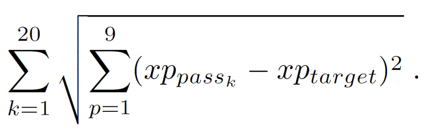
At the competition level, we then do a KNN search for the 20 most similar passes (k = 20) to each individual pass (target). Most similar is defined as the closest passes in Euclidean distance to the target pass. The “uniqueness” metric is calculated as the sum of the euclidean distances for all k = 20 passes. More formally,

There is some controversy in using Euclidean distance with categorical variables like height.id and body_part.id. However, for simplicity, we make the intentionally, naive assumption that their numeric IDs are continuous and we order them intuitively so that Ground Pass is closer to Low Pass which is closer to High Pass.

There are other metrics to better account for categorical variables and a good reference for KNN distance metrics can be found here. Since the euclidean distance is aggregated across all variables in the search, it is important that we scale all variables to have the same mean 0 and standard deviation 1. Otherwise, variables on a larger scale would unjustly carry more weight just because their individual distance metric would be larger than the other covariates.

The R package FNN makes this search very quick, a data set of 3.2 million passes takes about 2 minutes to run. To reduce dimensions and to keep the sample for each search more homogeneous, we only search for nearest neighbors inside of each league and backdating up to one season. It’s important to note a limitation here. The limitation is that with larger sample sizes there is a higher propensity for more similar passes and as a result fewer unique passes due to the lower euclidean distances. In order to make the uniqueness metric more scalable across bigger and smaller competitions, it would make sense to set k equal to a proportion of the total population within each competition.

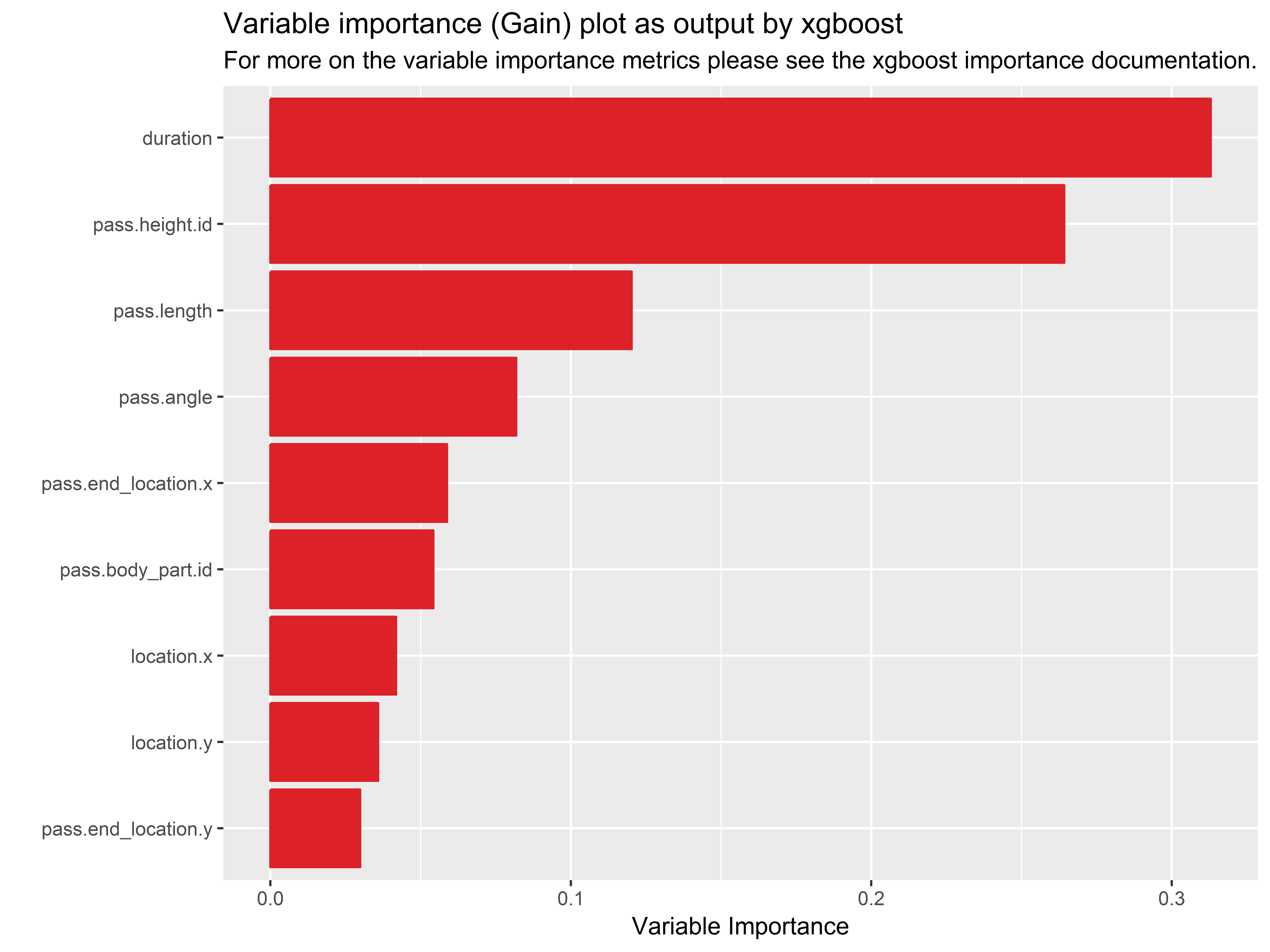
We account for that limitation in a different way. We extend the KNN search into a model based method. Using the “uniqueness” value calculated from the KNN search in each league, we then regress the uniqueness value on the same covariates in the original search. We could do this in a simple linear regression, but one would have to properly specify the non-linear relationship between location coordinates and the uniqueness. Instead, we use a tree based method to handle the non-linearities seamlessly. Using extreme gradient boosting (xgboost), we construct trees with a maximum depth of 12 different predictor combinations training for 1000 rounds.

We then check the correlation between the actual uniqueness from the KNN search and the predicted uniqueness from the xgboost method. A scatterplot of our results is shown below:
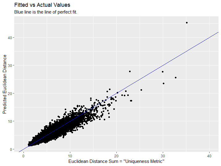
Correlation

It looks like we did pretty well! The correlation between observed uniqueness and predicted uniqueness was 0.967!

Now, why is this model based extension helpful? There are a few reasons. The first is that the original framework of the uniqueness metric requires searching an entire competition at each update. That can be computationally expensive especially if you have to update competitions 2-3 times a week. Secondly, the results are dependent on the individual competitions that they are in and therefore cannot easily extend into new competitions, especially competitions with fewer matches.

Using a model based approach allows us to quickly extend the “uniqueness” metric to new passes in new matches and competitions. The model based approach also allows us to further investigate the most important features influencing the actual “uniqueness” value.

Applications

With that long winded methodology out of the way, let’s get into all the cool and intriguing applications. The uniqueness metric describes passes that are more unusual than most. It can separate extraordinary passers from the ordinary and it can be used to better grade pass difficulty, pass predictability and positive attacking contribution. Let’s first look at the distribution of pass uniqueness for different player’s positions.

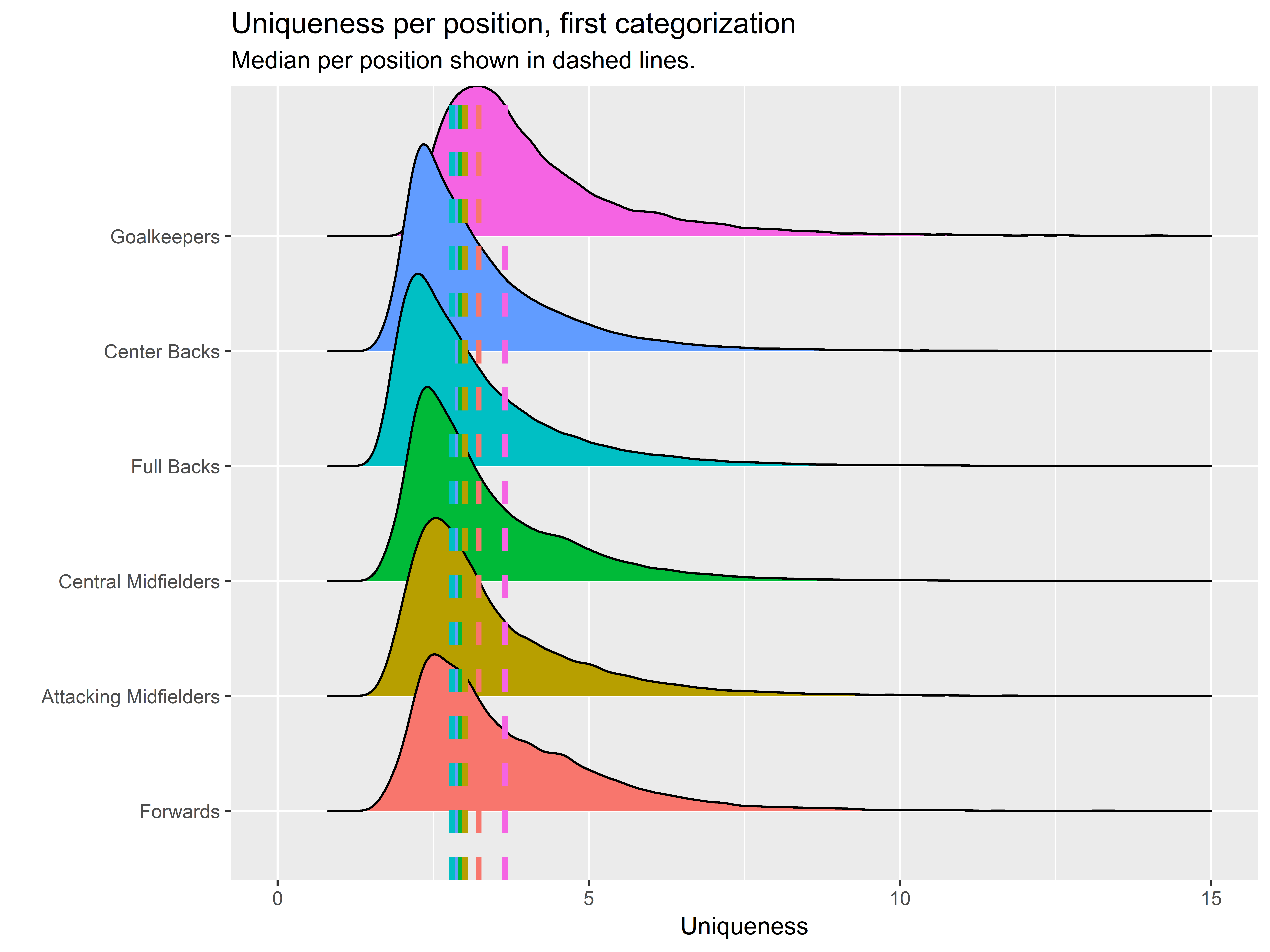
The density plot above proves a very interesting point and also highlights a potentially limiting factor of this metric. Goalkeepers are the most “unique” passers in the game!  Much as I’d like to shout out my beloved and under-appreciated position, unfortunately, that just can’t be the case. If goalkeepers were the most unique passers in the game they wouldn’t be playing in net.

What we are actually seeing here is a flaw in the KNN search, because goalkeepers physically pass less frequently than their counterparts in the field, their passes have less similar matches in the KNN search and therefore garner higher “uniqueness” values despite their passes probably being insignificant. The next most unique position category are forwards. These two groups being more unique passers than others actually makes sense. They are making passes in places where the fewest passes exist, and therefore are the least common passes in the game. Recalling this potential positional bias, we will continue to make comparisons inside of position categories.

Let’s see what some “unique” passes look like for each position. Recalling the importance of the duration variable in the uniqueness value, we filter out all passes with a duration greater than 2.5 seconds; these passes are likely long balls out of the back, which for convenience we’ll lump together for now.

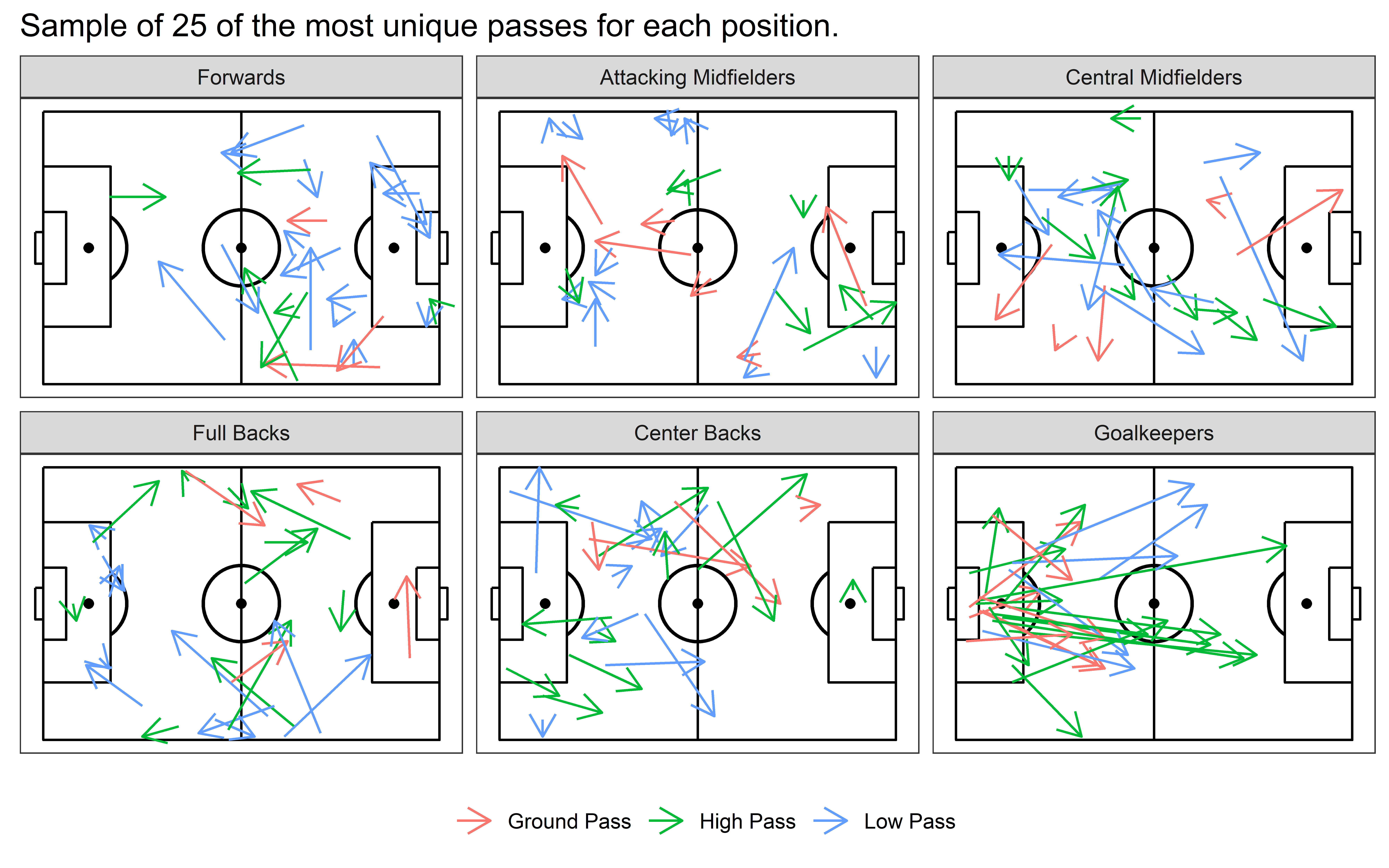
At this point, I hope the metric is starting to make sense. Our most unique passes are short passes high in the air or high passes into strange areas on tight angles, long ground passses whipping across the pitch and low driven passes on interesting angles. I’m starting to feel pretty comfortable with the effectiveness of the metric, so let’s get deeper into what this metric could do.

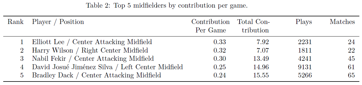
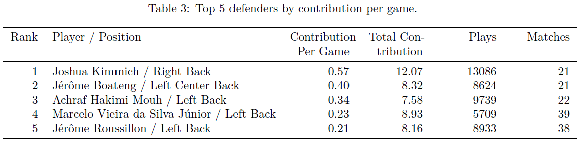
Everyone’s first inquiry is; who are the most unique passers? You must proceed with caution when investigating this, if we simply ranked players based on their median uniqueness or some other quantile we would make heavy passers suffer more than occasional, possibly, frantic passers. Instead, we rank passers based on the count of completed passes that were more unique than the 90th percentile of passes per 90 minutes played (this is also how players were ranked players in the original uniqueness framework).

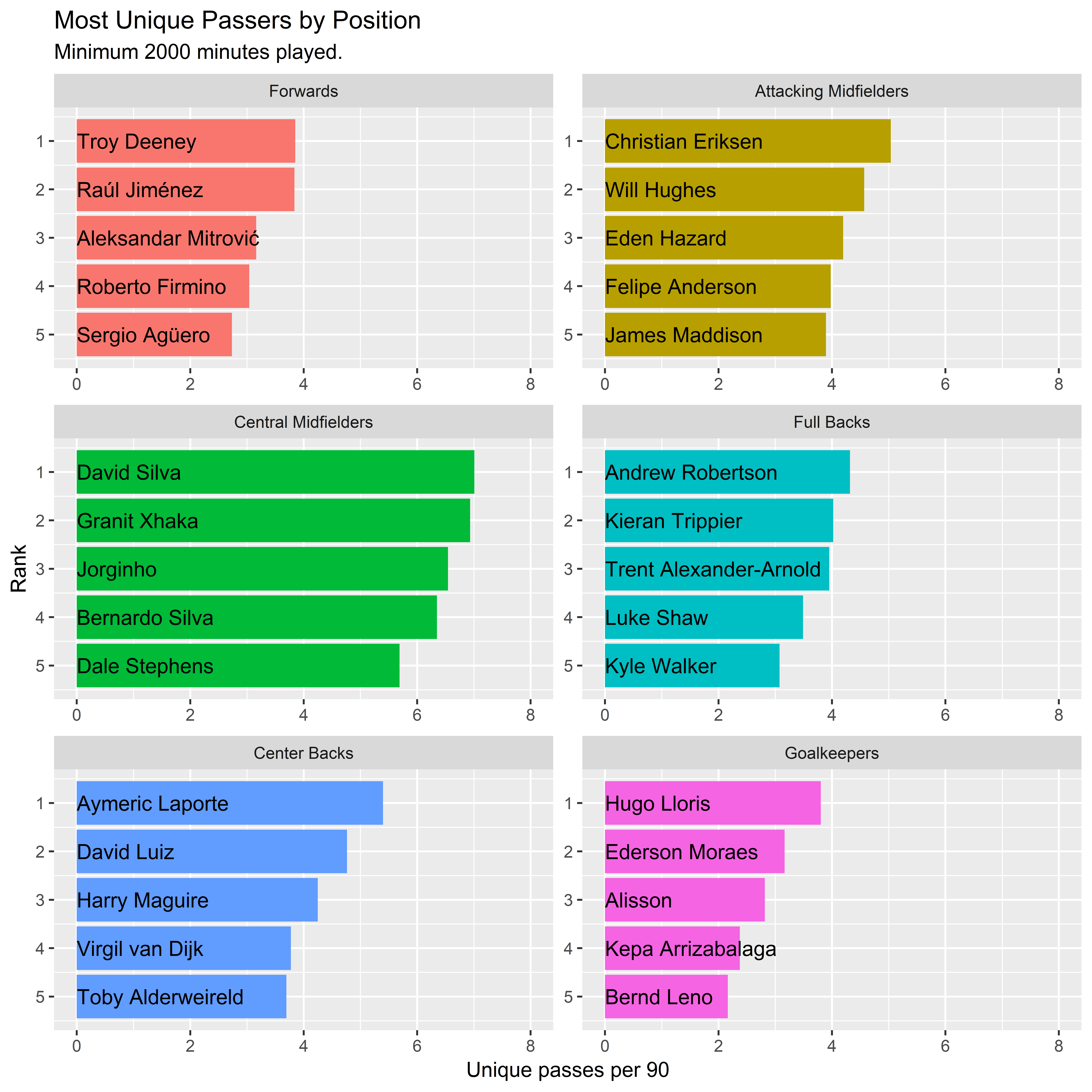
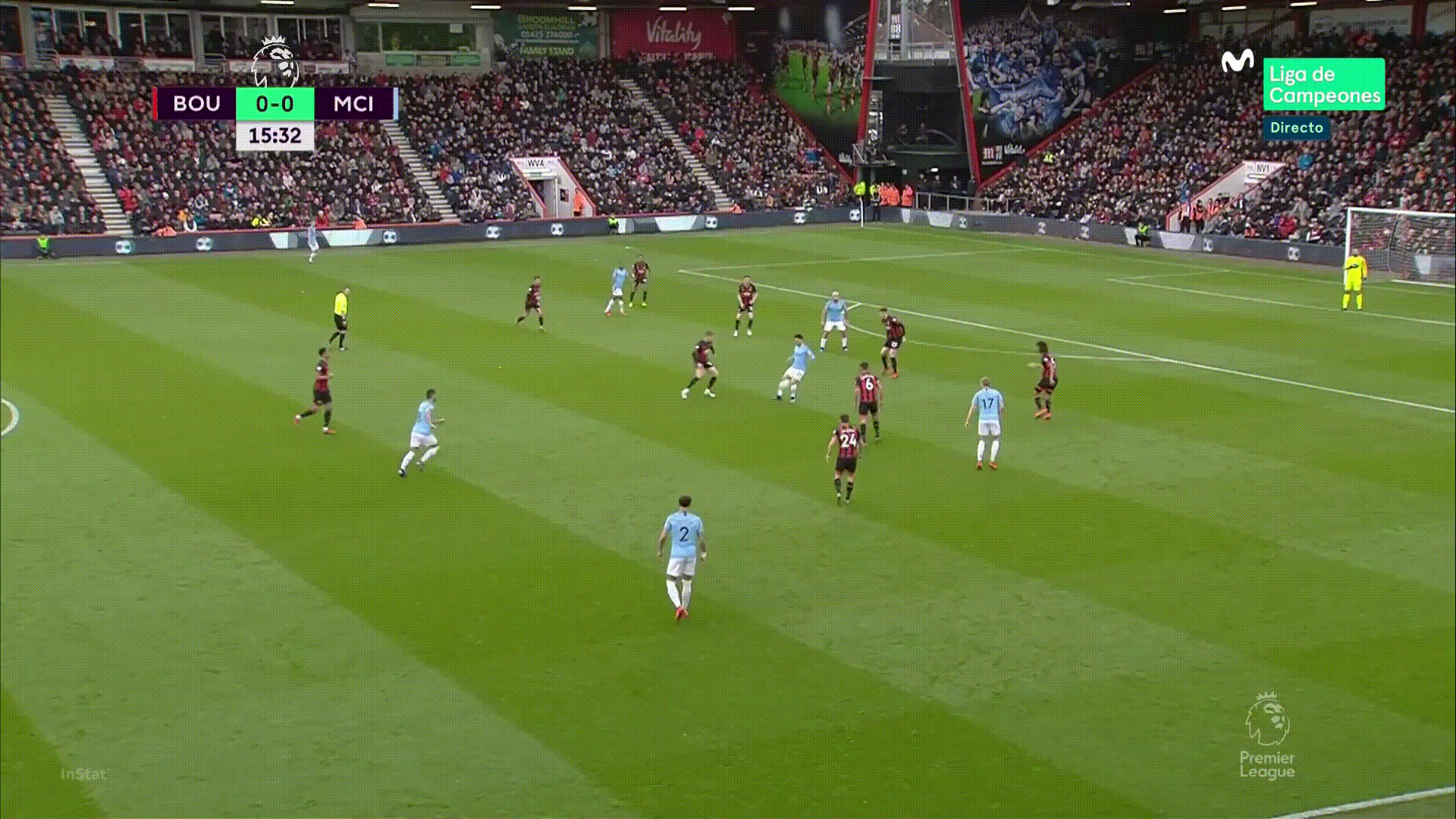
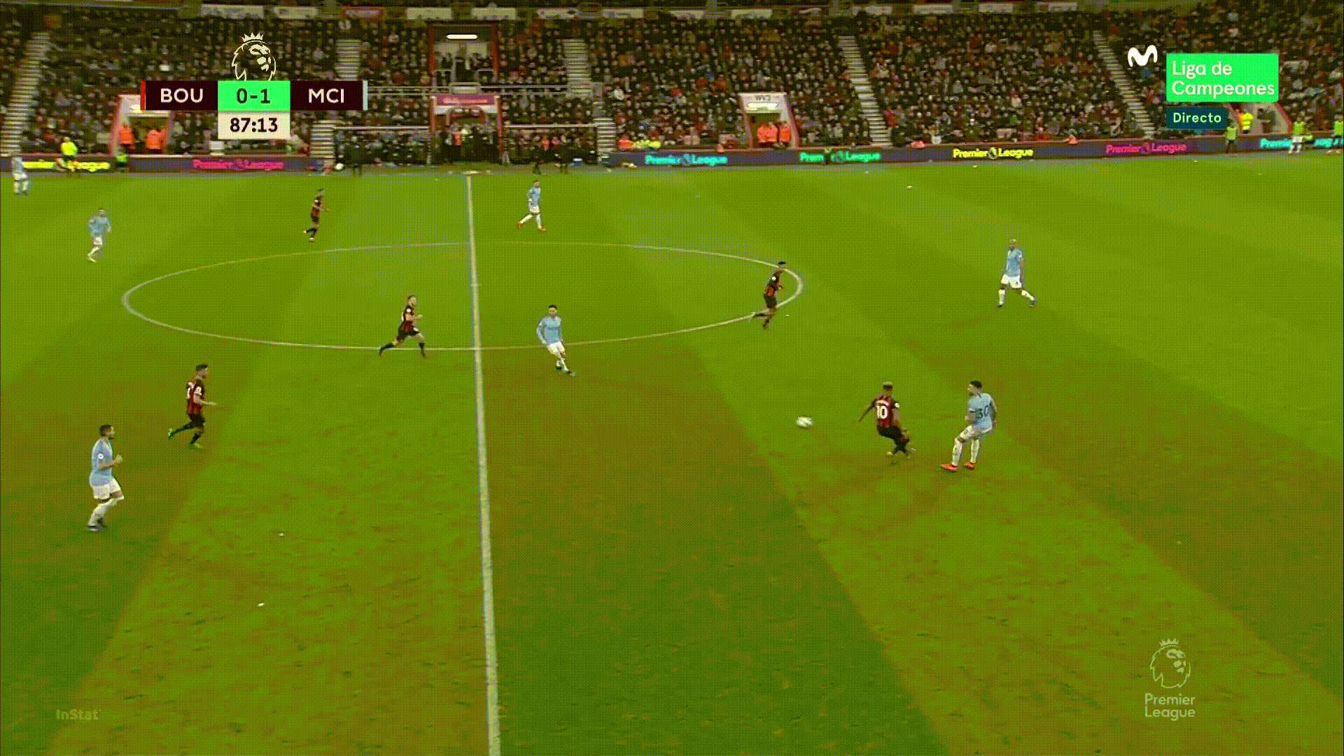
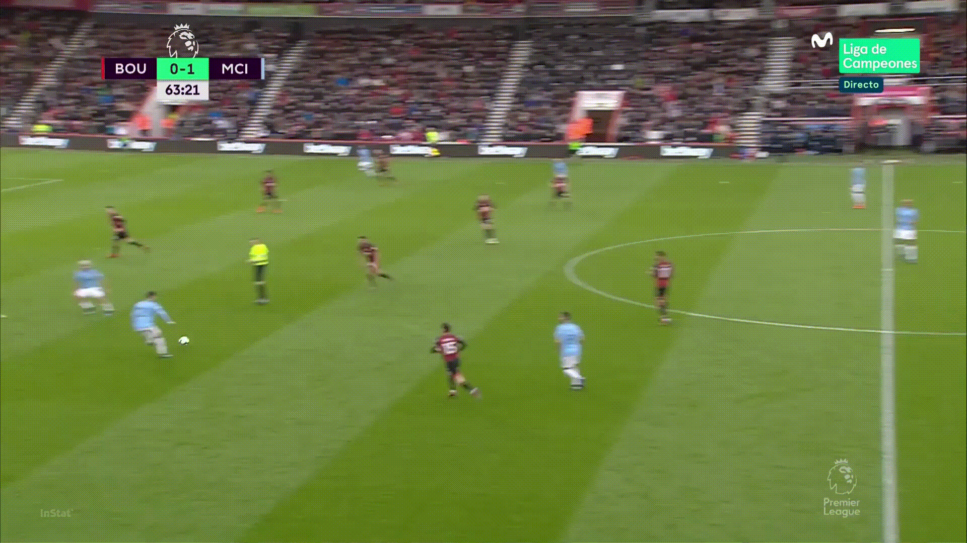
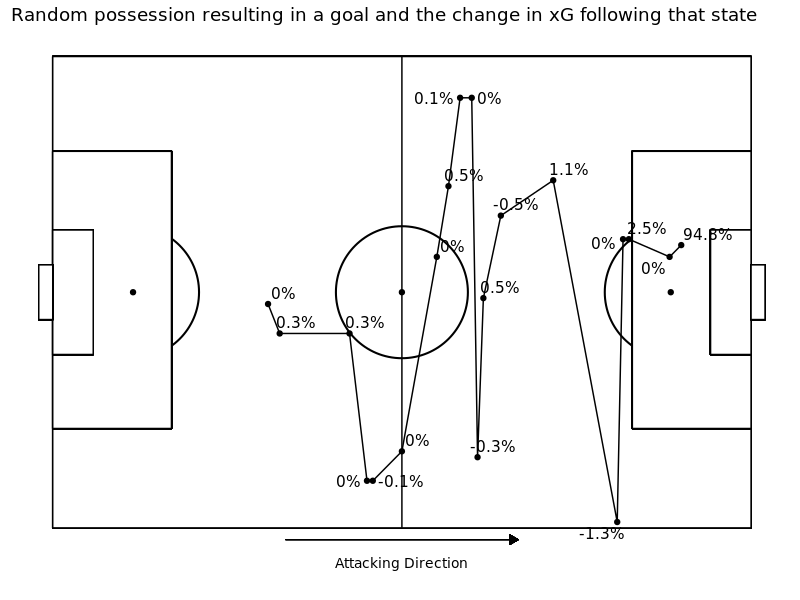
The results passed the ever-rigorous eye test from our analysis department. Although that may seem like a piece of cake to the average reader, let me assure you it is not too easy to sneak names by Euan,James and the crew. Nonetheless, we’re still left with a few questions. How are these player’s more unique? And, why does that matter? To answer the first question, we can look at an example match for our most unique passer in the EPL this season, David Silva.

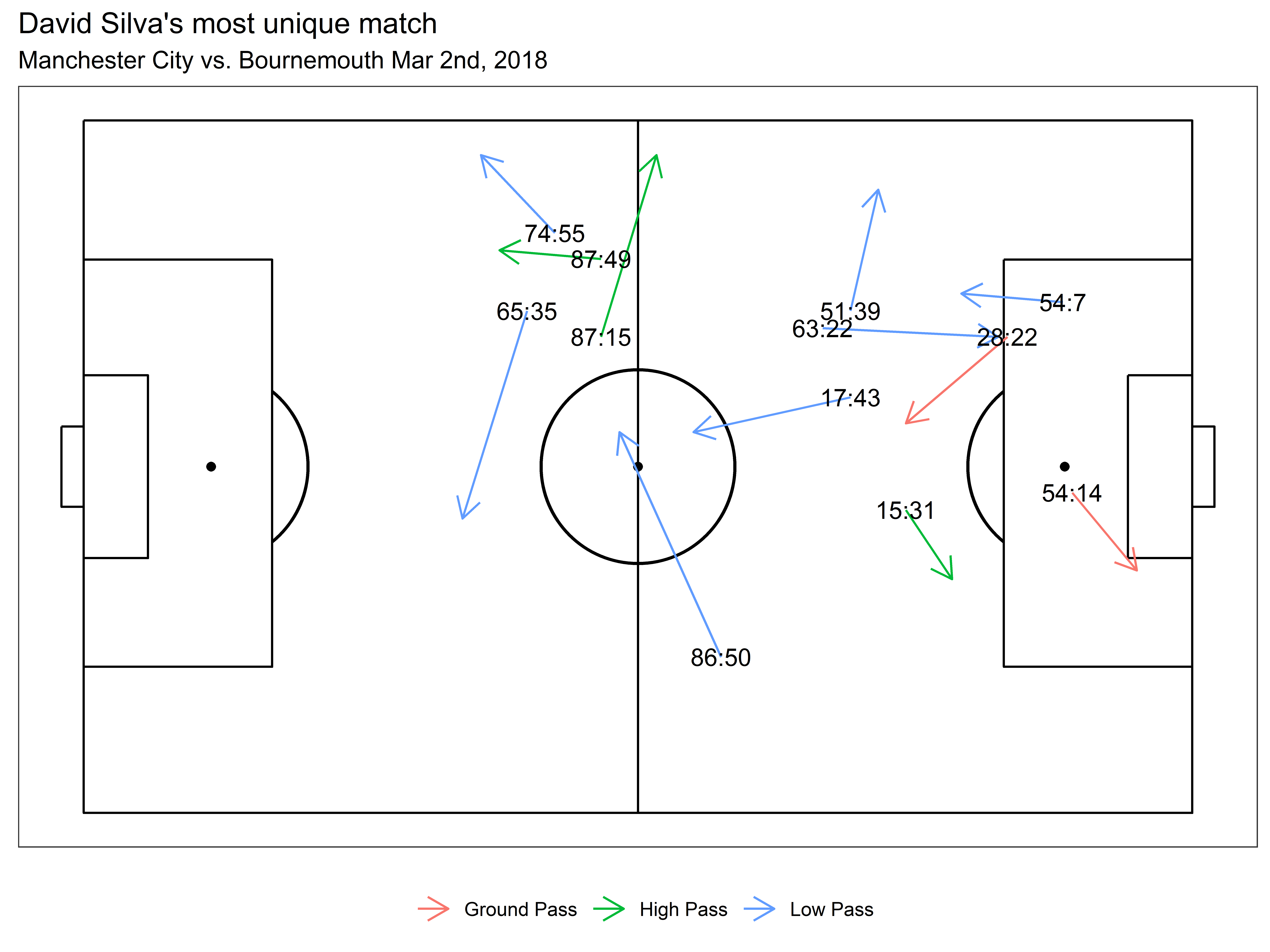
In the plot above, we match these passes to the video and see why they are so unique. As you can, see the passes aren't anybody's definition of great, but they certainly stand out as unusual.

We then of course have to answer the next question why is this important? And the reason is simple, the uniqueness metric extends easily into other areas of research. Are some players more creative than others? Well, yes. Can we find out which ones? Yes, we just did that. Can we see which of these unique passes made the attack more dangerous? Not yet, maybe soon, but not now. Can we use the uniqueness to predict completion probability? I thought you’d never ask.

Pass completion probability is our next application. Starting simply, is the effect of pass uniqueness related to the probability a pass is complete? This extension was proposed in the original framework, but lacked the sample size to really test it. I am lucky enough to have plenty of data at my finger tips. Using only the pass uniqueness to predict the probability of a pass is completed we constructed a simple logistic regression model. Given the assumed non-linearity of the pass uniqueness metric, we fit the model using a natural spline with 5 degrees of freedom.

The relationship between uniqueness and pass completion is pretty clear. For very common passes, there is a quadratic relationship with pass completion probability, reaching a peak completion probability of 90+% around a uniqueness of 2.4 or the lower 25th quantile of uniqueness and then there is a sharp decline in completion probability until a uniqueness of 3.5 (70th quantile of uniqueness) where the passing percentage continues to decline as uniqueness increases albeit less drastically. Intuitively, the more common the pass is the more likely it will be completed, and the more unique it is, the less likely it will be completed.

We checked the accuracy of the model using an ROC curve and found favorable results.

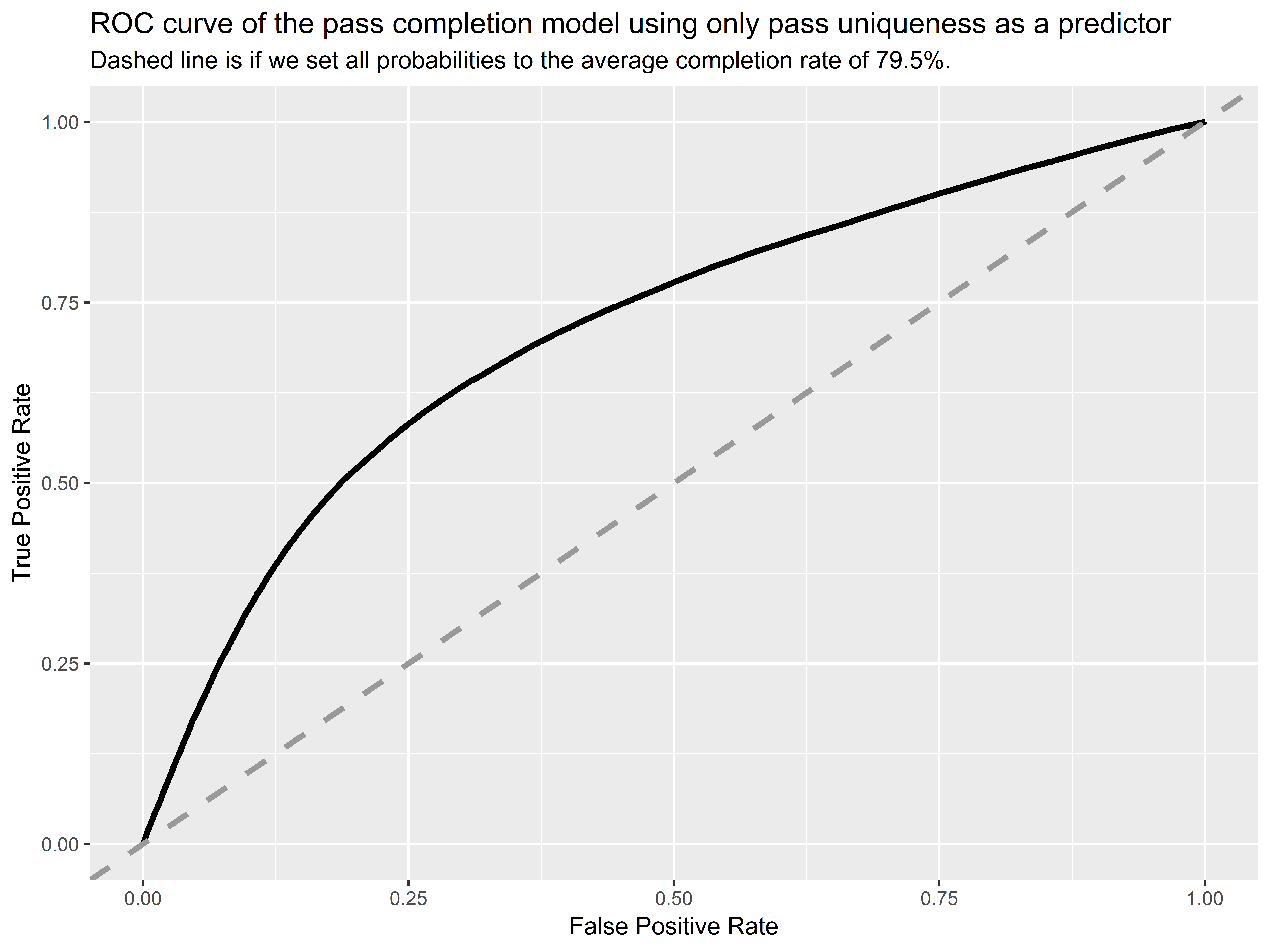
The model is performing better than assigning the average completion rate to every pass, but there is definitely room for improvement. The area under the curve is 0.71 which is far greater than no model at 0.5 but also a ways away from a perfect model at 1.0. In a follow up post, we will work through a more comprehensive pass difficulty model.

The extensions of this metric are endless and we are excited to dive into them further. For starters, the uniqueness metric is already summarizing some pretty complex relationships between pass characteristics and pass difficulty. It’s already teasing out passers who regularly defy football norms for better or for worse. This leads us to our greatest challenge, extracting unique and positively contributing passes that don’t just move the ball forward but improve build up play for the entire possession, not only the immediate reward. We’ll catch up with you soon with our next passing article in this series.

Header image courtesy of the Press Association

Attacking Contributions: Markov Models for Football

Messi or Ronaldo? Kroos or Modric? Mbappe or Neymar? Every football fan loves to argue over who they think is a better player. Depending on where your loyalties lie, arguments can range from simple statistics; like the number of goals they’ve scored or the trophies they have won, to advanced metrics like expected goal values from ghosting. To the layman football fan, the former argument is almost certainly more digestible. But for the rest of us, we often want a metric that’s more objective, more extendable, and more rigorous, while still being able to understand it and explain it to your counterpart to assert your football dominance.

The evolution of football analytics - how we got to non-shot expected goals models.

Every football analytics nerd understands the (slow) evolution of football statistics. The story begins with football’s notorious and frustratingly difficult objective of scoring goals, the historic hindrance for American spectating. Analyzing goals scored and goals conceded appeased few and people quickly realized the value of shot volume for depicting a team’s performance and ability. The obvious pitfall in comparing shot volume was the quality of a shot can vary drastically. This led to everyone under the sun defining their own expected goals (xG) model to objectify chance quality and aggregate goal likelihood as a better metric for attacking production. xG is now omnipresent in football analytics as a tool for attackers’ and teams’ performance. Most recently in the sports analytics community, people have extended the concept of expected goals to allocate ball progression contributions throughout a team’s possession of the ball.

Commonly referred to as “non-shot expected goals (NSxG) models”, these models are effective tools to quantify passes and carries into dangerous areas of the pitch, assigning value to actions other than shots and allowing for the comparison of attacking contribution of ALL players. Fivethirtyeight even uses a non-shot xG model as a component in their soccer projections.

The original research - before “non-shot expected goals” became a thing - was by Sarah Rudd, presented at NESSIS in 2011. Rudd used markov models to assign individuals offensive production values defined as the change in the probability of a possession ending in a goal from  the previous state of possession to the current state of possession.

For example, imagine a player standing 30 yards from the goal line, close to the sideline. They are in a non-threatening position and that possession will rarely result in a goal. Let’s say it has a 1% chance of resulting in a goal. Now, that player gets a cross off, the defender clears it out of bounds for a corner kick. Corner kicks resulted in goals approximately 4% of the time. This play would attribute a +3% change in NSxG for the player who crossed the ball.

As data becomes increasingly utilized and accessible, the variants of NSxG models grow just as xG models did. Mark Taylor further explains NSxG models here. Nils Mackay defines “xG added” to grade passing skill and extends it to allocate value for carries and structures as a possession based model. Similarly (and most recently), Karun Singh published his version of xG added, introducing xG threat, explaining it with beautiful interactive visualizations.

All of this publicly facing research has been pivotal in advancing the applications and effectiveness of sports analytics. Today, I am going to walk through a tutorial on StatsBomb’s first iteration of a Ball Progression Model. I like to refer to NSxG as “contribution”, simply because it's easier to say and not everything in football analytics needs an “x” in it.

Markov Model - Framework and Methodology.

Adopting the framework set forth by Rudd, we construct a possession based markov model we call our “Ball Progression Model”. We define attacking possessions to have two possible outcomes, a Goal or a Turnover. In a markov model, these two outcomes are known as the “absorption states”. The most crucial condition of an absorption state is that the probability of transitioning out of the state is 0 and the probability of remaining in the state is 1, given that it is the end of a possession this condition holds and the data must be structured as such (this condition makes it more difficult to consider shots or xG bins as potential absorption states). Leading up to the absorption state, a possession can transition between any number of “transient states”. We define transient states based on the context of the state and the geographical location of the possession at a current state. Extending the states defined by Rudd and applying to StatsBomb data, we define the following context-based transient states:

  • Attacking Third Free Kick
  • Central Third Free Kick
  • Defending Third Free Kick
  • Attacking Third Throw In
  • Central Third Throw In
  • Defending Third Throw In
  • Corner Kick
  • Penalty Won

We then define the following geographic zones as transient states:

Since a state can depend greatly on defensive pressure, we define the geographic zones each when they are absent of pressure and when they are under pressure. This leaves us with 76 geographic zones (38 with pressure, 38 without pressure) and 8 contextual zones for a total of 84 transient states.

Transient states can transition between other transient states and ultimately an absorption state based on some observed transition probability. The transition probability is dependent only on the current state of the possession and is independent of previous states. This is known as the markov property and is a key assumption in markov models (in the discussion we consider this a limitation and propose extensions to this property). For instance, if you have the ball in zone 21, the probability that you pass the ball to zone 28 is the same regardless of the fact that the ball came from zone 14 as opposed to any other zone. This is known as the “memoryless” property.

Quick notation - n is the number of transient states (in our case 84), r is the number of absorbing states (in our case 2). Q is the matrix of transition probabilities, Q is n x n. R is the matrix of absorption probabilities, R is n x r. N is known as the fundamental matrix and it is calculated as the inverse to the n x n identity matrix, I,  minus the transition matrix Q, formally N = (I - Q)-1 .

Calculations - for each transient state, we can calculate the expected number of plays (progressing actions: passes, carries, and shots) until absorption as the row sums of the fundamental matrix.  Then, the probability of reaching either absorption state for the current transient state is equal to N x R. For more on the theory behind markov models, please see here.  Special thanks to Ron Yurko for the code.

Results

We prepare the data (this is the most time consuming portion) and run our ball progression model for Europe’s big five leagues, England Championship and England League One for the 2017/2018 and 2018/2019 (through 2/18/19) seasons.

For each transient state, we calculate the probability of a goal in absorption as well as the expected number of plays until absorption. The three most likely states to result in a goal are (refer to geographic zones above): 36 w/ pressure (Pr(Goal) = 19.2%), 31 w/ pressure (Pr(Goal) = 9%), and 36 w/o pressure (Pr(Goal) = 8.3%). The three most likely zones to result in a turnover are: 1 w/ pressure (Pr(Turnover) = 99.5%), 3 w/ pressure (Pr(Turnover) = 99.5%), and 2 w/ pressure (Pr(Turnover) = 99.5%). We present a possession that resulted in a goal below, with the contribution value for each action.

We then calculate our “contribution” metric as the change in the probability of a goal from the current state to the next state. Formally,

contribution = Pr(Goal|Statet+1) - Pr(Goal|Statet) for each transient state at time t.

We can also calculate total attacking contributions for each individual, i, as the sum of all of their attacking contributions,

contributioni = ∑Pr(Goal|Statet+1) - Pr(Goal|Statet)i  ·I(action by player i)

We then scale their total contribution by the number of matches played to get a player’s “contribution per game”. We choose to leave the contribution per game metric raw, not standardizing by league strength. This is to simply to see the crude output from the model, giving every player a fair chance to shine regardless of where they play. The top five contributors for each position (attackers, midfielders, defenders and goalkeepers) are presented in the tables below:

We also formulate a hypothetical “Ultimate Team” for the top contributors for each position of a standard 4-4-2 against a 4-3-3. Again, we purposely make the naive assumption that contributions between different leagues are equal. We also, in order to show you some names you might know, purposely didn't stress that the ultimate teams are extremely broad and unrealistic when it comes to positional categorizations. The two squads we formulate highlight plenty of young stars to remember during the next transfer window.

Discussion

Our ball progression model has clearly identified the top players across Europe, and offers some justification for the money needed to acquire them. We have clearly designed a model that is easily interpretable even by the less-technical analytics sides. And ultimately, the model works without much computational power. Markov models are good at handling sequences of arbitrary length (as possessions in soccer can be anywhere from one event to 100s of events), and they allow for the attribution of final outcome contributions further along in the sequence. Nonetheless, there exist several limitations to a simple markov model.

  • First, markov models’ assume the “memoryless” property when in reality a soccer possession is not memoryless. The probability of scoring when you are in a current state can depend on previous passes and carries leading up to the current state.
    • A further extension of our ball progression model, that would appease this limitation, is higher order markov models. In higher order markov models, instead of assuming the markov property of independence, you assume that transition probabilities are conditionally independent based on the value of the current state and the value of the previous, 2nd previous, nth previous state, where the number of previous states you consider is the nth order of the markov model.
  • Another limitation is that this simple markov model does not consider the action required to transition between states. For instance,  the probability of a possession resulting in a goal may be different given that you passed into a zone vs. dribbled into a zone.
    • This limitation can be appeased with markov decision processes, in which you consider the action at each state and time step, some examples of markov decision processes in other sports can be found here, here, and here.
  • Lastly, and perhaps the most obvious limitation of this markov model is the categorized structure of transient and absorption states. This causes the loss of information and limits applications especially in the free-flowing game of football.  
    • There exists some methods for continuous stochastic processes, but their use in the public sphere is limited and the concepts are far more difficult to understand.

This leads us to StatsBomb’s latest endeavor. Based on the limitations outlined above, we recognized the need for a model that accounts for the continuous nature of football, the retention of information from previous states, and the actions chosen by decision makers. Our next model will improve on the limitations noted above as well as layer on additional components essential to a football team’s success such as the timing of goals and the style of play under different game states. This will be the primary model we use for holistic ball progression in player and team stats, and a white paper detailing the model will be made available to current StatsBomb customers in March.

Shots Under Pressure Part 3: Shooting Locations

Welcome back to our data exploration of shot pressure using StatsBomb data. In part 1, we laid the groundwork for our definition of shot pressure. We showed how overall shot pressure, and specifically pressure from certain angles, influences scoring likelihood. We continued that analysis to investigate players’ tendencies to shoot in the midst of pressure.

In part 2, we looked specifically at headers under pressure and teased you with some insight on passer’s ability to find open shooters. Unfortunately, we’re not quite ready to leak our player’s decision making analysis. Instead, in this article we are going to take a visual tour of the effects of shot pressure from different locations.

In this analysis, we continue with our shot pressure definition from part 1, which split the shot pressure into equal quadrants to the right, left, front and back of the shooter. After filtering for only shots from open play, we present a visual representations of how pressure from each direction effects the scoring rate.

How does the direction of pressure effect scoring rates in different locations of the pitch?

We present a series of figures with an interpretation for each one below. Please note that in the figures below, the color scale changes to make it easier to see the differences between shot locations. We calculate the change in scoring rate as the scoring rate under pressure (defined for each direction) minus the scoring rate without pressure from that direction. We tested these figures with various bin widths and they were not highly sensitive to the number of bins which is encouraging, but with even more data we will be able to fine to our spatial analyses.

Pressure left


In the figure above, we see that on the left side of the pitch, when the pressure from the left is greater than the pressure from the right, the change in scoring rate varies from approximately a 3% increase to no change (except for the top and bottom tiles). The intuitive explanation for this is that on the left side, the pressure is forcing shooters inside the field and giving them all of the goal to shoot at.

Closer to the goal frame, we see a drastic decrease in the scoring rate when there is pressure from the left and this is likely due to the proximity of the defenders to the attacker this close to the goal easily influencing the shot outcome by being more likely to block the shot or simply put the attacker under psychological pressure. On the right side, the pressure from the left is forcing shooters away from the goal and taking away part of the goal frame so we would expect scoring rates to decrease, however we see no such trend.

Pressure right


When we look at pressure from the opposite side now, we see an increase in the scoring rate on the right side of the pitch, but essentially no change on the left side of the pitch when the pressure is forcing the shooter outside. A possible explanation for this is the plethora of right footed players shooting through pressure on the left side of the pitch despite the pressure coming from the right, which could be confounding the effect of pressure in these regions.

Pressure Front


Pressure in front of the shooter shines again, just like in part 1 of this series. Note the change in color scale. In almost every tile, the scoring rate decreases when there is pressure from a defender forcing a shooter backwards. It is also important to note that the effect diminishes as the shooter gets further away from goal.

This could be due to the extra space behind the defender allowing for more uncertainty in scoring. But, it could also be due to how we are defining shot pressure as a radius growing with the distance from the goal. If the latter is correct, then we will have to revisit our shot pressure definition. That would also have implications for defensive technique when it comes to blocking shots further out from goal, and the optimal levels of aggression for closing players down..

Pressure From Behind


In a completely converse effect from pressure from the front of a shooter, pressure from behind a shooter hardly ever reduces the scoring rate. Almost everywhere on the pitch, the scoring rate increases when the pressure is coming from behing the shooter. There's a reason that defenders harassing players from behind is a method of last resort, it's because it generally has little impact on the shot the attacker ends up taking.

Pressure forcing the shooter outside


When we looked at pressure from the left and right above, we alluded to defenders forcing shooters outside and away from goal. We tried to tackle that idea by looking at when a defender forces a shooter outside by defining pressure pushing outside as more pressure from the right when the shooter is on the left side of the pitch and more pressure on the right when the shooter is on the left side of the pitch.

This is essentially the left half of the pressure from the right being greater than the pressure from the left plot, and the right half of the pressure from the left being greater than the pressure from the left plot. It is largely unknown, whether or not pressing a shooter towards the touch line effects the probability of scoring. It's worth noting that defensive positioning aimed at forcing players wide may not be an adequate defensive system, and specifically on the right side, where it forces many players onto their stronger foot, could be detrimental. We look forward to investigating this further, especially to figure out the big differences between the right and left sides.

Take Aways.

We made these figures to illustrate some of the raw numbers we saw in part 1 and present them in a manner that is easier to digest. Most conclusively, we have reaffirmed the importance of pressing a shooter backwards, away from goal and identified some key distinctions on each side of the pitch. Shot pressure can be defined in a number of ways and we are by no means claiming we have cracked the code, but there is indisputable football insight to take away from these analyses.

Header image courtesy of the Press Association

Shots Under Pressure Part 2: Headers

We first introduced our exploratory data analysis of shot pressure last week, that article can be found here. Now we’re going to examine specifically at headers. The goal is to see if there are any striking differences in the raw pressure metrics, and also look at the players topping each list and which passers are the best at pinpointing “wide open” shooters.

As the tables show, 72% of shots from a player’s head are under pressure versus 62% of all shots are under pressure. The average distance from goal for headers is 9.6 yards, roughly half of the average distance for all shots which is 18.8. That means the pressure radius is on average only, 2.3 yards. Thus, the defensive pressure on these headers is typically even closer to the shooter. Let’s take a closer look at where the pressure is coming from.

Looking at the pressure directions for headers, we see nearly identical results as what we saw with all shots in part 1 of this exploration into shot pressure.

Which players in the EPL take the most shots under pressure?

Players who take the highest percentage of their shots under pressure tend to be the big beefy boys who come up and crowd the box on set pieces. Then there is Steve Mounie and Ashley Barnes, attackers for notably conservative teams Huddersfield and Burnley. To some degree this is likely to be a function of the fact that the vast majority of many defenders shots come from set plays while most attackers will have some mix of set piece and open play headers on their statistical resume. In the cases of the attackers on the list disentangling their set play attempts from open play attempts would be a worthwhile next step.


Which players in the EPL take the fewest shots under pressure?

Notably, players that take a low percentage of their headers under pressure are a much more traditional set of attackers.

Which passers find the “open” player most often?

What we want to look at now is which players are finding teammates in positions to take open shots. It can be assumed at this point, that shots free from pressure are prefered to shots under pressure. Using the “pass_shot_assist” variable in the StatsBomb data we first look at the difference in proportion of shots under pressure given that they were taken after a key pass or not.

Now we can argue this is confounded by team strengths, teammates who make great runs and other factors. We could also argue that headers taken under pressure are not necessarily bad shots. But, given the clear, increased likelihood of scoring in the absence of pressure, it is definitely not a bad thing to be able to target open shooters. The players in the list above definitely pass the eye-test and in coming articles of this series on shot pressure, we will dive even deeper into those passers, their own shooting tendencies and identifying open players/better decisions through freeze frames.

Header image courtesy of the Press Association

Closing Down: How Defensive Pressure Impacts Shots

One of the things that makes StatsBomb data unique is that we have defensive positioning data for every shot. The challenge is rigorously translating the freeze frames that capture that positioning into usable information about how defensive pressure impacts the players taking the shots.

Defining the Problem

To start, we need to define what specifically pressure means. Obviously we’re looking at defenders within a certain radius of a shooter. Our first challenge is defining the distance around the shooter that we should examine. Adjusting the Pressure Radius (PR) for arbitrary distance categories would unjustly increase or decrease the radius for shots just inside or just outside a given category. Therefore, we create a piecewise linear function for all shots. This is defined as:

–          PR = DFG*0.15 + 0.85 for DFG <= 24 (where DFG = distance from goal)

–          PR = 4.5 for DFG > 24.

–          In other words, it is the straight line from the point (PR, DFG) of (1, 1) to (4.5, 24).

The PR is relatively arbitrary, but intuitively defined. It is designed to differentiate pressure at different positions on the pitch and with further research can be easily modified to best model defensive pressure. In simplest terms, the closest to the goal you are, the closer defenders must be to pressure you and influence your shot and the further away from the goal you are defenders may be slightly further away in order to impact a shot.

Here is an example of what that radius looks like:

Pressures from each side

In addition to dealing with distance, we also need to separate out the pressure defenders apply by direction. The idea here is to more specifically understand both how pressure effects change goal scoring probabilities and also how they interact with a shooter’s own tendencies. If we take the circle around the shooter with radius = PR as defined above, then we can define pressure from four different sides as:

–          Pressure Left = AngleToShooter > 315 and AngleToShooter < 45.

–          Pressure Behind = AngleToShooter >= 45 and AngleToShooter <= 135.

–          Pressure Right = AngleToShooter > 135 and AngleToShooter < 225.

–          Pressure Front = AngleToShooter >= 225 and AngleToShooter <= 315.

We will later see how the pressure from each of these sides influences a player’s decision of shooting foot and the observed goal rates. For example, here is a shot that had pressure from the left of the shooter.

Overall Shot and Goal Rates Under Pressure

After testing the pressure metrics both visually and numerically we apply the pressure values to all shots in our data set, and then view some summary statistics. Please note that all results below only reflect shots in the run of play.

In the tables above we can see that roughly 65% of all shots, under this definition are “under pressure”. We can also see that a significantly higher proportion of goals are scored in the absence of pressure than under pressure. The only angle that does not have a higher proportion of goals scored is the pressure behind the ball which would make sense, since the pressure behind the shooter is not disrupting the view to goal.

The Cool Stuff We Found

Once we define “under pressure” values for all of our shots, we can analyze a multitude of different aspects of the game and the player. First, we will look at whether the direction of pressure has any impact on the player’s choice of foot to shoot with. Furthermore, we look at whether the combination of the player’s dominant foot, shooting foot and direction of pressure has a significant relationship with the proportion of shots that become goals. We view the results in the tables below.

When the pressure from the left is greater than the pressure from the right, the proportion of shots taken with the player’s right foot is about 75%. When the pressure from the right is greater than the pressure from the left, the proportion of shots taken with the player’s right foot is still greater than 50% at approximately 50.2%. An obvious explanation for this is the vast majority of right footed players continuing to want to shoot with their right foot regardless of the pressure. Interestingly enough, we see in Table 3 that the highest proportion of goals are scored when a right footed player gets off a shot with his right foot and there is less pressure on the right side.

The next thing we wanted to look at with shots under pressure were the raw numbers on a player level. Which players players are trigger happy and will pull up regardless of who’s around? Which players are more selective with their shots? Or, which players happen to find themselves in better places to get shots off without defenders breathing all over them. Using 2017-18 Premier League numbers, the 10 players who take the greatest proportion of shots under pressure are summarized in table 5 and the 10 players who take the lowest proportion of shots under pressure are in table 6.

This pressure data contains tons of interesting information about what exactly is happening and players put the ball on net. There are certainly further factors that can be worked in too. This is only the beginning of the kind of information that we can glean from how players are pressured as they take shots.